- Made by AppCoda
- Contact us / Support
- Tweet this book
- Preface
- 1. Introduction to SwiftUI
- 2. Getting Started with SwiftUI and Working with Text
- 3. Working with Images
- 4. Layout User Interfaces with Stacks
- 5. Understanding ScrollView and Building a Carousel UI
- 6. Working with SwiftUI Buttons and Gradient
- 7. Understanding State and Binding
- 8. Implementing Path and Shape for Line Drawing and Pie Charts
- 9. Basic Animations and Transitions
- 10. Understanding Dynamic List, ForEach and Identifiable
- 11. Working with Navigation UI and Navigation Bar Customization
- 12. Playing with Modal Views, Floating Buttons and Alerts
- 13. Building a Form with Picker, Toggle and Stepper
- 14. Data Sharing with Combine and Environment Objects
- 15. Building a Registration Form with Combine and View Model
- 16. Working with Swipe-to-Delete, Context Menu and Action Sheets
- 17. Using Gestures
- 18. Displaying an Expandable Bottom Sheet Using Presentation Detents
- 19. Creating a Tinder-like UI with Gestures and Animations
- 20. Creating an Apple Wallet like Animation and View Transition
- 21. Working with JSON, Slider and Data Filtering
- 22. Building a ToDo app with Core Data
- 23. Integrating UIKit with SwiftUI Using UIViewRepresentable
- 24. Creating a Search Bar View and Working with Custom Binding
- 25. Putting Everything Together to Build a Real World App
- 26. Creating an App Store like Animated View Transition
- 27. Building an Image Carousel
- 28. Building an Expandable List View Using OutlineGroup
- 29. Building Grid Layout Using LazyVGrid and LazyHGrid
- 30. Creating an Animated Activity Ring with Shape and Animatable
- 31. Working with AnimatableModifier and LibraryContentProvider
- 32. Working with TextEditor to Create Multiline Text Fields
- 33. Using matchedGeometryEffect to Create View Animations
- 34. ScrollViewReader and Grid Animation
- 35. Working with Tab View and Tab Bar Customization
- 36. Using AsyncImage in SwiftUI for Loading Images Asynchronously
- 37. Implementing Search Bar Using Searchable
- 38. Creating Bar Charts and Line Charts with the Charts Framework
- 39. Capturing Text within Image Using Live Text APIs
- 40. How to Use ShareLink for Sharing Data Like Text and Photos
- 41. Using ImageRenderer to Convert SwiftUI Views into Images
- 42. Creating PDF Documents Using ImageRenderer
- 43. Using Gauge to Display Progress and Create a Speedometer
- 44. Creating Grid Layout Using Grid APIs
- 45. Switching Layout with AnyLayout
- Published with GitBook
Chapter 19
Creating a Tinder-like UI with Gestures and Animations
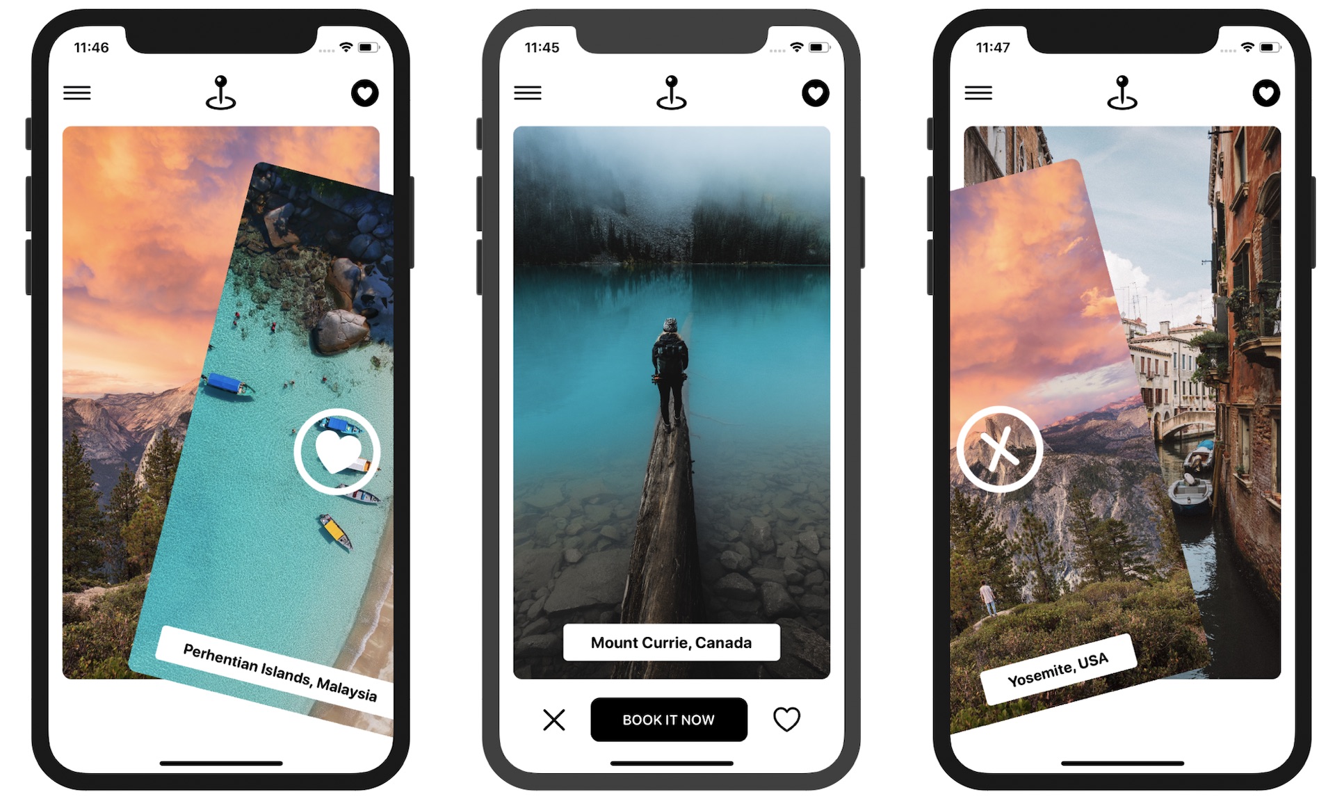
Wasn't it fun to build an expandable bottom sheet? Let's continue to apply what we learned about gestures to a real-world project. I'm not sure if you've used the Tinder app before. But you've probably come across a Tinder-like user interface in other apps. The swiping motion is central to Tinder's UI design and has become one of the most popular mobile UI patterns. Users swipe right to like a photo or swipe left to dislike it.
What we are going to do in this chapter is to build a simple app with a Tinder-like UI. The app presents users with a deck of travel cards and allows them to use the swipe gesture to like/dislike a card.
Note that we are not going to build a fully functional app but focus only on the Tinder-like UI.
Project Preparation
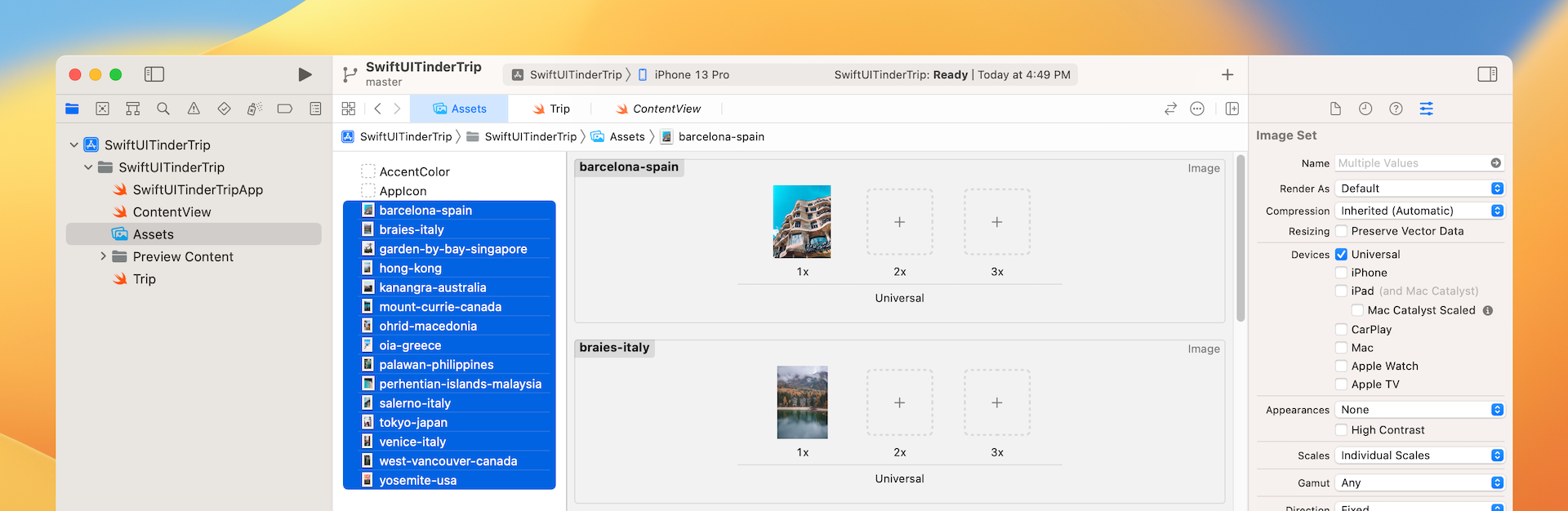
It would be great if you want to use your own images. But to save you time preparing trip images, I have created a starter project for you. You can download it from https://www.appcoda.com/resources/swiftui4/SwiftUITinderTripStarter.zip. This project comes with a set of photos for the travel cards.
I have also prepared the test data for the demo app and created the Trip.swift file to represent a trip:
struct Trip {
    var destination: String
    var image: String
}

#if DEBUG
var trips = [ Trip(destination: "Yosemite, USA", image: "yosemite-usa"),
              Trip(destination: "Venice, Italy", image: "venice-italy"),
              Trip(destination: "Hong Kong", image: "hong-kong"),
              Trip(destination: "Barcelona, Spain", image: "barcelona-spain"),
              Trip(destination: "Braies, Italy", image: "braies-italy"),
              Trip(destination: "Kanangra, Australia", image: "kanangra-australia"),
              Trip(destination: "Mount Currie, Canada", image: "mount-currie-canada"),
              Trip(destination: "Ohrid, Macedonia", image: "ohrid-macedonia"),
              Trip(destination: "Oia, Greece", image: "oia-greece"),
              Trip(destination: "Palawan, Philippines", image: "palawan-philippines"),
              Trip(destination: "Salerno, Italy", image: "salerno-italy"),
              Trip(destination: "Tokyo, Japan", image: "tokyo-japan"),
              Trip(destination: "West Vancouver, Canada", image: "west-vancouver-canada"),
              Trip(destination: "Singapore", image: "garden-by-bay-singapore"),
              Trip(destination: "Perhentian Islands, Malaysia", image: "perhentian-islands-malaysia")
            ]
#endif
In case if you prefer to use your own images and data, simply replace the images in the asset catalog and update Trip.swift.
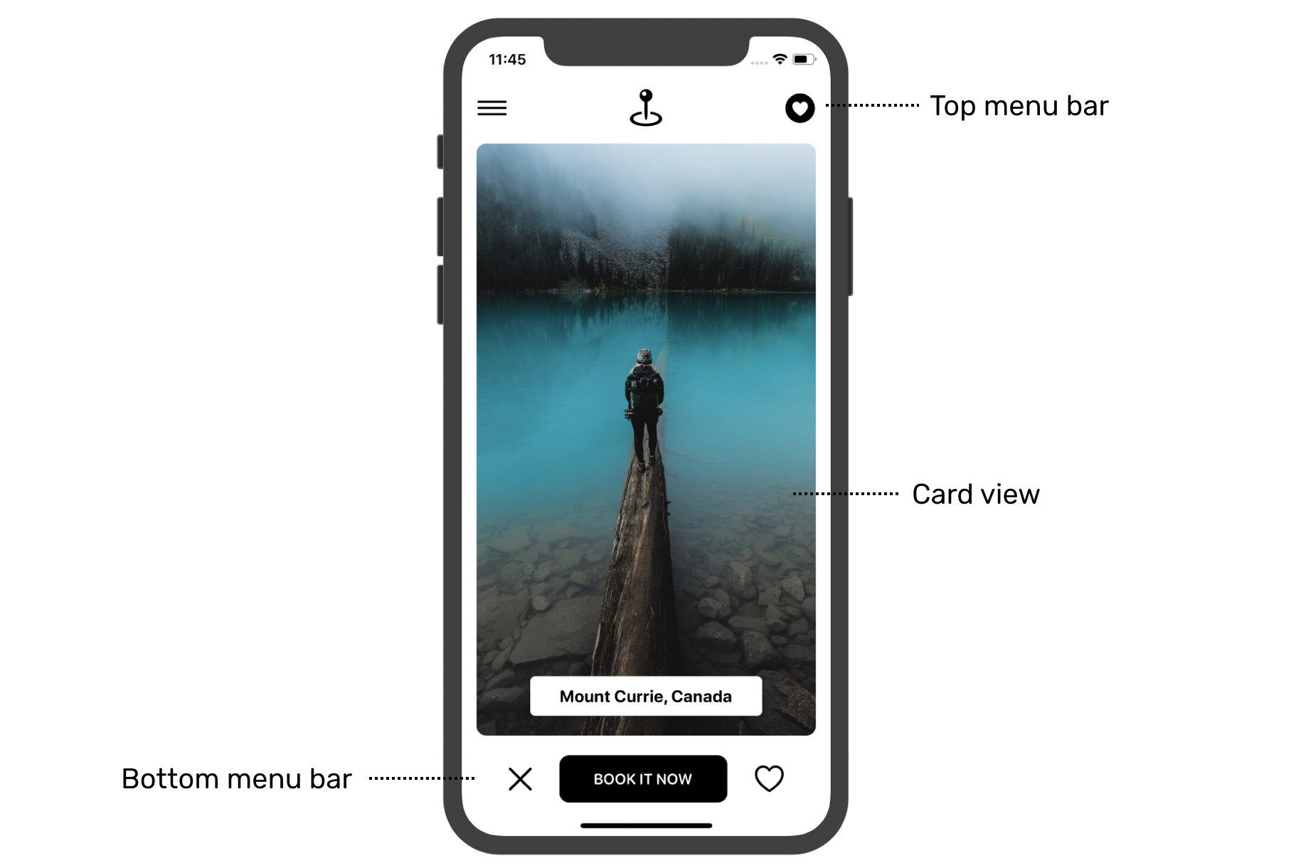
Building the Card Views and Menu Bars
Before implementing the swipe feature, let's start by creating the main UI. I will break the main screen into three parts:
- The top menu bar
- The card view
- The bottom menu bar
Card View
First, let's create a card view. If you want to challenge yourself, I highly recommend you stop here and implement it without following this section. Otherwise, keep reading.
To better organize the code, we will implement the card view in a separate file. In the project navigator, create a new file using the SwiftUI View template and name it CardView.swift.
The CardView is designed to display different photos and titles. So, declare two variables for storing these data:
let image: String
let title: String
The main screen is going to display a deck of card views. Later, we will use ForEach to loop through an array of card views and present them. If you still remember the usage of ForEach, SwiftUI needs to know how to uniquely identify each item in the array. Therefore, we will make CardView conform to the Identifiable protocol and introduce an id variable like this:
struct CardView: View, Identifiable {
    let id = UUID()
    let image: String
    let title: String

    .
    .
    .
}
In case if you forgot what the Identifiable protocol is, please refer to chapter 10.
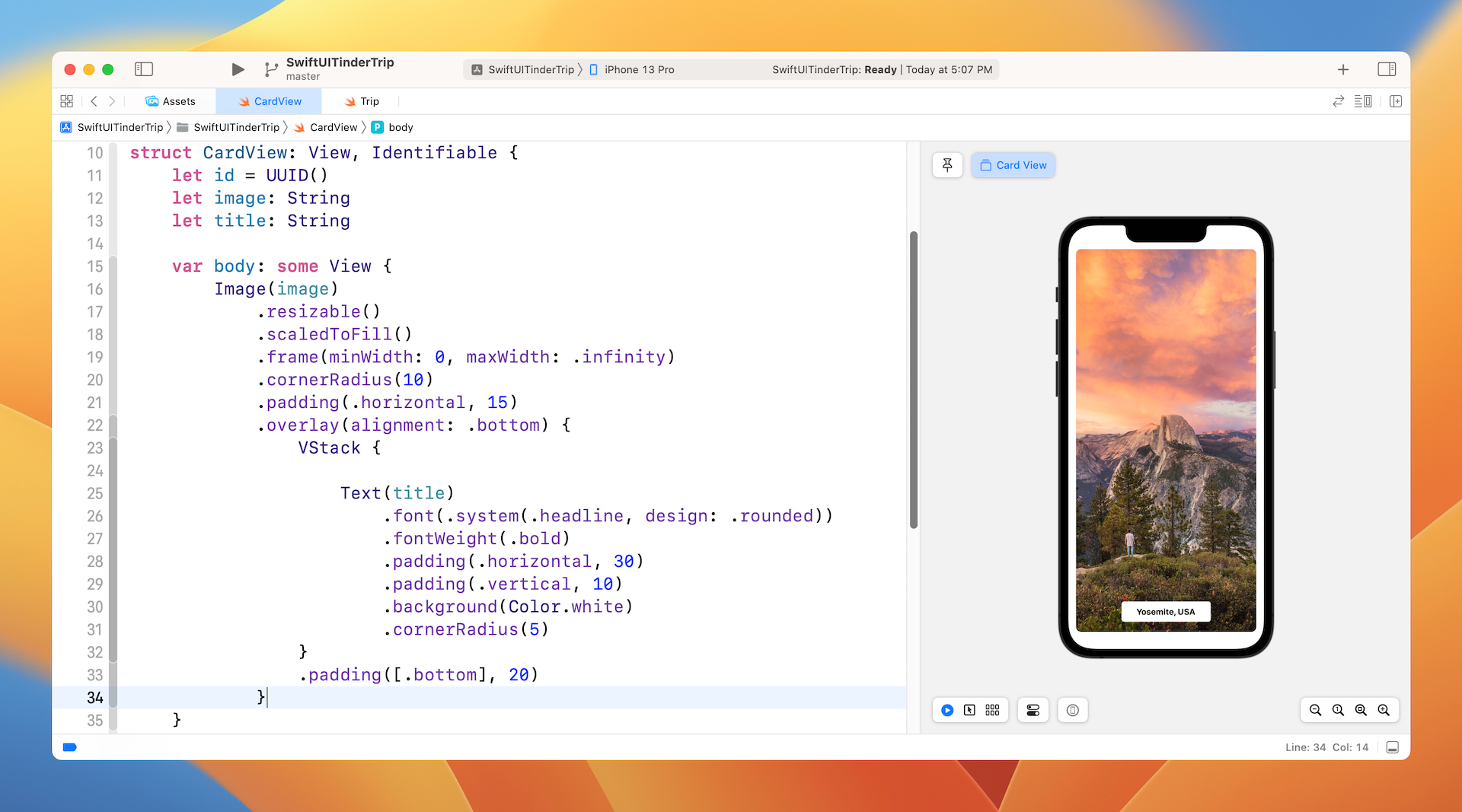
Now let's continue to implement the card view and update the body variable like this:
var body: some View {
    Image(image)
        .resizable()
        .scaledToFill()
        .frame(minWidth: 0, maxWidth: .infinity)
        .cornerRadius(10)
        .padding(.horizontal, 15)
        .overlay(alignment: .bottom) {
            VStack {

                Text(title)
                    .font(.system(.headline, design: .rounded))
                    .fontWeight(.bold)
                    .padding(.horizontal, 30)
                    .padding(.vertical, 10)
                    .background(Color.white)
                    .cornerRadius(5)
            }
            .padding([.bottom], 20)
        }
}
The card view is composed of an image and a text component, which is overlayed on top of the image. We set the image to the scaleToFill mode and round the corners by using the cornerRadius modifier. The text component is used to display the destination of the trip.
We have an in-depth discussion about a similar implementation of the card view in chapter 5. If you don't fully understand the code, please check out that chapter again.
You can't preview the card view yet because you have to provide the values of both image and title in the CardView_Previews. Therefore, update the CardView_Previews struct like this:
struct CardView_Previews: PreviewProvider {
    static var previews: some View {
        CardView(image: "yosemite-usa", title: "Yosemite, USA")
    }
}
I simply use one of the images in the asset catalog for preview purposes. You are free to alter the image and title to fit your own needs. In the preview canvas, you should now see the card view similar to figure 4.
Menu Bars and Main UI
With the card view ready, we can move on to implementing the main UI. The main UI has the card and two menu bars. For both menu bars, I will create a separate struct for each of them.
Now open ContentView.swift and start the implementation. For the top bar menu, create a new struct like this:
struct TopBarMenu: View {
    var body: some View {
        HStack {
            Image(systemName: "line.horizontal.3")
                .font(.system(size: 30))
            Spacer()
            Image(systemName: "mappin.and.ellipse")
            .font(.system(size: 35))
            Spacer()
            Image(systemName: "heart.circle.fill")
            .font(.system(size: 30))
        }
        .padding()
    }
}
The three icons are arranged using a horizontal stack with equal spacing. For the bottom bar menu, the implementation is pretty much the same. Insert the following code in ContentView.swift to create the menu bar:
struct BottomBarMenu: View {
    var body: some View {
        HStack {
            Image(systemName: "xmark")
                .font(.system(size: 30))
                .foregroundColor(.black)

            Button {
                // Book the trip
            } label: {
                Text("BOOK IT NOW")
                    .font(.system(.subheadline, design: .rounded))
                .bold()
                    .foregroundColor(.white)
                    .padding(.horizontal, 35)
                    .padding(.vertical, 15)
                    .background(Color.black)
                    .cornerRadius(10)
            }
            .padding(.horizontal, 20)

            Image(systemName: "heart")
                .font(.system(size: 30))
                .foregroundColor(.black)
        }

    }
}
We are not going to implement the "Book Trip" feature, so the action block is left blank. The rest of the code should be self explanatory assuming you understand how stacks and images work.
Before building the main UI, let me show you a trick to preview these two menu bars. It's not mandatory to put these bars in the ContentView in order to preview their look and feel.
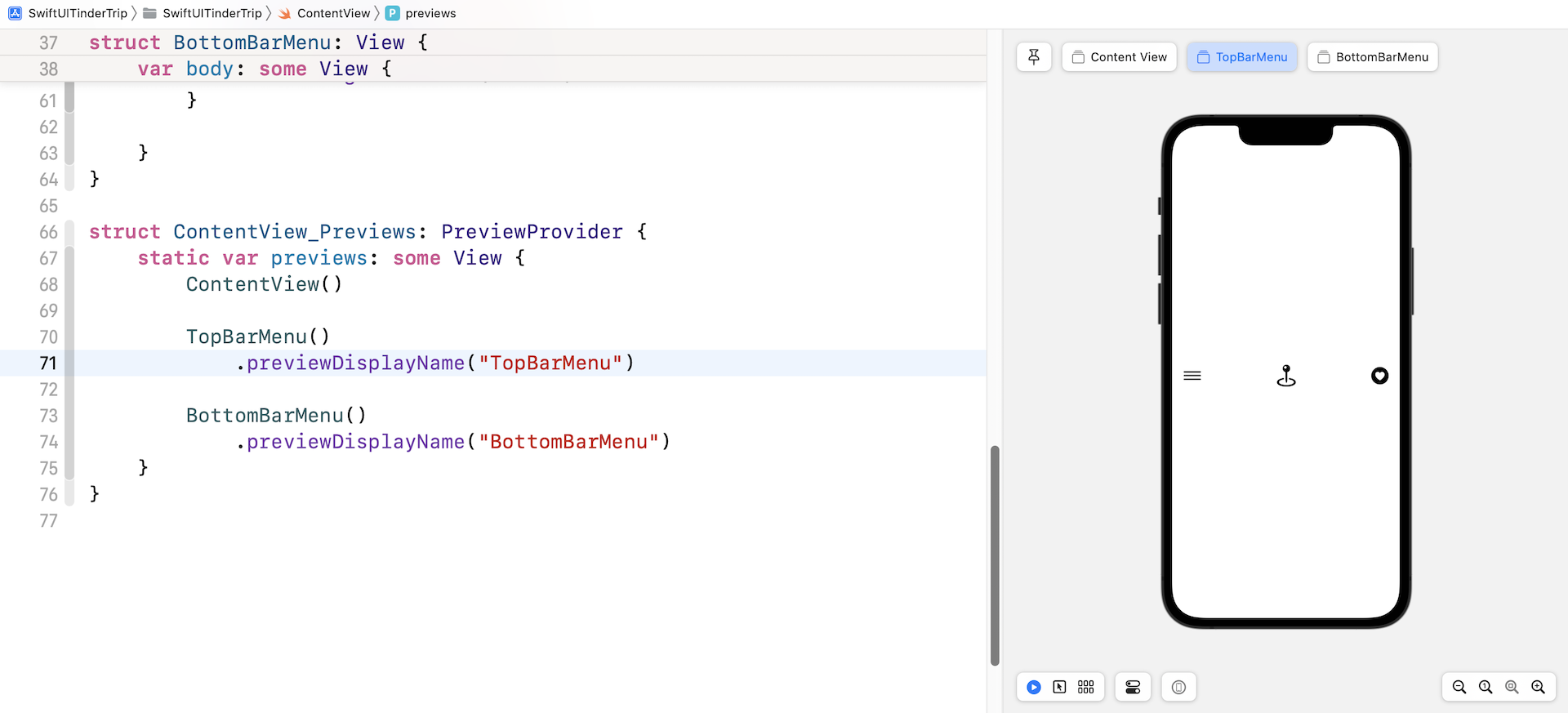
Now update the ContentView_Previews struct like this:
struct ContentView_Previews: PreviewProvider {
    static var previews: some View {
        ContentView()

        TopBarMenu()
            .previewDisplayName("TopBarMenu")

        BottomBarMenu()
            .previewDisplayName("BottomBarMenu")
    }
}
Here we include all the views in the preview section. For TopBarMenu and BottomBarMenu views, we added the previewDisplayName modifier to give the view a distinct name. If you take a look at the preview canvas, you will see three previews: Content View, TopBarMenu, and BottomBarMenu. Simply click the view to preview its layout. Figure 5 gives you a better idea what the preview looks like.
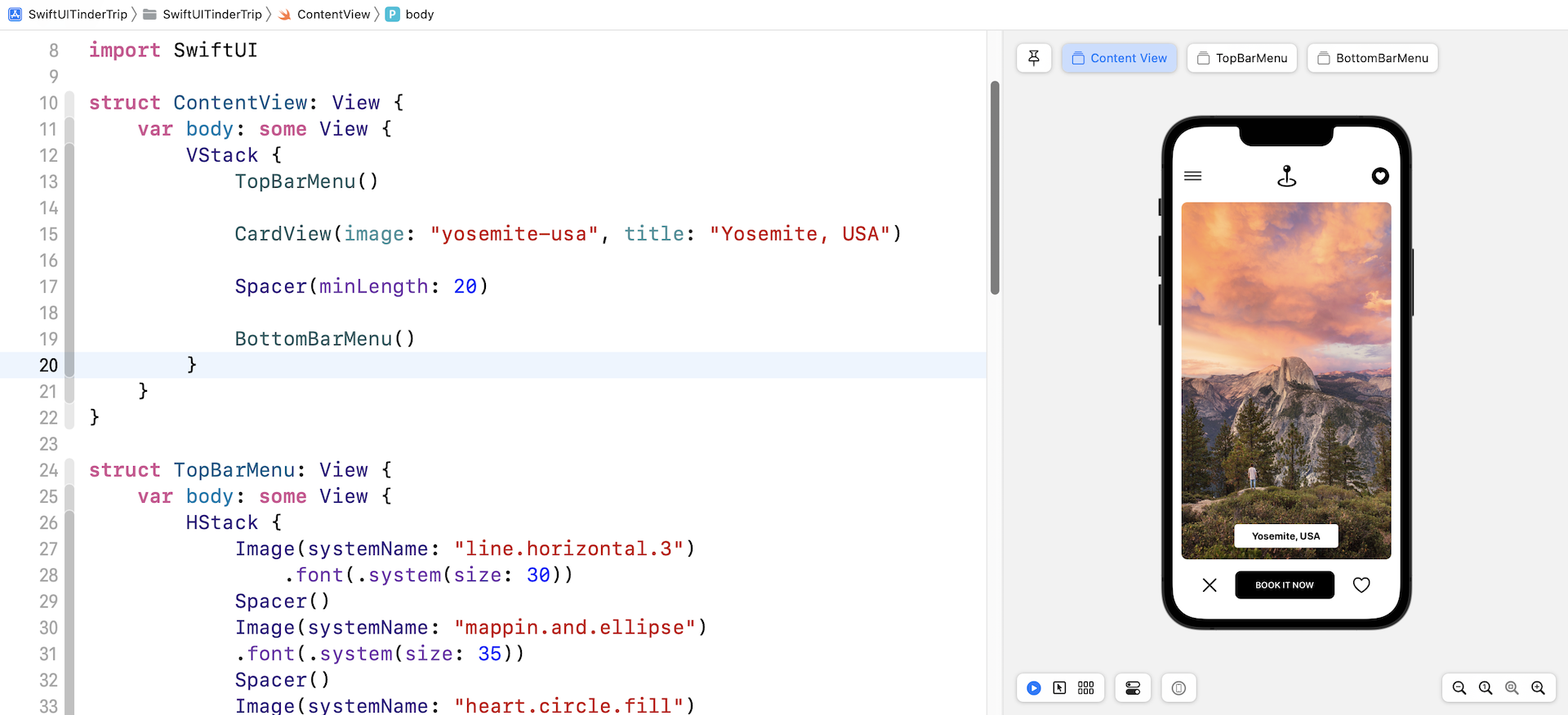
Okay, let's continue to lay out the main UI. Update the ContentView like this:
struct ContentView: View {
    var body: some View {
        VStack {
            TopBarMenu()

            CardView(image: "yosemite-usa", title: "Yosemite, USA")

            Spacer(minLength: 20)

            BottomBarMenu()
        }
    }
}
In the code, we simply arrange the UI components we have built using a VStack. Your preview should now show you the main screen.
Implementing the Card Deck
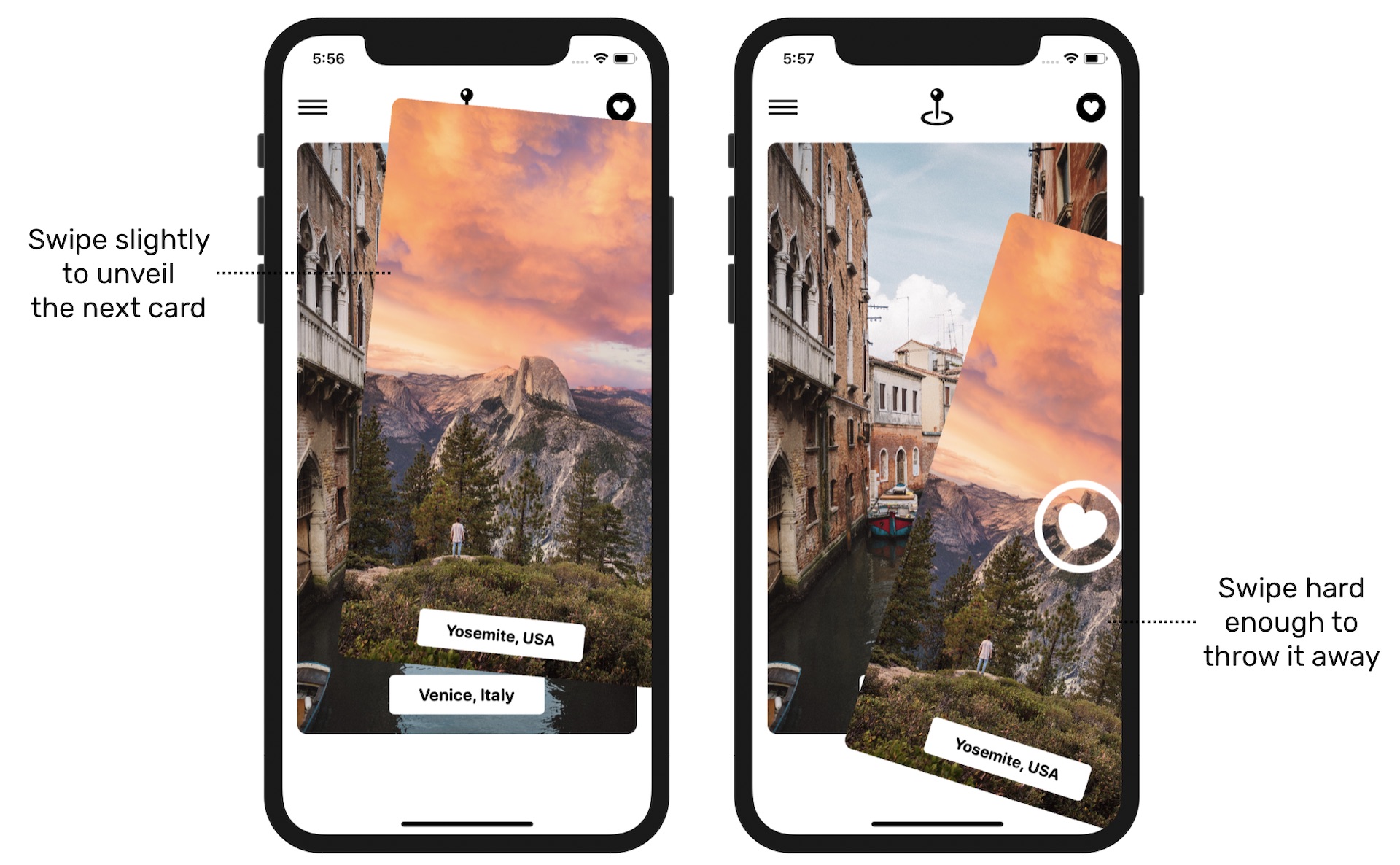
With all the preparation, we finally comes to the implementation of the Tinder-like UI. For those who haven't used the Tinder app before, let me first explain how a Tinder-like UI works.
You can imagine a Tinder-like UI as a deck of piled photo cards. For our demo app, the photo is a destination of a trip. Swiping the topmost card (i.e. the first trip) slightly to the left or right unveils the next card (i.e. the next trip) underneath. If the user releases the card, the app brings the card to the original position. But, when the user swipes hard enough, he/she can throw away the card and the app will bring the second card forward to become the topmost card.
The main screen we have implemented only contains a single card view. So, how can we implement the pile of card views?
The most straightforward way is to overlay each of the card views on top of each other using a ZStack. Let's try to do this. Update the ContentView struct like this:
struct ContentView: View {

    var cardViews: [CardView] = {

        var views = [CardView]()

        for trip in trips {
            views.append(CardView(image: trip.image, title: trip.destination))
        }

        return views
    }()

    var body: some View {
        VStack {
            TopBarMenu()

            ZStack {
                ForEach(cardViews) { cardView in
                    cardView
                }
            }

            Spacer(minLength: 20)

            BottomBarMenu()
        }
    }
}
In the code above, we initialize an array of cardViews containing all the trips, which was defined in the Trip.swift file. In the body variable, we loop through all the card views and overlay one with another by wrapping them in a ZStack.
The preview canvas should show you the same UI but with another image.
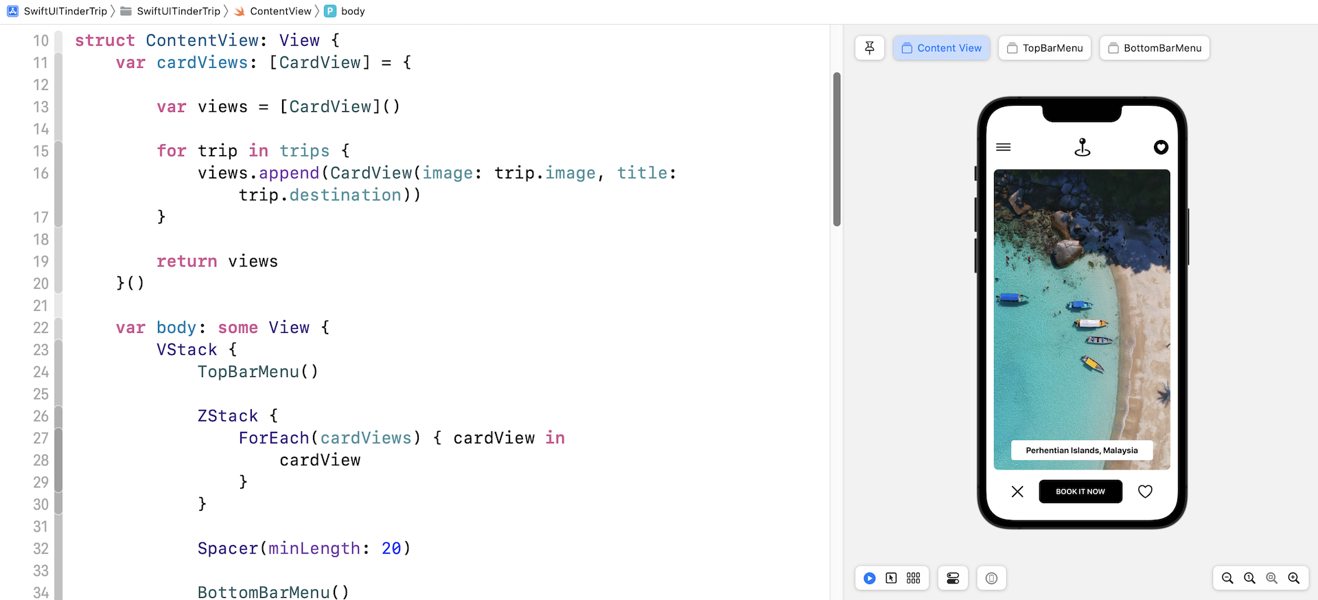
Why did it display another image? If you refer to the trips array defined in Trip.swift, the image is the last element of the array. In the ForEach block, the first trip is placed at the lowermost part of the deck. Thus, the last trip becomes the topmost photo of the deck.
Our card deck has two issues:
- The first trip of the
tripsarray is supposed to be the topmost card, however, it's now the lowermost card. - We rendered 15 card views for 15 trips. What if we have 10,000 trips or even more in the future? Should we create one card view for each of the trips? Is there a resource efficient way to implement the card deck?
Let's first fix the card order issue. SwiftUI provides the zIndex modifier for you to indicate the order of the views in a ZStack. A view with a higher value of zIndex is placed on top of those with a lower value. So, the topmost card should have the largest value of zIndex.
With this in mind, we create the following new function in ContentView:
private func isTopCard(cardView: CardView) -> Bool {

    guard let index = cardViews.firstIndex(where: { $0.id == cardView.id }) else {
        return false
    }

    return index == 0
}
While looping through the card views, we have to figure out a way to identify the topmost card. The function above takes in a card view, find out its index, and tells you if the card view is the topmost one.
Next, update the code block of ZStack like this:
ZStack {
    ForEach(cardViews) { cardView in
        cardView
            .zIndex(self.isTopCard(cardView: cardView) ? 1 : 0)
    }
}
We added the zIndex modifier for each of the card views. The topmost card is assigned a higher value of zIndex. In the preview canvas, you should now see the photo of the first trip (i.e. Yosemite, USA).
For the second issue, it’s more complicated. Our goal is to make sure the card deck can support tens of thousands of card views but without becoming resource intensive.
Let’s take a deeper look at the card deck. Do we actually need to initiate an individual card view for each trip photo? To create this card deck UI, we can just create two card views and overlay them with each other.
When the topmost card view is thrown away, the card view underneath becomes the topmost card. And, at the same time, we immediately initiate a new card view with a different photo and put it behind the topmost card. No matter how many photos you need to display in the card deck, the app has only two card views at all times. However, from a user point of view, the UI is composed of a pile of cards.
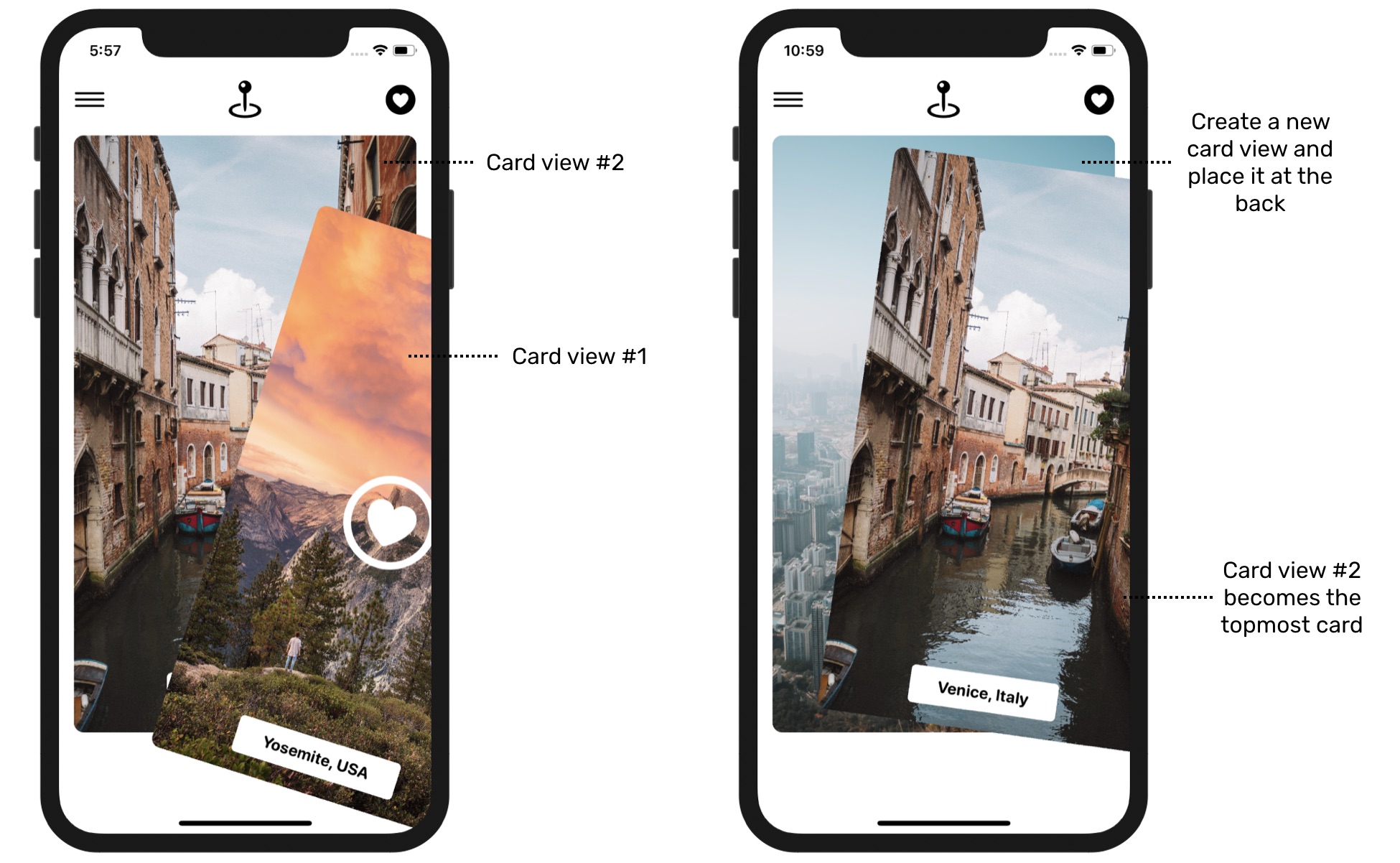
Now that you understand how we are going to construct the card deck, let’s move onto the implementation.
First, update the cardViews array, we no longer need to initialize all the trips but only the first two. Later, when the first trip (i.e. the first card) is thrown away, we will add another one to it.
var cardViews: [CardView] = {

    var views = [CardView]()

    for index in 0..<2 {
        views.append(CardView(image: trips[index].image, title: trips[index].destination))
    }

    return views
}()
After the code change, the UI should look exactly the same. But in the underlying implementation, the app now only show two card views in the deck.
Implementing the Swiping Motion
Before we dynamically create a new card view, we have to implement the swipe feature first. If you forgot how to work with gestures, read chapters 17 and 18 again. We will reuse some of the code discussed before.
First, define the DragState enum in ContentView, which represents the possible drag states:
enum DragState {
    case inactive
    case pressing
    case dragging(translation: CGSize)

    var translation: CGSize {
        switch self {
        case .inactive, .pressing:
            return .zero
        case .dragging(let translation):
            return translation
        }
    }

    var isDragging: Bool {
        switch self {
        case .dragging:
            return true
        case .pressing, .inactive:
            return false
        }
    }

    var isPressing: Bool {
        switch self {
        case .pressing, .dragging:
            return true
        case .inactive:
            return false
        }
    }

}
Once again, if you don't understand what an enum is used for, stop here and review the chapters on gestures. Next, let's define a @GestureState variable to store the drag state, which is set to inactive by default:
@GestureState private var dragState = DragState.inactive
Now, update the body part like this:
var body: some View {
    VStack {
        TopBarMenu()

        ZStack {
            ForEach(cardViews) { cardView in
                cardView
                    .zIndex(self.isTopCard(cardView: cardView) ? 1 : 0)
                    .offset(x: self.dragState.translation.width, y:  self.dragState.translation.height)
                    .scaleEffect(self.dragState.isDragging ? 0.95 : 1.0)
                    .rotationEffect(Angle(degrees: Double( self.dragState.translation.width / 10)))
                    .animation(.interpolatingSpring(stiffness: 180, damping: 100), value: self.dragState.translation)
                    .gesture(LongPressGesture(minimumDuration: 0.01)
                        .sequenced(before: DragGesture())
                        .updating(self.$dragState, body: { (value, state, transaction) in
                            switch value {
                            case .first(true):
                                state = .pressing
                            case .second(true, let drag):
                                state = .dragging(translation: drag?.translation ?? .zero)
                            default:
                                break
                            }

                        })

                    )
            }
        }

        Spacer(minLength: 20)

        BottomBarMenu()
            .opacity(dragState.isDragging ? 0.0 : 1.0)
            .animation(.default, value: dragState.isDragging)
    }
}
Basically, we apply what we learned in the gesture chapter to implement the dragging. The .gesture modifier has two gesture recognizers: long press and drag. When the drag gesture is detected, we update the dragState variable and store the translation of the drag.
The combination of the offset, scaleEffect, rotationEffect, and animation modifiers create the drag effect. The drag is made possible by updating the offset of the card view. When the card view is in the dragging state, we will scale it down a little bit by using scaleEffect and rotate it at a certain angle by applying the rotationEffect modifier. The animation is set to interpolatingSpring, but you are free to try out other animations.
We also made some code changes to the BottomBarMenu. While a user is dragging the card view, I want to hide the bottom bar. Thus, we apply the .opacity modifier and set its value to zero when it's in the dragging state.
After you make the change, run the project in a simulator to test it. You should be able to drag the card and move around. And, when you release the card, it returns to its original position.
Do you notice a problem here? While the drag is working, you're actually dragging the whole card deck! It's supposed to only drag the topmost card and the card underneath should stay unchanged. Also, the scaling effect should only apply to the topmost card.
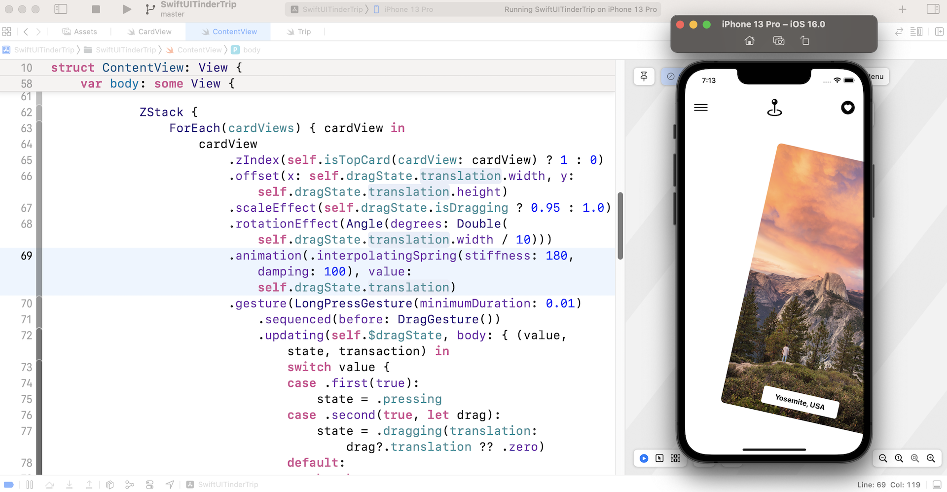
To fix the issues, we need to modify the code of the offset, scaleEffect, and rotationEffect modifiers such that the dragging only happens for the topmost card view.
ZStack {
    ForEach(cardViews) { cardView in
        cardView
            .zIndex(self.isTopCard(cardView: cardView) ? 1 : 0)
            .offset(x: self.isTopCard(cardView: cardView) ? self.dragState.translation.width : 0, y: self.isTopCard(cardView: cardView) ? self.dragState.translation.height : 0)
            .scaleEffect(self.dragState.isDragging && self.isTopCard(cardView: cardView) ? 0.95 : 1.0)
            .rotationEffect(Angle(degrees: self.isTopCard(cardView: cardView) ? Double( self.dragState.translation.width / 10) : 0))
            .animation(.interpolatingSpring(stiffness: 180, damping: 100), value: self.dragState.translation)
            .gesture(LongPressGesture(minimumDuration: 0.01)
                .sequenced(before: DragGesture())
                .updating(self.$dragState, body: { (value, state, transaction) in
                    switch value {
                    case .first(true):
                        state = .pressing
                    case .second(true, let drag):
                        state = .dragging(translation: drag?.translation ?? .zero)
                    default:
                        break
                    }

                })

            )
    }
}
Just focus on the changes to the offset, scaleEffect, and rotationEffect modifiers. The rest of the code was kept intact. For those modifiers, we introduce an additional check such that the effects are only applied to the topmost card.
Now if you run the app again, you should see the card underneath and drag the topmost card.
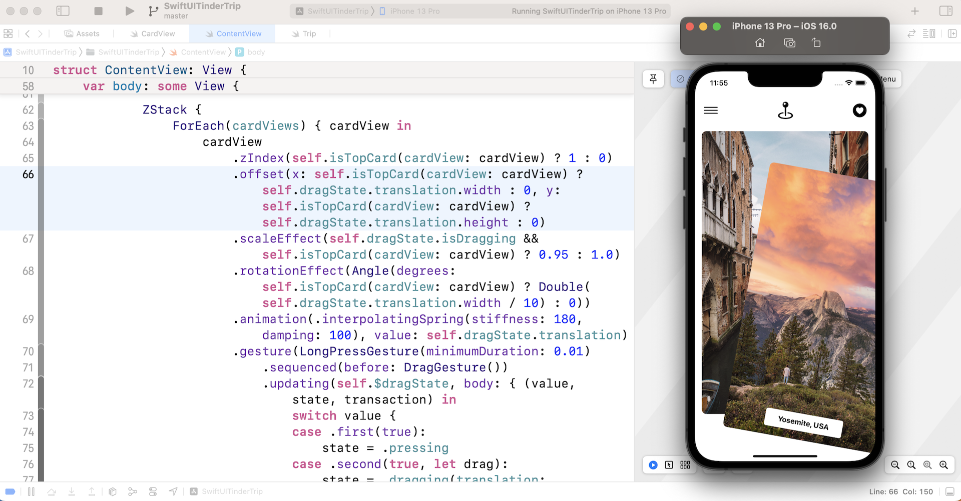
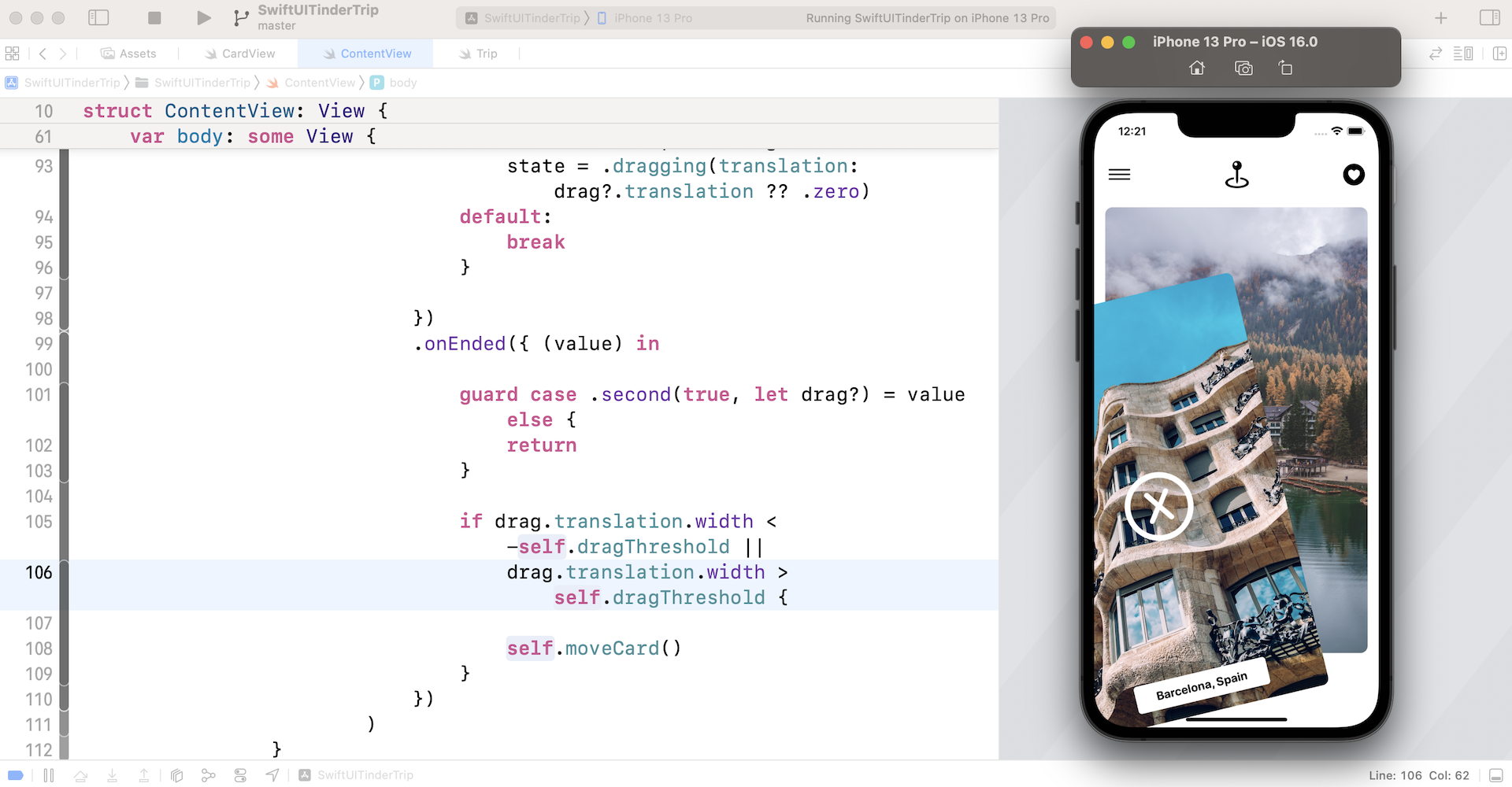
Displaying the Heart and xMark icons
Cool! The drag is now working. However, it's not done yet. The user should be able to swipe right/left to throw away the topmost card. And, there should be an icon (heart or xmark) shown on the card depending on the swiping direction.
First, let's declare a drag threshold in ContentView:
private let dragThreshold: CGFloat = 80.0
Once the translation of a drag passes the threshold, we will overlay an icon (either heart or xmark) on the card. Furthermore, if the user releases the card, the app will remove it from the deck, create a new one, and place the new card to the back of the deck.
To overlay the icon, add an overlay modifier to the cardViews. You can insert the following code under the .zIndex modifier:
.overlay {
    ZStack {
        Image(systemName: "x.circle")
            .foregroundColor(.white)
            .font(.system(size: 100))
            .opacity(self.dragState.translation.width < -self.dragThreshold && self.isTopCard(cardView: cardView) ? 1.0 : 0)

        Image(systemName: "heart.circle")
            .foregroundColor(.white)
            .font(.system(size: 100))
            .opacity(self.dragState.translation.width > self.dragThreshold  && self.isTopCard(cardView: cardView) ? 1.0 : 0.0)
    }
}
By default, both images are hidden by setting its opacity to zero. The translation's width has a positive value if the drag is to the right. Otherwise, it's a negative value. Depending on the drag direction, the app will unveil one of the images when the drag's translation exceeds the threshold.
You can run the project to have a quick test. When your drag exceeds the threshold, the heart/xmark icon will appear.
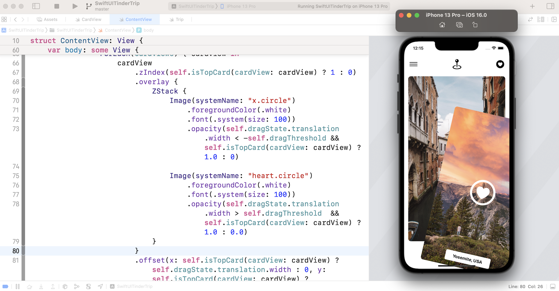
Removing/Inserting the Cards
Now when you release the card, it will still return to its original position. How do we remove the topmost card and add a new card at the same time?
First, let's mark the cardViews array with @State so that we can update its value and refresh the UI:
@State var cardViews: [CardView] = {

    var views = [CardView]()

    for index in 0..<2 {
        views.append(CardView(image: trips[index].image, title: trips[index].destination))
    }

    return views
}()
Next, declare another state variable to keep track of the last index of the trip. Say, when the card deck is first initialized, we display the first two trips stored in the trips array. The last index is set to 1.
@State private var lastIndex = 1
Okay, here comes the core function for removing and inserting the card views. Define a new function called moveCard:
private func moveCard() {
    cardViews.removeFirst()

    self.lastIndex += 1
    let trip = trips[lastIndex % trips.count]

    let newCardView = CardView(image: trip.image, title: trip.destination)

    cardViews.append(newCardView)
}
This function first removes the topmost card from the cardViews array, then it instantiates a new card view with the subsequent trip's image. Since cardViews is defined as a state property, SwiftUI will render the card views again once the array's value is changed. This is how we remove the topmost card and insert a new one to the deck.
For this demo, I want the card deck to keep showing a trip. After the last photo of the trips array is displayed, the app will revert back to the first element (note the modulus operator % in the code above).
Next, update the .gesture modifier and insert the .onEnded function:
.gesture(LongPressGesture(minimumDuration: 0.01)
    .sequenced(before: DragGesture())
    .updating(self.$dragState, body: { (value, state, transaction) in
        .
        .
        .
    })
    .onEnded({ (value) in

        guard case .second(true, let drag?) = value else {
            return
        }

        if drag.translation.width < -self.dragThreshold ||
            drag.translation.width > self.dragThreshold {

            self.moveCard()
        }
    })
)
When the drag gesture ends, we check if the drag's translation exceeds the threshold and call the moveCard() accordingly.
Now run the project in the preview canvas. Drag the image to the right/left until the icon appears. Release the drag and the topmost card should be replaced by the next card.
Fine Tuning the Animations
The app almost works but the animation falls short of expectations. Instead of having the card view disappear abruptly, the card should fall out of the screen gradually when it's thrown away.
To fine tune the animation effect, we will attach the transition modifier and apply an asymmetric transition to the card views.
Add the extension, AnyTransition to the bottom of ContentView.swift and define two transition effects:
extension AnyTransition {
    static var trailingBottom: AnyTransition {
        AnyTransition.asymmetric(
            insertion: .identity,
            removal: AnyTransition.move(edge: .trailing).combined(with: .move(edge: .bottom))
        )

    }

    static var leadingBottom: AnyTransition {
        AnyTransition.asymmetric(
            insertion: .identity,
            removal: AnyTransition.move(edge: .leading).combined(with: .move(edge: .bottom))
        )
    }
}
The reason why we use asymmetric transitions is that we only want to animate the transition when the card view is removed. When a new card view is inserted in the deck, there should be no animation.
The trailingBottom transition is used when the card view is thrown away to the right of the screen, while we apply the leadingBottom transition when the card view is thrown away to the left.
Next, declare a state property that holds the transition type. It's set to trailingBottom by default.
@State private var removalTransition = AnyTransition.trailingBottom
Now attach the .transition modifier to the card view. You can place it after the .animation modifier:
.transition(self.removalTransition)
Finally, update the code of the .gesture modifier with the onChanged function like this:
.gesture(LongPressGesture(minimumDuration: 0.01)
    .sequenced(before: DragGesture())
    .updating(self.$dragState, body: { (value, state, transaction) in
        switch value {
        case .first(true):
            state = .pressing
        case .second(true, let drag):
            state = .dragging(translation: drag?.translation ?? .zero)
        default:
            break
        }

    })
    .onChanged({ (value) in
        guard case .second(true, let drag?) = value else {
            return
        }

        if drag.translation.width < -self.dragThreshold {
            self.removalTransition = .leadingBottom
        }

        if drag.translation.width > self.dragThreshold {
            self.removalTransition = .trailingBottom
        }

    })
    .onEnded({ (value) in

        guard case .second(true, let drag?) = value else {
            return
        }

        if drag.translation.width < -self.dragThreshold ||
            drag.translation.width > self.dragThreshold {

            self.moveCard()
        }
    })

)
The code sets the removalTransition. The transition type is updated according to the swipe direction. Now you're ready to run the app again. You should now see an improved animation when the card is thrown away.
Summary
With SwiftUI, you can easily build some cool animations and mobile UI patterns. This Tinder-like UI is an examples.
I hope you fully understand what I covered in this chapter so you can adapt the code to fit your own project. It’s quite a huge chapter. I wanted to document my thought process instead of just presenting you with the final solution.
For reference, you can download the complete tinder project here: