- Made by AppCoda
- Contact us / Support
- Tweet this book
- Preface
- 1. Introduction to SwiftUI
- 2. Getting Started with SwiftUI and Working with Text
- 3. Working with Images
- 4. Layout User Interfaces with Stacks
- 5. Understanding ScrollView and Building a Carousel UI
- 6. Working with SwiftUI Buttons and Gradient
- 7. Understanding State and Binding
- 8. Implementing Path and Shape for Line Drawing and Pie Charts
- 9. Basic Animations and Transitions
- 10. Understanding Dynamic List, ForEach and Identifiable
- 11. Working with Navigation UI and Navigation Bar Customization
- 12. Playing with Modal Views, Floating Buttons and Alerts
- 13. Building a Form with Picker, Toggle and Stepper
- 14. Data Sharing with Combine and Environment Objects
- 15. Building a Registration Form with Combine and View Model
- 16. Working with Swipe-to-Delete, Context Menu and Action Sheets
- 17. Using Gestures
- 18. Displaying an Expandable Bottom Sheet Using Presentation Detents
- 19. Creating a Tinder-like UI with Gestures and Animations
- 20. Creating an Apple Wallet like Animation and View Transition
- 21. Working with JSON, Slider and Data Filtering
- 22. Building a ToDo app with Core Data
- 23. Integrating UIKit with SwiftUI Using UIViewRepresentable
- 24. Creating a Search Bar View and Working with Custom Binding
- 25. Putting Everything Together to Build a Real World App
- 26. Creating an App Store like Animated View Transition
- 27. Building an Image Carousel
- 28. Building an Expandable List View Using OutlineGroup
- 29. Building Grid Layout Using LazyVGrid and LazyHGrid
- 30. Creating an Animated Activity Ring with Shape and Animatable
- 31. Working with AnimatableModifier and LibraryContentProvider
- 32. Working with TextEditor to Create Multiline Text Fields
- 33. Using matchedGeometryEffect to Create View Animations
- 34. ScrollViewReader and Grid Animation
- 35. Working with Tab View and Tab Bar Customization
- 36. Using AsyncImage in SwiftUI for Loading Images Asynchronously
- 37. Implementing Search Bar Using Searchable
- 38. Creating Bar Charts and Line Charts with the Charts Framework
- 39. Capturing Text within Image Using Live Text APIs
- 40. How to Use ShareLink for Sharing Data Like Text and Photos
- 41. Using ImageRenderer to Convert SwiftUI Views into Images
- 42. Creating PDF Documents Using ImageRenderer
- 43. Using Gauge to Display Progress and Create a Speedometer
- 44. Creating Grid Layout Using Grid APIs
- 45. Switching Layout with AnyLayout
- Published with GitBook
Chapter 31
Working with AnimatableModifier and LibraryContentProvider
Earlier, you learned how to animate a shape by using Animatable and AnimatableData. In this chapter, we will take this further and show you how to animate a view using another protocol called AnimatableModifier. Additionally, I will walk you through a new feature of SwiftUI that will allow developers to easily share a custom view to the View library and make it easier for reuse. Later, I will show you how to take the progress ring view to the View library for reuse. As a sneak peek, you can take a look at figure 1 or check out this demo video (https://link.appcoda.com/librarycontentprovider) to see how it works.
Understanding AnimatableModifier
Let's first look at the AnimatableModifier protocol. As its name suggests, AnimatableModifier is a view modifier and it conforms to the Animatable protocol. This makes it very powerful to animate value changes for different types of views.
protocol AnimatableModifier : Animatable, ViewModifier
So, what are we going to animate? We will build on top of what we've implemented in the previous chapter and add a text label at the center of the progress ring. The label will show the current percentage of progress. As the progress bar moves, the label will be updated accordingly. Figure 2 shows you what the label looks like.
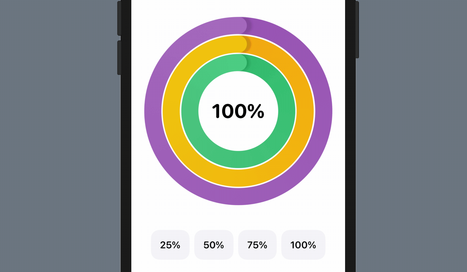
Animating Text using AnimatableModifer
I highly recommend you read chapter 30 first as this demo project is built on top of the previous one. In case if you haven't worked on the project, you can download it at https://www.appcoda.com/resources/swiftui4/SwiftUIProgressRingExercise.zip to get started.
Before we dive into the AnimatableModifier protocol, let me ask you. How are you going to layout the progress label and animate its change? Actually, we've built a similar progress indicator in chapter 9. So, based on what you learned, you may layout the progress label (in the ProgressRingView.swift file) like this:
ZStack {
    Circle()
        .stroke(Color(.systemGray6), lineWidth: thickness)

    Text(progressText)
        .font(.system(.largeTitle, design: .rounded))
        .fontWeight(.bold)
        .foregroundColor(.black)

    ...
}
You add a Text view in the ZStack and display the current progress in a formatted text using the below conversion:
private var progressText: String {
    let formatter = NumberFormatter()
    formatter.numberStyle = .percent
    formatter.percentSymbol = "%"

    return formatter.string(from: NSNumber(value: progress)) ?? ""
}
Since the progress variable is a state variable, the progressText will be automatically updated whenever the value of progress changes. This is a very straightforward implementation. However, there is an issue with the solution. The text animation doesn't work so well.
If you've made the above changes in ProgressRingView.swift, you can go back to ContentView.swift to see the result. The app does display the progress label, but when you change the progress from one value to another, the progress label immediately shows the new value using the fade animation.
This is not what we expect. The progress label shouldn't jump from one value (e.g. 100%) to another value (e.g. 50%) directly. We expect the progress label follows the animation of the progress bar and updates its value step by step like this:
100 -> 99 -> 98 -> 97 -> 96 ... ... ... ... ... ... ... ... ... ... 53 -> 52 -> 51 -> 50
The current implementation doesn't allow you to animate the text change. This is why I have to introduce you the AnimatableModifier protocol.
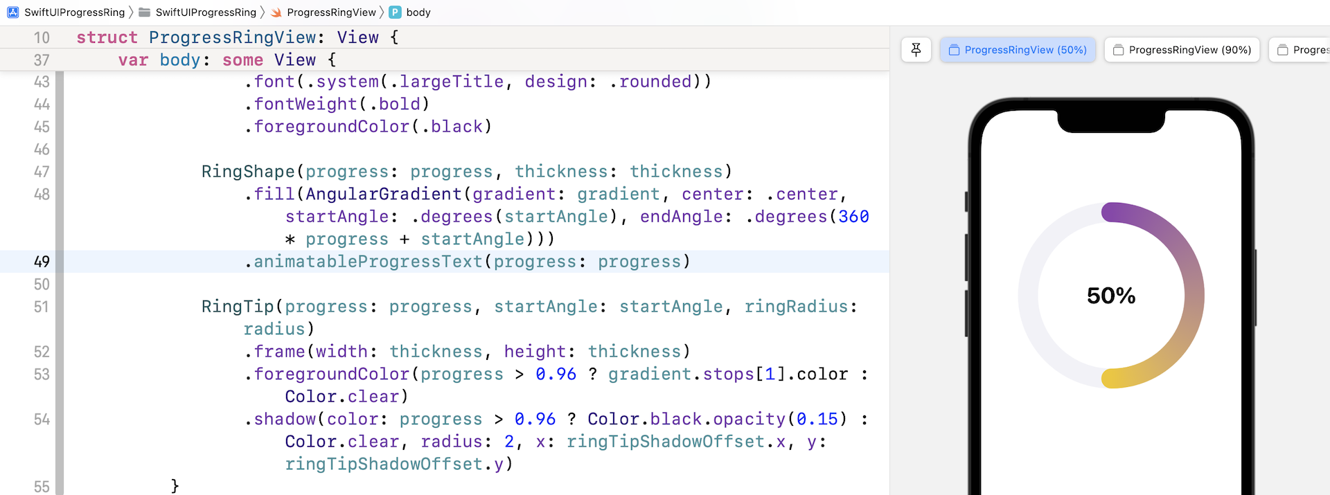
To animate the progress text, we will create a new struct called ProgressTextModifier, which adopts AnimatableModifier, in ProgressRingView.swift:
struct ProgressTextModifier: AnimatableModifier {

    var progress: Double = 0.0
    var textColor: Color = .primary

    private var progressText: String {
        let formatter = NumberFormatter()
        formatter.numberStyle = .percent
        formatter.percentSymbol = "%"

        return formatter.string(from: NSNumber(value: progress)) ?? ""
    }

    var animatableData: Double {
        get { progress }
        set { progress = newValue }
    }

    func body(content: Content) -> some View {
        content
            .overlay(
                Text(progressText)
                    .font(.system(.largeTitle, design: .rounded))
                    .fontWeight(.bold)
                    .foregroundColor(textColor)
                    .animation(nil)
            )
    }
}
Does the code look familiar to you? As mentioned earlier, the AnimatableModifier protocol conforms to both Animatable and ViewModifier. Therefore, we specify in the animatableData property what values to animate. Here, it's progress. To conform with the requirements of ViewModifier, we implement the body function and add the Text view.
This is how we animate the text using AnimatableModifier. For convenience purposes, insert the following code, at the end of ProgressRingView, to create an extension for applying the ProgressTextModifier:
extension View {
    func animatableProgressText(progress: Double, textColor: Color = Color.primary) -> some View {
        self.modifier(ProgressTextModifier(progress: progress, textColor: textColor))
    }
}
Now you can attach the animatableProgressText modifier to RingShape like this:
RingShape(progress: progress, thickness: thickness)
    .fill(AngularGradient(gradient: gradient, center: .center, startAngle: .degrees(startAngle), endAngle: .degrees(360 * progress + startAngle)))
    .animatableProgressText(progress: progress)
Once you have made the change, you should see the progress label in the preview canvas. To test the animation, run the app on an iPhone simulator or test it in the preview of ContentView.swift. When you change the progress, the progress text now animates.
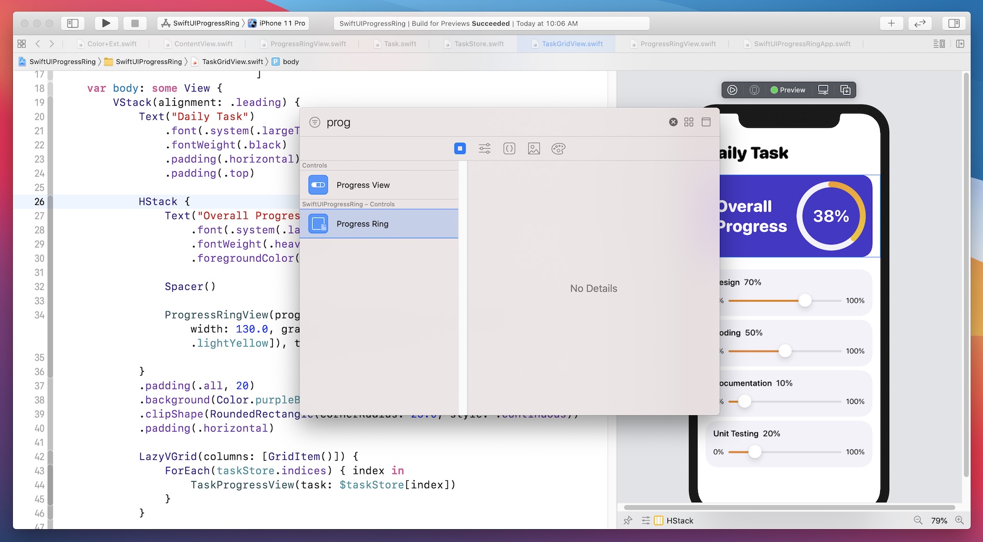
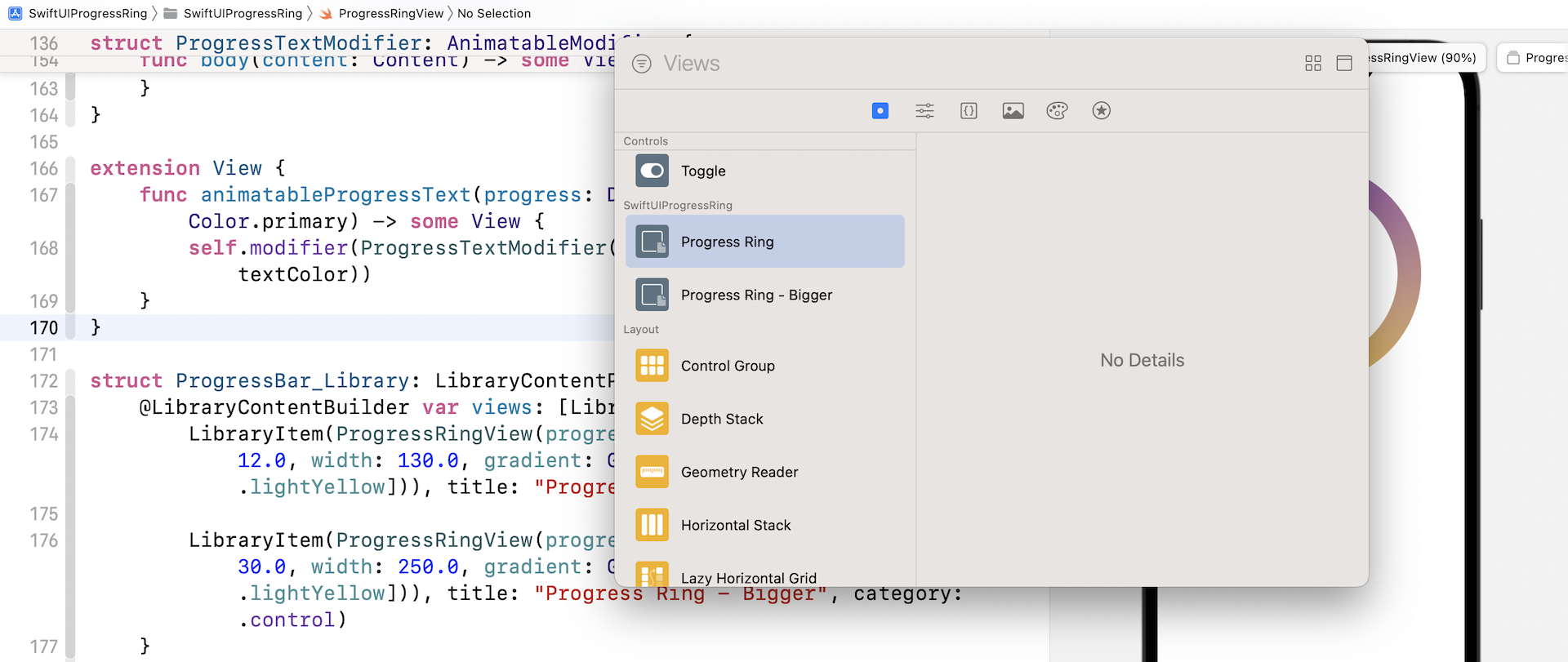
Using LibraryContentProvider
Starting from Xcode 12, Apple added a feature to the SwiftUI framework, allowing developers to take any custom views to the View library. If you forget what the View library is, just press command-shift-L to bring it up. The library lets you easily access all the available UI controls in SwiftUI. You can drag a control from the library and add it to the user interface directly.
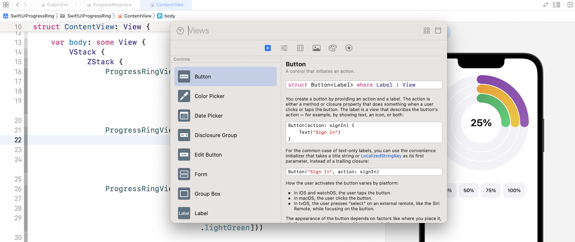
Xcode allows developers to add custom views to the library by using a protocol called LibraryContentProvider. To add a custom view to the View library, all you need to do is to create a new struct that conforms to the LibraryContentProvider protocol.
For example, to share the progress ring view to the View library, we can create a struct called ProgressBar_Library in ProgressRingView.swift like this:
struct ProgressBar_Library: LibraryContentProvider {
    @LibraryContentBuilder var views: [LibraryItem] {
        LibraryItem(ProgressRingView(progress: .constant(1.0), thickness: 12.0, width: 130.0, gradient: Gradient(colors: [.darkYellow, .lightYellow])), title: "Progress Ring", category: .control)
    }
}
The way to add a view to the View library is very simple. You create a struct that conforms to LibraryContentProvider and override the views property to return an array of custom views. In the code above, we return the progress ring view with some default values, name it "Progress Ring", and put it into the control category.
Optionally, if you want to add more than one library item, you can write the code like this:
struct ProgressBar_Library: LibraryContentProvider {
    @LibraryContentBuilder var views: [LibraryItem] {
        LibraryItem(ProgressRingView(progress: .constant(1.0), thickness: 12.0, width: 130.0, gradient: Gradient(colors: [.darkYellow, .lightYellow])), title: "Progress Ring", category: .control)

        LibraryItem(ProgressRingView(progress: .constant(1.0), thickness: 30.0, width: 250.0, gradient: Gradient(colors: [.darkPurple, .lightYellow])), title: "Progress Ring - Bigger", category: .control)
    }
}
As a side note, there are four possible values that can be given to item's category, depending on what the library item is supposed to represent:
controleffectlayoutother
You may also wonder what the @LibraryContentBuilder property wrapper is. It just saves you from writing the code for creating the array of LibraryItem instances. The code above can be rewritten like this:
struct ProgressBar_Library: LibraryContentProvider {
    var views: [LibraryItem] {
        return [LibraryItem(ProgressRingView(progress: .constant(1.0), thickness: 12.0, width: 130.0, gradient: Gradient(colors: [.darkYellow, .lightYellow])), title: "Progress Ring", category: .control),

                LibraryItem(ProgressRingView(progress: .constant(1.0), thickness: 30.0, width: 250.0, gradient: Gradient(colors: [.darkPurple, .lightYellow])), title: "Progress Ring - Bigger", category: .control)
    }
}
Once you create the struct, Xcode automatically discovers the implementation of the LibraryContentProvider protocol in your project and adds the progress ring view to the View library. You can now add the progress ring view to your UI by using drag and drop. Note that at the time of this writing, you can't add documentation for your custom control.
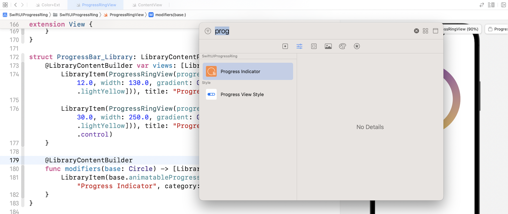
Not only can you add a custom view to the Xcode library, you can also add your own modifiers by implementing the modifiers method and return the array of library items. You can add the animatableProgressText modifier to the View library by implementing the method like this:
struct ProgressBar_Library: LibraryContentProvider {
    .
    .
    .

    @LibraryContentBuilder
    func modifiers(base: Circle) -> [LibraryItem] {
        LibraryItem(base.animatableProgressText(progress: 1.0), title: "Progress Indicator", category: .control)
    }
}
The base parameter lets you specify the type of control that can be modified by the modifier. In the code above, it's the Circle view. Again, once you insert the code inProgressBar_Library, Xcode will scan the library item and add it to the Modifier library.
Exercise
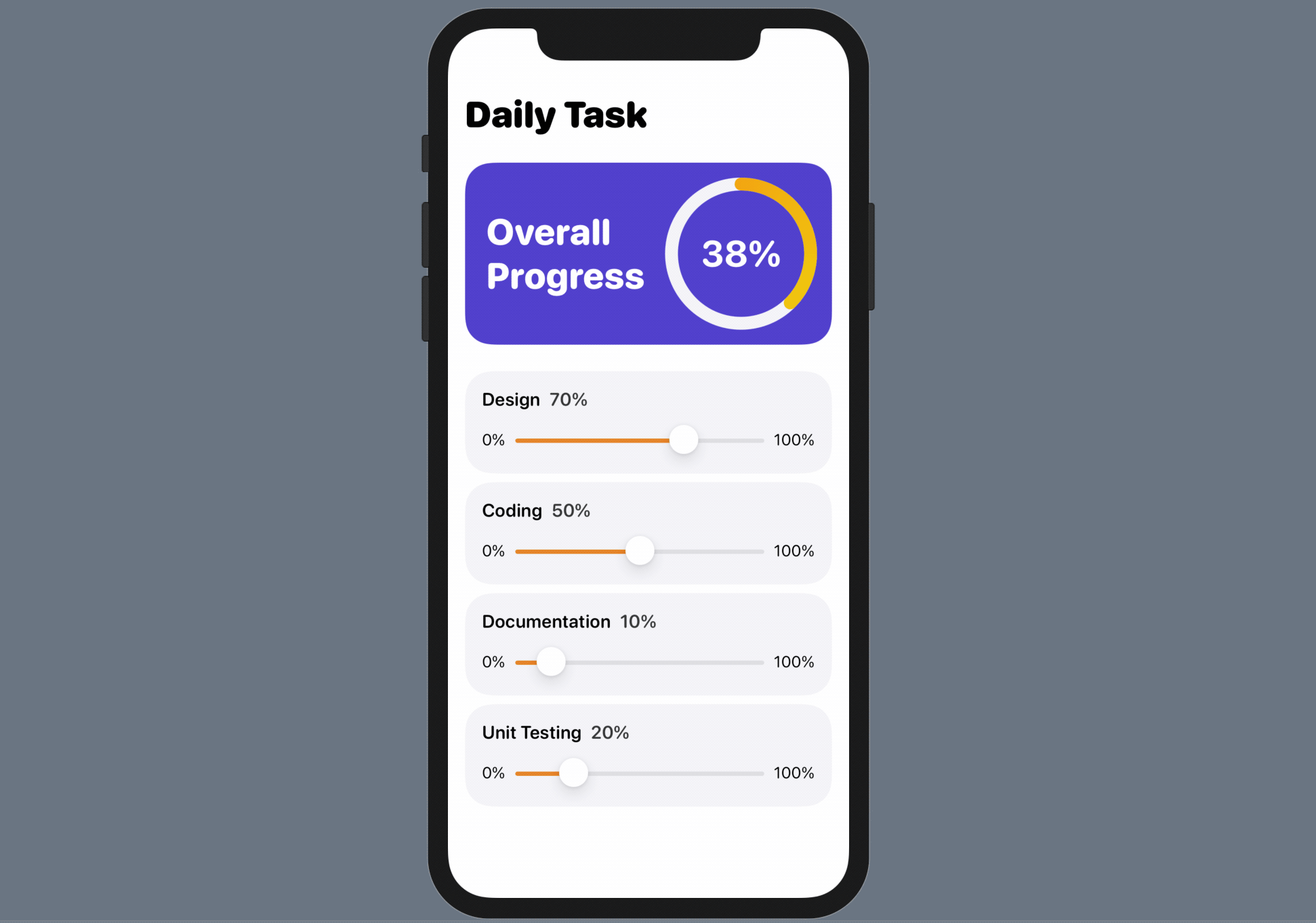
The progress ring is now incorporated in the View library. Try to use it and build an app like below. The app has 4 sliders for adjusting the progress of different tasks. The overall progress is calculated by averaging the progress values of all tasks.
Summary
The AnimatableModifier protocol is a very powerful protocol for animating changes of any views. In this chapter, we showed you how to animate the text change of a label. You can apply this technique to animate other values such as color and size.
The introduction of LibraryContentProvider makes it very easy for developers to share custom views and encourages code reuse. Imagine that you can build a library of custom components and put them into the View/Modifier library, every member in your team can easily access the controls and use them by drag & drop. Right now, you can only use the controls within the same Xcode project. We will discuss how you can make this possible by using Swift Package in the next chapter.
For reference, you can download the complete project here:
The solution of the exercise is also included in the demo project. Please refer to the TaskGridView.swift file.