- Made by AppCoda
- Contact us / Support
- Tweet this book
- Preface
- 1. Introduction to SwiftUI
- 2. Getting Started with SwiftUI and Working with Text
- 3. Working with Images
- 4. Layout User Interfaces with Stacks
- 5. Understanding ScrollView and Building a Carousel UI
- 6. Working with SwiftUI Buttons and Gradient
- 7. Understanding State and Binding
- 8. Implementing Path and Shape for Line Drawing and Pie Charts
- 9. Basic Animations and Transitions
- 10. Understanding Dynamic List, ForEach and Identifiable
- 11. Working with Navigation UI and Navigation Bar Customization
- 12. Playing with Modal Views, Floating Buttons and Alerts
- 13. Building a Form with Picker, Toggle and Stepper
- 14. Data Sharing with Combine and Environment Objects
- 15. Building a Registration Form with Combine and View Model
- 16. Working with Swipe-to-Delete, Context Menu and Action Sheets
- 17. Using Gestures
- 18. Displaying an Expandable Bottom Sheet Using Presentation Detents
- 19. Creating a Tinder-like UI with Gestures and Animations
- 20. Creating an Apple Wallet like Animation and View Transition
- 21. Working with JSON, Slider and Data Filtering
- 22. Building a ToDo app with Core Data
- 23. Integrating UIKit with SwiftUI Using UIViewRepresentable
- 24. Creating a Search Bar View and Working with Custom Binding
- 25. Putting Everything Together to Build a Real World App
- 26. Creating an App Store like Animated View Transition
- 27. Building an Image Carousel
- 28. Building an Expandable List View Using OutlineGroup
- 29. Building Grid Layout Using LazyVGrid and LazyHGrid
- 30. Creating an Animated Activity Ring with Shape and Animatable
- 31. Working with AnimatableModifier and LibraryContentProvider
- 32. Working with TextEditor to Create Multiline Text Fields
- 33. Using matchedGeometryEffect to Create View Animations
- 34. ScrollViewReader and Grid Animation
- 35. Working with Tab View and Tab Bar Customization
- 36. Using AsyncImage in SwiftUI for Loading Images Asynchronously
- 37. Implementing Search Bar Using Searchable
- 38. Creating Bar Charts and Line Charts with the Charts Framework
- 39. Capturing Text within Image Using Live Text APIs
- 40. How to Use ShareLink for Sharing Data Like Text and Photos
- 41. Using ImageRenderer to Convert SwiftUI Views into Images
- 42. Creating PDF Documents Using ImageRenderer
- 43. Using Gauge to Display Progress and Create a Speedometer
- 44. Creating Grid Layout Using Grid APIs
- 45. Switching Layout with AnyLayout
- Published with GitBook
Chapter 13
Building a Form with Picker, Toggle and Stepper
Mobile apps use forms to interact with users and solicit required data from them. Every day, when using your iPhone, it's very likely you will come across a mobile form. For example, a calendar app may present you a form to fill in the information for a new event. A shopping app asks you to provide the shipping and payment information by showing you a form. As a user, I can't deny that I hate filling out forms. That said, as a developer, these forms help us interact with users and ask for information to complete certain operations. Developing a form is definitely an essential skill you need to grasp.
In the SwiftUI framework, there is a special UI control called Form. With this new control, you can easily build a form. I will show you how to build a form using this Form component. While building out a form, you will also learn how to work with common controls like picker, toggle, and stepper.
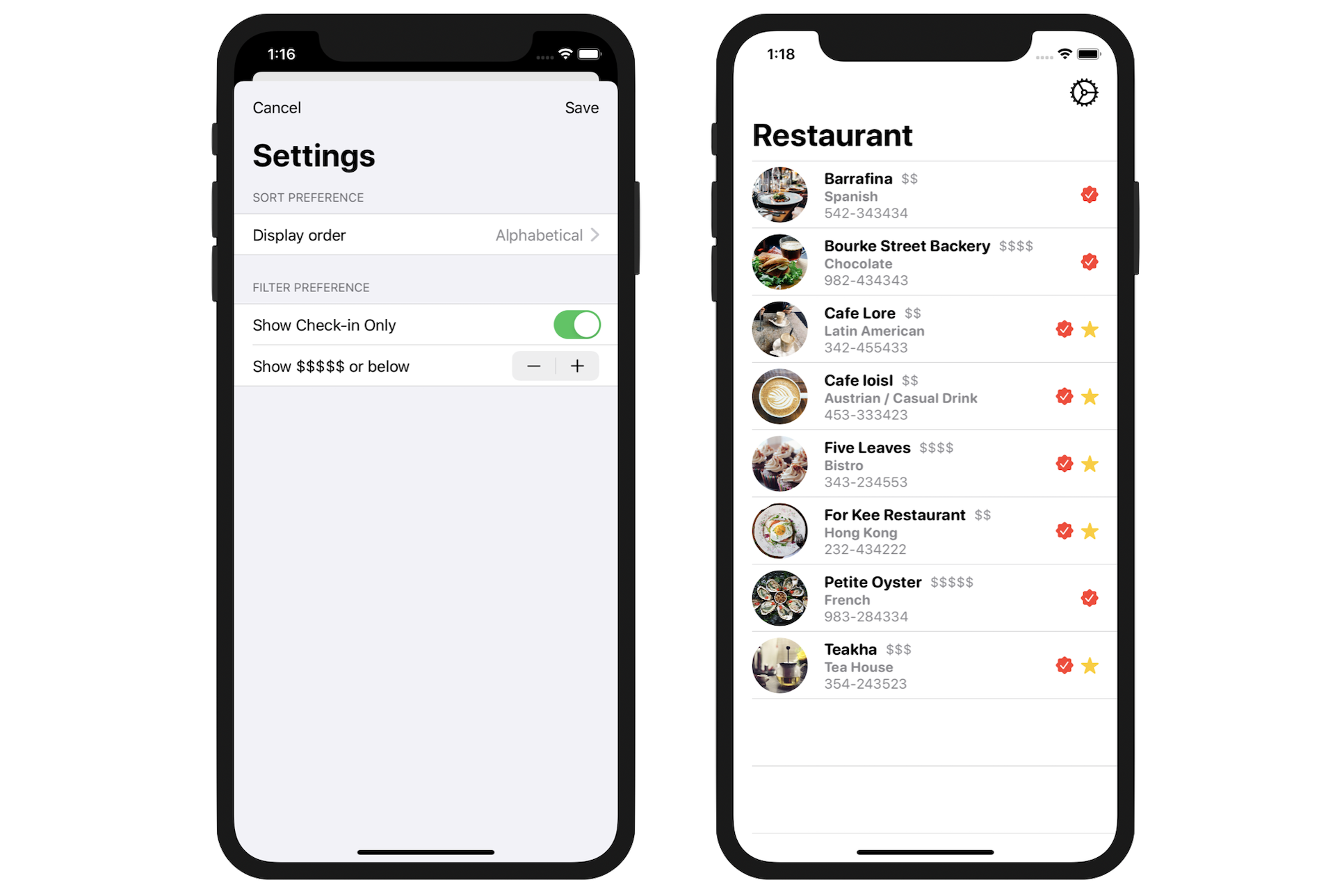
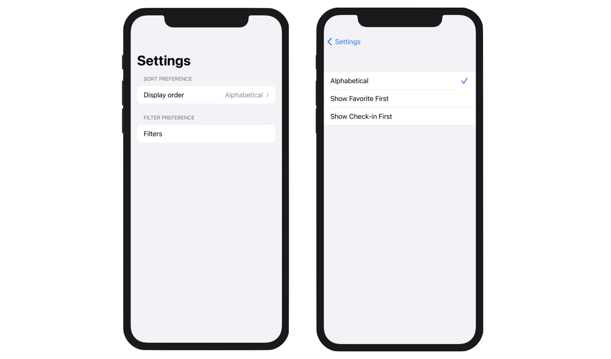
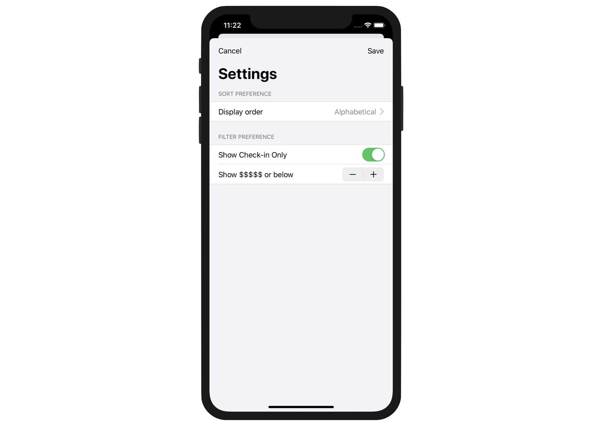
Okay, what project are we going to work on? Take a look at figure 1. We're going to build a Setting screen for the Restaurant app we have been working on in earlier chapters. The screen provides users with the options to configure the order and filter preferences. This type of form is very common in real-life projects. Once you understand how it works, you will be able to create your own form in your app projects.
In this chapter, we will focus on implementing the form layout. You will understand how to use the Form component to lay out a setting screen. We will also implement a picker for selecting a sort preference. We'll also create a toggle and a stepper for indicating filter preferences. Once you understand how to lay out a form, in the next chapter, I will show you how to make the app fully functional by updating the list in accordance with the user's preferences. You'll learn how to store user preferences, share data between views and monitor data update with @EnvironmentObject.
Preparing the Starter Project
To save you time from building the restaurant list again, I have created a starter project for you. Download it from https://www.appcoda.com/resources/swiftui4/SwiftUIFormStarter.zip. Once downloaded, open the SwiftUIForm.xcodeproj file with Xcode. Preview ContentView.swift in the canvas and you'll see a familiar UI except that it incorporates more detailed information for a restaurant.
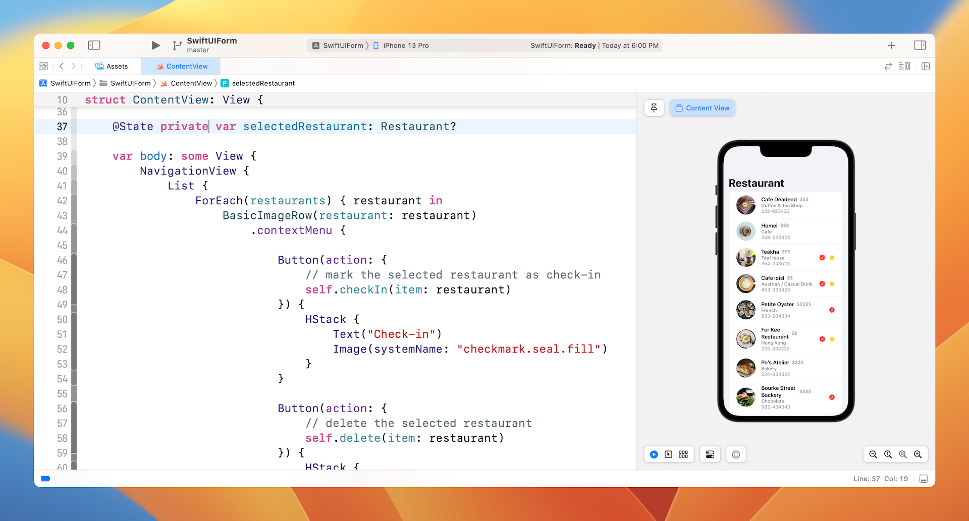
The Restaurant struct now has three more properties: type, phone, and priceLevel. I think both type and phone are self explanatory. Price level stores an integer of range 1 to 5 reflecting the average cost of the restaurant. The restaurants array has been prepopulated with some sample data. For later testing, some of the restaurants have isFavorite and isCheckIn set to true. This is why you see some check-in and favorite indicators displayed in the preview.
Building the Form UI
As mentioned, SwiftUI provides a UI component called Form for building the form UI. It's a container for holding and grouping controls (e.g. toggle) for data entry. Rather than explaining its usage to you, it's better to jump right into the implementation. You will understand how to use the component along the way.
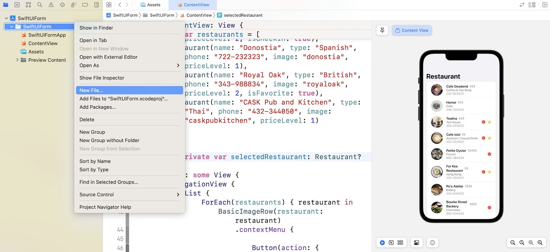
Since we will build a separate screen for Settings, let's create a new file for the form. In the project navigator, right click the SwiftUIForm folder and choose "New File...." Next, select to use SwiftUI View as the template and name the file SettingView.swift.
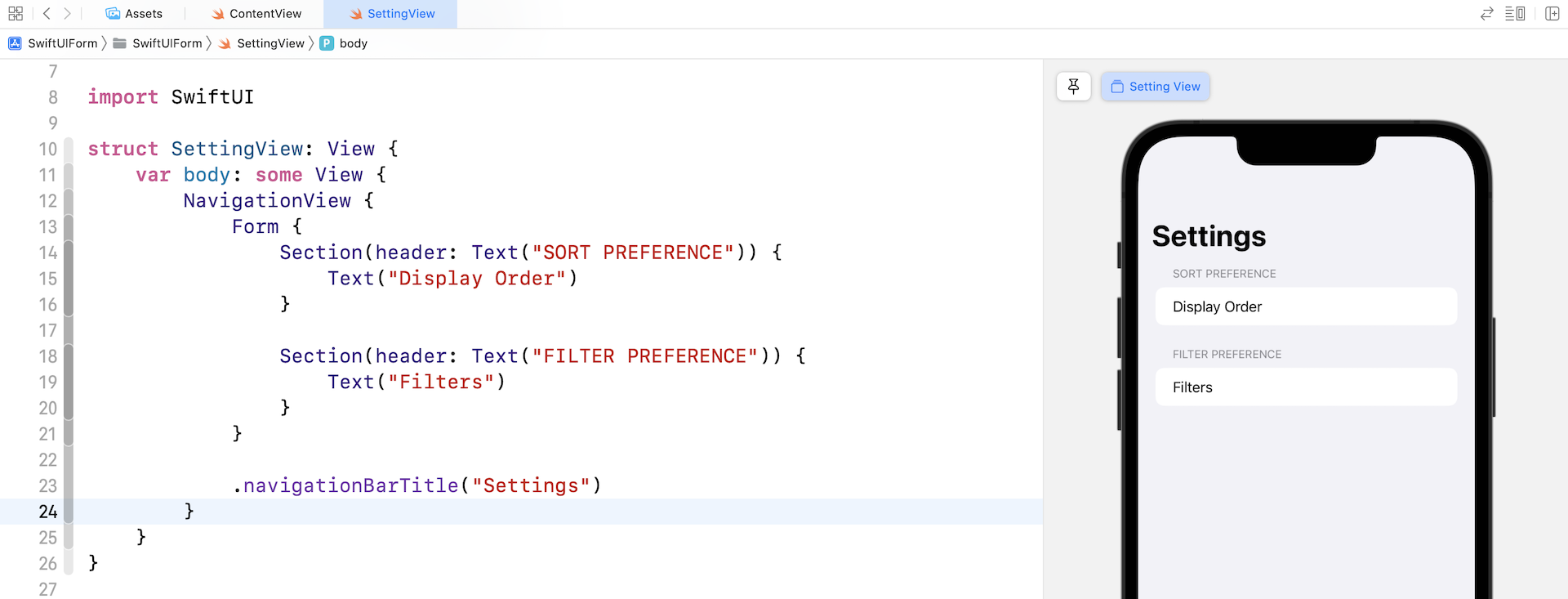
Now, let's start by creating the form. Replace SettingView with this:
struct SettingView: View {
    var body: some View {
        NavigationStack {
            Form {
                Section(header: Text("SORT PREFERENCE")) {
                    Text("Display Order")
                }

                Section(header: Text("FILTER PREFERENCE")) {
                    Text("Filters")
                }
            }

            .navigationBarTitle("Settings")
        }
    }
}
To lay out a form, you use the Form container. Inside it, you add sections and form components (text field, picker, toggle etc.). In the code above, we create two sections: Sort Preference and Filter Preference. For each section, we have a text view. Your canvas should display a preview like that shown in figure 4.
Creating a Picker View
When presenting a form, you certainly want to secure some information. It's useless if we just present a Text component. In the actual form, we use three types of UI controls for user input including a picker view, a toggle, and a stepper. Let's begin with the sort preference. For that, we will implement a picker view.
For the sort preference, users are allowed to choose the display order of the restaurant list, in which we offer three options for them to choose:
- Alphabetically
- Show Favorite First
- Show Check-in First
A Picker control is very suitable for handling this kind of input. First, we use an array to represent each of the options above. Let's declare an array named displayOrders in SettingView:
private var displayOrders = [ "Alphabetical", "Show Favorite First", "Show Check-in First"]
To use a picker, you also need to declare a state variable to store the user's selected option. In SettingView, declare the variable like this:
@State private var selectedOrder = 0
Here, 0 means the first item of displayOrders. Now replace the SORT PREFERENCE section like this:
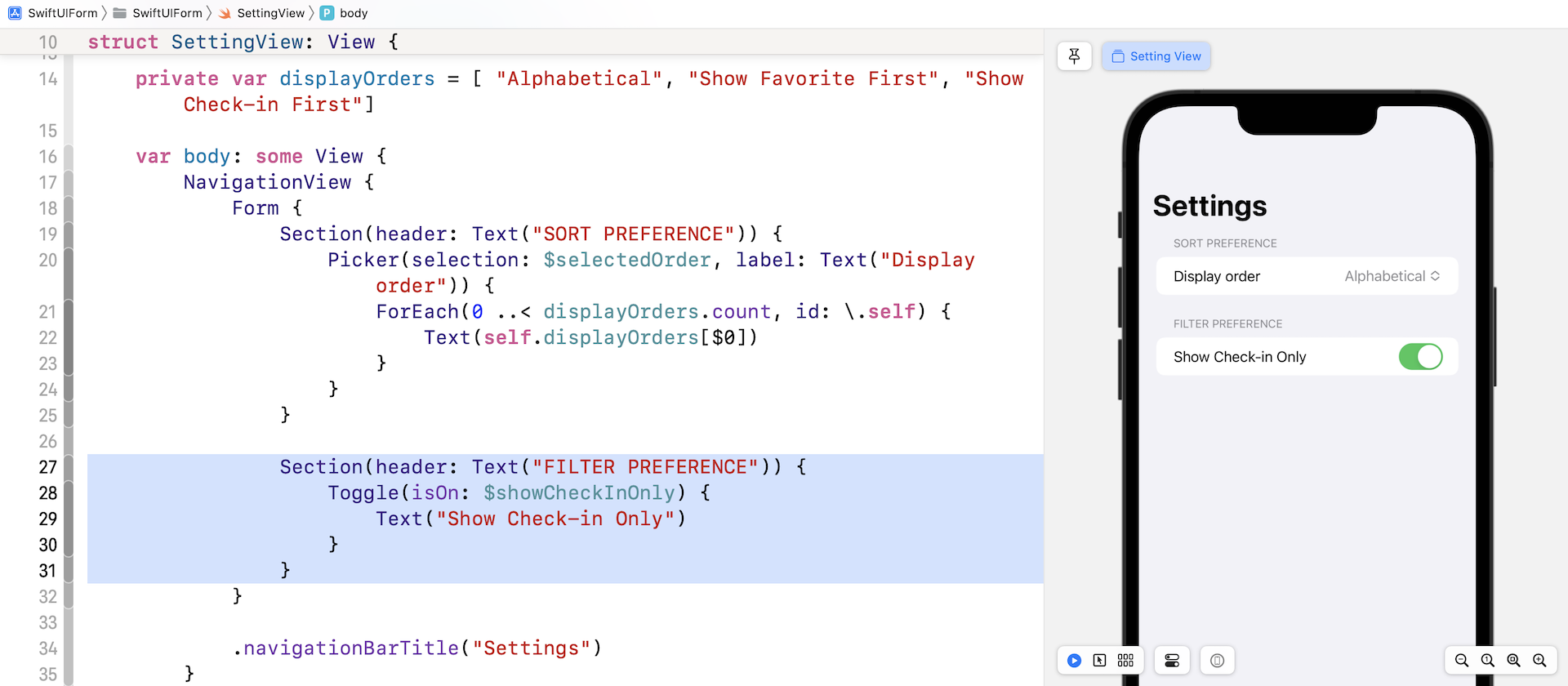
Section(header: Text("SORT PREFERENCE")) {
    Picker(selection: $selectedOrder, label: Text("Display order")) {
        ForEach(0 ..< displayOrders.count, id: \.self) {
            Text(self.displayOrders[$0])
        }
    }
}
This is how you create a picker container in SwiftUI. You have to provide two values; the binding of the selection (i.e. $selectedOrder) and the text label describing what the option is for. In the closure, you display the available options using Text.
In the canvas, you should see that the Display Order is set to Alphabetical. This is because selectedOrder is default to 0. If you click the Play button to text the view, tapping the option will bring you to the next screen, showing you all the available options. You can pick any of the options (e.g. Show Favorite First) for testing. When you go back to the Setting screen, the Display Order will become your selection. This is the power of the @State keyword. It automatically monitors the changes and helps you store the state of the selection.
Working with Toggle Switches
Next, let's move onto the input for setting the filter preference. First, we will implement a toggle (or a switch) to enable/disable the "Show Check-in Only" filter. A toggle has only two states: ON or OFF. This control is useful for prompting users to choose between two mutually exclusive options.
Creating a toggle switch using SwiftUI is quite straightforward. Similar to Picker, we have to declare a state variable to store the current setting of the toggle. So, declare the following variable in SettingView:
@State private var showCheckInOnly = false
Then, update the FILTER PREFERENCE section like this:
Section(header: Text("FILTER PREFERENCE")) {
    Toggle(isOn: $showCheckInOnly) {
        Text("Show Check-in Only")
    }
}
You use Toggle to create a toggle switch and pass it the current state of the toggle. In the closure, you present the description of the toggle. Here, we simply use a Text view.
The canvas should show a toggle switch under the Filter Preference section. If you test the app, you should be able to switch it between the ON and OFF states. Similarly, the state variable showCheckInOnly will always keep track of the user selection.
Using Steppers
The last UI control in the setting form is a Stepper. Again, referring to figure 1, users can filter the restaurants by setting the pricing level. Each of the restaurants has a pricing indicator with a range of 1 to 5. Users can adjust the price level to narrow down the number of restaurants displayed in the list view.
In the setting form, we will implement a stepper for users to adjust this setting. Basically, a Stepper in iOS shows a text field, and plus and minus buttons to perform increment and decrement actions on the text field.
To implement a stepper in SwiftUI, we first need a state variable to hold the current value of the stepper. In this case, this variable stores the user's price level filter. Declare the state variable in SettingView like this:
@State private var maxPriceLevel = 5
By default, we set the maxPriceLevel to 5. Update the FILTER PREFERENCE section like this:
Section(header: Text("FILTER PREFERENCE")) {
    Toggle(isOn: $showCheckInOnly) {
        Text("Show Check-in Only")
    }

    Stepper(onIncrement: {
        self.maxPriceLevel += 1

        if self.maxPriceLevel > 5 {
            self.maxPriceLevel = 5
        }
    }, onDecrement: {
        self.maxPriceLevel -= 1

        if self.maxPriceLevel < 1 {
            self.maxPriceLevel = 1
        }
    }) {
        Text("Show \(String(repeating: "$", count: maxPriceLevel)) or below")
    }
}
You create a stepper by initiating a Stepper component. For the onIncrement parameter, you specify the action to perform when the + button is clicked. In the code, we simply increase maxPriceLevel by 1. Conversely, the code specified in the onDecrement parameter will be executed when the - button is clicked.
Since the price level is in the range of 1 to 5, we perform a check to make sure the value of maxPriceLevel is between the value of 1 and 5. In the closure, we display the text description of the filter preference. The maximum price level is indicated by dollar signs.
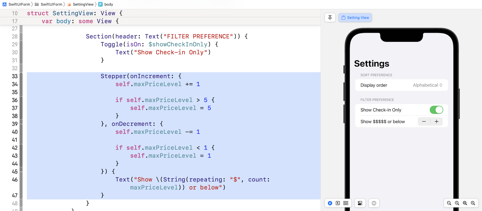
Test the app in the preview canvas. The number of $ signs will be adjusted when you click the + / - button.
Presenting the Form
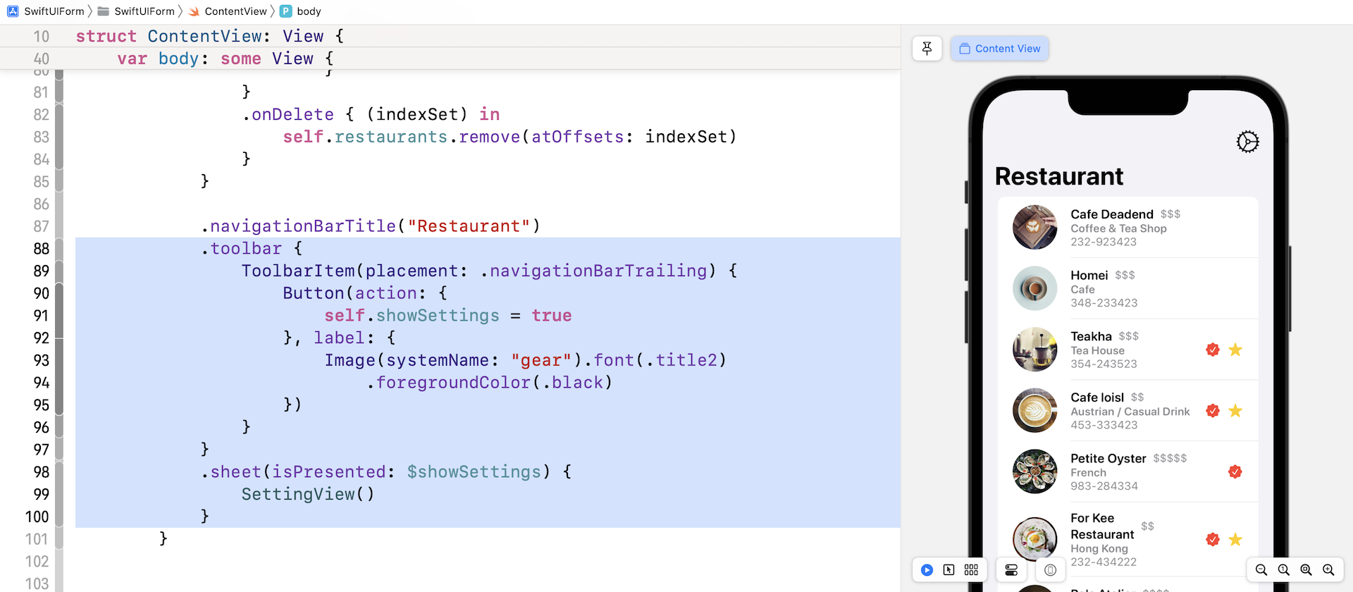
Now that you've completed the form UI, the next step is to present the form to users. For the demo, we will present this form as a modal view. In the content view, we will add a Setting button in the navigation bar to trigger the setting view.
Switch over to ContentView.swift. I assume you've read the modal view chapter, so I will not explain the code in depth. First, we need a variable to keep track of the state (i.e. shown or not shown) of the modal view. Insert the following line of code to declare the state variable:
@State private var showSettings: Bool = false
Next, insert the following modifiers in the NavigationStack (place it after navigationTitle):
.toolbar {
    ToolbarItem(placement: .navigationBarTrailing) {
        Button(action: {
            self.showSettings = true
        }, label: {
            Image(systemName: "gear").font(.title2)
                .foregroundColor(.black)
        })
    }
}
.sheet(isPresented: $showSettings) {
    SettingView()
}
The navigationBarItems modifier lets you add a button in the navigation bar. You're allowed to create a button at the leading or trailing position of the navigation bar. Since we want to display the button at the top-right corner, we use the trailing parameter. The sheet modifier is used for presenting the SettingView as a modal view.
In the canvas, you should see a gear icon in the navigation bar. Click the gear icon, it should bring up the Setting view.
Exercise
The only way to dismiss the Setting view is by using the swipe-down gesture. In the modal view chapter, you learned how to dismiss a modal view programmatically. As a refresher exercise, please create two buttons (Save & Cancel) in the navigation bar. You are not required to implement these buttons. When a user taps any of the buttons, just dismiss the setting view.
What's Coming Next
I hope you understand how the Form component works and that you know how to build a form UI with components like Picker and Stepper. Currently, the app can't store the user preferences permanently. Every time you launch the app, the settings are reset to the original settings. In the next chapter, I will show you how to save these settings in local storage. More importantly, we will update the list view in accordance with the user's preferences.
For reference, you can download the complete form project here:
- Demo project (https://www.appcoda.com/resources/swiftui4/SwiftUIForm.zip)