- Made by AppCoda
- Contact us / Support
- Tweet this book
- Preface
- 1. Introduction to SwiftUI
- 2. Getting Started with SwiftUI and Working with Text
- 3. Working with Images
- 4. Layout User Interfaces with Stacks
- 5. Understanding ScrollView and Building a Carousel UI
- 6. Working with SwiftUI Buttons and Gradient
- 7. Understanding State and Binding
- 8. Implementing Path and Shape for Line Drawing and Pie Charts
- 9. Basic Animations and Transitions
- 10. Understanding Dynamic List, ForEach and Identifiable
- 11. Working with Navigation UI and Navigation Bar Customization
- 12. Playing with Modal Views, Floating Buttons and Alerts
- 13. Building a Form with Picker, Toggle and Stepper
- 14. Data Sharing with Combine and Environment Objects
- 15. Building a Registration Form with Combine and View Model
- 16. Working with Swipe-to-Delete, Context Menu and Action Sheets
- 17. Using Gestures
- 18. Displaying an Expandable Bottom Sheet Using Presentation Detents
- 19. Creating a Tinder-like UI with Gestures and Animations
- 20. Creating an Apple Wallet like Animation and View Transition
- 21. Working with JSON, Slider and Data Filtering
- 22. Building a ToDo app with Core Data
- 23. Integrating UIKit with SwiftUI Using UIViewRepresentable
- 24. Creating a Search Bar View and Working with Custom Binding
- 25. Putting Everything Together to Build a Real World App
- 26. Creating an App Store like Animated View Transition
- 27. Building an Image Carousel
- 28. Building an Expandable List View Using OutlineGroup
- 29. Building Grid Layout Using LazyVGrid and LazyHGrid
- 30. Creating an Animated Activity Ring with Shape and Animatable
- 31. Working with AnimatableModifier and LibraryContentProvider
- 32. Working with TextEditor to Create Multiline Text Fields
- 33. Using matchedGeometryEffect to Create View Animations
- 34. ScrollViewReader and Grid Animation
- 35. Working with Tab View and Tab Bar Customization
- 36. Using AsyncImage in SwiftUI for Loading Images Asynchronously
- 37. Implementing Search Bar Using Searchable
- 38. Creating Bar Charts and Line Charts with the Charts Framework
- 39. Capturing Text within Image Using Live Text APIs
- 40. How to Use ShareLink for Sharing Data Like Text and Photos
- 41. Using ImageRenderer to Convert SwiftUI Views into Images
- 42. Creating PDF Documents Using ImageRenderer
- 43. Using Gauge to Display Progress and Create a Speedometer
- 44. Creating Grid Layout Using Grid APIs
- 45. Switching Layout with AnyLayout
- Published with GitBook
Chapter 33
Using matchedGeometryEffect to Create View Animations
In iOS 14, Apple introduced a lot of new additions to the SwiftUI framework like LazyVGrid and LazyHGrid. But matchedGeometryEffect was a new one that really caught my attention because it allows developers to create some amazing view animations with just a few lines of code. In earlier chapters, you learned how to create view animations. matchedGeometryEffect takes the implementation of view animations to the next level.
For any mobile apps, it is very common that you need to move from one view to another. Creating a delightful transition between views will definitely improve the user experience. With the matchedGeometryEffect modifier, you describe the appearance of two views. The modifier will then compute the difference between those two views and automatically animate the size/position change.
Feeling confused? No worries. You will understand what I mean after going through the demo apps.
Revisiting SwiftUI Animation
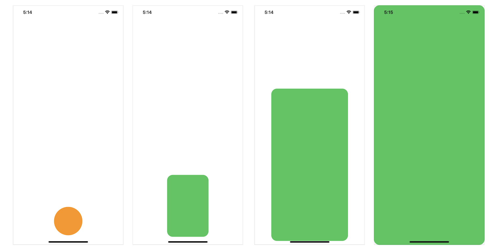
Before I walk you through the usage of matchedGeometryEffect, let's take a look at how we implement animation using SwiftUI. Figure 1 shows the beginning and final states of a view. When you tap the circle view on your left, it should grow bigger and move upward. Conversely, if you tap the one on the right, it returns to the original size and position.
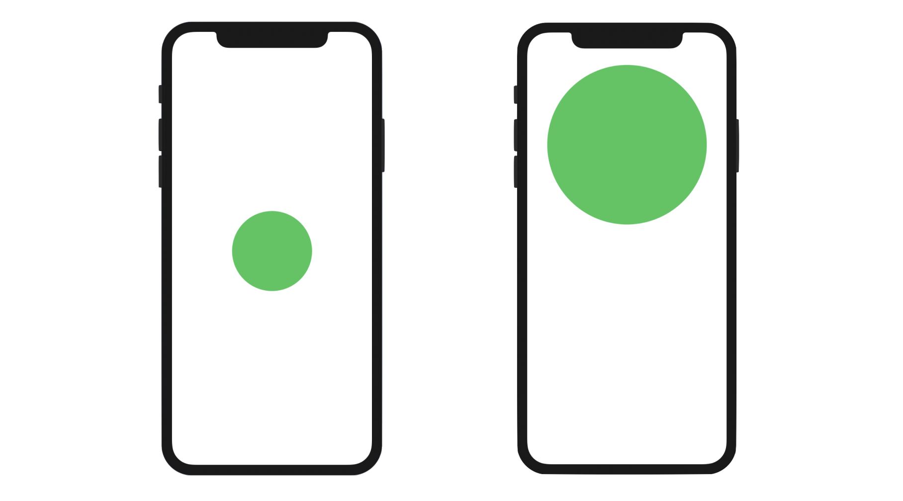
The implementation of this tappable circle is very straightforward. Assuming you've created a new SwiftUI project, you can update the ContentView struct like this:
struct ContentView: View {

    @State private var expand = false

    var body: some View {
        Circle()
            .fill(Color.green)
            .frame(width: expand ? 300 : 150, height: expand ? 300 : 150)
            .offset(y: expand ? -200 : 0)
            .animation(.default, value: expand)
            .onTapGesture {
                self.expand.toggle()
            }
    }
}
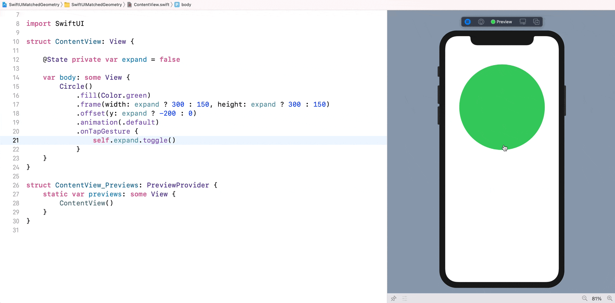
We have a state variable expand to keep track of the current state of the Circle view. In both the .frame and .offset modifiers, we vary the frame size and offset when the state changes. If you run the app in the preview canvas, you should see the animation when you tap the circle.
Understanding the matchedGeometryEffect Modifier
So, what is matchedGeometryEffect? How does it simplify the implementation of the view animation? Take a look at figure 1 and the code of the circle animation again. We have to figure out the exact value change between the start and the final state. In the example, they are the frame size and the offset.
With the matchedGeometryEffect modifier, you no longer need to figure out these differences. All you need to do is describe two views: one represents the start state and the other is for the final state. matchedGeometryEffect will automatically interpolate the size and position between the views.
To create the same animation as shown in figure 2 with matchedGeometryEffect, you first declare a namespace variable:
@Namespace private var shapeTransition
And then, rewrite the body part like this:
var body: some View {
    if expand {

        // Final State
        Circle()
            .fill(Color.green)
            .matchedGeometryEffect(id: "circle", in: shapeTransition)
            .frame(width: 300, height: 300)
            .offset(y: -200)
            .onTapGesture {
                withAnimation(.easeIn) {
                    expand.toggle()
                }
            }

    } else {

        // Start State
        Circle()
            .fill(Color.green)
            .matchedGeometryEffect(id: "circle", in: shapeTransition)
            .frame(width: 150, height: 150)
            .offset(y: 0)
            .onTapGesture {
                withAnimation(.easeIn) {
                    expand.toggle()
                }
            }
    }
}
In the code, we created two circle views: one is for the start state and the other is for the final state. When our app first initialized, we present a Circle view which is centered and has a width of 150 points. When the expand state variable is changed from false to true, the app displays another Circle view which is positioned 200 points from the center of the screen and has a width of 300 points.
For both Circle views, we attach the matchedGeometryEffect modifier and specify the same ID & namespace. By doing so, SwiftUI computes the size & position difference between these two views and interpolates the transition. Along with the withAnimation function, the framework will automatically animate the transition.
The ID and namespace are used for identifying which views are part of the same transition. This is why both Circle views use the same ID and namespace.
This is how you use matchedGeometryEffect to animate transition between two views. If you've used Magic Move in Keynote before, this new modifier is very much like Magic Move. To test the animation, I suggest you run the app in an iPhone simulator. At the time of this writing, there is a bug in Xcode that you can't test the animation in the preview canvas.
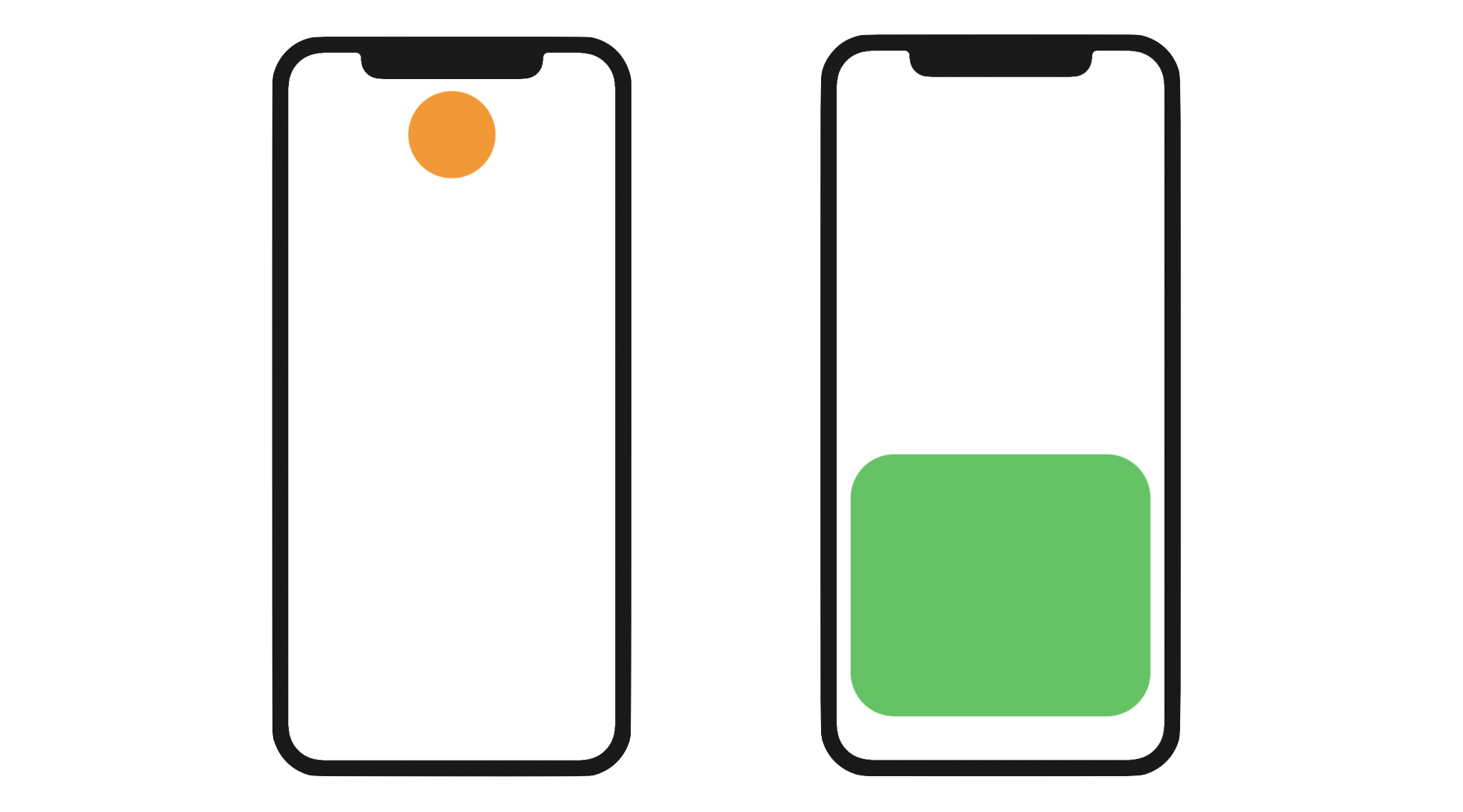
Morphing From a Circle to a Rounded Rectangle
Let's try to implement another animated view transition. This time, we will morph a circle into a rounded rectangle. The circle is positioned at the top of the screen, while the rounded rectangle is close to the bottom part of the screen.
Using the same technique you just learned, you need to prepare two views: the circle view and the rounded rectangle view. The matchedGeometryEffect modifier will then handle the transformation. Replace the body variable of the ContentView struct like this:
VStack {
    if expand {

        // Rounded Rectangle
        Spacer()

        RoundedRectangle(cornerRadius: 50.0)
            .matchedGeometryEffect(id: "circle", in: shapeTransition)
            .frame(minWidth: 0, maxWidth: .infinity, maxHeight: 300)
            .padding()
            .foregroundColor(Color(.systemGreen))
            .onTapGesture {
                withAnimation {
                    expand.toggle()
                }
            }

    } else {

        // Circle
        RoundedRectangle(cornerRadius: 50.0)
            .matchedGeometryEffect(id: "circle", in: shapeTransition)
            .frame(width: 100, height: 100)
            .foregroundColor(Color(.systemOrange))
            .onTapGesture {
                withAnimation {
                    expand.toggle()
                }
            }

        Spacer()
    }
}
We still make use of the expand state variable to toggle between the circle view and the rounded rectangle view. The code is very similar to the previous example, except that we use a VStack and a Spacer to position the view. You may wonder why we used RoundedRectangle to create the circle. The main reason is that it gives you a more smooth transition.
For both views, we attach the matchedGeometryEffect modifier and specify the same ID & namespace. That's all we need to do. The modifier will compare the difference between these two views and animate the changes. If you run the app in the preview canvas or on an iPhone simulator, you will see a nice transition between the circle and the rounded rectangle views. This is the magic of matchedGeometryEffect.
However, you may notice that the modifier doesn't animate the color change. This is right. matchedGeometryEffect only handles position and size changes.
Exercise #1
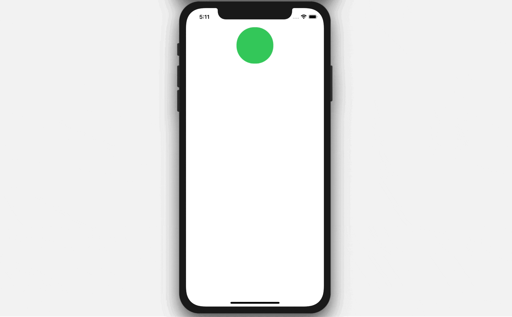
Let's have a simple exercise to test your understanding of matchedGeometryEffect. Your task is to create the animated transition as shown in figure 5. It starts with an orange circle view. When the circle is tapped, it will transform into a full screen background. You can find the solution in the final project.
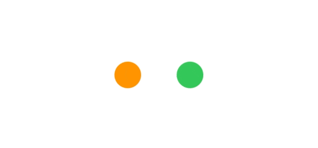
Swapping Two Views with Animated Transition
Now that you have some basic knowledge of matchedGeometryEffect, let's continue to see how it can help us create some nice animations. In this example, we will swap the position of two circle views and apply a modifier to create a smooth transition.
We will use a state variable to store the state of the swap and create a namespace variable for matchedGeometryEffect. Declare the following variable in ContentView:
@State private var swap = false

@Namespace private var dotTransition
By default, the orange circle is on the left side of the screen, while the green circle is positioned on the right. When the user taps any of the circles, it will trigger the swap. You don't need to figure out how the swap is done when using matchedGeometryEffect. To create the transition, all you need to do is:
- Create the layout of the orange and green circles before the swap
- Create the layout of the two circles after the swap
To translate the layout into code, you write the body variable like this:
if swap {

    // After swap
    // Green dot on the left, Orange dot on the right

    HStack {
        Circle()
            .fill(Color.green)
            .frame(width: 30, height: 30)
            .matchedGeometryEffect(id: "greenCircle", in: dotTransition)

        Spacer()

        Circle()
            .fill(Color.orange)
            .frame(width: 30, height: 30)
            .matchedGeometryEffect(id: "orangeCircle", in: dotTransition)
    }
    .frame(width: 100)
    .onTapGesture {
        withAnimation {
            swap.toggle()
        }
    }

} else {

    // Start state
    // Orange dot on the left, Green dot on the right

    HStack {
        Circle()
            .fill(Color.orange)
            .frame(width: 30, height: 30)
            .matchedGeometryEffect(id: "orangeCircle", in: dotTransition)

        Spacer()

        Circle()
            .fill(Color.green)
            .frame(width: 30, height: 30)
            .matchedGeometryEffect(id: "greenCircle", in: dotTransition)
    }
    .frame(width: 100)
    .onTapGesture {
        withAnimation {
            swap.toggle()
        }
    }
}
We use a HStack to layout the two circles horizontally and have a Spacer in between them to create some separation. When the swap variable is set to true, the green circle is placed to the left of the orange circle. When false, the green circle is positioned to the right of the orange circle.
As you can see, we just describe the layout of the circle views in difference states and let matchedGeometryEffect handle the rest. We attach the modifier to each of the Circle views. However, this time is a bit different. Since we have two different Circle views to match, we use two distinct IDs for the matchedGeometryEffect modifier. For the orange circles, we set the identifier to orangeCircle, while the green circles uses the identifier greenCircle.
Run the app on a simulator, you should see the swap animation when you tap any of the circles.
Exercise #2
Earlier, we used the matchedGeometryEffect on two circles and swap their position. Your exercise is to apply the same technique but on two images. Figure 6 shows you the sample UI. When the swap button is tapped, the app swaps the two photos with a nice animation.
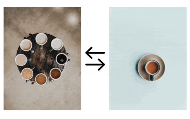
You are free to use your own photos. For my demo, I used these free photos from Unsplash.com:
Creating a Basic Hero Animation
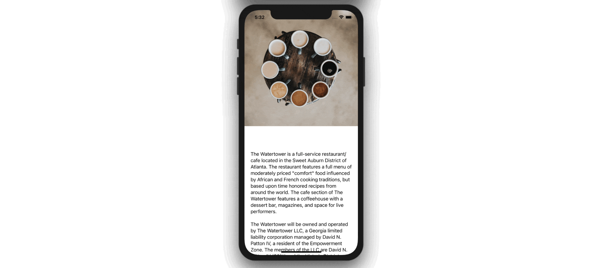
Other than transforming from one shape to another, you can use the matchedGeometryEffect modifier to create a basic hero animation. Figure 8 shows you a sample stack view of an image and text. When the view is tapped, both the image and text will be expanded to take up the full screen. This type of animation is usually known as a Hero Animation.
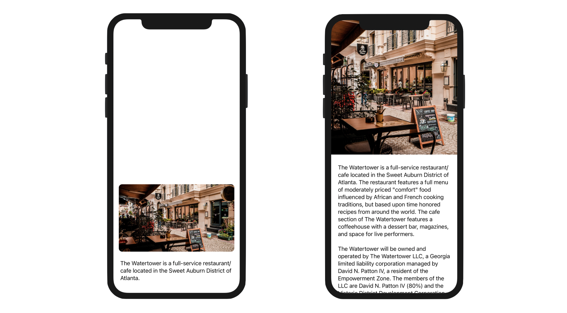
Again, we apply the matchedGeometryEffect technique to create this type of animated transition. If you refer to figure 8, there are two views in the view transition:
- One is the view showing a smaller image and an excerpt for the article.
- The other one is the view expanded into full screen showing a featured photo and the full article.
To begin, first declare a state variable to control the status of the view mode:
@State private var showDetail = false
When showDetail is set to false, the article view with a smaller image is displayed. when true, a full screen article view will be shown. Again, to use the matchedGeometryEffect modifier, we have to declare a namespace variable:
@Namespace private var articleTransition
Next, update the body variable like this:
// Display an article view with smaller image
if !showDetail {
    VStack {
        Spacer()

        VStack {
            Image("latte")
                .resizable()
                .scaledToFill()
                .frame(minWidth: 0, maxWidth: .infinity)
                .frame(height: 200)
                .matchedGeometryEffect(id: "image", in: articleTransition)
                .cornerRadius(10)
                .padding()
                .onTapGesture {
                    withAnimation(.interactiveSpring(response: 0.5, dampingFraction: 0.8, blendDuration: 0.2)) {
                        showDetail.toggle()
                    }
                }

            Text("The Watertower is a full-service restaurant/cafe located in the Sweet Auburn District of Atlanta.")
                .matchedGeometryEffect(id: "text", in: articleTransition)
                .padding(.horizontal)
        }
    }
}

// Display the article view in a full screen
if showDetail {

    ScrollView {
        VStack {
            Image("latte")
                .resizable()
                .scaledToFill()
                .frame(minWidth: 0, maxWidth: .infinity)
                .frame(height: 400)
                .clipped()
                .matchedGeometryEffect(id: "image", in: articleTransition)
                .onTapGesture {
                     withAnimation(.interactiveSpring(response: 0.5, dampingFraction: 0.8, blendDuration: 0.4)) {
                         showDetail.toggle()
                     }
                }

            Text("The Watertower is a full-service restaurant/cafe located in the Sweet Auburn District of Atlanta. The restaurant features a full menu of moderately priced \"comfort\" food influenced by African and French cooking traditions, but based upon time honored recipes from around the world. The cafe section of The Watertower features a coffeehouse with a dessert bar, magazines, and space for live performers.\n\nThe Watertower will be owned and operated by The Watertower LLC, a Georgia limited liability corporation managed by David N. Patton IV, a resident of the Empowerment Zone. The members of the LLC are David N. Patton IV (80%) and the Historic District Development Corporation (20%).\n\nThis business plan offers financial institutions an opportunity to review our vision and strategic focus. It also provides a step-by-step plan for the business start-up, establishing favorable sales numbers, gross margin, and profitability.\n\nThis plan includes chapters on the company, products and services, market focus, action plans and forecasts, management team, and financial plan.")
                .matchedGeometryEffect(id: "text", in: articleTransition)
                .animation(nil, value: showDetail)
                .padding(.all, 20)

            Spacer()
        }

    }
    .edgesIgnoringSafeArea(.all)
}
In the code above, we layout the views in different states. When showDetail is set to false, we use a VStack to layout the article image and the excerpt. The height of the image is set to 200 points to make it smaller.
The layout of the article view is very similar in full screen mode. The main difference is that the VStack view is embedded in a ScrollView to make the content scrollable. The image's height is set to 400 points, so that the image is a little bit bigger. In order to extend the image and text views outside of the screen's safe area, we attach the .edgesIgnoringSafeArea modifier to the scroll view and set its value to .all.
Since we have two different views in the transition, we use two different IDs for the matchedGeometryEffect modifier. For the image, we set the ID to image:
.matchedGeometryEffect(id: "image", in: articleTransition)
On the other hand, we set the ID of the text view to text:
.matchedGeometryEffect(id: "text", in: articleTransition)
Furthermore, we use two different animations for the text and image views. We apply the .interactiveSpring animation for the image view, while for the text view, we use the .easeOut animation.
The implementation is very straightforward, similar to what we have done in the earlier examples. Run the app in a simulator to try it out. When you tap the image view, the app renders a nice animation and shows the article in full screen.
Passing @Namespace between Views
Referring to the previous example, we can better organize the code by breaking the two different stack views into subviews. But the problem is how we can pass the @Namespace variable between views. Let's see how it can be done.
First, hold the command key and click on the VStack keyword of the first stack view. Choose Extract Subview from the context menu and name the subview ArticleExcerptView.
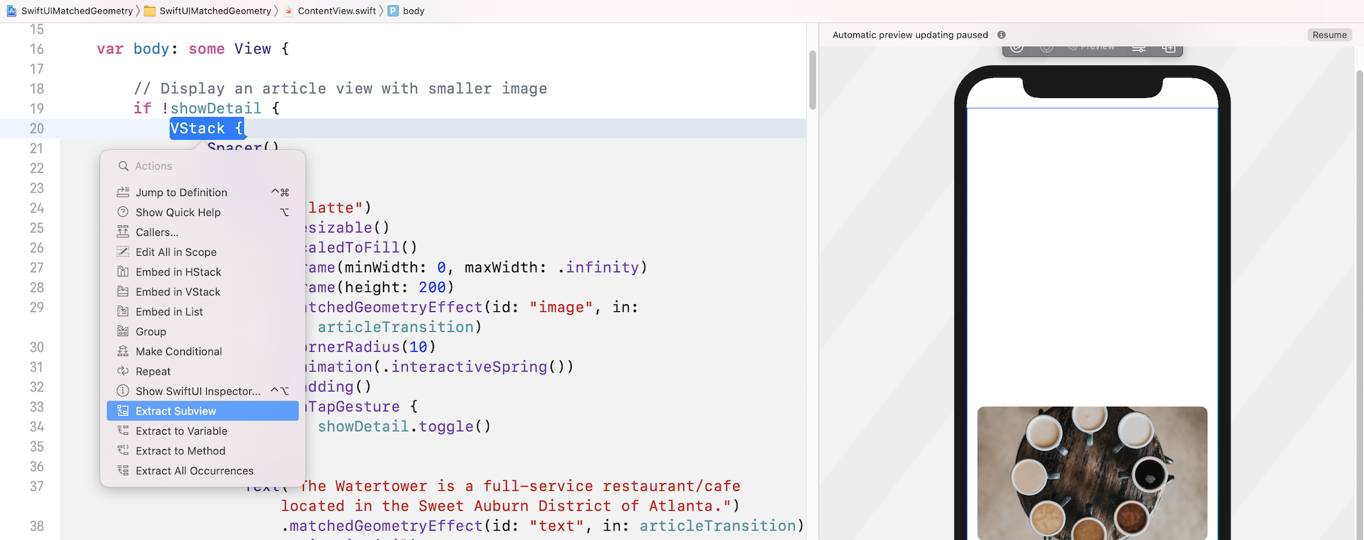
You should see quite a number of errors in the ArticleExcerptView struct, complaining about the missing of the namespace and the showDetail variable. To fix the error of the showDetail variable, you can declare a binding in ArticleExcerptView like this:
@Binding var showDetail: Bool
To accept a namespace from another view, the trick is to declare a variable with the type Namespace.ID like this:
var articleTransition: Namespace.ID
This should now fix all the errors in ArticleExcerptView. Now go back to ContentView and replace ArticleExcerptView() with:
ArticleExcerptView(showDetail: $showDetail, articleTransition: articleTransition)
We pass the binding to showDetail and the namespace variable to the subview. This is how you share a namespace across different views. Repeat the same procedure to extract the ScrollView into another subview. Name the subview ArticleDetailView.
Again, you need to declare the following variable and binding in ArticleDetailView to resolve all the errors:
@Binding var showDetail: Bool

var articleTransition: Namespace.ID
You should also update the instantiation of ArticleDetailView() like this:
ArticleDetailView(showDetail: $showDetail, articleTransition: articleTransition)
After all these changes, the ContentView struct is now simplified like this:
struct ContentView: View {

    @State private var showDetail = false

    @Namespace private var articleTransition

    var body: some View {

        // Display an article view with smaller image
        if !showDetail {
            ArticleExcerptView(showDetail: $showDetail, articleTransition: articleTransition)
        }

        // Display the article view in a full screen
        if showDetail {
            ArticleDetailView(showDetail: $showDetail, articleTransition: articleTransition)
        }

    }
}
Everything works the same but the code is now more readable and organized.
Summary
The introduction of the matchedGeometryEffect modifier takes the implementation of view animation to the next level. You can create some nice view transitions with much less code. Even if you are a beginner to SwiftUI, you can take advantage of this new modifier to make your app more awesome.
For reference, you can download the complete matched geometry project, with the solutions to the exercises, here: