- Made by AppCoda
- Contact us / Support
- Tweet this book
- Preface
- 1. Introduction to SwiftUI
- 2. Getting Started with SwiftUI and Working with Text
- 3. Working with Images
- 4. Layout User Interfaces with Stacks
- 5. Understanding ScrollView and Building a Carousel UI
- 6. Working with SwiftUI Buttons and Gradient
- 7. Understanding State and Binding
- 8. Implementing Path and Shape for Line Drawing and Pie Charts
- 9. Basic Animations and Transitions
- 10. Understanding Dynamic List, ForEach and Identifiable
- 11. Working with Navigation UI and Navigation Bar Customization
- 12. Playing with Modal Views, Floating Buttons and Alerts
- 13. Building a Form with Picker, Toggle and Stepper
- 14. Data Sharing with Combine and Environment Objects
- 15. Building a Registration Form with Combine and View Model
- 16. Working with Swipe-to-Delete, Context Menu and Action Sheets
- 17. Using Gestures
- 18. Displaying an Expandable Bottom Sheet Using Presentation Detents
- 19. Creating a Tinder-like UI with Gestures and Animations
- 20. Creating an Apple Wallet like Animation and View Transition
- 21. Working with JSON, Slider and Data Filtering
- 22. Building a ToDo app with Core Data
- 23. Integrating UIKit with SwiftUI Using UIViewRepresentable
- 24. Creating a Search Bar View and Working with Custom Binding
- 25. Putting Everything Together to Build a Real World App
- 26. Creating an App Store like Animated View Transition
- 27. Building an Image Carousel
- 28. Building an Expandable List View Using OutlineGroup
- 29. Building Grid Layout Using LazyVGrid and LazyHGrid
- 30. Creating an Animated Activity Ring with Shape and Animatable
- 31. Working with AnimatableModifier and LibraryContentProvider
- 32. Working with TextEditor to Create Multiline Text Fields
- 33. Using matchedGeometryEffect to Create View Animations
- 34. ScrollViewReader and Grid Animation
- 35. Working with Tab View and Tab Bar Customization
- 36. Using AsyncImage in SwiftUI for Loading Images Asynchronously
- 37. Implementing Search Bar Using Searchable
- 38. Creating Bar Charts and Line Charts with the Charts Framework
- 39. Capturing Text within Image Using Live Text APIs
- 40. How to Use ShareLink for Sharing Data Like Text and Photos
- 41. Using ImageRenderer to Convert SwiftUI Views into Images
- 42. Creating PDF Documents Using ImageRenderer
- 43. Using Gauge to Display Progress and Create a Speedometer
- 44. Creating Grid Layout Using Grid APIs
- 45. Switching Layout with AnyLayout
- Published with GitBook
Chapter 27
Building an Image Carousel
Carousel is one of the common UI patterns that you see in most mobile and web apps. Some people refer it as an image slider or rotator. However, whatever name you call it, a carousel is designed to display a set of data in finite screen space. For example, an image carousel may show a single image from its collection with a navigation control suggesting additional content. Users can swipe the screen to navigate through the image set. This is how Instagram presents multiple images to users. You can also find similar carousels in many other iOS apps such as Apple's Music and App Store.
In this chapter, you will learn how to build an image carousel entirely in SwiftUI. There are various ways to implement a carousel. One approach is to integrate with the UIKit component UIPageViewController and use it to create the carousel. However, we will explore an alternative approach and create the carousel completely in SwiftUI.
Let's get started.
Introducing the Travel Demo App
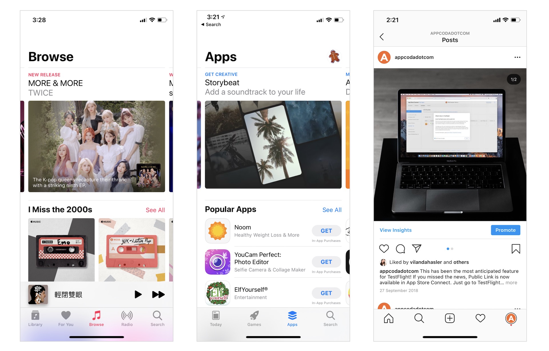
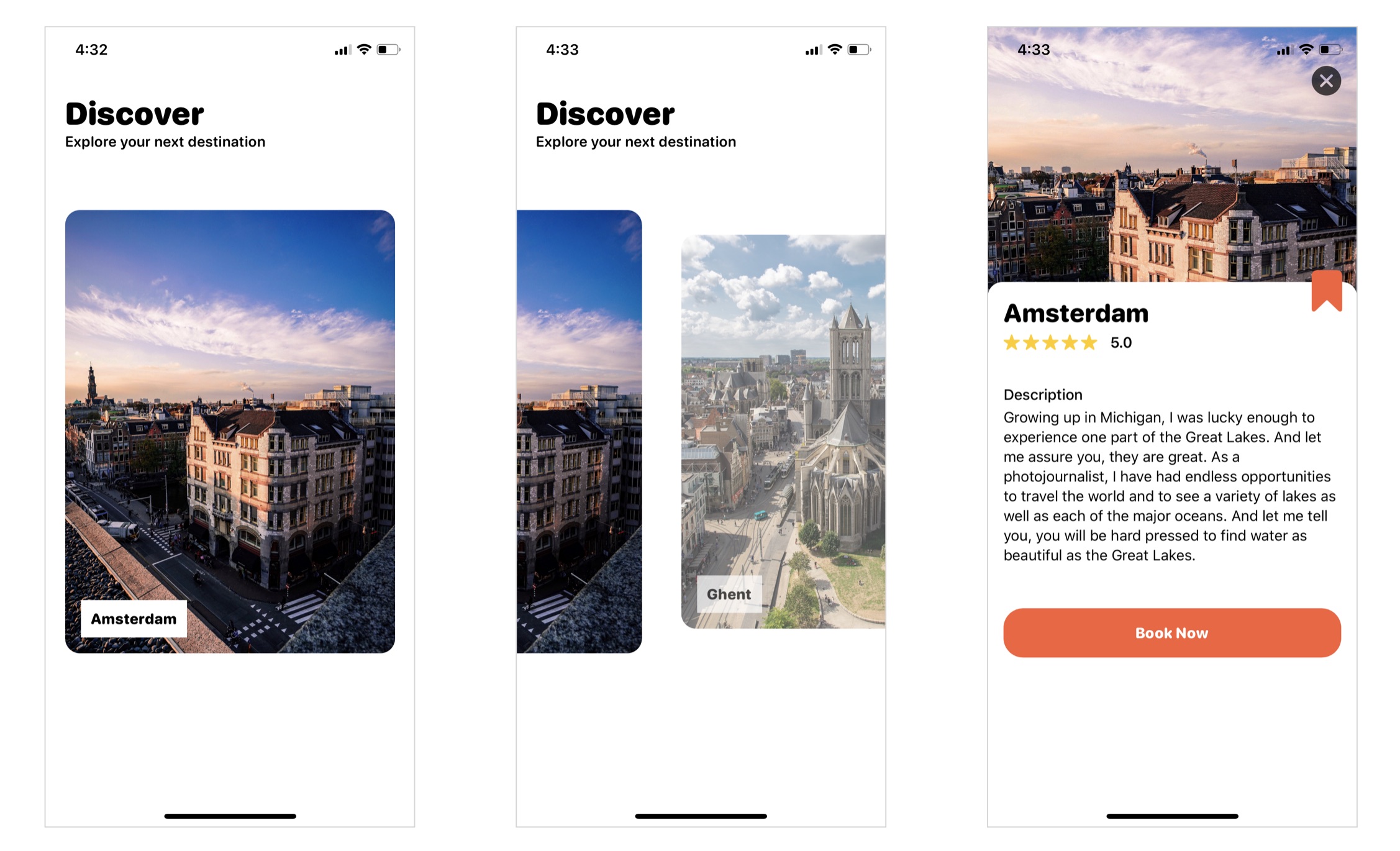
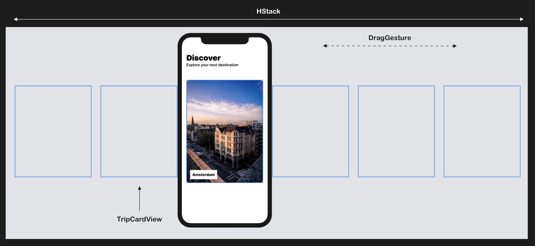
Likes other chapters, I walk you through the implementation by building a demo app. The app displays a collection of travel destinations in the form of a carousel. To browse through the trips, the user can swipe right to view the subsequent destination or swipe left to check out the previous trip. To make this demo app more engaging, the user can tap a destination to see its detail. So, in addition to the implementation of a carousel, you will also learn some animation techniques that can be applied in your own apps. Figure 2 shows you some sample screenshots of the demo app. To see it in action, you can check out the video at https://link.appcoda.com/carousel-demo.
To save you time from building the app from scratch and to focus on developing the carousel, I've created a starter project for you. Please download it from https://www.appcoda.com/resources/swiftui4/SwiftUICarouselStarter.zip and unzip the package.
The starter project comes with the following features:
- It bundles the required images in the asset catalog.
- The
ContentView.swiftfile is the default SwiftUI view generated by Xcode. - The
Trip.swiftfile contains theTripstruct, which represents a travel destination in the app. For testing purposes, this file also creates thesampleTripsarray which includes some test data. You may modify its content. - The
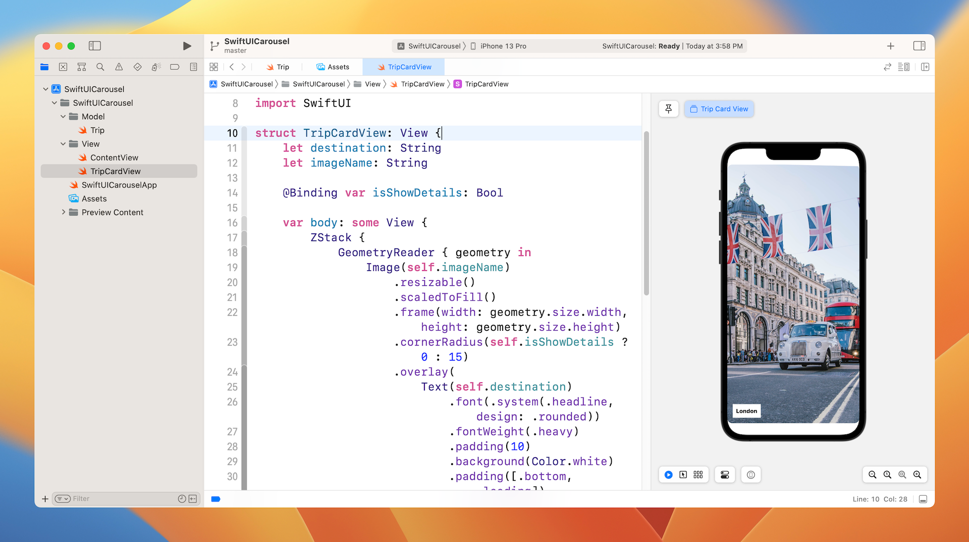
TripCardView.swiftfile implements the UI of a card view. Each card view is designed to display the destination's image. TheisShowDetailsbinding controls the appearance of the text label. WhenisShowDetailsis set to true, the label will be hidden.
The ScrollView Problem
So, how would you implement the carousel in SwiftUI? At first thought, you may want to create the carousel by using a scroll view. Probably you will write the code in ContentView.swift like this:
struct ContentView: View {

    @State private var isCardTapped = false

    var body: some View {
        GeometryReader { outerView in
            ScrollView(.horizontal, showsIndicators: false) {
                HStack(alignment: .center) {
                    ForEach(sampleTrips.indices, id: \.self) { index in
                        GeometryReader { innerView in
                            TripCardView(destination: sampleTrips[index].destination, imageName: sampleTrips[index].image, isShowDetails: self.$isCardTapped)
                        }
                        .padding(.horizontal, 20)
                        .frame(width: outerView.size.width, height: 450)
                    }
                }
            }
            .frame(width: outerView.size.width, height: outerView.size.height, alignment: .leading)
        }
    }
}
In the code above, we embed an HStack with a horizontal ScrollView to create the image slider. In the HStack, we loop through the sampleTrips array and create a TripCardView for each trip. To have better control of the card size, we have two GeometryReaders: outerView and innerView, where the outer view represents the size of the device's screen and the inner view wraps around the card view to control its size. If you haven't read the previous chapter and don't understand what GeometryReader is , please refer to chapter 26.
This looks simple, right? If you run the code in the preview canvas, it should result in a horizontal scroll view. You can swipe the screen to scroll through all the card views.
Does this mean we have completed the carousel? Not yet. There are a couple of major issues:
- The current implementation doesn't support paging. In other words, you can swipe the screen to continuously scroll through the content. The scroll view can stop at any location. For instance, take a look at figure 4. The scroll stops in between two card views. This is not our desired behavior. We expect the scrolling will stop on paging boundaries of the content view.
- When a card view is tapped, we need to find out its index and display its details in a separate view. The problem is that it is not easy to figure out which card view the user has tapped with the current implementation.
Both issues are related to the built-in ScrollView. The UIKit version of the scroll view supports paging. However, Apple didn't bring that feature to the SwiftUI framework. To resolve the issue, We need to build our own horizontal scroll view with paging support.
At first, you may think it's hard to develop our own scroll view. But in reality, it is not that hard. If you understand the usage of HStack and DragGesture, you can build a horizontal scroll view with paging support.
Building a Carousel with HStack and DragGesture
The idea is to layout all of the card views (i.e. trips) in a horizontal stack (HStack). The HStack should be long enough to accomodate all the card views but only display a single card view at any time. By default, the horizontal stack is non-scrollable. Therefore, we need to attach a drag gesture recognizer to the stack view and handle the drag on our own. Figure 5 illustrates our implementation of the horizontal scroll view.
Implementing the horizontal stack
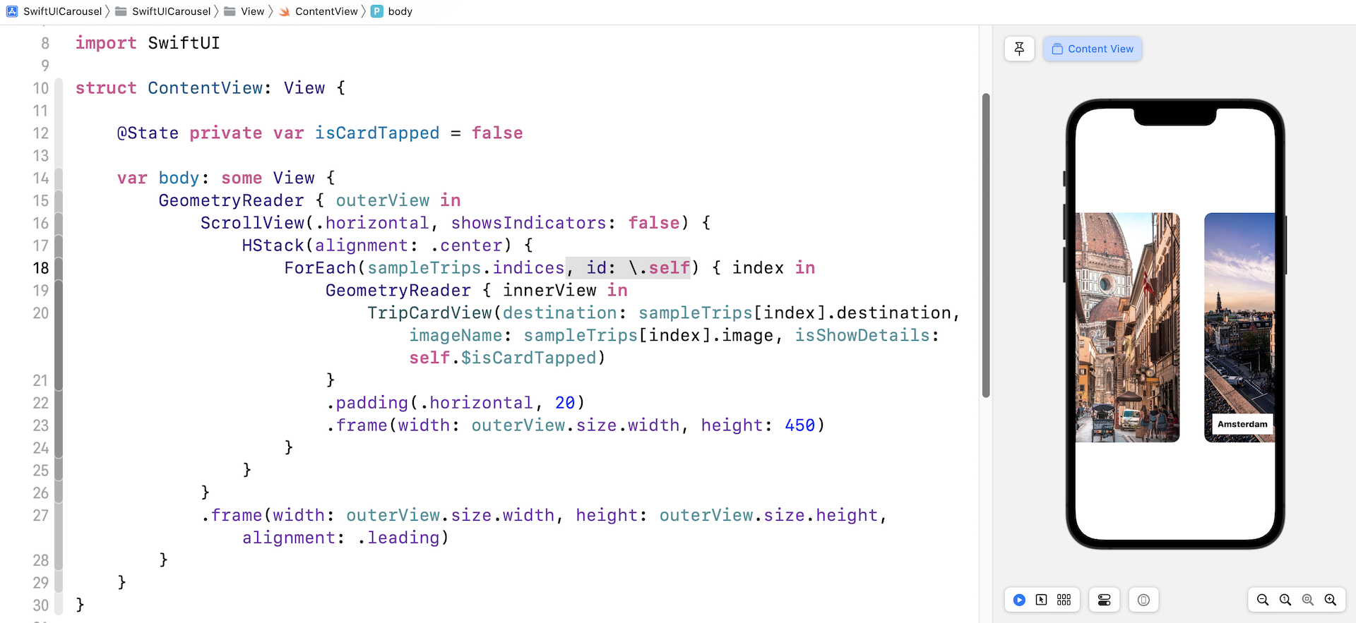
Now let's see how we turn this idea into code. Please bear with me in that you will need to update the code several times. I want to show you the implementation step by step. Open Content.swift and update the body like this:
var body: some View {
    HStack {
        ForEach(sampleTrips.indices, id: \.self) { index in
            TripCardView(destination: sampleTrips[index].destination, imageName: sampleTrips[index].image, isShowDetails: self.$isCardTapped)
        }
    }
}
In the code above, we start by laying out all card views within an HStack. By default, the horizontal stack tries its best to fit all the card views in the available screen space. You should see something like figure 6 in the preview canvas.
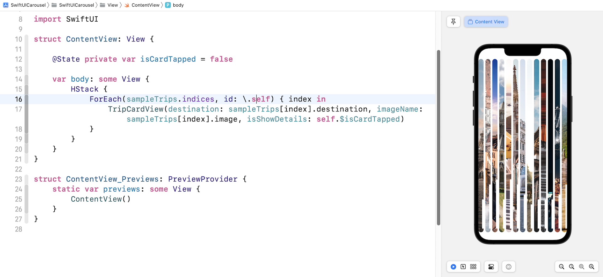
Obviously, this isn't the horizontal stack we want to build. We expect each card view to takes up the width of the screen. To do so, we have to wrap the HStack in a GeometryReader to retrieve the screen size. Update the code in the body like this:
var body: some View {
    GeometryReader { outerView in
        HStack {
            ForEach(sampleTrips.indices, id: \.self) { index in
                GeometryReader { innerView in
                    TripCardView(destination: sampleTrips[index].destination, imageName: sampleTrips[index].image, isShowDetails: self.$isCardTapped)
                }
                .frame(width: outerView.size.width, height: 500)
            }
        }
        .frame(width: outerView.size.width, height: outerView.size.height)
    }
}
The outerView parameter provides us the screen width and height, while the innerView parameter allows us to have better control of the size and position of the card view.
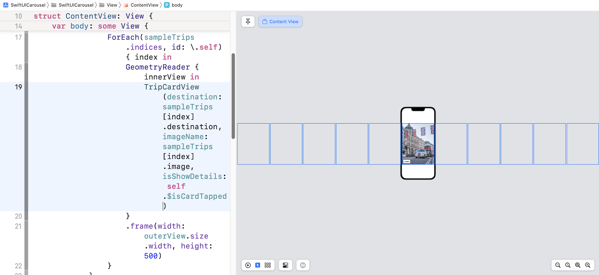
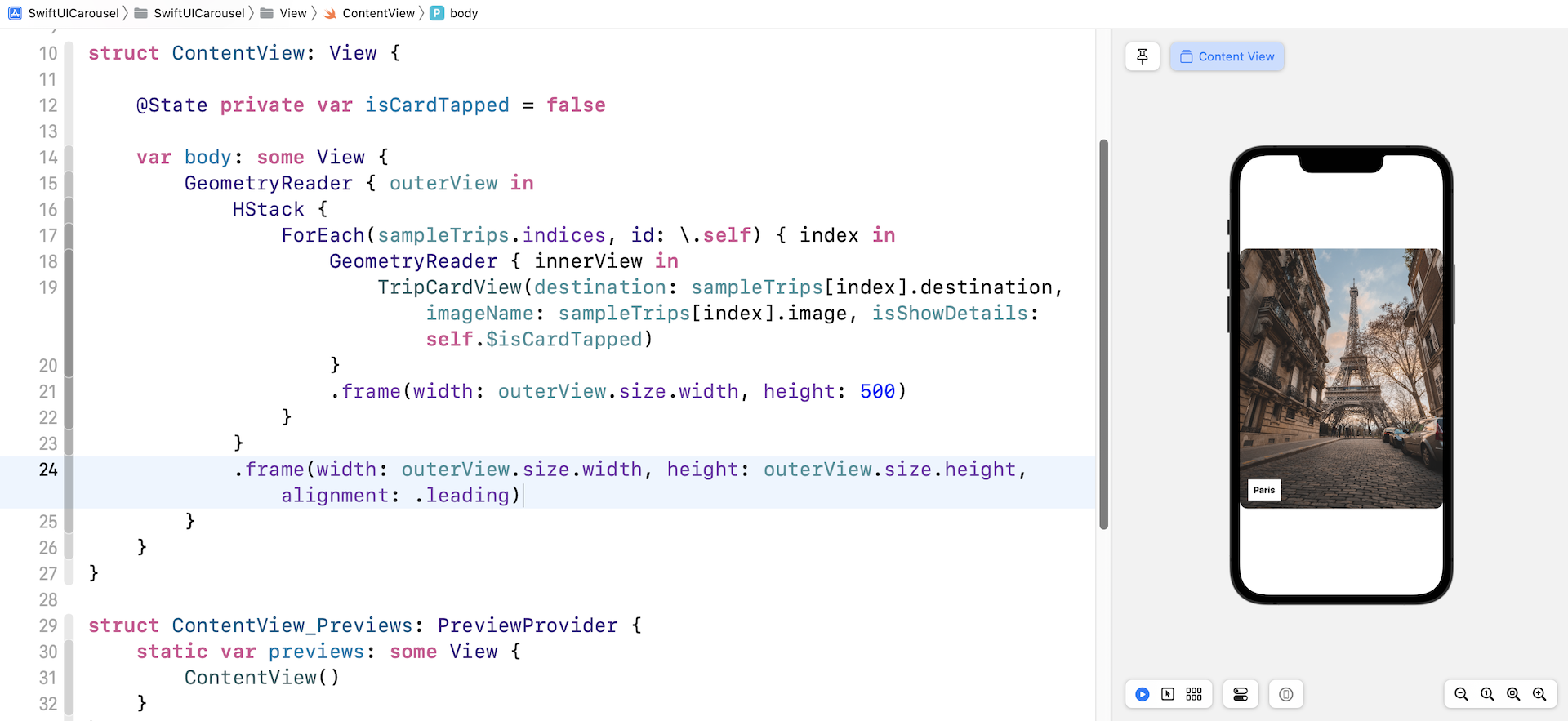
In the code above, we attach the .frame modifier to the card view and set its width to the screen width (i.e. outerView.size.width). This ensures that each card view takes up the whole screen width. For the height of the card view, we set it to 500 points to make it a bit smaller. After making the changes, you should see the card view showing the "London" image.
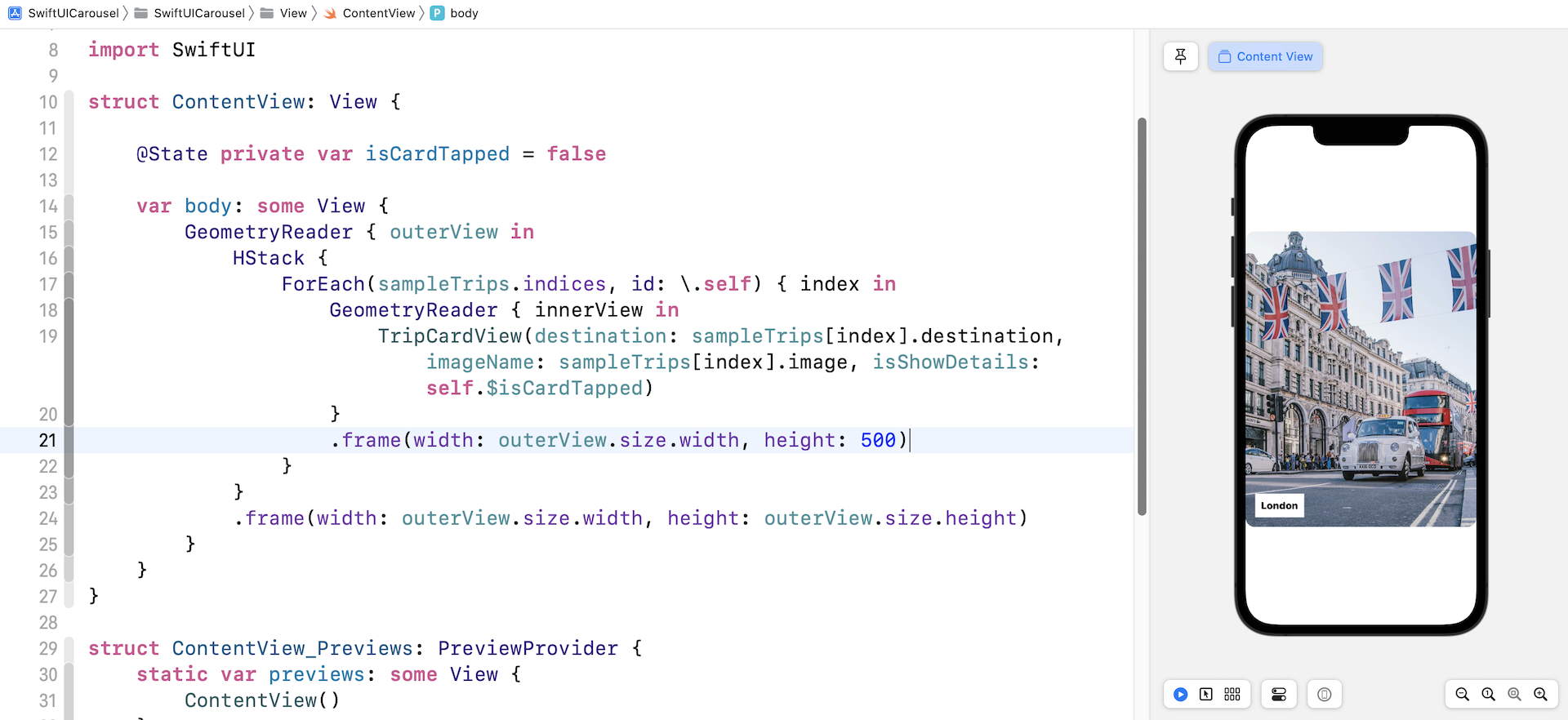
Why the "London" card view? If you switch to the Selectable mode, the preview canvas should display something like that shown in figure 8. We have 13 items in the sampleTrips array. Since each of the card views has a width equal to the screen width, the horizontal stack view has to expand beyond the screen. It happens that the "London" card view is the center (7th) item of the array. This is why you see the "London" card view.
Changing the alignment
So, how can we display the first item of the array instead of the center (7th) item? The trick is to attach a .frame modifier to the HStack with the alignment set to .leading like this:
.frame(width: outerView.size.width, height: outerView.size.height, alignment: .leading)
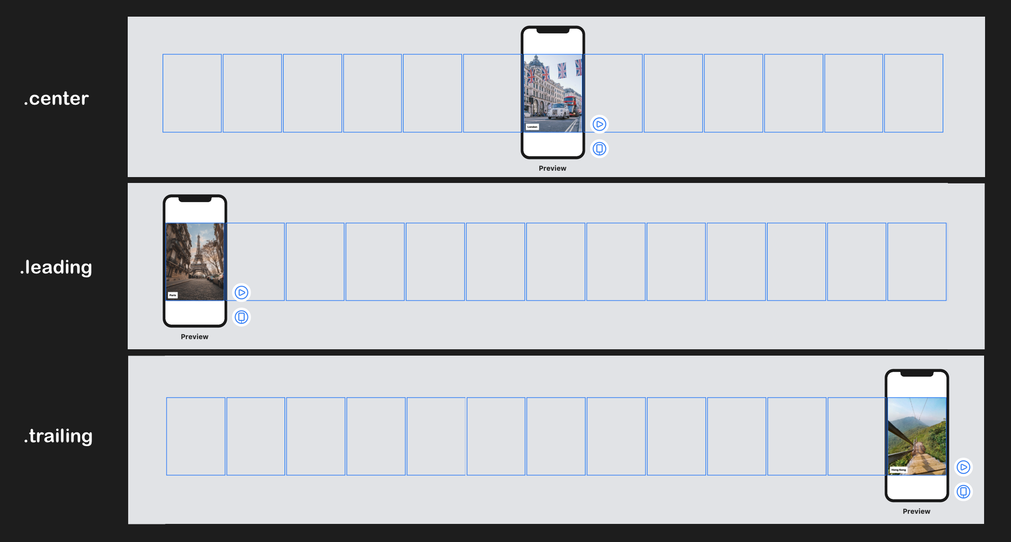
The default alignment is set to .center. This is why the 7th element of the horizontal view is shown on screen. Once you change the alignment to .leading, you should see the first element.
If you want to understand how the alignment affects the horizontal stack view, you can change its value to .center or .trailing to see its effect. Figure 10 shows what the stack view looks likes with different alignment settings.
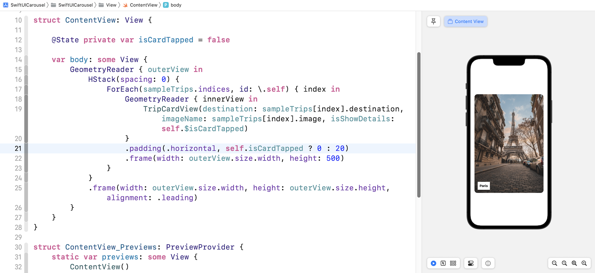
Did you notice the gap between each of the card views? This is also related to the default setting of HStack. To eliminate the spacing, you can update the HStack and set its spacing to zero like this:
HStack(spacing: 0)
Adding padding
Optionally, you can add horizontal padding to the image. I think this will make the card view look better. Insert the following line of code and attach it to the GeometryReader that wraps the card view (before .frame(width: outerView.size.width, height: 500)):
.padding(.horizontal, self.isCardTapped ? 0 : 20)
While it's too early for us to talk about the implementation of the detailed view, we added a condition for the padding. The horizontal padding will be removed when the user taps the card view.
Moving the HStack Card by Card
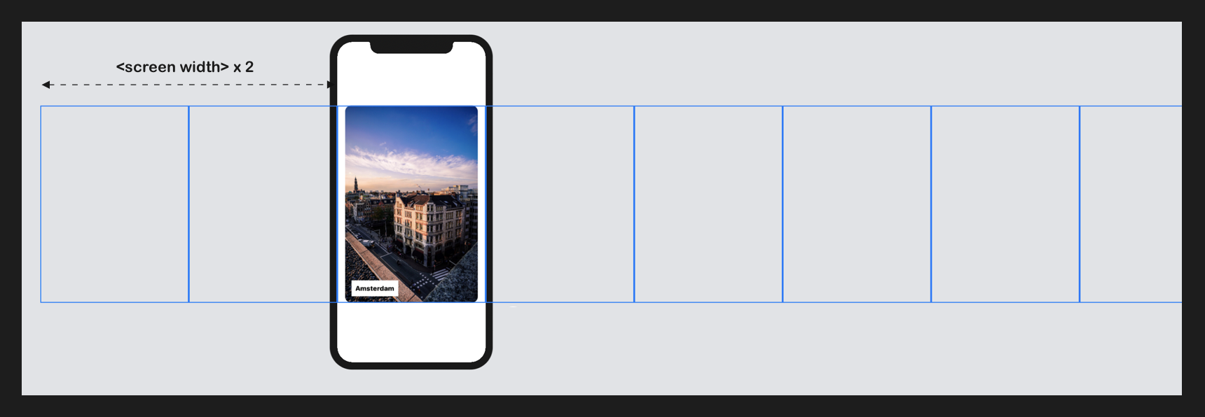
Now that we have created a horizontal stack that defaults to show the first card view, the next question is how do we move the stack to display a particular card?
It's just simple math! The card view's width equals the width of the screen. Suppose the screen width is 300 points and we want to display the third card view, we can shift the horizontal stack to the left by 600 points (300 x 2). Figure 12 shows the result.
To translate the description above into code, we first declare a state variable to keep track of the index of the visible card view:
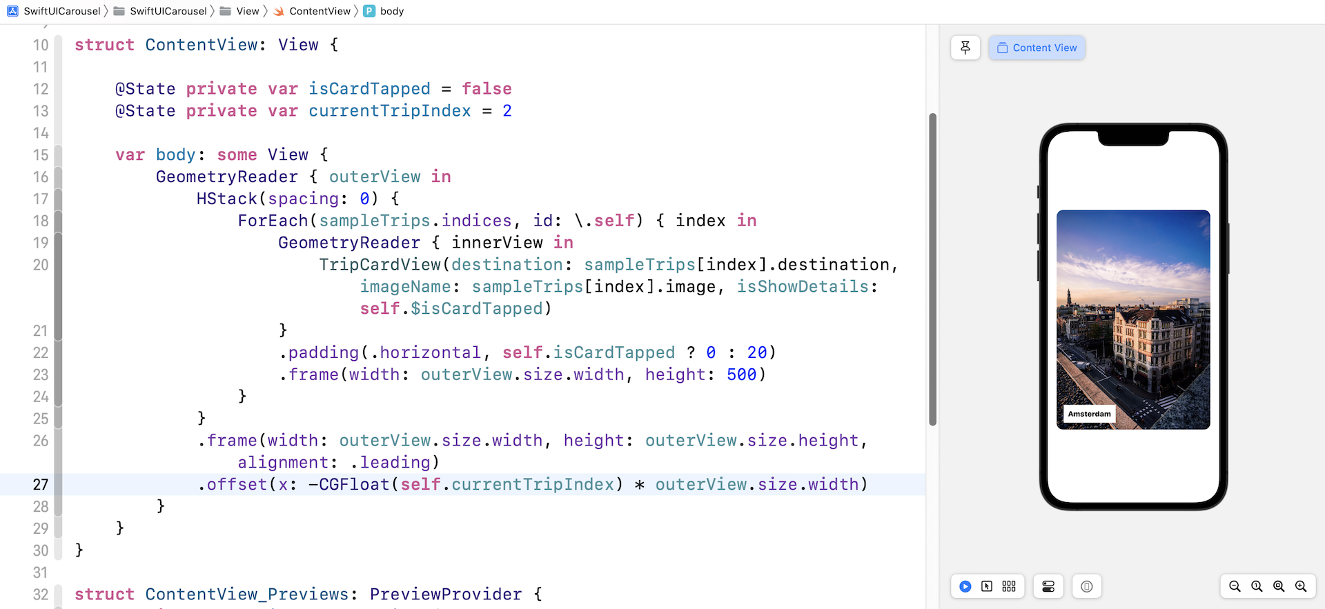
@State private var currentTripIndex = 2
By default, I want to display the third card view. This is why I set the currentTripIndex variable to 2. You can change it to other values.
To move the horizontal stack to the left, we can attach the .offset modifier to the HStack like this:
.offset(x: -CGFloat(self.currentTripIndex) * outerView.size.width)
The outerView's width is actually the width of the screen. In order to display the third card view, as explained before, we need to move the stack by 2 x screen width. This is why we multiply the currentTripIndex with the outerView's width. A negative value for the horizontal offset will shift the stack view to the left.
Once you have made the change, you should see the "Amsterdam" card view in your preview canvas.
Adding the Drag Gesture
With the current implementation, we can change the visible card view by altering the value of currentTripIndex. Remember, the horizontal stack doesn't allow users to drag the view. This is what we are going to implement in this section. I assume you already understand how gestures work in SwiftUI. If you don't understand gestures or @GestureState, please read chapter 17 first.
The drag gesture of the horizontal stack is expected work like this:
- The user can tap the image and start dragging.
- The drag can be in both directions.
- When the drag's distance exceeds a certain threshold, the horizontal stack will move to the next or previous card view depending on the drag direction.
- Otherwise, the stack view returns to the original position and displays the current card view.
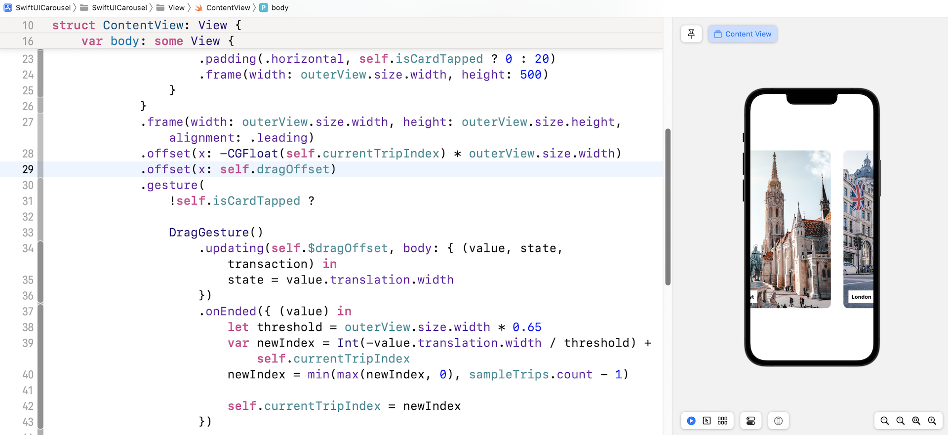
To translate the description above into code, we first declare a variable to hold the drag offset:
@GestureState private var dragOffset: CGFloat = 0
Next, we attach the .gesture modifier to the HStack and initialize a DragGesture like this:
.gesture(
    !self.isCardTapped ?

    DragGesture()
        .updating(self.$dragOffset, body: { (value, state, transaction) in
            state = value.translation.width
        })
        .onEnded({ (value) in
            let threshold = outerView.size.width * 0.65
            var newIndex = Int(-value.translation.width / threshold) + self.currentTripIndex
            newIndex = min(max(newIndex, 0), sampleTrips.count - 1)

            self.currentTripIndex = newIndex
        })

    : nil
)
As you drag the horizontal stack, the updating function is called. We save the horizontal drag distance to the dragOffset variable. When the drag ends, we check if the drag distance exceeds the threshold, which is set to 65% of the screen width, and computes the new index. Once we have the newIndex computed, we verify if it is within the range of the sampleTrips array. Lastly, we assign the value of newIndex to currentTripIndex. SwiftUI will then update the UI and display the corresponding card view automatically.
Please take note that we have a condition for enabling the drag gesture. When the card view is tapped, there is no gesture recognizer.
To move the stack view during the drag, we have to make one more change. Attach an additional .offset modifier to the HStack (right after the previous .offset) like this:
.offset(x: self.dragOffset)
Here, we update the horizontal offset of the stack view to the drag offset. Now you are ready to test the changes. Run the app in a simulator or in the preview canvas. You should be able to drag the stack view. When your drag exceeds the threshold, the stack view shows you the next trip.
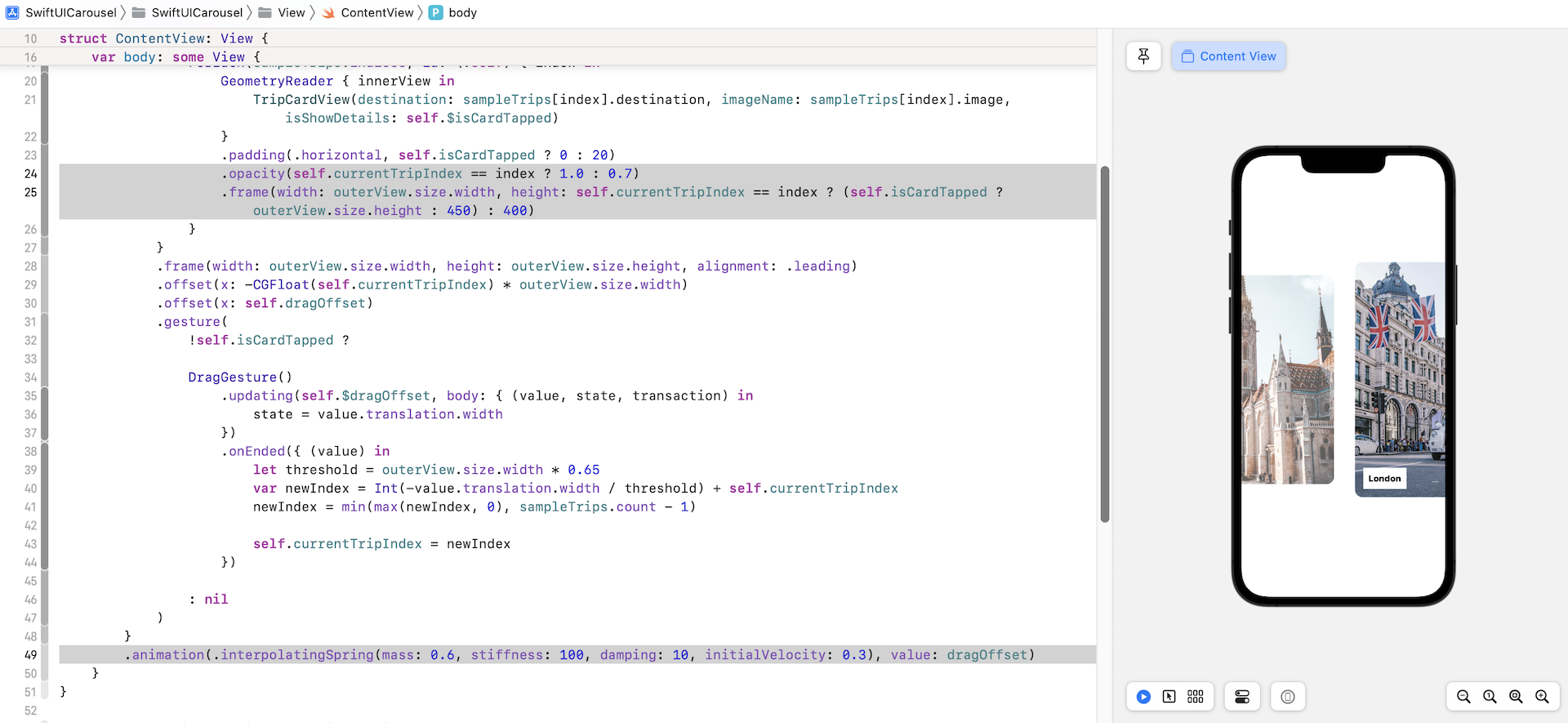
Animating the Card Transition
To improve the user experience, I want to add a nice animation when the app moves from one card view to another. First, modify the following line of code from:
.frame(width: outerView.size.width, height: 500)
To:
.frame(width: outerView.size.width, height: self.currentTripIndex == index ? (self.isCardTapped ? outerView.size.height : 450) : 400)
By updating the code, we make the visible card view a little bit larger than the rest. On top of that, attach the .opacity modifier to the card view like this:
.opacity(self.currentTripIndex == index ? 1.0 : 0.7)
Other than the card view's height, we also want to set a different opacity value for the visible and invisible card views. All these changes are not animated yet. Now insert the following line of code to the outer view's GeometryReader:
.animation(.interpolatingSpring(mass: 0.6, stiffness: 100, damping: 10, initialVelocity: 0.3), value: dragOffset)
SwiftUI will then animate the size and opacity changes of the card views automatically. Run the app in the preview canvas to test out the changes. This is how we implement a scroll view with HStack and add paging support.
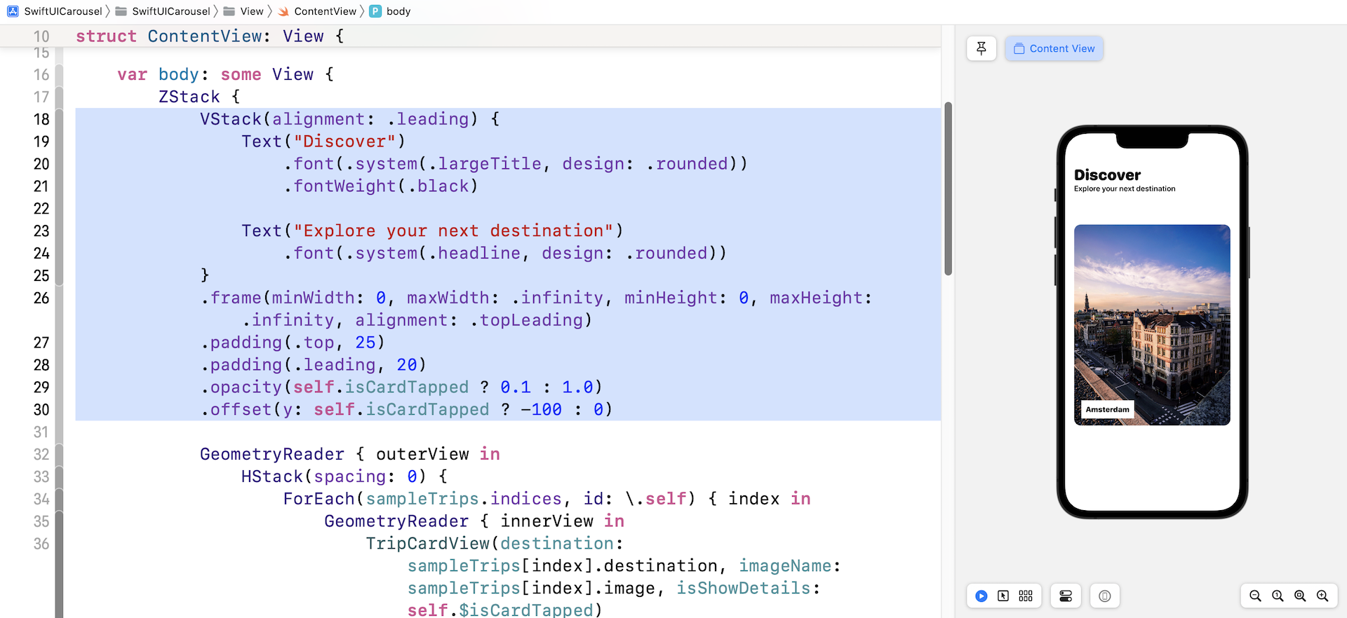
Adding the Title
Now that we have built the image carousel, wouldn't it be great if we implement the detail view to make the demo app more complete? Let's start by adding a title for the app.
Command-click the GeometryReader of the outer view and choose embed in ZStack.
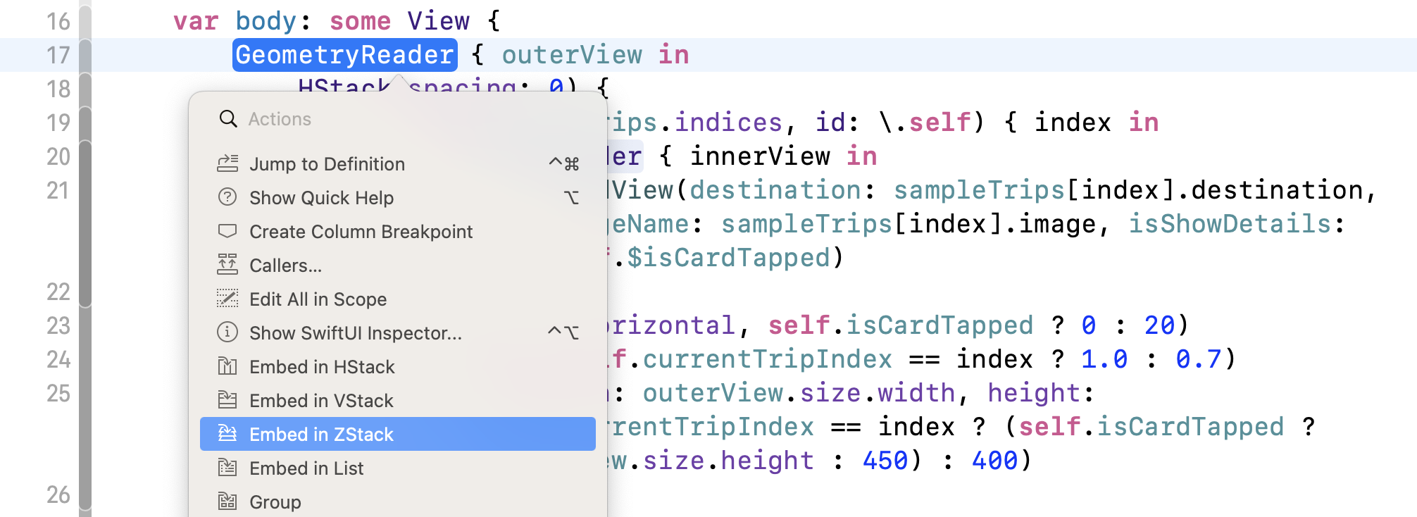
Next, insert the following code at the beginning of ZStack:
VStack(alignment: .leading) {
    Text("Discover")
        .font(.system(.largeTitle, design: .rounded))
        .fontWeight(.black)

    Text("Explore your next destination")
        .font(.system(.headline, design: .rounded))
}
.frame(minWidth: 0, maxWidth: .infinity, minHeight: 0, maxHeight: .infinity, alignment: .topLeading)
.padding(.top, 25)
.padding(.leading, 20)
.opacity(self.isCardTapped ? 0.1 : 1.0)
.offset(y: self.isCardTapped ? -100 : 0)
The code above is self explanatory but I'd like to highlight two lines of code. Both .opacity and .offset are optional. The purpose of the .opacity modifier is to hide the title when the card is tapped. The change to the vertical offset will add a nice touch to the user experience.
Exercise: Working on the Detail View
Let's begin the implementation of the detail view with an exercise. I assume you have some experience with SwiftUI and should be able to create the detail view shown in figure 18. You can create a separate file named TripDetailView.swift and write the code there.
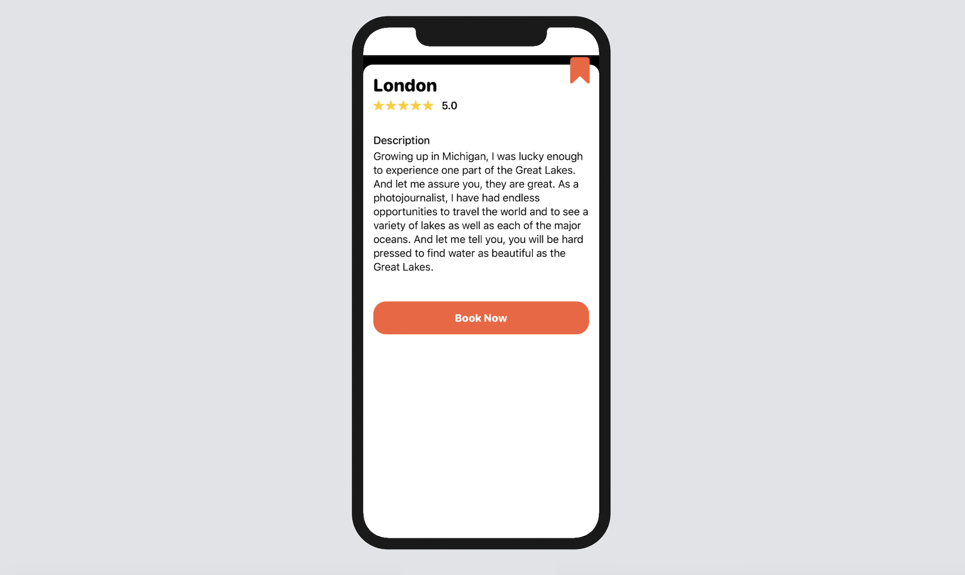
To keep things simple, the rating and description are just dummy data. The same goes for the Book Now button, which is not functional. This detail view only takes in a destination like this:
struct TripDetailView: View {
    let destination: String

    var body: some View {
        .
        .
        .
    }
}
Please take some time to create the detail view. I will walk you through my solution in a later section.
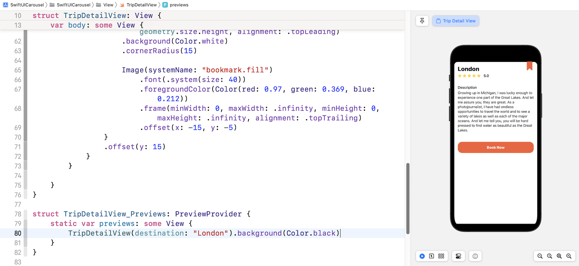
Implementing the Trip Detail View
Were you able to develop the detail view? I hope you tried to complete the exercise. Let me show you my solution. First, create a new file named TripDetailView.swift using the SwiftUI View template.
Next, replace the TripDetailView struct like this:
struct TripDetailView: View {
    let destination: String

    var body: some View {
        GeometryReader { geometry in
            ScrollView {
                ZStack {
                    VStack(alignment: .leading, spacing: 5) {

                        VStack(alignment: .leading, spacing: 5) {
                            Text(self.destination)
                                .font(.system(.title, design: .rounded))
                                .fontWeight(.heavy)

                            HStack(spacing: 3) {
                                ForEach(1...5, id: \.self) { _ in
                                    Image(systemName: "star.fill")
                                        .foregroundColor(.yellow)
                                        .font(.system(size: 15))
                                }

                                Text("5.0")
                                    .font(.system(.headline))
                                    .padding(.leading, 10)
                            }

                        }
                        .padding(.bottom, 30)


                        Text("Description")
                            .font(.system(.headline))
                            .fontWeight(.medium)

                        Text("Growing up in Michigan, I was lucky enough to experience one part of the Great Lakes. And let me assure you, they are great. As a photojournalist, I have had endless opportunities to travel the world and to see a variety of lakes as well as each of the major oceans. And let me tell you, you will be hard pressed to find water as beautiful as the Great Lakes.")
                            .padding(.bottom, 40)

                        Button(action: {
                            // tap me
                        }) {
                            Text("Book Now")
                                .font(.system(.headline, design: .rounded))
                                .fontWeight(.heavy)
                                .foregroundColor(.white)
                                .padding()
                                .frame(minWidth: 0, maxWidth: .infinity)
                                .background(Color(red: 0.97, green: 0.369, blue: 0.212))
                                .cornerRadius(20)
                        }
                    }
                    .padding()
                    .frame(width: geometry.size.width, height: geometry.size.height, alignment: .topLeading)
                    .background(Color.white)
                    .cornerRadius(15)

                    Image(systemName: "bookmark.fill")
                        .font(.system(size: 40))
                        .foregroundColor(Color(red: 0.97, green: 0.369, blue: 0.212))
                        .frame(minWidth: 0, maxWidth: .infinity, minHeight: 0, maxHeight: .infinity, alignment: .topTrailing)
                        .offset(x: -15, y: -5)
                }
                .offset(y: 15)
            }
        }

    }
}
Basically, we embed the whole content in a scroll view. Inside the scroll view, we use a ZStack to layout the content and the bookmark image. Since the TripDetailView requires a valid destination in order to work properly, you need to update the preview code like this:
struct TripDetailView_Previews: PreviewProvider {
    static var previews: some View {
        TripDetailView(destination: "London").background(Color.black)
    }
}
I also changed the background color to black, so that we can see the rounded corners of the detail view.
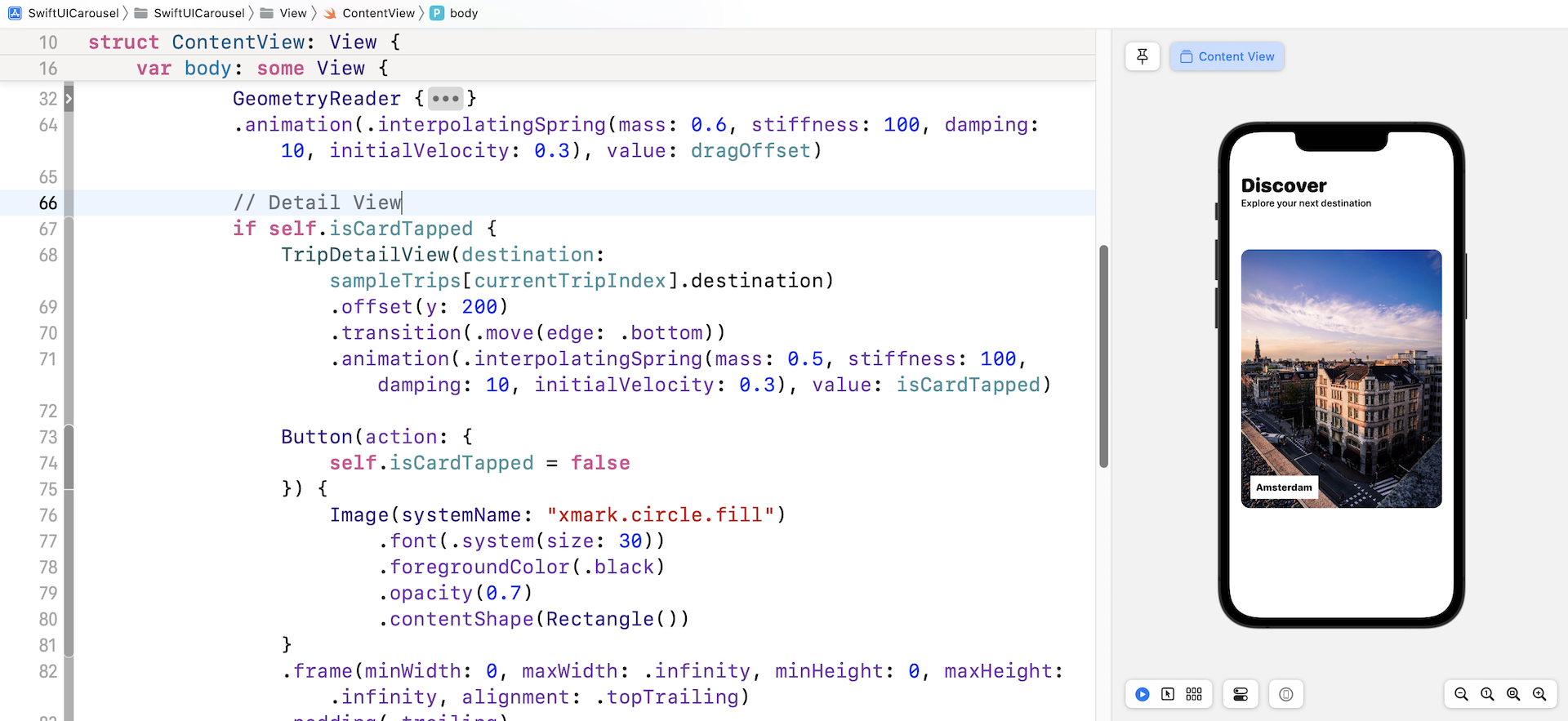
Bringing up the Detail View
Now let's go back to ContentView.swift to bring up the detail view. When a user taps a card view, we will bring up the detail view with an animated transition. Since the content view has a ZStack which wraps its core content, it's very easy for us to integrate with the detail view.
Insert the following code snippet in the ZStack:
if self.isCardTapped {
    TripDetailView(destination: sampleTrips[currentTripIndex].destination)
        .offset(y: 200)
        .transition(.move(edge: .bottom))
        .animation(.interpolatingSpring(mass: 0.5, stiffness: 100, damping: 10, initialVelocity: 0.3))

    Button(action: {
        self.isCardTapped = false
    }) {
        Image(systemName: "xmark.circle.fill")
            .font(.system(size: 30))
            .foregroundColor(.black)
            .opacity(0.7)
            .contentShape(Rectangle())
    }
    .frame(minWidth: 0, maxWidth: .infinity, minHeight: 0, maxHeight: .infinity, alignment: .topTrailing)
    .padding(.trailing)

}
The TripDetailView is only brought up when the card view is tapped. It's expected that the detail view will appear from the bottom of the screen and move upward with an animation. This is why we attach both the .transition and .animation modifiers to the detail view. To let users dismiss the detail view, we also add a close button, which appears at the top-right corner of the screen. In case you are not sure where to insert the code above, please refer to figure 20.
The code won't work yet because we haven't captured the tap gesture. Thus, attach the .onTapGesture function to the card view like this:
.onTapGesture {
    self.isCardTapped = true
}
When someone taps the card view, we simply change the isCardTapped state variable to true. Run the app and tap any of the card views. The app should bring up the detail view.
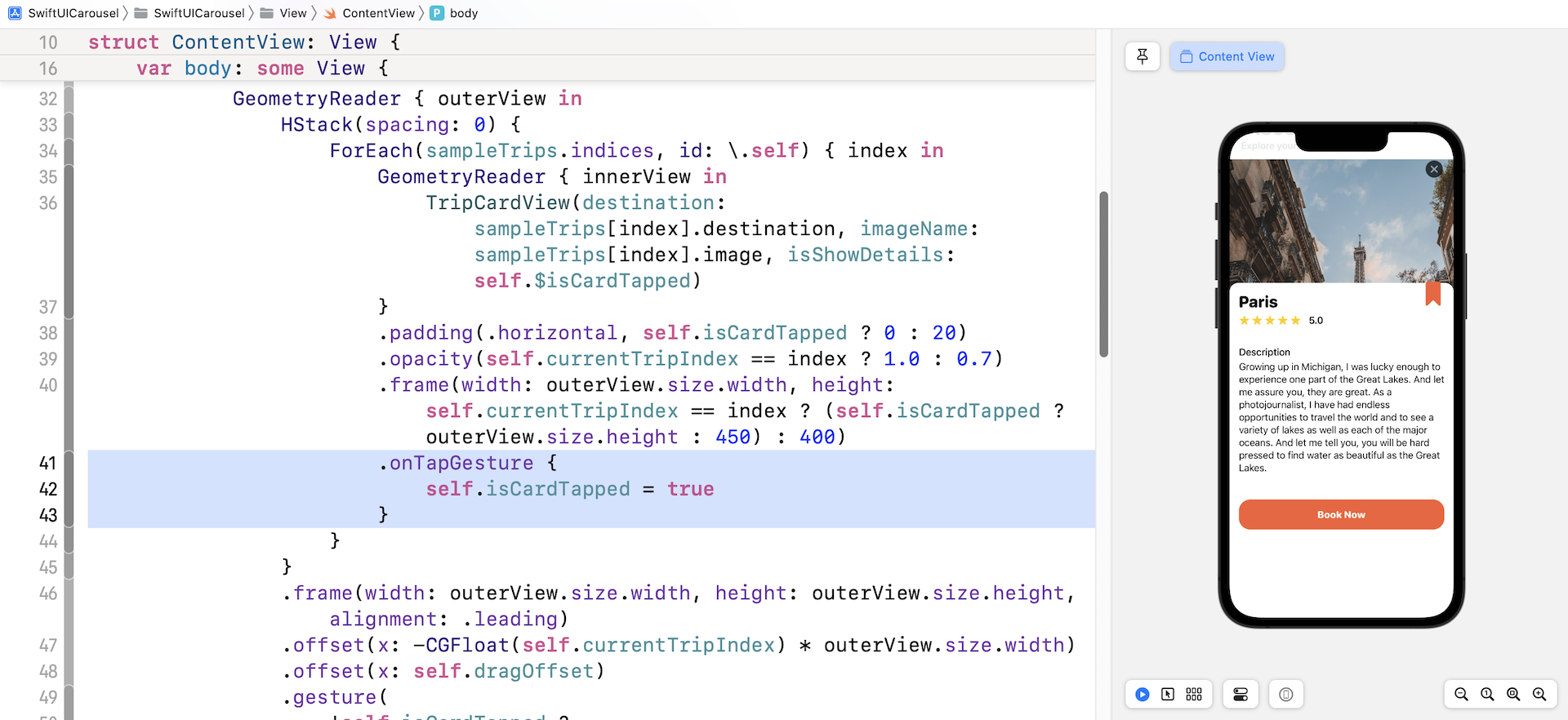
The detail view works! However, the animation doesn't work well. When the detail view is brought up, the card view grows a little bit bigger, which is achieved by the following line of code:
.frame(width: outerView.size.width, height: self.currentTripIndex == index ? (self.isCardTapped ? outerView.size.height : 450) : 400)
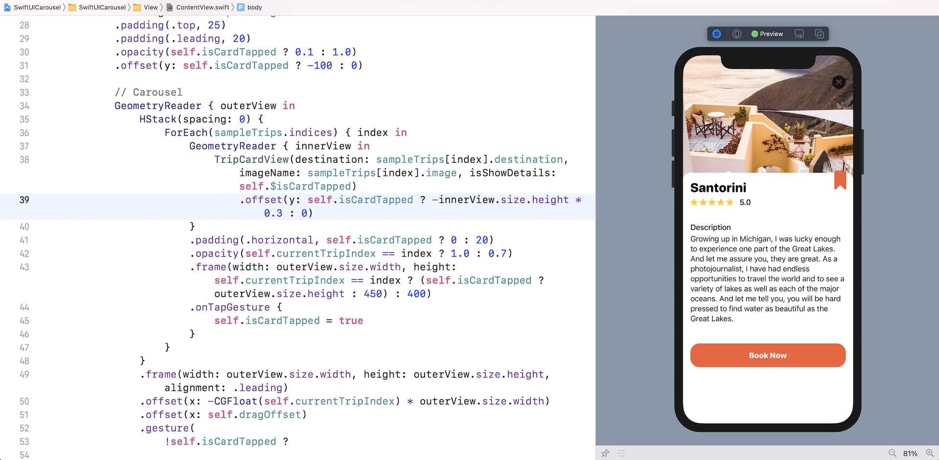
To make the animation look better, let's move the image upward when the detail view appears. Attach the .offset modifier to TripCardView:
.offset(y: self.isCardTapped ? -innerView.size.height * 0.3 : 0)
I set the vertical offset to 30% of the card view's height. You are free to change the value. Now run the app again and you should see a more slick animation.
Summary
Great! You've built a custom scroll view with paging support and learned how to bring up a detail view with animated transition. This technique is not limited to to an image carousel. In fact, you can modify the code to create a set of onboarding screens. I hope you love what you learned in this chapter and will apply it to your next app project.
For reference, you can download the complete carousel project here: