- Made by AppCoda
- Contact us / Support
- Tweet this book
- Preface
- 1. Introduction to SwiftUI
- 2. Getting Started with SwiftUI and Working with Text
- 3. Working with Images
- 4. Layout User Interfaces with Stacks
- 5. Understanding ScrollView and Building a Carousel UI
- 6. Working with SwiftUI Buttons and Gradient
- 7. Understanding State and Binding
- 8. Implementing Path and Shape for Line Drawing and Pie Charts
- 9. Basic Animations and Transitions
- 10. Understanding Dynamic List, ForEach and Identifiable
- 11. Working with Navigation UI and Navigation Bar Customization
- 12. Playing with Modal Views, Floating Buttons and Alerts
- 13. Building a Form with Picker, Toggle and Stepper
- 14. Data Sharing with Combine and Environment Objects
- 15. Building a Registration Form with Combine and View Model
- 16. Working with Swipe-to-Delete, Context Menu and Action Sheets
- 17. Using Gestures
- 18. Displaying an Expandable Bottom Sheet Using Presentation Detents
- 19. Creating a Tinder-like UI with Gestures and Animations
- 20. Creating an Apple Wallet like Animation and View Transition
- 21. Working with JSON, Slider and Data Filtering
- 22. Building a ToDo app with Core Data
- 23. Integrating UIKit with SwiftUI Using UIViewRepresentable
- 24. Creating a Search Bar View and Working with Custom Binding
- 25. Putting Everything Together to Build a Real World App
- 26. Creating an App Store like Animated View Transition
- 27. Building an Image Carousel
- 28. Building an Expandable List View Using OutlineGroup
- 29. Building Grid Layout Using LazyVGrid and LazyHGrid
- 30. Creating an Animated Activity Ring with Shape and Animatable
- 31. Working with AnimatableModifier and LibraryContentProvider
- 32. Working with TextEditor to Create Multiline Text Fields
- 33. Using matchedGeometryEffect to Create View Animations
- 34. ScrollViewReader and Grid Animation
- 35. Working with Tab View and Tab Bar Customization
- 36. Using AsyncImage in SwiftUI for Loading Images Asynchronously
- 37. Implementing Search Bar Using Searchable
- 38. Creating Bar Charts and Line Charts with the Charts Framework
- 39. Capturing Text within Image Using Live Text APIs
- 40. How to Use ShareLink for Sharing Data Like Text and Photos
- 41. Using ImageRenderer to Convert SwiftUI Views into Images
- 42. Creating PDF Documents Using ImageRenderer
- 43. Using Gauge to Display Progress and Create a Speedometer
- 44. Creating Grid Layout Using Grid APIs
- 45. Switching Layout with AnyLayout
- Published with GitBook
Chapter 38
Creating Bar Charts and Line Charts with the Charts Framework
You no longer need to build your own chart library or rely on third-party libraries to create charts. The SwiftUI framework now comes with the Charts APIs. With the brand new Charts framework in iOS 16, you can present animated charts with just a few lines of code.
Building a Simple Bar Chart
The Charts framework is very simple to use. In brief, you build SwiftUI Charts by defining what it calls Mark. Here is a quick example:
import SwiftUI
import Charts

struct ContentView: View {
    var body: some View {
        Chart {
            BarMark(
                x: .value("Day", "Monday"),
                y: .value("Steps", 6019)
            )

            BarMark(
                x: .value("Day", "Tuesday"),
                y: .value("Steps", 7200)
            )
        }
    }
}
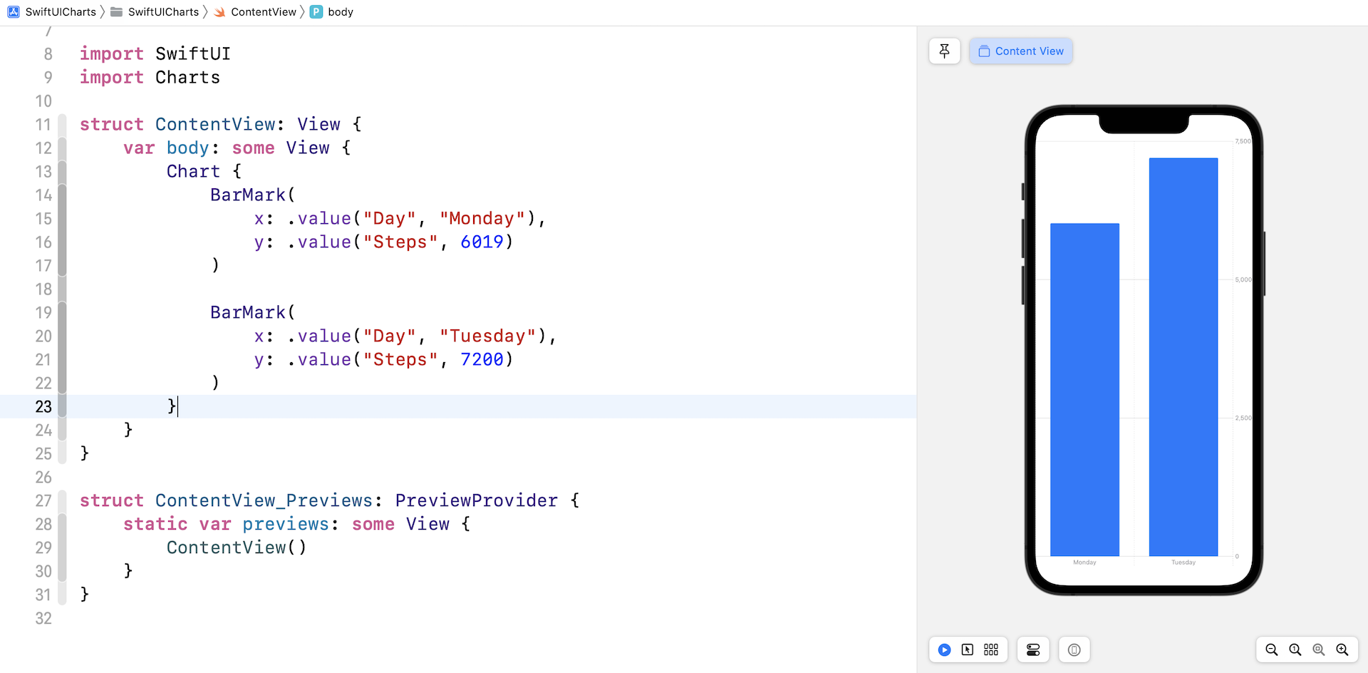
Whether you want to create a bar chart or line chart, we start with the Chart view. In the chart view, we define the bar marks to provide the chart data. The BarMark view is used for creating a bar chart. Each BarMark view accepts the x and y value. The x value is used for defining the chart data for x-axis. In the code above, the label of the x-axis is set to Day. The y axis shows the total number of steps.
If you input the code in Xode 14, the preview automatically displays the bar chart with two vertical bars.
The code above shows you the simplest way to create a bar chart. However, instead of hardcoding the chart data, you usually use the Charts API with a collection of data. Here is an example:
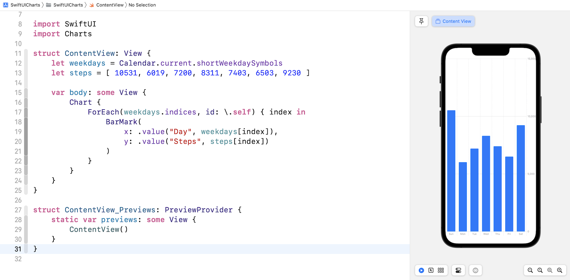
struct ContentView: View {
    let weekdays = Calendar.current.shortWeekdaySymbols
    let steps = [ 10531, 6019, 7200, 8311, 7403, 6503, 9230 ]

    var body: some View {
        Chart {
            ForEach(weekdays.indices, id: \.self) { index in
                BarMark(x: .value("Day", weekdays[index]), y: .value("Steps", steps[index]))
            }
        }
    }
}
We created two arrays (weekdays and steps) for the chart data. In the Chart view, we loop through the weekdays array and present the chart data. If you've written the code in your Xcode project, the preview should render the bar chart as shown in figure 2.
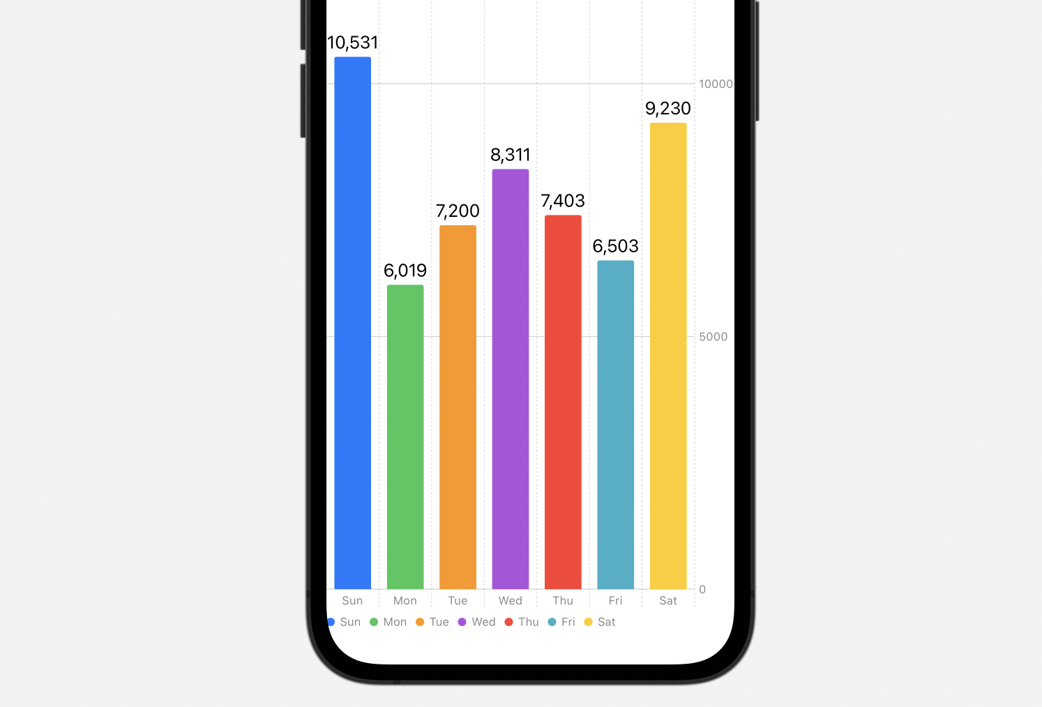
By default, the Charts API renders the bars in the same color. To display a different color for each of the bars, you can attach the foregroundStyle modifier to the BarMark view:
.foregroundStyle(by: .value("Day", weekdays[index]))
To add an annotation to each bar, you use the annotation modifier like this:
.annotation {
    Text("\(steps[index])")
}
By making these changes, the bar chart becomes more visually appealing.
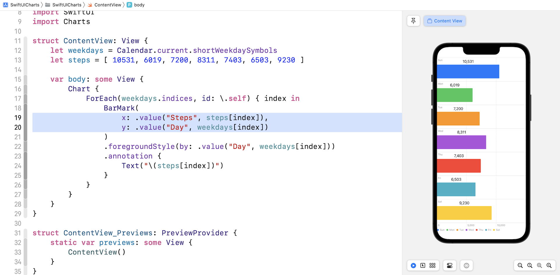
To create a horizontal bar chart, you can simply swap the values of x and y parameter of the BarMark view.
Creating a Line Chart
Now that you understand how to create a bar chart, let's see how to create a line chart using the Chart framework. As a demo, we will create a line chart that displays the average temperature of Hong Kong, Taipei, and London from 2021-Jul to 2022-Jun.
To store the weather data, I created a WeatherData struct. In your Xcode project, create a new file named WeatherData using the Swift File template. Insert the following code in the file:
struct WeatherData: Identifiable {
    let id = UUID()
    let date: Date
    let temperature: Double

    init(year: Int, month: Int, day: Int, temperature: Double) {
        self.date = Calendar.current.date(from: .init(year: year, month: month, day: day)) ?? Date()
        self.temperature = temperature
    }
}

let hkWeatherData = [
  WeatherData(year: 2021, month: 7, day: 1, temperature: 30.0),
  WeatherData(year: 2021, month: 8, day: 1, temperature: 29.0),
  WeatherData(year: 2021, month: 9, day: 1, temperature: 30.0),
  WeatherData(year: 2021, month: 10, day: 1, temperature: 26.0),
  WeatherData(year: 2021, month: 11, day: 1, temperature: 23.0),
  WeatherData(year: 2021, month: 12, day: 1, temperature: 19.0),
  WeatherData(year: 2022, month: 1, day: 1, temperature: 18.0),
  WeatherData(year: 2022, month: 2, day: 1, temperature: 15.0),
  WeatherData(year: 2022, month: 3, day: 1, temperature: 22.0),
  WeatherData(year: 2022, month: 4, day: 1, temperature: 24.0),
  WeatherData(year: 2022, month: 5, day: 1, temperature: 26.0),
  WeatherData(year: 2022, month: 6, day: 1, temperature: 29.0)
]

let londonWeatherData = [
  WeatherData(year: 2021, month: 7, day: 1, temperature: 19.0),
  WeatherData(year: 2021, month: 8, day: 1, temperature: 17.0),
  WeatherData(year: 2021, month: 9, day: 1, temperature: 17.0),
  WeatherData(year: 2021, month: 10, day: 1, temperature: 13.0),
  WeatherData(year: 2021, month: 11, day: 1, temperature: 8.0),
  WeatherData(year: 2021, month: 12, day: 1, temperature: 8.0),
  WeatherData(year: 2022, month: 1, day: 1, temperature: 5.0),
  WeatherData(year: 2022, month: 2, day: 1, temperature: 8.0),
  WeatherData(year: 2022, month: 3, day: 1, temperature: 9.0),
  WeatherData(year: 2022, month: 4, day: 1, temperature: 11.0),
  WeatherData(year: 2022, month: 5, day: 1, temperature: 15.0),
  WeatherData(year: 2022, month: 6, day: 1, temperature: 18.0)
]

let taipeiWeatherData = [
  WeatherData(year: 2021, month: 7, day: 1, temperature: 31.0),
  WeatherData(year: 2021, month: 8, day: 1, temperature: 30.0),
  WeatherData(year: 2021, month: 9, day: 1, temperature: 30.0),
  WeatherData(year: 2021, month: 10, day: 1, temperature: 26.0),
  WeatherData(year: 2021, month: 11, day: 1, temperature: 22.0),
  WeatherData(year: 2021, month: 12, day: 1, temperature: 19.0),
  WeatherData(year: 2022, month: 1, day: 1, temperature: 17.0),
  WeatherData(year: 2022, month: 2, day: 1, temperature: 17.0),
  WeatherData(year: 2022, month: 3, day: 1, temperature: 21.0),
  WeatherData(year: 2022, month: 4, day: 1, temperature: 23.0),
  WeatherData(year: 2022, month: 5, day: 1, temperature: 24.0),
  WeatherData(year: 2022, month: 6, day: 1, temperature: 27.0)
]
The Chart initializer takes in a list of Identifiable objects. This is why we make the WeatherData conform the Identifiable protocol. For each city, we create an array to store the sample weather data.
In the project navigator, create a new file named SimpleLineChartView using the SwiftUI View template. To create any types of chart using the Charts framework, you have to first import the Chartsframework:
import Charts
Declare a variable to store the sample weather data for the cities:
let chartData = [ (city: "Hong Kong", data: hkWeatherData),
                  (city: "London", data: londonWeatherData),
                  (city: "Taipei", data: taipeiWeatherData) ]
In the body variable, update the code like this to create the line chart:
VStack {
    Chart {
        ForEach(hkWeatherData) { item in
            LineMark(
                x: .value("Month", item.date),
                y: .value("Temp", item.temperature)
            )
        }
    }
    .frame(height: 300)
}
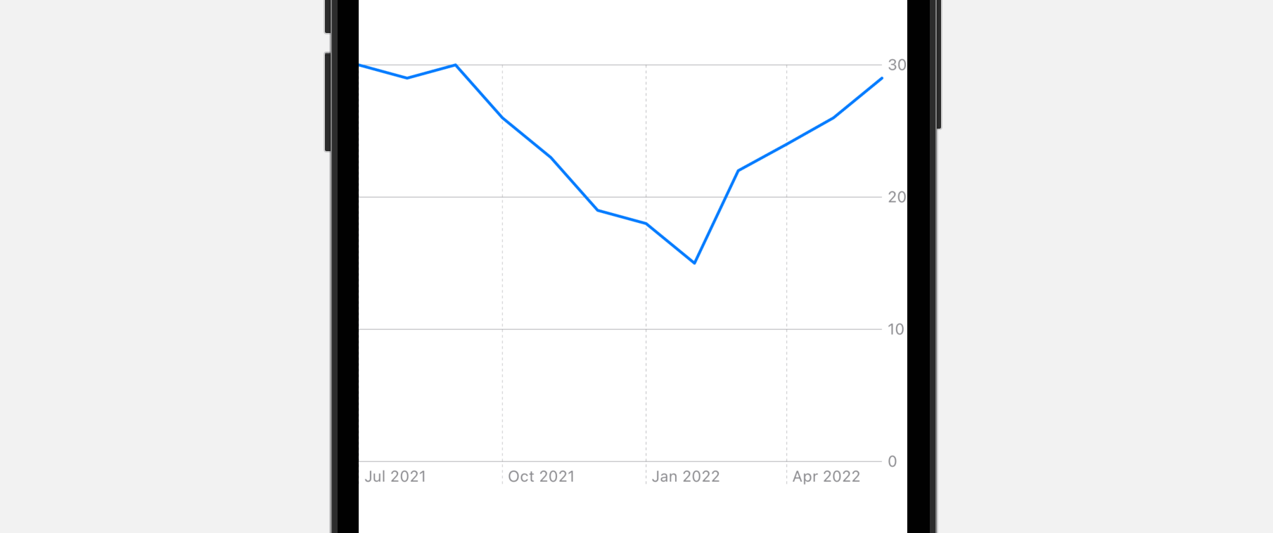
What the code above does is to plot a line chart for displaying the average temperature of Hong Kong. The ForEach statement loops through all items stored in hkWeatherData. For each item, we create a LineMark object that the x axis is set to the date and the y axis is set to the average temperature.
Optionally, you can resize the chart using the frame modifier. If you preview the code in Xcode preview, you should see the line chart in figure 5.
Customizing Chart Axes
You can customize both x and y axes by using the chartXAxis and chartYAxis modifiers respectively. Let's say, if we want to display the month labels using the digit format, we can attach the chartXAxis modifier to the Chart view like this:
.chartXAxis {
    AxisMarks(values: .stride(by: .month)) { value in
        AxisGridLine()
        AxisValueLabel(format: .dateTime.month(.defaultDigits))
    }
}
Inside chartXAxis , we create a visual mark called AxisMarks for the values of month. For each value, we display a value label by using a specific format. This line of code tells SwiftUI chart to use the digit format:
.dateTime.month(.defaultDigits)
On top of that, we added some grid lines by using AxisGridLine.
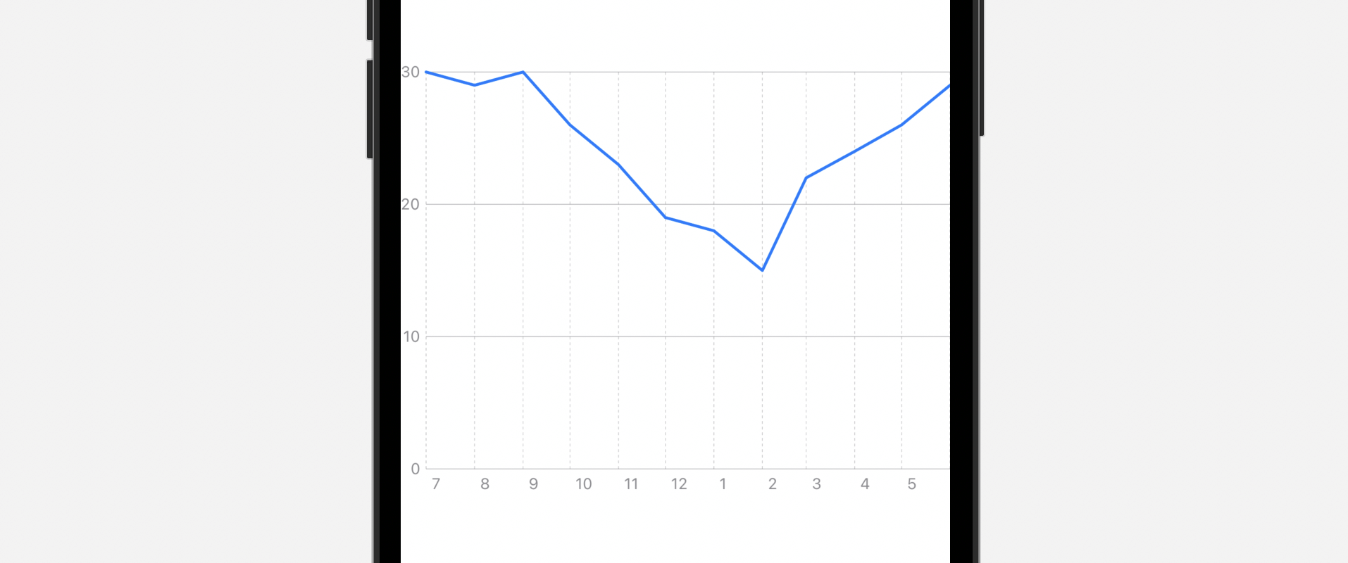
For the y-axis, instead of display the axis on the trailing (or right) side, we want to switch it to the leading (or left) side. To do that, attach the chartYAxis modifier like this:
.chartYAxis {
    AxisMarks(position: .leading)
}
If you've made the change, Xcode preview should update the chart like figure 6. The y-axis is moved to the left side and the format of month is changed. Plus, you should see some grid lines.
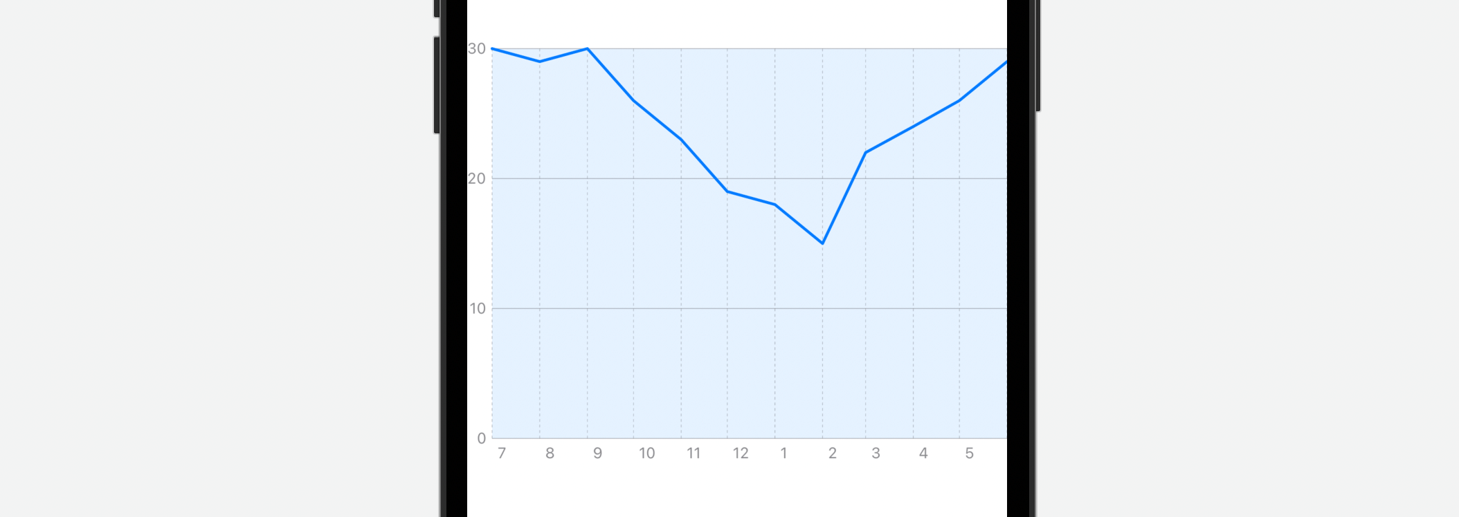
Customizing the Background Color of the Plot Area
The chartPlotStyle modifier allows you to change the background color of the plot area. Attach the modifier to the Chart view like this:
.chartPlotStyle { plotArea in
    plotArea
        .background(.blue.opacity(0.1))
}
We can then change the plot area using the background modifier. As an example, we change the plot area to light blue.
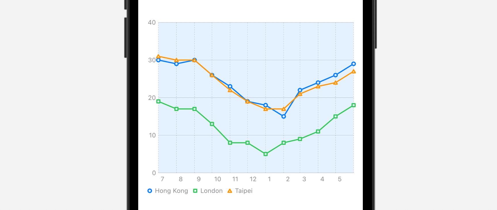
Creating a Multi-line Chart
Now that the chart displays a single source of data (i.e. the weather data of Hong Kong), how can we display the weather data of London and Taipei in the same line chart?
You can rewrite the code of Chart view like this:
Chart {
    ForEach(chartData, id: \.city) { series in
        ForEach(series.data) { item in
            LineMark(
                x: .value("Month", item.date),
                y: .value("Temp", item.temperature)
            )
        }
        .foregroundStyle(by: .value("City", series.city))
    }
}
We have another ForEach to loop through all the cities of the chart data. Here, the foregroundStyle modifier is used to apply a different color for each line. You don't have to specify the color. SwiftUI will automatically pick the color for you.
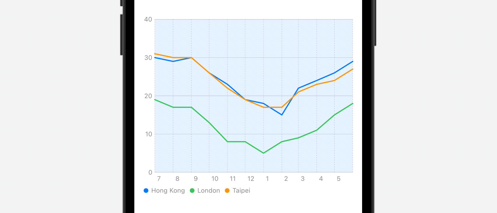
Right now, all the cities share the same symbol. If you want to use a distinct symbol, place the following line of code after foregroundStyle:
.symbol(by: .value("City", series.city))
Now each city has its own symbol in the line chart.
Customizing the Interpolation Method
You can alter the interpolation method of the line chart by attaching the interpolationMethod modifier to LineMark. Here is an example:
.interpolationMethod(.stepStart)
If you change the interpolation method to .stepStart, the line chart now looks like that displayed in figure 10.
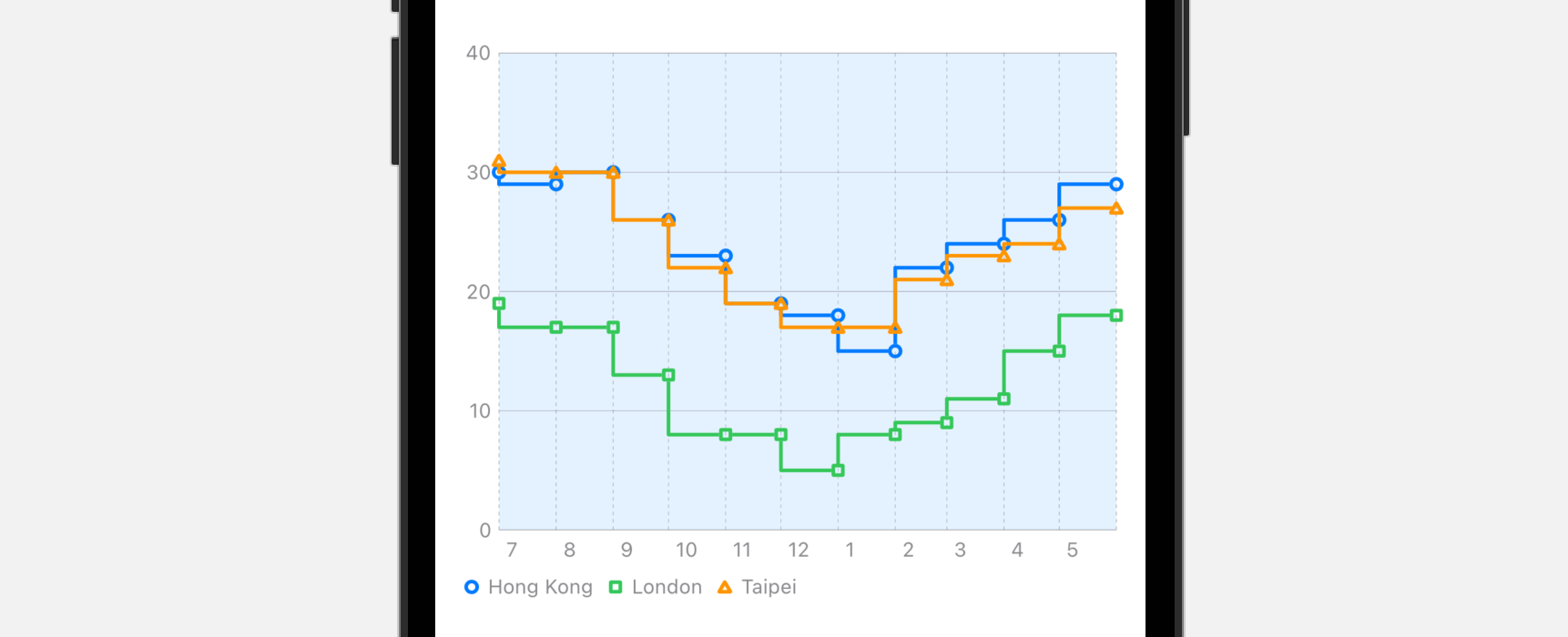
Other than .stepStart, you can try out the following options:
- cardinal
- catmullRom
- linear
- monotone
- stepCenter
- stepEnd
Summary
The Charts framework is a great addition to SwiftUI. Even if you just begin learning SwiftUI, you can create delightful charts with a few lines of code. While this chapter focuses on line charts and bar charts, the Charts API makes it very easy for developers to convert the chart to other forms such as scatter plots. You can check out the Swift Charts documentation for further reading.
For reference, you can download the complete project here:
- Demo project (https://www.appcoda.com/resources/swiftui4/SwiftUICharts.zip)