- Made by AppCoda
- Contact us / Support
- Tweet this book
- Preface
- 1. Introduction to SwiftUI
- 2. Getting Started with SwiftUI and Working with Text
- 3. Working with Images
- 4. Layout User Interfaces with Stacks
- 5. Understanding ScrollView and Building a Carousel UI
- 6. Working with SwiftUI Buttons and Gradient
- 7. Understanding State and Binding
- 8. Implementing Path and Shape for Line Drawing and Pie Charts
- 9. Basic Animations and Transitions
- 10. Understanding Dynamic List, ForEach and Identifiable
- 11. Working with Navigation UI and Navigation Bar Customization
- 12. Playing with Modal Views, Floating Buttons and Alerts
- 13. Building a Form with Picker, Toggle and Stepper
- 14. Data Sharing with Combine and Environment Objects
- 15. Building a Registration Form with Combine and View Model
- 16. Working with Swipe-to-Delete, Context Menu and Action Sheets
- 17. Using Gestures
- 18. Displaying an Expandable Bottom Sheet Using Presentation Detents
- 19. Creating a Tinder-like UI with Gestures and Animations
- 20. Creating an Apple Wallet like Animation and View Transition
- 21. Working with JSON, Slider and Data Filtering
- 22. Building a ToDo app with Core Data
- 23. Integrating UIKit with SwiftUI Using UIViewRepresentable
- 24. Creating a Search Bar View and Working with Custom Binding
- 25. Putting Everything Together to Build a Real World App
- 26. Creating an App Store like Animated View Transition
- 27. Building an Image Carousel
- 28. Building an Expandable List View Using OutlineGroup
- 29. Building Grid Layout Using LazyVGrid and LazyHGrid
- 30. Creating an Animated Activity Ring with Shape and Animatable
- 31. Working with AnimatableModifier and LibraryContentProvider
- 32. Working with TextEditor to Create Multiline Text Fields
- 33. Using matchedGeometryEffect to Create View Animations
- 34. ScrollViewReader and Grid Animation
- 35. Working with Tab View and Tab Bar Customization
- 36. Using AsyncImage in SwiftUI for Loading Images Asynchronously
- 37. Implementing Search Bar Using Searchable
- 38. Creating Bar Charts and Line Charts with the Charts Framework
- 39. Capturing Text within Image Using Live Text APIs
- 40. How to Use ShareLink for Sharing Data Like Text and Photos
- 41. Using ImageRenderer to Convert SwiftUI Views into Images
- 42. Creating PDF Documents Using ImageRenderer
- 43. Using Gauge to Display Progress and Create a Speedometer
- 44. Creating Grid Layout Using Grid APIs
- 45. Switching Layout with AnyLayout
- Published with GitBook
Chapter 30
Creating an Animated Activity Ring with Shape and Animatable
The built-in Activity app uses three circular progress bars to show your progress of Move, Exercise, and Stand. This kind of progress bar is known as an activity ring. Take a look at figure 1 if you haven't used the Activity app or you don't know what an activity ring is. Apple Watch has played a big part in making this round progress bar a popular UI pattern.
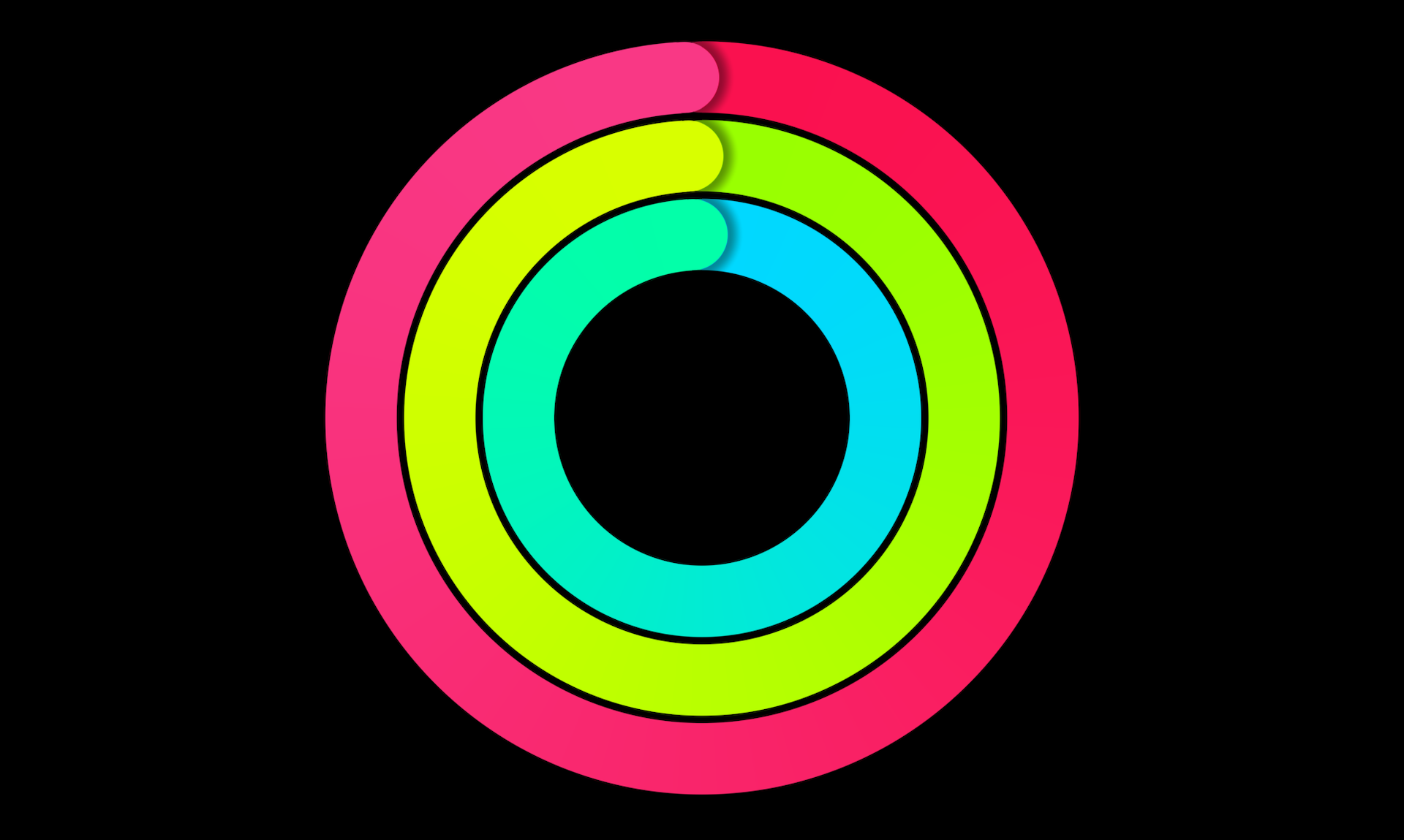
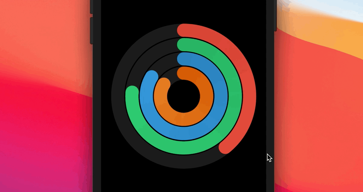
In this chapter, we will look into its implementation and build a similar activity ring in SwiftUI. Our goal is not just to create a static activity ring. It will be an animated one that shows progress changes like that shown in figure 2. Or you can check out the demo video at https://link.appcoda.com/progressring.
Creating a New Project
Let's create a new project to build the progress indicator. As usual, you use the App template for the project. Name it SwiftUIProgressRing or whatever name you like.
To organize our code better, create a new file using the SwiftUI view template and name it ProgressRingView.swift. Once created, Xcode should generate the file with the following code:
import SwiftUI

struct ProgressRingView: View {
    var body: some View {
        Text("Hello, World!")
    }
}

struct ProgressRingView_Previews: PreviewProvider {
    static var previews: some View {
        ProgressRingView()
    }
}
Dissecting the Activity Ring
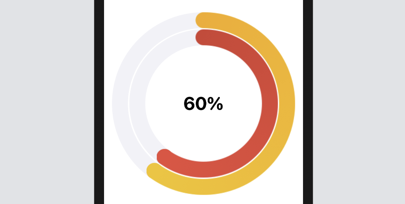
Before we dive into the implementation, take a look at figures 1 and 2 again. You should find that an activity ring is actually composed of two or more circular progress bars. So, what we need to build is a circular progress bar view and that should be flexible enough to display a certain percentage value and allow the user to adjust the bar width and color.
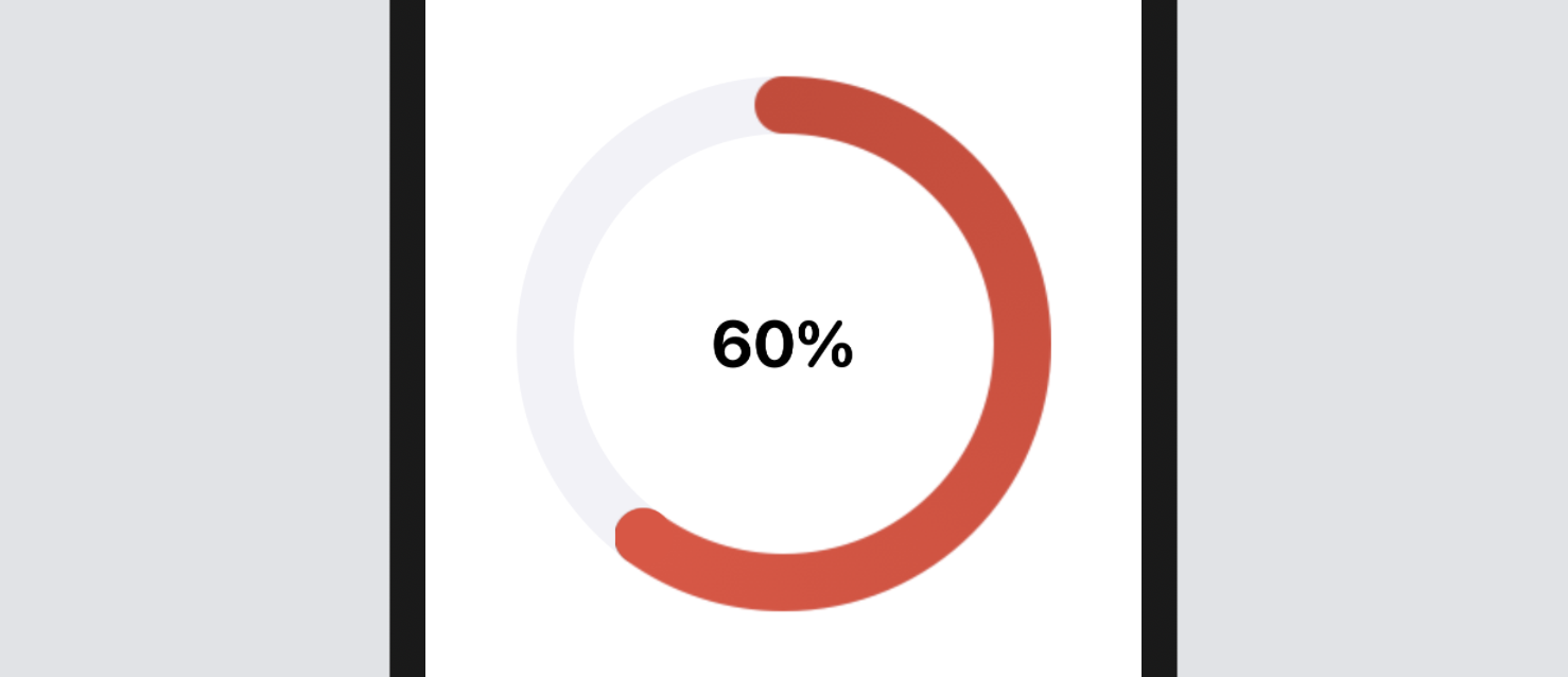
For example, if you tell the bar view to display 60% progress in red and set its width to 250 points. The circular progress view should show something like this:
By building a flexible circular progress bar view, it is very easy to create an activity ring. For example, we can overlay another circular progress bar with bigger size & different color on top of the one shown in figure 4 to become an activity ring.
That's how we are going to build the activity ring. Now let's begin to implement the circular progress bar.
Preparing the Color Extension
As mentioned, the circular progress bar that we are going to implement can support multiple colors and gradients. For demo and convenience purposes, we will prepare a set of default colors by using a Color extension. In the project navigator, right click SwiftUIProgressRing and choose New file.... Select the Swift file template and name the file Color+Ext.swift. Replace the file content with the following code:
import SwiftUI

extension Color {

    public init(red: Int, green: Int, blue: Int, opacity: Double = 1.0) {
        let redValue = Double(red) / 255.0
        let greenValue = Double(green) / 255.0
        let blueValue = Double(blue) / 255.0

        self.init(red: redValue, green: greenValue, blue: blueValue, opacity: opacity)
    }

    public static let lightRed = Color(red: 231, green: 76, blue: 60)
    public static let darkRed = Color(red: 192, green: 57, blue: 43)
    public static let lightGreen = Color(red: 46, green: 204, blue: 113)
    public static let darkGreen = Color(red: 39, green: 174, blue: 96)
    public static let lightPurple = Color(red: 155, green: 89, blue: 182)
    public static let darkPurple = Color(red: 142, green: 68, blue: 173)
    public static let lightBlue = Color(red: 52, green: 152, blue: 219)
    public static let darkBlue = Color(red: 41, green: 128, blue: 185)
    public static let lightYellow = Color(red: 241, green: 196, blue: 15)
    public static let darkYellow = Color(red: 243, green: 156, blue: 18)
    public static let lightOrange = Color(red: 230, green: 126, blue: 34)
    public static let darkOrange = Color(red: 211, green: 84, blue: 0)
    public static let purpleBg = Color(red: 69, green: 51, blue: 201)
}
In the code above, we create an init method which takes in the values of red, green, and blue. This makes it easier to initialize an instance of Color with an RGB color code. All the colors are derived from the flat color palette (https://flatuicolors.com/palette/defo). If you prefer to use other colors, you can simply modify the color values or create your own color constants.
Implementing the Circular Progress Bar
Referring to figure 4, a circular progress bar literally consists of two circles: a full circle in gray underneath and another partial ( or full) circle in gradient color on top. Thus, to implement the progress bar, we need a ZStack to overlay two views:
- A circle view in gray
- A ring shape in gradient color sitting on top of #1
Now open ProgressRingView.swift and declare the following variables:
var thickness: CGFloat = 30.0
var width: CGFloat = 250.0
Since this circular progress bar should support various sizes, we declare the variables above with default values. As the name suggests, the thickness variable controls the thickness of the progress bar. The width variable stores the diameter of the circle.
You can create the circle view using the built-in Circle shape like this:
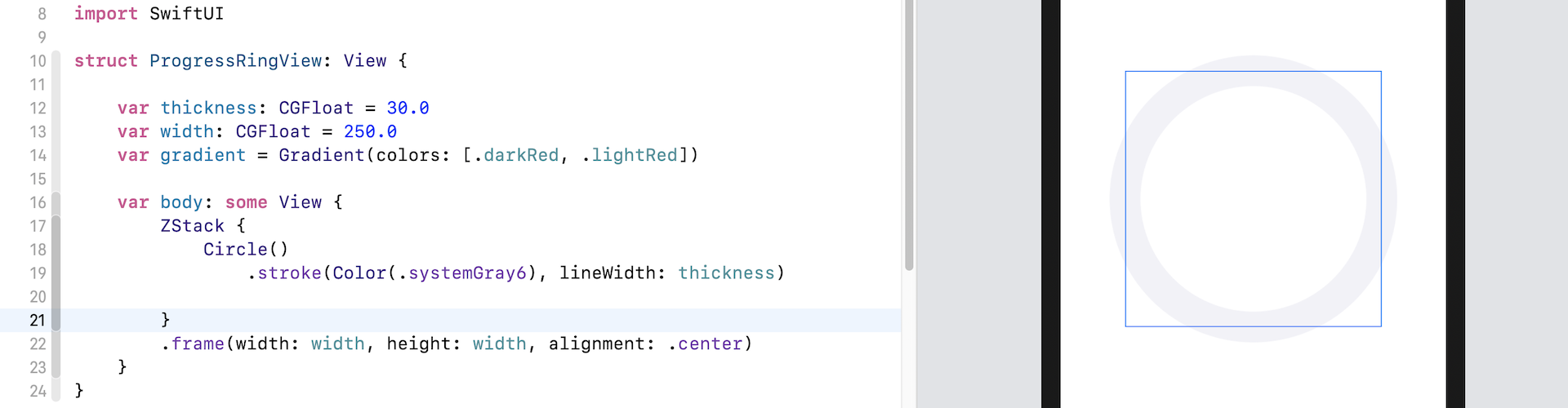
We use the stroke modifier to draw the outline of the circle in gray. As you can see in the figure, the thickness property is used to control the width of the outline. The width property is the diameter of the circle. I intentionally highlight the frame, so that you can see the thickness and width.
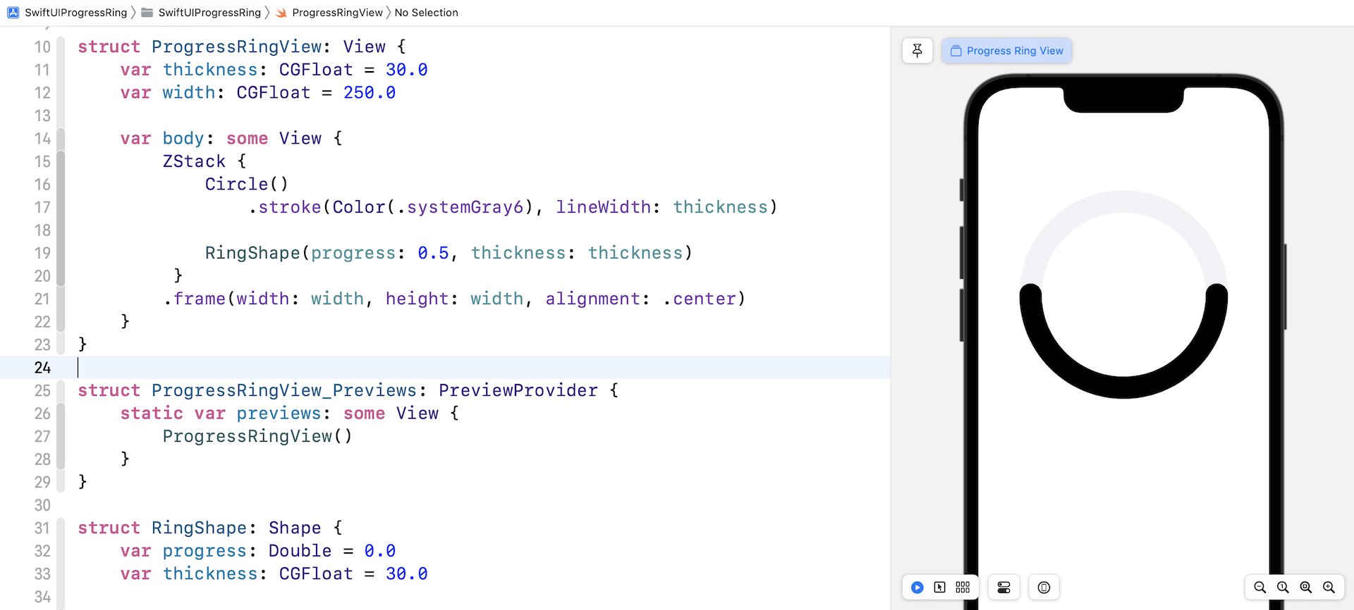
Next, we are going to implement the ring shape. One way to create this ring shape is by using Circle. We have discussed drawing circles in chapter 8. This time, let me show you an alternate implementation. We will use the Shape protocol to create a custom Ring shape.
In the same file, insert the following code:
struct RingShape: Shape {
    var progress: Double = 0.0
    var thickness: CGFloat = 30.0

    func path(in rect: CGRect) -> Path {

        var path = Path()

        path.addArc(center: CGPoint(x: rect.width / 2.0, y: rect.height / 2.0),
                    radius: min(rect.width, rect.height) / 2.0,
                    startAngle: .degrees(0),
                    endAngle: .degrees(360 * progress), clockwise: false)

        return path.strokedPath(.init(lineWidth: thickness, lineCap: .round))
    }
}
We create a RingShape struct by adopting the Shape protocol. We declare two properties in the struct. The progress property allows the user to specify the percentage of progress. The thickness property, similar to that in ProgressRingView, lets you control the width of the ring.
To draw the ring, we use the addArc method, followed by strokedPath. The radius of the arc can be calculated by dividing the frame's width (or height) by 2. The starting angle is currently set to zero degrees. We calculate the ending angle by multiplying 360 with the progress value. For example, if we set the progress to 0.5, we draw a half ring (from 0 to 180 degrees).
To use the RingShape, you can update the body variable like this:
ZStack {
    Circle()
        .stroke(Color(.systemGray6), lineWidth: thickness)

    RingShape(progress: 0.5, thickness: thickness)
 }
.frame(width: width, height: width, alignment: .center)
Once you make the changes, you should see a partial ring overlay on top of the gray circle. Note that it has round cap at both ends since we set the lineCap parameter of strokedPath to .round.
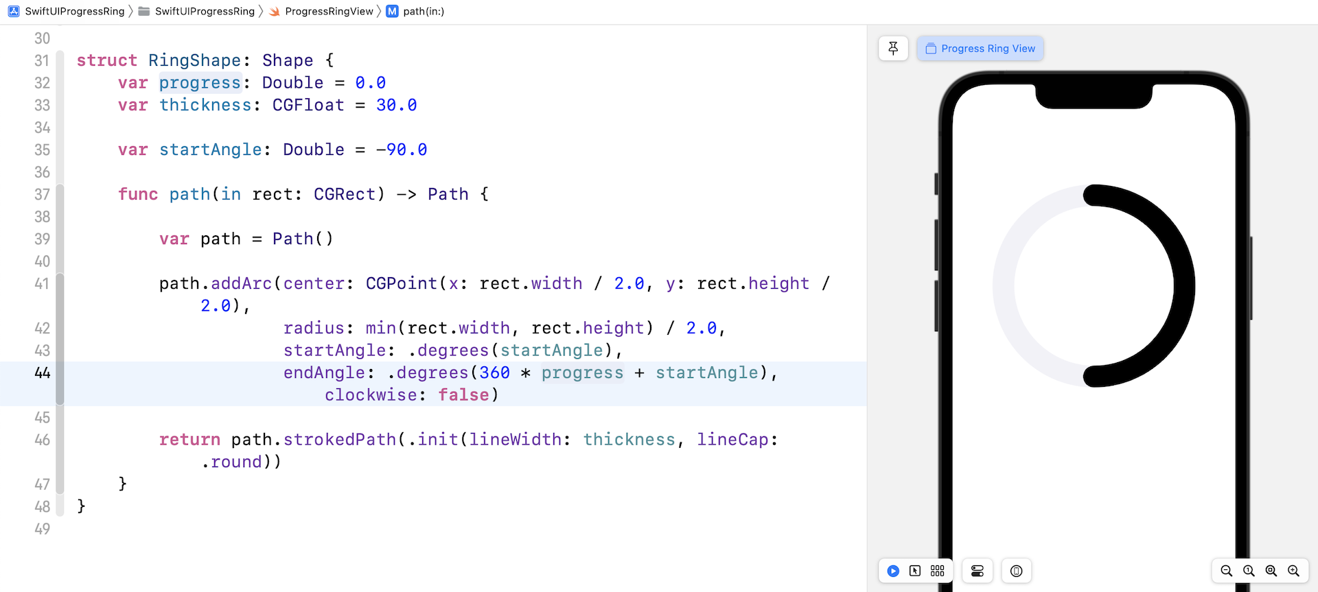
Other than the ring's color, you may also notice something that we need to tweak. The start point of the arc is not the same as that in figure 4. To fix the issue, you need change the startAngle from zero to -90.
Declare the following property in RingShape:
var startAngle: Double = -90.0
Then update the addArc method like this:
path.addArc(center: CGPoint(x: rect.width / 2.0, y: rect.height / 2.0),
            radius: min(rect.width, rect.height) / 2.0,
            startAngle: .degrees(startAngle),
            endAngle: .degrees(360 * progress + startAngle), clockwise: false)
We change the startAngle parameter to -90 degree. we also need to alter the endAngle parameter, because the starting angle is changed. With the modification, the arc now rotates by 90 degrees anticlockwise.
Adding a Gradient
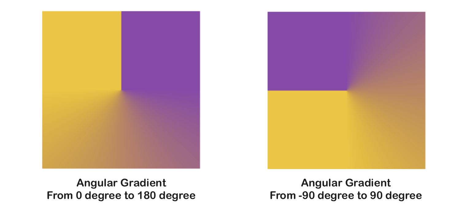
Now that you have a ring shape that is adjustable by passing different progress values to it, wouldn't it be great if we add a gradient color to the bar? SwiftUI provides three types of gradients including linear gradient, angular gradient, and radial gradient. Apple uses the angular gradient to fill the progress bar.
Here is an example using AngularGradient:
AngularGradient(gradient: Gradient(colors: [.darkPurple, .lightYellow]), center: .center, startAngle: .degrees(0), endAngle: .degrees(180))
The angular gradient applies the gradient color as the angle changes. In the code above, we render the gradient from 0 degrees to 180 degrees. Figure 9 shows you the result of two different angular gradients.
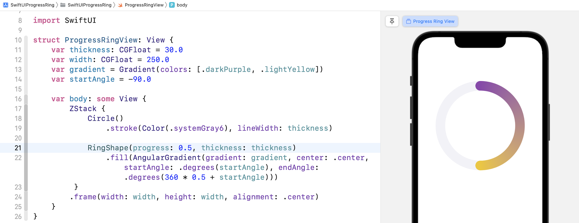
Since the starting angle of the ring shape is set to -90 degrees, we will apply the angular gradient like this (assuming the progress is set to 0.5):
AngularGradient(gradient: Gradient(colors: [.darkPurple, .lightYellow]), center: .center, startAngle: .degrees(startAngle), endAngle: .degrees(360 * 0.5 + startAngle))
Now let's modify the code to apply the gradient to the RingShape. First, declare the following properties in ProgressRingView:
var gradient = Gradient(colors: [.darkPurple, .lightYellow])
var startAngle = -90.0
Then fill the RingShape with the angular gradient by attaching the .fill modifier like below:
RingShape(progress: 0.5, thickness: thickness)
    .fill(AngularGradient(gradient: gradient, center: .center, startAngle: .degrees(startAngle), endAngle: .degrees(360 * 0.5 + startAngle)))
As soon as you complete the modification, the circular progress bar should be filled with the specified gradient.
Varying Progress
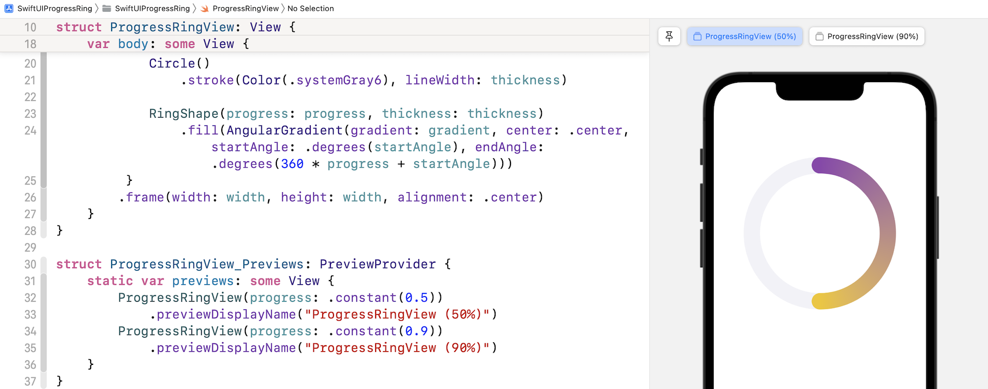
The percentage of progress is now fixed at 0.5. Obviously, we need to create a variable for that to make it adjustable. In ProgressRingView, declare a variable named progress like this:
@Binding var progress: Double
We are developing a flexible ProgressRingView and want to let the caller control the percentage of progress. Therefore, the source of truth (i.e. progress) should be provided by the caller. This is the reason why progress is marked as a binding variable.
With the variable, we can update the following line of code accordingly:
RingShape(progress: progress, thickness: thickness)
    .fill(AngularGradient(gradient: gradient, center: .center, startAngle: .degrees(startAngle), endAngle: .degrees(360 * progress + startAngle)))
Xcode should now indicate an error in ProgressRingView_Previews because we have to pass ProgressRingView the progress parameter. Therefore, update the ProgressRingView_Previews like this:
struct ProgressRingView_Previews: PreviewProvider {
    static var previews: some View {
        ProgressRingView(progress: .constant(0.5))
            .previewDisplayName("ProgressRingView (50%)")
        ProgressRingView(progress: .constant(0.9))
            .previewDisplayName("ProgressRingView (90%)")
    }
}
I want to see the end result of two different values of progress, so we create two instances of ProgressRingView in the preview. Now you should be able to see two previews in the preview pane.
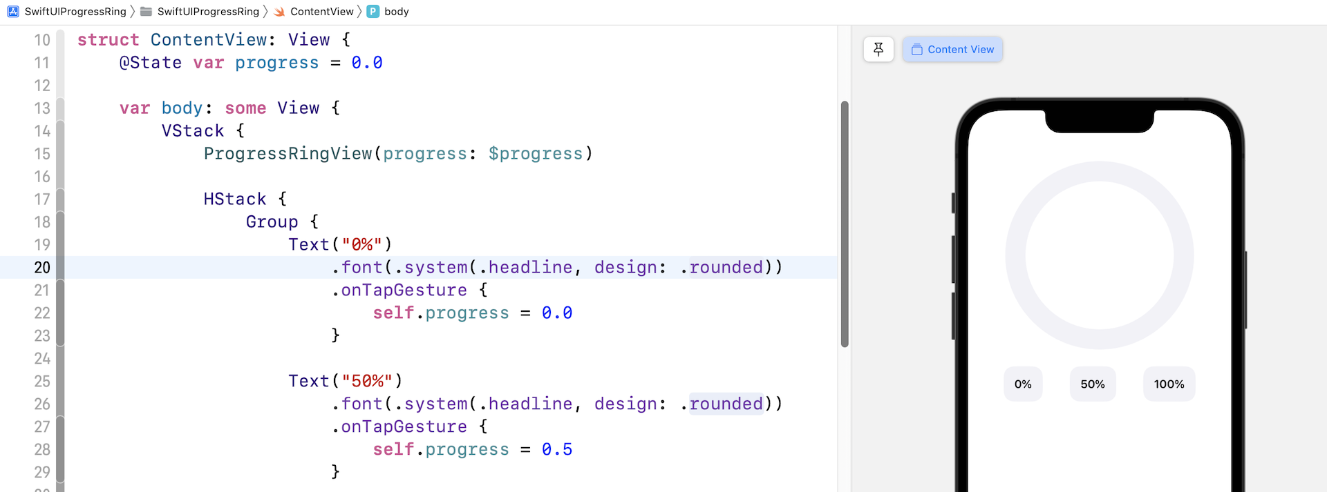
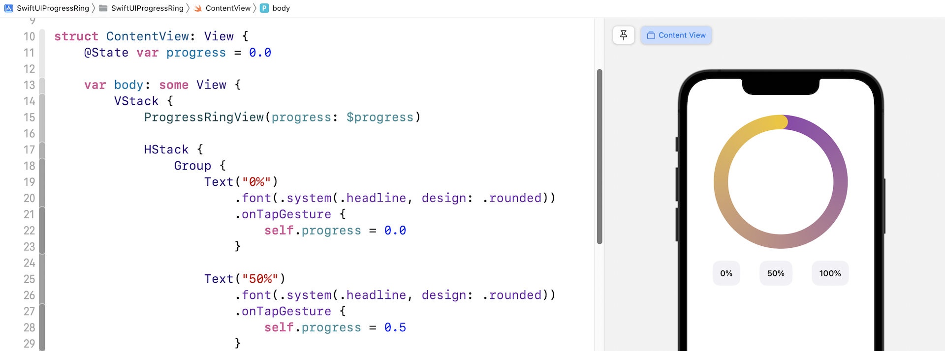
Animating the Ring Shape with Animatable
The circular progress bar looks pretty good. Let's put it into practice and create a simple demo like figure 12. This demo has three buttons for adjusting the progress. We expect that the progress bar will gradually increase (or decrease) to the chosen percentage when any of the buttons is tapped. For example, the current progress is set to 0. When the "50%" button is tapped, the progress bar will gradually goes up from 0% to 50%.
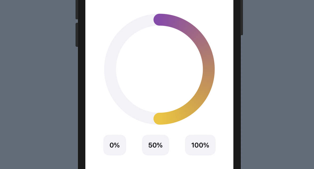
Now let's switch over to ContentView.swift to create this demo. First, declare a state variable to keep track of the progress like this:
@State var progress = 0.0
Then insert the following code in the body variable to create the UI:
VStack {
    ProgressRingView(progress: $progress)

    HStack {
        Group {
            Text("0%")
                .font(.system(.headline, design: .rounded))
                .onTapGesture {
                    self.progress = 0.0
                }

            Text("50%")
                .font(.system(.headline, design: .rounded))
                .onTapGesture {
                    self.progress = 0.5
                }

            Text("100%")
                .font(.system(.headline, design: .rounded))
                .onTapGesture {
                    self.progress = 1.0
                }
        }
        .padding()
        .background(Color(.systemGray6))
        .clipShape(RoundedRectangle(cornerRadius: 15.0, style: .continuous))
        .padding()
    }
    .padding()
}
In your preview canvas, you should have something like below. The progress bar only shows the gray circle underneath because the progress is defaulted to zero. Click the Play button to run the demo. Try tapping different buttons to see how the progress bar responds.
Does it work up to your expections? I think not. When you tap the 50% button, the progress bar instantly fills half of the ring without any animation. This isn't what we expect.
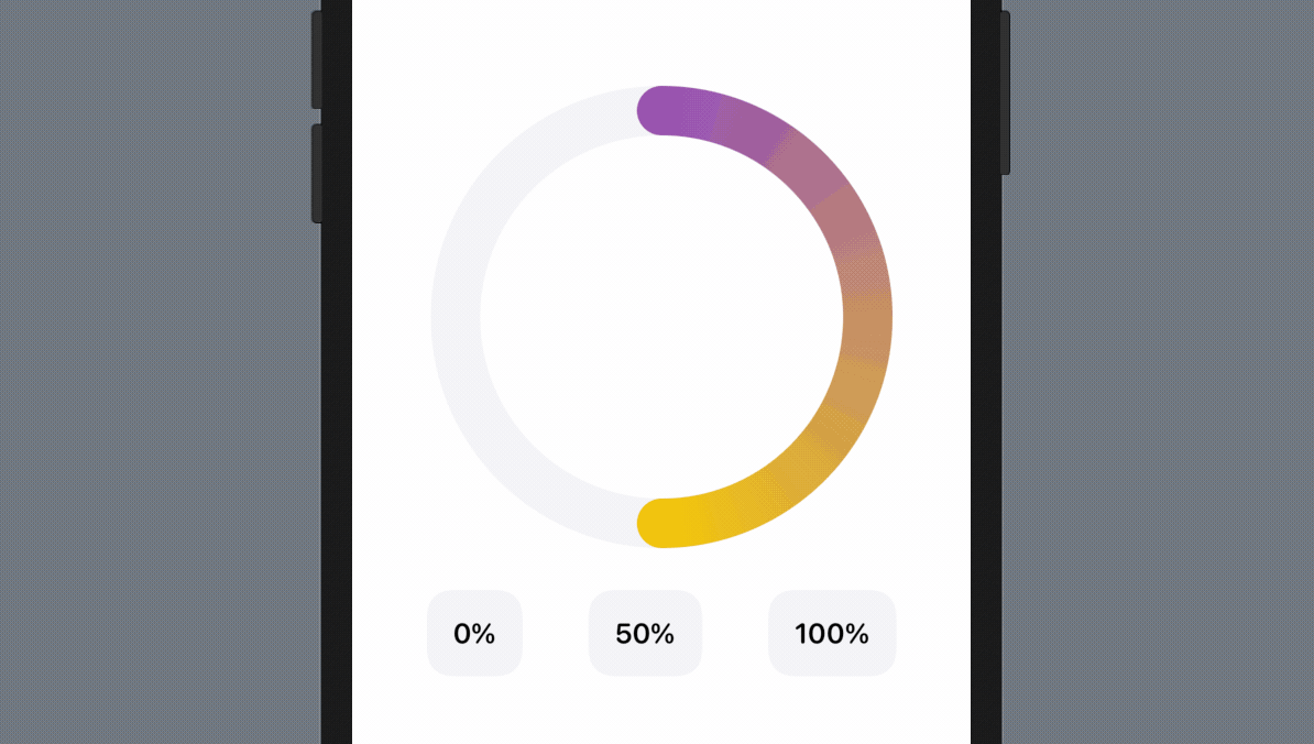
I guess you may know why the view is not animated. We haven't attached an .animation modifier to the ring shape. Switch back to ProgressRingView.swift and attach the .animation modifier to the ZStack of ProgressRingView. You can insert the code after the .frame modifier:
.animation(.easeInOut(duration: 1.0), value: progress)
Okay, it seems like we've figured out the solution. Let's go back to ContentView.swift and test the demo again. Run the demo and tap any of the buttons to try it out.
What's your result? Does the fix work?
Unfortunately, the ring still doesn't animate the progress change, but it does animate the gradient change.
What's the root cause?
Before solving the issue, let me further explain how the .animation modifier works. In the official documentation) for the .animation modifier, it mentions that the modifier applies the given animation to all animatable values within the view. The keyword here is animatable. When you use the .animation modifier on a view, SwiftUI automatically animates any changes to animatable properties of the view.
SwiftUI comes with a protocol called Animatable. For a view that supports animation, you can adopt the protocol and provide the animatableData property. This property tells SwiftUI what data the view can animate.
In chapter 9, I introduced you the basics of SwiftUI animation. You can easily animate the size change of a view using .scaleEffect or the position change by using .offset. It may seem to you that all these animations work automatically. Behind the scenes, Apple's engineers actually adopted the protocol and provided the animatable data for CGSize and CGPoint.
So, why can't RingShape animate its progress change?
The RingShape struct conforms to the Shape protocol. If you look at its documentation, Shape adopts the Animatable protocol and provides the default implementation. However, the default implementation of the animatableData property is to return an instance of EmptyAnimatableData, which means no animatable data. This is why ProgressRingView cannot animate the progress change.
To fix the issue and make the progress animatable, all you need to do is to override the default implementation and provide the animatable values. In the RingShape struct, insert the following code before the path function:
var animatableData: Double {
    get { progress }
    set { progress = newValue }
}
The implementation is very simple. We just tell SwiftUI to animate the progress value. That's it!
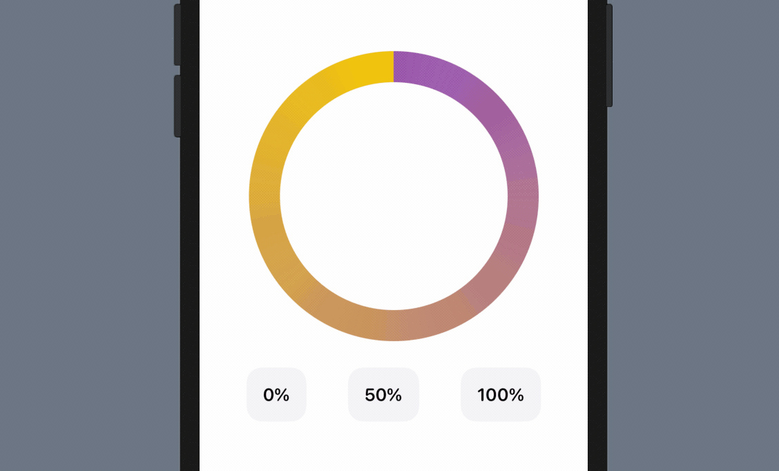
Now go back to ContentView.swift and play the demo app to have another test. This time the progress bar should animate the progress change.
The 100% Problem
With the animation, this circular progress bar is now even better. However, there is a little issue that you may notice. When the percentage is set to 100%, the arc becomes a full circle, hiding the round caps. To highlight where the arc ends, it's better to add the round cap with a drop shadow like the activity ring in figure 1.
To resolve the issue, my idea is to overlay a little circle, that its size is based on the thickness of the ring, at the end of the arc. Additionally, we will add a drop shadow for that little circle. Figure 16 illustrates this solution. Please note that for the final solution, the circle should have the same color as the arc's end. I just highlighted it using red color for purpose of illustration.
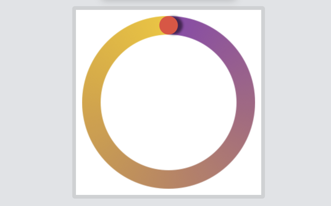
The question is how do you calculate the position of this little circle or the end position of the arc? This requires some mathematical knowledge. Figure 17 shows you how we calculate the position of the little circle.
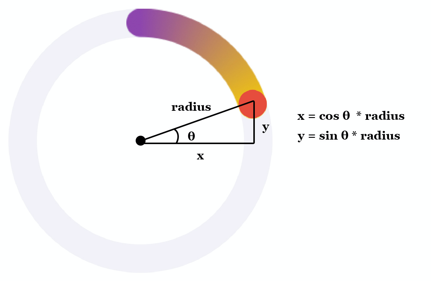
Now, let's dive into the implementation and create the little circle. Let's call it RingTip and implement it in the ProgressRingView.swift file like this:
struct RingTip: Shape {
    var progress: Double = 0.0
    var startAngle: Double = -90.0
    var ringRadius: Double

    private var position: CGPoint {
        let angle = 360 * progress + startAngle
        let angleInRadian = angle * .pi / 180

        return CGPoint(x: ringRadius * cos(angleInRadian), y: ringRadius * sin(angleInRadian))
    }

    var animatableData: Double {
        get { progress }
        set { progress = newValue }
    }

    func path(in rect: CGRect) -> Path {
        var path = Path()

        guard progress > 0.0 else {
            return path
        }

        let frame = CGRect(x: position.x, y: position.y, width: rect.size.width, height: rect.size.height)

        path.addRoundedRect(in: frame, cornerSize: frame.size)

        return path
    }

}
The RingTip struct takes in three parameters: progress, startAngle, and ringRadius for the calculation of the circle's position. Once we figure out the position, we can draw the path of the circle by using addRoundedRect.
Now go back to ProgressRingView and declare the following computed property to calculate the ring's radius:
private var radius: Double {
    Double(width / 2)
}
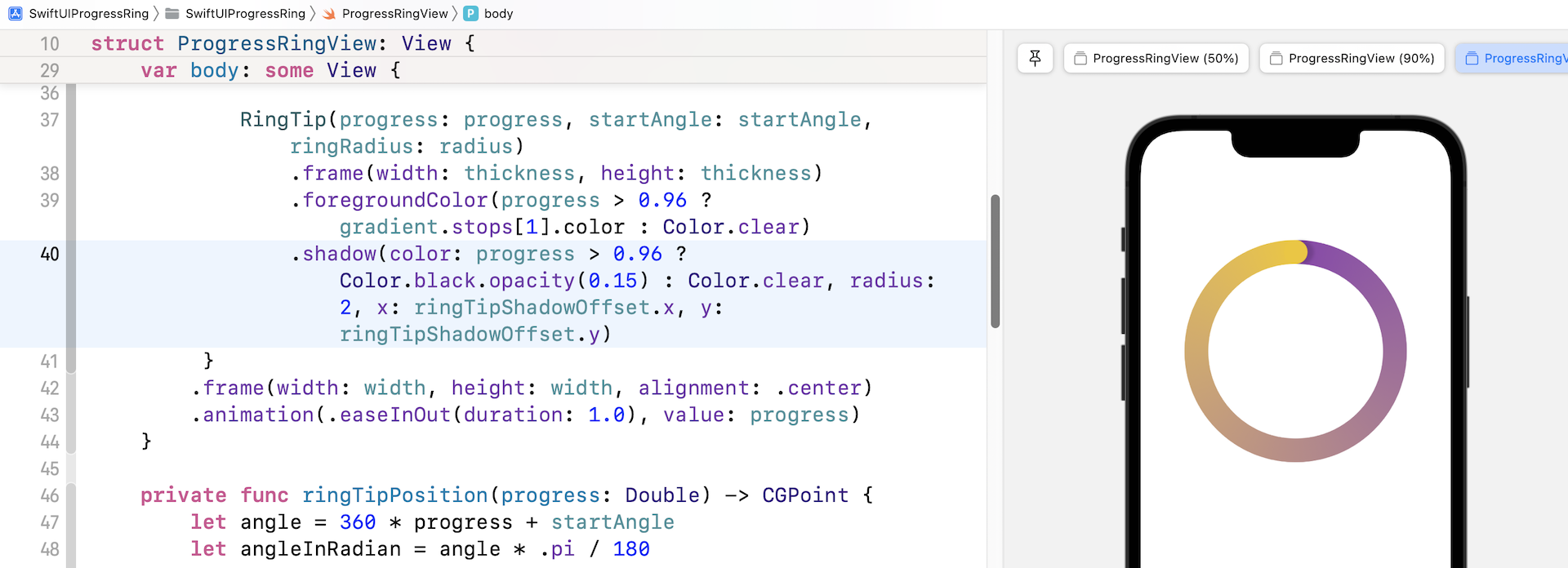
Next, create RingTip by inserting the following code after RingShape in the ZStack:
RingTip(progress: progress, startAngle: startAngle, ringRadius: radius)
.frame(width: thickness, height: thickness)
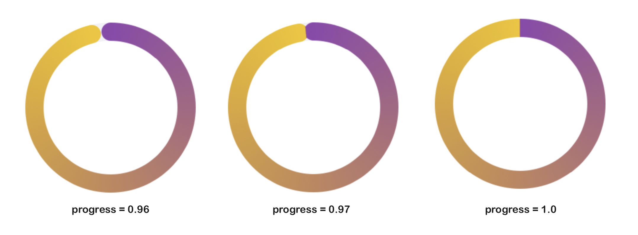
.foregroundColor(progress > 0.96 ? gradient.stops[1].color : Color.clear)
We instantiate RingTip by passing the current progress, start angle, and the radius of the ring. The foreground color is set to the ending gradient color. You may wonder why we only display the gradient color when the progress is greater than 0.96. Take a look at figure 18 and you will understand why I come up with this decision.
After adding the instance of RingTip in the ZStack, run the program in the preview. Click the 100% button. The progress bar should now have a round cap.
You've already built a pretty nice circular progress bar. But we can make it even better by adding a drop shadow at the arc end. In SwiftUI, you can simply attach the .shadow modifier to add a drop shadow. In this case, we can attach the modifier to RingTip. The hard part is that we need to figure out where we add the drop shadow.
The calculation of the shadow position is very similar to that of the ring tip. So, in ProgressRingView.swift, insert a function for computing the position of the ring tip:
private func ringTipPosition(progress: Double) -> CGPoint {
    let angle = 360 * progress + startAngle
    let angleInRadian = angle * .pi / 180

    return CGPoint(x: radius * cos(angleInRadian), y: radius * sin(angleInRadian))
}
Then add a new computed property for calculating the shadow offset of the ring tip like this:
private var ringTipShadowOffset: CGPoint {
    let shadowPosition = ringTipPosition(progress: progress + 0.01)
    let circlePosition = ringTipPosition(progress: progress)

    return CGPoint(x: shadowPosition.x - circlePosition.x, y: shadowPosition.y - circlePosition.y)
}
By adding 0.01 to the current progress, we can compute the shadow position. This is my solution for finding the shadow position. You may come up with an alternative solution.
With the shadow offset, we can attach the .shadow modifier to RingTip:
.shadow(color: progress > 0.96 ? Color.black.opacity(0.15) : Color.clear, radius: 2, x: ringTipShadowOffset.x, y: ringTipShadowOffset.y)
I just want to add a light shadow, so the opacity is set to 0.15. If you prefer to have a darker shadow, increase the opacity value (say, 1.0). After the code change, you should see a drop shadow at the end of the ring, provided that the progress is greater than 0.96. You can also try to set the progress value to a value larger than 1.0 and see how the progress bar looks.
Exercise
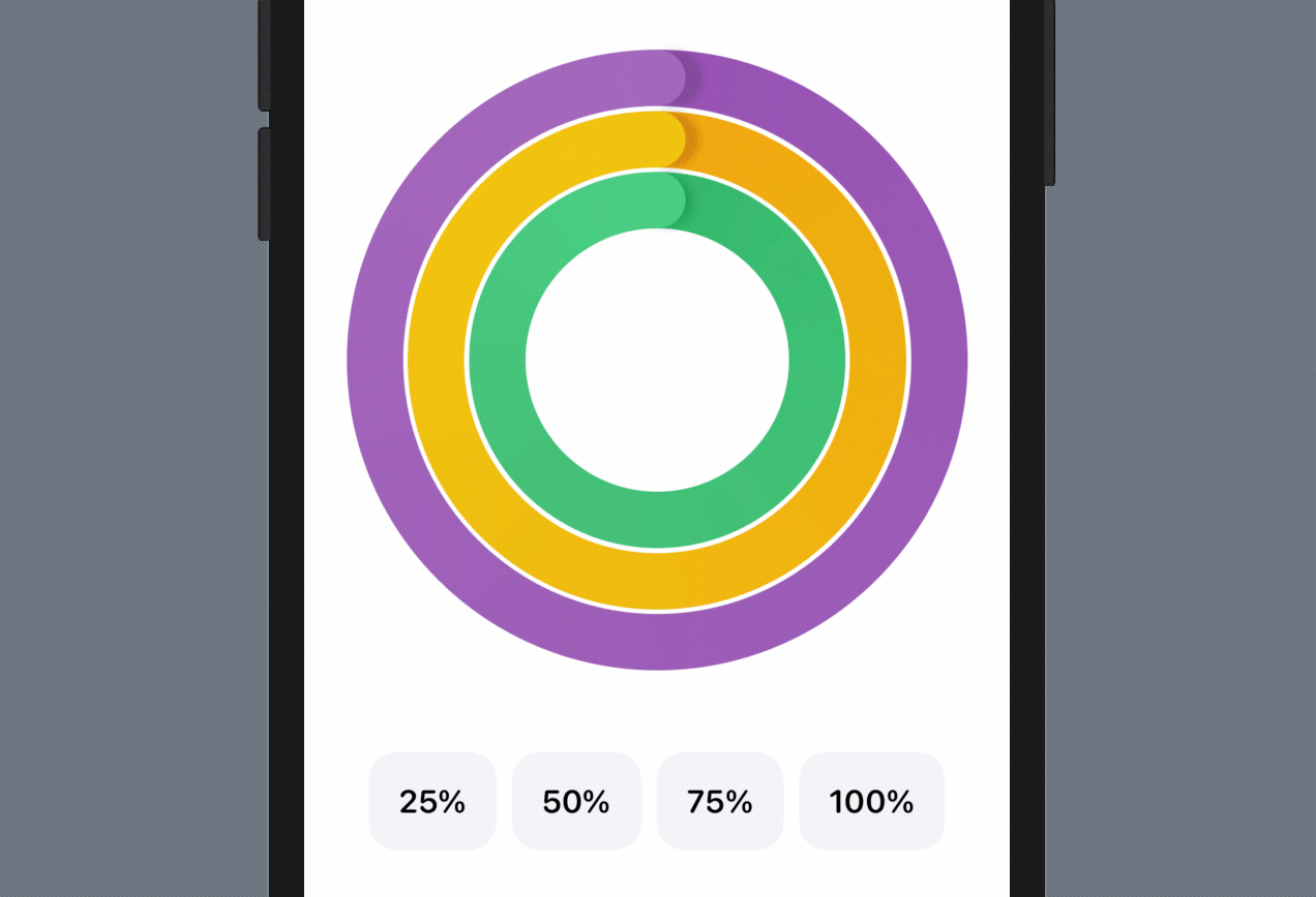
Now that you've created a flexible circular progress bar, it's time to have an exercise. Your task is to make use of what you've built and create an activity ring. The app also needs to provide four buttons for adjusting the activity ring like you see in figure 21.
Summary
By building an activity ring, we covered a number of SwiftUI features in this chapter. You should now have a better idea of implementing your custom shape and how to animate a shape using the Animatable protocol.
For reference, you can download the complete project here: