- Made by AppCoda
- Contact us / Support
- Tweet this book
- Preface
- 1. Introduction to SwiftUI
- 2. Getting Started with SwiftUI and Working with Text
- 3. Working with Images
- 4. Layout User Interfaces with Stacks
- 5. Understanding ScrollView and Building a Carousel UI
- 6. Working with SwiftUI Buttons and Gradient
- 7. Understanding State and Binding
- 8. Implementing Path and Shape for Line Drawing and Pie Charts
- 9. Basic Animations and Transitions
- 10. Understanding Dynamic List, ForEach and Identifiable
- 11. Working with Navigation UI and Navigation Bar Customization
- 12. Playing with Modal Views, Floating Buttons and Alerts
- 13. Building a Form with Picker, Toggle and Stepper
- 14. Data Sharing with Combine and Environment Objects
- 15. Building a Registration Form with Combine and View Model
- 16. Working with Swipe-to-Delete, Context Menu and Action Sheets
- 17. Using Gestures
- 18. Displaying an Expandable Bottom Sheet Using Presentation Detents
- 19. Creating a Tinder-like UI with Gestures and Animations
- 20. Creating an Apple Wallet like Animation and View Transition
- 21. Working with JSON, Slider and Data Filtering
- 22. Building a ToDo app with Core Data
- 23. Integrating UIKit with SwiftUI Using UIViewRepresentable
- 24. Creating a Search Bar View and Working with Custom Binding
- 25. Putting Everything Together to Build a Real World App
- 26. Creating an App Store like Animated View Transition
- 27. Building an Image Carousel
- 28. Building an Expandable List View Using OutlineGroup
- 29. Building Grid Layout Using LazyVGrid and LazyHGrid
- 30. Creating an Animated Activity Ring with Shape and Animatable
- 31. Working with AnimatableModifier and LibraryContentProvider
- 32. Working with TextEditor to Create Multiline Text Fields
- 33. Using matchedGeometryEffect to Create View Animations
- 34. ScrollViewReader and Grid Animation
- 35. Working with Tab View and Tab Bar Customization
- 36. Using AsyncImage in SwiftUI for Loading Images Asynchronously
- 37. Implementing Search Bar Using Searchable
- 38. Creating Bar Charts and Line Charts with the Charts Framework
- 39. Capturing Text within Image Using Live Text APIs
- 40. How to Use ShareLink for Sharing Data Like Text and Photos
- 41. Using ImageRenderer to Convert SwiftUI Views into Images
- 42. Creating PDF Documents Using ImageRenderer
- 43. Using Gauge to Display Progress and Create a Speedometer
- 44. Creating Grid Layout Using Grid APIs
- 45. Switching Layout with AnyLayout
- Published with GitBook
Chapter 20
Creating an Apple Wallet like Animation and View Transition
Do you use Apple's Wallet app? In the previous chapter, we built a simple app with a Tinder-like UI. What we're going to do in this chapter is to create an animated UI similar to the one you see in the Wallet app. When you tap and hold a credit card in the wallet app, you can use the drag gesture to rearrange the cards. If you haven't used the app, open Wallet and take a quick look. Alternatively, you can visit this URL (https://link.appcoda.com/swiftui-wallet) to check out the animation we're going to build.
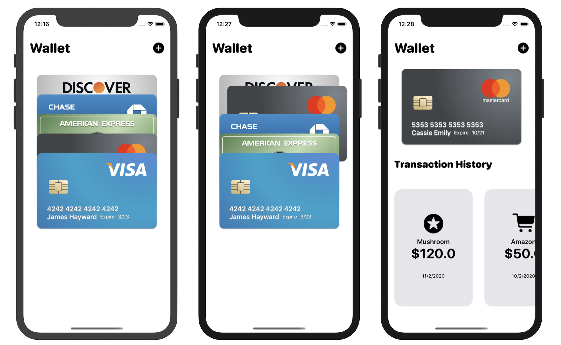
In the Wallet app, tapping one of the cards will bring up its transaction history. We will also create a similar animation, so you'll better understand view transitions and horizontal scroll view.
Project Preparation
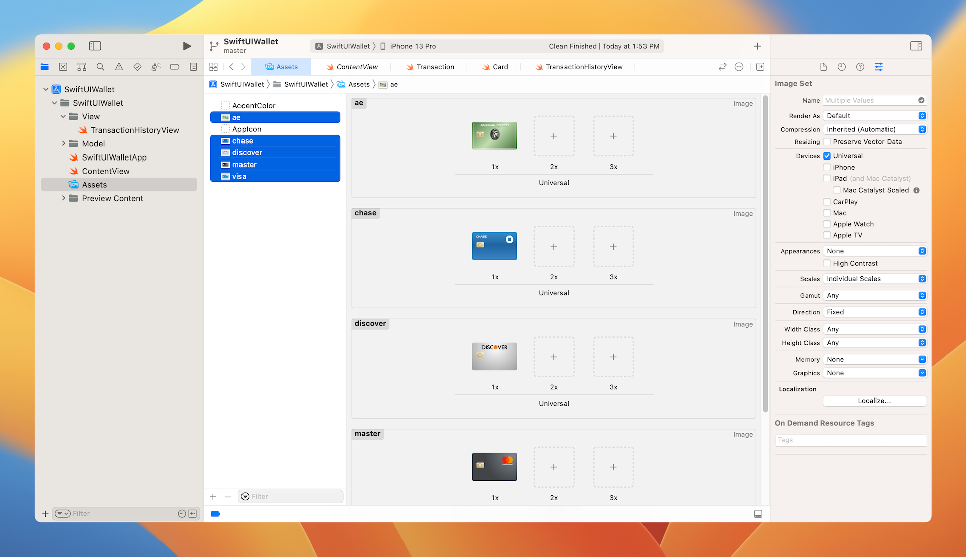
To keep you focused on learning animations and view transitions, begin with this starter project (https://www.appcoda.com/resources/swiftui4/SwiftUIWalletStarter.zip). The starter project already bundles the required credit card images and comes with a built-in transaction history view. If you want to use your own images, please replace them in the asset catalog.
In the project navigator, you should find a number of .swift files:
- Transaction.swift - the
Transactionstruct represents a transaction in the wallet app. Each transaction has an unique ID, merchant, amount, date, and icon. In addition to theTransactionstruct, we also declare an array of test transactions for demo purposes. - Card.swift - this file contains the struct of
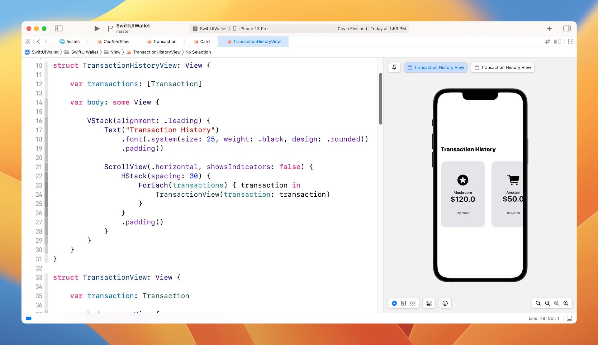
Card. ACardrepresents the data of a credit card including the card number, type, expiry date, image, and the customer's name. Additionally, there is an array of test credit cards in the file. One point to note is that the card image doesn't include any personal information, only the card brand (e.g. Visa). Later, we will create a view for a credit card. - TransactionHistoryView.swift - this is the transaction history view displayed in figure 1. The starter project comes with an implementation of the transaction history view. We display the transactions in a horizontal scroll view. You've worked with vertical scroll views before. The trick of creating a horizontal view is to pass a value of
.horizontalduring the initialization of a scroll view. Take a look at figure 3 or simply look at the Swift file for details. - ContentView.swift - this is the default SwiftUI view generated by Xcode.
Building a Card View
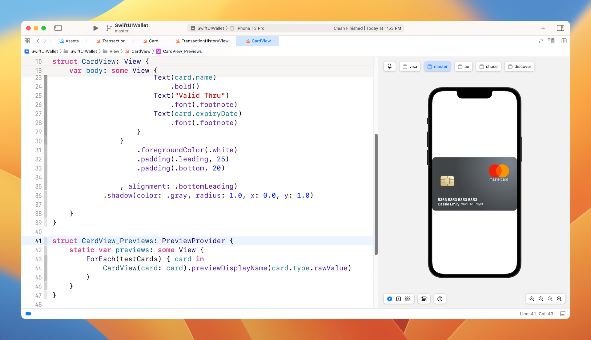
As mentioned in the previous section, all the card's images do not include any personal information and card number. Open the asset catalog again and take a look at the images. Each of the card images only has the card logo. We will soon create a card view to lay out the personal information and card number, as shown in figure 4.

To create the card view, right click the View group in the project navigator and create a new file. Choose the SwiftUI View template and name the file CardView.swift. Next, update the code like this:
struct CardView: View {
    var card: Card

    var body: some View {
        Image(card.image)
        .resizable()
        .scaledToFit()
            .overlay(

                VStack(alignment: .leading) {
                    Text(card.number)
                        .bold()
                    HStack {
                        Text(card.name)
                            .bold()
                        Text("Valid Thru")
                            .font(.footnote)
                        Text(card.expiryDate)
                            .font(.footnote)
                    }
                }
                .foregroundColor(.white)
                .padding(.leading, 25)
                .padding(.bottom, 20)

            , alignment: .bottomLeading)
            .shadow(color: .gray, radius: 1.0, x: 0.0, y: 1.0)

    }
}
We declare a card property to take in the card data. To display the personal information and card number on the card image, we use the overlay modifier and layout the text components with a vertical stack view and a horizontal stack view.
To preview the cards, update the CardView_Previews struct like this:
struct CardView_Previews: PreviewProvider {
    static var previews: some View {
        ForEach(testCards) { card in
            CardView(card: card).previewDisplayName(card.type.rawValue)
        }
    }
}
The testCards variable was defined in Card.swift. Therefore, we use ForEach to loop through the cards and set the name of each preview by calling previewDisplayName. Xcode will layout the card like that shown in figure 5.
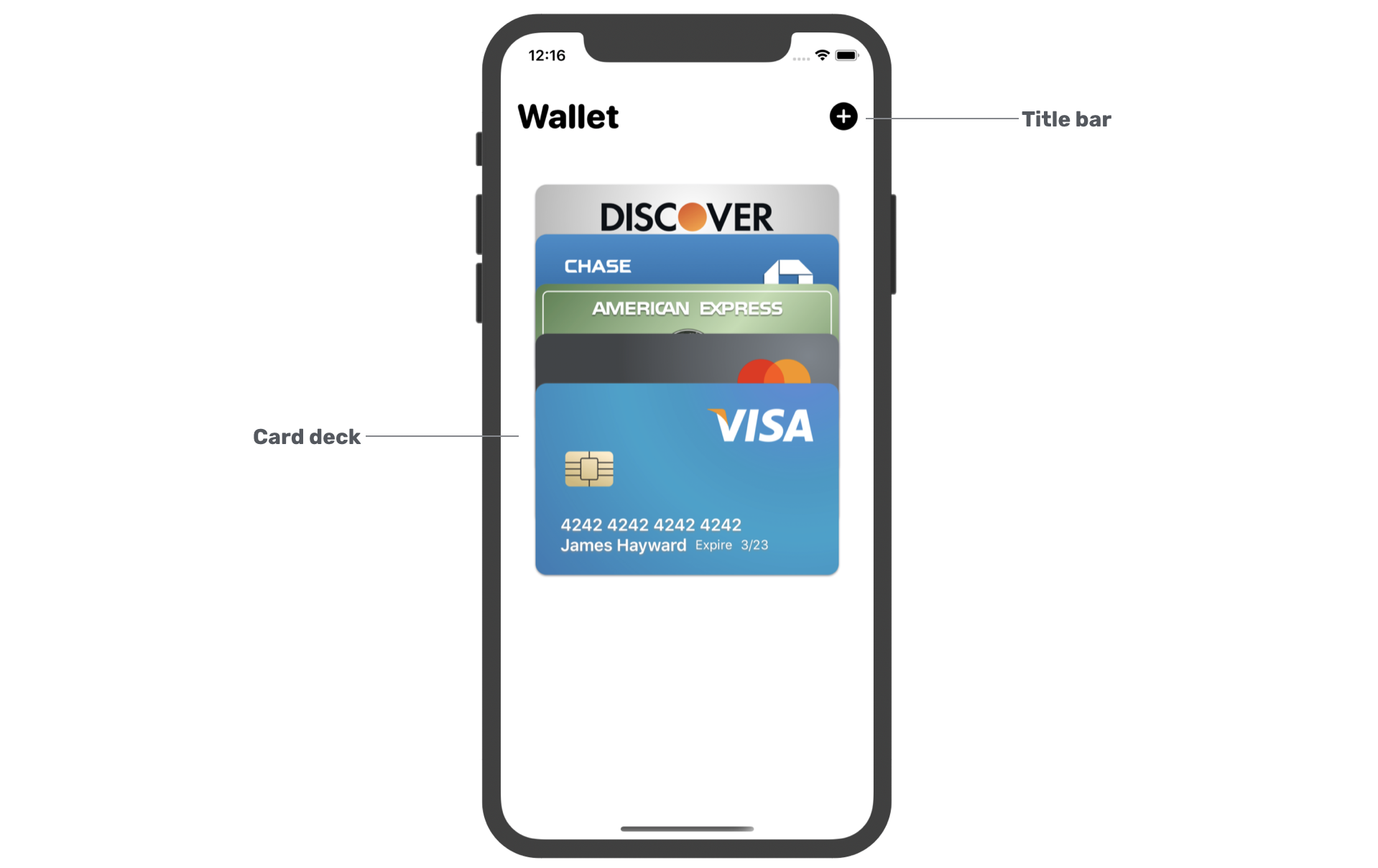
Building the Wallet View and Card Deck
Now that we have implemented the card view, let's start to build the wallet view. If you forgot what the wallet view looks like, take a look at figure 6. We will first layout the card deck before working on the gestures and animations.
In the project navigator, you should see the ContentView.swift file. Delete it and then right click the View folder to create a new one. In the dialog, choose SwiftUI View as the template and name the file WalletView.swift.
If you preview the WalletView or run the app on simulator, Xcode should display an error because the ContentView is set to the initial view and it was deleted. To fix the error, open SwiftUIWalletApp.swift and change the following line of code in WindowGroup from:
ContentView()
To:
WalletView()
Switch back to WalletView.swift. The compilation error will be fixed once you make the change. Now let's continue to layout the wallet view. First, we'll start with the title bar. In the WalletView.swift file, insert a new struct for the bar:
struct TopNavBar: View {

    var body: some View {
        HStack {
            Text("Wallet")
                .font(.system(.largeTitle, design: .rounded))
                .fontWeight(.heavy)

            Spacer()

            Image(systemName: "plus.circle.fill")
                .font(.system(.title))
        }
        .padding(.horizontal)
        .padding(.top, 20)
    }
}
The code is very straightforward. We laid out the title and the plus image using a horizontal stack.
Next, we create the card deck. First, declare a property in the WalletView struct for the array of credit cards:
var cards: [Card] = testCards
For demo purpose, we simply set the default value to testCards which was defined in the Card.swift file. To lay out the wallet view, we use both a VStack and ZStack. Update the body variable like this:
var body: some View {
   VStack {

        TopNavBar()
            .padding(.bottom)

        Spacer()

        ZStack {
            ForEach(cards) { card in
                CardView(card: card)
                    .padding(.horizontal, 35)
            }
        }

        Spacer()
    }
}
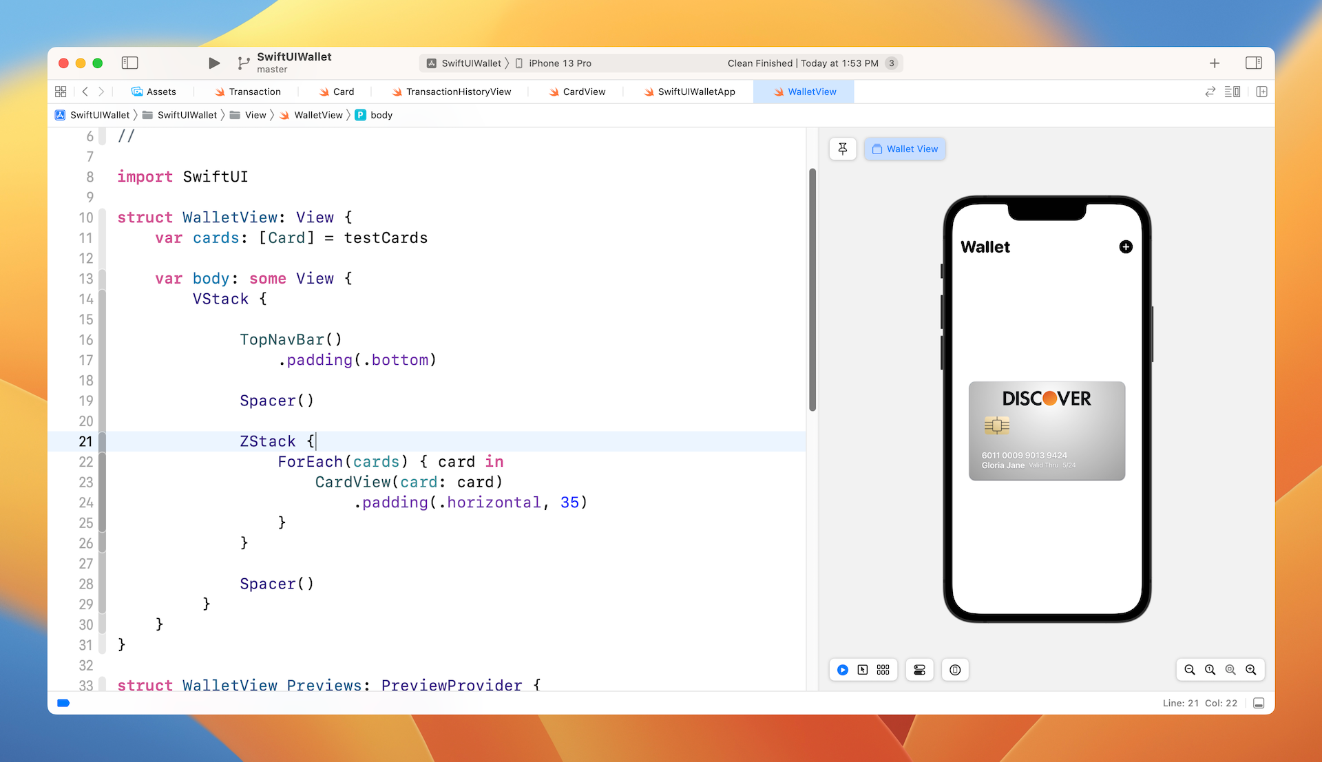
If you run the app on simulator or preview the UI directly, you should only see the last card in the card deck like that shown in figure 7.
There are two issues with the current implementation:
- The cards are now overlapped with each other - we need to figure out a way to spread out the deck of cards.
- The Discover card is supposed to be the last card - In a ZStack view, the items stack on top of each other. The first item being put into the ZStack becomes the lowermost layer, while the last item is the uppermost layer. If you look at the
testCardsarray inCard.swift, the first card is the Visa card, while the last card is the Discover card.
Okay, so how are we going to fix these issues? For the first issue, we can make use of the offset modifier to spread out the deck of cards. For the second issue, obviously we can alter the zIndex for each card in the CardView to change the order of the cards. Figure 8 illustrates how the solution works.
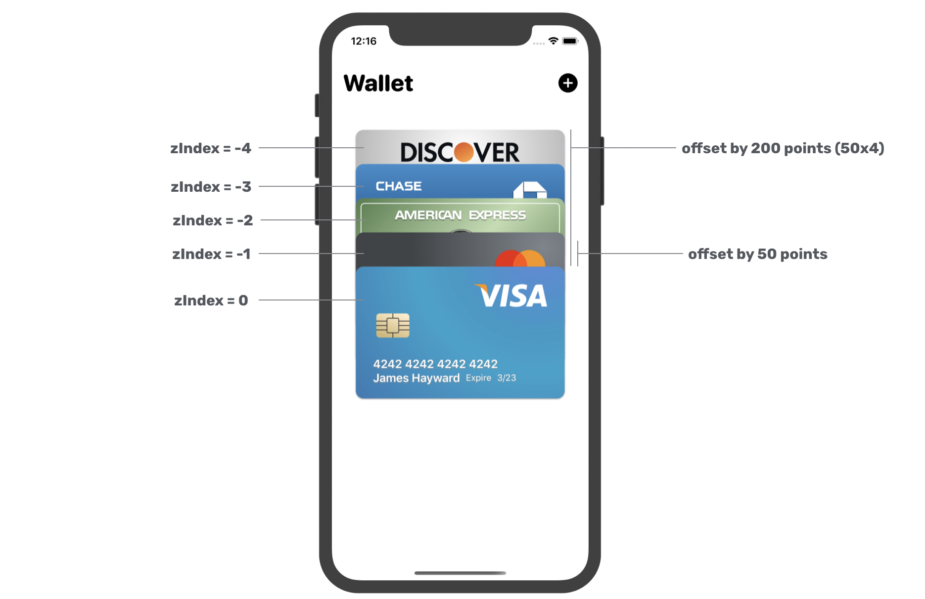
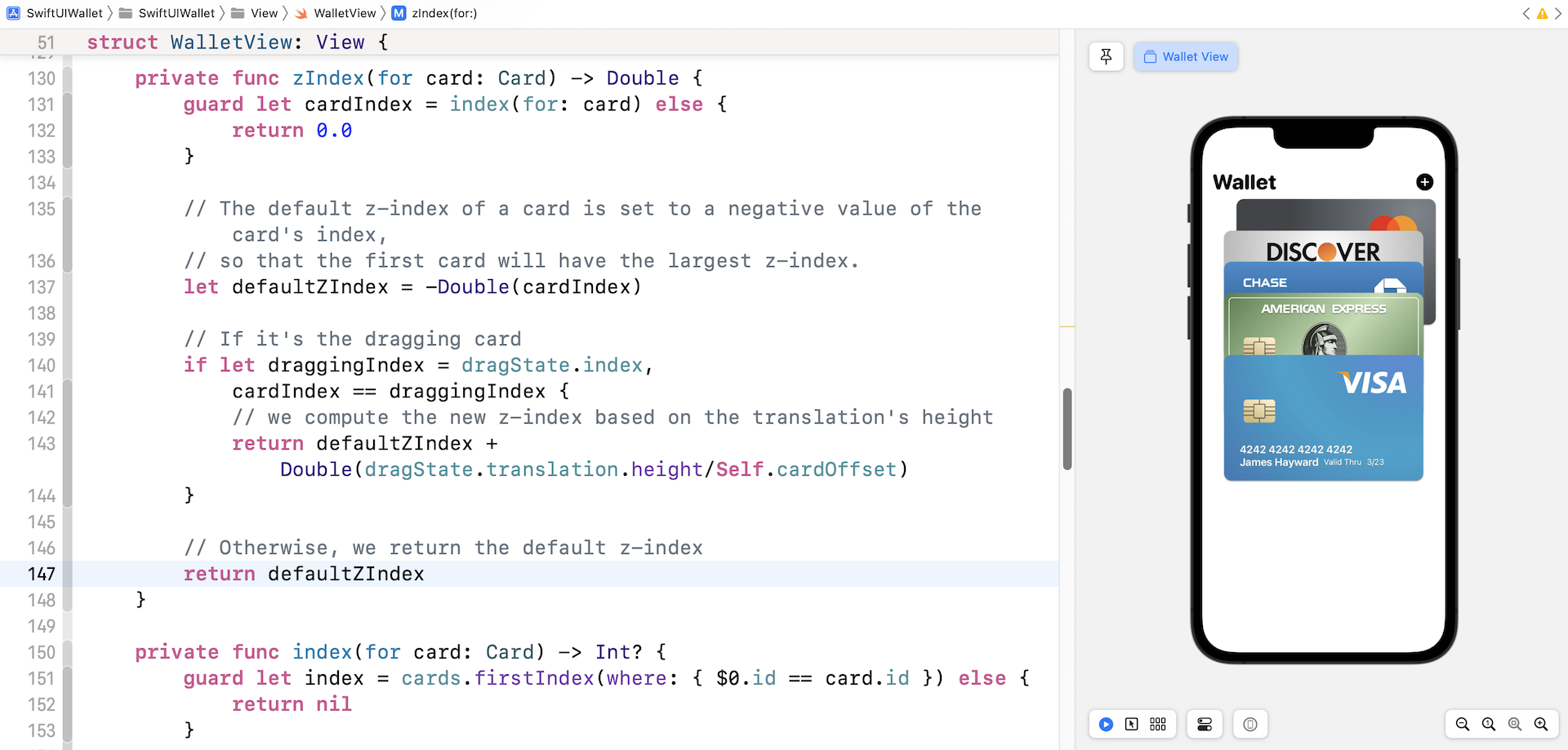
Let's first talk about the z-index. Each card's z-index is the negative value of its index in the cards array. The last item with the largest array index will have the smallest z-index. For this implementation, we will create an individual function to handle the computation of z-index. In the WalletView, insert the following code:
private func zIndex(for card: Card) -> Double {
    guard let cardIndex = index(for: card) else {
        return 0.0
    }

    return -Double(cardIndex)
}

private func index(for card: Card) -> Int? {
    guard let index = cards.firstIndex(where: { $0.id == card.id }) else {
        return nil
    }

    return index
}
Both functions work together to figure out the correct z-index of a given card. To compute a correct z-index, the first thing we need is the index of the card in the cards array. The index(for:) function is designed to get the array index of the given card. Once we have the index, we can turn it into a negative value. This is what the zIndex(for:) function does.
Now, you can attach the zIndex modifier to the CardView like this:
CardView(card: card)
    .padding(.horizontal, 35)
    .zIndex(self.zIndex(for: card))
Once you make the change, the Visa card should move to the top of the deck.
Next, let's fix the first issue to spread out the cards. Each of the cards should be offset by a certain vertical distance. That distance is computed by using the card's index. Say, we set the default vertical offset to 50 points. The last card (with the index #4) will be offset by 200 points (50*4).
Now that you should understand how we are going to spread the cards, let's write the code. Declare the default vertical offset in WalletView:
private static let cardOffset: CGFloat = 50.0
Next, create a new function called offset(for:) that is used to compute the vertical offset of the given card:
private func offset(for card: Card) -> CGSize {

    guard let cardIndex = index(for: card) else {
        return CGSize()
    }

    return CGSize(width: 0, height: -50 * CGFloat(cardIndex))
}
Finally, attach the offset modifier to the CardView:
CardView(card: card)
    .padding(.horizontal, 35)
    .offset(self.offset(for: card))
    .zIndex(self.zIndex(for: card))
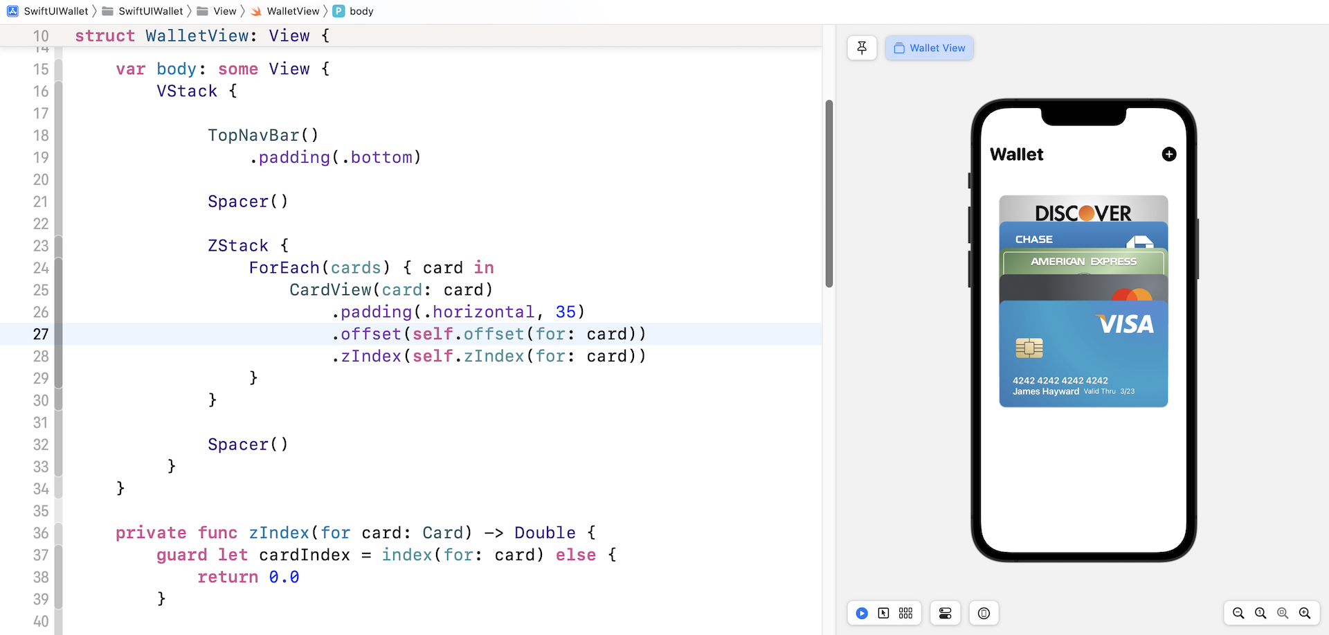
That's how we spread the card using the offset modifier. If everything is correct, you should see a preview like that shown in figure 9.
Adding a Slide-in Animation
Now that we have completed the layout of the wallet view, it's time to add some animations. The first animation I want to add is a slide-in animation. When the app is first launched, each of the cards slides from the far left of the screen. You may think that this animation is unnecessary but I want to take this opportunity to show you how to create an animation and view transition at the app launch.

First, we need a way to trigger the transition animation. Let's declare a state variable at the beginning of CardView:
@State private var isCardPresented = false
This variable indicates whether the cards should be presented on screen. By default, it's set to false. Later, we will set this value to true to trigger the view transition.
Each of the cards is a view. To implement an animation like that displayed in figure 10, we need to attach both the transition and animation modifiers to the CardView like this:
CardView(card: card)
    .offset(self.offset(for: card))
    .padding(.horizontal, 35)
    .zIndex(self.zIndex(for: card))
    .transition(AnyTransition.slide.combined(with: .move(edge: .leading)).combined(with: .opacity))
    .animation(self.transitionAnimation(for: card), value: isCardPresented)
For the transition, we combine the default slide transition with the move transition. As mentioned before, the transition will not be animated without the animation modifier. This is why we also attach the animation modifier. Since each card has its own animation, we create a function called transitionAnimation(for:) to compute the animation. Insert the following code to create the function:
private func transitionAnimation(for card: Card) -> Animation {
    var delay = 0.0

    if let index = index(for: card) {
        delay = Double(cards.count - index) * 0.1
    }

    return Animation.spring(response: 0.1, dampingFraction: 0.8, blendDuration: 0.02).delay(delay)
}
In fact, all the cards have a similar animation, which is a spring animation. The difference is in the delay. The last card of the deck will appear first, thus the value of the delay should be the smallest. The formula below is how we compute the delay for each of the cards. The smaller the index, the longer the delay.
delay = Double(cards.count - index) * 0.1
So, how can we trigger the view transition of the card view at the app launch? The trick is to attach an id modifier to each of the card view:
CardView(card: card)
    .
    .
    .
    .id(isCardPresented)
    .
    .animation(self.transitionAnimation(for: card), value: isCardPresented)
The value is set to isCardPresented. Now attach the onAppear modifier and attach it to the ZStack:
.onAppear {
    isCardPresented.toggle()
}
When the ZStack appears, we change the value of isCardPresented from false to true. When the id value changes, SwiftUI considers this to be a new view. Thus, this triggers the view transition animation of the cards.
After applying the changes, hit the Play button to test the app in a simulator. The app should render the animation when it launches.
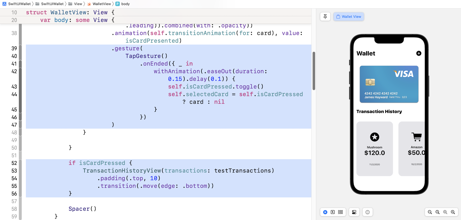
Handling the Tap Gesture and Displaying the Transaction History
When a user taps a card, the app moves the selected card upward and brings up the transaction history. For those non-selected cards, they are moved off the screen.
To implement this feature, we need two more state variables. Declare these variables in WalletView:
@State var isCardPressed = false
@State var selectedCard: Card?
The isCardPressed variable indicates if a card is selected, while the selectedCard variable stores the card selected by the user.
.gesture(
    TapGesture()
        .onEnded({ _ in
            withAnimation(.easeOut(duration: 0.15).delay(0.1)) {
                self.isCardPressed.toggle()
                self.selectedCard = self.isCardPressed ? card : nil
            }
        })
)
To handle the tap gesture, we attach the above gesture modifier to the CardView (just below .animation(self.transitionAnimation(for: card)) ) and use the built-in TapGesture to capture the tap event. In the code block, we simply toggle the state of isCardPressed and set the current card to the selectedCard variable.
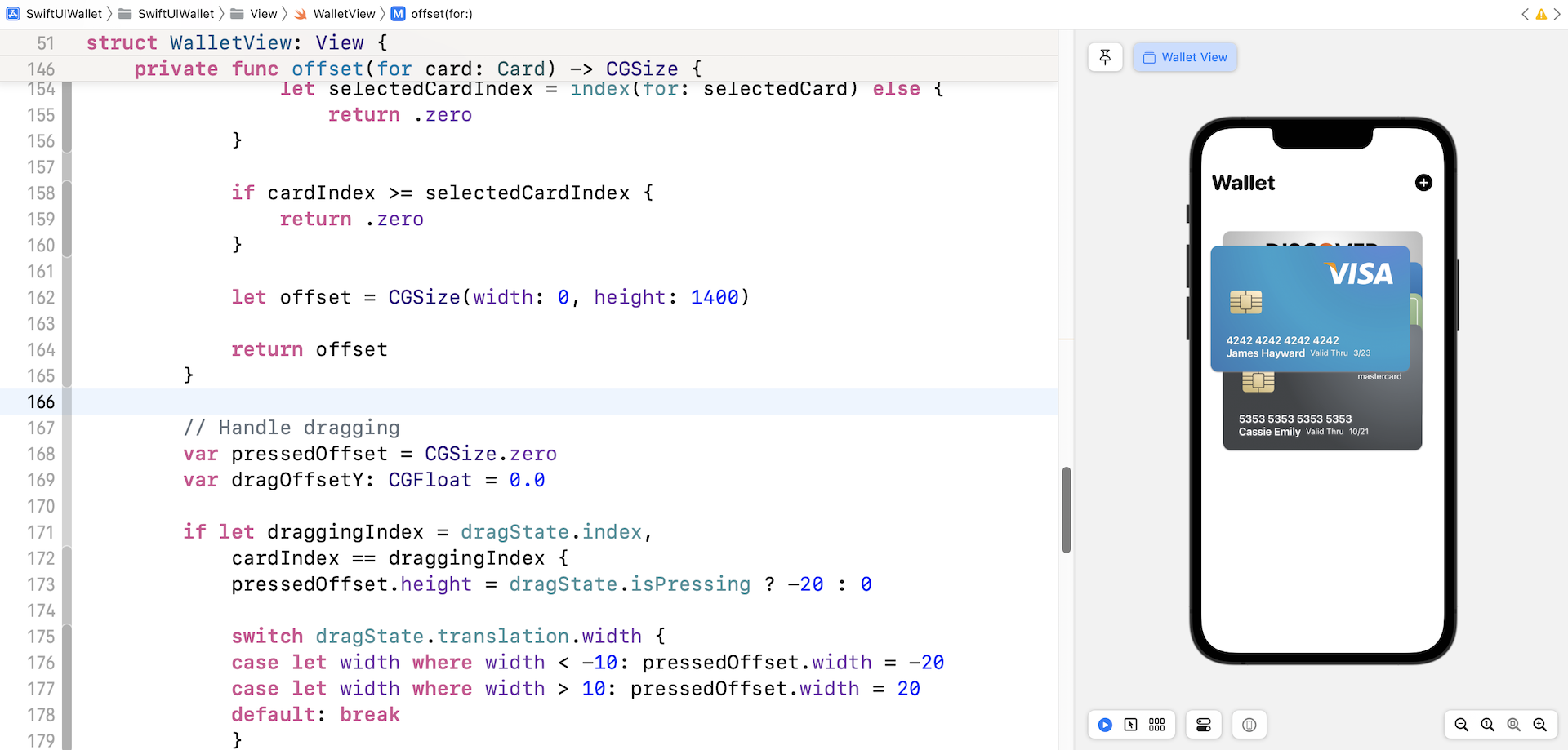
To move the selected card (and those underneath) upward and the rest of the cards move off the screen, update the offset(for:) function like this:
private func offset(for card: Card) -> CGSize {

    guard let cardIndex = index(for: card) else {
        return CGSize()
    }

    if isCardPressed {
        guard let selectedCard = self.selectedCard,
            let selectedCardIndex = index(for: selectedCard) else {
                return .zero
        }

        if cardIndex >= selectedCardIndex {
            return .zero
        }

        let offset = CGSize(width: 0, height: 1400)

        return offset
    }

    return CGSize(width: 0, height: -50 * CGFloat(cardIndex))
}
We added an if clause to check if a card is selected. If the given card is the card selected by the user, we set the offset to .zero. For those cards that are right below the selected card, we will also move them upward. This is why we set the offset to .zero. For the rest of the cards, we move them off the screen. Therefore, the vertical offset is set to 1400 points.
Now we are ready to write the code for bringing up the transaction history view. As mentioned at the very beginning, the starter project comes with this transaction history view. Therefore, you do not need to build it yourself.
We can use the isCardPressed state variable to determine if the transaction history view is shown or not. Insert the following right before Spacer():
if isCardPressed {
    TransactionHistoryView(transactions: testTransactions)
        .padding(.top, 10)
        .transition(.move(edge: .bottom))
}
In the code above, we set the transition to .move to bring the view up from the bottom of the screen. Feel free to change it to suit your preference.
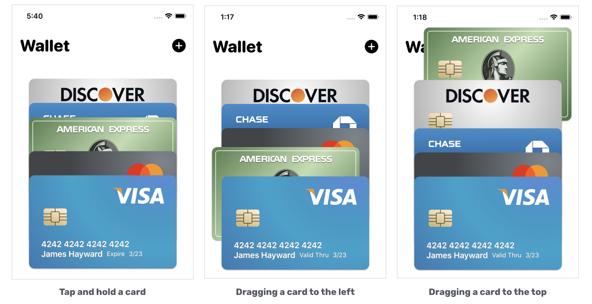
Rearranging the Cards Using the Drag Gesture
Now comes the core part of this chapter. Let's see how to rearrange the card deck with the drag gesture. First, let me describe how this feature works in detail:
- To initiate the dragging action, the user must tap and hold the card. A simple tap will only bring up the transaction history view.
- Once the user successfully holds a card, the app will move it a little upward. This is the feedback that we want to give to users, telling them we are ready to drag the card around.
- As the user drags the card, the user should be able to move it across the deck.
- After the user releases the card at a certain position, the app will update the position of all the cards in the card deck.
Handling the Long Press and Drag Gestures
Now that you understand what we are going to do, let's move onto the implementation. If you forgot how SwiftUI handles gestures, please go back and read chapter 17. Most of the techniques that we will use have been discussed in that chapter.
To begin, insert the following code in WalletView.swift to create the DragState enum so that we can easily keep track of the drag state:
enum DragState {
    case inactive
    case pressing(index: Int? = nil)
    case dragging(index: Int? = nil, translation: CGSize)

    var index: Int? {
        switch self {
        case .pressing(let index), .dragging(let index, _):
            return index
        case .inactive:
            return nil
        }
    }
    var translation: CGSize {
        switch self {
        case .inactive, .pressing:
            return .zero
        case .dragging(_, let translation):
            return translation
        }
    }

    var isPressing: Bool {
        switch self {
        case .pressing, .dragging:
            return true
        case .inactive:
            return false
        }
    }

    var isDragging: Bool {
        switch self {
        case .dragging:
            return true
        case .inactive, .pressing:
            return false
        }
    }
}
Next, declare a state variable in WalletView to keep track of the drag state:
@GestureState private var dragState = DragState.inactive
If you've read the chapter about SwiftUI gestures, you should already know how to detect a long press and drag gesture. However, this time it will be a bit different. We need to handle the tap gesture, the drag, and the long press gesture at the same time. Additionally, the app should ignore the tap gesture if the long press gesture is detected.
Now update the gesture modifier of the CardView like this:
.gesture(
    TapGesture()
        .onEnded({ _ in
            withAnimation(.easeOut(duration: 0.15).delay(0.1)) {
                self.isCardPressed.toggle()
                self.selectedCard = self.isCardPressed ? card : nil
            }
        })
        .exclusively(before: LongPressGesture(minimumDuration: 0.05)
        .sequenced(before: DragGesture())
        .updating(self.$dragState, body: { (value, state, transaction) in
            switch value {
            case .first(true):
                state = .pressing(index: self.index(for: card))
            case .second(true, let drag):
                state = .dragging(index: self.index(for: card), translation: drag?.translation ?? .zero)
            default:
                break
            }

        })
        .onEnded({ (value) in

            guard case .second(true, let drag?) = value else {
                return
            }

            // Rearrange the cards
        })

    )
)
SwiftUI allows you to combine multiple gestures exclusively. In the code above, we tell SwiftUI to either capture the tap gesture or the long press gesture. In other words, SwiftUI will ignore the long press gesture once the tap gesture is detected.
The code for the tap gesture is exactly the same as our previous code. The drag gesture is sequenced after the long press gesture. In the updating function, we set the state of the drag, the translation, and the card's index to the dragState variable defined earlier. I'm not going to explain the code in detail as it was covered in chapter 17.
Before you can drag the card, you have to update the offset(for:) function like this:
private func offset(for card: Card) -> CGSize {

    guard let cardIndex = index(for: card) else {
        return CGSize()
    }

    if isCardPressed {
        guard let selectedCard = self.selectedCard,
            let selectedCardIndex = index(for: selectedCard) else {
                return .zero
        }

        if cardIndex >= selectedCardIndex {
            return .zero
        }

        let offset = CGSize(width: 0, height: 1400)

        return offset
    }

    // Handle dragging
    var pressedOffset = CGSize.zero
    var dragOffsetY: CGFloat = 0.0

    if let draggingIndex = dragState.index,
        cardIndex == draggingIndex {
        pressedOffset.height = dragState.isPressing ? -20 : 0

        switch dragState.translation.width {
        case let width where width < -10: pressedOffset.width = -20
        case let width where width > 10: pressedOffset.width = 20
        default: break
        }

        dragOffsetY = dragState.translation.height
    }

    return CGSize(width: 0 + pressedOffset.width, height: -50 * CGFloat(cardIndex) + pressedOffset.height + dragOffsetY)
}
We added a block of code to handle the dragging. Please bear in the mind that only the selected card is draggable. Therefore, we need to check if the given card is the one being dragged by the user before making the offset change.
Earlier, we stored the card's index in the dragState variable. So, we can easily compare the given card index with the one stored in dragState to figure out which card to drag.
For the dragging card, we add an additional offset both horizontally and vertically.
Run the app to test it out, tap & hold a card and then drag it around.
Currently, you should be able to drag the card, however, the card's z-index doesn't change accordingly. For example, if you drag the Visa card, it always stays on the top of the deck. Let's fix it by updating the zIndex(for:) function:
private func zIndex(for card: Card) -> Double {
    guard let cardIndex = index(for: card) else {
        return 0.0
    }

    // The default z-index of a card is set to a negative value of the card's index,
    // so that the first card will have the largest z-index.
    let defaultZIndex = -Double(cardIndex)

    // If it's the dragging card
    if let draggingIndex = dragState.index,
        cardIndex == draggingIndex {
        // we compute the new z-index based on the translation's height
        return defaultZIndex + Double(dragState.translation.height/Self.cardOffset)
    }

    // Otherwise, we return the default z-index
    return defaultZIndex
}
The default z-index is still set to the negative value of the card's index. For the dragging card, we need to compute a new z-index as the user drags across the deck. The updated z-index is calculated based on the translation's height and the default offset of the card (i.e. 50 points).
Run the app and drag the Visa card again. Now the z-index is continuously updated as you drag the card.
Updating the Card Deck
When you release the card, it returns to its original position. So, how can we reorder the cards' after the drag?
The trick here is to update the items of the cards array, so as to trigger a UI update. First, we need to mark the cards variable as a state variable like this:
@State var cards: [Card] = testCards
Next, let's create another new function for rearranging the cards:
private func rearrangeCards(with card: Card, dragOffset: CGSize) {
    guard let draggingCardIndex = index(for: card) else {
        return
    }

    var newIndex = draggingCardIndex + Int(-dragOffset.height / Self.cardOffset)
    newIndex = newIndex >= cards.count ? cards.count - 1 : newIndex
    newIndex = newIndex < 0 ? 0 : newIndex

    let removedCard = cards.remove(at: draggingCardIndex)
    cards.insert(removedCard, at: newIndex)

}
When you drag the card over the adjacent cards, we need to update the z-index once the drag's translation is greater than the default offset. Figure 15 shows the expected behaviour of the drag.

This is the formula we use to compute the updated z-index:
var newIndex = draggingCardIndex + Int(-dragOffset.height / Self.cardOffset)
Once we have the updated index, the last step is to update the item in the cards array by removing the dragging card and insert it into the new position. Since the cards array is now a state variable, SwiftUI updates the card deck and renders the animation automatically.
Lastly, insert the following line of code under // Rearrange the cards to call the function:
withAnimation(.spring()) {
    self.rearrangeCards(with: card, dragOffset: drag.translation)
}
After that, you are ready to run the app to test it out. Congratulations, You've built the Wallet-like animation.
Summary
After going through this chapter, I hope you have a deeper understanding of SwiftUI animation and view transitions. If you compare SwiftUI with the original UIKit framework, SwiftUI has made it pretty easy to work with animation. Do you remember how you rendered the card animation when the user releases the dragging card? All you need to do is to update the state variable and SwiftUI handles the heavy lifting. That is the power of SwiftUI!
For reference, you can download the complete wallet project here:
- Demo project (https://www.appcoda.com/resources/swiftui4/SwiftUIWallet.zip)