- Made by AppCoda
- Contact us / Support
- Tweet this book
- Preface
- 1. Introduction to SwiftUI
- 2. Getting Started with SwiftUI and Working with Text
- 3. Working with Images
- 4. Layout User Interfaces with Stacks
- 5. Understanding ScrollView and Building a Carousel UI
- 6. Working with SwiftUI Buttons and Gradient
- 7. Understanding State and Binding
- 8. Implementing Path and Shape for Line Drawing and Pie Charts
- 9. Basic Animations and Transitions
- 10. Understanding Dynamic List, ForEach and Identifiable
- 11. Working with Navigation UI and Navigation Bar Customization
- 12. Playing with Modal Views, Floating Buttons and Alerts
- 13. Building a Form with Picker, Toggle and Stepper
- 14. Data Sharing with Combine and Environment Objects
- 15. Building a Registration Form with Combine and View Model
- 16. Working with Swipe-to-Delete, Context Menu and Action Sheets
- 17. Using Gestures
- 18. Displaying an Expandable Bottom Sheet Using Presentation Detents
- 19. Creating a Tinder-like UI with Gestures and Animations
- 20. Creating an Apple Wallet like Animation and View Transition
- 21. Working with JSON, Slider and Data Filtering
- 22. Building a ToDo app with Core Data
- 23. Integrating UIKit with SwiftUI Using UIViewRepresentable
- 24. Creating a Search Bar View and Working with Custom Binding
- 25. Putting Everything Together to Build a Real World App
- 26. Creating an App Store like Animated View Transition
- 27. Building an Image Carousel
- 28. Building an Expandable List View Using OutlineGroup
- 29. Building Grid Layout Using LazyVGrid and LazyHGrid
- 30. Creating an Animated Activity Ring with Shape and Animatable
- 31. Working with AnimatableModifier and LibraryContentProvider
- 32. Working with TextEditor to Create Multiline Text Fields
- 33. Using matchedGeometryEffect to Create View Animations
- 34. ScrollViewReader and Grid Animation
- 35. Working with Tab View and Tab Bar Customization
- 36. Using AsyncImage in SwiftUI for Loading Images Asynchronously
- 37. Implementing Search Bar Using Searchable
- 38. Creating Bar Charts and Line Charts with the Charts Framework
- 39. Capturing Text within Image Using Live Text APIs
- 40. How to Use ShareLink for Sharing Data Like Text and Photos
- 41. Using ImageRenderer to Convert SwiftUI Views into Images
- 42. Creating PDF Documents Using ImageRenderer
- 43. Using Gauge to Display Progress and Create a Speedometer
- 44. Creating Grid Layout Using Grid APIs
- 45. Switching Layout with AnyLayout
- Published with GitBook
Chapter 9
Basic Animations and Transitions
Have you ever used the magic move animation in Keynote? With magic move, you can easily create slick animation between slides. Keynote automatically analyzes the objects between slides and renders the animations automatically. To me, SwiftUI has brought Magic Move to app development. Animations using the framework are automatic and magical. You define two states of a view and SwiftUI will figure out the rest, animating the changes between the two states.
SwiftUI empowers you to animate changes for individual views and transitions between views. The framework comes with a number of built-in animations to create different effects.
In this chapter, you will learn how to animate views using implicit and explicit animations, provided by SwiftUI. As usual, we'll work on a few demo projects and learn the programming technique along the way.
Implicit and Explicit Animations
SwiftUI provides two types of animations: implicit and explicit. Both approaches allow you to animate views and view transitions. For implementing implicit animations, the framework provides a modifier called animation. You attach this modifier to the views you want to animate and specify your preferred animation type. Optionally, you can define the animation duration and delay. SwiftUI will then automatically render the animation based on the state changes of the views.
Explicit animations offer more finite control over the animations you want to present. Instead of attaching a modifier to the view, you tell SwiftUI what state changes you want to animate inside the withAnimation() block.
A bit confused? That's fine. You will have a better idea after going through a couple of examples.
Implicit Animations
Let's begin with implicit animations. Create a new project, name it SwiftUIAnimation (or whatever name you like). Be sure to select SwiftUI for the interface!
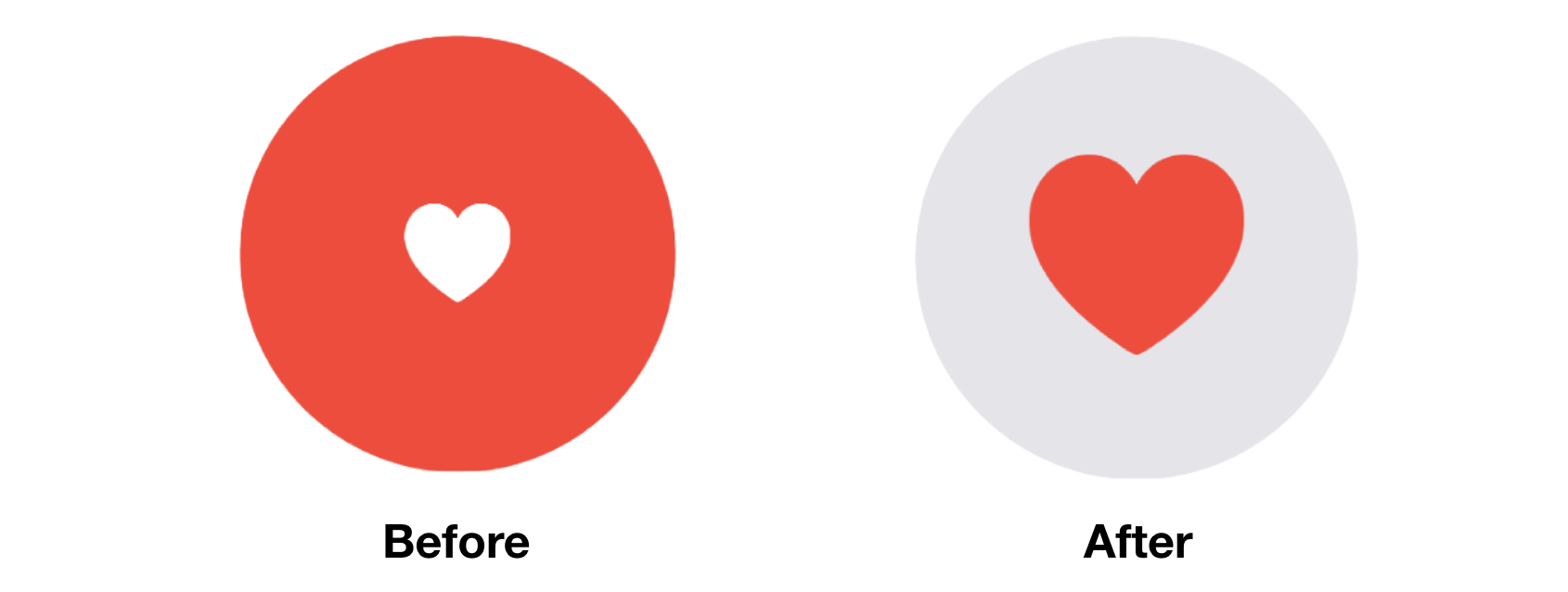
Take a look at figure 1. It's a simple tappable view that is composed of a red circle and a heart. When a user taps the heart or circle, the circle's color will be changed to light gray and the heart's color to red. At the same time, the size of the heart icon grows bigger. We have various state changes here:
- The color of the circle changes from red to light gray.
- The color of the heart icon changes from white to red.
- The heart icon doubles its original size.
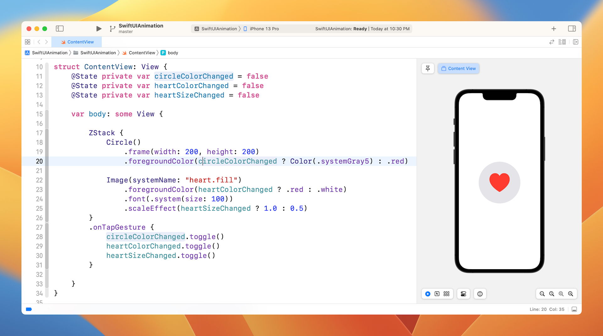
To implement the tappable circle using SwiftUI, add the following code to ContentView.swift:
struct ContentView: View {
    @State private var circleColorChanged = false
    @State private var heartColorChanged = false
    @State private var heartSizeChanged = false

    var body: some View {

        ZStack {
            Circle()
                .frame(width: 200, height: 200)
                .foregroundColor(circleColorChanged ? Color(.systemGray5) : .red)

            Image(systemName: "heart.fill")
                .foregroundColor(heartColorChanged ? .red : .white)
                .font(.system(size: 100))
                .scaleEffect(heartSizeChanged ? 1.0 : 0.5)
        }
        .onTapGesture {
            circleColorChanged.toggle()
            heartColorChanged.toggle()
            heartSizeChanged.toggle()
        }

    }
}
We define three state variables to model the states of the circle color, heart color and heart size, with the initial value set to false. To create the circle and heart, we use ZStack to overlay the heart image on top of the circle. SwiftUI comes with the onTapGesture modifier to detect the tap gesture. You can attach it to any view to make it tappable. In the onTapGesture closure, we toggle the states to change the view's appearance.
In the preview canvas, tap the heart view. The color of the circle and heart icon should change accordingly. However, these changes are not animated.
To animate the changes, you need to attach the animation modifier to both Circle and Image views:
Circle()
    .frame(width: 200, height: 200)
    .foregroundColor(circleColorChanged ? Color(.systemGray5) : .red)
    .animation(.default, value: circleColorChanged)

Image(systemName: "heart.fill")
    .foregroundColor(heartColorChanged ? .red : .white)
    .font(.system(size: 100))
    .scaleEffect(heartSizeChanged ? 1.0 : 0.5)
    .animation(.default, value: heartSizeChanged)
SwiftUI monitors the value change which you specify in the animation modifier. When the value changes, it computes and renders the animation that allows the views to go smoothly from one state to another state. Tap the heart again and you should see a slick animation.
Not only can you apply the animation modifier to a single view, it is applicable to a group of views. For example, you can rewrite the code above by attaching the animation modifier to ZStack like this:
ZStack {
    Circle()
        .frame(width: 200, height: 200)
        .foregroundColor(circleColorChanged ? Color(.systemGray5) : .red)

    Image(systemName: "heart.fill")
        .foregroundColor(heartColorChanged ? .red : .white)
        .font(.system(size: 100))
        .scaleEffect(heartSizeChanged ? 1.0 : 0.5)
}
.animation(.default, value: circleColorChanged)
.animation(.default, value: heartSizeChanged)
.onTapGesture {
    self.circleColorChanged.toggle()
    self.heartColorChanged.toggle()
    self.heartSizeChanged.toggle()
}
It works exactly same. SwiftUI looks for all the state changes embedded in ZStack and creates the animations.
In the example, we use the default animation. SwiftUI provides a number of built-in animations for you to choose including linear, easeIn, easeOut, easeInOut, and spring. The linear animation animates the changes in linear speed, while other easing animations have various speed. For details, you can check out www.easings.net to see the difference between each of the easing functions.
To use an alternate animation, you just need to set the specific animation in the animation modifier. Let's say, you want to use the spring animation, you can change .default to the following:
.animation(.spring(response: 0.3, dampingFraction: 0.3, blendDuration: 0.3), value: circleColorChanged)
This renders a spring-based animation that gives the heart a bumpy effect. You can adjust the damping and blend values to achieve a different effect.
Explicit Animations
That's how you animate views using implicit animation. Let's see how we can achieve the same result using explicit animation. As explained before, you need to wrap the state changes in a withAnimation block. To create the same animated effect, you can write the code like this:
ZStack {
    Circle()
        .frame(width: 200, height: 200)
        .foregroundColor(circleColorChanged ? Color(.systemGray5) : .red)

    Image(systemName: "heart.fill")
        .foregroundColor(heartColorChanged ? .red : .white)
        .font(.system(size: 100))
        .scaleEffect(heartSizeChanged ? 1.0 : 0.5)
}
.onTapGesture {
    withAnimation(.default) {
        self.circleColorChanged.toggle()
        self.heartColorChanged.toggle()
        self.heartSizeChanged.toggle()
    }
}
We no longer use the animation modifier, instead we wrap the code in onTapGesture with withAnimation. The withAnimation call takes in an animation parameter. Here we specify to use the default animation.
Of course, you can change it to spring animation by updating withAnimation like this:
withAnimation(.spring(response: 0.3, dampingFraction: 0.3, blendDuration: 0.3)) {
    self.circleColorChanged.toggle()
    self.heartColorChanged.toggle()
    self.heartSizeChanged.toggle()
}
With explicit animation, you can easily control which state you want to animate. For example, if you don't want to animate the size change of the heart icon, you can exclude that line of code from withAnimation like this:
.onTapGesture {
    withAnimation(.spring(response: 0.3, dampingFraction: 0.3, blendDuration: 0.3)) {
        self.circleColorChanged.toggle()
        self.heartColorChanged.toggle()
    }

    self.heartSizeChanged.toggle()
}
In this case, SwiftUI only animates the color change of both circle and heart. You no longer see the animated growing effect of the heart icon.
You may wonder if we can disable the scale animation by using implicit animation. You can! You can reorder the .animation modifier to prevent SwiftUI from animating a certain state change. Here is the code that achieves the same effect:
ZStack {
    Circle()
        .frame(width: 200, height: 200)
        .foregroundColor(circleColorChanged ? Color(.systemGray5) : .red)
        .animation(.spring(response: 0.3, dampingFraction: 0.3, blendDuration: 0.3), value: circleColorChanged)

    Image(systemName: "heart.fill")
        .foregroundColor(heartColorChanged ? .red : .white)
        .font(.system(size: 100))
        .animation(.spring(response: 0.3, dampingFraction: 0.3, blendDuration: 0.3), value: heartColorChanged)
        .scaleEffect(heartSizeChanged ? 1.0 : 0.5)
}
.onTapGesture {
    self.circleColorChanged.toggle()
    self.heartColorChanged.toggle()
    self.heartSizeChanged.toggle()
}
For the Image view, we place the animation modifier right before scaleEffect. This will cancel the animation. The state change of the scaleEffect modifier will not be animated.
While you can create the same animation using implicit animation, in my opinion, it's more convenient to use explicit animation in this case.
Creating a Loading Indicator Using RotationEffect
The power of SwiftUI animation is that you don't need to care how the views are animated. All you need is to provide the start and end state. SwiftUI will then figure out the rest. Utilizing this concept, you can create various types of animation.
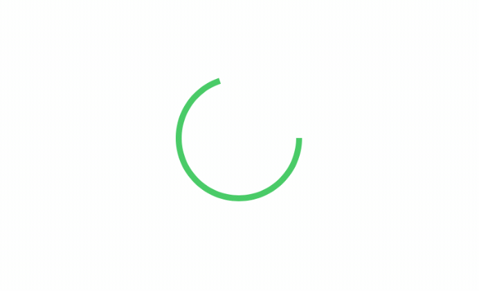
For example, let's create a simple loading indicator that you can commonly find in a real-world application like "Medium". To create a loading indicator like that shown in figure 3, we start with an open ended circle like this:
Circle()
    .trim(from: 0, to: 0.7)
    .stroke(Color.green, lineWidth: 5)
    .frame(width: 100, height: 100)
How do we rotate the circle? We make use of the rotationEffect and animation modifiers. The trick is to keep rotating the circle by 360 degrees. Here is the code:
struct ContentView: View {
    @State private var isLoading = false

    var body: some View {
        Circle()
            .trim(from: 0, to: 0.7)
            .stroke(Color.green, lineWidth: 5)
            .frame(width: 100, height: 100)
            .rotationEffect(Angle(degrees: isLoading ? 360 : 0))
            .animation(.default.repeatForever(autoreverses: false), value: isLoading)
            .onAppear() {
                isLoading = true
            }
    }
}
The rotationEffect modifier takes in the rotation degree (360 degrees). In the code above, we have a state variable to control the loading status. When it's set to true, the rotation degree will be set to 360 to rotate the circle. In the animation modifier, we specify to use the .default animation, but there is a difference. We tell SwiftUI to repeat the same animation again and again. This is the trick that creates the loading animation.
*Note: If you can't see the animation in the preview canvas, run the app in the simulator.*
If you want to change the speed of the animation, you can use the linear animation and specify a duration like this:
.animation(.linear(duration: 5).repeatForever(autoreverses: false), value: isLoading)
The greater the duration value the slower the animation (rotation).
The onAppear modifier may be new to you. If you have some knowledge of UIKit, this modifier is very similar to viewDidAppear. It's automatically called when the view appears on screen. In the code, we change the loading status to true in order to start the animation when the view is loaded up.
Once you manage this technique, you can tweak the design and develop various versions of loading indicator. For example, you can overlay an arc on a circle to create a fancy loading indicator.
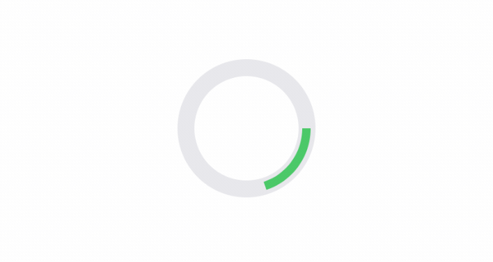
struct ContentView: View {

    @State private var isLoading = false

    var body: some View {
        ZStack {

            Circle()
                .stroke(Color(.systemGray5), lineWidth: 14)
                .frame(width: 100, height: 100)

            Circle()
                .trim(from: 0, to: 0.2)
                .stroke(Color.green, lineWidth: 7)
                .frame(width: 100, height: 100)
                .rotationEffect(Angle(degrees: isLoading ? 360 : 0))
                .animation(.linear(duration: 1).repeatForever(autoreverses: false), value: isLoading)
                .onAppear() {
                    self.isLoading = true
            }
        }
    }
}
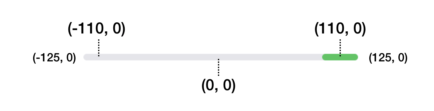
The loading indicator doesn't need to be circular. You can also use Rectangle or RoundedRectangle to create the indicator. Instead of changing the rotation angle, you modify the value of the offset to create an animation like this.
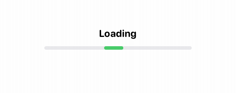
To create the animation, we overlay two rounded rectangles together. The rectangle on top is much shorter than the one below. When the loading begins, we update its offset value from -110 to 110.
struct ContentView: View {

    @State private var isLoading = false

    var body: some View {
        ZStack {

            Text("Loading")
                .font(.system(.body, design: .rounded))
                .bold()
                .offset(x: 0, y: -25)

            RoundedRectangle(cornerRadius: 3)
                .stroke(Color(.systemGray5), lineWidth: 3)
                .frame(width: 250, height: 3)

            RoundedRectangle(cornerRadius: 3)
                .stroke(Color.green, lineWidth: 3)
                .frame(width: 30, height: 3)
                .offset(x: isLoading ? 110 : -110, y: 0)
                .animation(.linear(duration: 1).repeatForever(autoreverses: false), value: isLoading)
        }
        .onAppear() {
            self.isLoading = true
        }
    }
}
This moves the green rectangle along the line. When you repeat the same animation over and over, it becomes a loading animation. Figure 6 illustrates the offset values.
Creating a Progress Indicator
The loading indicator provides feedback to the user that the app is working on something. However, it doesn't show the actual progress. If you need to give users more information about the progress of a task, you may want to build a progress indicator.
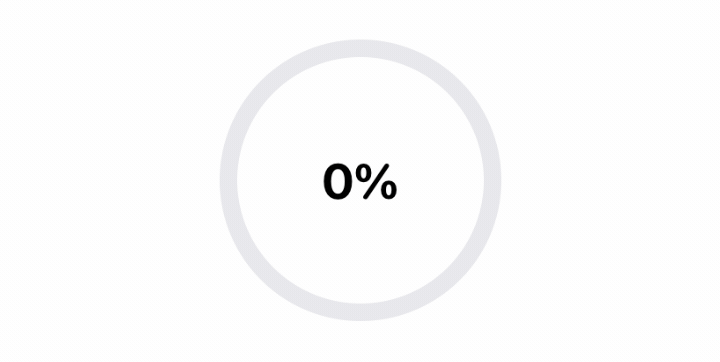
Building a progress indicator is very similar to that of the loading indicator. But you need a state variable to keep track of the progress. Here is a code snippet for creating the indicator:
struct ContentView: View {
    @State private var progress: CGFloat = 0.0

    var body: some View {

        ZStack {
            Text("\(Int(progress * 100))%")
                .font(.system(.title, design: .rounded))
                .bold()

            Circle()
                .stroke(Color(.systemGray5), lineWidth: 10)
                .frame(width: 150, height: 150)

            Circle()
                .trim(from: 0, to: progress)
                .stroke(Color.green, lineWidth: 10)
                .frame(width: 150, height: 150)
                .rotationEffect(Angle(degrees: -90))
        }
        .onAppear() {
            Timer.scheduledTimer(withTimeInterval: 0.5, repeats: true) { timer in
                self.progress += 0.05
                print(self.progress)
                if self.progress >= 1.0 {
                    timer.invalidate()
                }
            }
        }
    }
}
Instead of a boolean state variable, we use a floating point number to store the status. To display progress, we set the trim modifier with the progress value. In a real world application, you can update the value of the progress value to show the actual progress of the operation. For this demo, we used a timer which updates the progress every half second.
Delaying an Animation
Not only does the SwiftUI framework allow you to control the duration of an animation, you can also delay an animation through the delay function like this:
Animation.default.delay(1.0)
This will delay the start of the animation by 1 second. The delay function is applicable to other animations.
By mixing and matching the values of duration and delay, you can achieve some interesting animations like the dot loading indicator below.

This indicator is composed of five dots. Each dot is animated to scale up and down, but with different time delays. Here is how it's implemented in code.
struct ContentView: View {
    @State private var isLoading = false

    var body: some View {
        HStack {
            ForEach(0...4, id: \.self) { index in
                Circle()
                    .frame(width: 10, height: 10)
                    .foregroundColor(.green)
                    .scaleEffect(self.isLoading ? 0 : 1)
                    .animation(.linear(duration: 0.6).repeatForever().delay(0.2 * Double(index)), value: isLoading)
            }
        }
        .onAppear() {
            self.isLoading = true
        }
    }
}
We first use a HStack to layout the circles horizontally. Since all five circles (dots) are the same size and color, we use ForEach to create the circles. The scaleEffect modifier is used to scale the circle's size. By default, it's set to 1, which is its original size. When the loading starts, the value is updated to 0. This will minimize the dot.
The line of code for rendering the animation looks a bit complicated. Let's break it down and look at it step by step:
.animation(.linear(duration: 0.6).repeatForever().delay(0.2 * Double(index)), value: isLoading)
The first part creates a linear animation with a duration of 0.6 seconds. This animation is expected to run repeatedly, so we call the repeatForever function.
If you run the animation without calling the delay function, all the dots scales up and down simultaneously. However, this is not what we want. Instead of scaling up/down all at once, each dot should resize itself independently. This is why we call the delay function and use a different delay value for each dot (based on its order in the row).
You may vary the value of duration and delay to tweak the animation.
Transforming a Rectangle into Circle
Sometimes, you probably need to smoothly transform one shape (e.g. rectangle) into another (e.g. circle). With the built-in shape and animation, you can easily create this transformation as shown in figure 9.
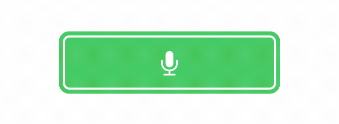
The trick of morphing a rectangle into a circle is to use the RoundedRectangle shape and animate the change of the corner radius. Assuming the width and height of the rectangle are the same, it becomes a circle when its corner radius is set to half of its width. Here is the implementation of the morphing button:
struct ContentView: View {
    @State private var recordBegin = false
    @State private var recording = false

    var body: some View {
        ZStack {

            RoundedRectangle(cornerRadius: recordBegin ? 30 : 5)
                .frame(width: recordBegin ? 60 : 250, height: 60)
                .foregroundColor(recordBegin ? .red : .green)
                .overlay(
                    Image(systemName: "mic.fill")
                        .font(.system(.title))
                        .foregroundColor(.white)
                        .scaleEffect(recording ? 0.7 : 1)
                )

            RoundedRectangle(cornerRadius: recordBegin ? 35 : 10)
                .trim(from: 0, to: recordBegin ? 0.0001 : 1)
                .stroke(lineWidth: 5)
                .frame(width: recordBegin ? 70 : 260, height: 70)
                .foregroundColor(.green)

        }
        .onTapGesture {
            withAnimation(Animation.spring()) {
                self.recordBegin.toggle()
            }

            withAnimation(Animation.spring().repeatForever().delay(0.5)) {
                self.recording.toggle()
            }
        }
    }
}
We have two state variables here: recordBegin and recording to control two separate animations. The first variable controls the morphing of the button. As explained before, we make use of the corner radius for the transformation. The width of the rectangle is originally set to 250 points. When a user taps the rectangle to trigger the transformation, the frame's width is changed to 60 points. Alongside with the change, the corner radius is changed to 30 points, which is half of the width.
This is how we transform a rectangle into a circle. SwiftUI automatically renders the animation of this transformation.
The recording state variable handles the scaling of the mic image. We change the scaling ratio from 1 to 0.7 when it's in the recording state. By running the same animation repeatedly, it creates the pulsing animation.
Note that the code above uses the explicit approach to animate the views. This is not mandatory. If you prefer, you can use the implicit animation approach to achieve the same result.
Understanding Transitions
What we have discussed so far is animating a view that already exists in the view hierarchy. We animate the view's size by scaling it up and down.
SwiftUI allows developers to do more than that. You can define how a view is inserted or removed from the view hierarchy. In SwiftUI, this is known as transition. By default, the framework uses fade in and fade out transition. However, it comes with several ready-to-use transitions such as slide, move, opacity, etc. Of course, you are allowed to develop your own or simply mix and match various types of transitions together to create your desired transition.
Building a Simple Transition
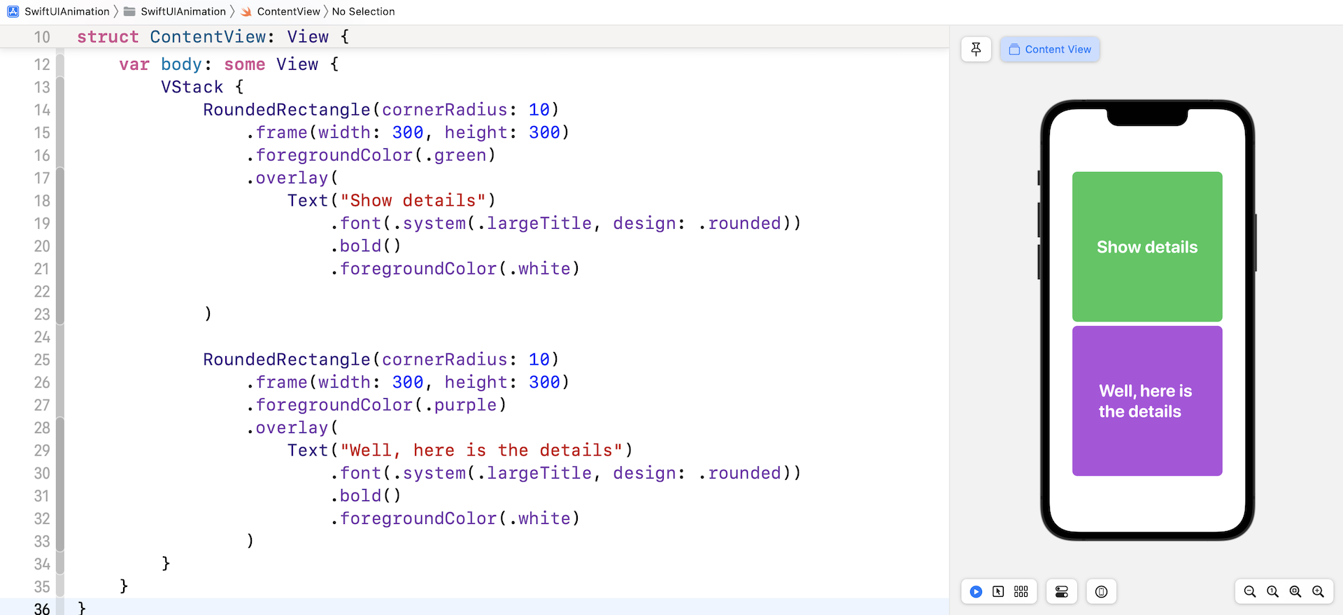
Let's take a look at a simple example to better understand what a transition is and how it works with animations. Create a new project named SwiftUITransition and update the ContentView like this:
struct ContentView: View {
var body: some View {
VStack {
RoundedRectangle(cornerRadius: 10)
.frame(width: 300, height: 300)
.foregroundColor(.green)
.overlay(
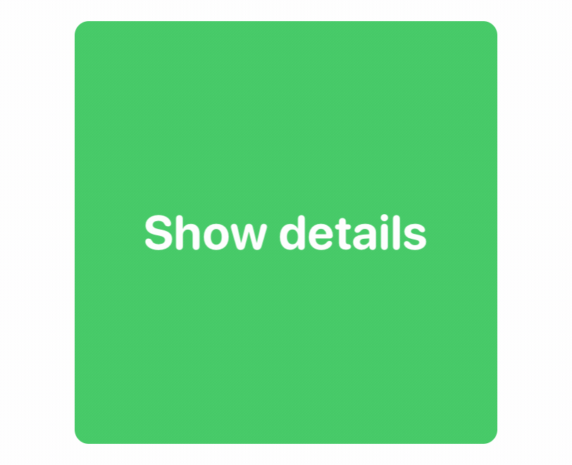
Text("Show details")
.font(.system(.largeTitle, design: .rounded))
.bold()
.foregroundColor(.white)
)
RoundedRectangle(cornerRadius: 10)
.frame(width: 300, height: 300)
.foregroundColor(.purple)
.overlay(
Text("Well, here is the details")
.font(.system(.largeTitle, design: .rounded))
.bold()
.foregroundColor(.white)
)
}
}
}
In the code above, we lay out two squares vertically using VStack. At first, the purple rectangle should be hidden. It's displayed only when a user taps the green rectangle (i.e. Show details). In order to show the purple square, we need to make the green square tappable.
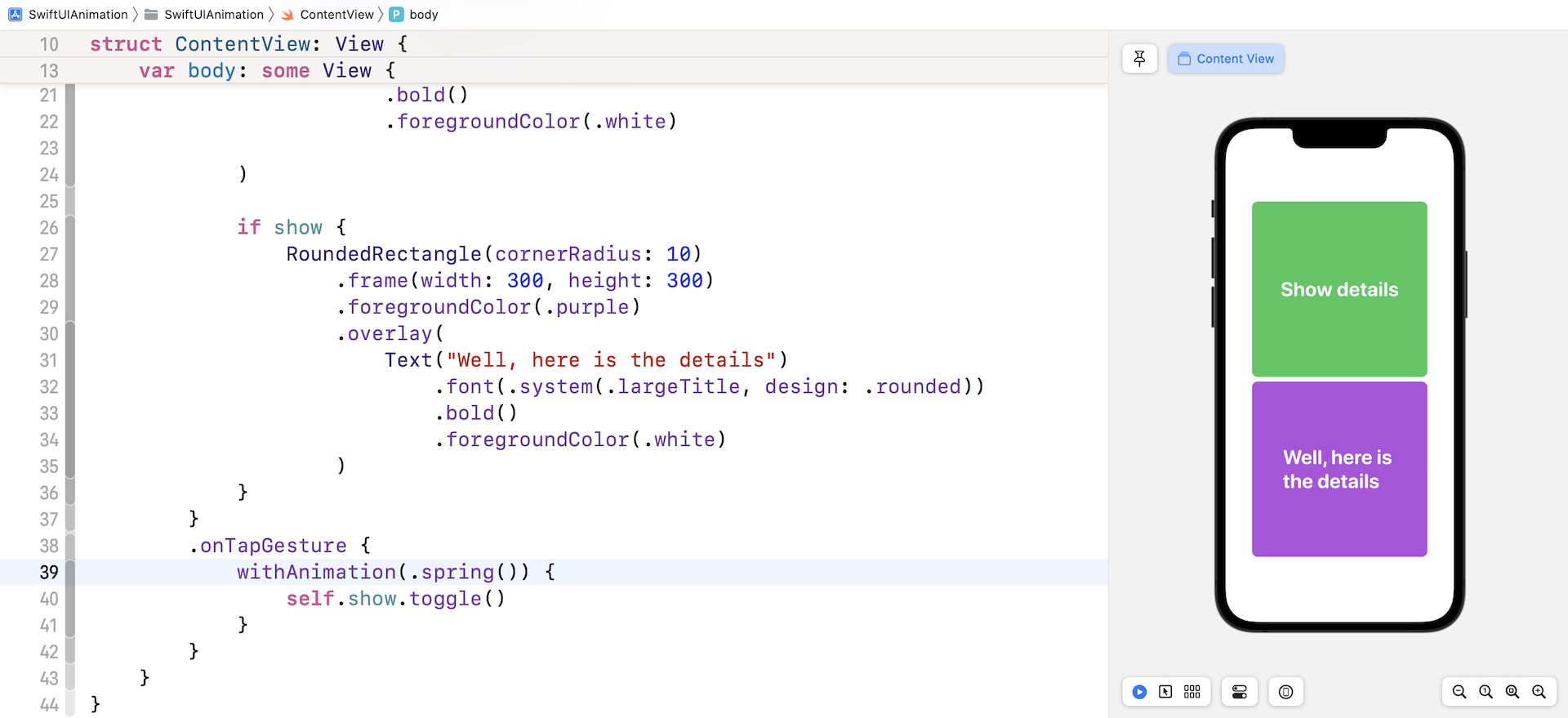
To do that, we need to declare a state variable to determine whether the purple square is shown or not. Insert this line of code in ContentView:
@State private var show = false
Next, to hide the purple square, we wrap the purple square within a if clause like this:
if show {
    RoundedRectangle(cornerRadius: 10)
        .frame(width: 300, height: 300)
        .foregroundColor(.purple)
        .overlay(
            Text("Well, here is the details")
                .font(.system(.largeTitle, design: .rounded))
                .bold()
                .foregroundColor(.white)
        )
}
For the VStack, we attach the onTapGesture function to detect a tap and create an animation for the state change. Note that the transition should be associated with an animation, otherwise, it won't work on its own.
.onTapGesture {
    withAnimation(.spring()) {
        self.show.toggle()
    }
}
Once a user taps the stack, we toggle the show variable to display the purple square. If you run the app in the simulator or the preview canvas, you should only see the green square. Tapping it will display the purple rectangle with a smooth fade in/out transition.
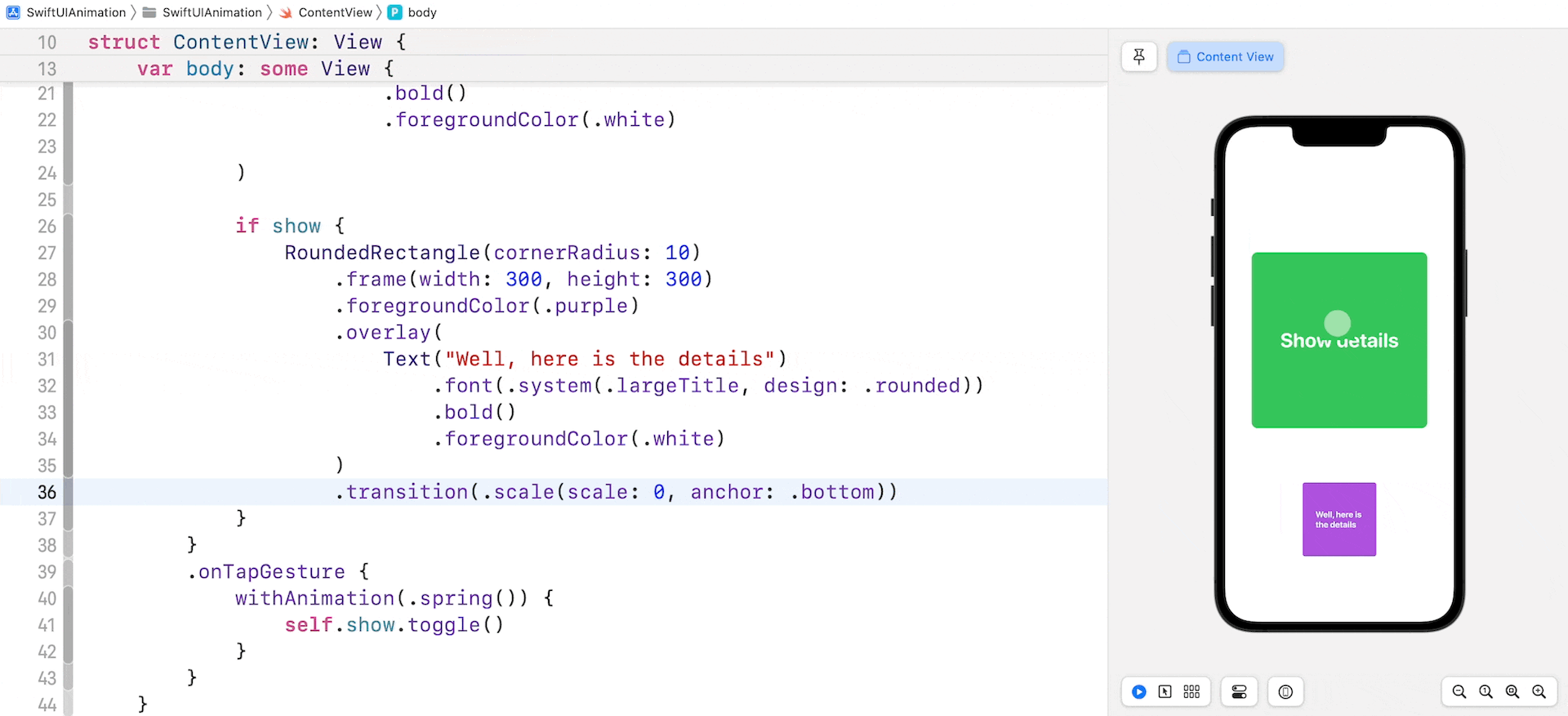
As mentioned, if you do not specify the transition you want to use, SwiftUI renders the fade in and out transition. To use an alternative transition, attach the transition modifier to the purple square like this:
if show {
    RoundedRectangle(cornerRadius: 10)
        .frame(width: 300, height: 300)
        .foregroundColor(.purple)
        .overlay(
            Text("Well, here is the details")
                .font(.system(.largeTitle, design: .rounded))
                .bold()
                .foregroundColor(.white)
        )
        .transition(.scale(scale: 0, anchor: .bottom))
}
The transition modifier takes in a parameter of the type AnyTransition. Here we use the scale transition with the anchor set to .bottom. That's all you need to do to modify the transition. Run the app in a simulator. You should see a pop animation when the app reveals the purple square. You should test the animations using the built-in simulator instead of running the app in preview because the preview canvas may not render the transition correctly.
In addition to .scale, the SwiftUI framework comes with several built-in transitions including .opaque, .offset, .move, and .slide. Replace the .scale transition with the .offset transition like this:
.transition(.offset(x: -600, y: 0))
This time, the purple square slides in from the left when it's inserted into the VStack.
Combining Transitions
You can combine two or more transitions together by calling the combined(with:) method to create an even more slick transition. For example, to combine the offset and scale animation, you write the code like this:
.transition(AnyTransition.offset(x: -600, y: 0).combined(with: .scale))
Here is another example that combines three transitions:
.transition(AnyTransition.offset(x: -600, y: 0).combined(with: .scale).combined(with: .opacity))
Sometimes you need to define a reusable animation. You can define an extension on AnyTransition like this:
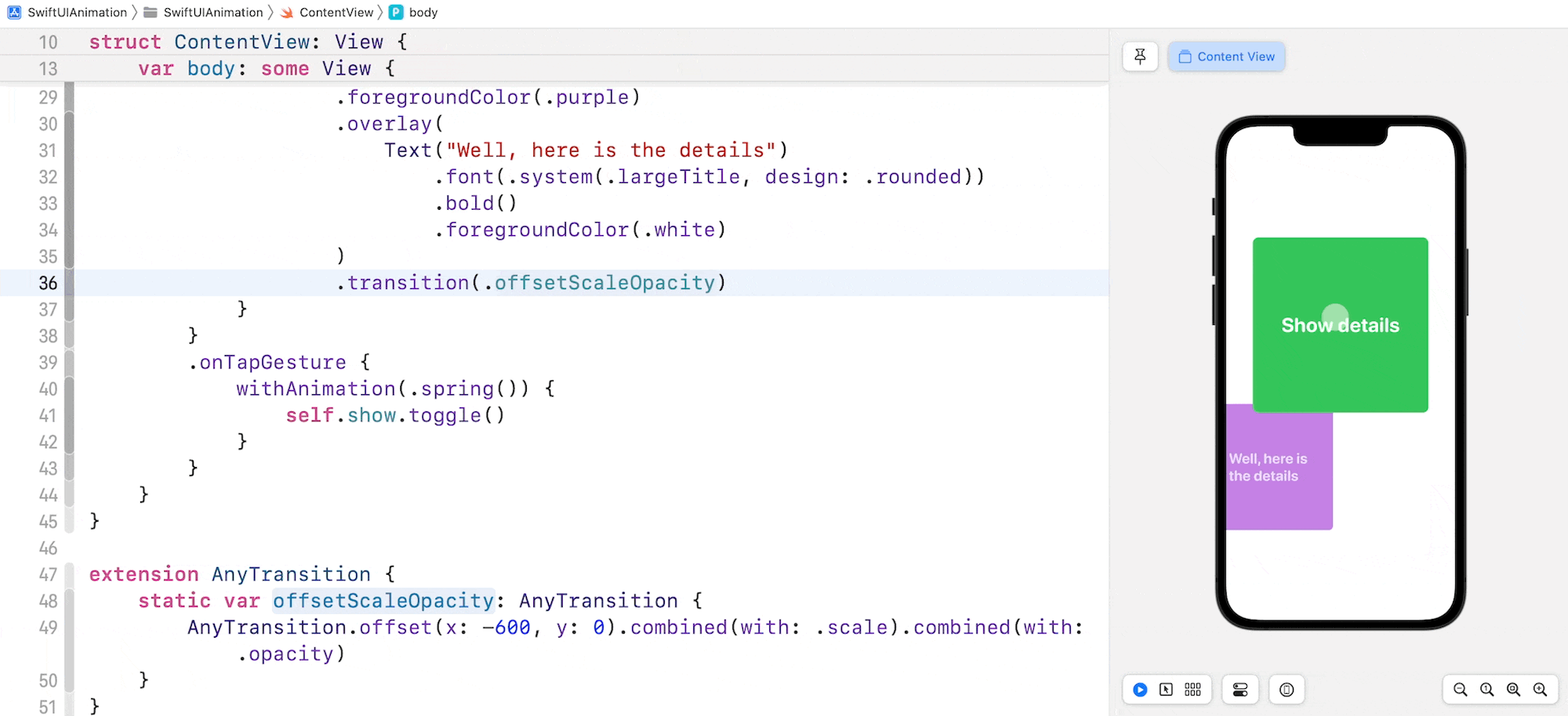
extension AnyTransition {
    static var offsetScaleOpacity: AnyTransition {
        AnyTransition.offset(x: -600, y: 0).combined(with: .scale).combined(with: .opacity)
    }
}
Then you can use the offsetScaleOpacity animation in the transition modifier directly:
.transition(.offsetScaleOpacity)
Run the app and test the transition again. Does it look great?
Asymmetric Transitions
The transitions that we just discussed are all symmetric, meaning that the insertion and removal of the view use the same transition. For example, if you apply the scale transition to a view, SwiftUI scales up the view when it's inserted in the view hierarchy. When it's removed, the framework scales it back down to the original size.
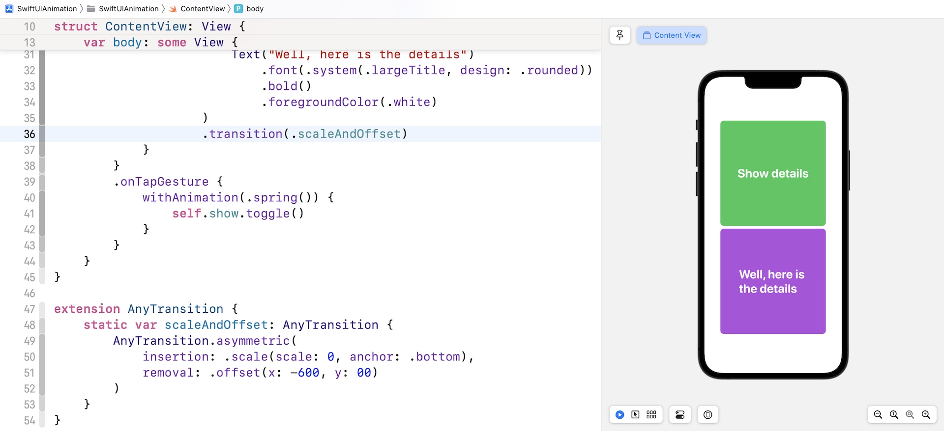
So, what if you want to use a scale transition when the view is inserted and an offset transition when the view is removed? This is known as Assymetric Transitions in SwiftUI. It's very simple to use this type of transition. You just need to call the .assymetric method and specify both the insertion & removal transitions. Here is the sample code:
.transition(.asymmetric(insertion: .scale(scale: 0, anchor: .bottom), removal: .offset(x: -600, y: 0)))
Again, if you need to reuse the transition, you can define an extension on AnyTransition like this:
extension AnyTransition {
    static var scaleAndOffset: AnyTransition {
        AnyTransition.asymmetric(
            insertion: .scale(scale: 0, anchor: .bottom),
            removal: .offset(x: -600, y: 00)
        )
    }
}
Add this code after the ContentView block and before the ContentView_Previews block. Run the app using the built-in simulator. You should see the scale transition when the purple square appears on screen. When you tap the rectangles again, the purple rectangle will slide off the screen.
Exercise #1: Using Animation and Transition to Build a Fancy Button
Now that you have learned transitions and animations, let me challenge you to build a fancy button that displays the current state of an operation. If you can't see the animation below, please click this link (https://www.appcoda.com/wp-content/uploads/2019/10/swiftui-animation-16.gif) to see the animation.
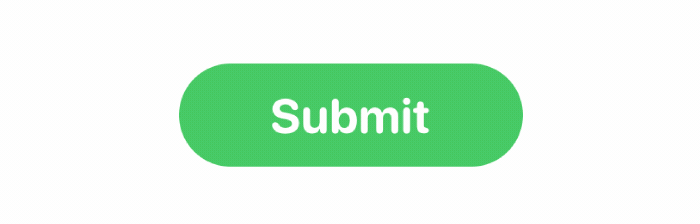
This button has three states:
- The original state: it shows a Submit button in green.
- The processing state: it displays a rotating circle and updates its label to Processing.
- The complete state: it displays the Done button in red.
It's quite a challenging project that will test your knowledge of SwiftUI animation and transition. You will need to combine everything you've learned so far to work out the solution.
In the demo button shown in figure 16, the processing takes around 4 seconds. You do not need to perform a real operation. To help you with this exercise, I use the following code to simulate an operation.
private func startProcessing() {
    self.loading = true

    // Simulate an operation by using DispatchQueue.main.asyncAfter
    // In a real world project, you will perform a task here.
    // When the task finishes, you set the completed status to true
    DispatchQueue.main.asyncAfter(deadline: .now() + 4) {
        self.completed = true
    }
}
Exercise #2: Animated View Transitions
You've learned how to implement view transitions. Try to integrate a transition with the card view project that you built in chapter 5 and create a view transition like below. When a user taps the card, the current view will scale down and fade away. The next view will be brought to the front with a scale-up animation.
If you can't understand the animation above, you can click this link (https://www.appcoda.com/wp-content/uploads/2019/10/swiftui-view-animation.gif) to see the desired result.
Summary
Animation has a special role in mobile UI design. Well thought out animation improves user experience and brings meaning to UI interaction. A smooth and effortless transition between two views will delight and impress your users. With more than 2 million apps on the App Store, it's not easy to make your app stand out. However, a well-designed UI with animation will definitely make a difference!
Even for experienced developers, it's not an easy task to code slick animations. Fortunately, the SwiftUI framework has simplified the development of UI animation and transition. You tell the framework how the view should look at the beginning and the end. SwiftUI figures out the rest, rendering a smooth and nice animation.
In this chapter, I've walked you through the basics. But as you can see, you've already built some delightful animations and transitions. Most importantly, it needed just a few lines of code.
I hope you enjoyed reading this chapter and find the techniques useful. For reference, you can download the sample projects and solutions to exercises below: