- Made by AppCoda
- Contact us / Support
- Tweet this book
- Preface
- 1. Introduction to SwiftUI
- 2. Getting Started with SwiftUI and Working with Text
- 3. Working with Images
- 4. Layout User Interfaces with Stacks
- 5. Understanding ScrollView and Building a Carousel UI
- 6. Working with SwiftUI Buttons and Gradient
- 7. Understanding State and Binding
- 8. Implementing Path and Shape for Line Drawing and Pie Charts
- 9. Basic Animations and Transitions
- 10. Understanding Dynamic List, ForEach and Identifiable
- 11. Working with Navigation UI and Navigation Bar Customization
- 12. Playing with Modal Views, Floating Buttons and Alerts
- 13. Building a Form with Picker, Toggle and Stepper
- 14. Data Sharing with Combine and Environment Objects
- 15. Building a Registration Form with Combine and View Model
- 16. Working with Swipe-to-Delete, Context Menu and Action Sheets
- 17. Using Gestures
- 18. Displaying an Expandable Bottom Sheet Using Presentation Detents
- 19. Creating a Tinder-like UI with Gestures and Animations
- 20. Creating an Apple Wallet like Animation and View Transition
- 21. Working with JSON, Slider and Data Filtering
- 22. Building a ToDo app with Core Data
- 23. Integrating UIKit with SwiftUI Using UIViewRepresentable
- 24. Creating a Search Bar View and Working with Custom Binding
- 25. Putting Everything Together to Build a Real World App
- 26. Creating an App Store like Animated View Transition
- 27. Building an Image Carousel
- 28. Building an Expandable List View Using OutlineGroup
- 29. Building Grid Layout Using LazyVGrid and LazyHGrid
- 30. Creating an Animated Activity Ring with Shape and Animatable
- 31. Working with AnimatableModifier and LibraryContentProvider
- 32. Working with TextEditor to Create Multiline Text Fields
- 33. Using matchedGeometryEffect to Create View Animations
- 34. ScrollViewReader and Grid Animation
- 35. Working with Tab View and Tab Bar Customization
- 36. Using AsyncImage in SwiftUI for Loading Images Asynchronously
- 37. Implementing Search Bar Using Searchable
- 38. Creating Bar Charts and Line Charts with the Charts Framework
- 39. Capturing Text within Image Using Live Text APIs
- 40. How to Use ShareLink for Sharing Data Like Text and Photos
- 41. Using ImageRenderer to Convert SwiftUI Views into Images
- 42. Creating PDF Documents Using ImageRenderer
- 43. Using Gauge to Display Progress and Create a Speedometer
- 44. Creating Grid Layout Using Grid APIs
- 45. Switching Layout with AnyLayout
- Published with GitBook
Chapter 4
Layout User Interface with Stacks
Stacks in SwiftUI is similar to the stack views in UIKit. By combining views in horizontal and vertical stacks, you can construct complex user interfaces for your apps. For UIKit, it's inevitable to use auto layout in order to build interfaces that fit all screen sizes. To some beginners, auto layout is a complicated subject and hard to learn. The good news is that you no longer need to use auto layout in SwiftUI. Everything is stacks including VStack, HStack, and ZStack.
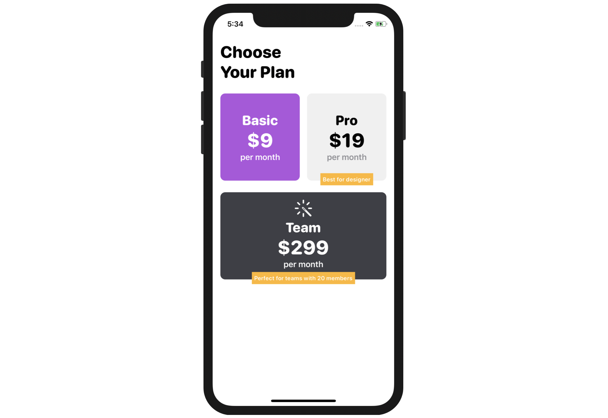
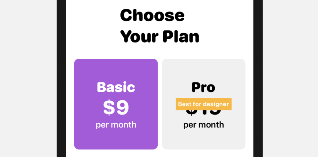
In this chapter, I will walk you through all types of stacks and build a grid layout using stacks. So, what project will you work on? Take a look at the figure below. We'll lay out a simple grid interfaces step by step. After going over this chapter, you will be able to combine views with stacks and build the UI you want.
Understanding VStack, HStack, and ZStack
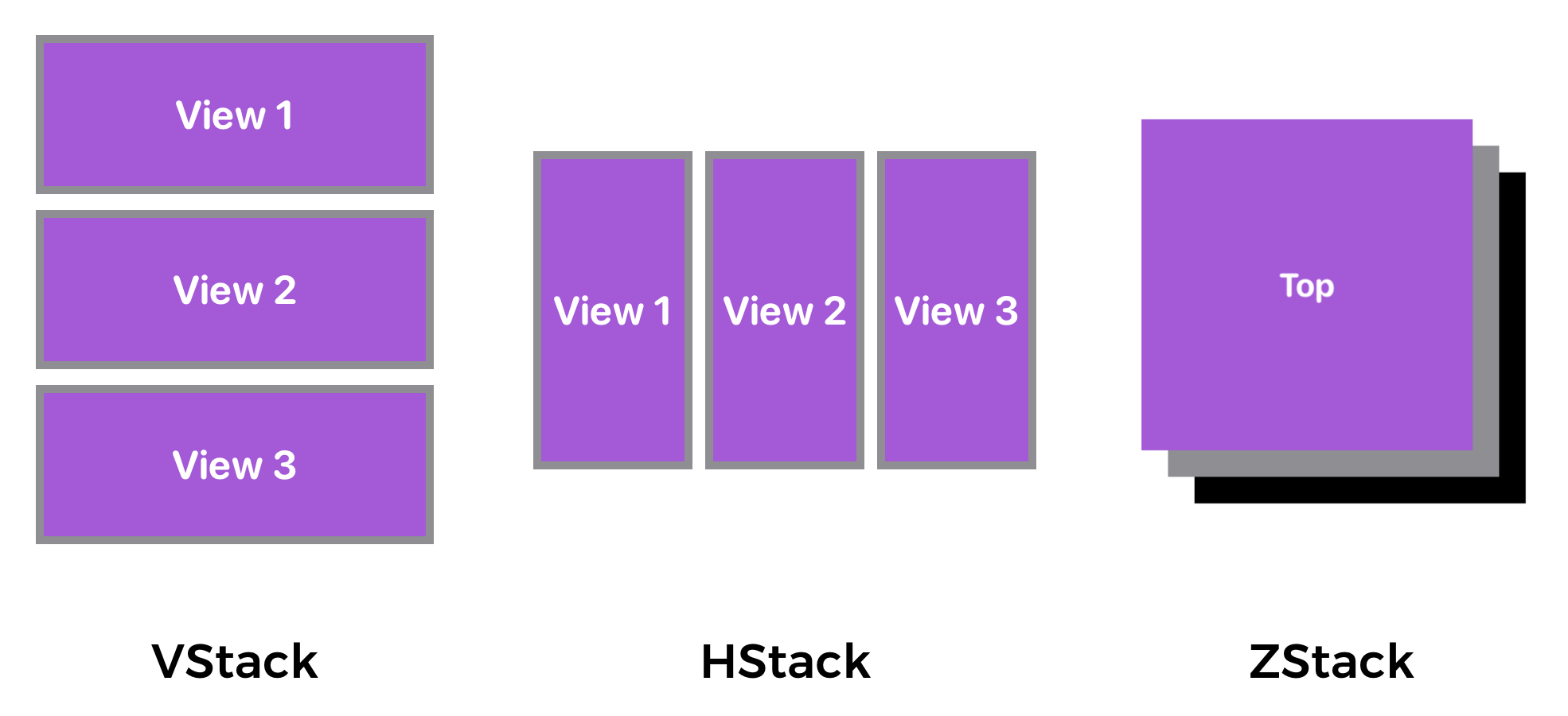
SwiftUI provides three different types of stacks for developers to combine views in various orientations. Depending on how you're going to arrange the views, you can either use:
- HStack - arranges the views horizontally
- VStack - arranges the views vertically
- ZStack - overlays one view on top of another
The figure below shows you how these stacks can be used to organize views.
Creating a New Project with SwiftUI enabled
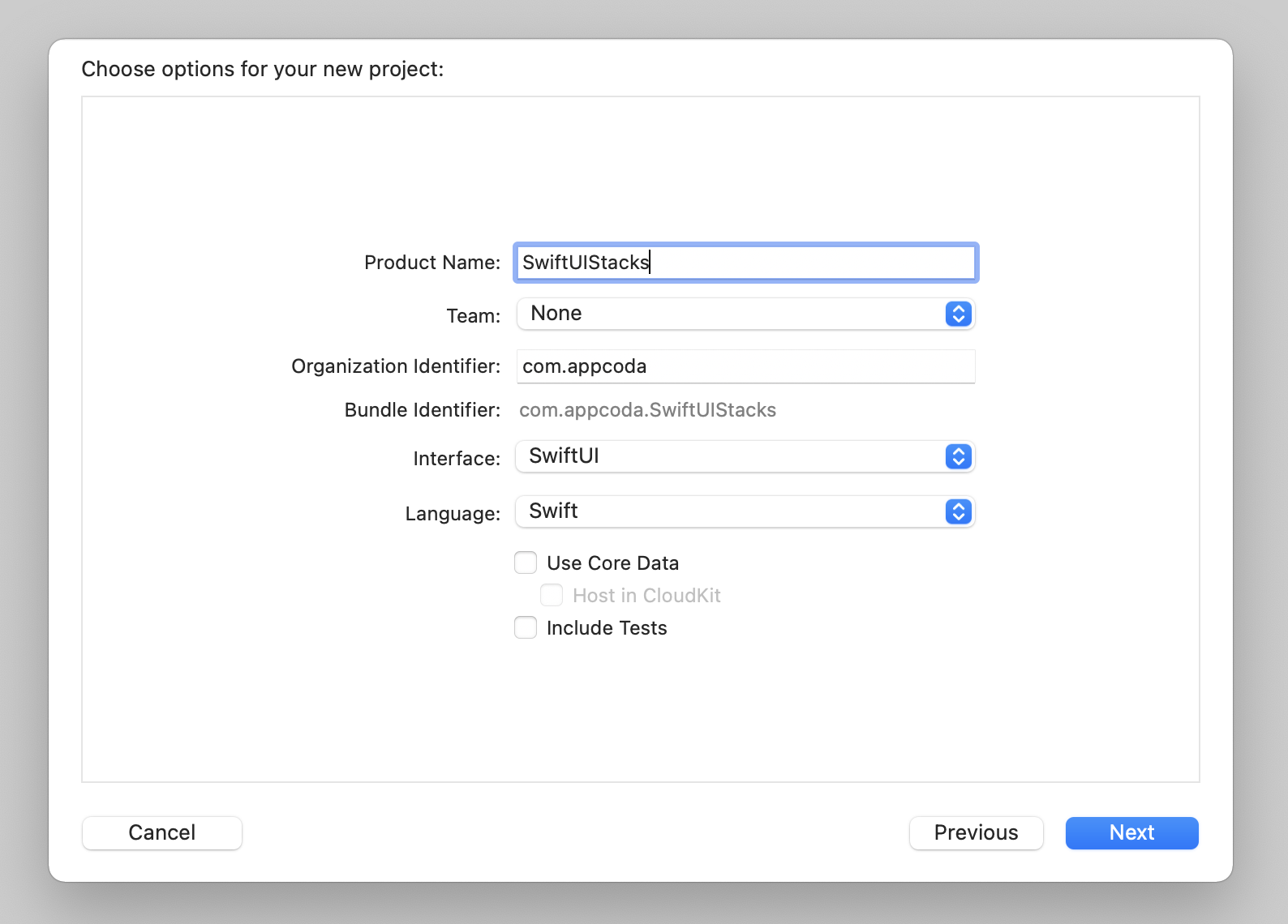
First, fire up Xcode and create a new project using the App template under the iOS tab. In the next screen, type the name of the project. I set it to SwiftUIStacks but you're free to use any other name. Be sure to select the SwiftUI option for Interface.
Once you save the project, Xcode will load the ContentView.swift file and display a preview in the design canvas. If the preview is not displayed, click the Resume button in the canvas.
Using VStack
We're going to build the UI as displayed in figure 1, but first, let's break down the UI into small parts. We'll begin with the heading as shown below.
Presently, Xcode should have already generated the following code to display the "Hello World" label:
struct ContentView: View {
    var body: some View {
        VStack {
            Image(systemName: "globe")
                .imageScale(.large)
                .foregroundColor(.accentColor)
            Text("Hello, world!")
        }
    }
}
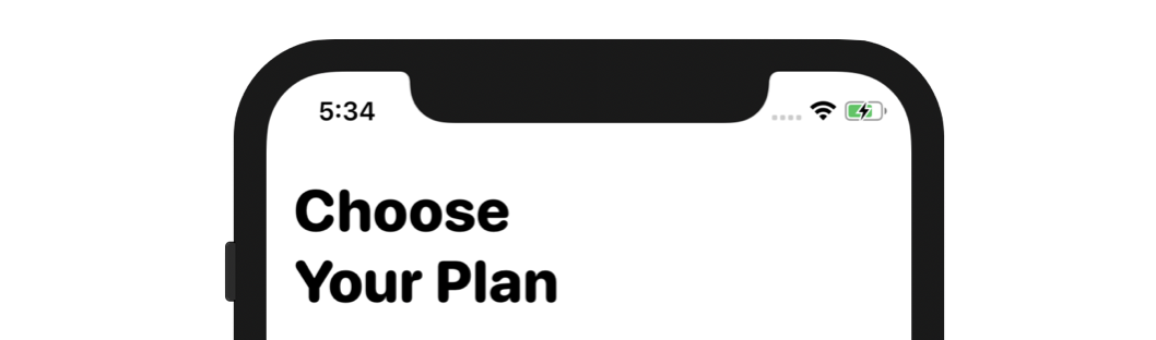
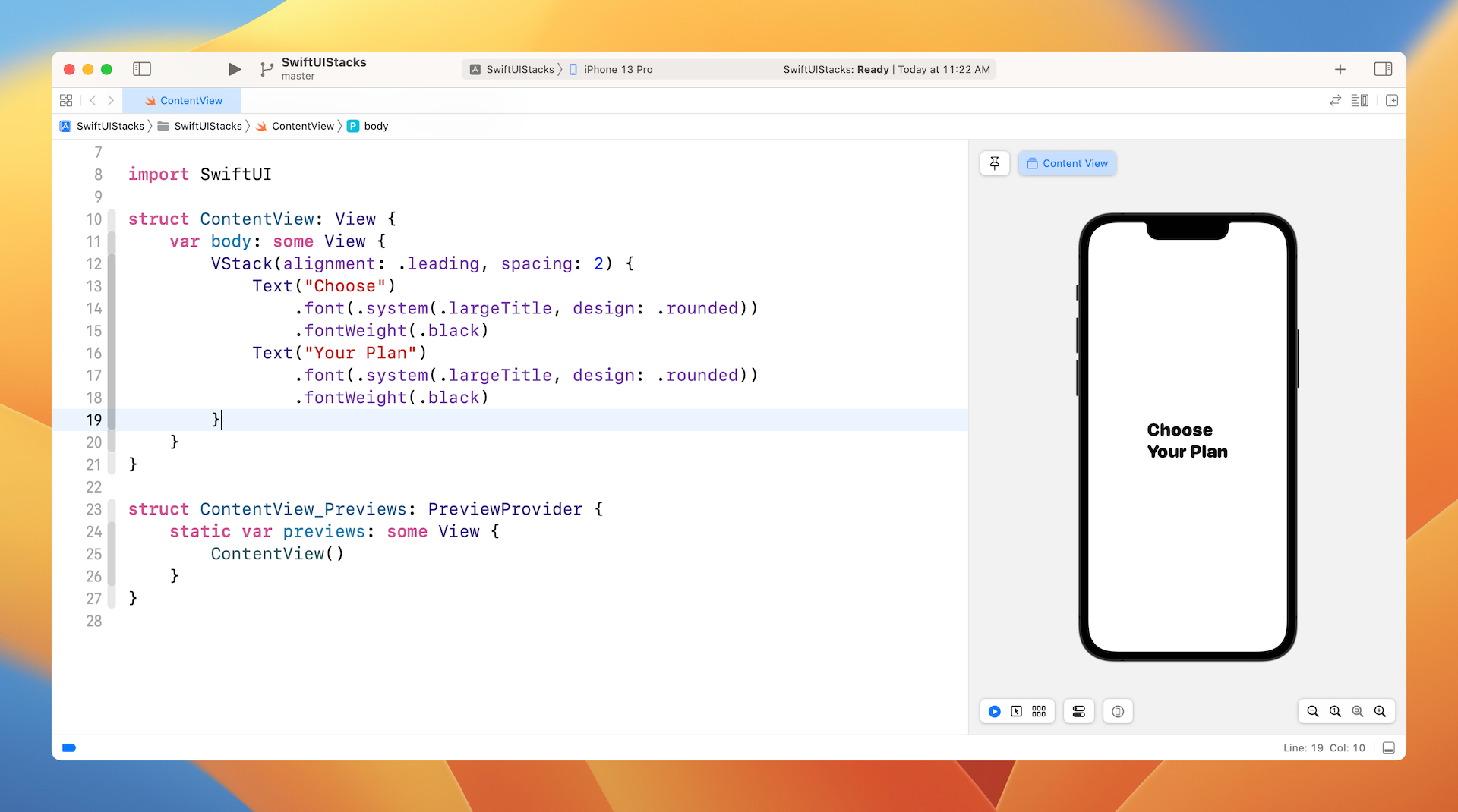
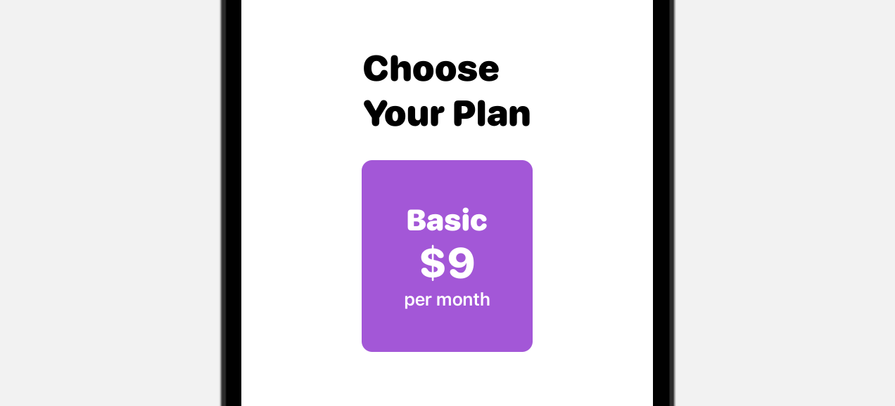
To display the text as shown in figure 4, we will combine two Text views within a VStack like this:
struct ContentView: View {
    var body: some View {
        VStack {
            Text("Choose")
                .font(.system(.largeTitle, design: .rounded))
                .fontWeight(.black)
            Text("Your Plan")
                .font(.system(.largeTitle, design: .rounded))
                .fontWeight(.black)
        }
    }
}
When you embed views in a VStack, the views will be arranged vertically like this:

By default, the views embedded in the stack are aligned in center position. To align both views to the left, you can specify the alignment parameter and set its value to .leading like this:
VStack(alignment: .leading, spacing: 2) {
    Text("Choose")
        .font(.system(.largeTitle, design: .rounded))
        .fontWeight(.black)
    Text("Your Plan")
        .font(.system(.largeTitle, design: .rounded))
        .fontWeight(.black)
}
Additionally, you can adjust the space of the embedded views by using the spacing parameter. The code above added the parameter spacing to the VStack and set its value to 2. The figure below shows the resulting view.
Using HStack
Next, let's layout the first two pricing plans. If you look at the Basic and Pro plans, the look & feel of these two components are very similar. Let’s take the Basic plan as an example, to achieve the desired layout, you can use VStack to combine three text views.
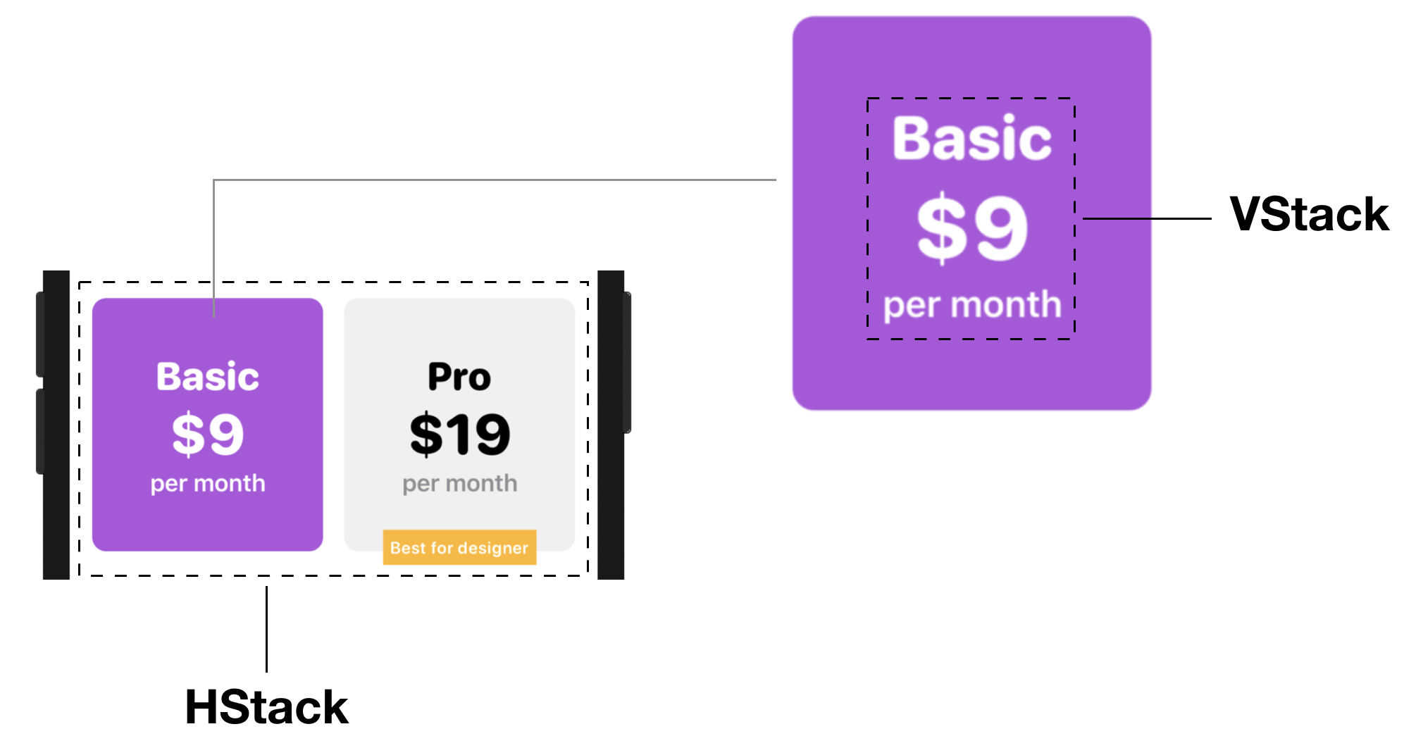
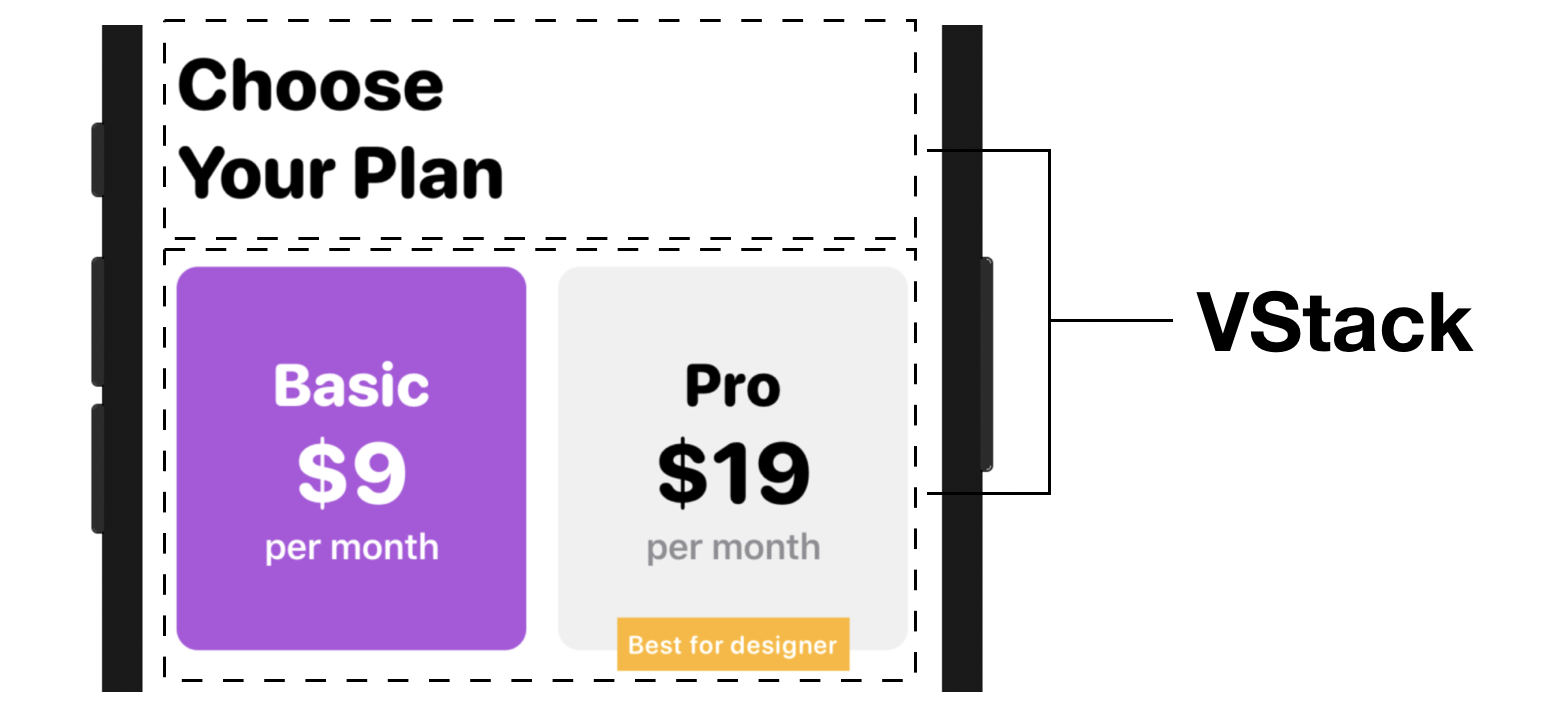
Both the Basic and Pro components are arranged side by side. By using HStack, you can lay out views horizontally. Stacks can be nested meaning that you can nest stack views within other stack views. Since the pricing plan block sits right below the heading view, which is a VStack, we will use another VStack to embed a vertical stack (i.e. Choose Your Plan) and a horizontal stack (i.e. the pricing plan block).
Now that you have some basic ideas about how we're going to use VStack and HStack for implementing the UI, let's jump right into the code.
To embed the existing VStack in another VStack, hold the command key and then click the VStack keyword. This will bring up a context menu showing all the available options. Choose Embed in VStack to embed the VStack.
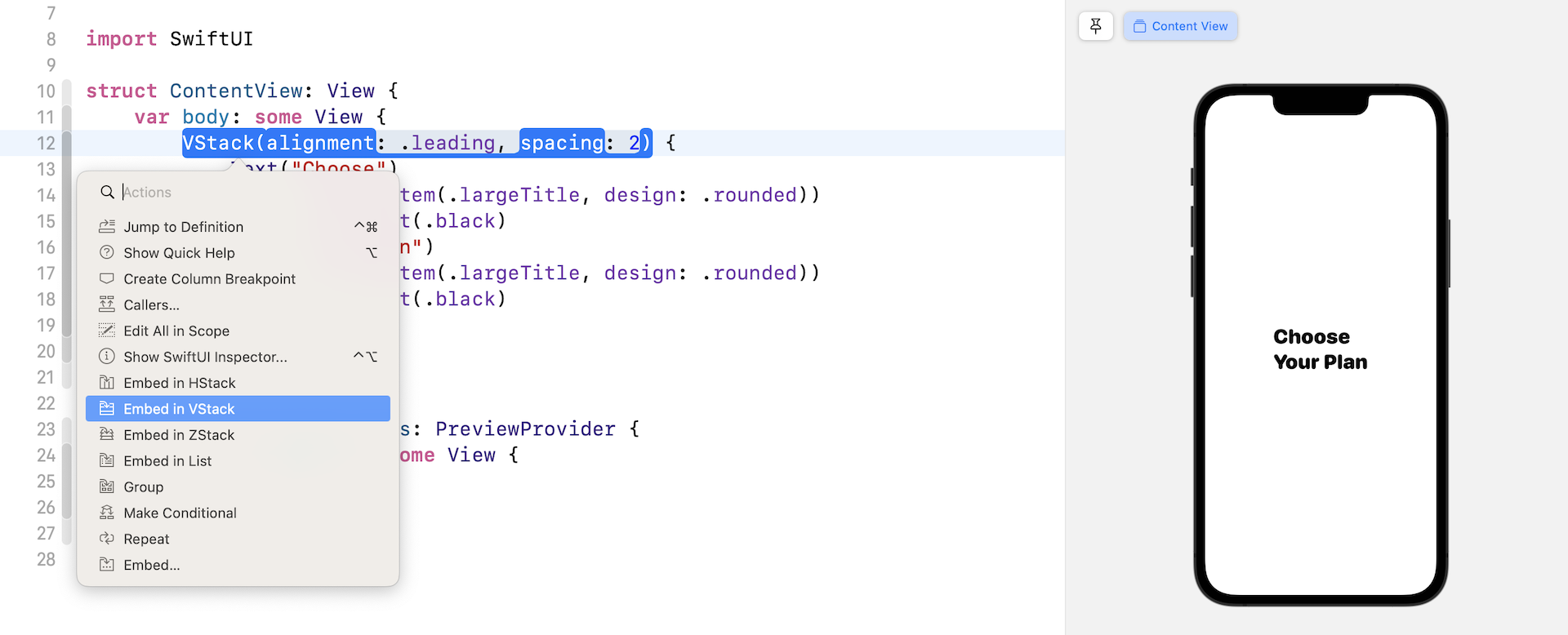
Xcode will then generate the required code to embed the stack. Your code should look like the following:
struct ContentView: View {
    var body: some View {
        VStack {
            VStack(alignment: .leading, spacing: 2) {
                Text("Choose")
                    .font(.system(.largeTitle, design: .rounded))
                    .fontWeight(.black)
                Text("Your Plan")
                    .font(.system(.largeTitle, design: .rounded))
                    .fontWeight(.black)
            }
        }
    }
}
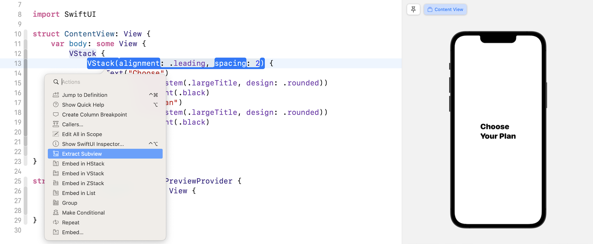
Extracting a View
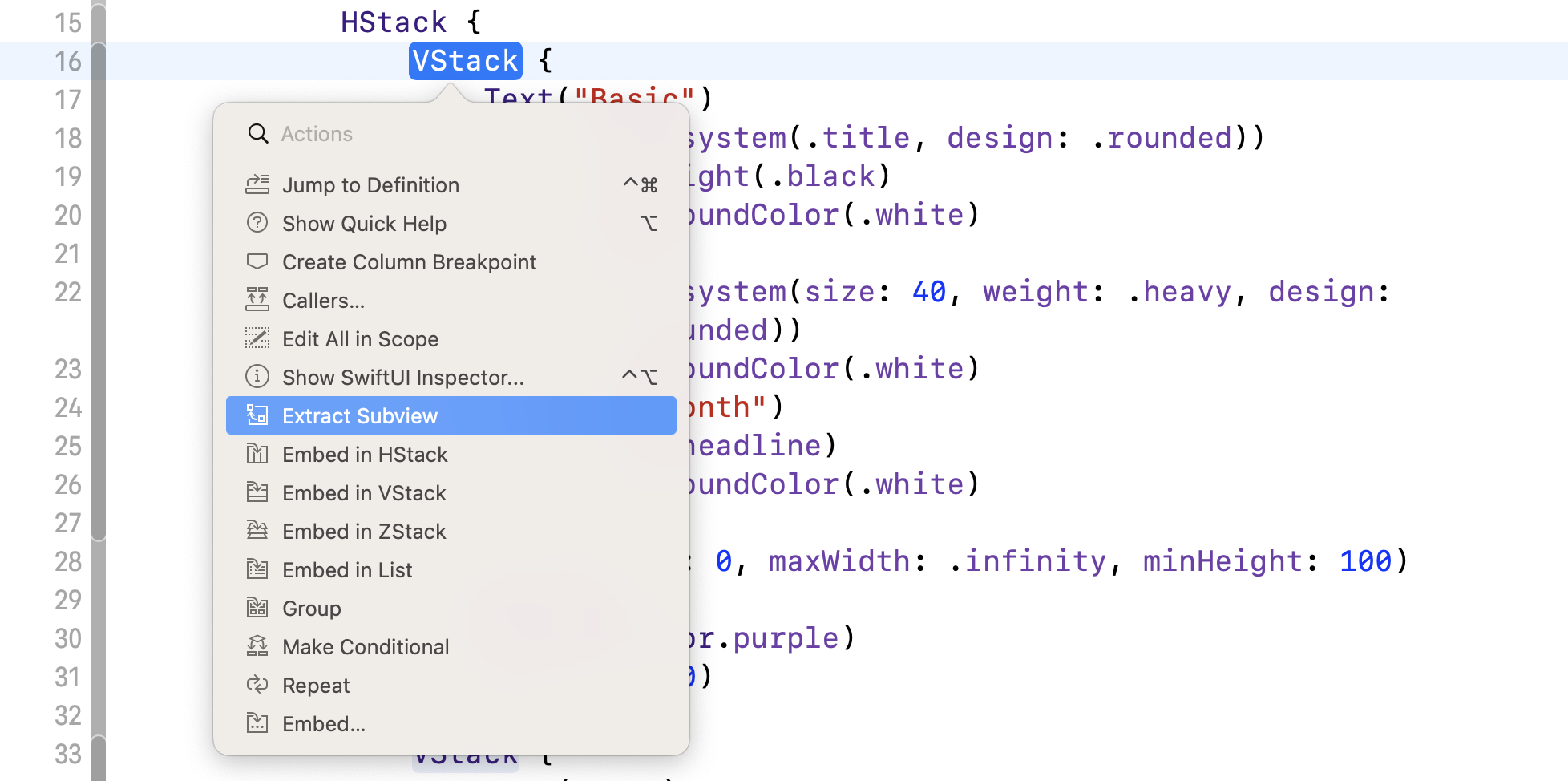
Before we continue to lay out the UI, let me show you a trick to better organize the code. As you're going to build a more complex UI that involves several components, the code inside ContentView will eventually become a giant code block that is hard to review and debug. It's always a good practice to break large blocks of code into smaller blocks, so the code is easier to read and maintain.
Xcode has a built-in feature to refactor the SwiftUI code. Hold the command key and click the VStack that holds the text views (i.e. line 13). Select Extract Subview to extract the code.
Xcode extracts the code block and creates a default struct named ExtractedView. Rename ExtractedView to HeaderView to give it a more meaningful name (see the figure below for details).
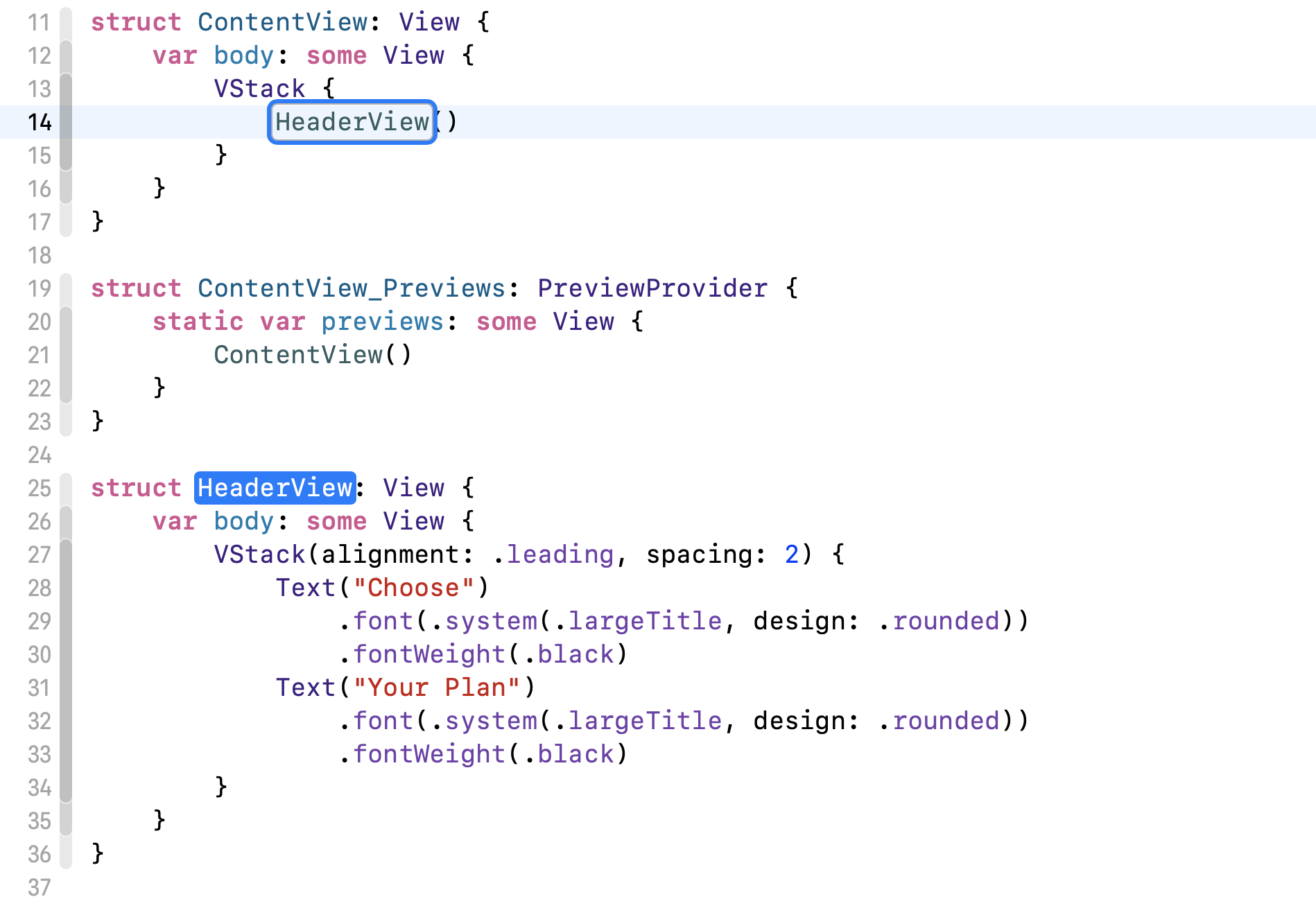
The UI is still the same. However, look at the code block in ContentView. It's now much cleaner and easier to read.
Let's continue to implement the UI of the pricing plans. We'll first create the UI for the Basic plan. Update ContentView like this:
struct ContentView: View {
    var body: some View {
        VStack {
            HeaderView()

            VStack {
                Text("Basic")
                    .font(.system(.title, design: .rounded))
                    .fontWeight(.black)
                    .foregroundColor(.white)
                Text("$9")
                    .font(.system(size: 40, weight: .heavy, design: .rounded))
                    .foregroundColor(.white)
                Text("per month")
                    .font(.headline)
                    .foregroundColor(.white)
            }
            .padding(40)
            .background(Color.purple)
            .cornerRadius(10)
        }
    }
}
Here we add another VStack under HeaderView. This VStack is used to hold three text views for showing the Basic plan. I'll not go into the details of padding, background, and cornerRadius because we have already discussed these modifiers in earlier chapters.
Next, we're going to implement the UI of the Pro plan. This Pro plan should be placed right next the Basic plan. In order to do that, you need to embed the VStack of the Basic plan in a HStack. Hold the command key and click the VStack keyword. Choose Embed in HStack.
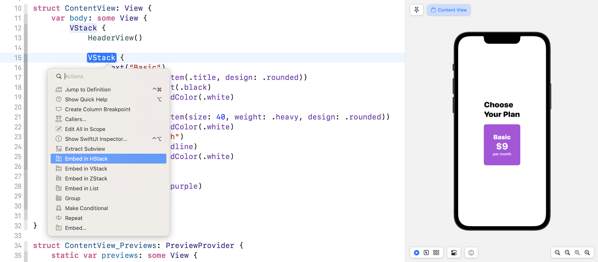
Xcode should insert the code for HStack and embed the selected VStack in the horizontal stack like this:
HStack {
    VStack {
        Text("Basic")
            .font(.system(.title, design: .rounded))
            .fontWeight(.black)
            .foregroundColor(.white)
        Text("$9")
            .font(.system(size: 40, weight: .heavy, design: .rounded))
            .foregroundColor(.white)
        Text("per month")
            .font(.headline)
            .foregroundColor(.white)
    }
    .padding(40)
    .background(Color.purple)
    .cornerRadius(10)
}
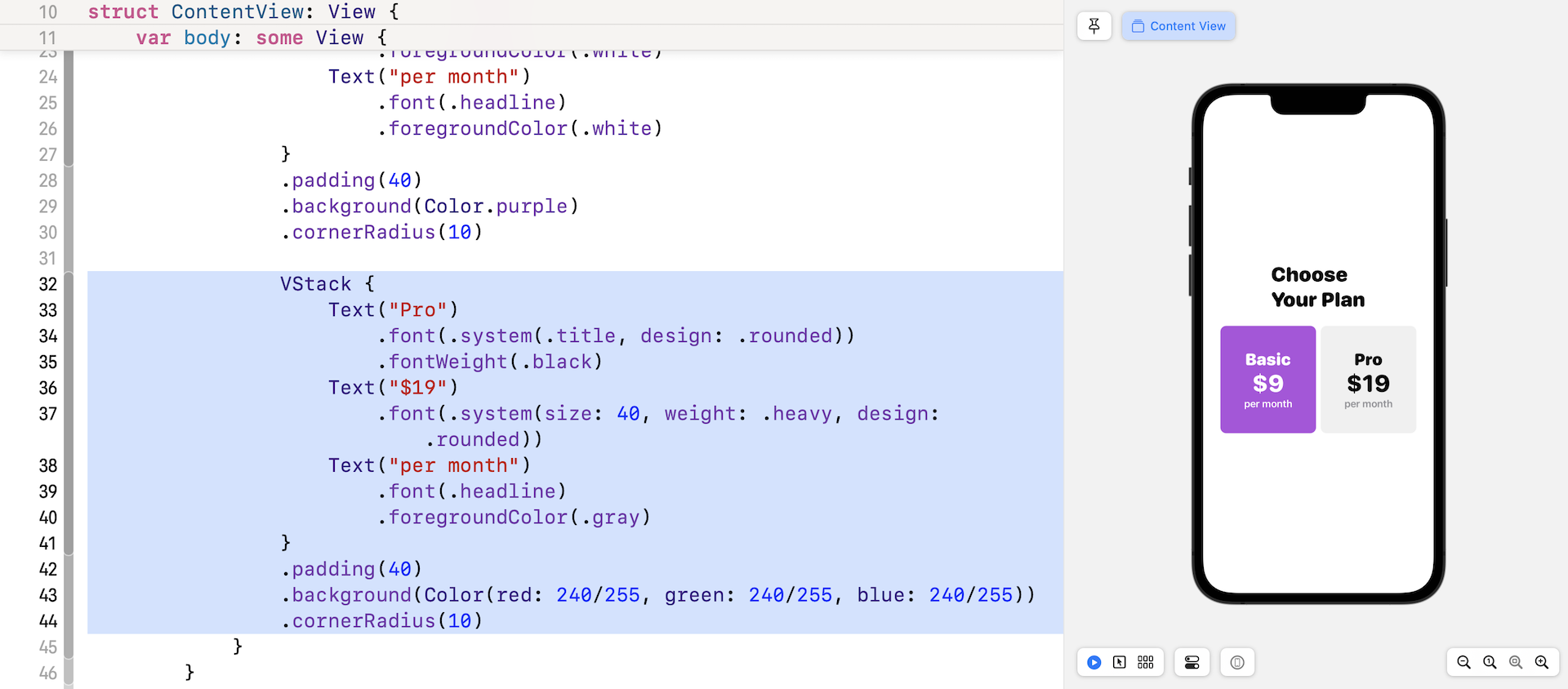
Now we're ready to create the UI of the Pro plan. The code is very similar to that of the Basic plan except for the background and text colors. Insert the following code right below cornerRadius(10):
VStack {
    Text("Pro")
        .font(.system(.title, design: .rounded))
        .fontWeight(.black)
    Text("$19")
        .font(.system(size: 40, weight: .heavy, design: .rounded))
    Text("per month")
        .font(.headline)
        .foregroundColor(.gray)
}
.padding(40)
.background(Color(red: 240/255, green: 240/255, blue: 240/255))
.cornerRadius(10)
As soon as you insert the code, you should see the layout below in the canvas.
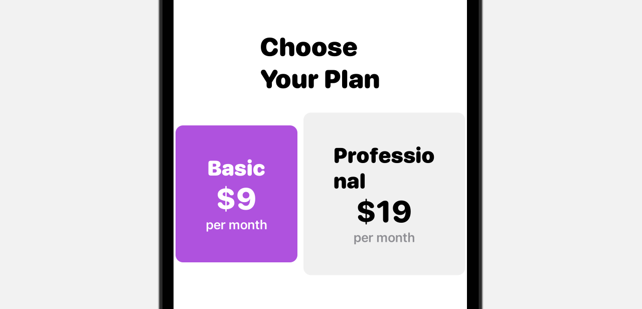
The current size of the pricing blocks looks similar, but each block will adjust itself when the length of the text changes. Let's say, you update the word "Pro" to "Professional". The gray area will expand to accomodate the change. In short, the view defines its own size and its size is just big enough to fit the content.
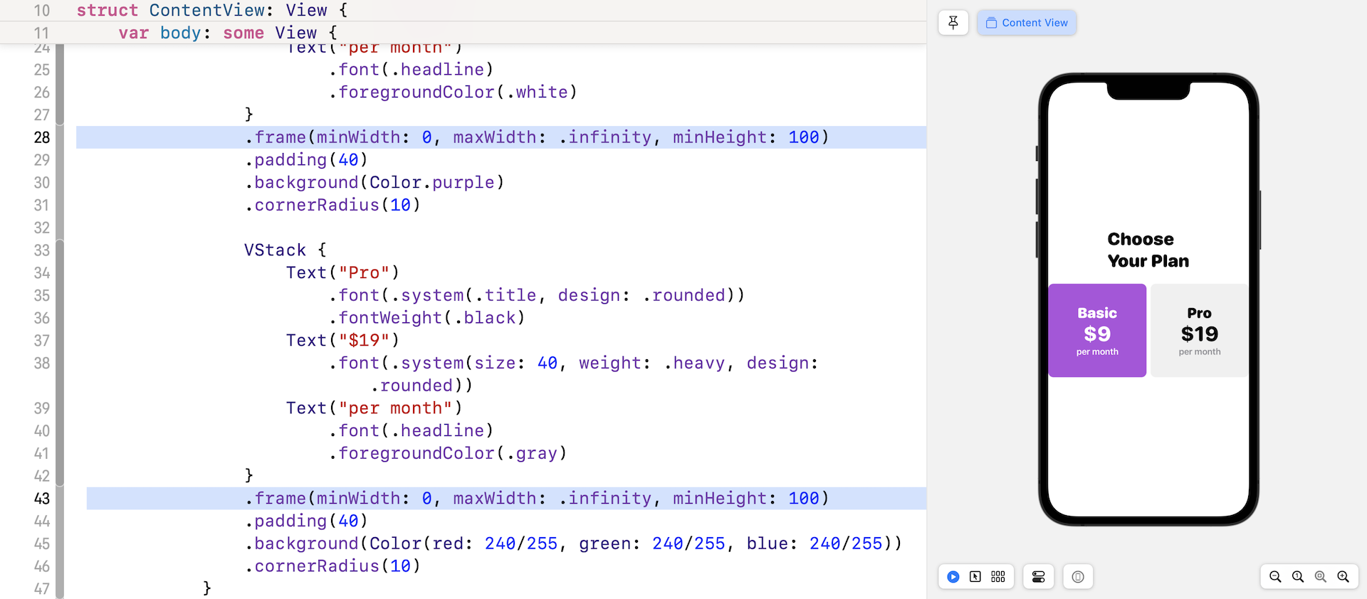
If you refer to figure 1 again, both pricing blocks have the same size. To adjust both blocks to have the same size, you can use the .frame modifier to set the maxWidth to .infinity like this:
.frame(minWidth: 0, maxWidth: .infinity, minHeight: 100)
The .frame modifier allows you to define the frame size. You can specify the size as a fixed value. For example, in the code above, we set the minHeight to 100 points. When you set the maxWidth to .infinity, the view will adjust itself to fill the maximum width. For example, if there is only one pricing block, it will take up the whole screen width.
For two pricing blocks, iOS will fill the block equally when maxWidth is set to .infinity. Now insert the above line of code into each of the pricing blocks. Your result should look like figure 17.
To give the horizontal stack some spacing, you can add a .padding modifier like this:
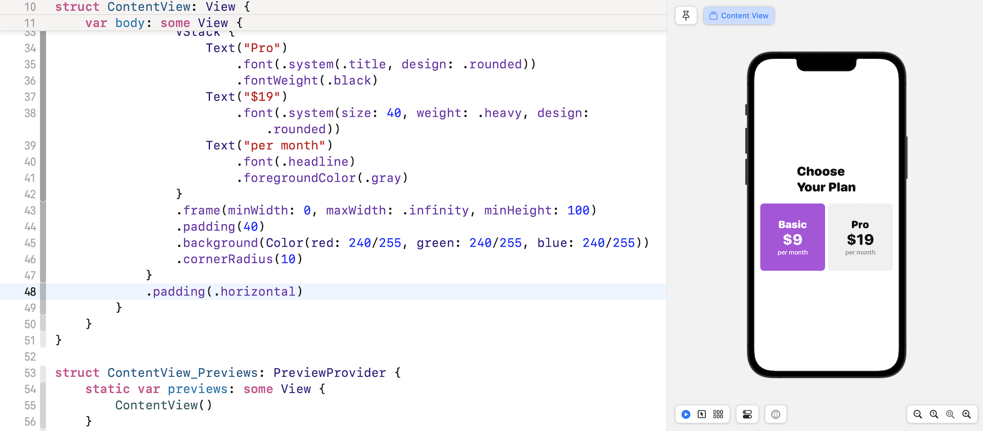
The .horizontal parameter means we want to add some padding for both leading and trailing sides of the HStack.
Organizing the Code
Again, before we lay out the rest of the UI components, let's refactor the current code to make it more organized. If you look at both stacks that are used to lay out the Basic and Pro pricing plan, the code is very similar except the following items:
- the name of the pricing plan
- the price
- the text color
- the background color of the pricing block
To streamline the code and improve reusability, we can extract the VStack code block and make it adaptable to different values of the pricing plan.
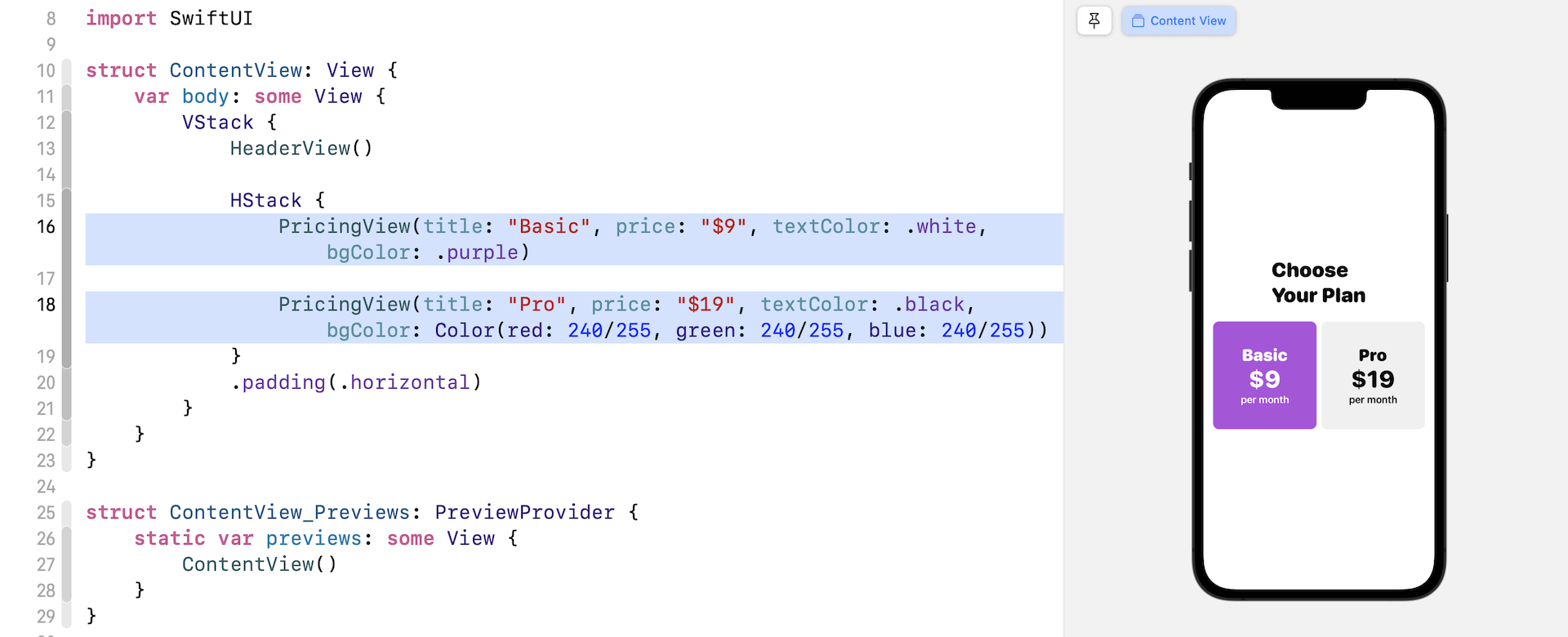
Go back to the code editor. Hold the command key and click the VStack of the Basic plan. Once Xcode extracts the code, rename the subview from ExtractedView to PricingView.
As we mentioned earlier, the PricingView should be flexible to display different pricing plans. We will add four variables in the PricingView struct. Update PricingView like this:
struct PricingView: View {

    var title: String
    var price: String
    var textColor: Color
    var bgColor: Color

    var body: some View {
        VStack {
            Text(title)
                .font(.system(.title, design: .rounded))
                .fontWeight(.black)
                .foregroundColor(textColor)
            Text(price)
                .font(.system(size: 40, weight: .heavy, design: .rounded))
                .foregroundColor(textColor)
            Text("per month")
                .font(.headline)
                .foregroundColor(textColor)
        }
        .frame(minWidth: 0, maxWidth: .infinity, minHeight: 100)
        .padding(40)
        .background(bgColor)
        .cornerRadius(10)
    }
}
We added variables for the title, price, text, and background color of the pricing block. Furthermore, we make use of these variables in the code to update the title, price, text and background color accordingly.
Once you make the changes, you'll see an error telling you that there are some missing arguments for the PricingView.
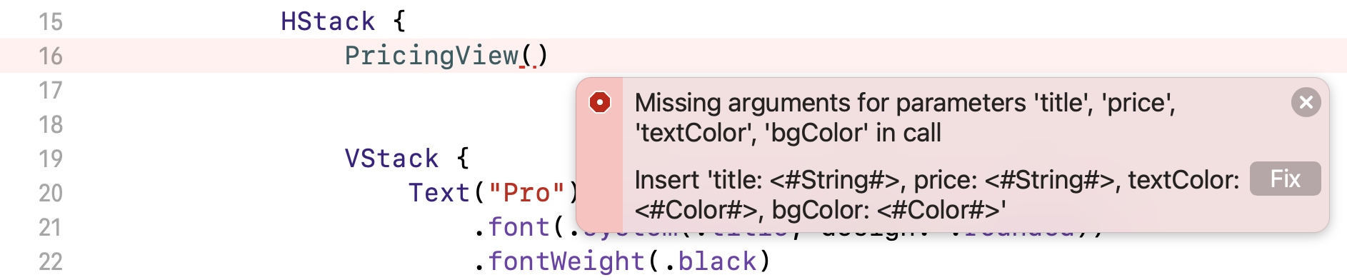
Earlier, we introduced four variables in the view. When calling PricingView, we must provide the values of these parameters. So, update the initialization of PricingView() and add the parameters like this:
PricingView(title: "Basic", price: "$9", textColor: .white, bgColor: .purple)
Also, you can replace the VStack of the Pro plan using PricingView like this:
PricingView(title: "Pro", price: "$19", textColor: .black, bgColor: Color(red: 240/255, green: 240/255, blue: 240/255))
The layout of the pricing blocks is the same but the underlying code, as you can see, is much cleaner and easier to read.
Using ZStack
Now that you've laid out the pricing blocks and refactored the code, there is still one thing missing for the Pro pricing. We want to overlay a message in yellow on the pricing block. To do that, we use the ZStack view which allows you to overlay a view on top of an existing view.
Embed the PricingView of the Pro plan within a ZStack and add the Text view, like this:
ZStack {
    PricingView(title: "Pro", price: "$19", textColor: .black, bgColor: Color(red: 240/255, green: 240/255, blue: 240/255))

    Text("Best for designer")
        .font(.system(.caption, design: .rounded))
        .fontWeight(.bold)
        .foregroundColor(.white)
        .padding(5)
        .background(Color(red: 255/255, green: 183/255, blue: 37/255))
}
The order of the views embedded in the ZStack determine how the views are overlaid with each other. For the code above, the Text view will overlay on top of the pricing view. In the canvas, you should see the pricing layout like this:
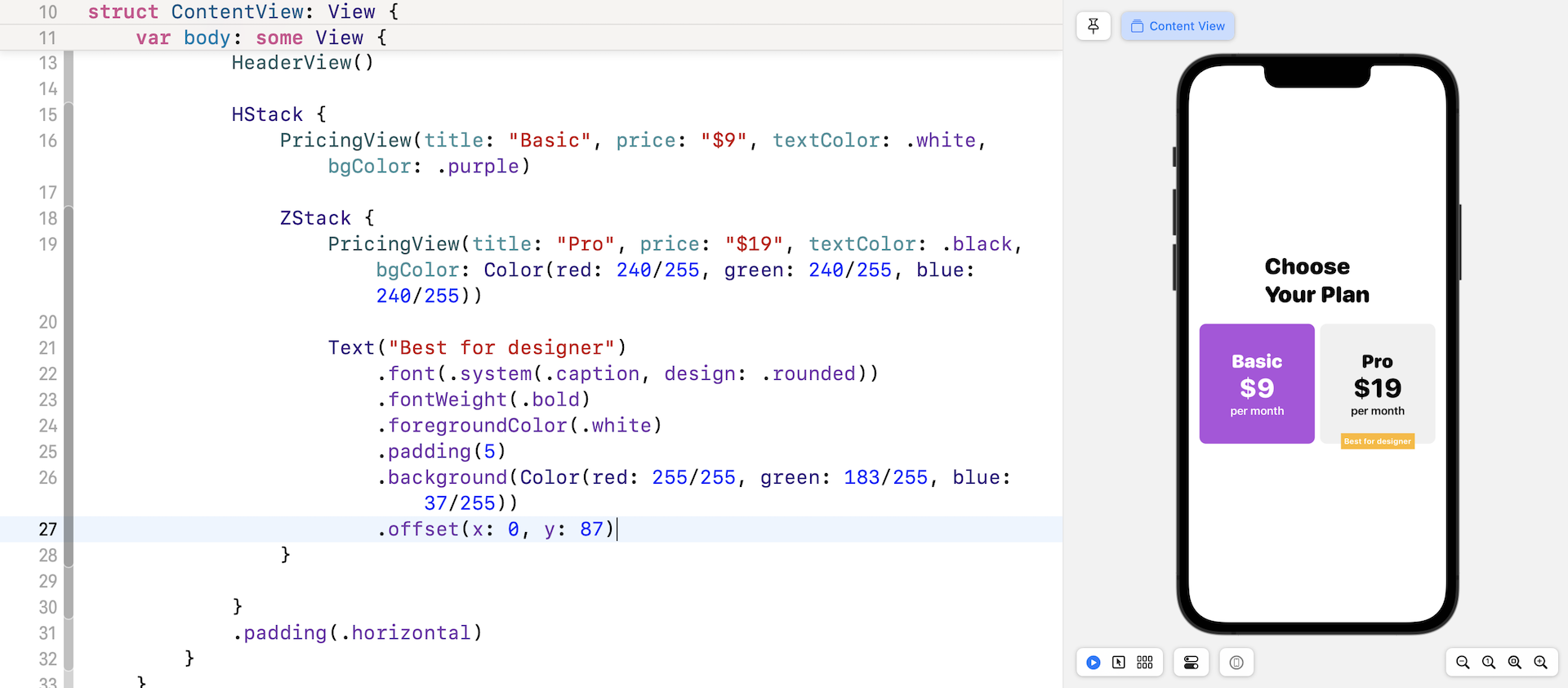
To adjust the position of the text, you can use the .offset modifier. Insert the following line of code at the end of the Text view (see figure 23):
.offset(x: 0, y: 87)
The Best for designer label will move to the bottom of the block. A negative value of y will move the label to the top part if you want to re-position it.
Optionally, if you want to adjust the spacing between the Basic and Pro pricing block, you can specify the spacing parameter within a HStack like this:
HStack(spacing: 15) {
  ...
}
Exercise #1
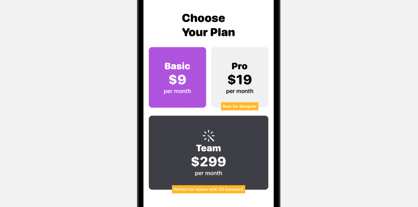
We haven't finished yet. I want to discuss how we handle optionals in SwiftUI and introduce another view component called Spacer. However, before we continue, let's have a simple exercise. Your task is to lay out the Team pricing plan as shown in figure 24. The image I used is a system image with the name "wand.and.rays" from SF Symbols.
Please don't look at the solution, try to develop your own solution.
Handling Optionals in SwiftUI
Have you tried the exercise and come up with your own solution? The layout of the Team plan is very similar to the Basic & Pro plans. You could replicate the VStack of these two plans and create the Team plan. However, let me show you a more elegant solution.
We can reuse the PricingView to create the Team plan. However, as you are aware, the Team plan has an icon that sits above the title. In order to lay out this icon, we need to modify PricingView to accomodate an icon. Since the icon is not mandatory for a pricing plan, we declare an optional in PricingView:
var icon: String?
If you're new to Swift, an optional means that the variable may or may not have a value. In the example above, we define a variable named icon of the type String. The call to the method is expected to pass the image name if the pricing plan is required to display an icon. Otherwise, this variable is set to nil by default.
So, how do you handle an optional in SwiftUI? In Swift, there are a couple of ways to unwrap an option. One way is to check if the optional has a non-nil value and then unwrap the value by using the exclamation mark. For example, we need to check if icon has a value before displaying an image. We can write the code like this:
if icon != nil {

    Image(systemName: icon!)
        .font(.largeTitle)
        .foregroundColor(textColor)

}
A better and more common way to handle optional is to use if let. The same piece of code can be rewritten like this:
if let icon = icon {

    Image(systemName: icon)
        .font(.largeTitle)
        .foregroundColor(textColor)

}
To support the rendering of an icon, the final code of PricingView should be updated as below:
struct PricingView: View {

    var title: String
    var price: String
    var textColor: Color
    var bgColor: Color
    var icon: String?

    var body: some View {
        VStack {

            if let icon = icon {

                Image(systemName: icon)
                    .font(.largeTitle)
                    .foregroundColor(textColor)

            }

            Text(title)
                .font(.system(.title, design: .rounded))
                .fontWeight(.black)
                .foregroundColor(textColor)
            Text(price)
                .font(.system(size: 40, weight: .heavy, design: .rounded))
                .foregroundColor(textColor)
            Text("per month")
                .font(.headline)
                .foregroundColor(textColor)
        }
        .frame(minWidth: 0, maxWidth: .infinity, minHeight: 100)
        .padding(40)
        .background(bgColor)
        .cornerRadius(10)
    }
}
Once you make this change, you can create the Team plan by using ZStack and PricingView. You put the code in ContentView and insert it after .padding(.horiontal):
ZStack {
    PricingView(title: "Team", price: "$299", textColor: .white, bgColor: Color(red: 62/255, green: 63/255, blue: 70/255), icon: "wand.and.rays")
        .padding()

    Text("Perfect for teams with 20 members")
        .font(.system(.caption, design: .rounded))
        .fontWeight(.bold)
        .foregroundColor(.white)
        .padding(5)
        .background(Color(red: 255/255, green: 183/255, blue: 37/255))
        .offset(x: 0, y: 110)
}
Using Spacer
When comparing your current UI with that of figure 1, do you see any difference? There are a couple of differences you may notice:
- The Choose Your Plan label is not left aligned.
- The Choose Your Plan label and the pricing plans should be aligned to the top of the screen.
In UIKit, you would define auto layout constraints to position the views. SwiftUI doesn't have auto layout. Instead, it provides a view called Spacer for you to create complex layouts.
A flexible space that expands along the major axis of its containing stack layout, or on both axes if not contained in a stack.
- SwiftUI documentation (https://developer.apple.com/documentation/swiftui/spacer)
To fix the left alignment, let's update the HeaderView like this:
struct HeaderView: View {
    var body: some View {
        HStack {
            VStack(alignment: .leading, spacing: 2) {
                Text("Choose")
                    .font(.system(.largeTitle, design: .rounded))
                    .fontWeight(.black)
                Text("Your Plan")
                    .font(.system(.largeTitle, design: .rounded))
                    .fontWeight(.black)
            }

            Spacer()
        }
        .padding()
    }
}
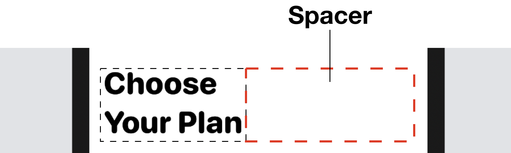
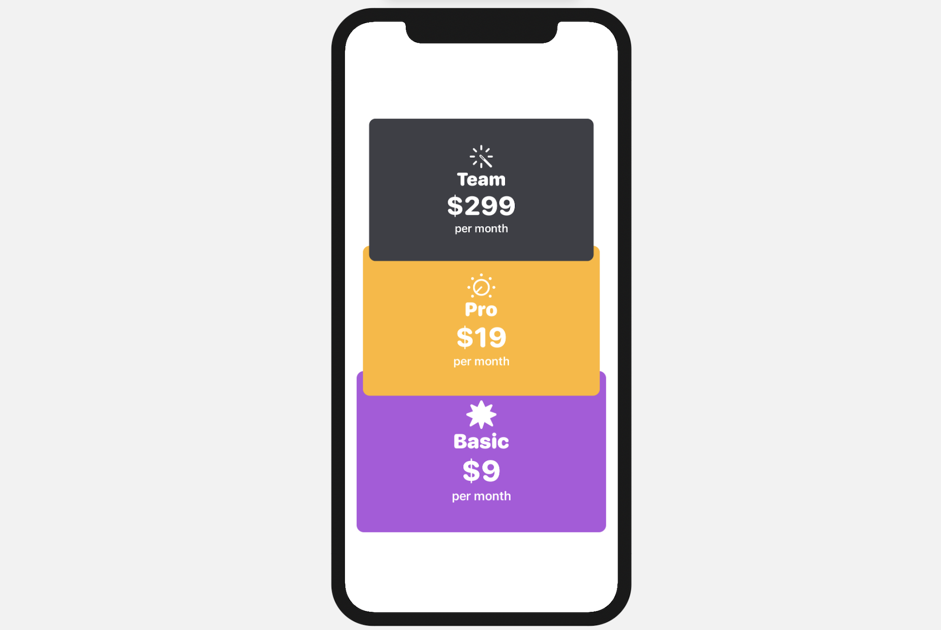
Here we embed the original VStack and a Spacer within a HStack. By using a Spacer, we push the VStack to the left. Figure 26 illustrates how the spacer works.
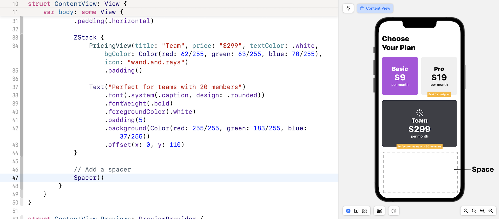
You may now know how to fix the second difference. The solution is to add a spacer at the end of the VStack of ContentView like this:
struct ContentView: View {
    var body: some View {
        VStack {
            HeaderView()

            HStack(spacing: 15) {
                ...
            }
            .padding(.horizontal)

            ZStack {
                ...
            }

              // Add a spacer
            Spacer()
        }
    }
}
Figure 27 illustrates how the spacer works visually.
Exercise #2
Now that you know how VStack, HStack, and ZStack work, your final exercise is to create a layout as shown in figure 28. For the icons, I use system images from SF Symbols. You're free to pick any of the images instead of following mine. As a hint, you can use the modifier .scale to scale up/down a view. For example, if you attach .scale(0.5) to a view, it automatically resizes the view to half of its original size.
For reference, you can download the complete projects here:
- Demo project (https://www.appcoda.com/resources/swiftui4/SwiftUIStacks.zip)
- Solution to exercise #2 (https://www.appcoda.com/resources/swiftui4/SwiftUIStacksExercise.zip)