- Made by AppCoda
- Contact us / Support
- Tweet this book
- Preface
- 1. Introduction to SwiftUI
- 2. Getting Started with SwiftUI and Working with Text
- 3. Working with Images
- 4. Layout User Interfaces with Stacks
- 5. Understanding ScrollView and Building a Carousel UI
- 6. Working with SwiftUI Buttons and Gradient
- 7. Understanding State and Binding
- 8. Implementing Path and Shape for Line Drawing and Pie Charts
- 9. Basic Animations and Transitions
- 10. Understanding Dynamic List, ForEach and Identifiable
- 11. Working with Navigation UI and Navigation Bar Customization
- 12. Playing with Modal Views, Floating Buttons and Alerts
- 13. Building a Form with Picker, Toggle and Stepper
- 14. Data Sharing with Combine and Environment Objects
- 15. Building a Registration Form with Combine and View Model
- 16. Working with Swipe-to-Delete, Context Menu and Action Sheets
- 17. Using Gestures
- 18. Displaying an Expandable Bottom Sheet Using Presentation Detents
- 19. Creating a Tinder-like UI with Gestures and Animations
- 20. Creating an Apple Wallet like Animation and View Transition
- 21. Working with JSON, Slider and Data Filtering
- 22. Building a ToDo app with Core Data
- 23. Integrating UIKit with SwiftUI Using UIViewRepresentable
- 24. Creating a Search Bar View and Working with Custom Binding
- 25. Putting Everything Together to Build a Real World App
- 26. Creating an App Store like Animated View Transition
- 27. Building an Image Carousel
- 28. Building an Expandable List View Using OutlineGroup
- 29. Building Grid Layout Using LazyVGrid and LazyHGrid
- 30. Creating an Animated Activity Ring with Shape and Animatable
- 31. Working with AnimatableModifier and LibraryContentProvider
- 32. Working with TextEditor to Create Multiline Text Fields
- 33. Using matchedGeometryEffect to Create View Animations
- 34. ScrollViewReader and Grid Animation
- 35. Working with Tab View and Tab Bar Customization
- 36. Using AsyncImage in SwiftUI for Loading Images Asynchronously
- 37. Implementing Search Bar Using Searchable
- 38. Creating Bar Charts and Line Charts with the Charts Framework
- 39. Capturing Text within Image Using Live Text APIs
- 40. How to Use ShareLink for Sharing Data Like Text and Photos
- 41. Using ImageRenderer to Convert SwiftUI Views into Images
- 42. Creating PDF Documents Using ImageRenderer
- 43. Using Gauge to Display Progress and Create a Speedometer
- 44. Creating Grid Layout Using Grid APIs
- 45. Switching Layout with AnyLayout
- Published with GitBook
Chapter 29
Building Grid Layouts Using LazyVGrid and LazyHGrid
The initial release of SwiftUI didn't come with a native collection view. You can either build your own solution or use third party libraries. In WWDC 2020, Apple introduced tons of new features for the SwiftUI framework. One of them is to address the need for grid views. SwiftUI now provides developers two new UI components called LazyVGrid and LazyHGrid. One is for creating vertical grids and the other is for horizontal grids. The word Lazy, as mentioned by Apple, refers to the grid view not creating items until they are needed. What this means to you is that the performance of these grid views are already optimized by default.
In this chapter, I will walk you through how to create both horizontal and vertical views. Both LazyVGrid and LazyHGrid are designed to be flexible, so that developers can easily create various types of grid layouts. We will also see how to vary the size of grid items to achieve different layouts. After you manage the basics, we will dive a little bit deeper and create complex layouts like that shown in figure 1.
The Essential of Grid Layout in SwiftUI
To create a grid layout, whether it's horizontal or vertical, here are the steps you follow:
First, you need to prepare the raw data for presentation in the grid. For example, here is an array of SF symbols that we are going to present in the demo app:
private var symbols = ["keyboard", "hifispeaker.fill", "printer.fill", "tv.fill", "desktopcomputer", "headphones", "tv.music.note", "mic", "plus.bubble", "video"]Create an array of type
GridItemthat describes what the grid will look like. Including, how many columns the grid should have. Here is a code snippet for describing a 3-column grid:private var threeColumnGrid = [GridItem(.flexible()), GridItem(.flexible()), GridItem(.flexible())]Next, you layout the grid by using
LazyVGridandScrollView. Here is an example:ScrollView { LazyVGrid(columns: threeColumnGrid) { // Display the item } }Alternatively, if you want to build a horizontal grid, you use
LazyHGridlike this:ScrollView(.horizontal) { LazyHGrid(rows: threeColumnGrid) { // Display the item } }
Using LazyVGrid to Create Vertical Grids
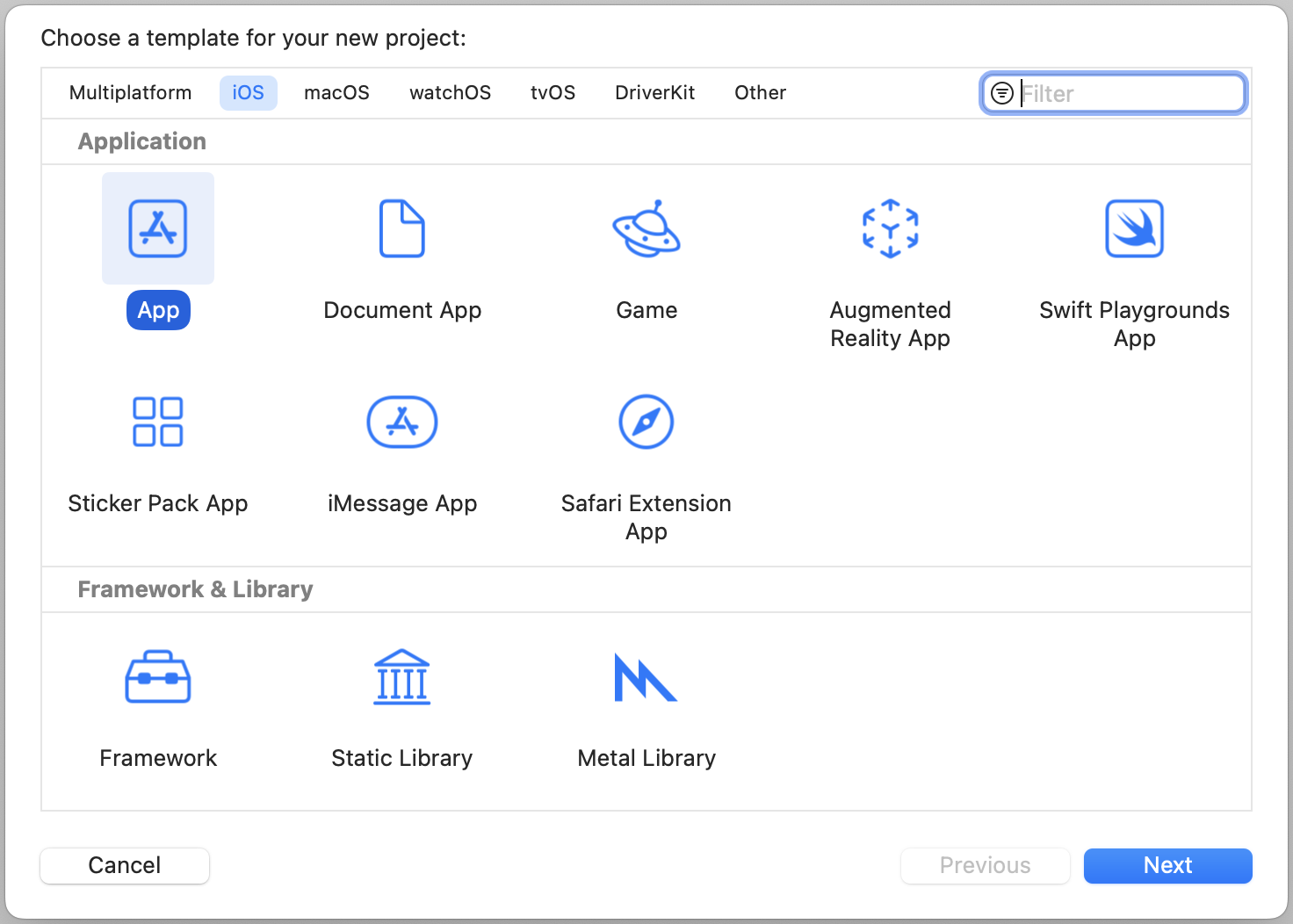
With a basic understanding of the grid layout, let's put the code to work. We will start with something simple by building a 3-column grid. Open Xcode and create a new project with the App template. Please make sure you select SwiftUI for the Interface option. Name the project SwiftUIGridLayout or whatever name you prefer.
Once the project is created, choose ContentView.swift. In ContentView, declare the following variables:
private var symbols = ["keyboard", "hifispeaker.fill", "printer.fill", "tv.fill", "desktopcomputer", "headphones", "tv.music.note", "mic", "plus.bubble", "video"]

private var colors: [Color] = [.yellow, .purple, .green]

private var gridItemLayout = [GridItem(.flexible()), GridItem(.flexible()), GridItem(.flexible())]
We are going to display a set of SF symbols in a 3-column grid. To present the grid, update the body variable like this:
var body: some View {
    ScrollView {
        LazyVGrid(columns: gridItemLayout, spacing: 20) {
            ForEach((0...9999), id: \.self) {
                Image(systemName: symbols[$0 % symbols.count])
                    .font(.system(size: 30))
                    .frame(width: 50, height: 50)
                    .background(colors[$0 % colors.count])
                    .cornerRadius(10)
            }
        }
    }
}
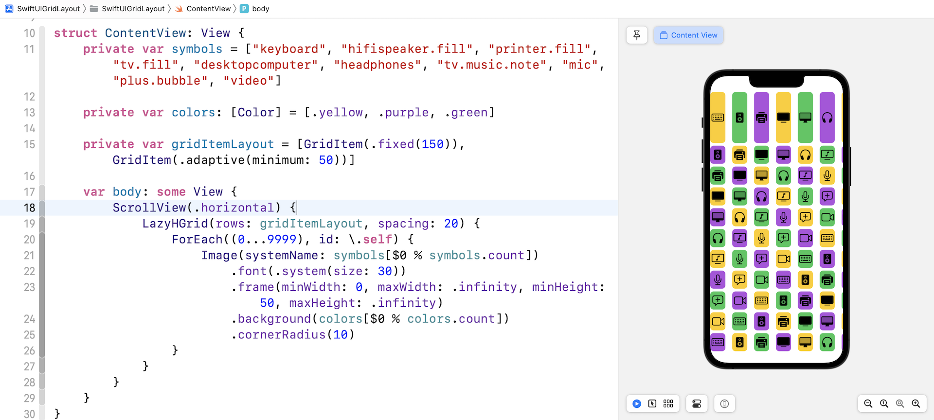
We use LazyVGrid and tell the vertical grid to use a 3-column layout. We also specify that there is a 20 point space between rows. In the code block, we have a ForEach loop to present a total of 10,000 image views. If you've made the change correctly, you should see a three column grid in the preview.
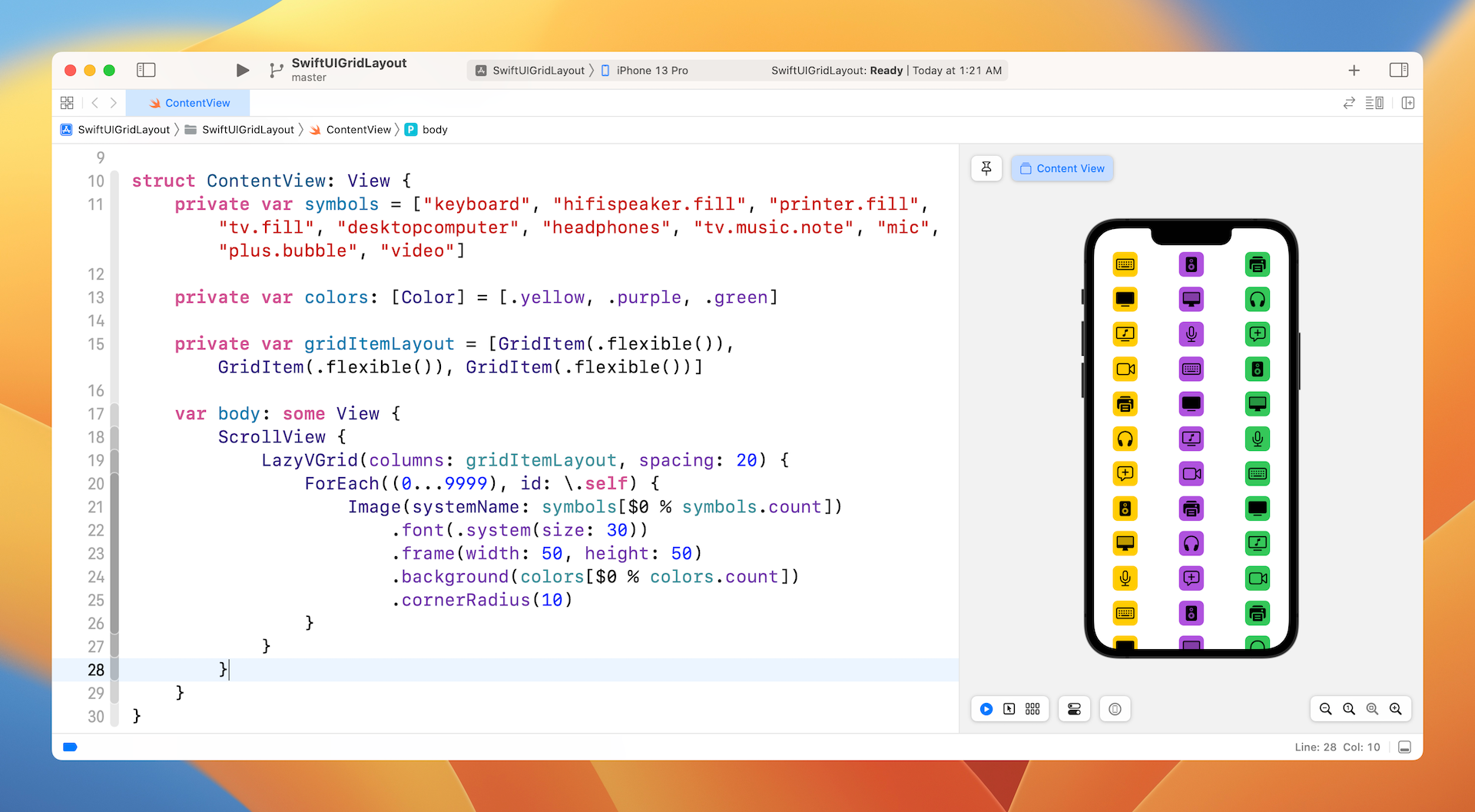
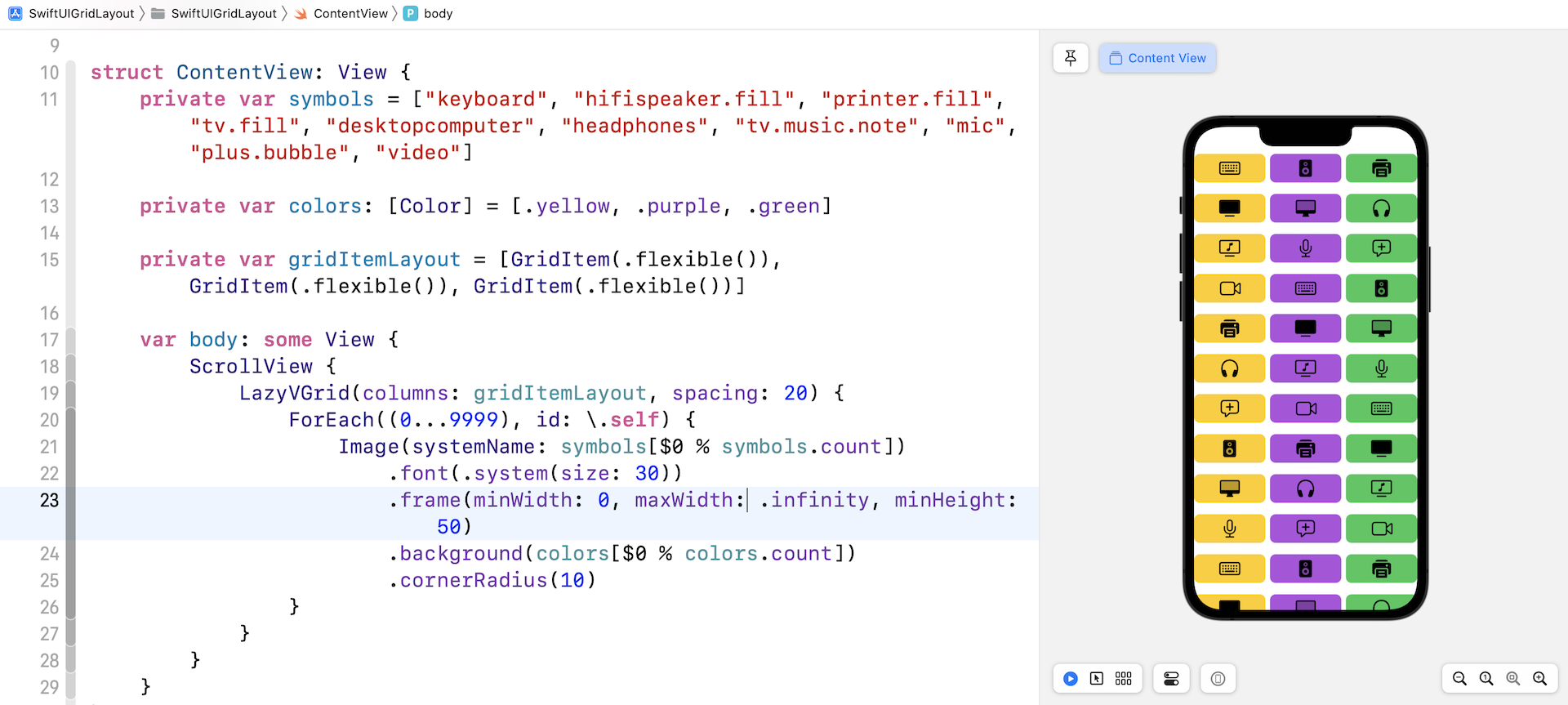
This is how we create a vertical grid with three columns. The frame size of the image is fixed to 50 by 50 points, which is controlled by the .frame modifier. If you want to make a grid item wider, you can alter the frame modifier like this:
.frame(minWidth: 0, maxWidth: .infinity, minHeight: 50)
The image's width will expand to take up the column's width like that shown in figure 4.
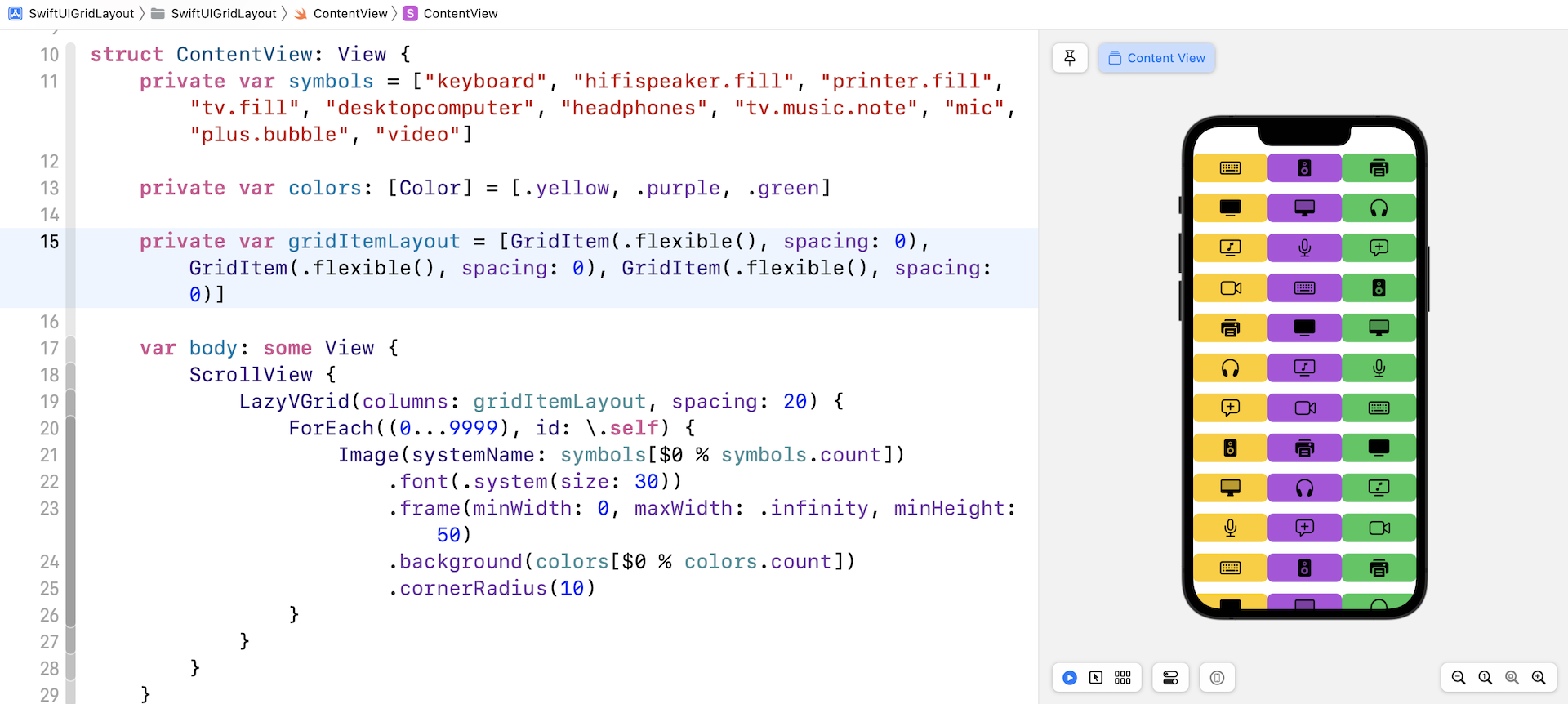
Note that there is a space between the columns and rows. Sometimes, you may want to create a grid without any spaces. How can you achieve that? The space between rows is controlled by the spacing parameter of LazyVGrid. We have set its value to 20 points. You can simply change it to 0 such that there is no space between rows.
The spacing between grid items is controlled by the instances of GridItem initialized in gridItemLayout. You can set the spacing between items by passing a value to the spacing parameter. Therefore, to remove the spacing between rows, you can initialize the gridLayout variable like this:
private var gridItemLayout = [GridItem(.flexible(), spacing: 0), GridItem(.flexible(), spacing: 0), GridItem(.flexible(), spacing: 0)]
For each GridItem, we specify to use a spacing of zero. For simplicity, the code above can be rewritten like this:
private var gridItemLayout = Array(repeating: GridItem(.flexible(), spacing: 0), count: 3)
If you've made both changes, your preview canvas should show you a grid view without any spacing.
Using GridItem to Vary the Grid Layout (Flexible/Fixed/Adaptive)
Let's take a further look at GridItem. You use GridItem instances to configure the layout of items in LazyHGrid and LazyVGrid views. Earlier, we defined an array of three GridItem instances, each of which uses the size type .flexible(). The flexible size type enables you to create three columns with equal size. If you want to describe a 6-column grid, you can create the array of GridItem like this:
private var sixColumnGrid: [GridItem] = Array(repeating: .init(.flexible()), count: 6)
.flexible() is just one of the size types for controlling the grid layout. If you want to place as many items as possible in a row, you can use the adaptive size type:
private var gridItemLayout = [GridItem(.adaptive(minimum: 50))]
The adaptive size type requires you to specify the minimize size for a grid item. In the code above, each grid item has a minimum size of 50. If you modify the gridItemLayout variable as above and set the spacing of LazyVGrid back to 20, you should achieve a grid layout similar to the one shown in figure 6.
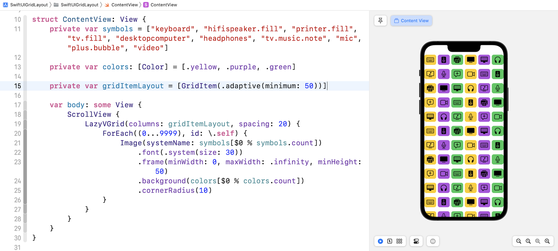
By using .adaptive(minimum: 50), you instruct LazyVGrid to fill as many images as possible in a row such that each item has a minimum size of 50 points.
Note: I used iPhone 13 Pro as the simulator. If you use other iOS simulators with different screen sizes, you may achieve a different result.
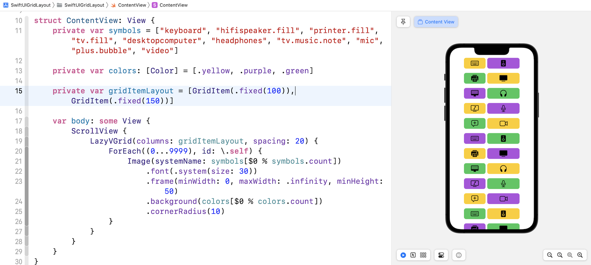
In addition to .flexible and .adaptive, you can also use .fixed if you want to create fixed width columns. For example, you want to layout the image in two columns such that the first column has a width of 100 points and the second one has a width of 150 points. You write the code like this:
private var gridItemLayout = [GridItem(.fixed(100)), GridItem(.fixed(150))]
Update the gridItemLayout variable as shown above, this will result in a two-column grid with different sizes.
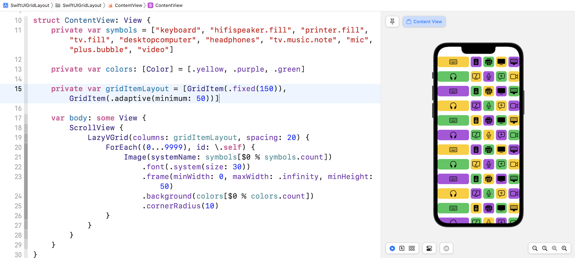
You are allowed to mix different size types to create more complex grid layouts. For example, you can define a fixed size GridItem, followed by a GridItem with an adaptive size like this:
private var gridItemLayout = [GridItem(.fixed(150)), GridItem(.adaptive(minimum: 50))]
In this case, LazyVGrid creates a fixed size column of 100 point width. And then, it tries to fill as many items as possible within the remaining space.
Using LazyHGrid to Create Horizontal Grids
Now that you've created a vertical grid, LazyHGrid has made it so easy to convert a vertical grid to a horizontal one. The usage of horizontal grid is nearly the same as LazyVGrid except that you embed it in a horizontal scroll view. Furthermore, LazyHGrid takes in a parameter named rows instead of columns.
Therefore, you can rewrite a couple lines of code to transform a grid view from vertical orientation to horizontal:
ScrollView(.horizontal) {
    LazyHGrid(rows: gridItemLayout, spacing: 20) {
        ForEach((0...9999), id: \.self) {
            Image(systemName: symbols[$0 % symbols.count])
                .font(.system(size: 30))
                .frame(minWidth: 0, maxWidth: .infinity, minHeight: 50, maxHeight: .infinity)
                .background(colors[$0 % colors.count])
                .cornerRadius(10)
        }
    }
}
Run the demo in the preview or test it on a simulator. You should see a horizontal grid.
Switching Between Different Grid Layouts
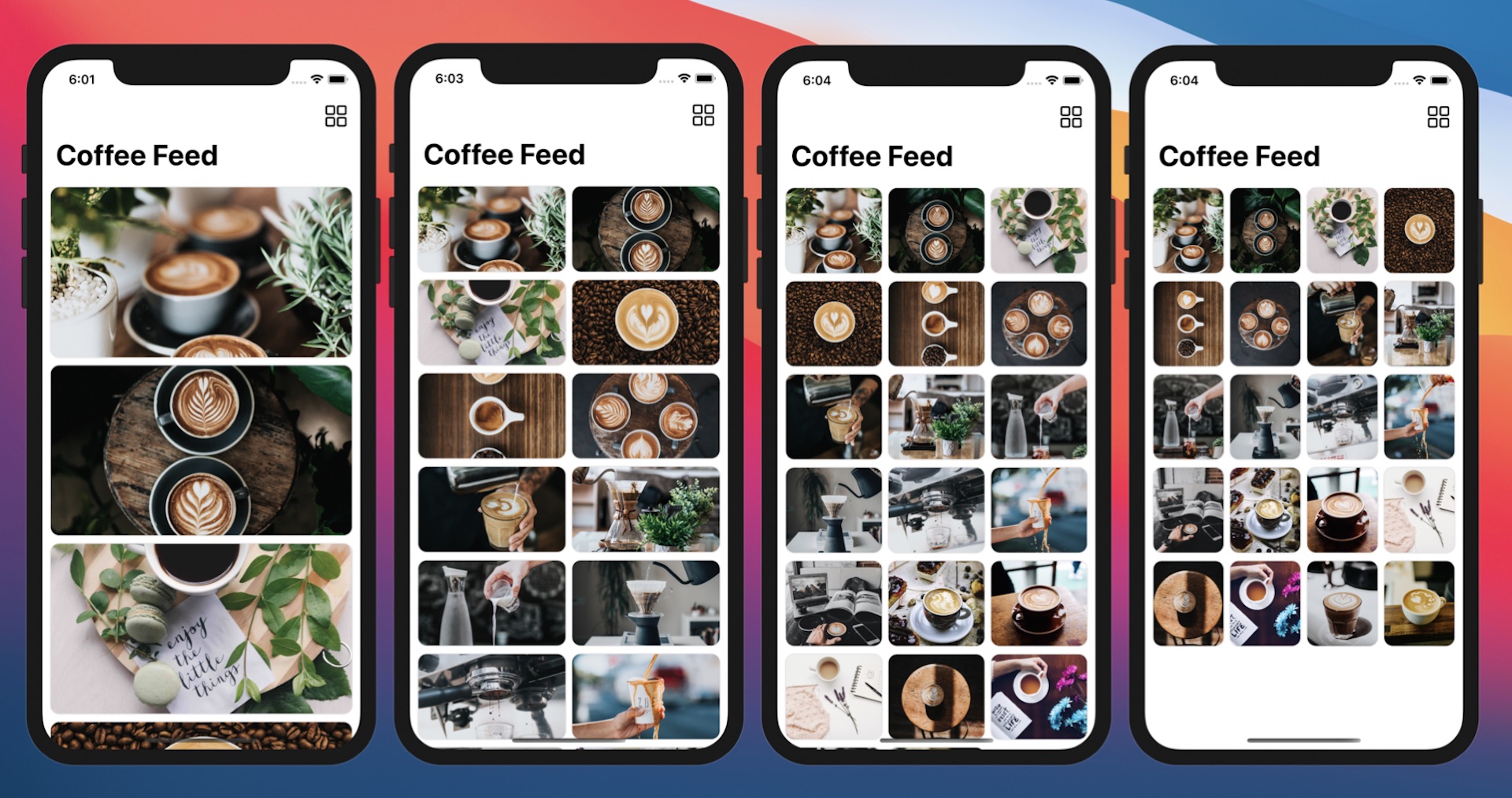
Now that you have some experience with LazyVGrid and LazyHGrid, let's create something more complicated. Imagine you are going to build a photo app that displays a collection of coffee photos. In the app, it provides a feature for users to change the layout. By default, it shows the list of photos in a single column. The user can tap a Grid button to change the list view to a grid view with 2 columns. Tap the same button again for a 3-column layout, followed by a 4-column layout.
Create a new project for this demo app. Again, choose the App template and name the project SwiftUIPhotoGrid. Next, download the image pack at https://www.appcoda.com/resources/swiftui/coffeeimages.zip. Unzip the images and add them to the asset catalog.
Before creating the grid view, we will create the data model for the collection of photos. In the project navigator, right click SwiftUIGridView and choose New file... to create a new file. Select the Swift File template and name the file Photo.swift.
Insert the following code in the Photo.swift file to create the Photo struct:
struct Photo: Identifiable {
    var id = UUID()
    var name: String
}

let samplePhotos = (1...20).map { Photo(name: "coffee-\($0)") }
We have 20 coffee photos in the image pack, so we initialize an array of 20 Photo instances. With the data model ready, let's switch over to ContentView.swift to build the grid.
First, declare a gridLayout variable to define our preferred grid layout:
@State var gridLayout: [GridItem] = [ GridItem() ]
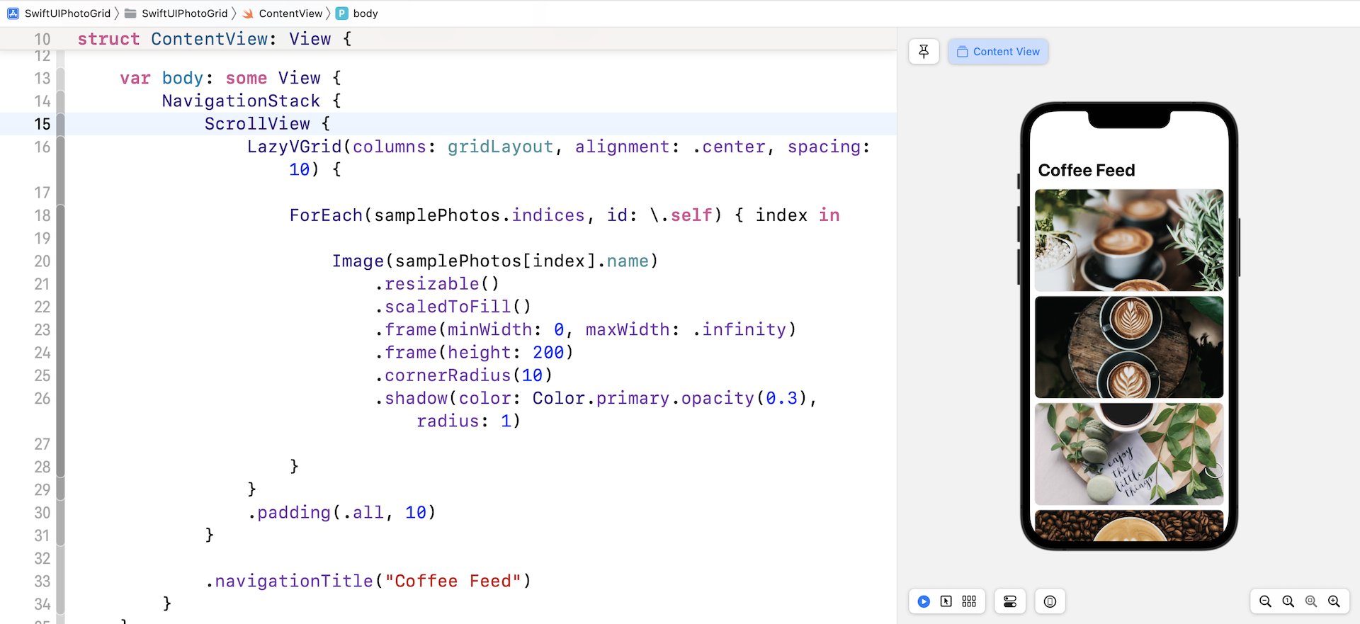
By default, we want to display a list view. Other than using List, you can actually use LazyVGrid to build a list view. We do this by defining the gridLayout with one grid item. By telling LazyVGrid to use a single column grid layout, it will arrange the items like a list view. Insert the following code in body to create the grid view:
NavigationStack {
    ScrollView {
        LazyVGrid(columns: gridLayout, alignment: .center, spacing: 10) {

            ForEach(samplePhotos.indices, id: \.self) { index in

                Image(samplePhotos[index].name)
                    .resizable()
                    .scaledToFill()
                    .frame(minWidth: 0, maxWidth: .infinity)
                    .frame(height: 200)
                    .cornerRadius(10)
                    .shadow(color: Color.primary.opacity(0.3), radius: 1)

            }
        }
        .padding(.all, 10)
    }

    .navigationTitle("Coffee Feed")
}
We use LazyVGrid to create a vertical grid with a spacing of 10 points between rows. The grid is used to display coffee photos, so we use ForEach to loop through the samplePhotos array. We embed the grid in a scroll view to make it scrollable and wrap it with a navigation view. Once you have made the change, you should see a list of photos in the preview canvas.
Now we need to a button for users to switch between different layouts. We will add the button to the navigation bar. The SwiftUI framework has a modifier called .toolbar for you to populate items within the navigation bar. Right after .navigationTitle, insert the following code to create the bar button:
.toolbar {
    ToolbarItem(placement: .navigationBarTrailing) {
        Button {
            self.gridLayout = Array(repeating: .init(.flexible()), count: self.gridLayout.count % 4 + 1)
        } label: {
            Image(systemName: "square.grid.2x2")
                .font(.title)
                .foregroundColor(.primary)
        }
    }
}
In the code above, we update the gridLayout variable and initialize the array of GridItem. Let's say the current item count is one, we will create an array of two GridItems to change to a 2-column grid. Since we've marked gridLayout as a state variable, SwiftUI will render the grid view every time we update the variable.
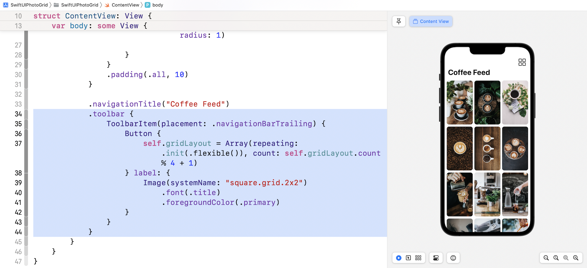
You can run the app to have a quick test. Tapping the grid button will switch to another grid layout.
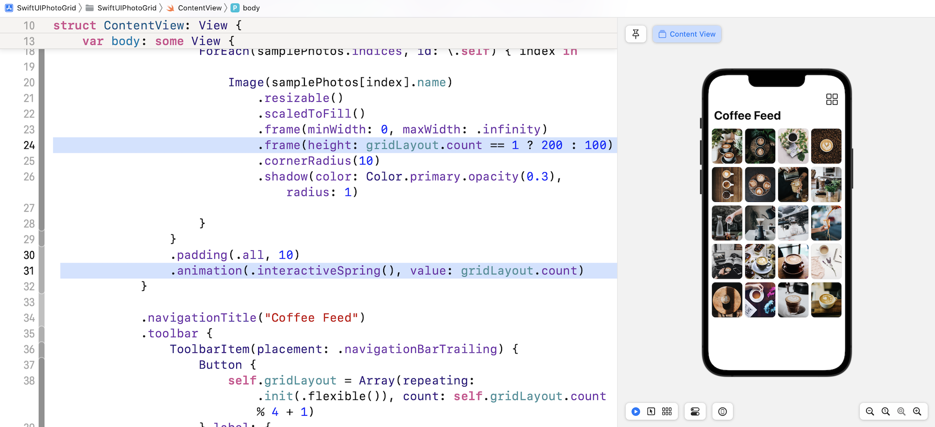
There are a couple of things we want to improve. First, the height of the grid item should be adjusted to 100 points for grids with two or more columns. Update the .frame modifier with the height parameter like this:
.frame(height: gridLayout.count == 1 ? 200 : 100)
Second, when you switch from one grid layout to another, SwiftUI simply redraws the grid view without any animation. Wouldn't it be great if we added a nice transition between layout changes? To do that, you just add a single line of code. Insert the following code after .padding(.all, 10):
.animation(.interactiveSpring(), value: gridLayout.count)
This is the power of SwiftUI. By telling SwiftUI that you want to animate changes, the framework handles the rest and you will see a nice transition between the layout changes.
Building Grid Layout with Multiple Grids
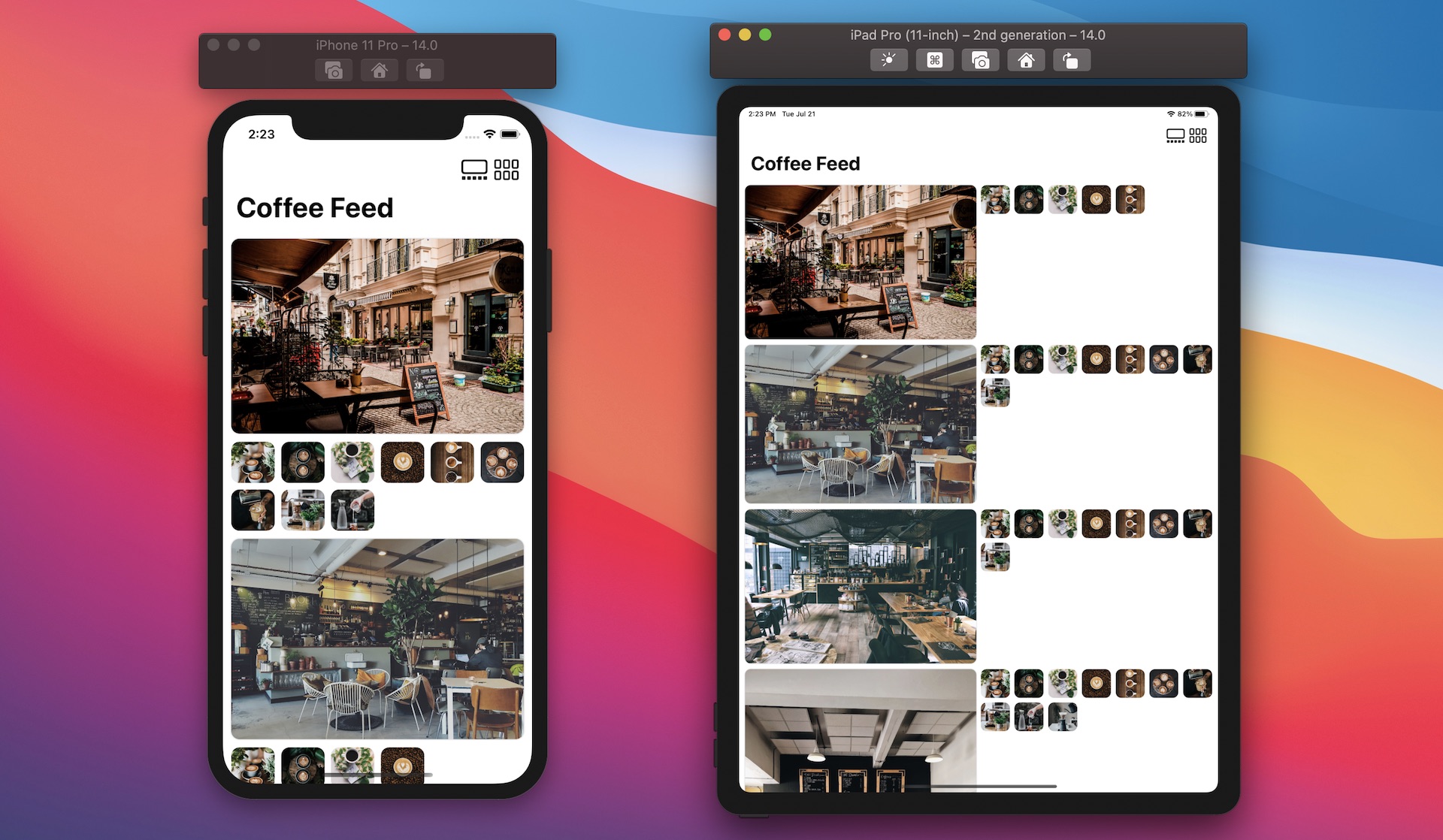
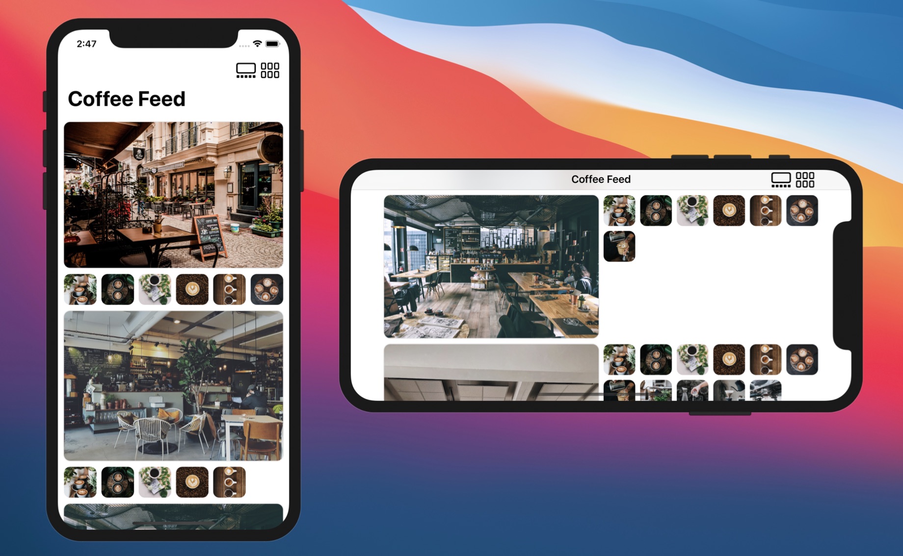
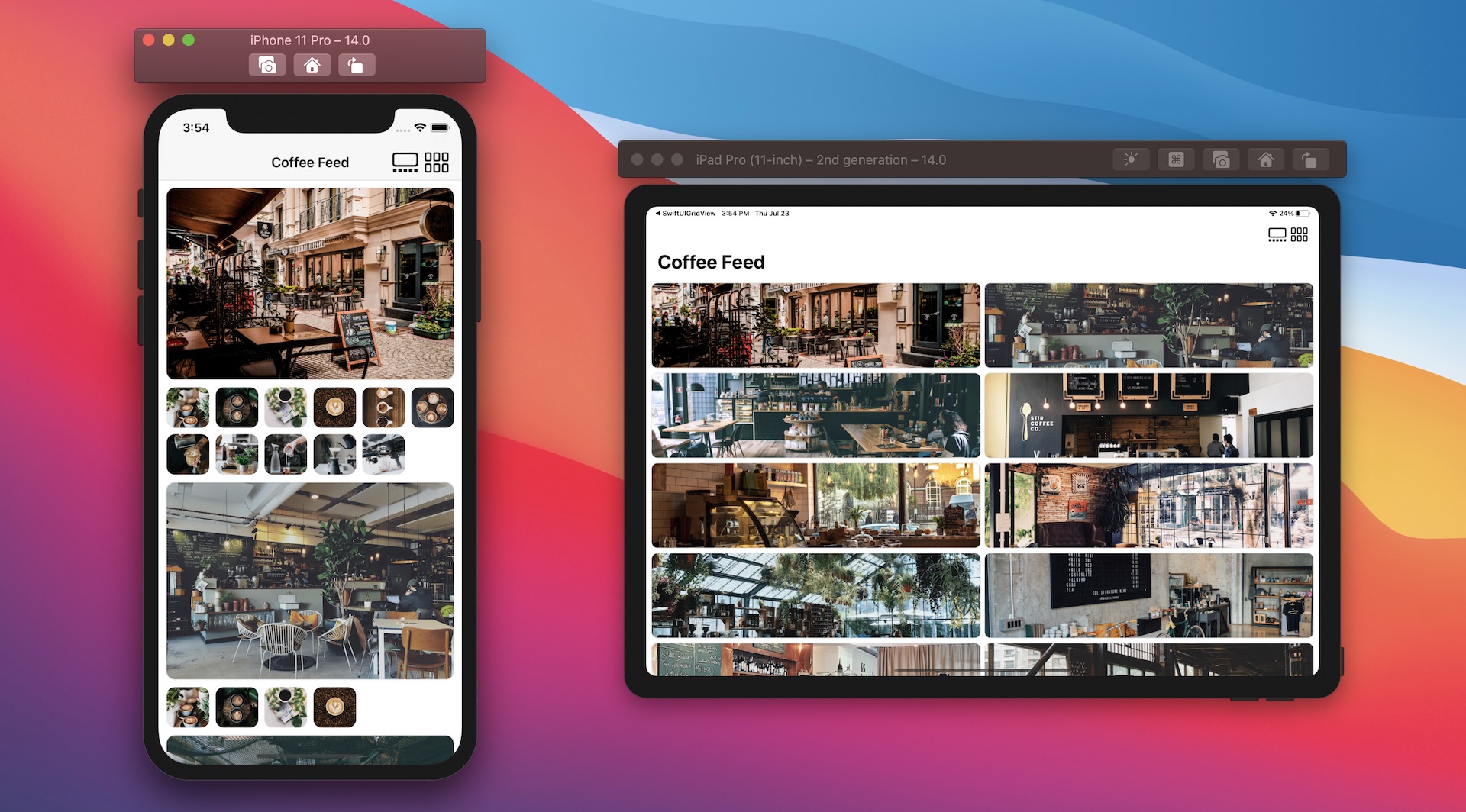
You are not limited to using a single LazyVGrid or LazyHGrid in your app. By combining more than one LazyVGrid, you are able to build some interesting layouts. Take a look at figure 14. We are going to create this kind of grid layout. The grid displays a list of cafe photos. Under each cafe photo, it shows a list of coffee photos. When the device is in landscape orientation, the cafe photo and the list of coffee photos will be arranged side by side.
Let's go back to our Xcode project and create the data model first. The image pack you downloaded earlier comes a set of cafe photos. So, create a new Swift file and name it Cafe.swift. In the file, insert the following code:
struct Cafe: Identifiable {
    var id = UUID()
    var image: String
    var coffeePhotos: [Photo] = []
}

let sampleCafes: [Cafe] = {

    var cafes = (1...18).map { Cafe(image: "cafe-\($0)") }

    for index in cafes.indices {
        let randomNumber = Int.random(in: (2...12))
        cafes[index].coffeePhotos = (1...randomNumber).map { Photo(name: "coffee-\($0)") }
    }

    return cafes
}()
The Cafe struct is self explanatory. It has an image property for storing the cafe photo and the coffeePhotos property for storing a list of coffee photos. In the code above, we also create an array of Cafe for demo purposes. For each cafe, we randomly pick some coffee photos. Please feel free to modify the code if you have other images you prefer.
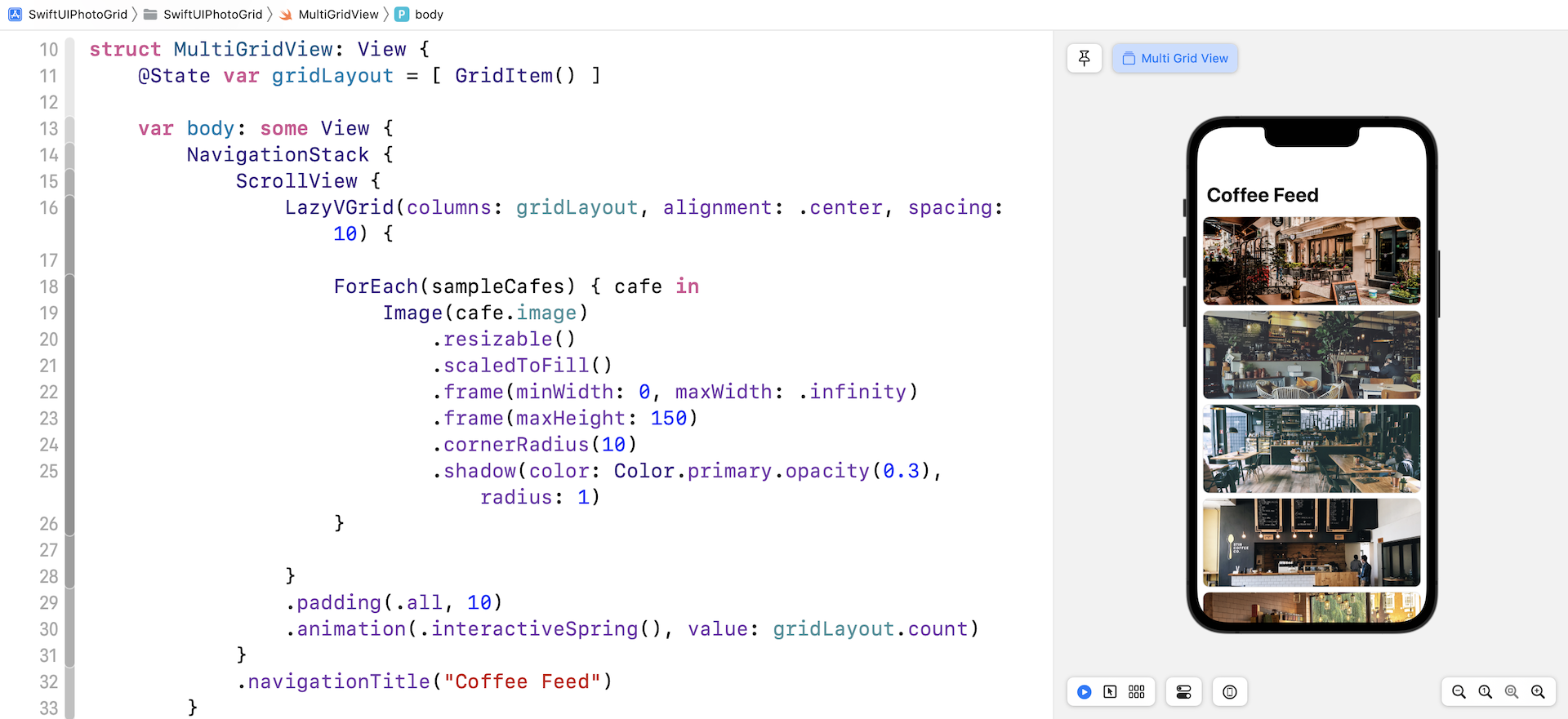
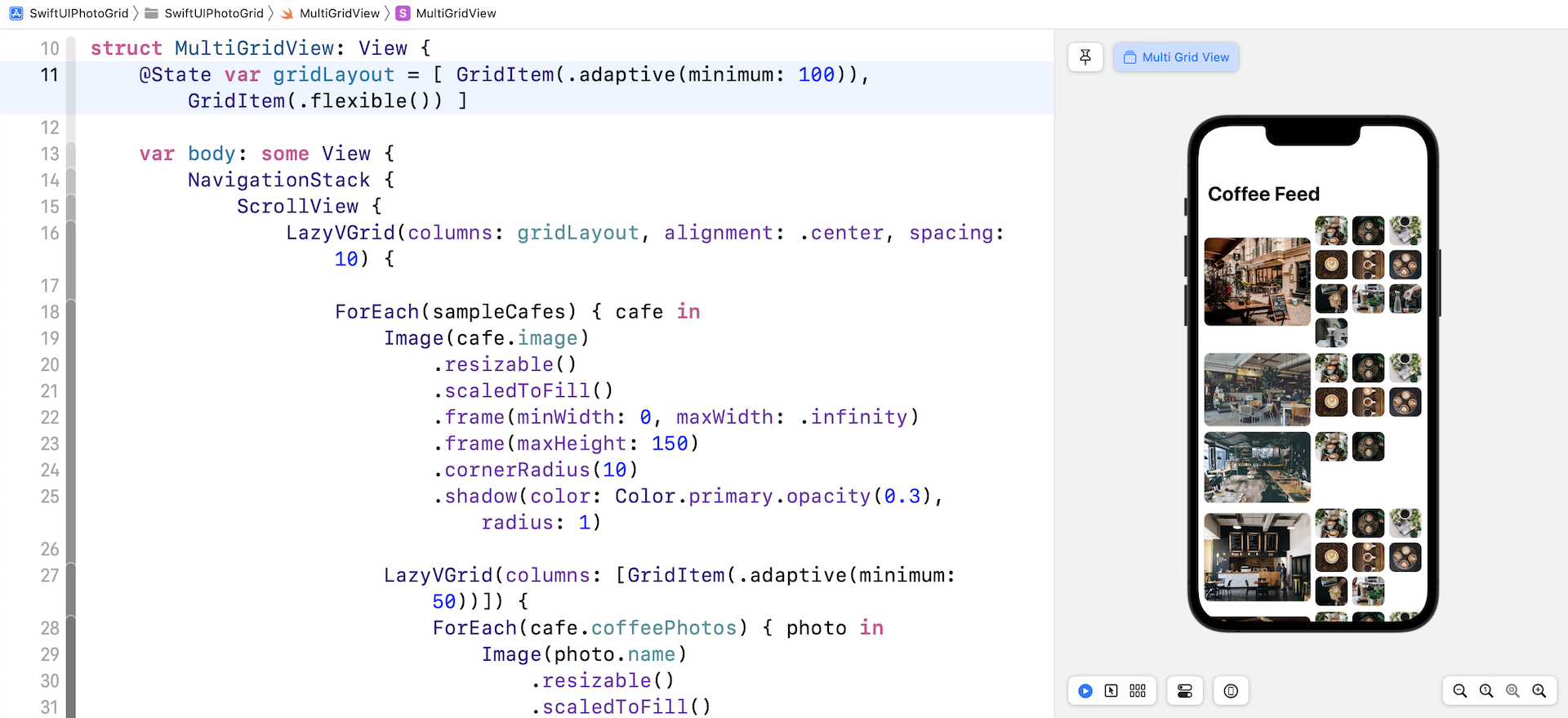
Instead of modifying the ContentView.swift file, let's create a new file for implementing this grid view. Right click SwiftUIPhotoGrid and choose New File.... Select the SwiftUI View template and name the file MultiGridView.
Similar to the earlier implementation, let's declare a gridLayout variable to store the current grid layout:
@State var gridLayout = [ GridItem() ]
By default, our grid is initialized with one GridItem. Next, insert the following code in body to create a vertical grid with a single column:
NavigationStack {
    ScrollView {
        LazyVGrid(columns: gridLayout, alignment: .center, spacing: 10) {

            ForEach(sampleCafes) { cafe in
                Image(cafe.image)
                    .resizable()
                    .scaledToFill()
                    .frame(minWidth: 0, maxWidth: .infinity)
                    .frame(maxHeight: 150)
                    .cornerRadius(10)
                    .shadow(color: Color.primary.opacity(0.3), radius: 1)
            }

        }
        .padding(.all, 10)
        .animation(.interactiveSpring(), value: gridLayout.count)
    }
    .navigationTitle("Coffee Feed")
}
I don't think we need to go through the code again because it's almost the same as the code we wrote earlier. If your code works properly, you should see a list view that shows the collection of cafe photos.
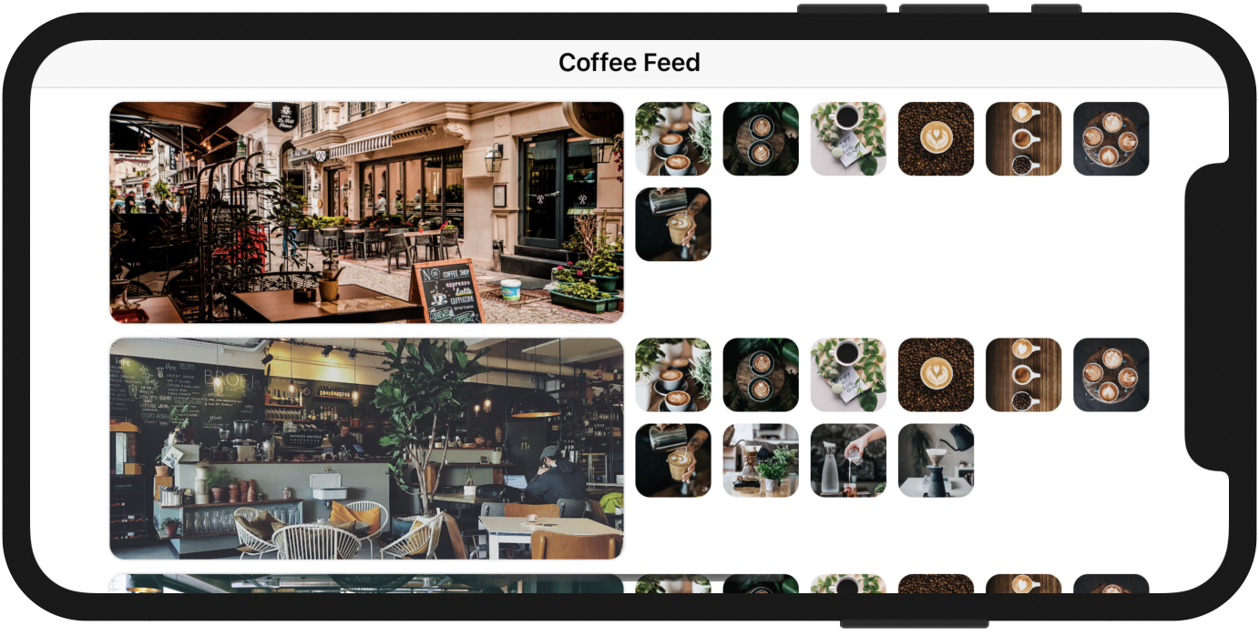
Adding an Additional Grid
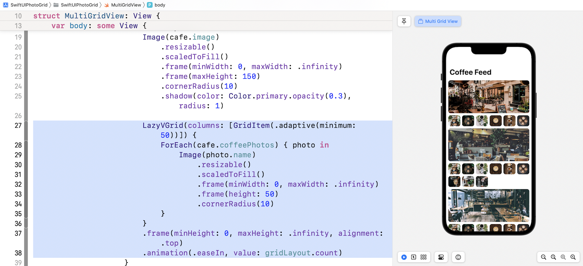
How do we display another grid under each of the cafe photos? All you need to do is add another LazyVGrid inside the ForEach loop. Insert the following code after the Image view of the loop:
LazyVGrid(columns: [GridItem(.adaptive(minimum: 50))]) {
    ForEach(cafe.coffeePhotos) { photo in
        Image(photo.name)
            .resizable()
            .scaledToFill()
            .frame(minWidth: 0, maxWidth: .infinity)
            .frame(height: 50)
            .cornerRadius(10)
    }
}
.frame(minHeight: 0, maxHeight: .infinity, alignment: .top)
.animation(.easeIn, value: gridLayout.count)
Here we create another vertical grid for the coffee photos. By using the adaptive size type, this grid will fill as many photos as possible in a row. Once you make the code change, the app UI will look like that shown in figure 16.
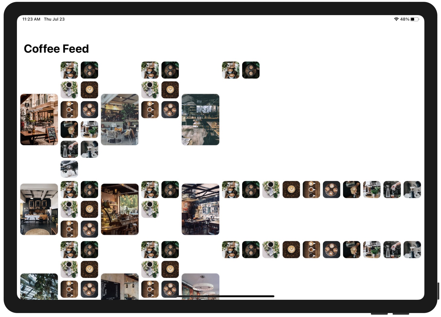
If you prefer to arrange the cafe and coffee photos side by side, you can modify the gridLayout variable like this:
@State var gridLayout = [ GridItem(.adaptive(minimum: 100)), GridItem(.flexible()) ]
As soon as you change the gridLayout variable, your preview will be updated to display the cafe and coffee photos side by side.
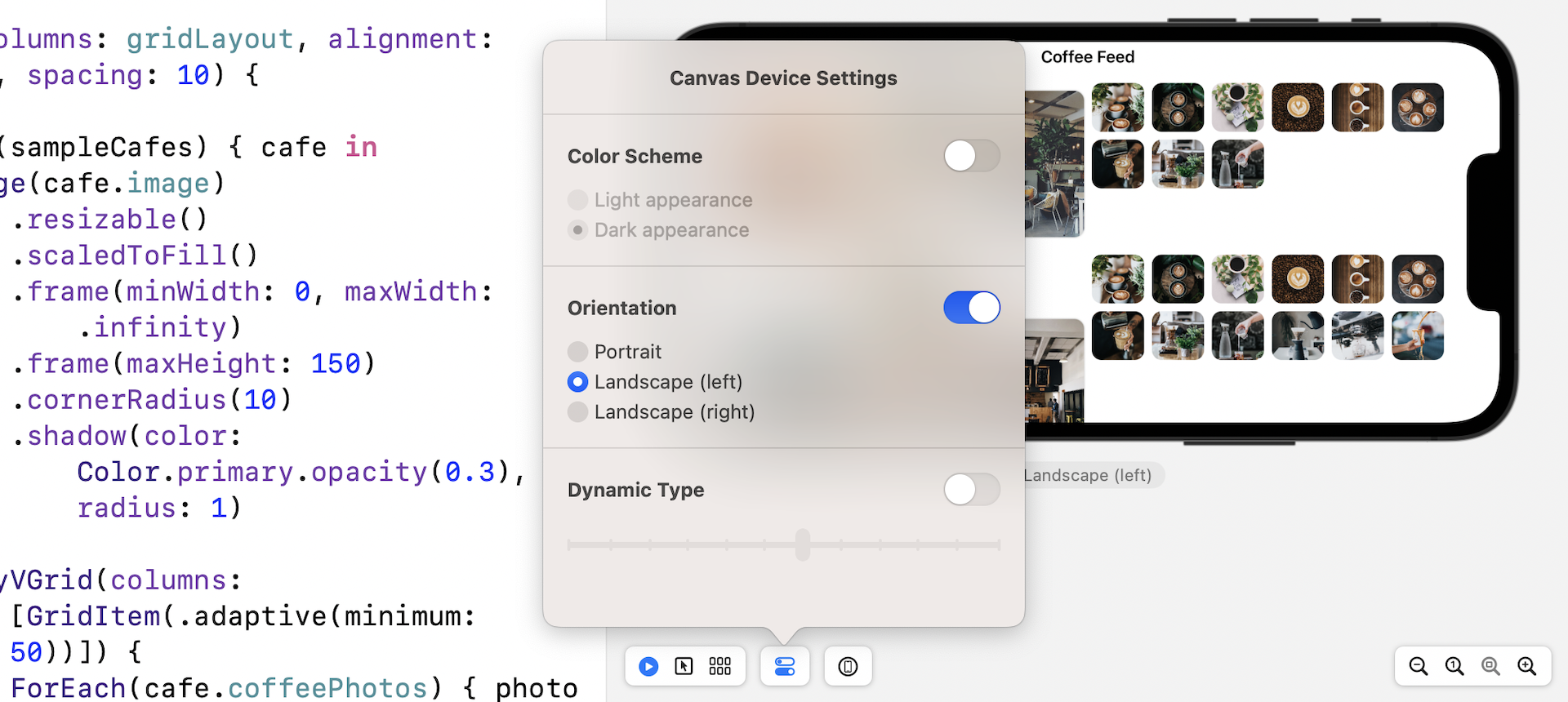
Handling Landscape Orientation
To test the app in landscape orientation in Xcode preview, you can choose the Device Settings option and enable the Orientation option. Set it to Landscape (Left) or Landscape (Right).
Alternatively, you can run the app on a simulator and test the landscape mode. But before you run the app, you will need to perform a simple modification in SwiftUIPhotoGridApp.swift. Since we have created a new file for implementing this multi-grid, modify the view in WindowGroup from ContentView() to MultiGridView() like below:
struct SwiftUIPhotoGridApp: App {
    var body: some Scene {
        WindowGroup {
            MultiGridView()
        }
    }
}
Now you're ready to test the app on an iPhone simulator. You rotate the simulator sideways by pressing command-left (or right)
Do you find the UI in landscape mode less appealing? The app works great in the portrait orientation. However, the grid layout doesn't look as expected on landscape orientation. What we expect is that the UI should look pretty much the same as that in portrait mode.
To fix the issue, we can adjust the minimum width of the adaptive grid item and make it a bit wider when the device is in landscape orientation. The question is how can you detect the orientation changes?
In SwiftUI, every view comes with a set of environment variables. You can find out the current device orientation by accessing both the horizontal and vertical size class variables like this:
@Environment(\.horizontalSizeClass) var horizontalSizeClass: UserInterfaceSizeClass?
@Environment(\.verticalSizeClass) var verticalSizeClass: UserInterfaceSizeClass?
The @Environment property wrapper allows you to access the environment values. In the code above, we tell SwiftUI that we want to read both the horizontal and vertical size classes, and subscribe to their changes. In other words, we will be notified whenever the device's orientation changes.
If you haven't done so, please make sure you insert the code above in MultiGridView.
The next question is how do we capture the notification and respond to the changes? You use a modifier called .onChange(). You can attach this modifier to any views to monitor any state changes. In this case, we can attach the modifier to NavigationStack like this:
.onChange(of: verticalSizeClass) { value in
    self.gridLayout = [ GridItem(.adaptive(minimum:  verticalSizeClass == .compact  ? 100 : 250)), GridItem(.flexible()) ]
}
We monitor the change of both horizontalSizeClass and verticalSizeClass variables. Whenever there is a change, we will update the gridLayout variable with a new grid configuration. The iPhone has a compact height in landscape orientation. Therefore, if the value of verticalSizeClass equals .compact, we alter the minimum size of the grid item to 250 points.
Now run the app on an iPhone simulator again. When you turn the device sideways, it now shows the cafe photo and coffee photos side by side.
Exercise
I have a couple of exercises for you. First, the app UI doesn't look good on iPad. Modify the code and fix the issue such that it only shows two columns: one for the cafe photo and the other for the coffee photos.
The next exercise is more complicated with a number of requirements:
- Different default grid layout for iPhone and iPad - When the app is first loaded up, it displays a single column grid for iPhone in portrait mode. For iPad and iPhone landscape, the app shows the cafe photos in a 2-column grid.
- Show/hide button for the coffee photos - Add a new button in the navigation bar for toggling the display of coffee photos. By default, the app only shows the list of cafe photos. When this button is tapped, it shows the coffee photo grid.
- Another button for switching grid layout - Add another bar button for toggling the grid layout between one and two columns.
To help you better understand what the final deliverable looks like, please check out this video demo at https://link.appcoda.com/multigrid-demo.
Summary
The missing collection view in the first release of SwiftUI is now here. The introduction of LazyVGrid and LazyHGrid in SwiftUI lets developers create different types of grid layouts with a few lines of code. This tutorial is just a quick overview of these two new UI components. I encourage you to try out different configurations of GridItem to see what grid layouts you can achieve.
For reference, you can download the complete grid project and the solution to the exercise at: