- Made by AppCoda
- Contact us / Support
- Tweet this book
- Preface
- 1. Introduction to SwiftUI
- 2. Getting Started with SwiftUI and Working with Text
- 3. Working with Images
- 4. Layout User Interfaces with Stacks
- 5. Understanding ScrollView and Building a Carousel UI
- 6. Working with SwiftUI Buttons and Gradient
- 7. Understanding State and Binding
- 8. Implementing Path and Shape for Line Drawing and Pie Charts
- 9. Basic Animations and Transitions
- 10. Understanding Dynamic List, ForEach and Identifiable
- 11. Working with Navigation UI and Navigation Bar Customization
- 12. Playing with Modal Views, Floating Buttons and Alerts
- 13. Building a Form with Picker, Toggle and Stepper
- 14. Data Sharing with Combine and Environment Objects
- 15. Building a Registration Form with Combine and View Model
- 16. Working with Swipe-to-Delete, Context Menu and Action Sheets
- 17. Using Gestures
- 18. Displaying an Expandable Bottom Sheet Using Presentation Detents
- 19. Creating a Tinder-like UI with Gestures and Animations
- 20. Creating an Apple Wallet like Animation and View Transition
- 21. Working with JSON, Slider and Data Filtering
- 22. Building a ToDo app with Core Data
- 23. Integrating UIKit with SwiftUI Using UIViewRepresentable
- 24. Creating a Search Bar View and Working with Custom Binding
- 25. Putting Everything Together to Build a Real World App
- 26. Creating an App Store like Animated View Transition
- 27. Building an Image Carousel
- 28. Building an Expandable List View Using OutlineGroup
- 29. Building Grid Layout Using LazyVGrid and LazyHGrid
- 30. Creating an Animated Activity Ring with Shape and Animatable
- 31. Working with AnimatableModifier and LibraryContentProvider
- 32. Working with TextEditor to Create Multiline Text Fields
- 33. Using matchedGeometryEffect to Create View Animations
- 34. ScrollViewReader and Grid Animation
- 35. Working with Tab View and Tab Bar Customization
- 36. Using AsyncImage in SwiftUI for Loading Images Asynchronously
- 37. Implementing Search Bar Using Searchable
- 38. Creating Bar Charts and Line Charts with the Charts Framework
- 39. Capturing Text within Image Using Live Text APIs
- 40. How to Use ShareLink for Sharing Data Like Text and Photos
- 41. Using ImageRenderer to Convert SwiftUI Views into Images
- 42. Creating PDF Documents Using ImageRenderer
- 43. Using Gauge to Display Progress and Create a Speedometer
- 44. Creating Grid Layout Using Grid APIs
- 45. Switching Layout with AnyLayout
- Published with GitBook
Chapter 8
Implementing Path and Shape for Line Drawing and Pie Charts
For experienced developers, you probably have used the Core Graphics APIs to draw shapes and objects. It's a very powerful framework for you to create vector-based drawings. SwiftUI also provides several vector drawing APIs for developers to draw lines and shapes.
In this chapter, you will learn how to draw lines, arcs, pie charts, and donut charts using Path and the built-in Shape such as Circle and RoundedRectangle. Here are the topics we'll cover:
- Understanding Path and how to draw a line
- What is the
Shapeprotocol and how to draw a custom shape by conforming to the protocol - How to draw a pie chart
- How to create a progress indicator with an open circle
- How to draw a donut chart
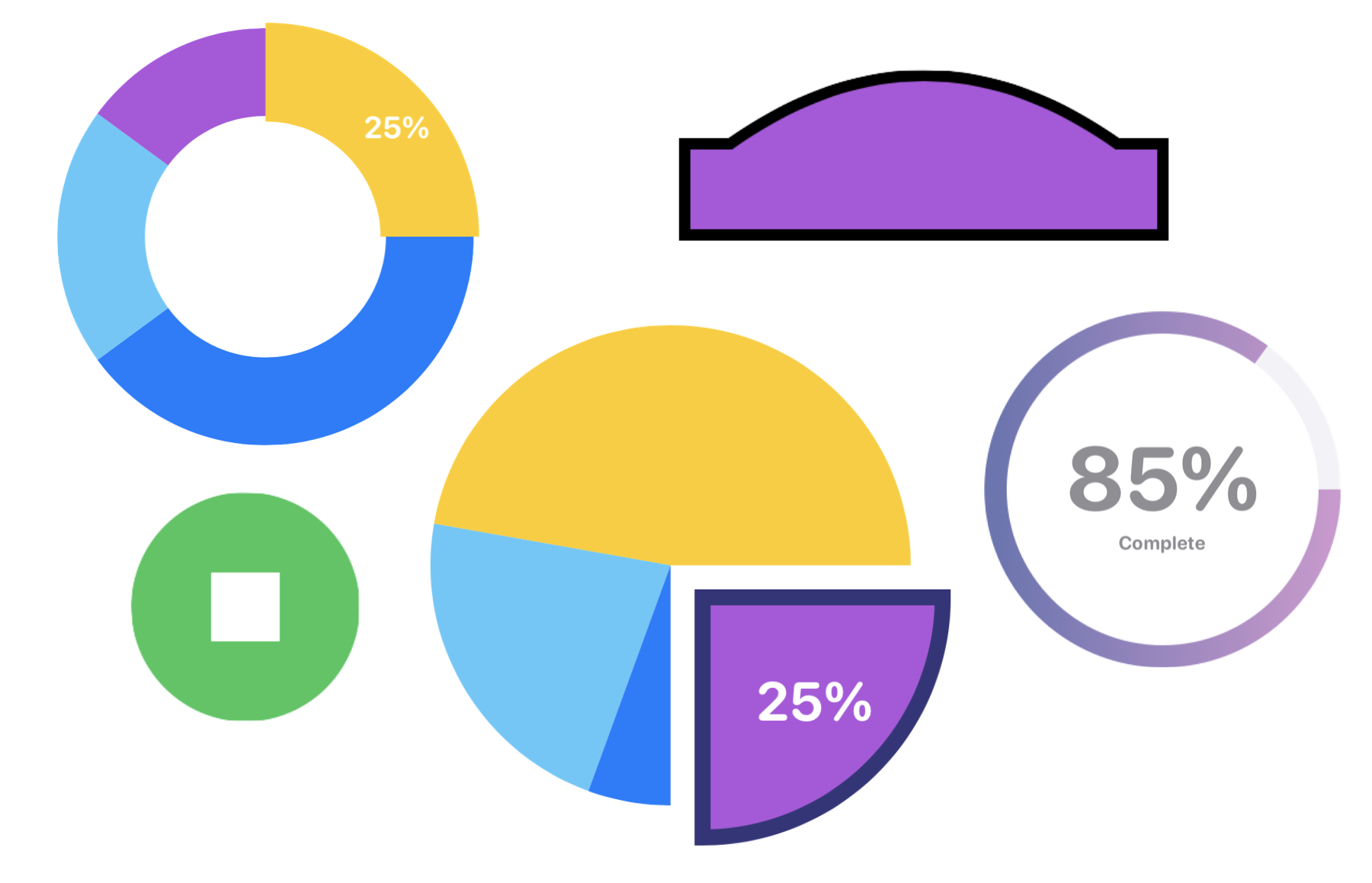
Figure 1 shows you some of the shapes and charts that we will create in this chapter.
Understanding Path
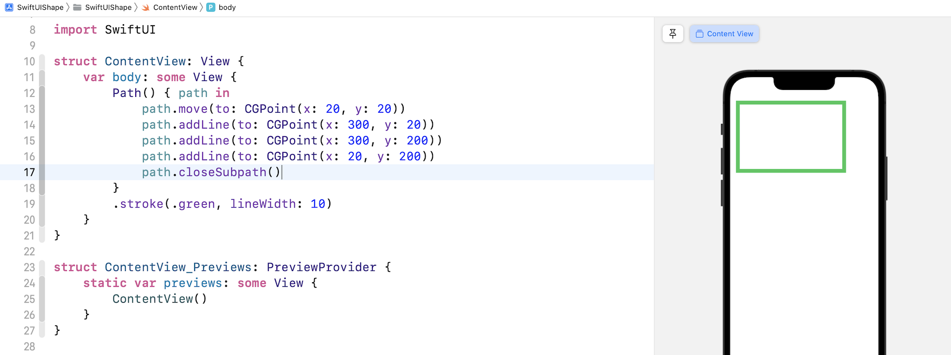
In SwiftUI, you draw lines and shapes using Path. If you refer to Apple's documentation (https://developer.apple.com/documentation/swiftui/path), Path is a struct containing the outline of a 2D shape. Basically, a path is the setting of a point of origin, then drawing lines from point to point. Let me give you an example. Take a look at figure 2. We will walk thorugh how this rectangle is drawn.
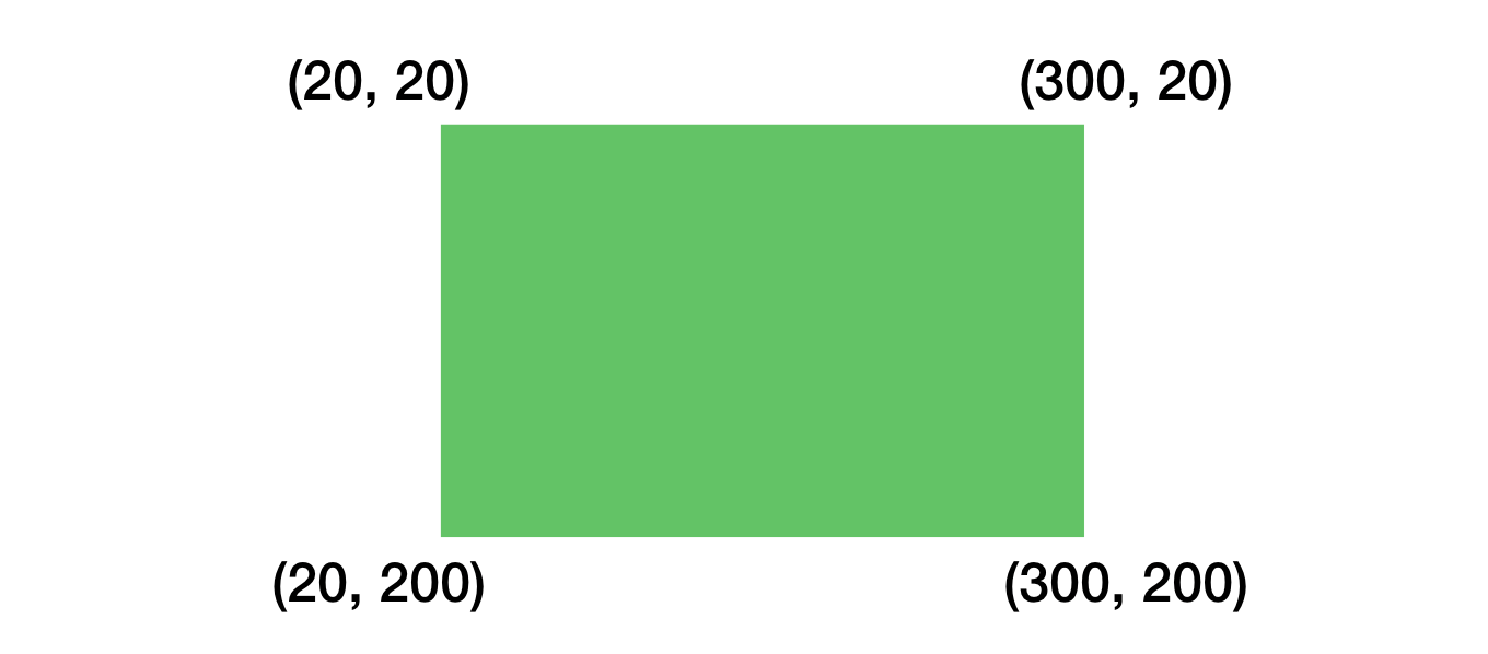
If you were to verbally tell me how you would draw the rectangle step by step, you would probably provide the following description:
- Move the point (20, 20)
- Draw a line from (20, 20) to (300, 20)
- Draw a line from (300, 20) to (300, 200)
- Draw a line from (300, 200) to (20, 200)
- Fill the whole area in green
That's how Path is works! Let's write your verbal description in code:
Path() { path in
    path.move(to: CGPoint(x: 20, y: 20))
    path.addLine(to: CGPoint(x: 300, y: 20))
    path.addLine(to: CGPoint(x: 300, y: 200))
    path.addLine(to: CGPoint(x: 20, y: 200))
}
.fill(.green)
You initialize a Path and provide detailed instructions in the closure. You call the move(to:) method to move to a particular coordinate. To draw a line from the current point to a specific point, you call the addLine(to:) method. By default, iOS fills the path with the default foreground color, which is black. To fill it with a different color, you can use the .fill modifier and set a different color.
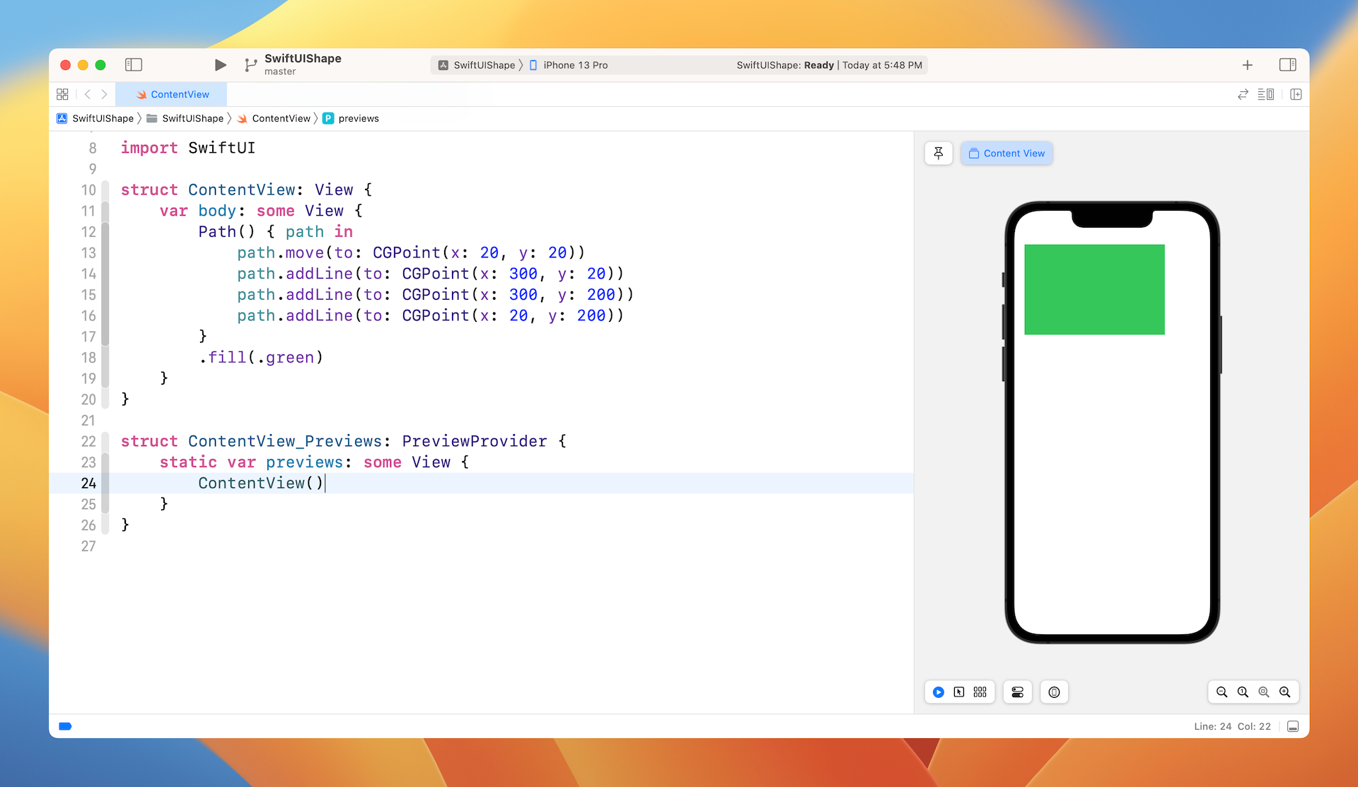
Test the code by creating a new project using the App template. Name the project SwiftUIShape (or whatever name you like) and then type the above code snippet in the body. The preview canvas should display a rectangle in green.
Using Stroke to Draw Borders
You're not required to fill the whole area with color. If you just want to draw the lines, you can use the .stroke modifier and specify the line width and color. Figure 4 shows the result.
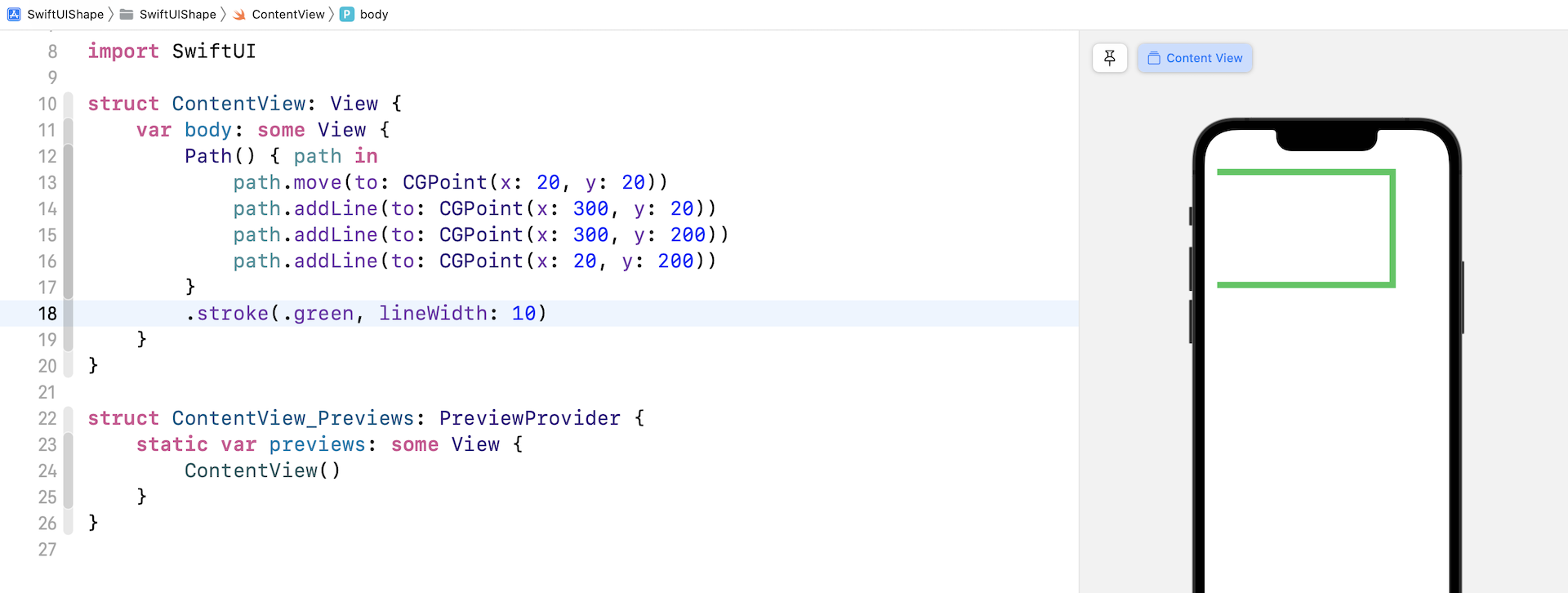
Because we didn't specify a step to draw the line to the point of origin, it shows an open-ended path. To close the path, you can call the closeSubpath() method at the end of the Path closure, that will automatically connect the current point with the point of origin.
Drawing Curves
Path provides several built-in APIs to help you draw different shapes. You are not limited to drawing straight lines. The addQuadCurve, addCurve, and addArc allow you to create curves and arcs. Let's say, you want to draw a dome on top of a rectangle like that shown in figure 6.
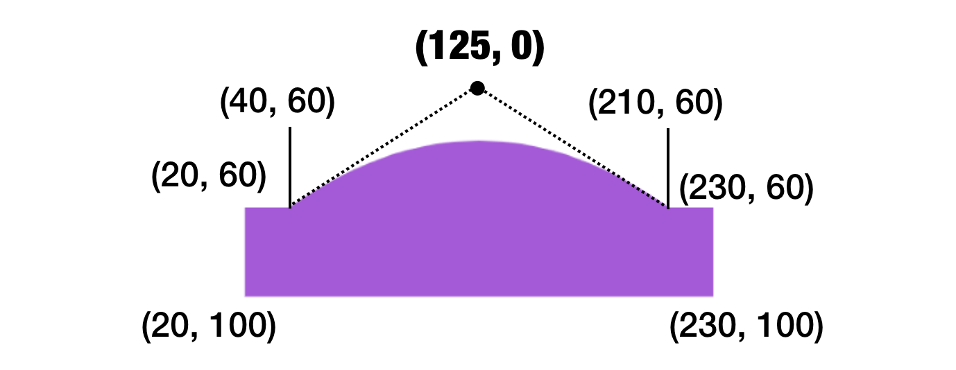
You write the code like this:
Path() { path in
    path.move(to: CGPoint(x: 20, y: 60))
    path.addLine(to: CGPoint(x: 40, y: 60))
    path.addQuadCurve(to: CGPoint(x: 210, y: 60), control: CGPoint(x: 125, y: 0))
    path.addLine(to: CGPoint(x: 230, y: 60))
    path.addLine(to: CGPoint(x: 230, y: 100))
    path.addLine(to: CGPoint(x: 20, y: 100))
}
.fill(Color.purple)
The addQuadCurve method lets you draw a curve by defining a control point. Referring to figure 6, (40, 60) and (210, 60) are known as anchor points. (125, 0) is the control point, which is calculated to create the dome shape. I'm not going to discuss the mathematics involved in drawing the curve, however, try to change the value of the control point to see its effect. In brief, this control point controls how the curve is drawn. If it's placed closer to the top of the rectangle (e.g. 125, 30), you will create a less rounded appearance.
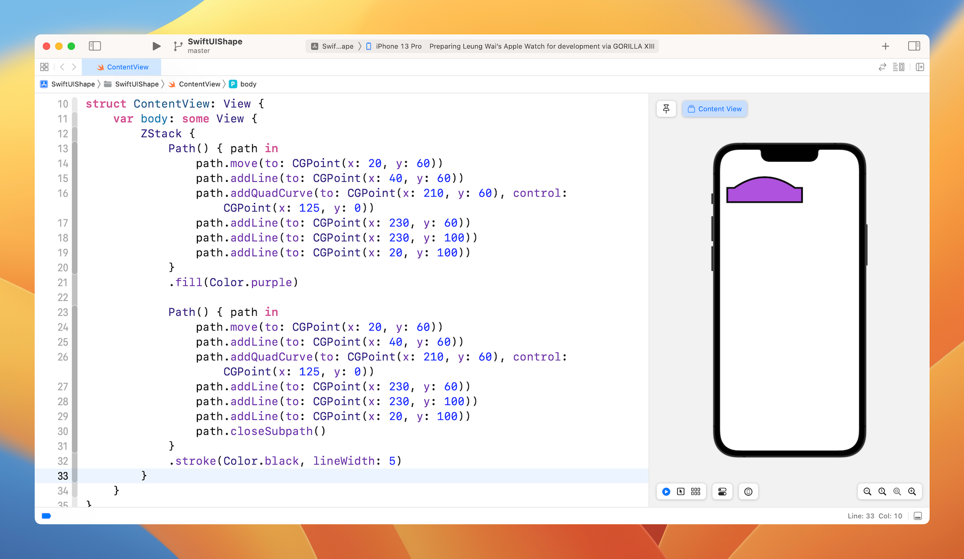
Fill and Stroke
What if you want to draw the border of the shape and fill the shape with color at the same time? The fill and stroke modifiers cannot be used in parallel. You can make use of ZStack to achieve the same effect. Here is the code:
ZStack {
    Path() { path in
        path.move(to: CGPoint(x: 20, y: 60))
        path.addLine(to: CGPoint(x: 40, y: 60))
        path.addQuadCurve(to: CGPoint(x: 210, y: 60), control: CGPoint(x: 125, y: 0))
        path.addLine(to: CGPoint(x: 230, y: 60))
        path.addLine(to: CGPoint(x: 230, y: 100))
        path.addLine(to: CGPoint(x: 20, y: 100))
    }
    .fill(Color.purple)

    Path() { path in
        path.move(to: CGPoint(x: 20, y: 60))
        path.addLine(to: CGPoint(x: 40, y: 60))
        path.addQuadCurve(to: CGPoint(x: 210, y: 60), control: CGPoint(x: 125, y: 0))
        path.addLine(to: CGPoint(x: 230, y: 60))
        path.addLine(to: CGPoint(x: 230, y: 100))
        path.addLine(to: CGPoint(x: 20, y: 100))
        path.closeSubpath()
    }
    .stroke(Color.black, lineWidth: 5)
}
We create two Path objects with the same path and overlay one on top of the other using ZStack. The one underneath uses fill to fill the dome rectangle with purple color. The one overlayed on top only draws the borders with black color. Figure 7 shows the result.
Drawing Arcs and Pie Charts
SwiftUI provides a convenient API for developers to draw arcs. This API is incredibly useful to compose various shapes and objects including pie charts. To draw an arc, you write the code like this:
Path { path in
    path.move(to: CGPoint(x: 200, y: 200))
    path.addArc(center: .init(x: 200, y: 200), radius: 150, startAngle: .degrees(0), endAngle: .degrees(90), clockwise: true)
}
.fill(.green)
Enter this code in the body, you will see an arc that fills with green color in the preview canvas.
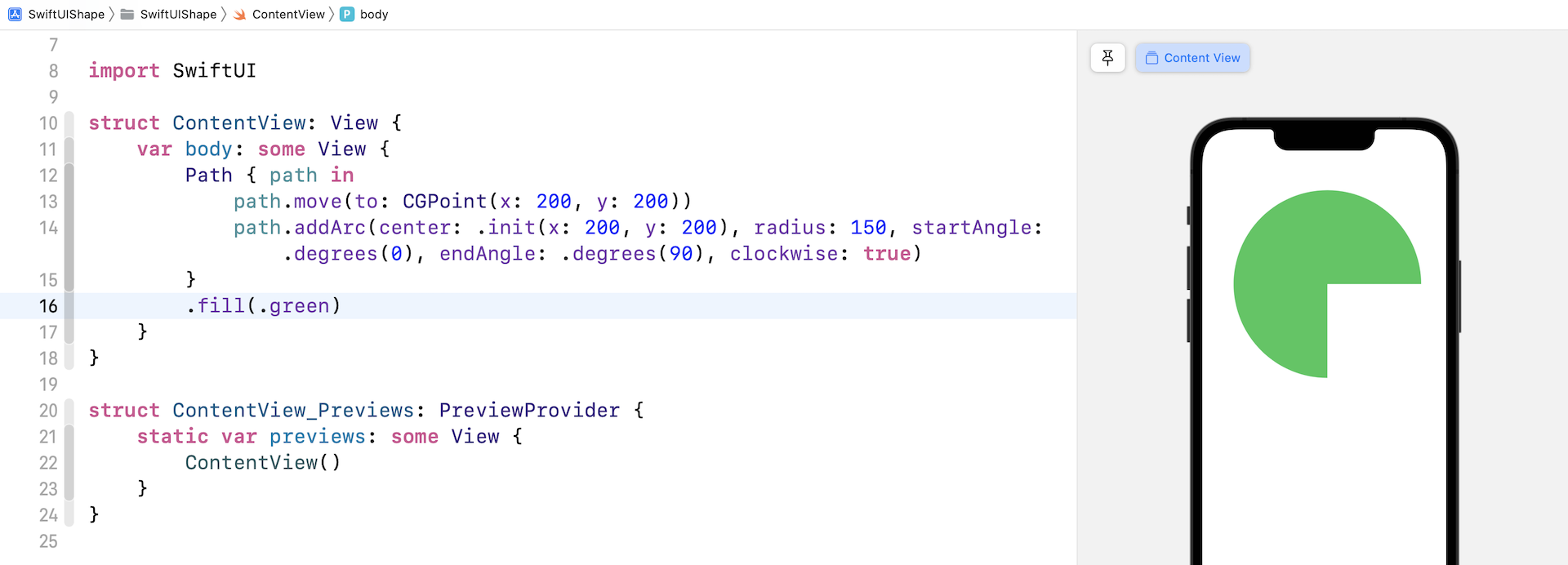
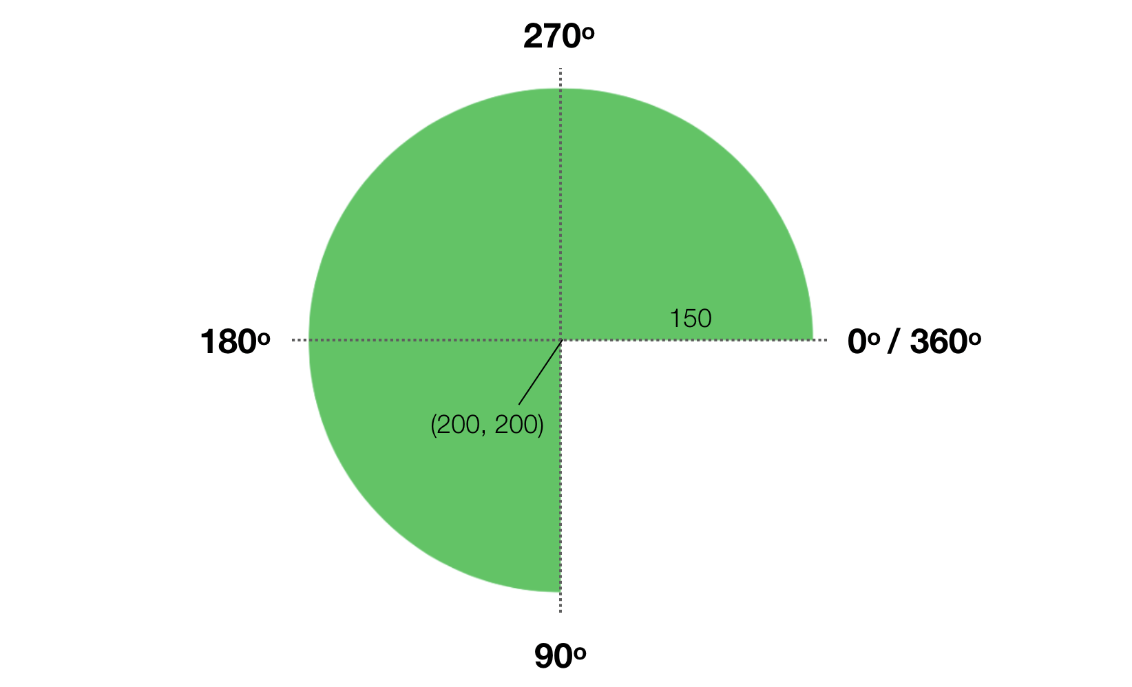
In the code, we first move to the starting point (200, 200). Then we call addArc to create the arc. The addArc method accepts several parameters:
- center - the center point of the circle
- radius - the radius of the circle for creating the arc
- startAngle - the starting angle of the arc
- endAngle - the ending angle of the arc
- clockwise - the direction to draw the arc
If you just look at the name of the startAngle and endAngle parameters, you might be a bit confused with their meaning. Figure 9 will give you a better idea of how these parameters work.
By using addArc, you can easily create a pie chart with different colored segments. All you need to do is overlay different pie segments with ZStack. Each segment has different values for startAngle and endAngle to compose the chart. Here is an example:
ZStack {
    Path { path in
        path.move(to: CGPoint(x: 187, y: 187))
        path.addArc(center: .init(x: 187, y: 187), radius: 150, startAngle: .degrees(0), endAngle: .degrees(190), clockwise: true)
    }
    .fill(.yellow)

    Path { path in
        path.move(to: CGPoint(x: 187, y: 187))
        path.addArc(center: .init(x: 187, y: 187), radius: 150, startAngle: .degrees(190), endAngle: .degrees(110), clockwise: true)
    }
    .fill(.teal)

    Path { path in
        path.move(to: CGPoint(x: 187, y: 187))
        path.addArc(center: .init(x: 187, y: 187), radius: 150, startAngle: .degrees(110), endAngle: .degrees(90), clockwise: true)
    }
    .fill(.blue)

    Path { path in
        path.move(to: CGPoint(x: 187, y: 187))
        path.addArc(center: .init(x: 187, y: 187), radius: 150, startAngle: .degrees(90), endAngle: .degrees(360), clockwise: true)
    }
    .fill(.purple)

}
This will render a pie chart with 4 segments. If you want to have more segments, just create additional path objects with different angle values. As a side note, the color I used comes from the standard color objects provided in iOS. You can check out the full set of color objects at https://developer.apple.com/documentation/uikit/uicolor/standard_colors.
Sometimes, you may want to highlight a particular segment by splitting it from the pie chart. Say, to highlight the segment in purple, you can apply the offset modifier to re-position the segment:
Path { path in
    path.move(to: CGPoint(x: 187, y: 187))
    path.addArc(center: .init(x: 187, y: 187), radius: 150, startAngle: .degrees(90), endAngle: .degrees(360), clockwise: true)
}
.fill(.purple)
.offset(x: 20, y: 20)
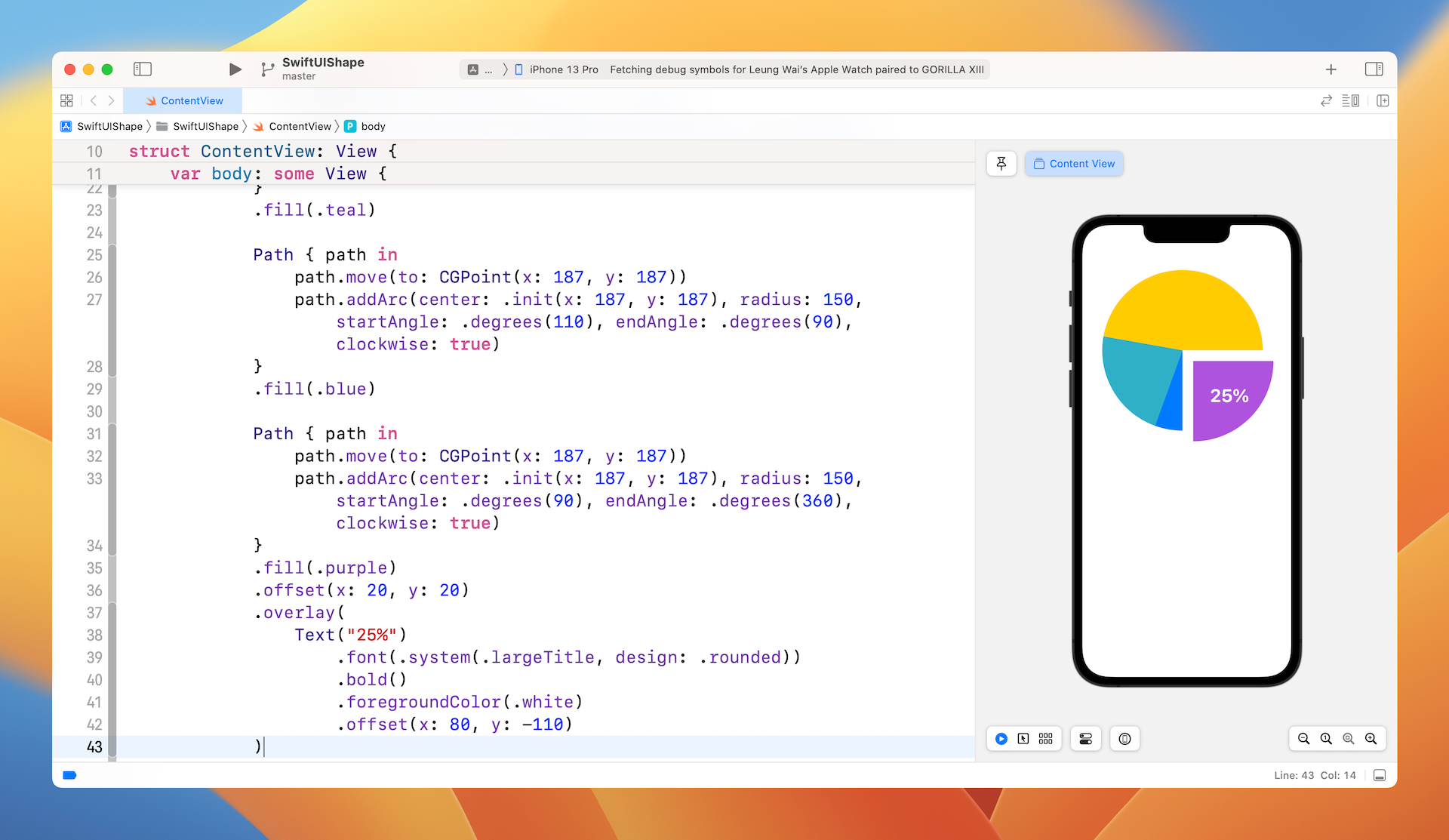
Optionally, you can overlay a border to further catch people's attention. If you want to add a label to the highlighted segment, you can also overlay a Text view like this:
Path { path in
    path.move(to: CGPoint(x: 187, y: 187))
    path.addArc(center: .init(x: 187, y: 187), radius: 150, startAngle: .degrees(90), endAngle: .degrees(360), clockwise: true)
    path.closeSubpath()
}
.stroke(Color(red: 52/255, green: 52/255, blue: 122/255), lineWidth: 10)
.offset(x: 20, y: 20)
.overlay(
    Text("25%")
        .font(.system(.largeTitle, design: .rounded))
        .bold()
        .foregroundColor(.white)
        .offset(x: 80, y: -110)
)
This path has the same starting and end angle as the purple segment, however; it only draws the border and adds a text view in order to make the segment stand out. Figure 10 shows the end result.
Understanding the Shape Protocol
Before we look into the Shape protocol, let's begin with a simple exercise. Based on what you have learned, draw the following shape with Path.
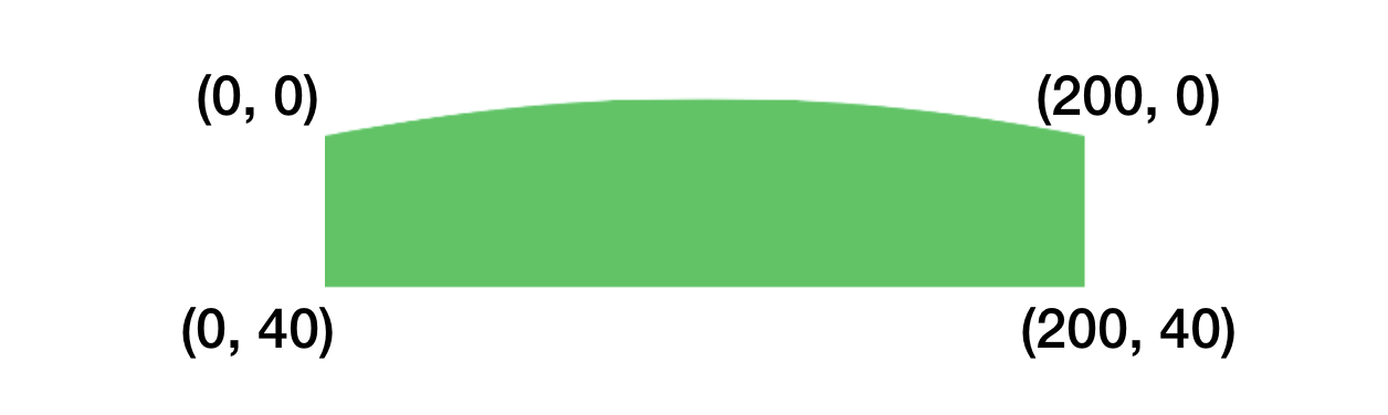
Don't look at the solution yet. Try to build one by yourself.
Okay, to build this shape, you create a Path using addLine and addQuadCurve:
Path() { path in
    path.move(to: CGPoint(x: 0, y: 0))
    path.addQuadCurve(to: CGPoint(x: 200, y: 0), control: CGPoint(x: 100, y: -20))
    path.addLine(to: CGPoint(x: 200, y: 40))
    path.addLine(to: CGPoint(x: 200, y: 40))
    path.addLine(to: CGPoint(x: 0, y: 40))
}
.fill(Color.green)
If you've read the documentation for Path, you may find another function called addRect, which lets you draw a rectangle with a specific width and height. Let's use it to create the same shape:
Path() { path in
    path.move(to: CGPoint(x: 0, y: 0))
    path.addQuadCurve(to: CGPoint(x: 200, y: 0), control: CGPoint(x: 100, y: -20))
    path.addRect(CGRect(x: 0, y: 0, width: 200, height: 40))
}
.fill(Color.green)
Let's talk about the Shape protocol. The protocol is very simple with only one requirement. To adopt it, you must implement the following function:
func path(in rect: CGRect) -> Path
When is it useful to adopt the Shape protocol? To answer this, let's say you want to create a button with the dome shape but flexible size. Is it possible to reuse the Path that you have just created?
Take a look at the code above again. You created a path with absolute coordinates and size. In order to create the same shape but with variable size, you can create a struct to adopt the Shape protocol and implement the path(in:) function. When the path(in:) function is called by the framework, you will be given the rect size. You can then draw the path within that rect.
In the code that follows we create the Dome shape using a path(in:) function.
struct Dome: Shape {
    func path(in rect: CGRect) -> Path {
        var path = Path()

        path.move(to: CGPoint(x: 0, y: 0))
        path.addQuadCurve(to: CGPoint(x: rect.size.width, y: 0), control: CGPoint(x: rect.size.width/2, y: -(rect.size.width * 0.1)))
        path.addRect(CGRect(x: 0, y: 0, width: rect.size.width, height: rect.size.height))

        return path
    }
}
By adopting the protocol, we are given the rectangular area for drawing the path. From the rect, we get the width and height of the rectangular area to compute the control point and draw the rectangle base.
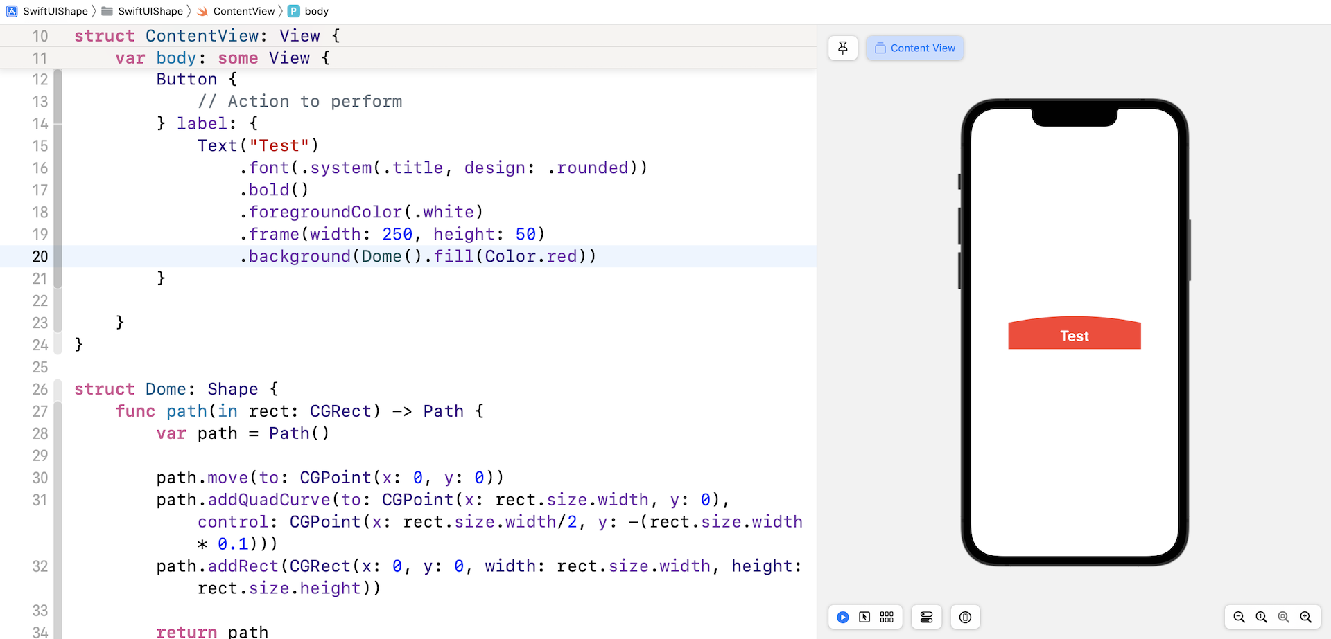
With the dynamic shape, you can create various SwiftUI controls. For example, you can create a button with the Dome shape like this:
Button(action: {
    // Action to perform
}) {
    Text("Test")
        .font(.system(.title, design: .rounded))
        .bold()
        .foregroundColor(.white)
        .frame(width: 250, height: 50)
        .background(Dome().fill(Color.red))
}
We apply the Dome shape as the background of the button. Its width and height are based on the specified frame size.
Using the Built-in Shapes
Earlier, we built a custom shape by using the Shape protocol. SwiftUI actually comes with several built-in shapes including Circle, Rectangle, RoundedRectangle, Ellipse, etc. If you don't need anything fancy, these shapes are good enough for you to create common objects.

Let's say, you want to create a stop button like the one shown in figure 13. It's composed of a rounded rectangle and a circle. You can write the code like this:
Circle()
    .foregroundColor(.green)
    .frame(width: 200, height: 200)
    .overlay(
        RoundedRectangle(cornerRadius: 5)
            .frame(width: 80, height: 80)
            .foregroundColor(.white)
    )
Here, we initialize a Circle view and then overlay a RoundedRectangle view on it.
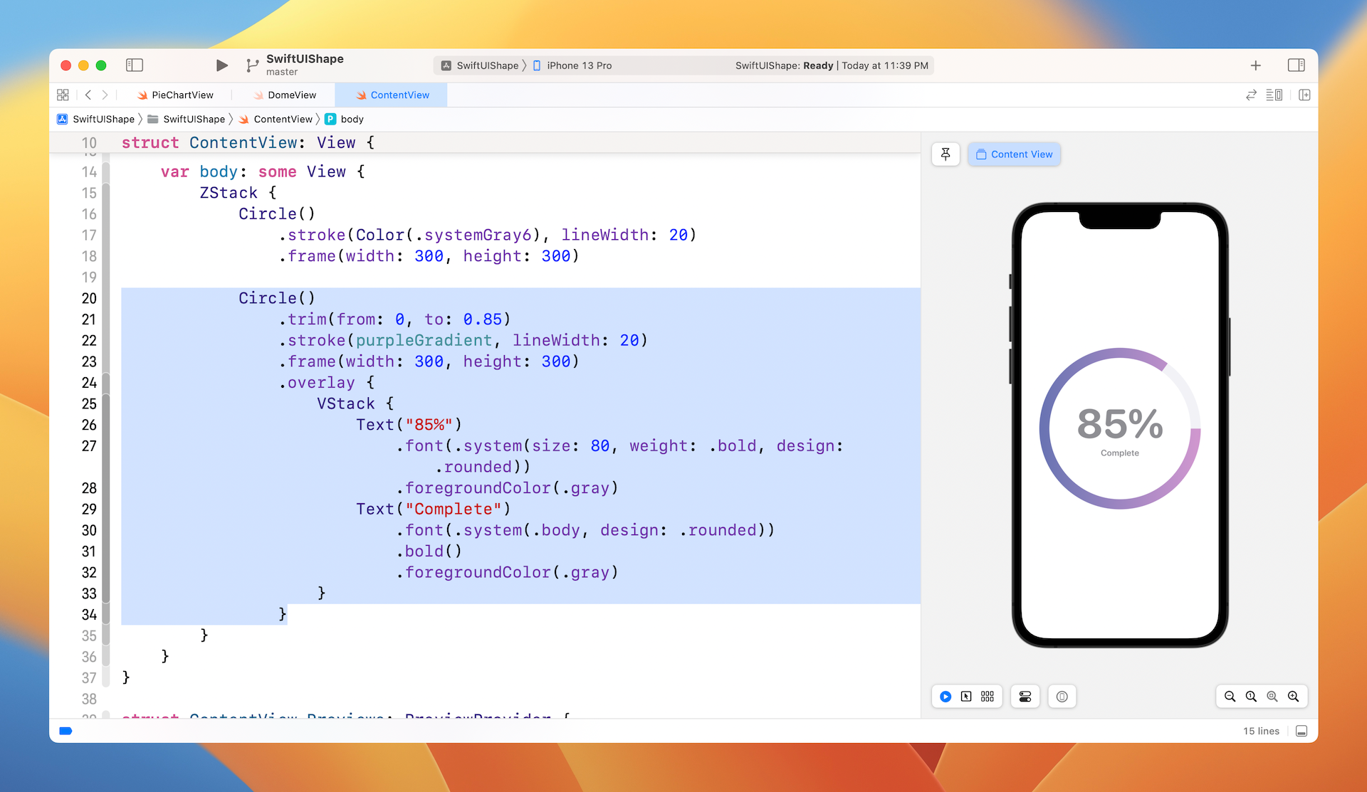
Creating a Progress Indicator Using Shapes
By mixing and matching the built-in shapes, you can create various types of vector-based UI controls for your applications. Let me show you another example. Figure 14 shows you a progress indicator that can be built by using Circle.

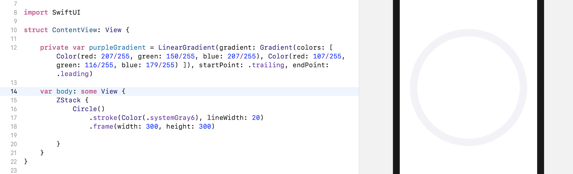
This progress indicator is actually composed of two circles. We have a gray outline of a circle underneath. On top of the grey circle, is an open outline of a circle indicating the completion progress. In your project, write the code in ContentView like this:
struct ContentView: View {

    private var purpleGradient = LinearGradient(gradient: Gradient(colors: [ Color(red: 207/255, green: 150/255, blue: 207/255), Color(red: 107/255, green: 116/255, blue: 179/255) ]), startPoint: .trailing, endPoint: .leading)

    var body: some View {

        ZStack {
            Circle()
                .stroke(Color(.systemGray6), lineWidth: 20)
                .frame(width: 300, height: 300)

        }
    }
}
We use the stroke modifier to draw the outline of the grey circle. You may adjust the value of the lineWidth parameter if you prefer thicker (or thinner) lines. The purpleGradient property defines the purple gradient that we will use later in drawing the open circle.
Now, insert the following code in ZStack to create the open circle:
Circle()
    .trim(from: 0, to: 0.85)
    .stroke(purpleGradient, lineWidth: 20)
    .frame(width: 300, height: 300)
    .overlay {
        VStack {
            Text("85%")
                .font(.system(size: 80, weight: .bold, design: .rounded))
                .foregroundColor(.gray)
            Text("Complete")
                .font(.system(.body, design: .rounded))
                .bold()
                .foregroundColor(.gray)
        }
    }
To create an open circle, add the trim modifier. You specify a from value and a to value to indicate which segment of the circle should be shown. In this case, we want to show progress of 85%. So, we set the from value to 0 and the to value to 0.85.
To display the completion percentage, we overlay a text view in the middle of the circle.
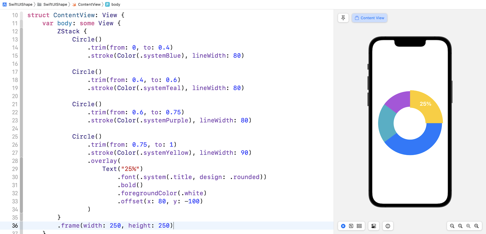
Drawing a Donut Chart
The last example I want to show you is a donut chart. If you fully understand how the trim modifier works, you may already know how we are going to implement the donut chart. By playing around with the values of the trim modifier, we can break a circle into multiple segments.
That's the technique we use to create a donut chart and here is the code:
ZStack {
    Circle()
        .trim(from: 0, to: 0.4)
        .stroke(Color(.systemBlue), lineWidth: 80)

    Circle()
        .trim(from: 0.4, to: 0.6)
        .stroke(Color(.systemTeal), lineWidth: 80)

    Circle()
        .trim(from: 0.6, to: 0.75)
        .stroke(Color(.systemPurple), lineWidth: 80)

    Circle()
        .trim(from: 0.75, to: 1)
        .stroke(Color(.systemYellow), lineWidth: 90)
        .overlay(
            Text("25%")
                .font(.system(.title, design: .rounded))
                .bold()
                .foregroundColor(.white)
                .offset(x: 80, y: -100)
        )
}
.frame(width: 250, height: 250)
The first segment represents 40% of the circle. The second segment 20% of the circle, but note that the from value is 0.4 instead of 0. This starts the second segment at the end of the first segment.
For the last segment, I intentionally set the line width to a larger value so that this segment stands out from the others. If you don't like that, you can change the value of lineWidth from 90 to 80.
Summary
I hope you enjoyed reading this chapter and coding the demo projects. With these drawing APIs, provided by the framework, you can easily create custom shapes for your application. There is a lot you can do with Path and Shape. I have covered just a few of these in this chapter, try to apply what you've learned and further explore these powerful APIs, they are magical!
For reference, you can download the shapes project files below:
- Demo project (https://www.appcoda.com/resources/swiftui4/SwiftUIShape.zip)