- Made by AppCoda
- Contact us / Support
- Tweet this book
- Preface
- 1. Introduction to SwiftUI
- 2. Getting Started with SwiftUI and Working with Text
- 3. Working with Images
- 4. Layout User Interfaces with Stacks
- 5. Understanding ScrollView and Building a Carousel UI
- 6. Working with SwiftUI Buttons and Gradient
- 7. Understanding State and Binding
- 8. Implementing Path and Shape for Line Drawing and Pie Charts
- 9. Basic Animations and Transitions
- 10. Understanding Dynamic List, ForEach and Identifiable
- 11. Working with Navigation UI and Navigation Bar Customization
- 12. Playing with Modal Views, Floating Buttons and Alerts
- 13. Building a Form with Picker, Toggle and Stepper
- 14. Data Sharing with Combine and Environment Objects
- 15. Building a Registration Form with Combine and View Model
- 16. Working with Swipe-to-Delete, Context Menu and Action Sheets
- 17. Using Gestures
- 18. Displaying an Expandable Bottom Sheet Using Presentation Detents
- 19. Creating a Tinder-like UI with Gestures and Animations
- 20. Creating an Apple Wallet like Animation and View Transition
- 21. Working with JSON, Slider and Data Filtering
- 22. Building a ToDo app with Core Data
- 23. Integrating UIKit with SwiftUI Using UIViewRepresentable
- 24. Creating a Search Bar View and Working with Custom Binding
- 25. Putting Everything Together to Build a Real World App
- 26. Creating an App Store like Animated View Transition
- 27. Building an Image Carousel
- 28. Building an Expandable List View Using OutlineGroup
- 29. Building Grid Layout Using LazyVGrid and LazyHGrid
- 30. Creating an Animated Activity Ring with Shape and Animatable
- 31. Working with AnimatableModifier and LibraryContentProvider
- 32. Working with TextEditor to Create Multiline Text Fields
- 33. Using matchedGeometryEffect to Create View Animations
- 34. ScrollViewReader and Grid Animation
- 35. Working with Tab View and Tab Bar Customization
- 36. Using AsyncImage in SwiftUI for Loading Images Asynchronously
- 37. Implementing Search Bar Using Searchable
- 38. Creating Bar Charts and Line Charts with the Charts Framework
- 39. Capturing Text within Image Using Live Text APIs
- 40. How to Use ShareLink for Sharing Data Like Text and Photos
- 41. Using ImageRenderer to Convert SwiftUI Views into Images
- 42. Creating PDF Documents Using ImageRenderer
- 43. Using Gauge to Display Progress and Create a Speedometer
- 44. Creating Grid Layout Using Grid APIs
- 45. Switching Layout with AnyLayout
- Published with GitBook
Chapter 6
Working with SwiftUI Buttons, Labels and Gradient
Buttons initiate app-specific actions, have customizable backgrounds, and can include a title or an icon. The system provides a number of predefined button styles for most use cases. You can also design fully custom buttons.
- Apple's documentation (https://developer.apple.com/design/human-interface-guidelines/ios/controls/buttons/)
I don't think I need to explain what a button is. It's a very basic UI control that you can find in all apps and has the ability to handle users' touch, and trigger a certain action. If you have learned iOS programming before, Button in SwiftUI is very similar to UIButton in UIKit. It's just more flexible and customizable. You will understand what I mean in a while. In this chapter, I will go through this SwiftUI control and you will learn the following techniques:
- How to create a simple button and handle the user's selection
- How to customize the button's background, padding and font
- How to add borders to a button
- How to create a button with both image and text
- How to create a button with a gradient background and shadows
- How to create a full-width button
- How to create a reusable button style
- How to add a tap animation
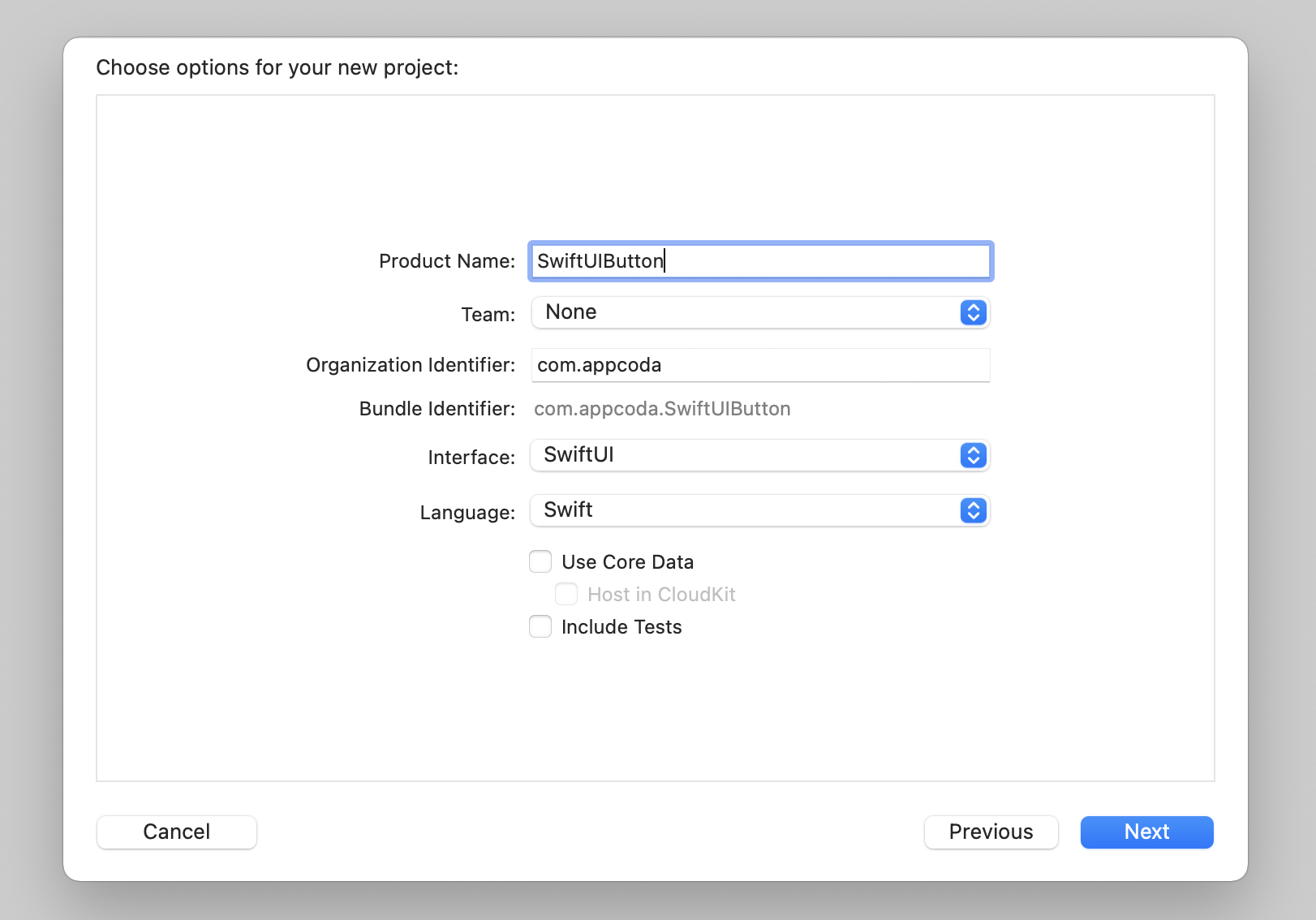
Creating a New Project with SwiftUI enabled
Okay, let's start with the basics and create a simple button using SwiftUI. First, fire up Xcode and create a new project using the App template. In the next screen, type the name of the project. I set it to SwiftUIButton but you're free to use any other name. You need to make sure you select SwiftUI for the Interface option.
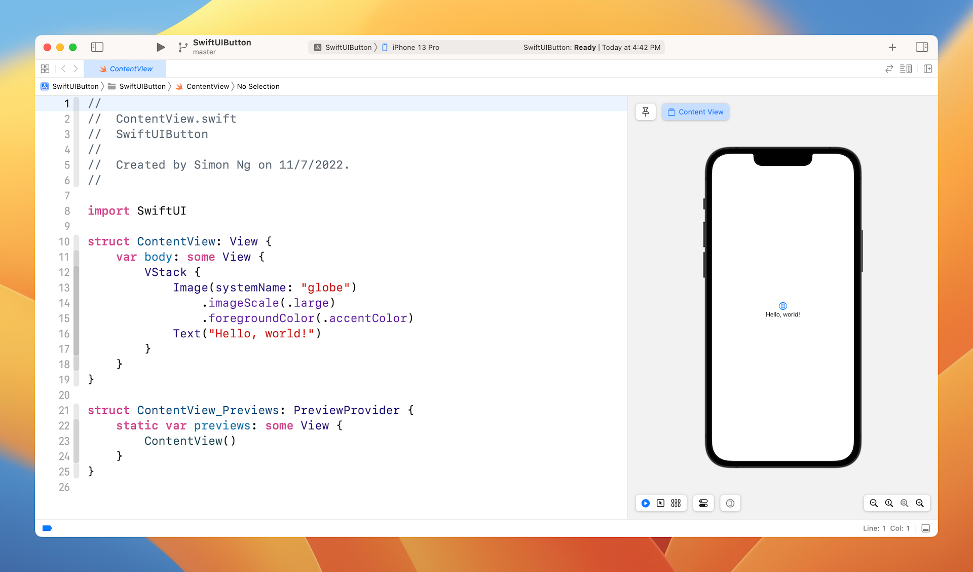
Once you save the project, Xcode should load the ContentView.swift file and display a preview.
It's very easy to create a button using SwiftUI. Basically, you use the code snippet below to create a button:
Button {
    // What to perform
} label: {
    // How the button looks like
}
When creating a button, you need to provide two code blocks:
- What action to perform - the code to perform after the button is tapped or selected by the user.
- How the button looks - the code block that describes the look & feel of the button.
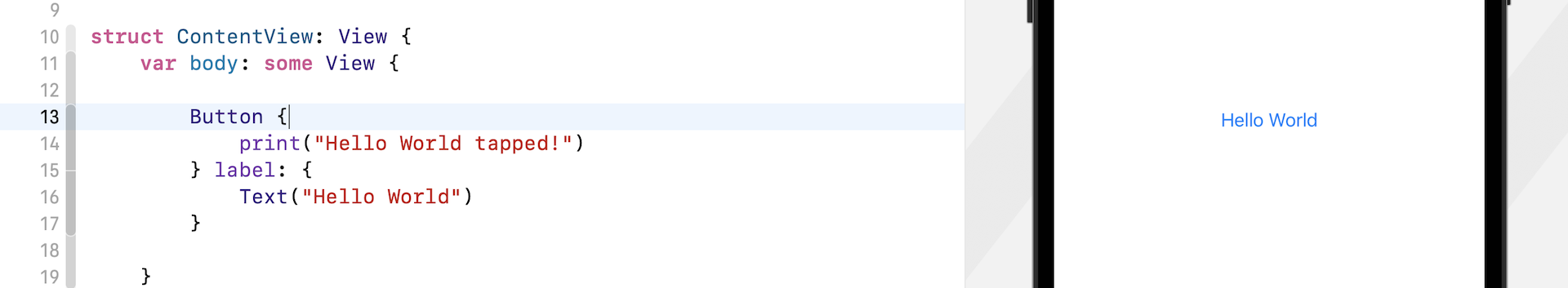
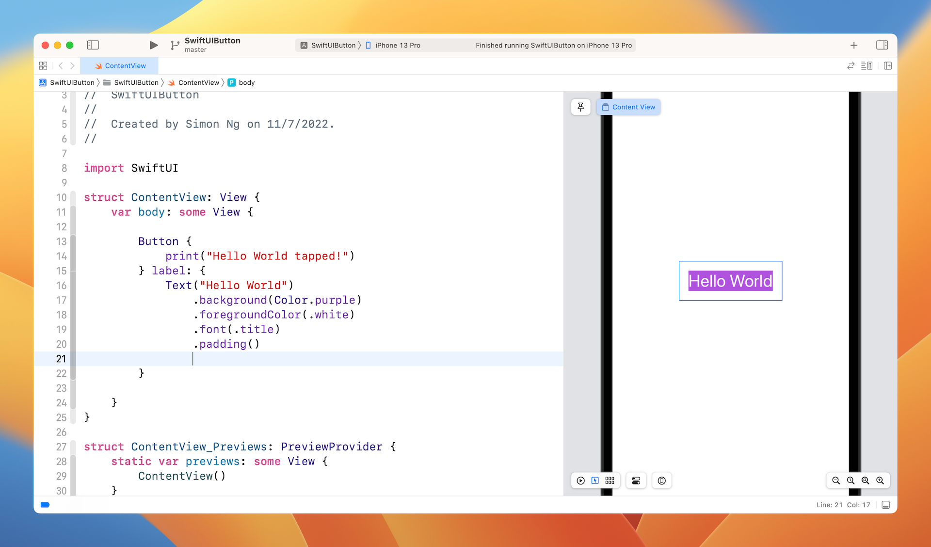
For example, if you just want to turn the Hello World label into a button, you can update the code like this:
struct ContentView: View {
    var body: some View {
        Button {
            print("Hello World tapped!")
        } label: {
            Text("Hello World")
        }
    }
}
As a side note, you may write the code like this:
struct ContentView: View {
    var body: some View {
        Button(action: {
            print("Hello World tapped!")
        }) label: {
            Text("Hello World")
        }
    }
}
Both pieces of code are exactly the same. It's just a matter of coding style. In this book, we prefer to use the first approach.
Once you implement a button, the Hello World text becomes a tappable button as you see it in the canvas.
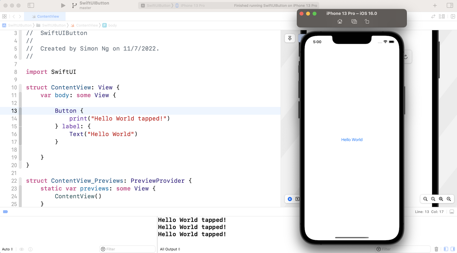
The print statement outputs the message to the console. In order to test it, you have to run the app on a simulator. Click the Play button to launch the simulator. You should see the Hello World tapped message on the console when you tap the button. If you can't see the console, go up to the Xcode menu and choose View > Debug Area > Activate Console.
Customizing the Button's Font and Background
Now that you know how to create a simple button, let's customize its look & feel with the built-in modifiers. To change the background and text color, you can use the background and foregroundColor modifiers like this:
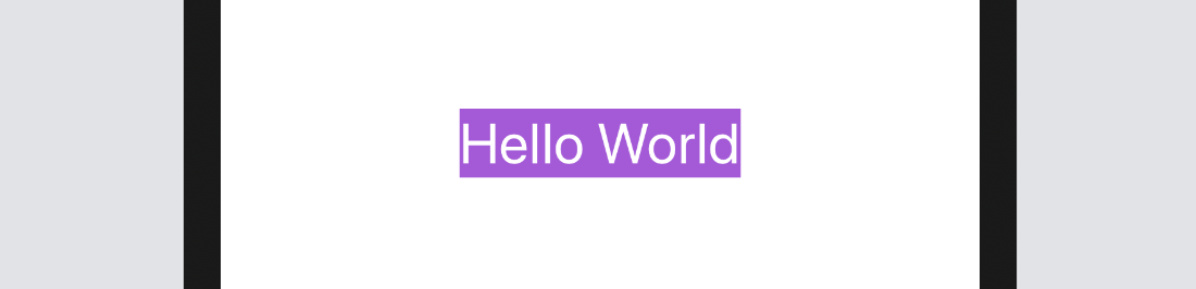
Text("Hello World")
    .background(Color.purple)
    .foregroundColor(.white)
If you want to change the font type, you use the font modifier and specify the font type (e.g. .title) like this:
Text("Hello World")
    .background(Color.purple)
    .foregroundColor(.white)
    .font(.title)
After the change, your button should look like the figure below.
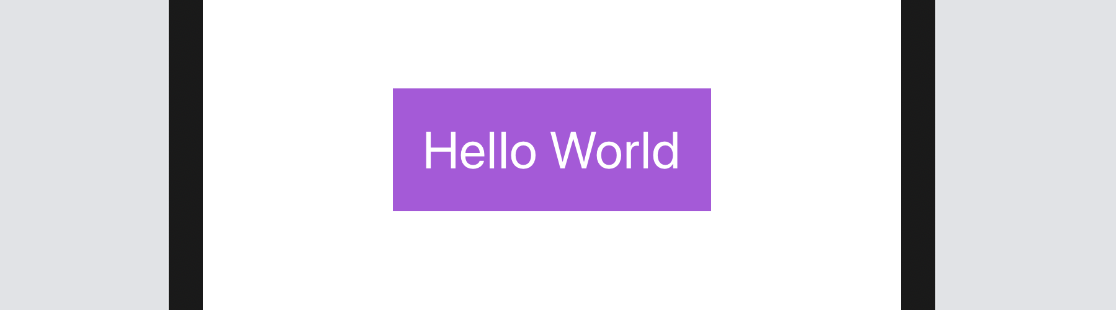
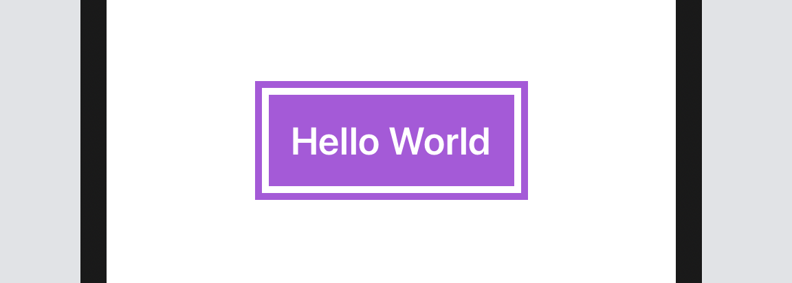
As you can see, the button doesn't look very good. Wouldn't it be great to add some space around the text? To do that, you can use the padding modifier like this:
Text("Hello World")
    .padding()
    .background(Color.purple)
    .foregroundColor(.white)
    .font(.title)
After you make the change, the canvas will update the button accordingly. The button should now look much better.
The Order of Modifiers is Important
One thing I want to highlight is that the padding modifier should be placed before the background modifier. If you write the code as illustrated below, the end result will be different.
If you place the padding modifier after the background modifier, you can still add some padding to the button but without the preferred background color. If you wonder why, the modifiers like this:
Text("Hello World")
    .background(Color.purple) // 1. Change the background color to purple
    .foregroundColor(.white)  // 2. Set the foreground/font color to white
    .font(.title)             // 3. Change the font type
    .padding()                // 4. Add the paddings with the primary color (i.e. white)
Conversely, the modifiers will work like this if the padding modifier is placed before the background modifier:
Text("Hello World")
    .padding()                // 1. Add the paddings
    .background(Color.purple) // 2. Change the background color to purple including the padding
    .foregroundColor(.white)  // 3. Set the foreground/font color to white
    .font(.title)             // 4. Change the font type
Adding Borders to the Button
This doesn't mean the padding modifier should always be placed at the very beginning. It just depends on your button design. Let's say, you want to create a button with borders like this:
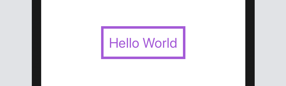
You can change the code of the Text control like below:
Text("Hello World")
    .foregroundColor(.purple)
    .font(.title)
    .padding()
    .border(Color.purple, width: 5)
Here we set the foreground color to purple and then add some empty paddings around the text. The border modifier is used to define the border's width and color. Please alter the value of the width parameter to see how it works.
Let me give you another example. Let's say, a designer shows you the following button design. How are you going to implement it with what you've learned? Before you read the next paragraph, take a few minutes to figure out the solution.
Okay, here is the solution:
Text("Hello World")
    .fontWeight(.bold)
    .font(.title)
    .padding()
    .background(Color.purple)
    .foregroundColor(.white)
    .padding(10)
    .border(Color.purple, width: 5)
We use two padding modifiers to create the button design. The first padding, together with the background modifier, is for creating a button with padding and a purple background. The padding(10) modifier adds extra padding around the button and the border modifier specifies a rounded border in purple.
Let's look at a more complex example. What if you wanted a button with rounded borders like this?
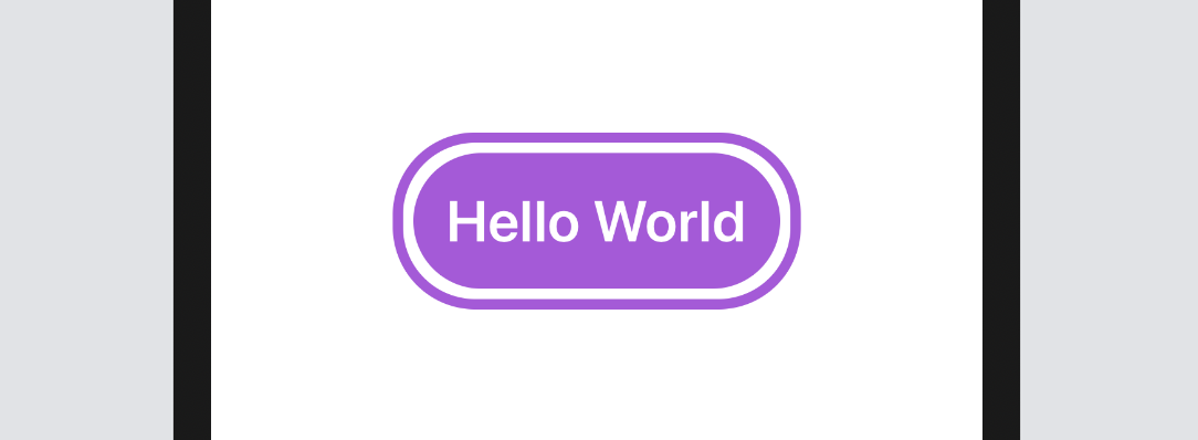
SwiftUI comes with a modifier named cornerRadius that lets you easily create rounded corners. To render the button's background with rounded corners, you simply use the modifier and specify the corner radius:
.cornerRadius(40)
For the border with rounded corners, it'll take a little bit of work since the border modifier doesn't allow you to create rounded corners. What we need to do is to draw a border and overlay it on the button. Here is the final code:
Text("Hello World")
    .fontWeight(.bold)
    .font(.title)
    .padding()
    .background(.purple)
    .cornerRadius(40)
    .foregroundColor(.white)
    .padding(10)
    .overlay {
        RoundedRectangle(cornerRadius: 40)
            .stroke(.purple, lineWidth: 5)
    }
The overlay modifier lets you overlay another view on top of the current view. In the code, we draw a border with rounded corners using the stroke modifier of the RoundedRectangle object. The stroke modifier allows you to configure the color and line width of the stroke.
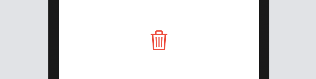
Creating a Button with Images and Text
So far, we have only worked with text buttons. In a real world project, you or your designer may want to display a button with an image. The syntax of creating an image button is exactly the same except that you use the Image control instead of the Text control like this:
Button(action: {
    print("Delete button tapped!")
}) {
    Image(systemName: "trash")
        .font(.largeTitle)
        .foregroundColor(.red)
}
For convenience, we use the built-in SF Symbols (i.e. trash) to create the image button. We specify .largeTitle in the font modifier to make the image a bit larger. Your button should look like this:
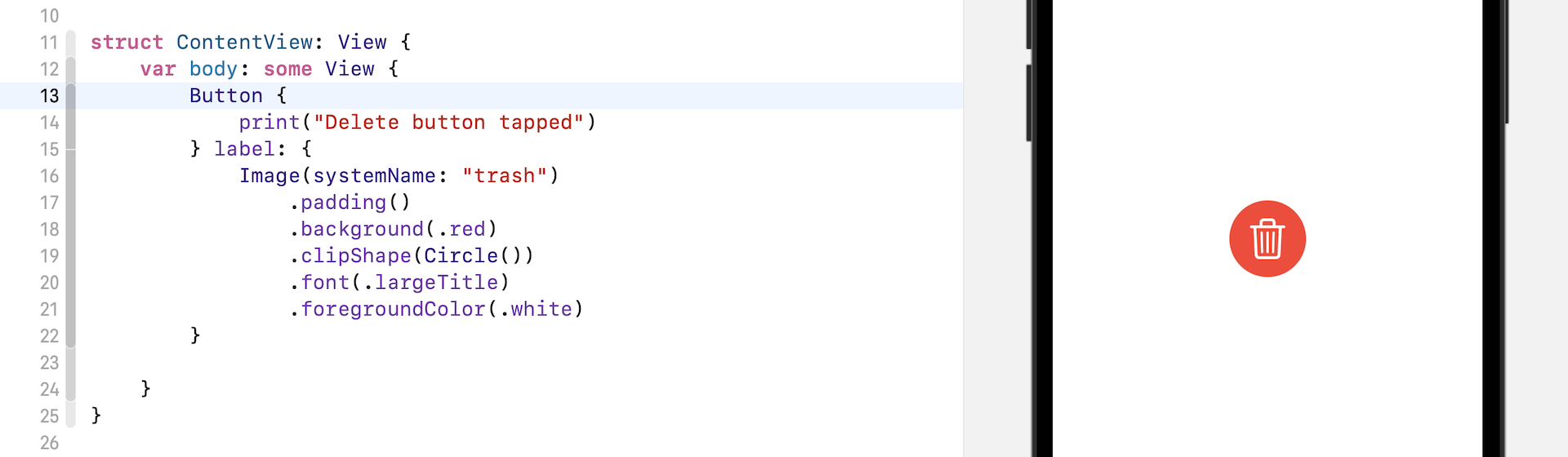
Similarly, if you want to create a circular image button with a solid background color, you can apply the modifiers we discussed earlier. Figure 12 shows you an example.
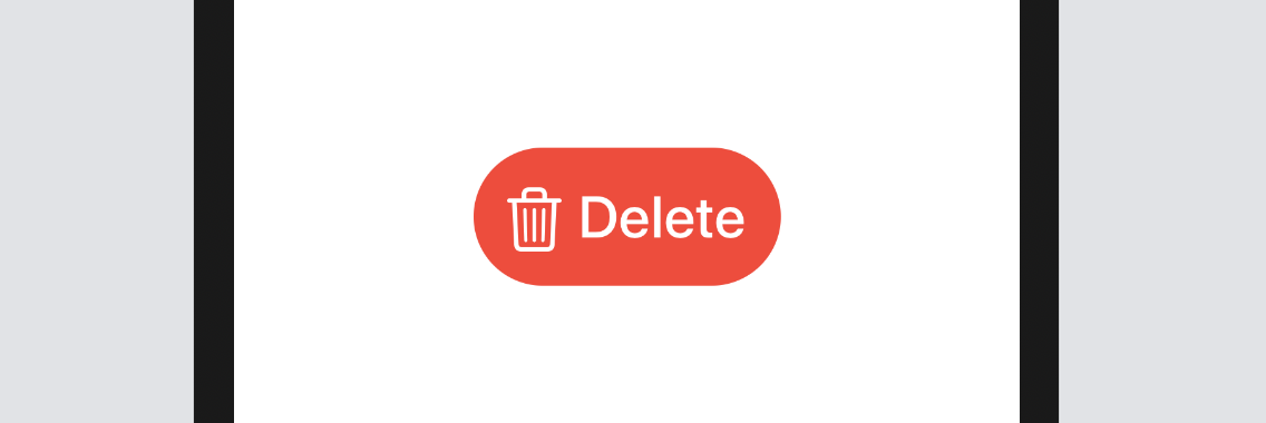
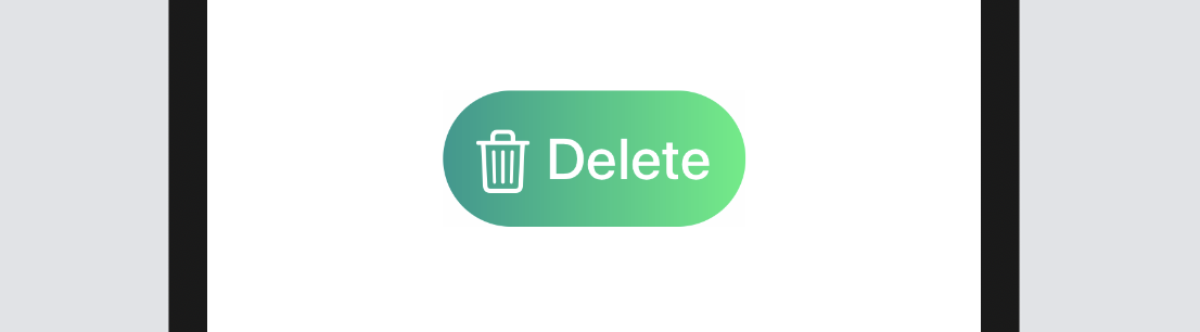
You can use both text and image to create a button. Say, you want to put the word "Delete" next to the icon. Replace the code like this:
Button {
    print("Delete button tapped")
} label: {
    HStack {
        Image(systemName: "trash")
            .font(.title)
        Text("Delete")
            .fontWeight(.semibold)
            .font(.title)
    }
    .padding()
    .foregroundColor(.white)
    .background(Color.red)
    .cornerRadius(40)
}
Here we embed both the image and the text control in a horizontal stack. This will lay out the trash icon and the Delete text side by side. The modifiers applied to the HStack set the background color, padding, and round the button's corners. Figure 13 shows the resulting button.
Using Label
Starting from iOS 14, the SwiftUI framework introduced a new view called Label that lets you place an image and text side by side. Thus, instead of using HStack, you can use Label to create the same layout.
Button {
    print("Delete button tapped")
} label: {
    Label(
        title: {
            Text("Delete")
                .fontWeight(.semibold)
                .font(.title)
        },
        icon: {
            Image(systemName: "trash")
                .font(.title)
        }
    )
    .padding()
    .foregroundColor(.white)
    .background(.red)
    .cornerRadius(40)
}
Creating a Button with Gradient Background and Shadow
With SwiftUI, you can easily style the button with a gradient background. Not only can you define a specific color to the background modifier, you can easily apply a gradient effect to any button. All you need to do is to replace the following line of code:
.background(.red)
With:
.background(LinearGradient(gradient: Gradient(colors: [Color.red, Color.blue]), startPoint: .leading, endPoint: .trailing))
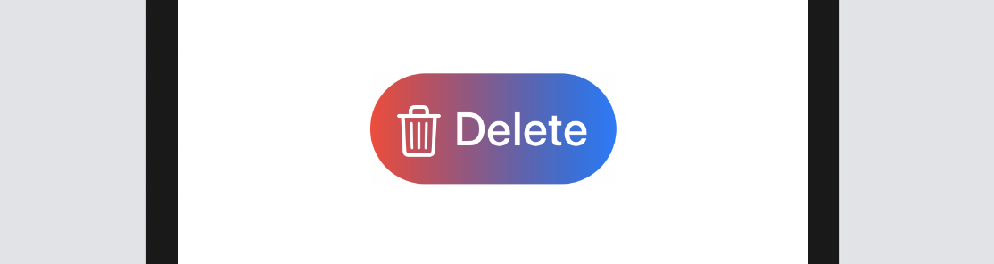
The SwiftUI framework comes with several built-in gradient effects. The code above applies a linear gradient from left (.leading) to right (.trailing). It begins with red on the left and ends with blue on the right.
If you want to apply the gradient from top to bottom, you replace the .leading with .top and the .trailing with .bottom like this:
.background(LinearGradient(gradient: Gradient(colors: [Color.red, Color.blue]), startPoint: .top, endPoint: .bottom))
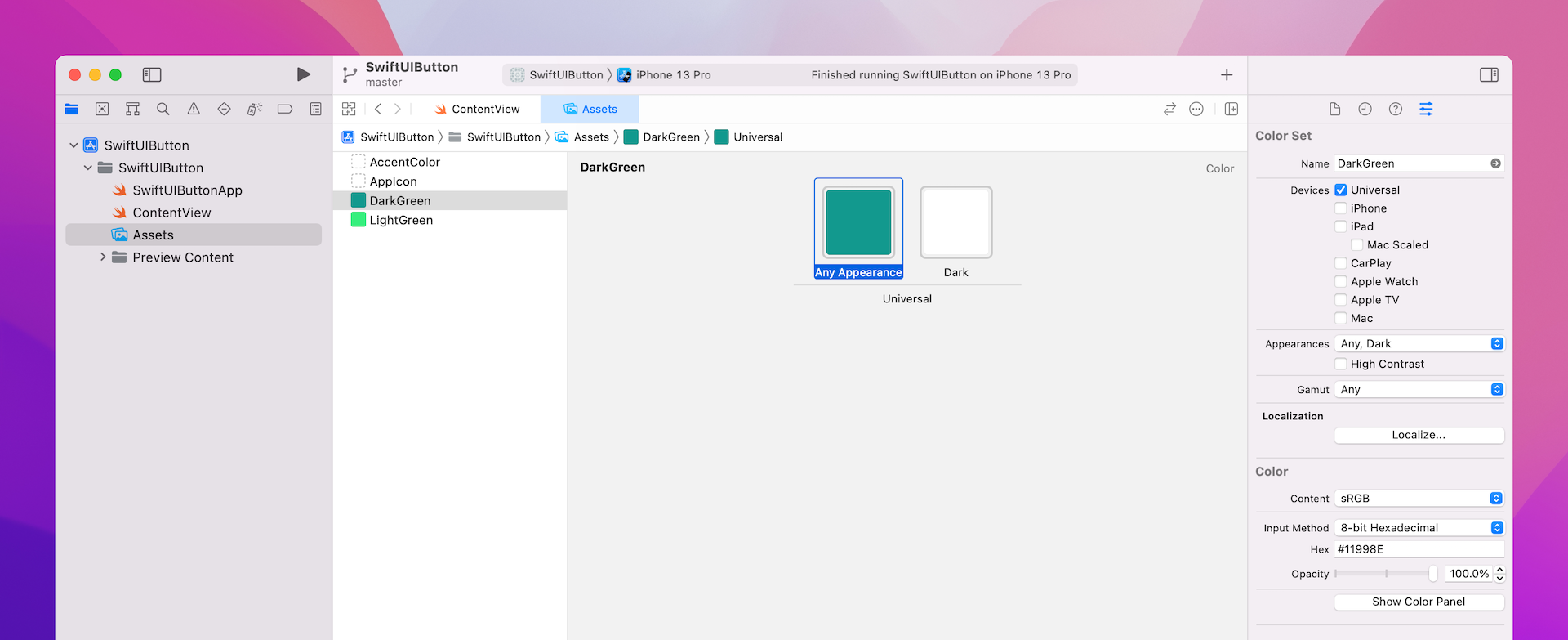
You're free to use your own colors to render the gradient effect. Let's say, your designer tells you to use the following gradient:

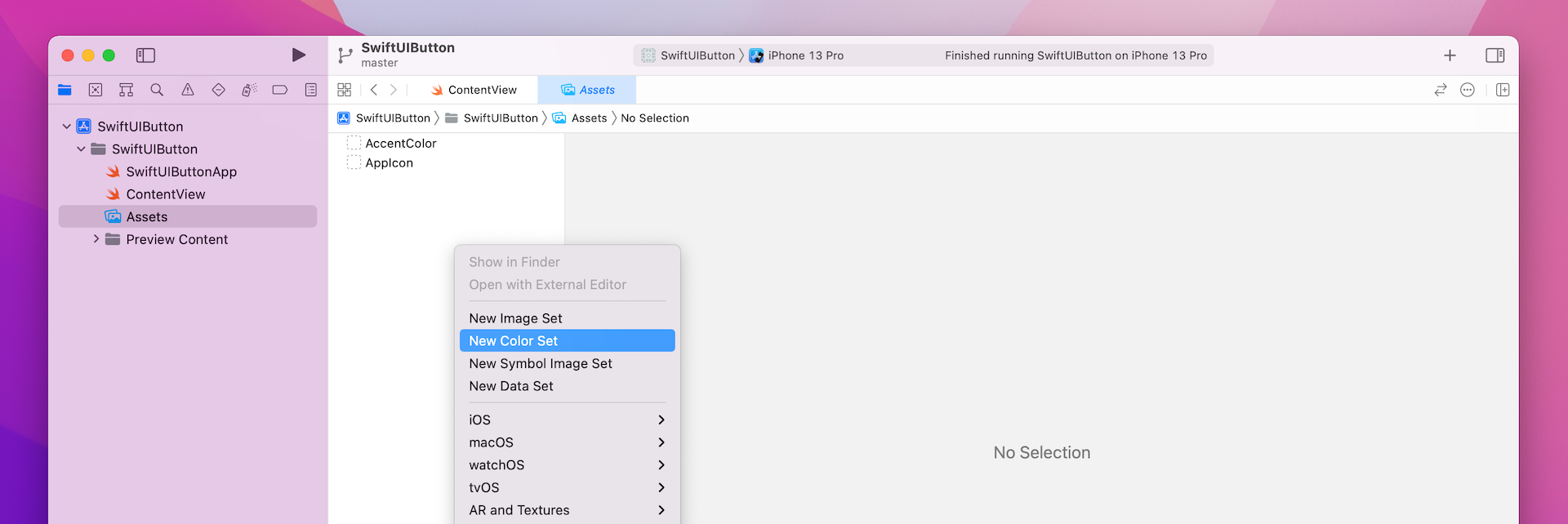
There are multiple ways to convert the color code from hex to the compatible format in Swift. Here is one approach. In the project navigator, choose the asset catalog (Assets). Right click the blank area (under AppIcon) and select New Color Set.
Next, choose the color well for Any Appearance and click the Show inspector button. Then click the Attributes inspector icon to reveal the attributes of a color set. In the name field, set the name to DarkGreen. In the Color section, change the input method to 8-bit Hexadecimal.
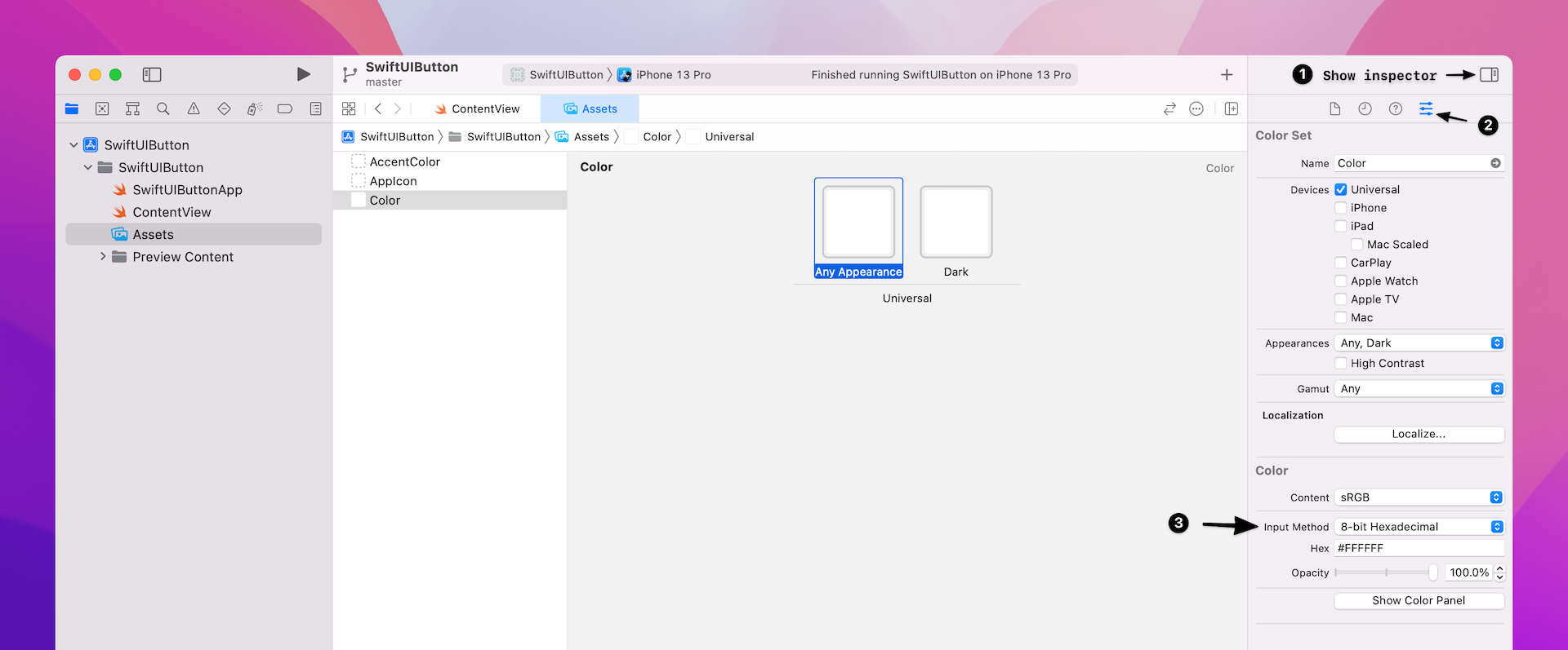
Now you can set the color code in the Hex field. For this example, enter #11998e to define the color. Name the color set DarkGreen. Repeat the same procedure to define another color set. Enter #38ef7d for the additional color. Name this color LightGreen.
Now that you've defined two color sets, let's go back to ContentView.swift and update the code. To use the color set, you just need to specify the name of the color set like this:
Color("DarkGreen")
Color("LightGreen")
To render the gradient with the DarkGreen and LightGreen color sets, all you need is to update the background modifier like this:
.background(LinearGradient(gradient: Gradient(colors: [Color("DarkGreen"), Color("LightGreen")]), startPoint: .leading, endPoint: .trailing))
If you've made the change correctly, your button should have a nice gradient background as shown in figure 19.
There is one more modifier I want to show you in this section. The shadow modifier allows you to draw a shadow around the button (or any view). Just add this line of code after the cornerRadius modifier to see the shadow:
.shadow(radius: 5.0)
Optionally, you can control the color, radius, and position of the shadow. Here is an example:
.shadow(color: .gray, radius: 20.0, x: 20, y: 10)
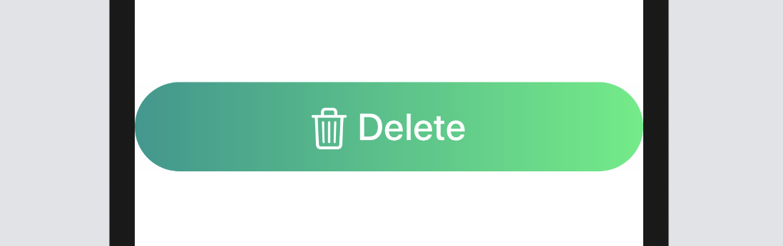
Creating a Full-width Button
Bigger buttons usually grab user's attention. Sometimes, you may need to create a full-width button that takes up the width of the screen. The frame modifier is designed to control the size of a view. Whether you want to create a fixed size button or a button with variable width, you use this modifier. To create a full-width button, you can change the Button code like this:
Button(action: {
    print("Delete tapped!")
}) {
    HStack {
        Image(systemName: "trash")
            .font(.title)
        Text("Delete")
            .fontWeight(.semibold)
            .font(.title)
    }
    .frame(minWidth: 0, maxWidth: .infinity)
    .padding()
    .foregroundColor(.white)
    .background(LinearGradient(gradient: Gradient(colors: [Color("DarkGreen"), Color("LightGreen")]), startPoint: .leading, endPoint: .trailing))
    .cornerRadius(40)
}
This is very similar to the code we just wrote, except that we added the frame modifier before padding. Here we define a flexible width for the button. We set the maxWidth parameter to .infinity. This will result in the button filling the width of the container view. You should now see a full-width button in the canvas.
By defining maxWidth to .infinity, the width of the button will be adjusted automatically depending on the screen width of the device. If you want to give the button some more horizontal space, insert a padding modifier after .cornerRadius(40):
.padding(.horizontal, 20)
Styling Buttons with ButtonStyle
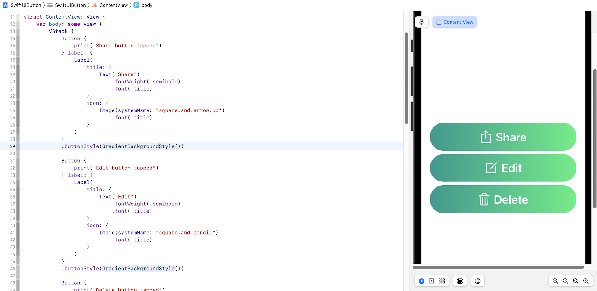
In a real world app, the same button design will be utilised in multiple buttons. Let's say, you're creating three buttons: Delete, Edit, and Share that all have the same button style like this:
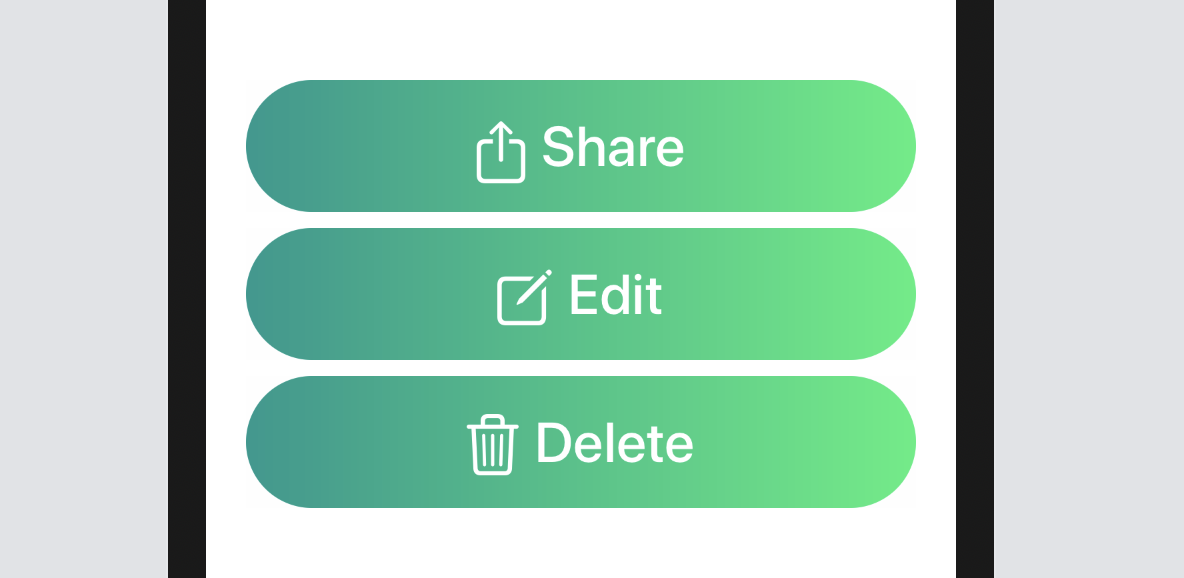
You'll probably write the code like this:
struct ContentView: View {
    var body: some View {
        VStack {
            Button {
                print("Share button tapped")
            } label: {
                Label(
                    title: {
                        Text("Share")
                            .fontWeight(.semibold)
                            .font(.title)
                    },
                    icon: {
                        Image(systemName: "square.and.arrow.up")
                            .font(.title)
                    }
                )
                .frame(minWidth: 0, maxWidth: .infinity)
                .padding()
                .foregroundColor(.white)
                .background(LinearGradient(gradient: Gradient(colors: [Color("DarkGreen"), Color("LightGreen")]), startPoint: .leading, endPoint: .trailing))
                .cornerRadius(40)
                .padding(.horizontal, 20)
            }

            Button {
                print("Edit button tapped")
            } label: {
                Label(
                    title: {
                        Text("Edit")
                            .fontWeight(.semibold)
                            .font(.title)
                    },
                    icon: {
                        Image(systemName: "square.and.pencil")
                            .font(.title)
                    }
                )
                .frame(minWidth: 0, maxWidth: .infinity)
                .padding()
                .foregroundColor(.white)
                .background(LinearGradient(gradient: Gradient(colors: [Color("DarkGreen"), Color("LightGreen")]), startPoint: .leading, endPoint: .trailing))
                .cornerRadius(40)
                .padding(.horizontal, 20)
            }

            Button {
                print("Delete button tapped")
            } label: {
                Label(
                    title: {
                        Text("Delete")
                            .fontWeight(.semibold)
                            .font(.title)
                    },
                    icon: {
                        Image(systemName: "trash")
                            .font(.title)
                    }
                )
                .frame(minWidth: 0, maxWidth: .infinity)
                .padding()
                .foregroundColor(.white)
                .background(LinearGradient(gradient: Gradient(colors: [Color("DarkGreen"), Color("LightGreen")]), startPoint: .leading, endPoint: .trailing))
                .cornerRadius(40)
                .padding(.horizontal, 20)
            }
        }

    }
}
As you can see from the code above, you need to replicate all modifiers for each of the buttons. What if you or your designer want to modify the button style? You'll need to modify all the modifiers. That's quite a tedious task and not good coding practice. How can you generalize the style and make it reusable?
SwiftUI provides a protocol called ButtonStyle for you to create your own button style. To create a reusable style for our buttons, Create a new struct called GradientBackgroundStyle that conforms to the ButtonStyle protocol. Insert the following code snippet and put it right above struct ContentPreview_Previews:
struct GradientBackgroundStyle: ButtonStyle {

    func makeBody(configuration: Self.Configuration) -> some View {
        configuration.label
            .frame(minWidth: 0, maxWidth: .infinity)
            .padding()
            .foregroundColor(.white)
            .background(LinearGradient(gradient: Gradient(colors: [Color("DarkGreen"), Color("LightGreen")]), startPoint: .leading, endPoint: .trailing))
            .cornerRadius(40)
            .padding(.horizontal, 20)
    }
}
The protocol requires us to provide the implementation of the makeBody function that accepts a configuration parameter. The configuration parameter includes a label property applies modifiers to change the button's style. In the code above, we apply the same set of modifiers that we used before.
So, how do you apply the custom style to a button? SwiftUI provides a modifier called .buttonStyle for you to apply the button style like this:
Button {
    print("Delete button tapped")
} label: {
    Label(
        title: {
            Text("Delete")
                .fontWeight(.semibold)
                .font(.title)
        },
        icon: {
            Image(systemName: "trash")
                .font(.title)
        }
    )
}
.buttonStyle(GradientBackgroundStyle())
Cool, right? The code is now simplified and you can easily apply the button style to any button with just one line of code.
You can also determine if the button is pressed by accessing the isPressed property. This allows you to alter the style of the button when the user taps on it. For example, let's say we want to make the button a bit smaller when someone presses the button. You add a line of code like this:
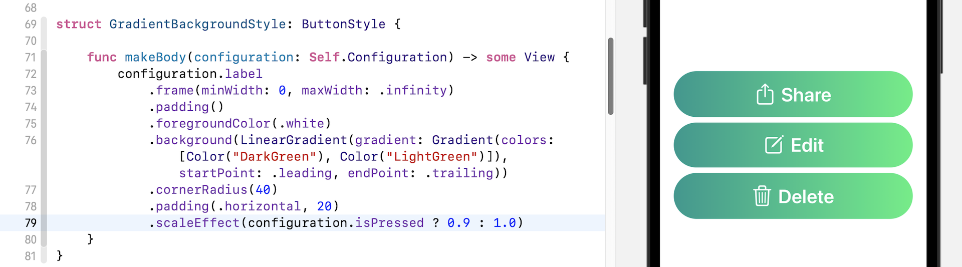
The scaleEffect modifier lets you scale up or down a button (and any view). To scale up the button, you provide a value greater than 1.0. To make the button smaller, enter a value less than 1.0.
.scaleEffect(configuration.isPressed ? 0.9 : 1.0)
So, what the line of code does is scale down the button (i.e. 0.9) when the button is pressed and scales back to its original size (i.e. 1.0) when the user lifts their finger. Run the app, you should see a nice animation when the button is scaled up and down. This is the power of SwiftUI. You do not need to write any extra lines of code and it comes with built-in animation.
Exercise
Your exercise is to create an animated button which shows a plus icon. When a user presses the button, the plus icon will rotate (clockwise/counterclockwise) to become a cross icon.
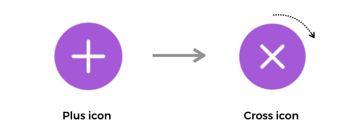
As a hint, the modifier rotationEffect may be used to rotate the button (or other view).
Styling a Button in iOS 15
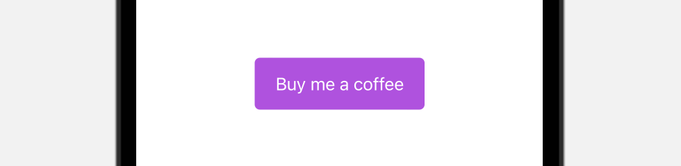
I believe you know how to create a button as shown in figure 25. In iOS 15, Apple introduced a number of modifiers for the Button view. To create the button, you can write the code like this:
Button {

} label: {
    Text("Buy me a coffee")
}
.tint(.purple)
.buttonStyle(.borderedProminent)
.buttonBorderShape(.roundedRectangle(radius: 5))
.controlSize(.large)
The tint modifier specifies the color of the button. By applying the .borderedProminent style, iOS renders the button with purple background and display the text in white. The .buttonBorderShape modifier lets you set the border shape of the button. Here, we set it to .roundedRectangle to round the button’s corners.
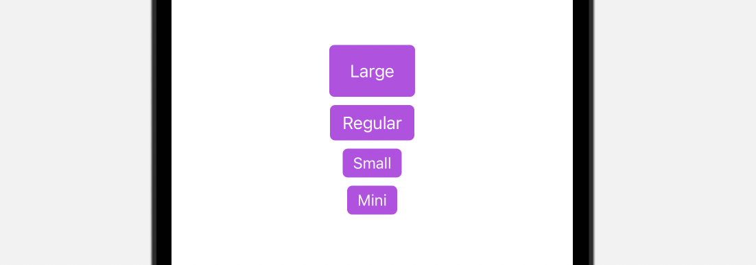
The .controlSize allows you to change the size of the button. The default size is .regular. Other valid values includes .large, .small, and .mini. The figure below shows you how the button looks for different sizes.
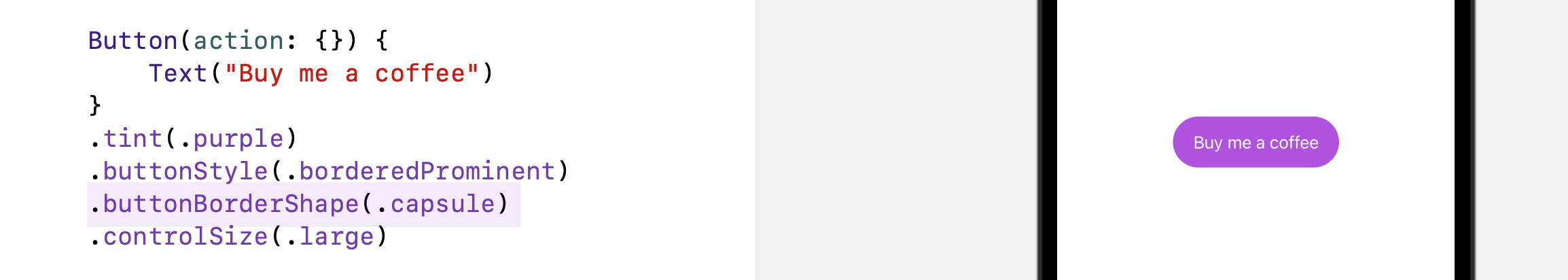
Other than using .roundedRectangle, SwiftUI provides another border shape named .capsule for developers to create a capsule shape button.
You can also use the .automatic option to let the system adjust the shape of the button.
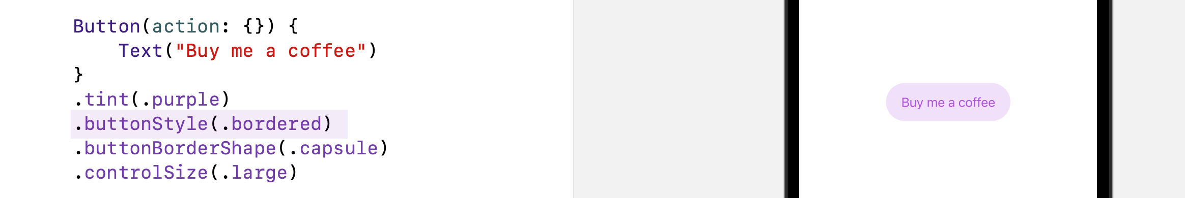
So far, we use the .borderProminent button style. The new version of SwiftUI provides other built-in styles including .bordered, .borderless, and .plain. The .bordered style is the one you will usually use. The figure below displays a sample button using the .bordered style.
Applying Style to Multiple Buttons
With button style, you can easily apply the same style to a group of buttons. Here is an example:
VStack {
    Button(action: {}) {
        Text("Add to Cart")
            .font(.headline)
    }

    Button(action: {}) {
        Text("Discover")
            .font(.headline)
            .frame(maxWidth: 300)
    }

    Button(action: {}) {
        Text("Check out")
            .font(.headline)
    }
}
.tint(.purple)
.buttonStyle(.bordered)
.controlSize(.large)
Using Button Role
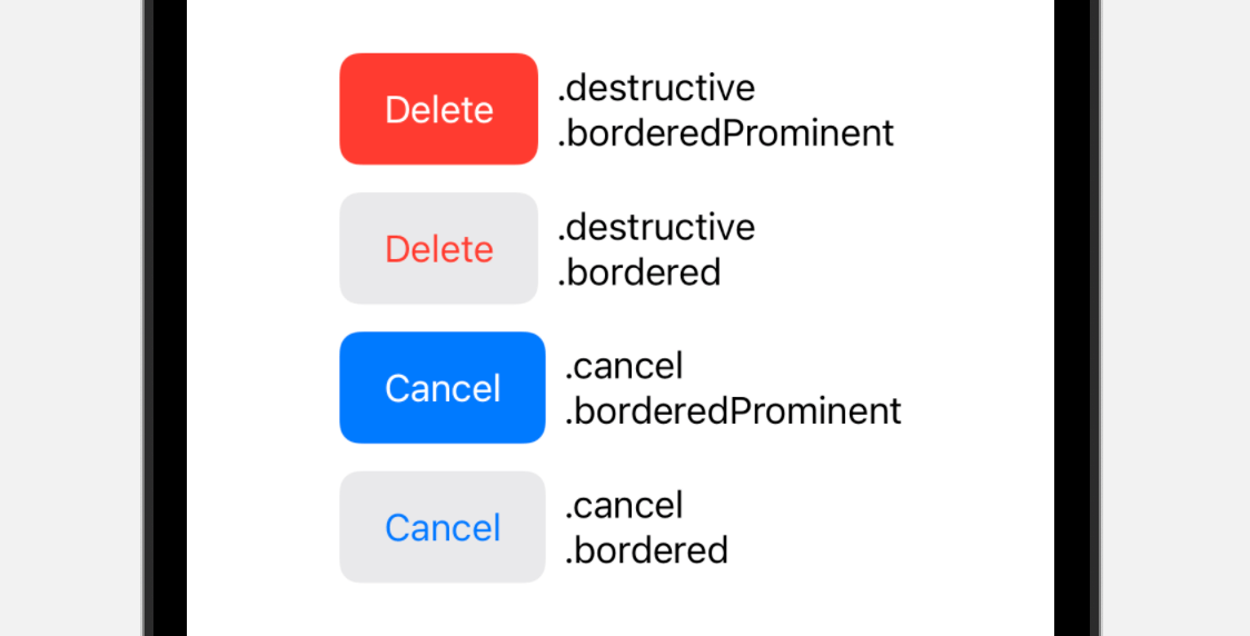
Starting from iOS 15, the SwiftUI framework introduces a new role option for Button. This option describes the semantic role of the button. Based on the given role, iOS automatically renders the appropriate look & feel for the button.
For example, if you define the role as .destructive like this:
Button("Delete", role: .destructive) {
    print("Delete")
}
.buttonStyle(.borderedProminent)
.controlSize(.large)
iOS will display the delete button in red automatically. Figure 29 shows you the appearance of the button for different roles and button styles.
Summary
In this chapter, we covered the basics of creating buttons in SwiftUI. Buttons play a key role in any application UI. Well designed buttons, not only make your UI more appealing, but bring the user experience of your app to the next level. As you have learned, by mixing SF Symbols, gradients, and animations together, you can easily build attractive and useful buttons.
For reference, you can download the complete button project here:
- Demo project (https://www.appcoda.com/resources/swiftui4/SwiftUIButton.zip)