- Made by AppCoda
- Contact us / Support
- Tweet this book
- Preface
- 1. Introduction to SwiftUI
- 2. Getting Started with SwiftUI and Working with Text
- 3. Working with Images
- 4. Layout User Interfaces with Stacks
- 5. Understanding ScrollView and Building a Carousel UI
- 6. Working with SwiftUI Buttons and Gradient
- 7. Understanding State and Binding
- 8. Implementing Path and Shape for Line Drawing and Pie Charts
- 9. Basic Animations and Transitions
- 10. Understanding Dynamic List, ForEach and Identifiable
- 11. Working with Navigation UI and Navigation Bar Customization
- 12. Playing with Modal Views, Floating Buttons and Alerts
- 13. Building a Form with Picker, Toggle and Stepper
- 14. Data Sharing with Combine and Environment Objects
- 15. Building a Registration Form with Combine and View Model
- 16. Working with Swipe-to-Delete, Context Menu and Action Sheets
- 17. Using Gestures
- 18. Displaying an Expandable Bottom Sheet Using Presentation Detents
- 19. Creating a Tinder-like UI with Gestures and Animations
- 20. Creating an Apple Wallet like Animation and View Transition
- 21. Working with JSON, Slider and Data Filtering
- 22. Building a ToDo app with Core Data
- 23. Integrating UIKit with SwiftUI Using UIViewRepresentable
- 24. Creating a Search Bar View and Working with Custom Binding
- 25. Putting Everything Together to Build a Real World App
- 26. Creating an App Store like Animated View Transition
- 27. Building an Image Carousel
- 28. Building an Expandable List View Using OutlineGroup
- 29. Building Grid Layout Using LazyVGrid and LazyHGrid
- 30. Creating an Animated Activity Ring with Shape and Animatable
- 31. Working with AnimatableModifier and LibraryContentProvider
- 32. Working with TextEditor to Create Multiline Text Fields
- 33. Using matchedGeometryEffect to Create View Animations
- 34. ScrollViewReader and Grid Animation
- 35. Working with Tab View and Tab Bar Customization
- 36. Using AsyncImage in SwiftUI for Loading Images Asynchronously
- 37. Implementing Search Bar Using Searchable
- 38. Creating Bar Charts and Line Charts with the Charts Framework
- 39. Capturing Text within Image Using Live Text APIs
- 40. How to Use ShareLink for Sharing Data Like Text and Photos
- 41. Using ImageRenderer to Convert SwiftUI Views into Images
- 42. Creating PDF Documents Using ImageRenderer
- 43. Using Gauge to Display Progress and Create a Speedometer
- 44. Creating Grid Layout Using Grid APIs
- 45. Switching Layout with AnyLayout
- Published with GitBook
Chapter 3
Working with Images and Labels
Now that you have a basic introduction to SwiftUI and understand how to display textual content, let's learn how to display images in this chapter. We will also explore the usage of Label, one of the most common user interface components.
In addition to text, images are another basic element that you'll use in iOS app development. SwiftUI provides a view called Image for developers to render and draw images on screen. Similar to what we've done in the previous chapter, I'll show you how to work with Image by building a simple demo. In brief, this chapter covers the following topics:
- What's SF Symbols and how to display a system image
- How to display our own images
- How to resize an image
- How to display a full screen image using
ignoresSafeArea - How to create a circular image
- How to apply an overlay to an image
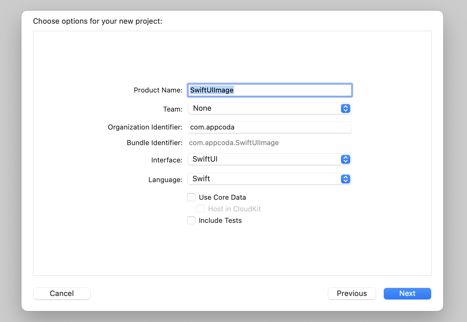
Creating a New Project for Playing with Images
First, fire up Xcode and create a new project using the App template (under iOS). Enter SwiftUIImage as the name of the project. For the organization name, you can set it to your company or organization. Again, here I use com.appcoda but you should set to your own value. To use SwiftUI, please make sure you select SwiftUI for the Interface option. Click Next and choose a folder to create the project.
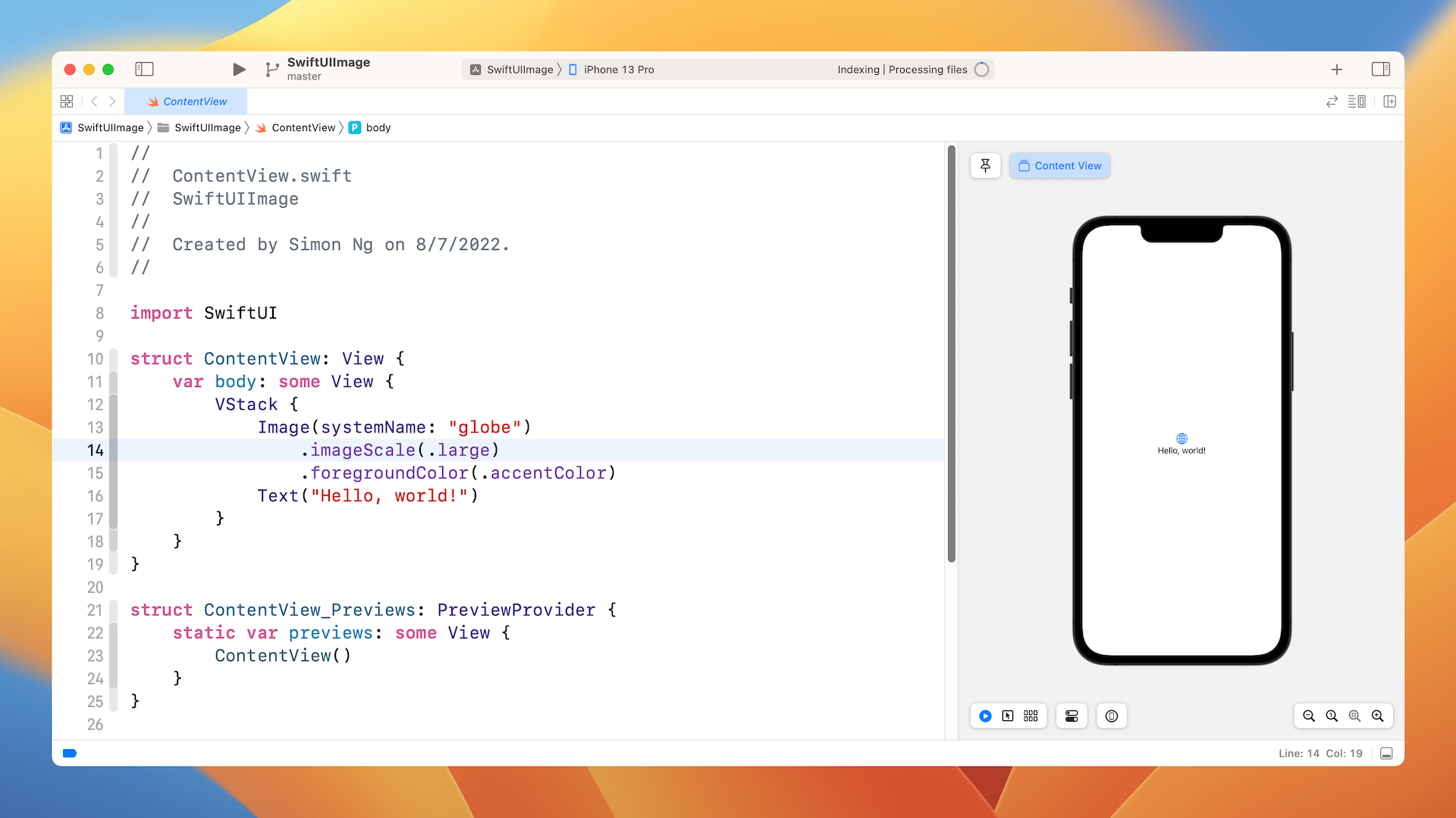
Once you save the project, Xcode should load the ContentView.swift file and display a design/preview canvas.
Understanding SF Symbols
With over 4,000 symbols, SF Symbols is a library of iconography designed to integrate seamlessly with San Francisco, the system font for Apple platforms. Symbols come in nine weights and three scales, and automatically align with text labels. They can be exported and edited using vector graphics editing tools to create custom symbols with shared design characteristics and accessibility features. SF Symbols 4 features over 700 new symbols, variable color, automatic rendering, and new unified layer annotation.
Before I show you how to display an image on screen, let's first talk about where the images I use come from. Needless to say, you can provide your own images for use in the app. Starting from iOS 13, Apple introduced a large set of system images called SF Symbols that allow developers to use them in any app. Along with the release of iOS 16, Apple further improved the image set by releasing SF Symbols 4. It features over 700 new symbols and supports variable colors.
These images are referred as symbols since it's integrated with the built-in San Francisco font. To use these symbols, no extra installation is required. As long as your app is deployed to a device running iOS 13 (or later), you can access these symbols directly. But you should take note that there are now six different sets of symbols to consider:
- SF Symbols v1.1 available in iOS/iPadOS/tvOS/Mac Catalyst 13.0, watchOS 6.0 and macOS 11.0
- SF Symbols v2.0 available in iOS/iPadOS/tvOS/Mac Catalyst 14.0, watchOS 7.0 and macOS 11.0
- SF Symbols v2.1 available in iOS/iPadOS/tvOS/Mac Catalyst 14.2, watchOS 7.1 and macOS 11.0
- SF Symbols v2.2 available in iOS/iPadOS/tvOS/Mac Catalyst 14.5, watchOS 7.4 and macOS 11.3
- SF Symbols v3.0 available in iOS/iPadOS/tvOS/Mac Catalyst 15.0, watchOS 8.0 and macOS 12.0
- SF Symbols v4.0 available in iOS/iPadOS/tvOS/Mac Catalyst 16.0, watchOS 9.0 and macOS 13.0
To use the symbols, all you need is the name of the symbol. With over 4,000 symbols available for your use, Apple has released an app called SF Symbols (https://developer.apple.com/sf-symbols/), so that you can easily explore the symbols and locate the one that fits your need. I highly recommend you install the app before proceeding to the next section.
Displaying a System Image
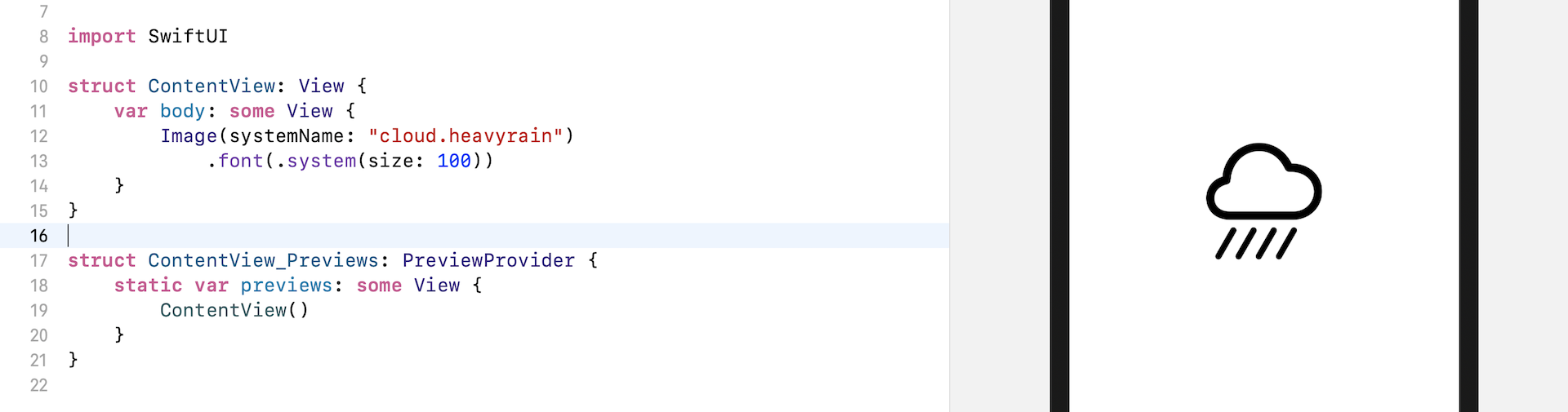
To display a system image (symbol) on screen, you initialize an Image view with the systemName parameter like this:
Image(systemName: "cloud.heavyrain")
This will create an image view and load the specified system image. As mentioned before, SF symbols are seamlessly integrated with the San Francisco font. You can easily scale the image by applying the font modifier:
Image(systemName: "cloud.heavyrain")
    .font(.system(size: 100))
Given that the image is part of a font family, you can vary the font size using the size parameter, as we did in the previous chapter.
Again, since this system image is actually a font, you can apply modifiers such as foregroundColor, that you learned in the previous chapter, to change its appearance.
For example, to change the symbol's color to blue, you write the code like this:
Image(systemName: "cloud.heavyrain")
    .font(.system(size: 100))
    .foregroundColor(.blue)
To add a drop shadow effect, you use the shadow modifier:
Image(systemName: "cloud.heavyrain")
    .font(.system(size: 100))
    .foregroundColor(.blue)
    .shadow(color: .gray, radius: 10, x: 0, y: 10)
Using Your Own Images
Obviously, other than using the system images, you will need to use your own images when building apps. Let's see how you can load your images using the Image view.
Note: You're free to use your own image. In case you don't have an appropriate image to use, you can download this image (https://unsplash.com/photos/Q0-fOL2nqZc) from unsplash.com to follow the rest of the material. After downloading the photo, please make sure you change the filename to "paris.jpg".
Before you can use an image in your project, the first step is to import the images into the asset catalog (Assets). Assuming you already prepared the image (paris.jpg), press command+0 in Xcode to reveal the project navigator and then choose Assets. Open Finder and drag the image to the outline view.
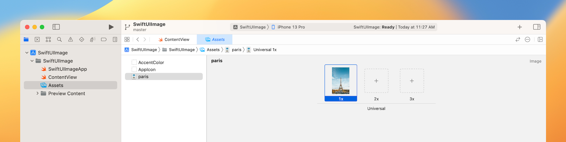
If you're new to iOS app development, this asset catalog is where you store application resources like images, color, and data. Once you put the image in the asset catalog, you can load the image by referring to its name. Additionally, you can configure on which device the image can be loaded (e.g. iPhone only).
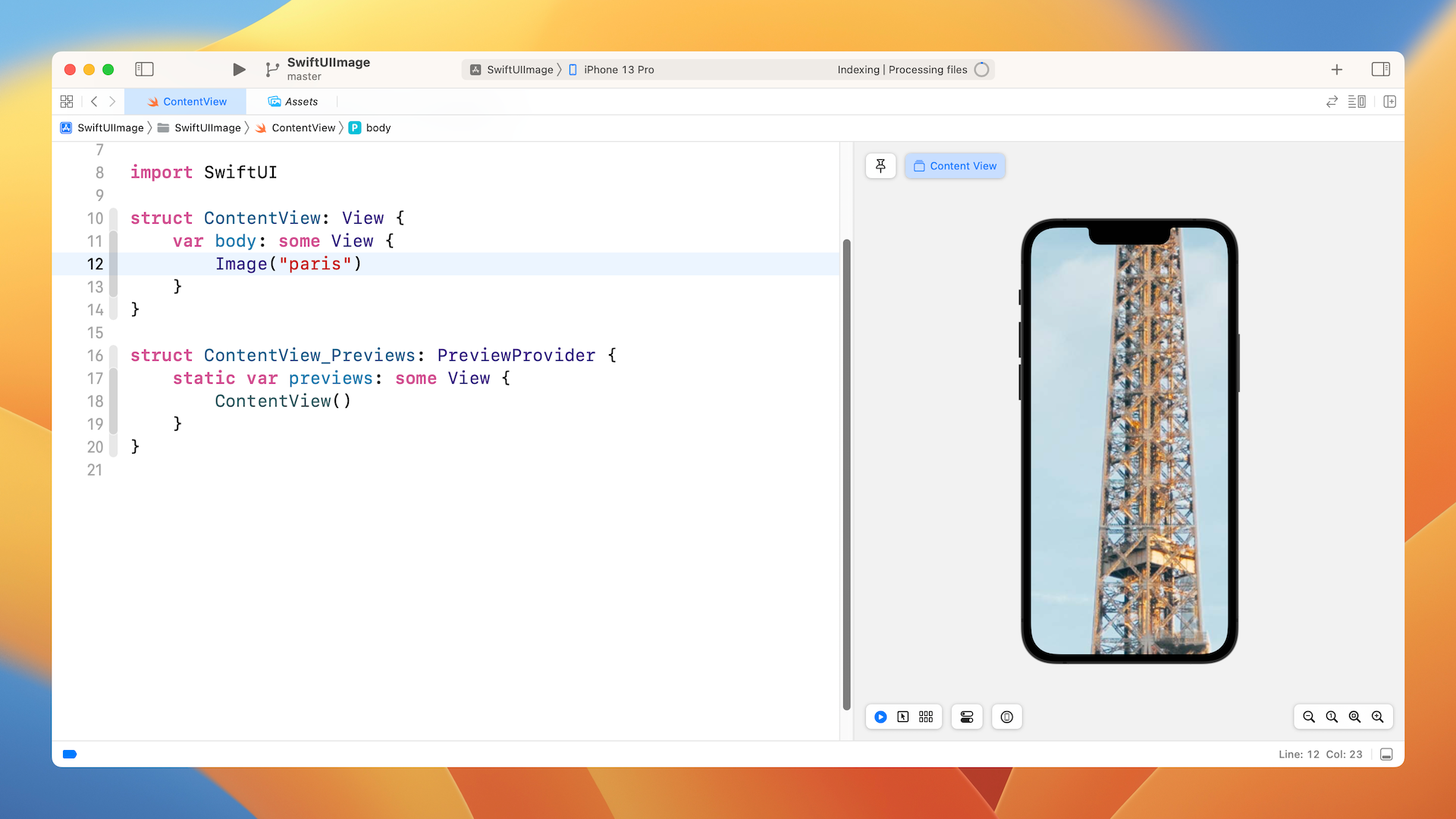
To display the image on screen, you write the code like this (see figure 6):
Image("paris")
All you need to do is specify the name of the image and you should see the image in the preview canvas. However, since the image is a high resolution image (4437x6656 pixels), you only see a part of the image.
Resizing an Image
To resize the image, the resizable modifier is used:
Image("paris")
    .resizable()
By default, the image resizes the image using the stretch mode. This means the original image will be scaled to fill the whole screen (except the top and bottom area).
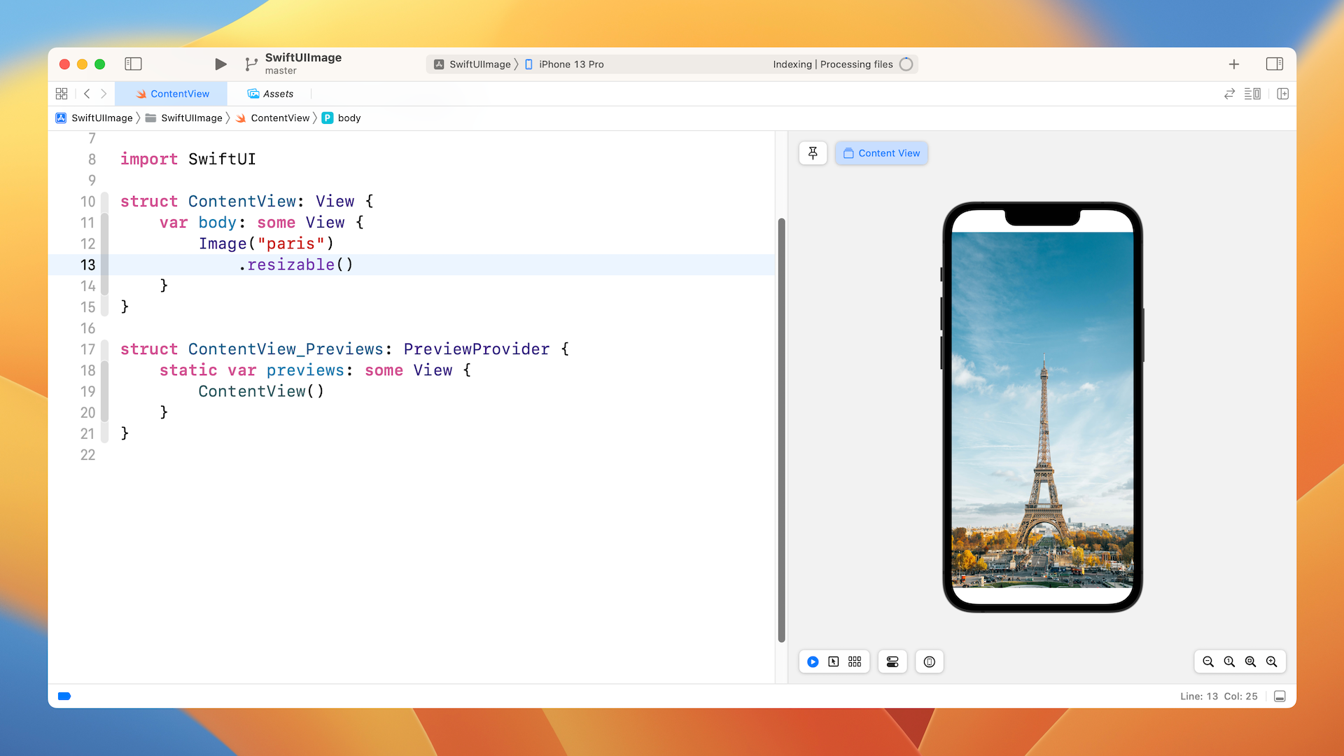
Technically speaking, the image fills the whole safe area as defined by iOS. The concept of safe area has been around for quite a long time. The safe area is defined as the view area that is safe to lay out our UI components. For example, as you can see in the figure, the safe area is the view area that excludes the top bar (i.e. status bar) and the bottom bar. The safe area will prevent you from accidentally hiding system UI components like the status bar, navigation bar, and tab bar.
If you want to display a full-screen image, you can ignore the safe area by setting the ignoresSafeArea modifier.
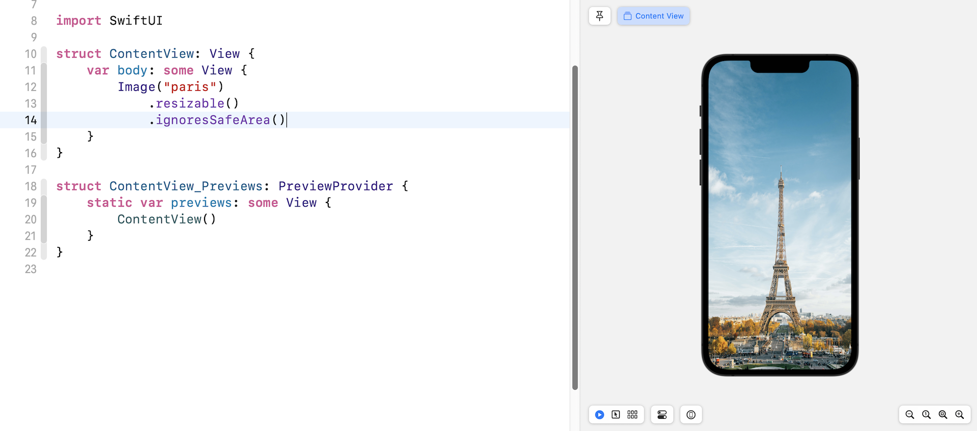
You can also choose to ignore the safe area for a specific edge. To ignore the safe area for the top edge but keep it for the bottom edge, you can specify the parameter .bottom like this:
.ignoresSafeArea(.container, edges: .bottom)
Aspect Fit and Aspect Fill
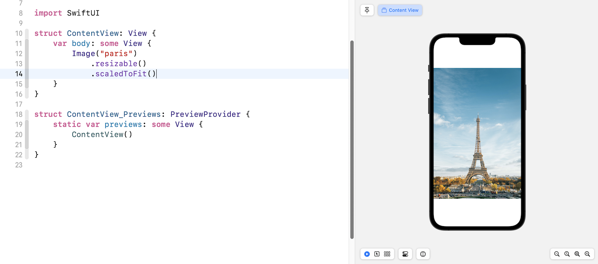
If you look into both images in the previous section and compare it with the original image, you will find that the aspect ratio is a bit distorted. The stretch mode doesn't take into account the aspect ratio of the original image. It stretches each side to fit the view area. To keep the original aspect ratio, you can apply the modifier scaledToFit like this:
Image("paris")
    .resizable()
    .scaledToFit()
Alternatively, you can use the aspectRatio modifier and set the content mode to .fit. This will achieve the same result.
Image("paris")
    .resizable()
    .aspectRatio(contentMode: .fit)
In some cases you may want to keep the aspect ratio of the image but stretch the image to as large as possible, to do this, apply the .fill content mode:
Image("paris")
    .resizable()
    .aspectRatio(contentMode: .fill)
To get a better understanding of the difference between these two modes, Let's limit the size of the image. The frame modifier allows you to control the size of a view. By setting the frame's width to 300 points, the image's width will be limited to 300 points.
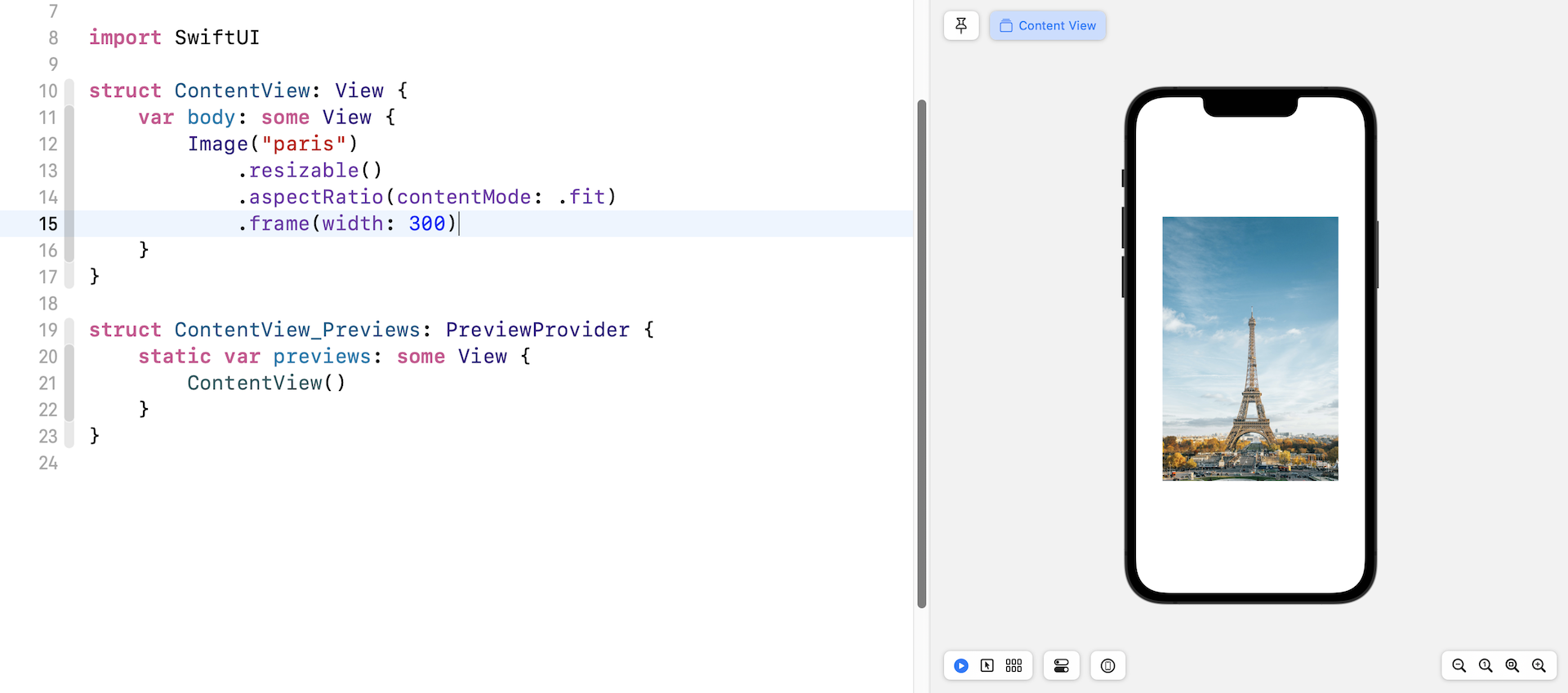
Now replace the Image code with the following:
Image("paris")
    .resizable()
    .aspectRatio(contentMode: .fill)
    .frame(width: 300)
The image will be scaled down in size but the original aspect ratio is kept. If you change the content mode to .fill, the image looks pretty much the same as figure 7. However, if you switch over to the Selectable mode and look at the image carefully, the aspect ratio of the original image is maintained.
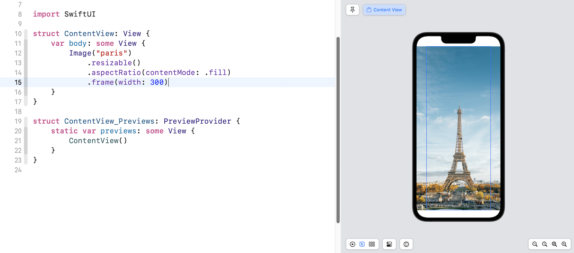
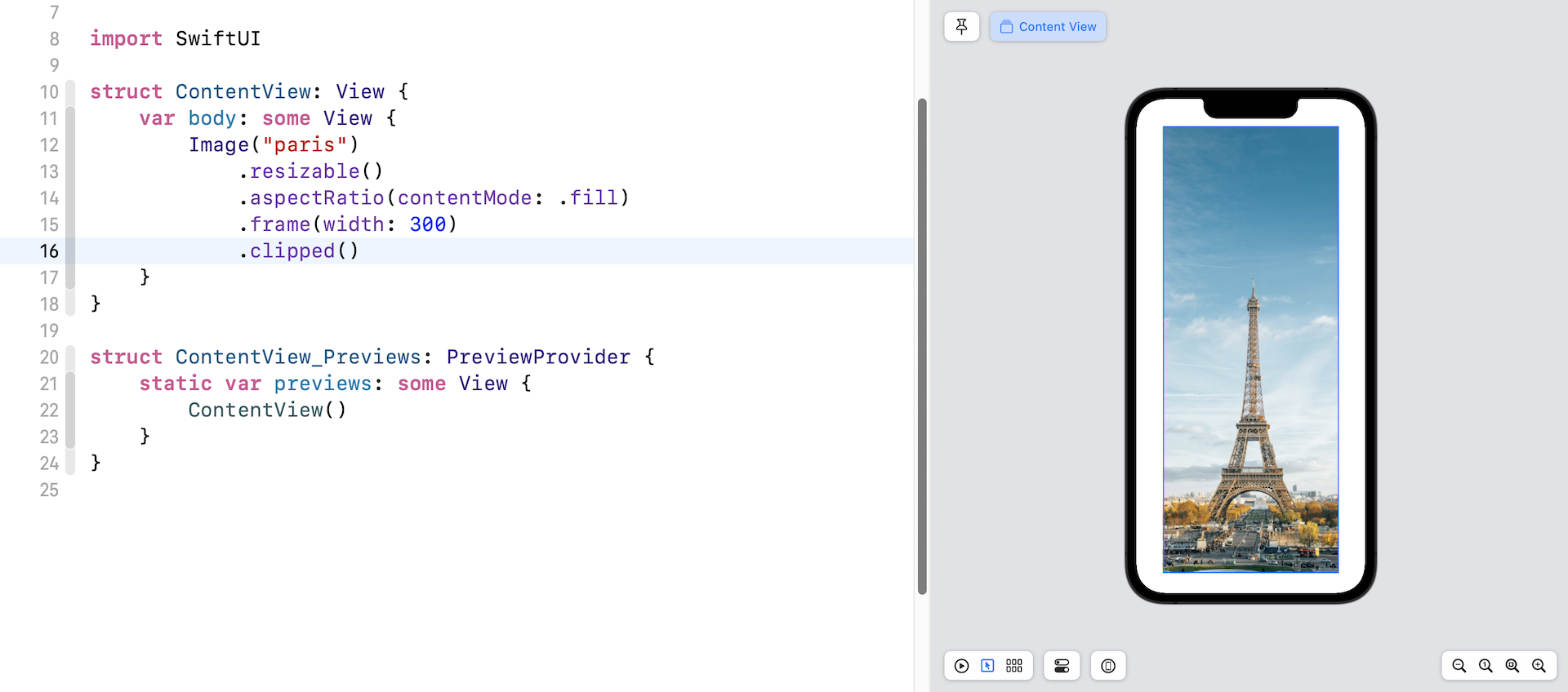
One thing you may notice is that the image's width still takes up the whole screen width. To make it scale correctly, you use the clipped modifier to eliminate extra parts of the view (the left and right edges).
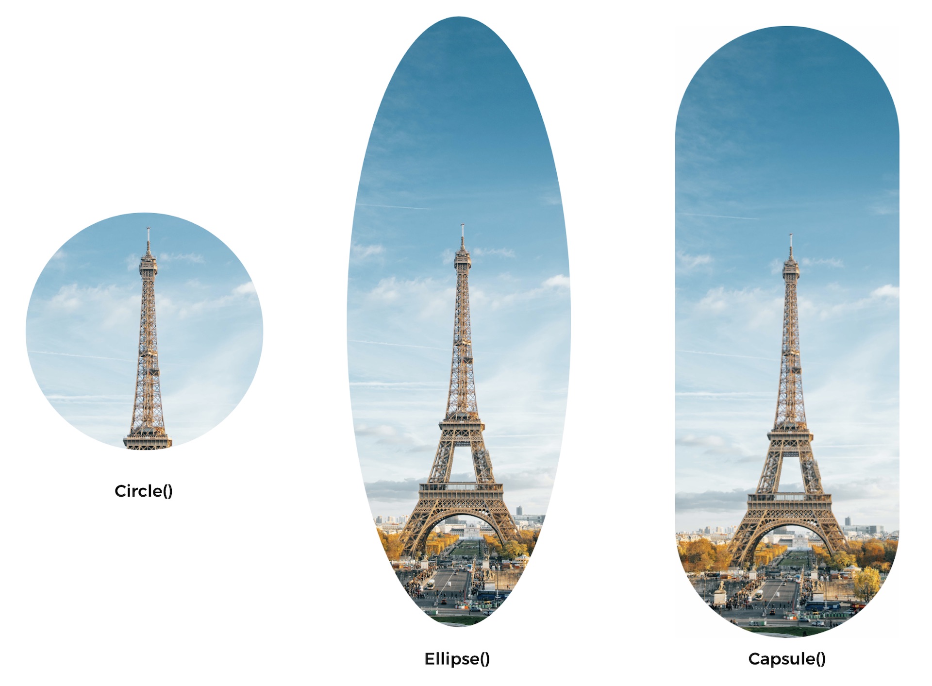
Creating a Circular Image
In addition to clipping the image in rectangle shape, SwiftUI provides other modifiers for you to clip the image into various shapes (circle, elliose, and capsule). For example, if you want to create a circular image, you use the clipShape modifier like this:
Image("paris")
    .resizable()
    .aspectRatio(contentMode: .fill)
    .frame(width: 300)
    .clipShape(Circle())
Here we specify to clip the image into a circular shape. You can pass different parameters to create an image with a different shape. Figure 13 shows you some examples.
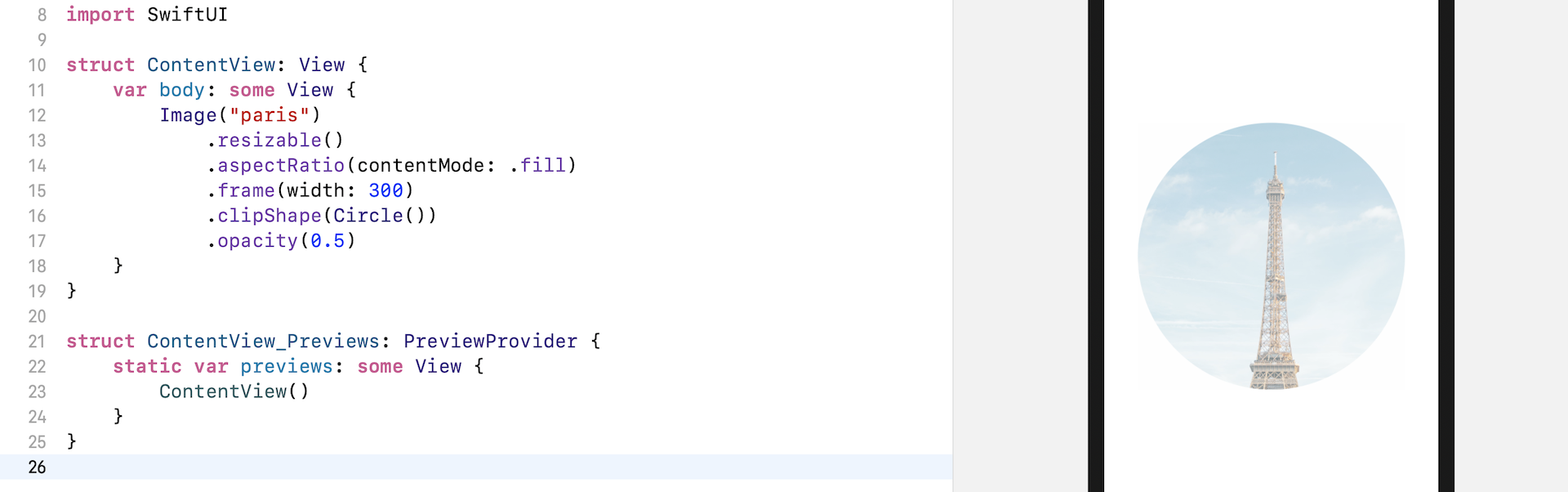
Adjusting the Opacity
SwiftUI comes with a modifier named opacity that you can use to control the opacity of an image (or any view). You pass a value between 0 and 1 to indicate the opacity of the image. Zero means that the view is completely invisible. A value of 1 indicates the image is fully opaque.
For example, if you apply the opacity modifier to the image view and set its value to 0.5, the image will become partially transparent.
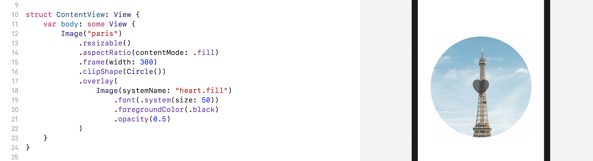
Applying an Overlay to an Image
When designing your app, you may need to layer another image or text on top of an image view. The SwiftUI framework provides a modifier named overlay for developers to apply an overlay to an image. Let's say, you want to overlay a system image (i.e. heart.fill) on top of the existing image. You write the code like this:
Image("paris")
    .resizable()
    .aspectRatio(contentMode: .fill)
    .frame(width: 300)
    .clipShape(Circle())
    .overlay(
        Image(systemName: "heart.fill")
            .font(.system(size: 50))
            .foregroundColor(.black)
            .opacity(0.5)
    )
The .overlay modifier takes in a View as parameter. In the code above, we create another image (i.e. heart.fill) and lay it over the existing image (i.e. Paris).
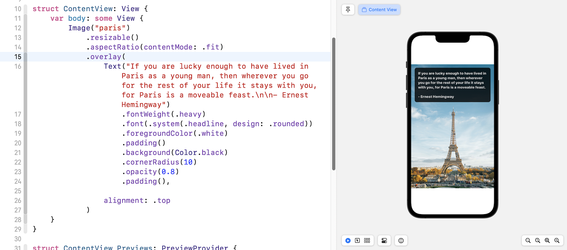
In fact, you can apply any view as an overlay. For example, you can overlay a Text view on the image, like this:
Image("paris")
    .resizable()
    .aspectRatio(contentMode: .fit)
    .overlay(

        Text("If you are lucky enough to have lived in Paris as a young man, then wherever you go for the rest of your life it stays with you, for Paris is a moveable feast.\n\n- Ernest Hemingway")
            .fontWeight(.heavy)
            .font(.system(.headline, design: .rounded))
            .foregroundColor(.white)
            .padding()
            .background(Color.black)
            .cornerRadius(10)
            .opacity(0.8)
            .padding(),

        alignment: .top

    )
In the overlay modifier, you create a Text view and this text view will be applied as an overlay to the image. You should be familiar with the modifiers of the Text view as we have discussed in the previous chapter. To change the text, we simply change the font and its color. Additionly we can add some padding and apply a background color. One thing I'd like to highlight is the alignment parameter. For the overlay modifier, you can provide an optional value to adjust the alignment of the view. By default, it's set to center. In this case, we want to position the text overlay to the top part of the image. Change the value from .center to .top to see how it works.
Darken an Image Using Overlay
Not only can you overlay an image or text on another image, you can apply an overlay to darken an image. Replace the Image code with the following to see the effect:
Image("paris")
    .resizable()
    .aspectRatio(contentMode: .fit)
    .overlay(
        Rectangle()
            .foregroundColor(.black)
            .opacity(0.4)
    )
We draw a Rectangle over the image and set its foreground color to black. In order to apply a darkening effect, we set the opacity to 0.4, giving it a 40% opacity. The image should now be darkened.
Alternatively, you may rewrite the code like this to achieve the same effect:
Image("paris")
    .resizable()
    .aspectRatio(contentMode: .fit)
    .overlay(
        Color.black
            .opacity(0.4)
    )
In SwiftUI, Color is also a view. This is why we can use Color.black as the top layer to darken the image underneath.
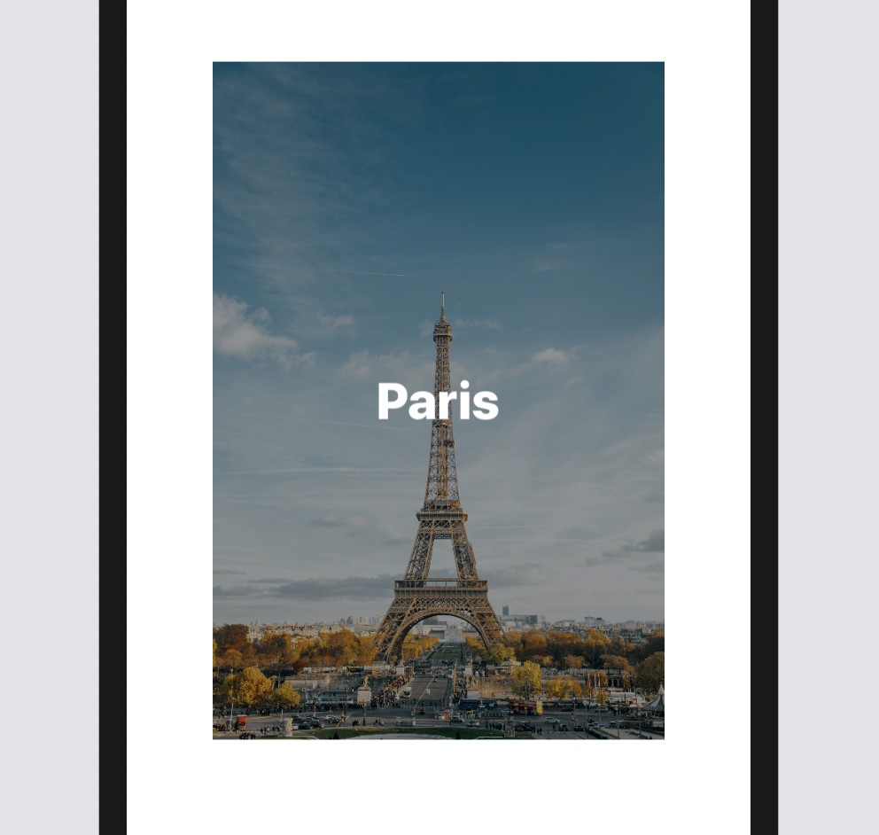
This technique is very useful if you want to overlay some light-colored text on a bright image to make the text more legible. Replace the Image code like this:
Image("paris")
    .resizable()
    .aspectRatio(contentMode: .fit)
    .frame(width: 300)
    .overlay(
        Color.black
            .opacity(0.4)
            .overlay(
                Text("Paris")
                    .font(.largeTitle)
                    .fontWeight(.black)
                    .foregroundColor(.white)
                    .frame(width: 200)
            )
    )
As mentioned before, the overlay modifier is not limited to Image. You can apply it to any other view. In the code above, we use Color.black to darken the image. On top of that, we apply an overlay and place a Text over it. If you've made the change correctly, you should see the word "Paris" in bold white, placed over the darkened image.
Applying Multicolors to SF Symbols
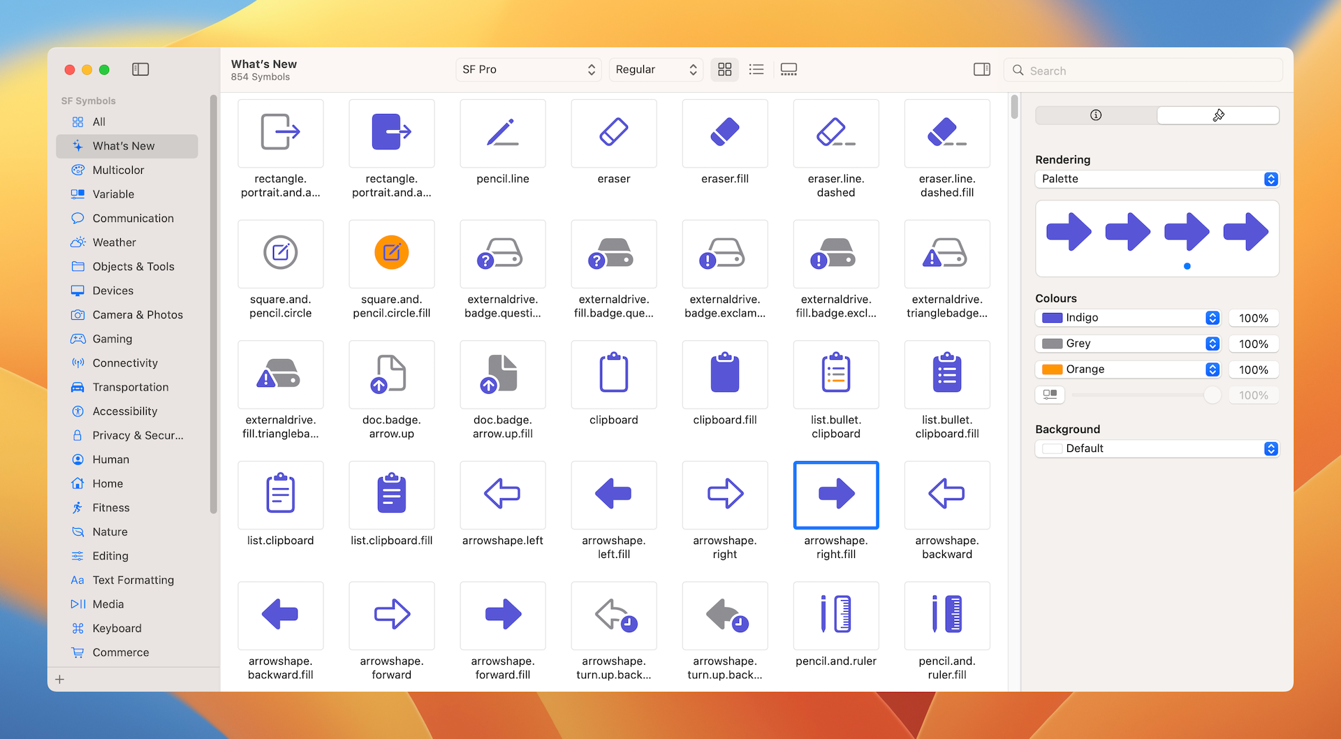
Starting from iOS 15, SF Symbols provides four rendering modes that enable multiple options when applying color to symbols. Depending on the mode you choose, you can apply a single color or multicolours to a symbol. For example, cloud.sun.rain is a symbol which supports Palette Rendering. You can apply two or more contrasting colors to the symbol. The figure below shows you how to test palette rendering using the SF Symbols app.
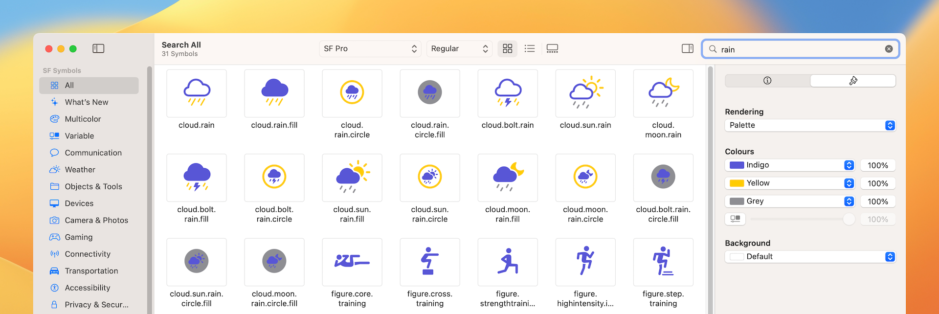
In SwiftUI, you can attach the symbolRenderingMode modifier to change the mode. To create the same symbol with multiple colors, you can write the code like this:
Image(systemName: "cloud.sun.rain")
    .symbolRenderingMode(.palette)
    .foregroundStyle(.indigo, .yellow, .gray)
We specify in the code to use the palette mode and then apply the colors by using the foregroundStyle modifier.
Variable Colors
In iOS 16, SF Symbols add a new feature called Variable Color. You can adjust the color of the symbol by changing a percentage value. This is especially useful when you use some of the symbols to indicate a progress.
You can easily try out this new feature using SF Symbols 4 (https://developer.apple.com/sf-symbols/). After you install the application, choose the Variable category and pick one of the symbols. In the inspector, you can click the Variable Color button to enable the feature. As you change the percentage value, the symbols reacts to the change and fills parts of it. Take the slowmo symbol as an example. When you set the percentage value to 60%, only some of the bars are filled to indicate the progress.
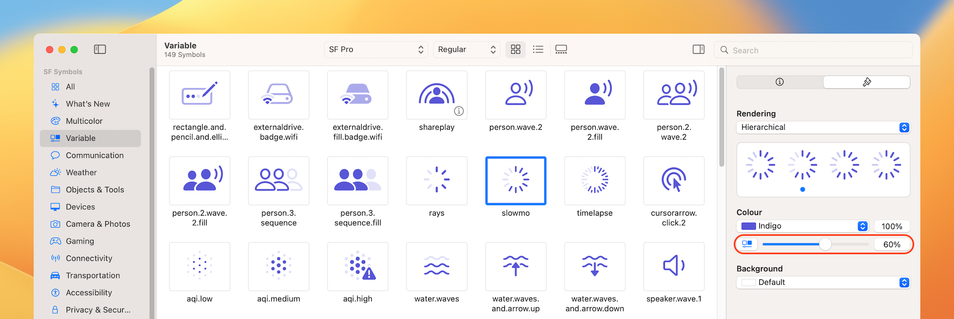
Variable Color can be used with every single rendering mode available for SF Symbols. You can change to other Rendering modes to see the effects.
To set the percentage value in code, you can instantiate the Image view with an additional variableValue parameter and pass it with the percentage value:
Image(systemName: "slowmo", variableValue: 0.6)
    .symbolRenderingMode(.palette)
    .foregroundStyle(.indigo)
    .font(.largeTitle)
Wrap Up
In this chapter, I showed you how to work with images. SwiftUI has made it very easy for developers to display images and use different modifiers to apply various image effects. If you're an indie developer, the newly introduced SF Symbols will save you a lot of time from searching third-party icons!
For reference, you can download the complete images project here:
- Demo project (https://www.appcoda.com/resources/swiftui4/SwiftUIImage.zip)