- Made by AppCoda
- Contact us / Support
- Tweet this book
- Preface
- 1. Introduction to SwiftUI
- 2. Getting Started with SwiftUI and Working with Text
- 3. Working with Images
- 4. Layout User Interfaces with Stacks
- 5. Understanding ScrollView and Building a Carousel UI
- 6. Working with SwiftUI Buttons and Gradient
- 7. Understanding State and Binding
- 8. Implementing Path and Shape for Line Drawing and Pie Charts
- 9. Basic Animations and Transitions
- 10. Understanding Dynamic List, ForEach and Identifiable
- 11. Working with Navigation UI and Navigation Bar Customization
- 12. Playing with Modal Views, Floating Buttons and Alerts
- 13. Building a Form with Picker, Toggle and Stepper
- 14. Data Sharing with Combine and Environment Objects
- 15. Building a Registration Form with Combine and View Model
- 16. Working with Swipe-to-Delete, Context Menu and Action Sheets
- 17. Using Gestures
- 18. Displaying an Expandable Bottom Sheet Using Presentation Detents
- 19. Creating a Tinder-like UI with Gestures and Animations
- 20. Creating an Apple Wallet like Animation and View Transition
- 21. Working with JSON, Slider and Data Filtering
- 22. Building a ToDo app with Core Data
- 23. Integrating UIKit with SwiftUI Using UIViewRepresentable
- 24. Creating a Search Bar View and Working with Custom Binding
- 25. Putting Everything Together to Build a Real World App
- 26. Creating an App Store like Animated View Transition
- 27. Building an Image Carousel
- 28. Building an Expandable List View Using OutlineGroup
- 29. Building Grid Layout Using LazyVGrid and LazyHGrid
- 30. Creating an Animated Activity Ring with Shape and Animatable
- 31. Working with AnimatableModifier and LibraryContentProvider
- 32. Working with TextEditor to Create Multiline Text Fields
- 33. Using matchedGeometryEffect to Create View Animations
- 34. ScrollViewReader and Grid Animation
- 35. Working with Tab View and Tab Bar Customization
- 36. Using AsyncImage in SwiftUI for Loading Images Asynchronously
- 37. Implementing Search Bar Using Searchable
- 38. Creating Bar Charts and Line Charts with the Charts Framework
- 39. Capturing Text within Image Using Live Text APIs
- 40. How to Use ShareLink for Sharing Data Like Text and Photos
- 41. Using ImageRenderer to Convert SwiftUI Views into Images
- 42. Creating PDF Documents Using ImageRenderer
- 43. Using Gauge to Display Progress and Create a Speedometer
- 44. Creating Grid Layout Using Grid APIs
- 45. Switching Layout with AnyLayout
- Published with GitBook
Chapter 44
Creating Grid Layout Using Grid APIs
SwiftUI 4.0 introduces a new Grid API for composing grid-based layout. You can arrange the same layout by using VStack and HStack. The Grid view, however, makes it a lot easier. A Grid view is a container view that arranges other views in a two dimensional layout.
The Basics
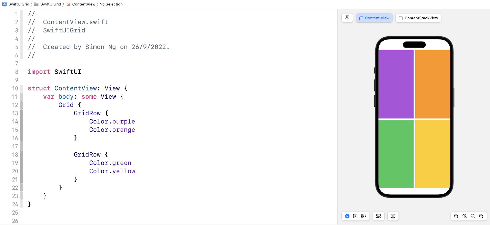
Let's start with a simple grid. To create a 2x2 grid, you write the code like below:
struct ContentView: View {
    var body: some View {
        Grid {
            GridRow {
                Color.purple
                Color.orange
            }

            GridRow {
                Color.green
                Color.yellow
            }
        }
    }
}
Assuming you've created a SwiftUI project in Xcode, you should see a 2x2 grid, filled with different colors.
To create a 3x3 grid, you just need to add another GridRow. And, for each GridRow, you insert one more child view.
Comparing Grid Views and Stack Views
You may wonder why we need to use the Grid APIs. You can create the same grid UI using HStack and VStack. So, why did Apple introduce this new APIs? It's correct that you can build the same grid with stack views. However, there is a major difference that makes Grid views more desirable in building grid layout.
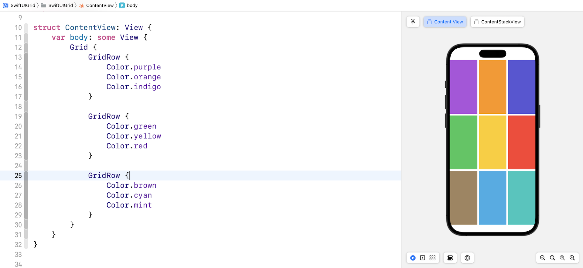
Let's create another 2x2 grid using the code below:
struct ContentView: View {
    var body: some View {
        Grid {
            GridRow {
                Image(systemName: "trash")
                    .font(.system(size: 100))
                Image(systemName: "trash")
                    .font(.system(size: 50))
            }

            GridRow {
                Color.green
                Color.yellow
            }
        }
    }
}
This time, the first row displays two system images and the second row shows the color views. Your preview should show a grid like below.
To build the same grid layout using nested VStack and HStack, we can write the code like this:
VStack {
    HStack {
        Image(systemName: "trash")
            .font(.system(size: 100))
            .frame(minWidth: 0, maxWidth: .infinity)
        Image(systemName: "trash")
            .font(.system(size: 50))
            .frame(minWidth: 0, maxWidth: .infinity)
    }

    HStack {
        Color.green
        Color.yellow
    }
}
By default, each column of the Grid view occupies equal space in a row. But for HStack, we have to attach the frame modifier to make each image take up the same space across the row.
The Grid view just makes it easier to create grid views and provides several modifiers to customize the grid layout.
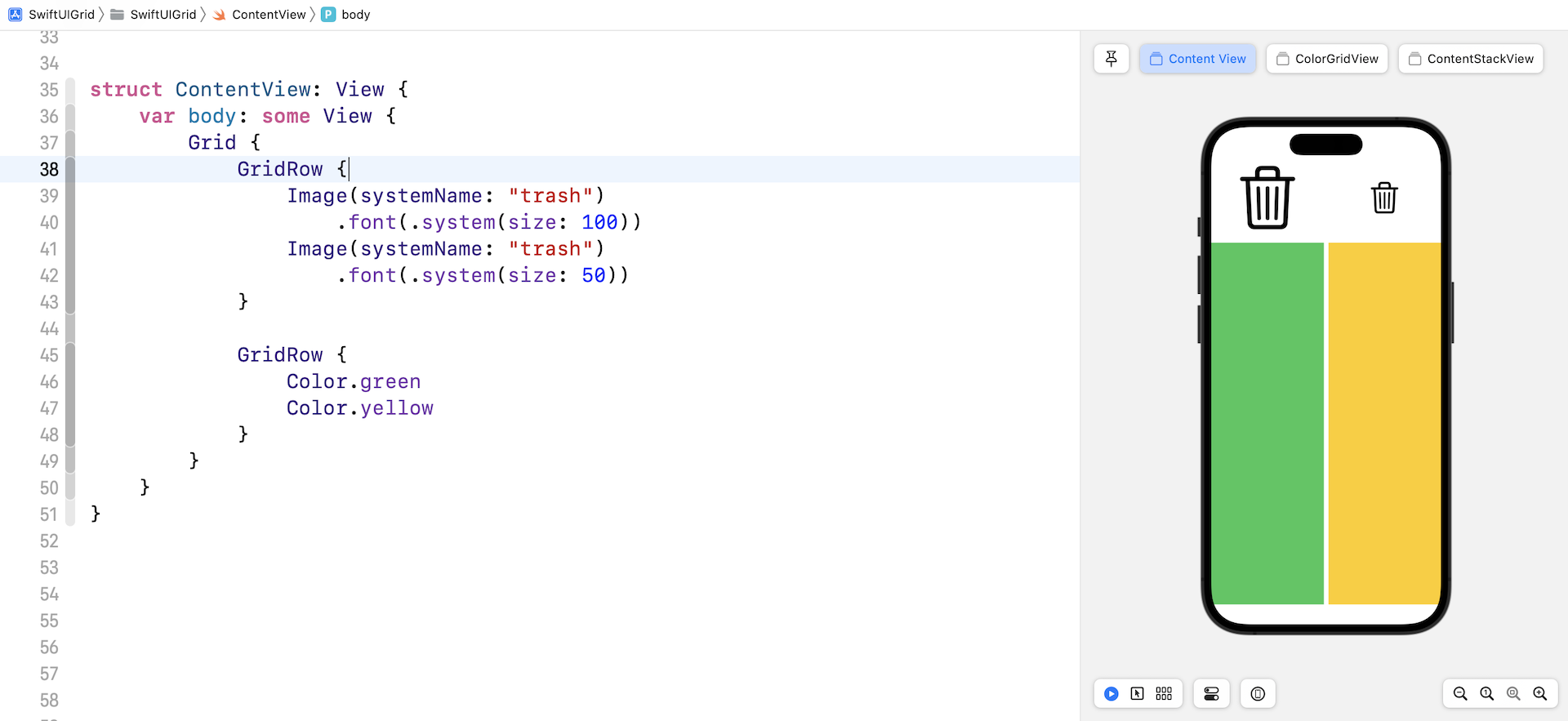
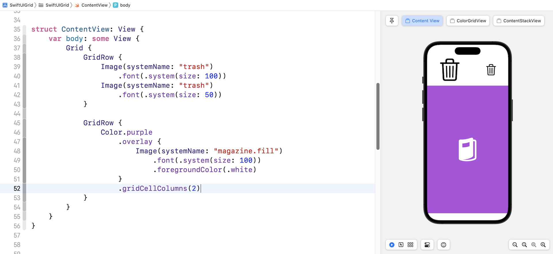
Using gridCellColumns to Merge Cells
When creating a grid view, you may want to display a single cell in a specific row, while other rows keep showing multiple cells. The gridCellColumns modifier is designed for you to merge cells. Here is an example:
Grid {
    GridRow {
        Image(systemName: "trash")
            .font(.system(size: 100))
        Image(systemName: "trash")
            .font(.system(size: 50))
    }

    GridRow {
        Color.purple
            .overlay {
                Image(systemName: "magazine.fill")
                    .font(.system(size: 100))
                    .foregroundColor(.white)
            }
            .gridCellColumns(2)
    }
}
The second row only has one cell. We attach the gridCellColumn modifier and set its value to 2 to merge the cells. If you do not use the modifier, you'll see a blank cell.
Adding a Blank Cell
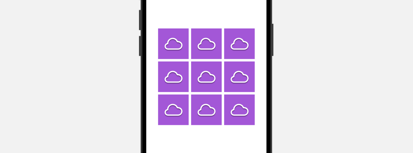
Now let's create another 3x3 grid view like this:
struct ContentView: View {
    var body: some View {
        Grid {
            GridRow {
                IconView(name: "cloud")
                IconView(name: "cloud")
                IconView(name: "cloud")
            }

            GridRow {
                IconView(name: "cloud")
                IconView(name: "cloud")
                IconView(name: "cloud")
            }

            GridRow {
                IconView(name: "cloud")
                IconView(name: "cloud")
                IconView(name: "cloud")
            }
        }
    }
}

struct IconView: View {
    var name: String = "trash"

    var body: some View {
        Image(systemName: name)
            .frame(width: 100, height: 100)
            .background(in: Rectangle())
            .backgroundStyle(.purple)
            .foregroundStyle(.white.shadow(.drop(radius: 1, y: 3.0)))
            .font(.system(size: 50))
    }
}
What if we want to display a blank view for the cell at the center of the grid? To make this happen, you can use the following code to add a blank cell:
Color.clear
    .gridCellUnsizedAxes([.horizontal, .vertical])
If you replace the center cell with the code above, you will see a blank cell at the center of the grid.
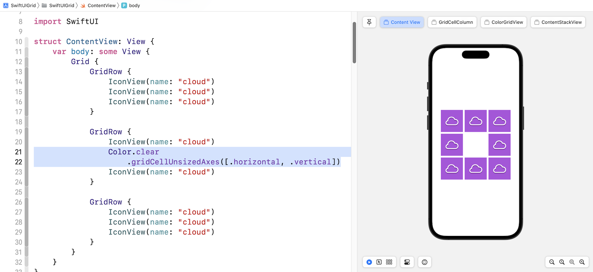
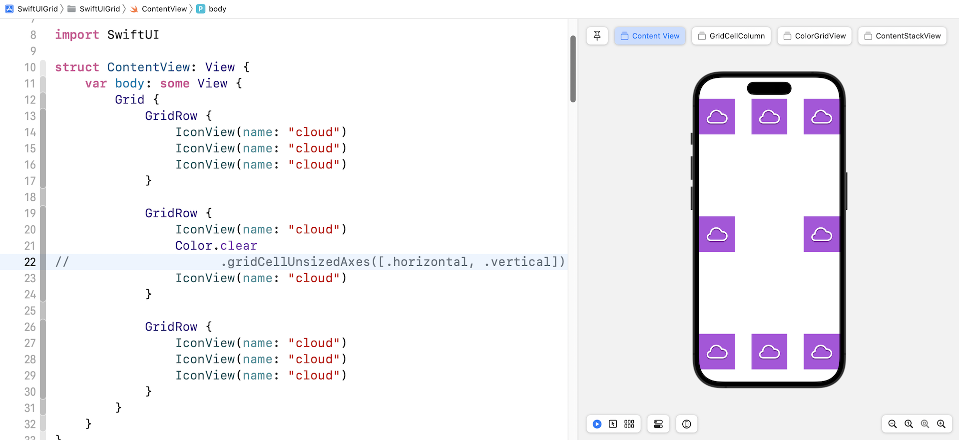
The gridCellUnsizedAxes modifier prevents the blank cell from taking up more space than the other cells in the row or column need?. If you omit the modifier, you will achieve a grid layout like figure 7.
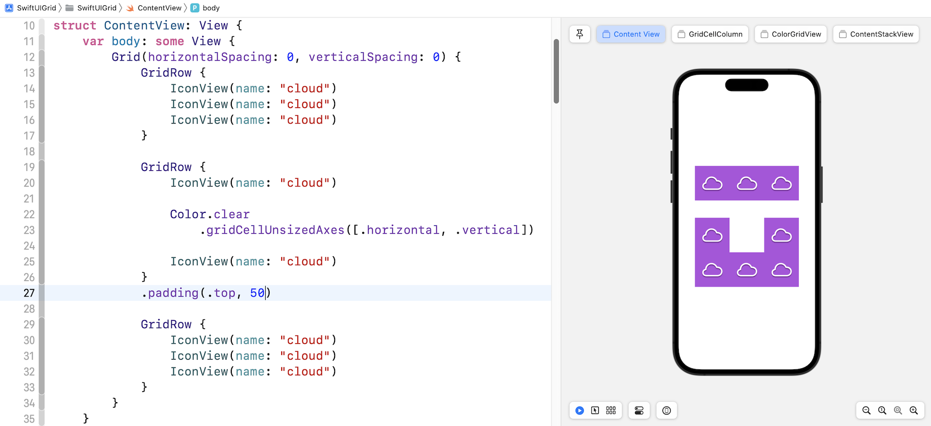
Adjusting the Cell Spacing
To control the vertical and horizontal spacing between cells, you can use the horizontalSpacing and verticalSpacing parameter when instantiating a Grid view:
Grid(horizontalSpacing: 0, verticalSpacing: 0) {
  .
  .
  .
}
If you need to add some spacing between rows, you can attach the padding modifier to GridRow. Figure 8 shows you an example.
Controlling the Cell Alignment
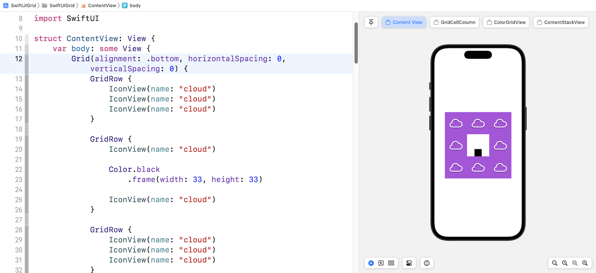
The Grid view has an optional parameter named alignment for you to configure the default alignment of the cells. For example, here sets the default alignment to .bottom:
Grid(alignment: .bottom, horizontalSpacing: 0, verticalSpacing: 0) {
  .
  .
  .
}
If you've changed the code, the black box should align to the bottom of the cell.
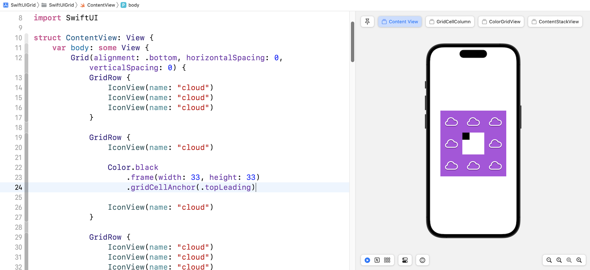
To override the default alignment setting, the cell itself can attach the gridCellAnchor modifier to change the alignment. Figure 10 shows an example.
Summary
The introduction of the Grid APIs provides developers with one more option to build grid-based layout. You can use HStack and VStack to build a similar layout. That said, Grid views save you quite a lot of code and make your code more readable. If your app only needs to support the latest version of iOS , give the Grid API a try and build some interesting layouts.
For reference, you can download the complete project here:
- Demo project (https://www.appcoda.com/resources/swiftui4/SwiftUIGrid.zip)