- Made by AppCoda
- Contact us / Support
- Tweet this book
- Preface
- 1. Introduction to SwiftUI
- 2. Getting Started with SwiftUI and Working with Text
- 3. Working with Images
- 4. Layout User Interfaces with Stacks
- 5. Understanding ScrollView and Building a Carousel UI
- 6. Working with SwiftUI Buttons and Gradient
- 7. Understanding State and Binding
- 8. Implementing Path and Shape for Line Drawing and Pie Charts
- 9. Basic Animations and Transitions
- 10. Understanding Dynamic List, ForEach and Identifiable
- 11. Working with Navigation UI and Navigation Bar Customization
- 12. Playing with Modal Views, Floating Buttons and Alerts
- 13. Building a Form with Picker, Toggle and Stepper
- 14. Data Sharing with Combine and Environment Objects
- 15. Building a Registration Form with Combine and View Model
- 16. Working with Swipe-to-Delete, Context Menu and Action Sheets
- 17. Using Gestures
- 18. Displaying an Expandable Bottom Sheet Using Presentation Detents
- 19. Creating a Tinder-like UI with Gestures and Animations
- 20. Creating an Apple Wallet like Animation and View Transition
- 21. Working with JSON, Slider and Data Filtering
- 22. Building a ToDo app with Core Data
- 23. Integrating UIKit with SwiftUI Using UIViewRepresentable
- 24. Creating a Search Bar View and Working with Custom Binding
- 25. Putting Everything Together to Build a Real World App
- 26. Creating an App Store like Animated View Transition
- 27. Building an Image Carousel
- 28. Building an Expandable List View Using OutlineGroup
- 29. Building Grid Layout Using LazyVGrid and LazyHGrid
- 30. Creating an Animated Activity Ring with Shape and Animatable
- 31. Working with AnimatableModifier and LibraryContentProvider
- 32. Working with TextEditor to Create Multiline Text Fields
- 33. Using matchedGeometryEffect to Create View Animations
- 34. ScrollViewReader and Grid Animation
- 35. Working with Tab View and Tab Bar Customization
- 36. Using AsyncImage in SwiftUI for Loading Images Asynchronously
- 37. Implementing Search Bar Using Searchable
- 38. Creating Bar Charts and Line Charts with the Charts Framework
- 39. Capturing Text within Image Using Live Text APIs
- 40. How to Use ShareLink for Sharing Data Like Text and Photos
- 41. Using ImageRenderer to Convert SwiftUI Views into Images
- 42. Creating PDF Documents Using ImageRenderer
- 43. Using Gauge to Display Progress and Create a Speedometer
- 44. Creating Grid Layout Using Grid APIs
- 45. Switching Layout with AnyLayout
- Published with GitBook
Chapter 18
Displaying an Expandable Bottom Sheet Using Presentation Detents
Bottom sheets have increased in popularity lately. You can easily find them in famous apps like Facebook and Uber. Bottom sheets are like an enhanced version of an action sheet that slides up from the bottom of screen and overlays on top of the original view to provide contextual information or additional user options. For instance, when you save a photo to a collection in Instagram, the app shows you a bottom sheet to choose a collection. The Facebook app displays the sheet with additional action items when you click the ellipsis button of a post. The Uber app also makes use of bottom sheets to display the pricing of your chosen trip.
The size of bottom sheets varies depending on the contextual information you want to display. In some cases, bottom sheets tend to be bigger (which is also known as backdrops) and take up 80-90% of the screen. Usually, users are allowed to interact with the sheet with the drag gesture. You can slide it up to expand its size or slide it down to minimize or dismiss the sheet.

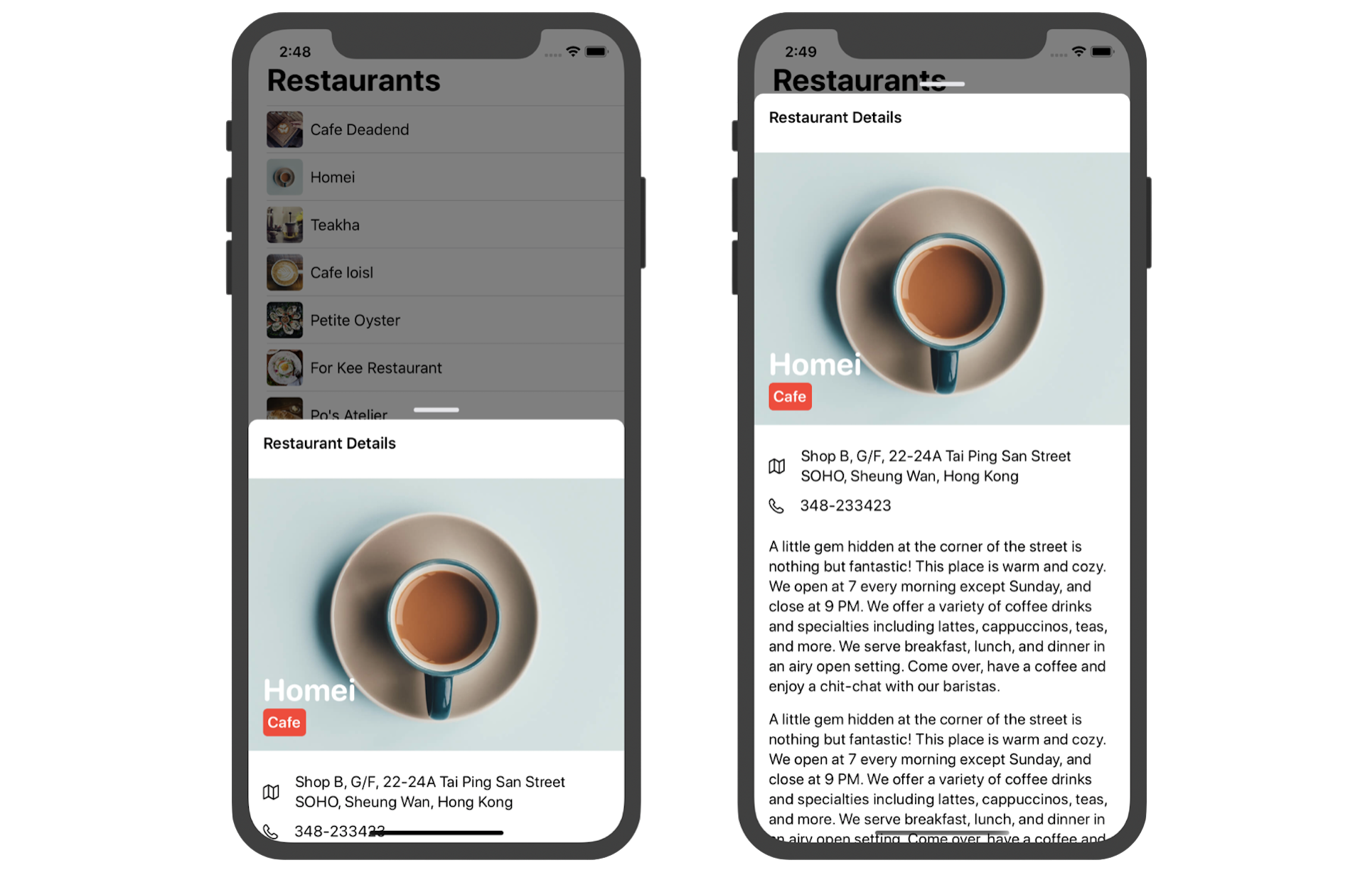
In this chapter, we will build a similar expandable bottom sheet using SwiftUI gestures. The demo app shows a list of restaurants in the main view. When a user taps one of the restaurant records, the app brings up a bottom sheet to display the restaurant details. You can expand the sheet by sliding it up. To dismiss the sheet, you can slide it down.
Introducing Presentation Detents
In iOS 15, Apple unveiled the UISheetPresentationController class for displaying an expandable bottom sheet in iOS apps. At the time, it's only available in the UIKit framework. For SwiftUI, you either have to build your own component or rely on third party libraries.
Starting from iOS 16, the SwiftUI framework comes with a new modifier called presentationDetents for presenting a resizable bottom sheet.
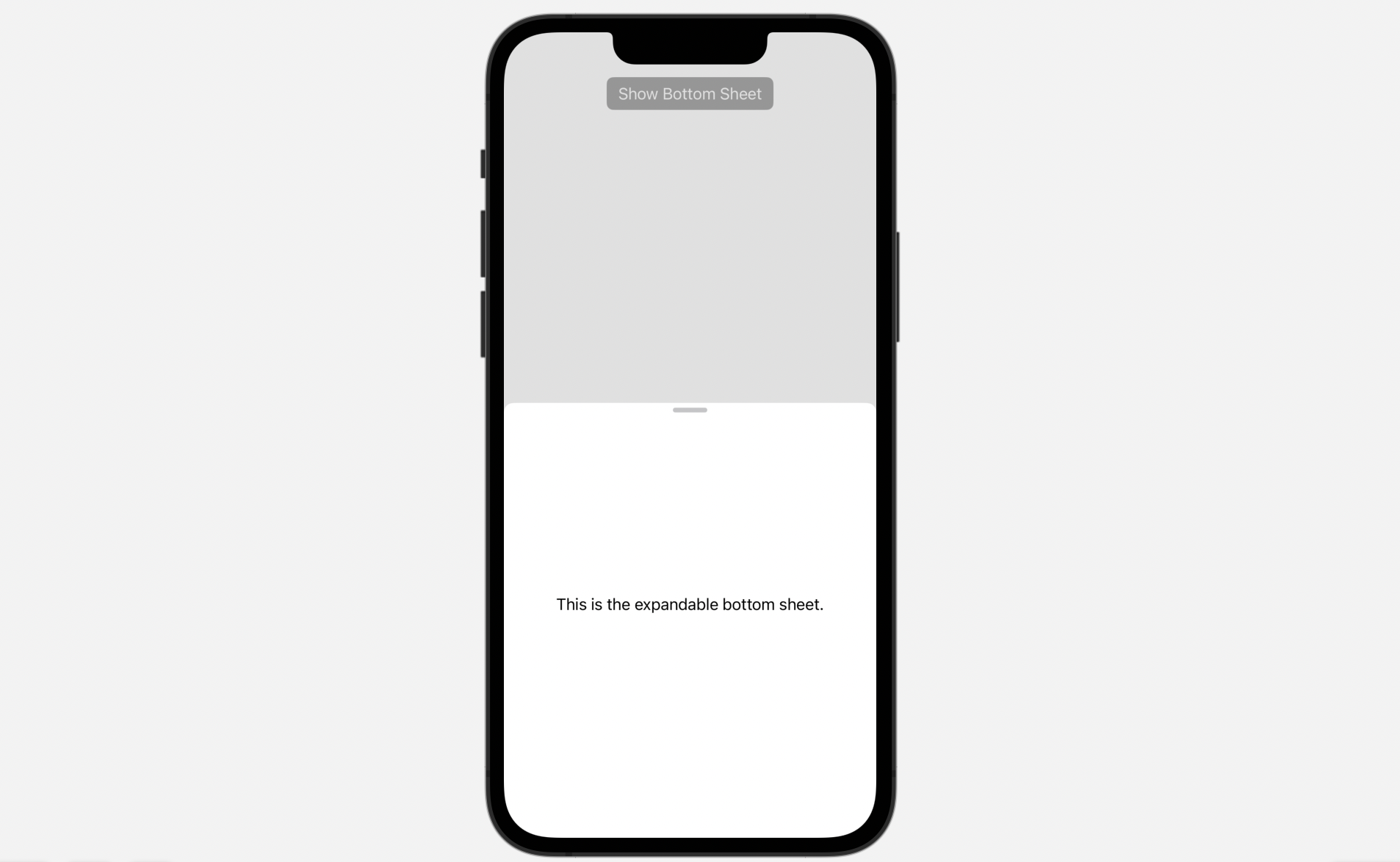
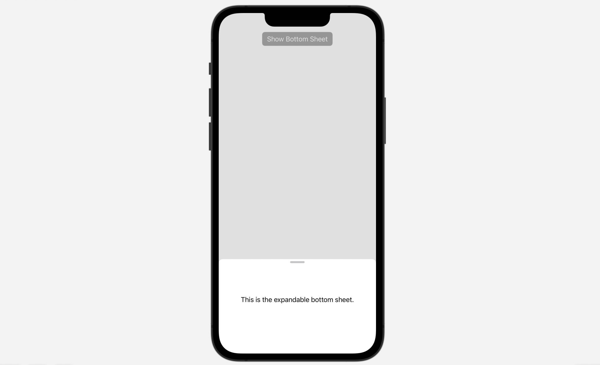
To present a bottom sheet, you insert the modifier inside the sheet view. Here is an example:
struct BasicBottomSheet: View {
    @State private var showSheet = false

    var body: some View {
        VStack {
            Button("Show Bottom Sheet") {
                showSheet.toggle()
            }
            .buttonStyle(.borderedProminent)
            .sheet(isPresented: $showSheet) {
                Text("This is the expandable bottom sheet.")
                    .presentationDetents([.medium, .large])
            }

            Spacer()
        }
    }
}
You specify a set of detents in the presentationDetents modifier. As shown above, the bottom sheet supports both medium and large size. When it first appears, the bottom sheet is displayed in medium size. You can expand it to large size by dragging the sheet.
Understanding the Starter Project
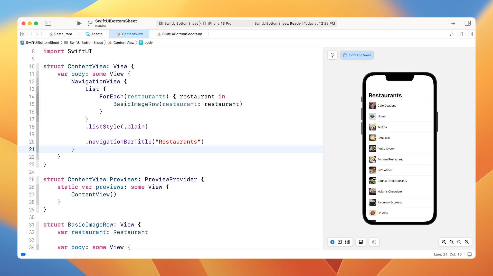
To save you some time building the demo app from the ground up, I've prepared a starter project for you. You can download it from https://www.appcoda.com/resources/swiftui4/SwiftUIBottomSheetStarter.zip. Unzip the file and open SwiftUIBottomSheet.xcodeproj to get started.
The starter project comes with a set of restaurant images and the restaurant data. If you look in the Model folder in the project navigator, you should find a file named Restaurant.swift. This file contains the Restaurant struct and the set of sample restaurant data.
struct Restaurant: Identifiable {
    var id: UUID = UUID()
    var name: String
    var type: String
    var location: String
    var phone: String
    var description: String
    var image: String
    var isVisited: Bool

    init(name: String, type: String, location: String, phone: String, description: String, image: String, isVisited: Bool) {
        self.name = name
        self.type = type
        self.location = location
        self.phone = phone
        self.description = description
        self.image = image
        self.isVisited = isVisited
    }

    init() {
        self.init(name: "", type: "", location: "", phone: "", description: "", image: "", isVisited: false)
    }
}
I've created the main view for you that displays a list of restaurants. You can open the ContentView.swift file to check out the code. I am not going to explain the code in details as we have gone through the implementation of list in chapter 10.
Creating the Restaurant Detail View
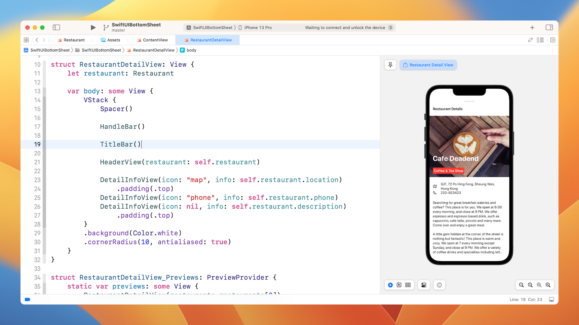
The bottom sheet will contain the restaurant details with a small handlebar. So, the very first thing we have to do is to create the restaurant detail view like that shown in figure 4.
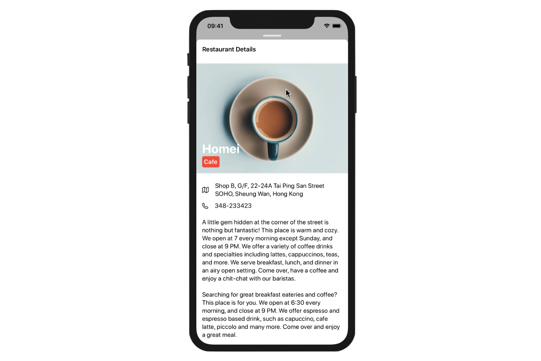
Before you follow me to implement the view, I suggest you consider it as an exercise and create the detail view on your own. As you can see, the detail view is composed of UI components including Image, Text, and ScrollView. We have already covered all these components, so give it a try and provide your own implementation.
Okay, let me show you how to build the detail view. If you have already built the detail view on your own, you can use my implementation as a reference.
The layout of the detail view is a bit complicated, so it's better to break it into multiple parts for easier implementation:
- The handlebar, which is a small rounded rectangle
- The title bar containing the title of the detail view
- The header view containing the featured image, restaurant name, and type
- The detail info view containing the restaurant data, which includes address, phone, and description.
We will implement each of the above using a separate struct to better organize our code. Now create a new file using the SwiftUI View template and name it RestaurantDetailView.swift. All the code discussed below will be put in this new file.
Handlebar
First, the handlebar. The handlebar is actually a small rectangle with rounded corners. To create it, all we need to do is to create a Rectangle and give it rounded corners. In the RestaurantDetailView.swift file, insert the following code:
struct HandleBar: View {

    var body: some View {
        Rectangle()
            .frame(width: 50, height: 5)
            .foregroundColor(Color(.systemGray5))
            .cornerRadius(10)
    }
}
Title Bar
Next, it's the title bar. The implementation is simple since it's just a Text view. Let's create another struct for it:
struct TitleBar: View {

    var body: some View {
        HStack {
            Text("Restaurant Details")
                .font(.headline)
                .foregroundColor(.primary)

            Spacer()
        }
        .padding()
    }
}
The spacer here is used to align the text to the left.
Header View
The header view consists of an image view and two text views. The text views are overlayed on top of the image view. Again, we will use a separate struct to implement the header view:
struct HeaderView: View {
    let restaurant: Restaurant

    var body: some View {
        Image(restaurant.image)
            .resizable()
            .scaledToFill()
            .frame(height: 300)
            .clipped()
            .overlay(
                HStack {
                    VStack(alignment: .leading) {
                        Spacer()
                        Text(restaurant.name)
                            .foregroundColor(.white)
                            .font(.system(.largeTitle, design: .rounded))
                            .bold()

                        Text(restaurant.type)
                            .font(.system(.headline, design: .rounded))
                            .padding(5)
                            .foregroundColor(.white)
                            .background(Color.red)
                            .cornerRadius(5)

                    }
                    Spacer()
                }
                .padding()
            )
    }
}
Since we need to display the restaurant data, the HeaderView has the restaurant property. For the layout, we created an Image view and set the content mode to scaleToFill. The height of the image is fixed at 300 points. Since we use the scaleToFill mode, we need to attach the .clipped() modifier to hide any content that extends beyond the edges of the image frame.
For the two labels, we use the .overlay modifier to overlay two Text views.
Detail Info View
Lastly, the information view. If you look at the address, phone, and description fields carefully, you should notice that they are pretty similar. Both address and phone fields have an icon right next to the textual information, while the description field contains text only.
So, wouldn't it be great to build a view which is flexible to handle both field types? Here is the code snippet:
struct DetailInfoView: View {
    let icon: String?
    let info: String

    var body: some View  {
        HStack {
            if icon != nil {
                Image(systemName: icon!)
                    .padding(.trailing, 10)
            }
            Text(info)
                .font(.system(.body, design: .rounded))

            Spacer()
        }.padding(.horizontal)
    }
}
The DetailInfoView takes in two parameters: icon and info. The icon parameter is an optional, meaning that it can either have a value or nil.
When you need to present a data field with an icon, you use the DetailInfoView like this:
DetailInfoView(icon: "map", info: self.restaurant.location)
Alternatively, if you only need to present a text-only field like the description field, you use the DetailInfoView like this:
DetailInfoView(icon: nil, info: self.restaurant.description)
As you can see, by building a generic view to handle similar layout, you make the code more modular and reusable.
Using VStack to Glue Them All Together
Now that we have built all components, we can combine them by using VStack like this:
struct RestaurantDetailView: View {
    let restaurant: Restaurant

    var body: some View {
        VStack {
            Spacer()

            HandleBar()

            TitleBar()

            HeaderView(restaurant: self.restaurant)

            DetailInfoView(icon: "map", info: self.restaurant.location)
                .padding(.top)
            DetailInfoView(icon: "phone", info: self.restaurant.phone)
            DetailInfoView(icon: nil, info: self.restaurant.description)
                .padding(.top)
        }
        .background(Color.white)
        .cornerRadius(10, antialiased: true)
    }
}
The code above is self explanatory. We use the components that were built in the earlier sections and embed them in a vertical stack. Originally, the VStack has a transparent background. To ensure that the detail view has a white background, we attach the background modifier.
Before you can test the detail view, you have to modify the code of RestaurantDetailView_Previews like this:
struct RestaurantDetailView_Previews: PreviewProvider {
    static var previews: some View {
        RestaurantDetailView(restaurant: restaurants[0])
    }
}
In the code, we pass a sample restaurant (i.e. restaurants[0]) for testing. If you've followed everything correctly, Xcode should show you a similar detail view in the preview canvas to figure 6.
Make It Scrollable
Do you notice that the detail view can't display the full description? To fix the issue, we have to make the detail view scrollable by embedding the content in a ScrollView like this:
struct RestaurantDetailView: View {
    let restaurant: Restaurant

    var body: some View {
        VStack {
            Spacer()

            HandleBar()

            ScrollView(.vertical) {
                TitleBar()

                HeaderView(restaurant: self.restaurant)

                DetailInfoView(icon: "map", info: self.restaurant.location)
                    .padding(.top)
                DetailInfoView(icon: "phone", info: self.restaurant.phone)
                DetailInfoView(icon: nil, info: self.restaurant.description)
                    .padding(.top);
            }
            .background(Color.white)
            .cornerRadius(10, antialiased: true)
        }
    }
}
Except the handlebar, the rest of the views are wrapped within the scroll view. If you run the app in the preview canvas again, the detail view is now scrollable.
Bring Up the Detail View
Now that the detail view is pretty much done. Let's go back to the list view (i.e. ContentView.swift) to bring it up whenever a user selects a restaurant.
In the ContentView struct, declare a state variable to store the user's chosen restaurant:
@State private var selectedRestaurant: Restaurant?
As you've learned in an earlier chapter, you can attach the onTapGesture modifier to detect the tap gesture. So, when a tap is recognized, we update the value of selectedRestaurant like this:
List {
    ForEach(restaurants) { restaurant in
        BasicImageRow(restaurant: restaurant)
            .onTapGesture {
                self.selectedRestaurant = restaurant
            }
    }
}
The detail view, which is the bottom sheet, is expected to overlay on top of the list view. We check if the detail view is enabled and initialize it like this:
NavigationStack {
    .
    .
    .
}
.sheet(item: $selectedRestaurant) { restaurant in
    RestaurantDetailView(restaurant: restaurant)
        .presentationDetents([.medium, .large])
}
We attach the .sheet modifier to NavigationStack. In the closure, we create an instance of RestaurantDetailView and present it as a bottom sheet using the .presentationDetents modifier. Thus, when the user selects a restaurant, the app brings up the detail view in the form of bottom sheet.
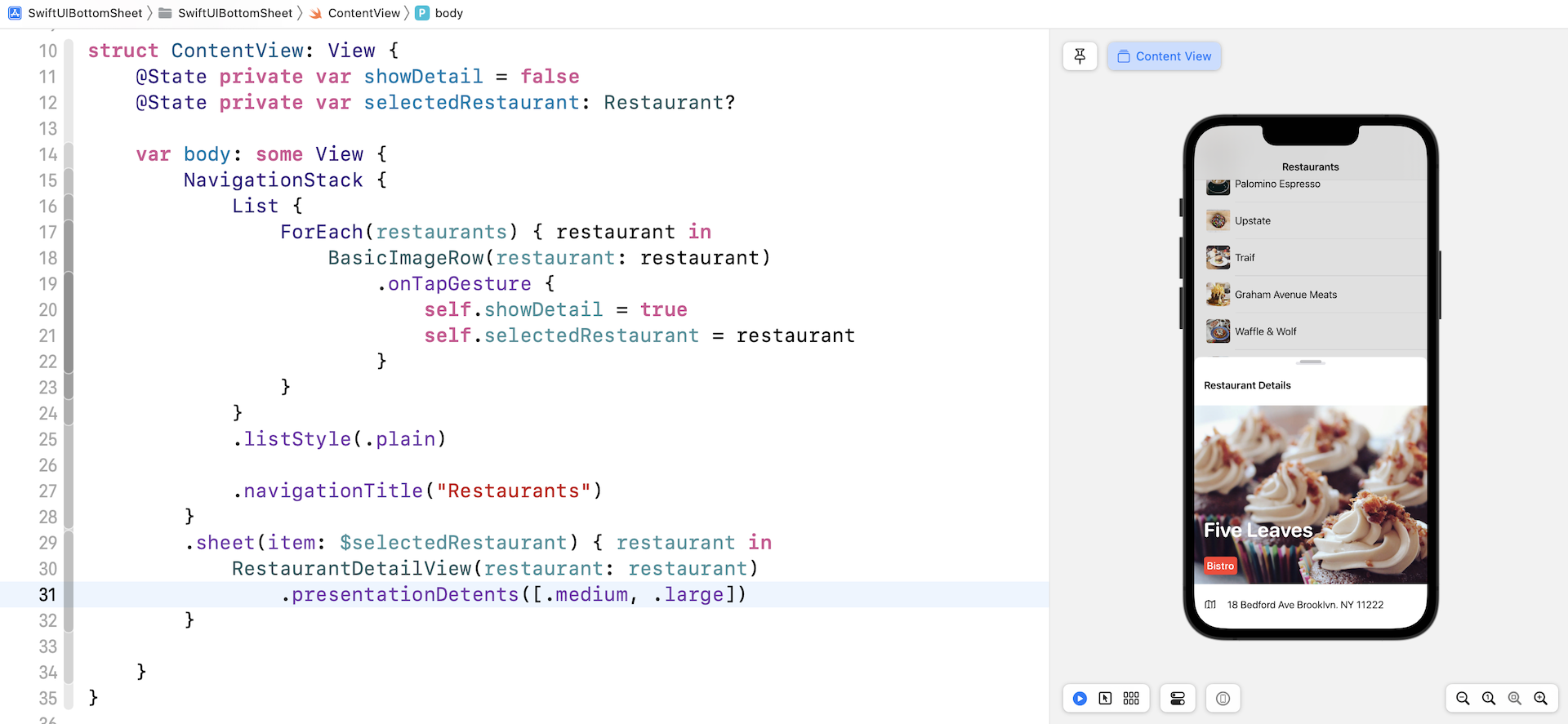
Since the presentation detents support both medium and large sizes, you can drag the bottom sheet upward to expand it.
Hide the Drag Indicator
The presentationDetents modifier automatically generates a drag indicator near the top edge of the bottom sheet. Since our detail view already has the handle bar, we can hide the default indicator. To do so, attach the presentationDragIndicator modifier and set it to .hidden:
RestaurantDetailView(restaurant: restaurant)
    .presentationDetents([.medium, .large])
    .presentationDragIndicator(.hidden)
Controlling its Size Using Fraction and Height
Other than the preset detents such as .medium, you can create a custom detent using .height and .fraction. Here is another example:
.presentationDetents([.fraction(0.1), .height(200), .medium, .large])
Now the bottom supports 4 different sizes including:
- around 10% of the screen height
- a fixed height of 200 points
- the standard Medium and Large sizes
Storing the Selected Detent
Every time you dismiss the bottom sheet, the presentation detent is reset to its original state. In other words, for the below presentation detents:
.presentationDetents([.height(200), .medium, .large])
Every time you open the bottom sheet, it begins with the .height(200) detent. What if you want to restore the last selected detent? In this case, you can declare a state variable to keep track of the currently selected detent:
@State private var selectedDetent: PresentationDetent = .medium
For the presentationDetents modifier, you specify the binding of the variable in the selection parameter:
.presentationDetents([.height(200), .medium, .large], selection: $selectedDetent)
SwiftUI then stores the currently selected detent in the state variable. Even if you dismiss the bottom sheet, the next time when you bring the bottom sheet, it restores to the last selected detent.
Summary
In this chapter, I showed you how to create a bottom sheet with the new presentationDetents modifier. This is one of the most anticipated view components that many developers have been waited for. With this customizable bottom sheet, you can now easily display supplementary content that anchors to the bottom of the screen.
For reference, you can download the complete bottom sheet project here: