- Made by AppCoda
- Contact us / Support
- Tweet this book
- Preface
- 1. Introduction to SwiftUI
- 2. Getting Started with SwiftUI and Working with Text
- 3. Working with Images
- 4. Layout User Interfaces with Stacks
- 5. Understanding ScrollView and Building a Carousel UI
- 6. Working with SwiftUI Buttons and Gradient
- 7. Understanding State and Binding
- 8. Implementing Path and Shape for Line Drawing and Pie Charts
- 9. Basic Animations and Transitions
- 10. Understanding Dynamic List, ForEach and Identifiable
- 11. Working with Navigation UI and Navigation Bar Customization
- 12. Playing with Modal Views, Floating Buttons and Alerts
- 13. Building a Form with Picker, Toggle and Stepper
- 14. Data Sharing with Combine and Environment Objects
- 15. Building a Registration Form with Combine and View Model
- 16. Working with Swipe-to-Delete, Context Menu and Action Sheets
- 17. Using Gestures
- 18. Displaying an Expandable Bottom Sheet Using Presentation Detents
- 19. Creating a Tinder-like UI with Gestures and Animations
- 20. Creating an Apple Wallet like Animation and View Transition
- 21. Working with JSON, Slider and Data Filtering
- 22. Building a ToDo app with Core Data
- 23. Integrating UIKit with SwiftUI Using UIViewRepresentable
- 24. Creating a Search Bar View and Working with Custom Binding
- 25. Putting Everything Together to Build a Real World App
- 26. Creating an App Store like Animated View Transition
- 27. Building an Image Carousel
- 28. Building an Expandable List View Using OutlineGroup
- 29. Building Grid Layout Using LazyVGrid and LazyHGrid
- 30. Creating an Animated Activity Ring with Shape and Animatable
- 31. Working with AnimatableModifier and LibraryContentProvider
- 32. Working with TextEditor to Create Multiline Text Fields
- 33. Using matchedGeometryEffect to Create View Animations
- 34. ScrollViewReader and Grid Animation
- 35. Working with Tab View and Tab Bar Customization
- 36. Using AsyncImage in SwiftUI for Loading Images Asynchronously
- 37. Implementing Search Bar Using Searchable
- 38. Creating Bar Charts and Line Charts with the Charts Framework
- 39. Capturing Text within Image Using Live Text APIs
- 40. How to Use ShareLink for Sharing Data Like Text and Photos
- 41. Using ImageRenderer to Convert SwiftUI Views into Images
- 42. Creating PDF Documents Using ImageRenderer
- 43. Using Gauge to Display Progress and Create a Speedometer
- 44. Creating Grid Layout Using Grid APIs
- 45. Switching Layout with AnyLayout
- Published with GitBook
Chapter 26
Creating an App Store like Animated View Transition
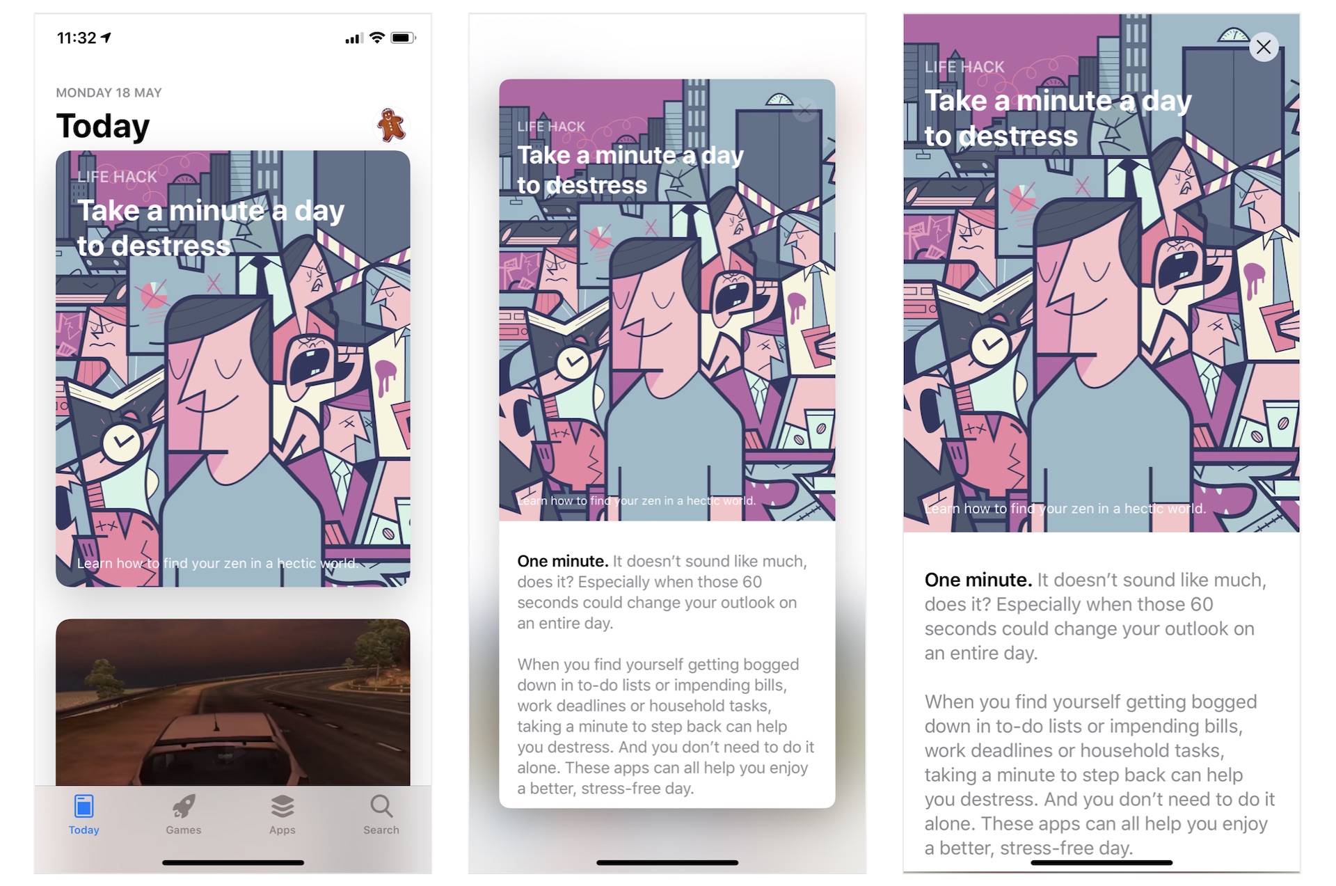
You probably have used Apple's the built-in App Store app. In the Today section, it presents users with a headline, various articles and app recommendations. What interests me and many of you is the animated view transition. As you can see in figure 1, the articles are listed in a card like format. When you tap it, the card pops out to reveal the full content. To dismiss the article view and return to the list view, you simply tap the close button . If you don't understand what I mean, the best way to understand these views is to open the App Store app on your iPhone to try it out.
In this chapter, we will build a similar list view and implement the animated transition using SwiftUI. In particular, you will learn the following techniques:
- How to use GeometryReader to detect screen sizes
- How to create a variable-sized card view
- How to implement an App Store like animated view transition
Let's get started.
Introducing the Demo App
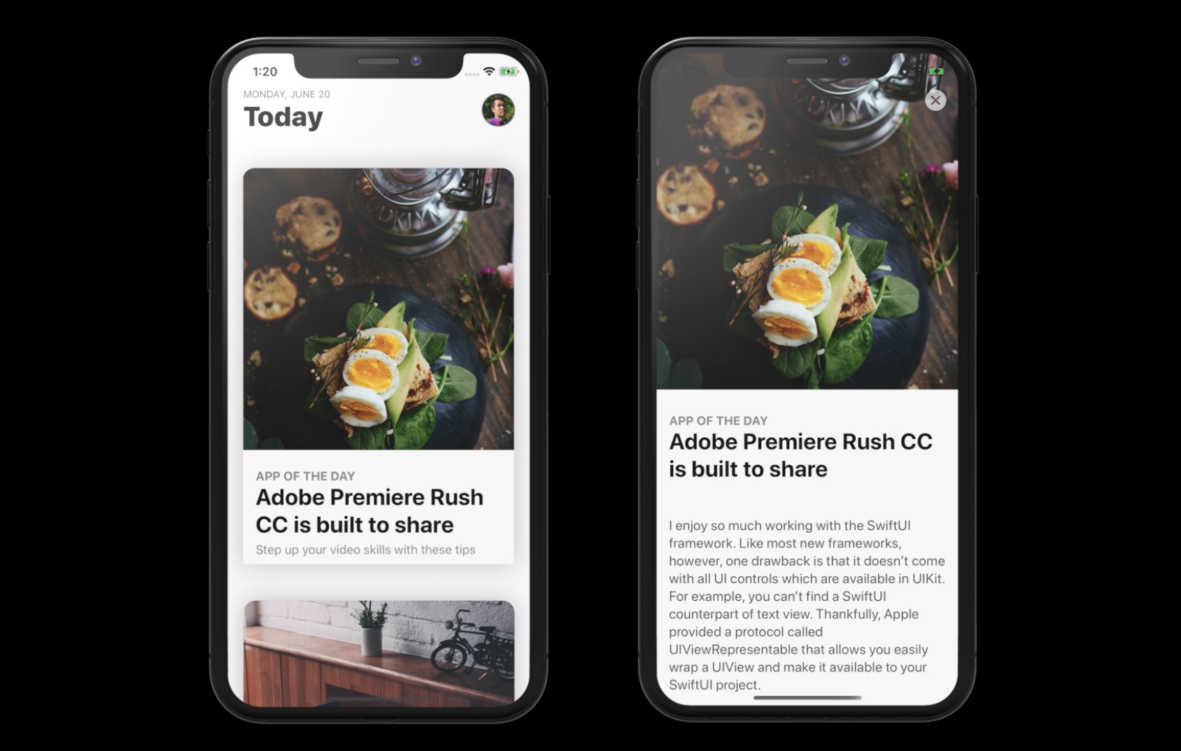
As usual, we will build a demo app together. The app looks very similar to the App Store app but without the tab bar. It only has a list view showing all the articles in card format. When a user taps any of the articles, the card expands to full screen and displays the article details. To return to the list view, the user can either tap the close button or drag down the article view to collapse it.
We will build the app from scratch. But to save you time from typing some of the code, I have prepared a starter project for you. You can download it from https://www.appcoda.com/resources/swiftui4/SwiftUIAppStoreStarter.zip. After downloading the project, unzip it and open SwiftUIAppStore.xcodeproj to take a look.
The starter projects comes with the following implementation:
- It already bundles the required images in the asset catalog.
- The
ContentView.swiftfile is the default SwiftUI view generated by Xcode. - The
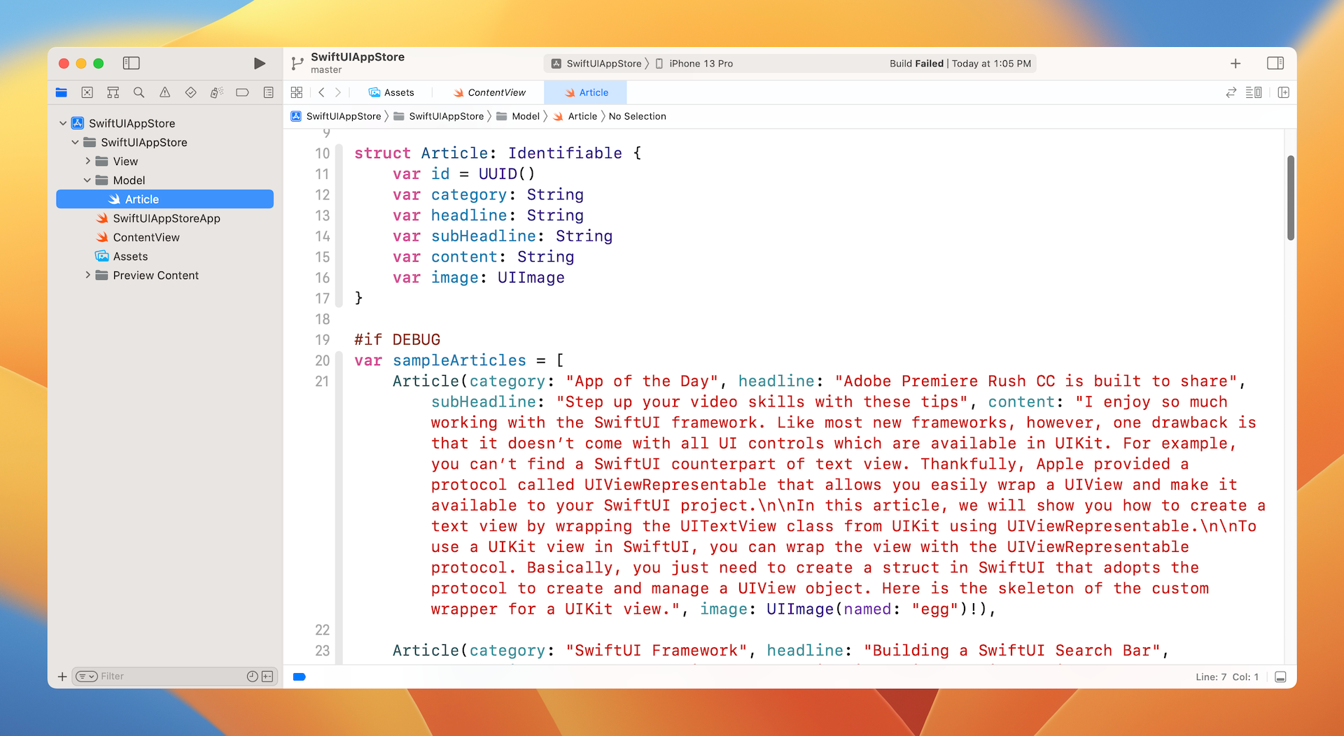
Article.swiftfile contains theArticlestruct, which represents an article in the app. For testing purposes, this file also creates thesampleArticlesarray which includes some test data. You may modify its content if you want to change the article data.
Understanding the Card View
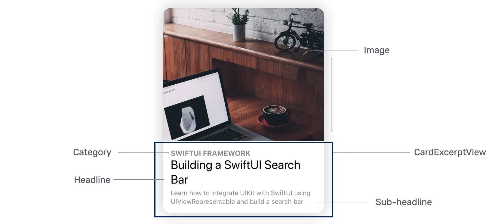
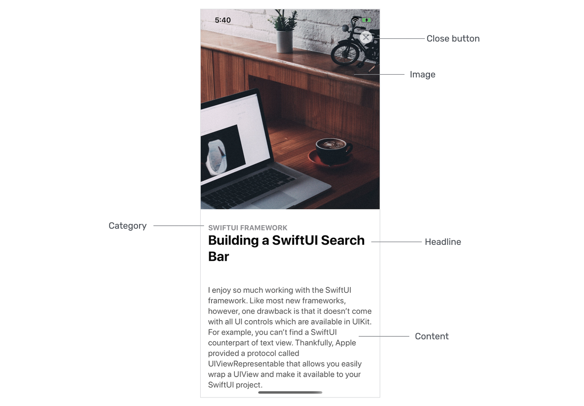
You've learned how to create a card-like UI before. This card view is very similar to that implemented in chapter 5, but it will be more flexible to support scrollable content. In other words, it has two modes: excerpt and full content. In the excerpt mode, it only displays the image, category, headline and sub-headline of the article. As its name suggests, the full content will display the article details as shown in figure 2.
If you look a bit closer into the card views shown in figure 4, you will find that the size of card views varies according to the height of the image. However, the height of the card will not exceed 500 points.
Let's also look at how the card view looks in full content mode. As you can see in the figure below, the card view expands to a full screen that displays the content. Other than that, the image is a little bit bigger and the sub-headline is hidden. Furthermore, the close button appears on screen for users to dismiss the view. Please also take note that this is a scrollable view.
Implementing the Card View
Now that you understand the requirements of this card view, let's see how to create it. We will use a separate file for implementing the card view. In the project navigator, right click the View folder and choose New file.... Select the SwiftUI View template and name the file ArticleCardView.swift.
First, let's begin with the excerpt view, which is the view overlayed on top of the image (see figure 5). Insert the following code in the file:
struct ArticleExcerptView: View {

    let category: String
    let headline: String
    let subHeadline: String

    @Binding var isShowContent: Bool

    var body: some View {
        VStack(alignment: .leading) {
            Spacer()

            Rectangle()
                .frame(minHeight: 100, maxHeight: 150)
                .overlay(
                    HStack {
                        VStack(alignment: .leading) {
                            Text(self.category.uppercased())
                                .font(.subheadline)
                                .fontWeight(.bold)
                                .foregroundColor(.secondary)

                            Text(self.headline)
                                .font(.title)
                                .fontWeight(.bold)
                                .foregroundColor(.primary)
                                .minimumScaleFactor(0.1)
                                .lineLimit(2)
                                .padding(.bottom, 5)

                            if !self.isShowContent {
                                Text(self.subHeadline)
                                    .font(.subheadline)
                                    .foregroundColor(.secondary)
                                    .minimumScaleFactor(0.1)
                                    .lineLimit(3)

                            }
                        }
                        .padding()

                        Spacer()
                    }
            )
        }
        .foregroundColor(.white)

    }
}
The ArticleExcerptView should be flexible to support different content. Therefore, we define the variables above. As previously mentioned, the card view should be able to switch between excerpt and full content mode. This binding variable is declared for controlling the display of the content. When its value is set to false, it's in excerpt mode. Conversely, it's in full content mode when true. The sub-headline is displayed only when the value of isShowContent is set to true.
There are various ways to layout the excerpt view. In the code above, we create a Rectangle view and overlay it with the headline and sub-headline. You should be familiar with most of the modifiers attached to the Text view. But the minimumScaleFactor modifier is worth a mention. By applying the modifier, the system automatically shrinks the font size of the text to fit the available space. For example, if the headline contains too much text, iOS will scale it down to 10% of its original size before it truncates.
Previewing the UI
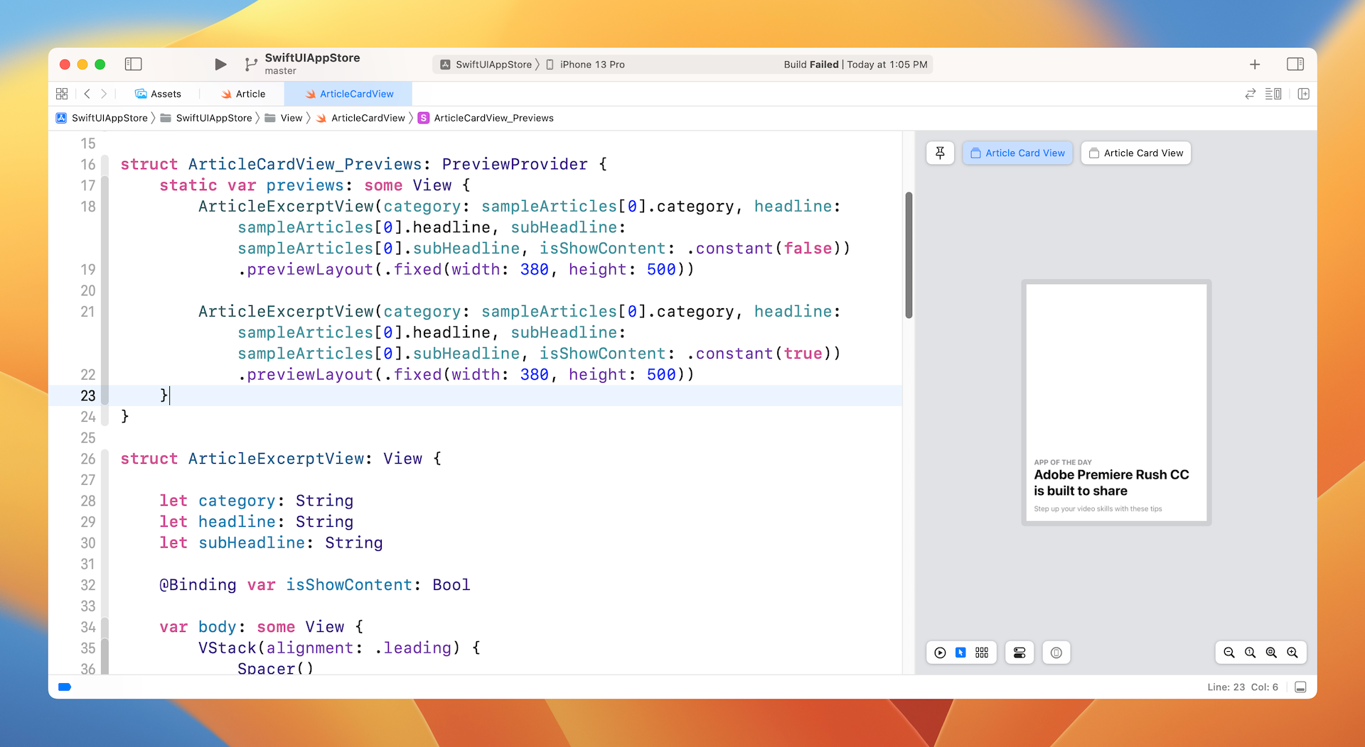
To preview the excerpt view, you can modify the preview code like this:
struct ArticleCardView_Previews: PreviewProvider {
    static var previews: some View {
        ArticleExcerptView(category: sampleArticles[0].category, headline: sampleArticles[0].headline, subHeadline: sampleArticles[0].subHeadline, isShowContent: .constant(false)).previewLayout(.fixed(width: 380, height: 500))

        ArticleExcerptView(category: sampleArticles[0].category, headline: sampleArticles[0].headline, subHeadline: sampleArticles[0].subHeadline, isShowContent: .constant(true)).previewLayout(.fixed(width: 380, height: 500))
    }
}
Here, we instantiate two excerpt views such that one has the isShowContent binding set to false and the other one set to true. The sampleArticles array is the test data which comes with the starter project.
Instead of previewing using a device, we preview the UI in a fixed size rectangle. If everything works perfectly, you should see the excerpt view in the preview canvas. Please make sure you change to the Selectable mode to preview the fixed layout.
With the excerpt view ready, let's implement the article card view. Update the ArticleCardView struct like this:
struct ArticleCardView: View {

    let category: String
    let headline: String
    let subHeadline: String
    let image: UIImage
    var content: String = ""

    @Binding var isShowContent: Bool

    var body: some View {
        ScrollView {
            VStack(alignment: .leading) {
                Image(uiImage: self.image)
                    .resizable()
                    .scaledToFill()
                    .frame(height: min(self.image.size.height/3, 500))
                    .border(Color(.sRGB, red: 150/255, green: 150/255, blue: 150/255, opacity: 0.1), width: self.isShowContent ? 0 : 1)
                    .cornerRadius(15)
                    .overlay(
                        ArticleExcerptView(category: self.category, headline: self.headline, subHeadline: self.subHeadline, isShowContent: self.$isShowContent)
                            .cornerRadius(self.isShowContent ? 0 : 15)
                    )

                // Content
                if self.isShowContent {
                    Text(self.content)
                        .foregroundColor(Color(.darkGray))
                        .font(.system(.body, design: .rounded))
                        .padding(.horizontal)
                        .padding(.bottom, 50)
                        .transition(.move(edge: .bottom))
                }
            }
        }
        .shadow(color: Color(.sRGB, red: 64/255, green: 64/255, blue: 64/255, opacity: 0.3), radius: self.isShowContent ? 0 : 15)
    }
}
To arrange the layout of the card view, we overlay the ArticleExcerptView on top of an Image view. The image view is set to .scaledToFill with the height not exceeding 500 points. The content is only displayed when the isShowContent binding is set to true.
In order to make the view scrollable, we embed the VStack in a vertical scroll view. The shadow modifier is used to add a shadow to the card view.
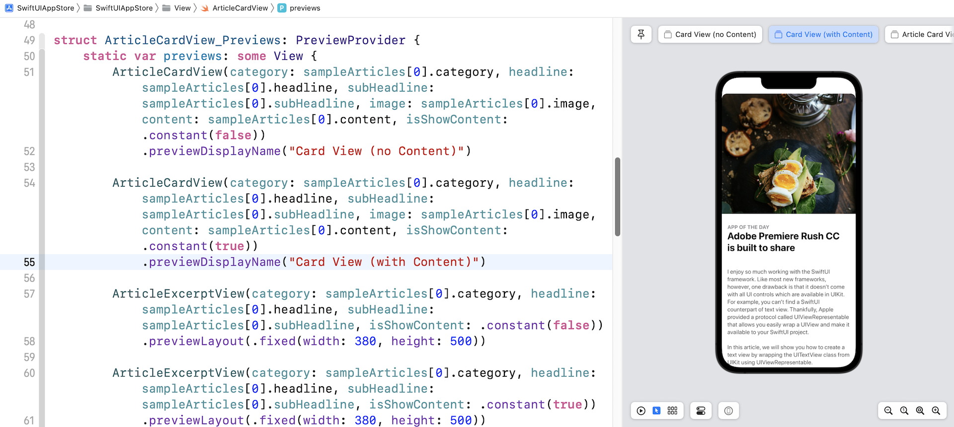
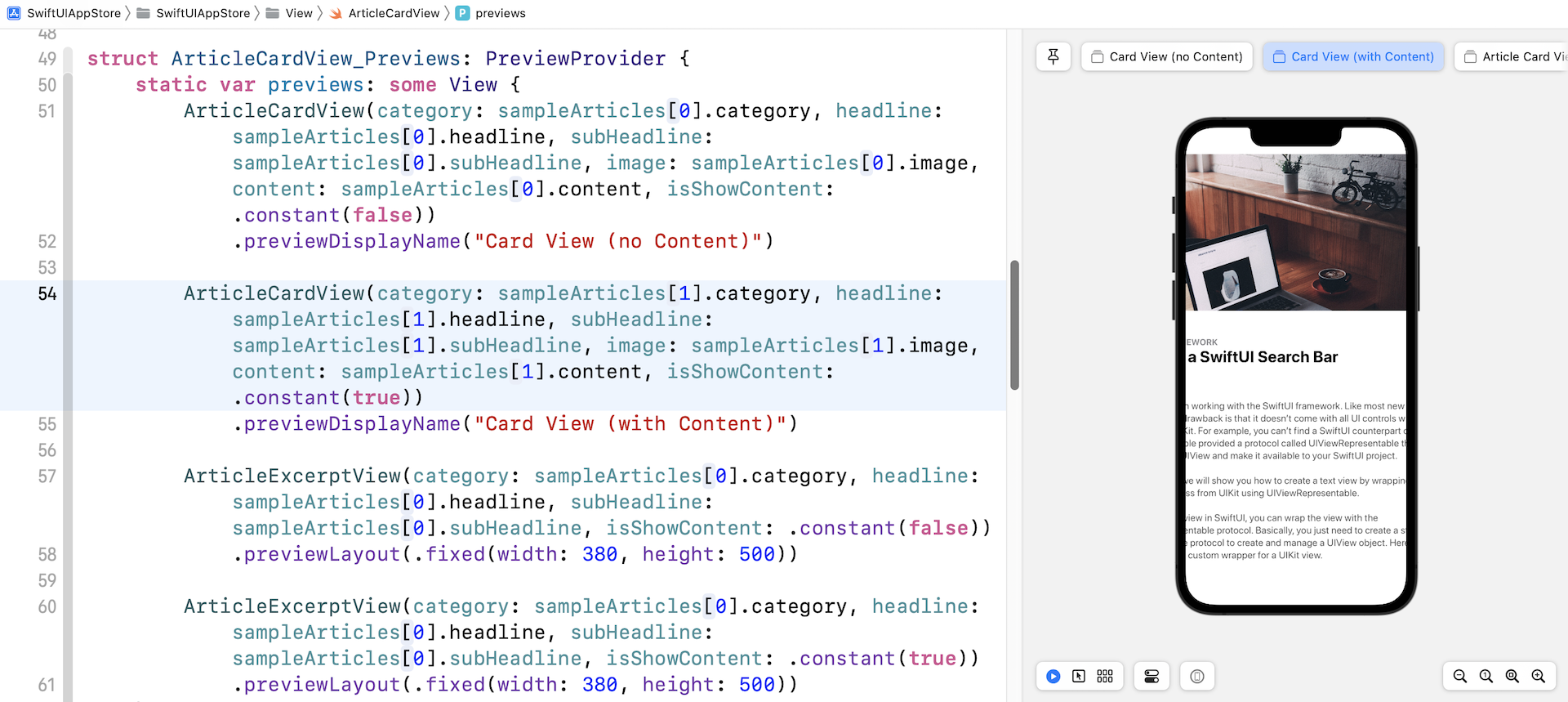
To preview the article card view, you can insert the following code within the Group section of ArticleCardView_Previews:
ArticleCardView(category: sampleArticles[0].category, headline: sampleArticles[0].headline, subHeadline: sampleArticles[0].subHeadline, image: sampleArticles[0].image, content: sampleArticles[0].content, isShowContent: .constant(false))
    .previewDisplayName("Card View (no Content)")

ArticleCardView(category: sampleArticles[0].category, headline: sampleArticles[0].headline, subHeadline: sampleArticles[0].subHeadline, image: sampleArticles[0].image, content: sampleArticles[0].content, isShowContent: .constant(true))
    .previewDisplayName("Card View (with Content)")
Once you have made the changes, you should be able to see the card UI in the preview canvas. Additionally, you should see two simulators such that one displays the excerpt view and the other displays the full content.
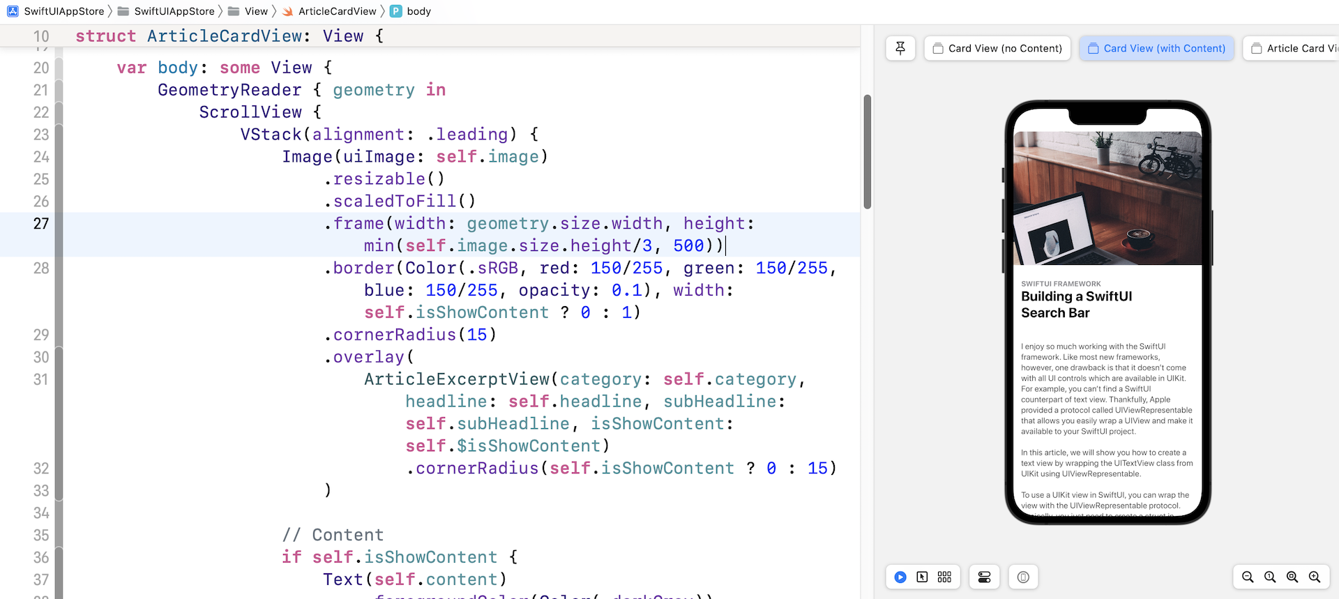
Using GeometryReader
It seems everything works great. But if you try to preview the card view with another sample article (say, sampleArticles[1]), the UI doesn't look good. Both the featured image and the content go beyond the screen edge.
Let's look at our code again. For the Image view, we only limited the height of the image, we don't have any limits on its width:
.frame(height: min(self.image.size.height/3, 500))
To fix the issue, we have to set the frame's width and ensure it doesn't exceed the width of the screen. The question is how do you find out the screen width? SwiftUI provides a container view called GeometryReader which lets you access the size of its parent view. Therefore, we need to embed the ScrollView within a GeometryReader like this:
var body: some View {
    GeometryReader { geometry in
        ScrollView {
            VStack(alignment: .leading) {
                .
                .
                .
            }
        }
        .shadow(color: Color(.sRGB, red: 64/255, green: 64/255, blue: 64/255, opacity: 0.3), radius: self.isShowContent ? 0 : 15)
    }
}
Within the closure of GeometryReader, it has a parameter that provides you with extra information about the view such as size and position. So, to limit the width of the frame to the size of the screen, you can modify the .frame modifier like this:
.frame(width: geometry.size.width, height: min(self.image.size.height/3, 500))
In the code, we set the width equal to that of the screen. Once you complete the change, the card view should look great.
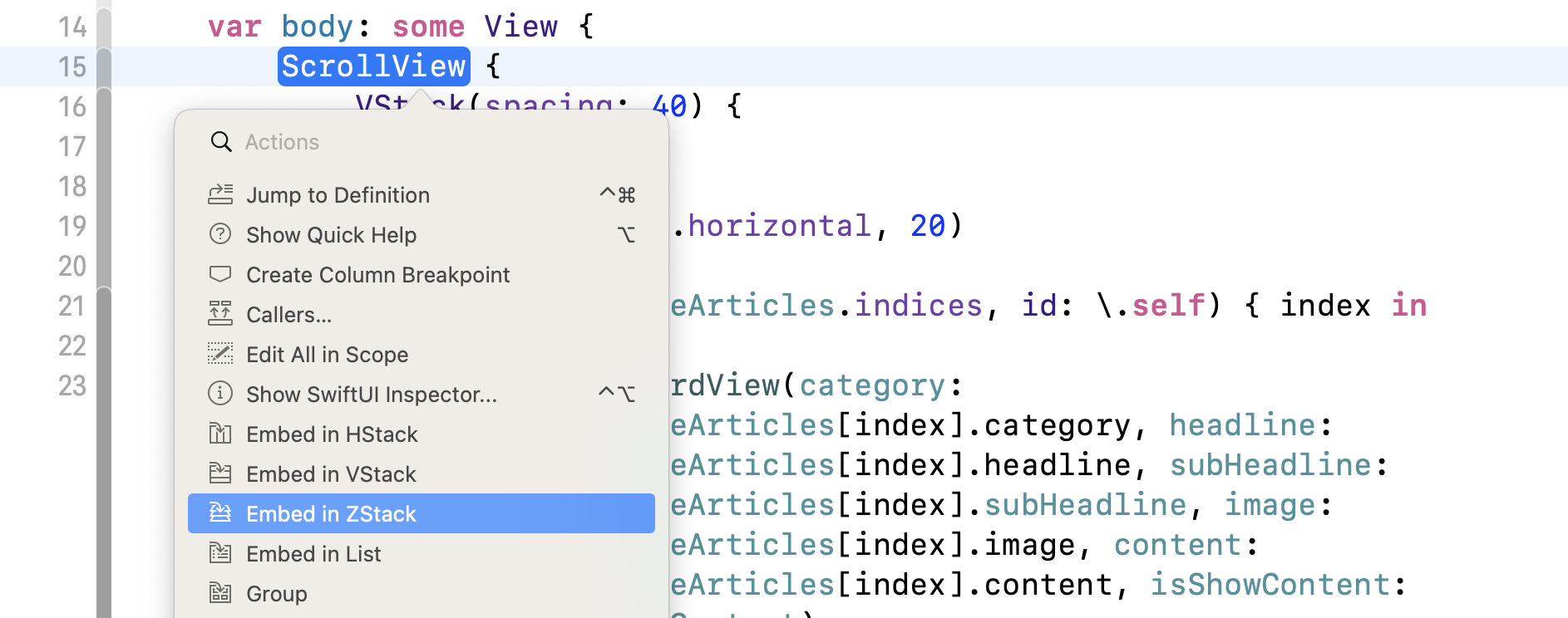
Adding the close button
The card view is almost done, but there is still one thing left. We haven't implemented the close button yet. To overlay the button on top of the image, we will embed the scroll view in a ZStack. You can modify the code directly to add the ZStack or let's show you another way to do that.
Hold the command key and click on ScrollView, you should then see a context menu. Choose Embed in ZStack to embed the scroll view in a ZStack.
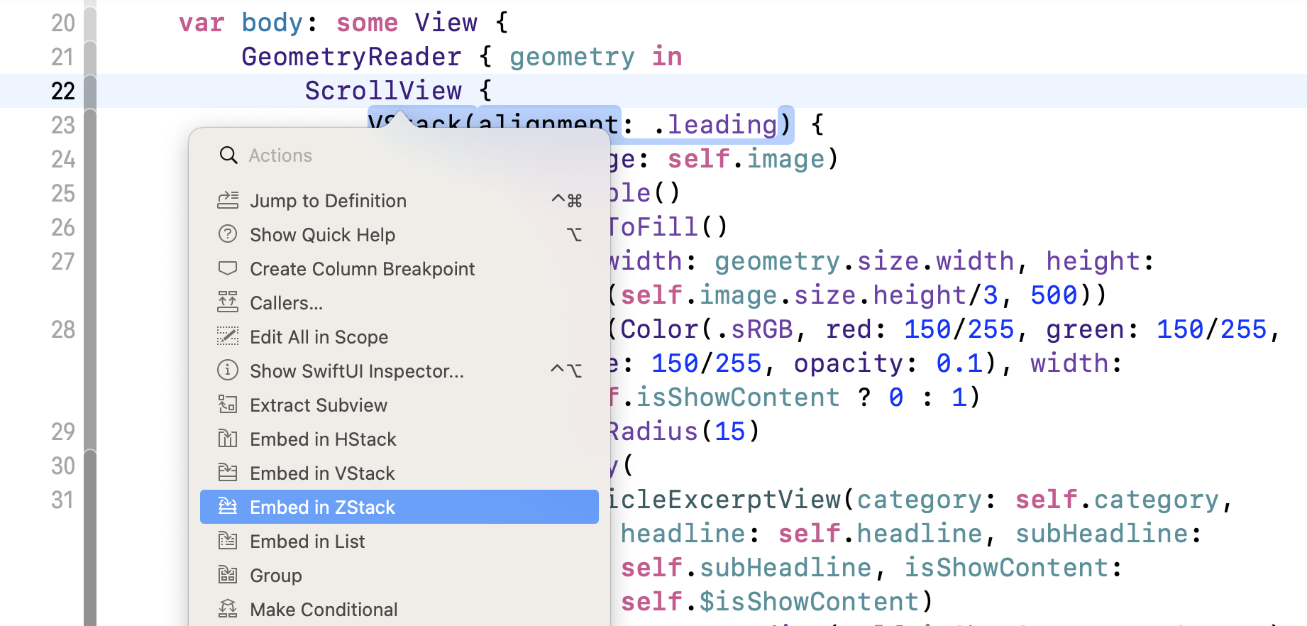
Xcode will automatically indent the code and embed the scroll view in the ZStack. Now change ZStack to set its alignment to .topTrailing because we want to place the close button near the top-right corner. Your code should look like this:
var body: some View {
    GeometryReader { geometry in
        ZStack(alignment: .topTrailing) {
            ScrollView {
                VStack(alignment: .leading) {
                    .
                    .
                    .
                }
            }
            .shadow(color: Color(.sRGB, red: 64/255, green: 64/255, blue: 64/255, opacity: 0.3), radius: self.isShowContent ? 0 : 15)
        }
    }
}
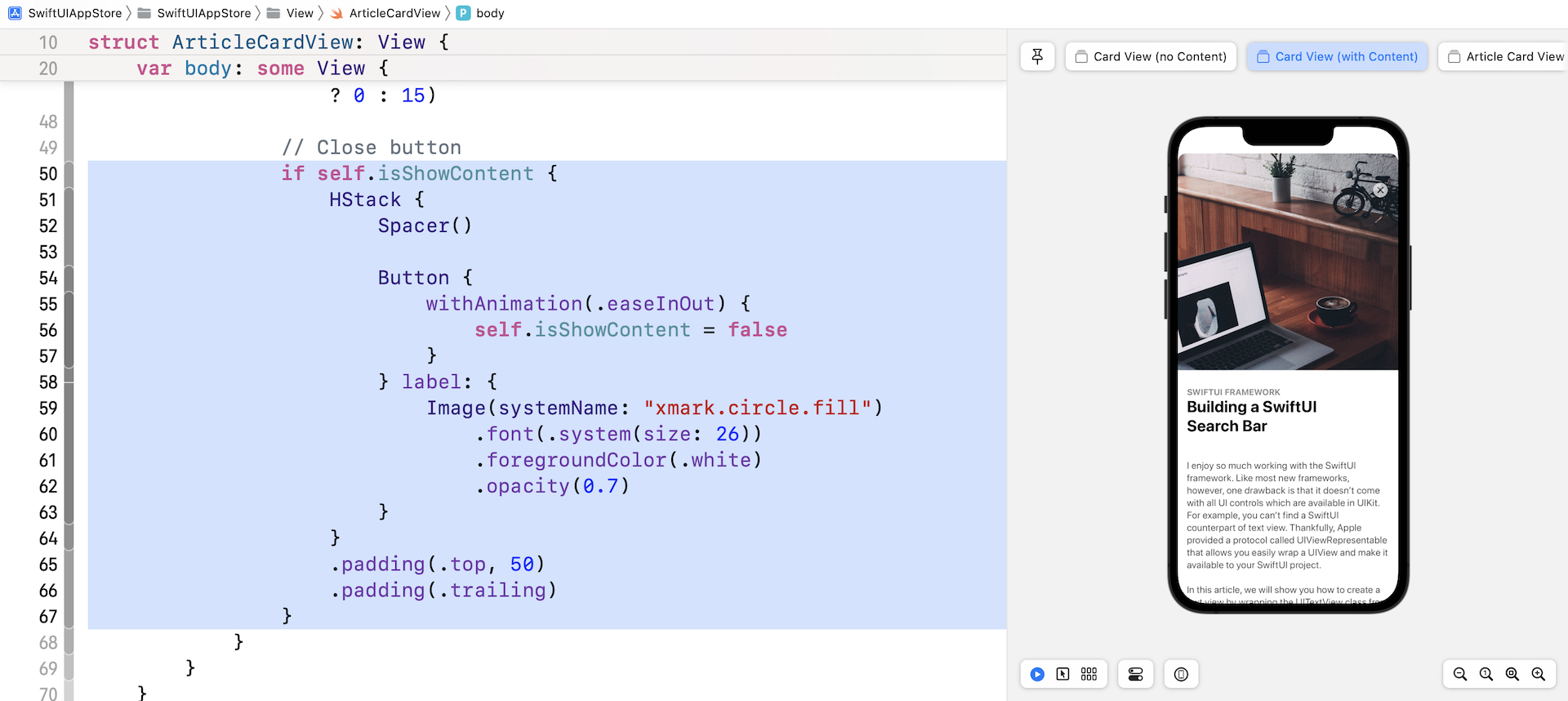
Next, insert the following code right below the .shadow modifier to add the close button:
if self.isShowContent {
    HStack {
        Spacer()

        Button {
              withAnimation(.easeInOut) {
                self.isShowContent = false
            }
        } label: {
            Image(systemName: "xmark.circle.fill")
                .font(.system(size: 26))
                .foregroundColor(.white)
                .opacity(0.7)
        }
    }
    .padding(.top, 50)
    .padding(.trailing)
}
After the modification, the preview should display the close button when the value of isShowContent is set to true.
Building the List View
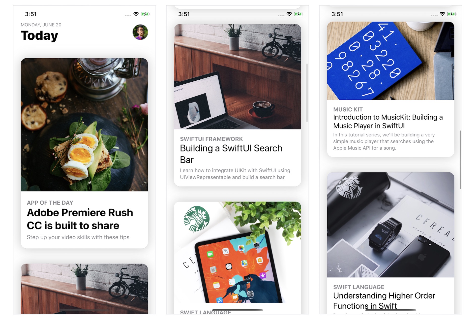
Now that we've implemented the layout of the card view, let's switch over to ContentView.swift and create the list view. At the very top of the list view, is the top bar with a heading and a profile photo.

I believe you should know how to create the layout by using VStack and HStack. To better organize the code, I will create the top bar and the avatar in two separate structs. Insert the following code in ContentView.swift:
struct TopBarView : View {

    var body: some View {
        HStack(alignment: .lastTextBaseline) {
            VStack(alignment: .leading) {
                Text(getCurrentDate().uppercased())
                    .font(.caption)
                    .foregroundColor(.secondary)
                Text("Today")
                    .font(.largeTitle)
                    .fontWeight(.heavy)
            }

            Spacer()

            AvatarView(image: "profile", width: 40, height: 40)

        }
    }

    func getCurrentDate(with format: String = "EEEE, MMM d") -> String {
        let dateFormatter = DateFormatter()
        dateFormatter.dateFormat = format
        return dateFormatter.string(from: Date())
    }
}

struct AvatarView: View {
    let image: String
    let width: CGFloat
    let height: CGFloat

    var body: some View {
        Image(image)
            .resizable()
            .frame(width: width, height: height)
            .clipShape(Circle())
            .overlay(Circle().stroke(Color.gray, lineWidth: 1))
    }
}
Next, update the code of ContentView like this:
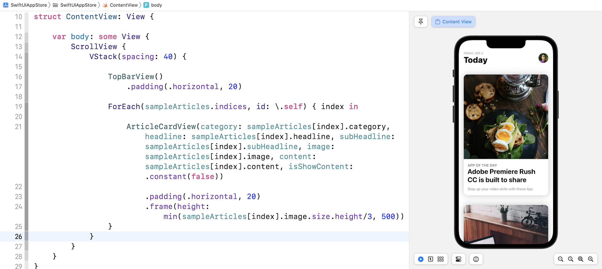
struct ContentView: View {

    var body: some View {
        ScrollView {
            VStack(spacing: 40) {

                TopBarView()
                    .padding(.horizontal, 20)

                ForEach(sampleArticles.indices, id: \.self) { index in

                    ArticleCardView(category: sampleArticles[index].category, headline: sampleArticles[index].headline, subHeadline: sampleArticles[index].subHeadline, image: sampleArticles[index].image, content: sampleArticles[index].content, isShowContent: .constant(false))

                        .padding(.horizontal, 20)
                        .frame(height: min(sampleArticles[index].image.size.height/3, 500))
                }
            }
        }
    }
}
We embed a VStack in a ScrollView to create the vertical scroll view. In the code block, we loop through all the sampleArticles using ForEach and create an ArticleCardView for each article. If your code works properly, the preview canvas should show you a list of articles.
Expanding the Card View to Full Screen Using MatchedGeometryEffect
Now it comes to the hard part. How do you switch the card view from excerpt mode to full content mode? Right now, we set the isShowContent parameter to .constant(false). To switch between these two modes, we need to have a variable to keep track of its state.
Therefore, declare the following state variable in ContentView:
@State private var showContent = false
By default, all card views are in the excerpt state. Thus, the value of the showContents variable is set to false. Later, when a card is tapped, we will change the state from false to true.
We also need a variable to keep track of the index of the selected card. Declare one more state variable:
@State private var selectedArticleIndex: Int?
It's defined as an optional because no card view is initially selected.
Now, modify the initialization of ArticleCardView. Instead of using .constant(false), pass it the binding of the state variable (i.e. $showContent):
ArticleCardView(category: sampleArticles[index].category, headline: sampleArticles[index].headline, subHeadline: sampleArticles[index].subHeadline, image: sampleArticles[index].image, content: sampleArticles[index].content, isShowContent: $showContent)
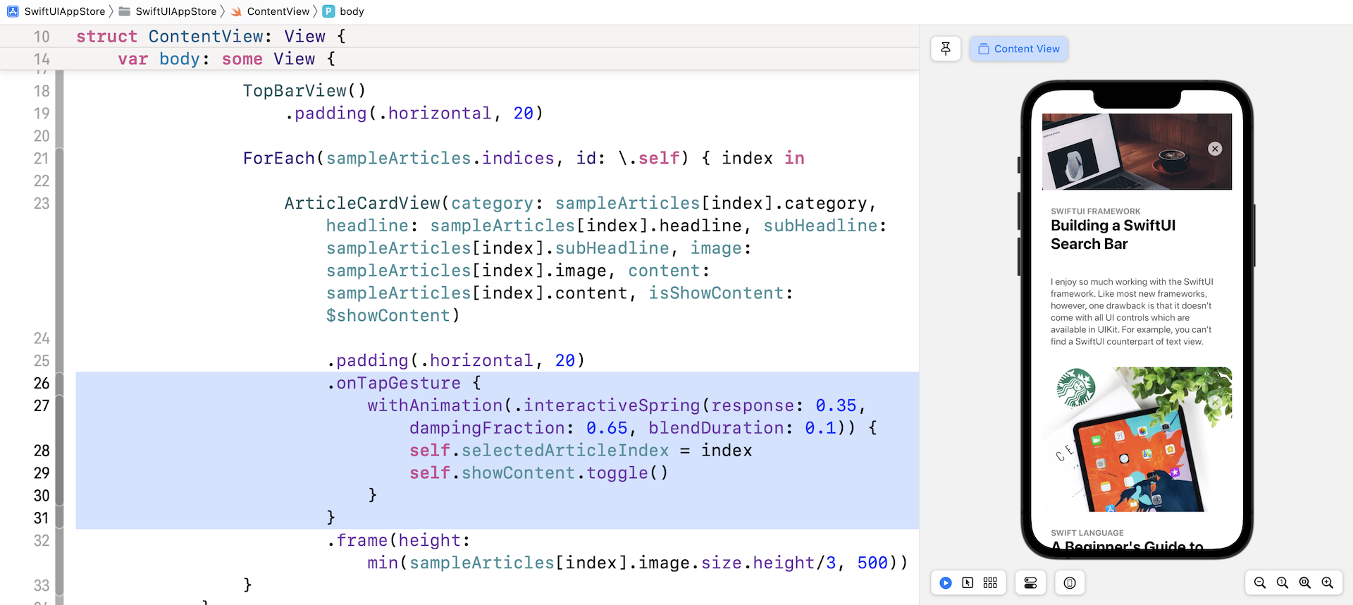
Handling the Tap Gesture
When the user taps one of the card views, the selected card should be changed to full screen mode. To capture the tap gesture, attach the .onTapGesture modifier to ArticleCardView and place it below .padding(.horizontal, 20):
.onTapGesture {
    withAnimation(.interactiveSpring(response: 0.35, dampingFraction: 0.65, blendDuration: 0.1)) {
        self.selectedArticleIndex = index
        self.showContent.toggle()
    }
}
When a tap gesture is detected, we change the showContent variable from false to true. At the same time, we save the index of the selected card view.
Let's have a quick test to see how the app functions after making the changes. When you run the app in the preview canvas, tap any of the card views to see the result. Though it doesn't work as expected, the card view should show the content of the article and hide the sub-headline. Additionally, you should be able to tap the close button to return to the excerpt mode. If you can't see the content, drag up the card view to reveal it.
Animating the Transition using MatchedGeometryEffect
How can we expand the selected card view to a full-screen card view and animate the transition? In chapter 33, I introduced a modifier called matchedGeometryEffect. With this powerful modifier, you can describe the appearance of the initial view and the final view. matchedGeometryEffect then compute the difference between these two views and automatically animates the size & position change.
Note: If you haven't read chapter 33, please go through the chapter first.
In this demo, the initial view is the card view in excerpt mode, while the final view is the card view showing the full content. What we are going to do is to embed the current scroll view in a ZStack view. Initially, the app displays the list of card view. When the user taps any of the card views, we overlay the full content view on top of the existing scroll view.
Now hold the command key and click ScrollView. Choose Embed in ZStack.
Set the alignment parameter of the ZStack view to .top like this:
ZStack(alignment: .top) {

  ScrollView {
    .
    .
    .
  }

}
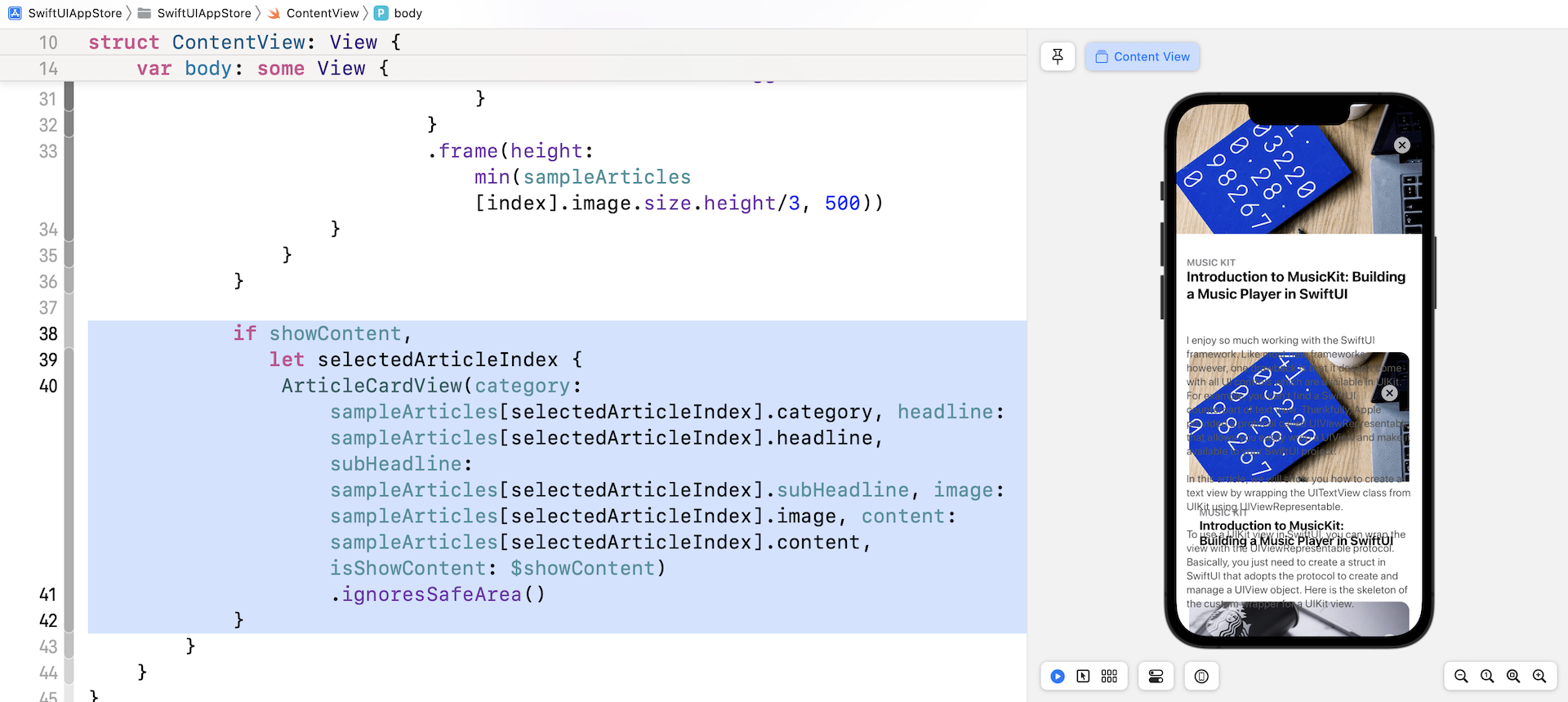
Next, insert the following code after the closing bracket of the scroll view:
if showContent,
   let selectedArticleIndex {
    ArticleCardView(category: sampleArticles[selectedArticleIndex].category, headline: sampleArticles[selectedArticleIndex].headline, subHeadline: sampleArticles[selectedArticleIndex].subHeadline, image: sampleArticles[selectedArticleIndex].image, content: sampleArticles[selectedArticleIndex].content, isShowContent: $showContent)
        .ignoresSafeArea()
}
When a user taps one of the card views, the value of showContent is changed to true and selectedArticleIndex is set to the index of the selected card view. In this case, we display the card view in full content mode by setting the isShowContent parameter to true.
If you test the app in the preview pane, tapping a card view will expand its content to full screen.
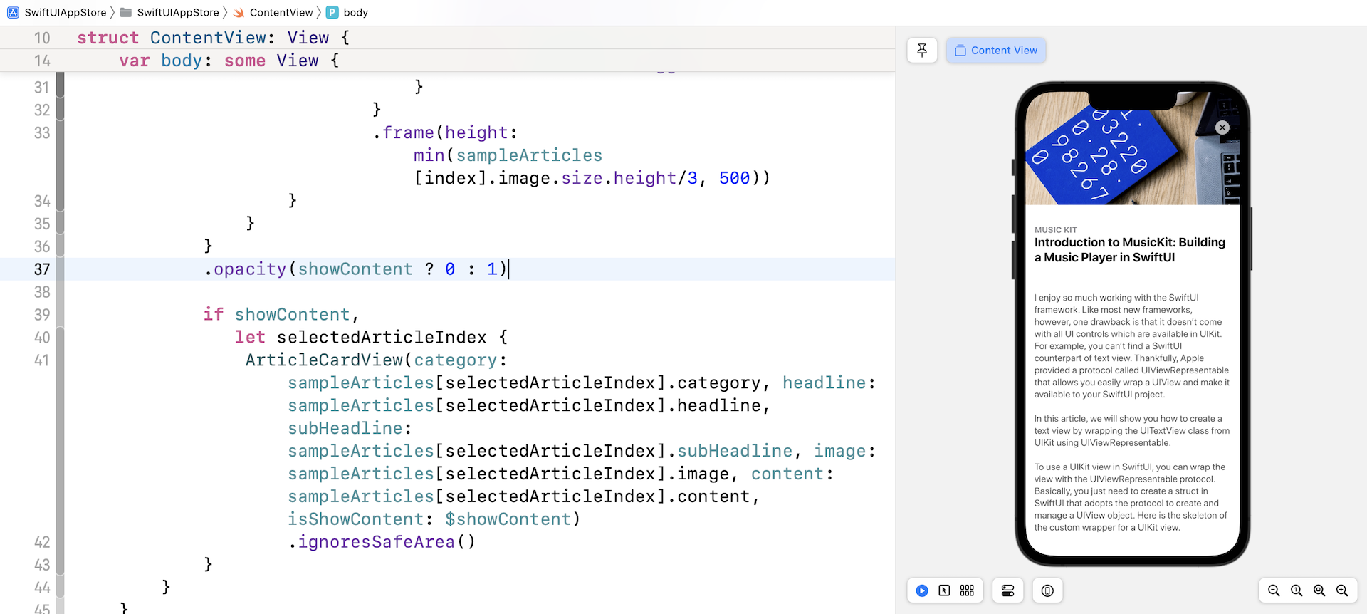
It works but the result doesn't look good. The list behind the full-content card view is still visible. We need to hide it away when any of the card views is selected. To fix the issue, attach a opacity modifier to ScrollView:
.opacity(showContent ? 0 : 1)
When the app is showing full content of a card view, we set the opacity of the scroll view to 0. Test the app again. The card view should display full content properly.
The last thing we need to do is to animate the transition. As explained at the beginning of this section, we can make use of the matchedGeometryEffect modifier to let SwiftUI render the transition animation.
To use the modifier, we first have to define a namespace variable:
@Namespace var nsArticle
Next, attach the matchedGeometryEffect modifier to the ArticleCardView in the ForEach loop:
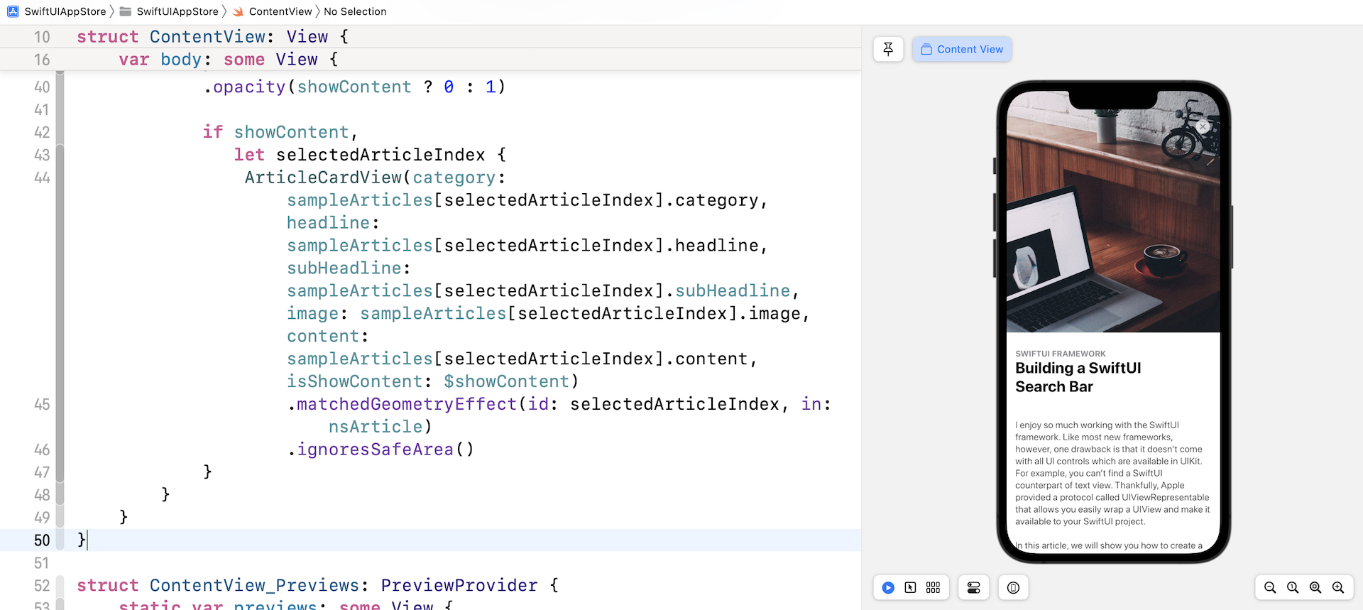
.matchedGeometryEffect(id: index, in: nsArticle)
You can place the line of code above before the onTapGesture modifier. For the ArticleCardView, attach another matchedGeometryEffect modifier and use the same namespace (insert it above the ignoresSafeArea modifier):
.matchedGeometryEffect(id: selectedArticleIndex, in: nsArticle)
The matchedGeometryEffect modifier works in pairs. By doing the implementation above, SwiftUI automatically computes the view transition animation.
Enlarging the Image
We haven't finished the implementation yet. Next up is the featured image. In full content mode, I want to make the image a bit larger. This is an easy fix. Just switch over to ArticleCardView.swift and change the .frame modifier of the Image view like this:
.frame(width: geometry.size.width, height: self.isShowContent ? geometry.size.height * 0.7 : min(self.image.size.height/3, 500))
When the card view is displaying the article content, the height of the image is now adjusted to 70% of the screen height. You may alter the value to suit your preference. Now go back to ContentView.swift and test the change. The featured image becomes larger in full content mode.
Run the app in the simulator or in the preview canvas. You will see a slick animation when the card view expands to full screen.
Summary
Congratulations! You've built an App Store like animation using SwiftUI. After implementing this demo project, I hope you understand how to create complex view animations.
Animation is an essential part of the UI these days. As you can see, SwiftUI has made it very easy for developers to build some beautiful animations and screen transitions. In your next app project, don't forget to apply the techniques you learned in this chapter to improve the user experience of your app.
For reference, you can download the complete project here: