- Made by AppCoda
- Contact us / Support
- Tweet this book
- Preface
- 1. Introduction to SwiftUI
- 2. Getting Started with SwiftUI and Working with Text
- 3. Working with Images
- 4. Layout User Interfaces with Stacks
- 5. Understanding ScrollView and Building a Carousel UI
- 6. Working with SwiftUI Buttons and Gradient
- 7. Understanding State and Binding
- 8. Implementing Path and Shape for Line Drawing and Pie Charts
- 9. Basic Animations and Transitions
- 10. Understanding Dynamic List, ForEach and Identifiable
- 11. Working with Navigation UI and Navigation Bar Customization
- 12. Playing with Modal Views, Floating Buttons and Alerts
- 13. Building a Form with Picker, Toggle and Stepper
- 14. Data Sharing with Combine and Environment Objects
- 15. Building a Registration Form with Combine and View Model
- 16. Working with Swipe-to-Delete, Context Menu and Action Sheets
- 17. Using Gestures
- 18. Displaying an Expandable Bottom Sheet Using Presentation Detents
- 19. Creating a Tinder-like UI with Gestures and Animations
- 20. Creating an Apple Wallet like Animation and View Transition
- 21. Working with JSON, Slider and Data Filtering
- 22. Building a ToDo app with Core Data
- 23. Integrating UIKit with SwiftUI Using UIViewRepresentable
- 24. Creating a Search Bar View and Working with Custom Binding
- 25. Putting Everything Together to Build a Real World App
- 26. Creating an App Store like Animated View Transition
- 27. Building an Image Carousel
- 28. Building an Expandable List View Using OutlineGroup
- 29. Building Grid Layout Using LazyVGrid and LazyHGrid
- 30. Creating an Animated Activity Ring with Shape and Animatable
- 31. Working with AnimatableModifier and LibraryContentProvider
- 32. Working with TextEditor to Create Multiline Text Fields
- 33. Using matchedGeometryEffect to Create View Animations
- 34. ScrollViewReader and Grid Animation
- 35. Working with Tab View and Tab Bar Customization
- 36. Using AsyncImage in SwiftUI for Loading Images Asynchronously
- 37. Implementing Search Bar Using Searchable
- 38. Creating Bar Charts and Line Charts with the Charts Framework
- 39. Capturing Text within Image Using Live Text APIs
- 40. How to Use ShareLink for Sharing Data Like Text and Photos
- 41. Using ImageRenderer to Convert SwiftUI Views into Images
- 42. Creating PDF Documents Using ImageRenderer
- 43. Using Gauge to Display Progress and Create a Speedometer
- 44. Creating Grid Layout Using Grid APIs
- 45. Switching Layout with AnyLayout
- Published with GitBook
Chapter 7
Understanding State and Binding
State management is something every developer has to deal with in application development. Imagine that you are developing a music player app. When a user taps the Play button, the button will change itself to a Stop button. In your implementation, there must be some way to keep track of the application's state so that you know when to change the button's appearance.

SwiftUI comes with a few built-in features for state management. In particular, it introduces a property wrapper named @State. When you annotate a property with @State, SwiftUI automatically stores it somewhere in your application. What's more, views that make use of that property automatically listen to the value change of the property. When the state changes, SwiftUI will recompute those views and update the application's appearance.
Doesn't it sound great? Or are you a bit confused with state management?
You will get a better understanding of state and binding after going through the coding examples in this chapter and a couple of exercises I’ve prepared for you. Please take some time to work on these. It will help you master this important concept of SwiftUI.
Creating a New Project with SwiftUI enabled
Let's start with a simple example that I just described earlier to see how to switch between a Play button and a Stop button, by keeping track of the application's state. First, fire up Xcode and create a new project using the App template. Set the name of the project to SwiftUIState but you're free to use any other name. Please make sure SwiftUI is selected as the Interface option.
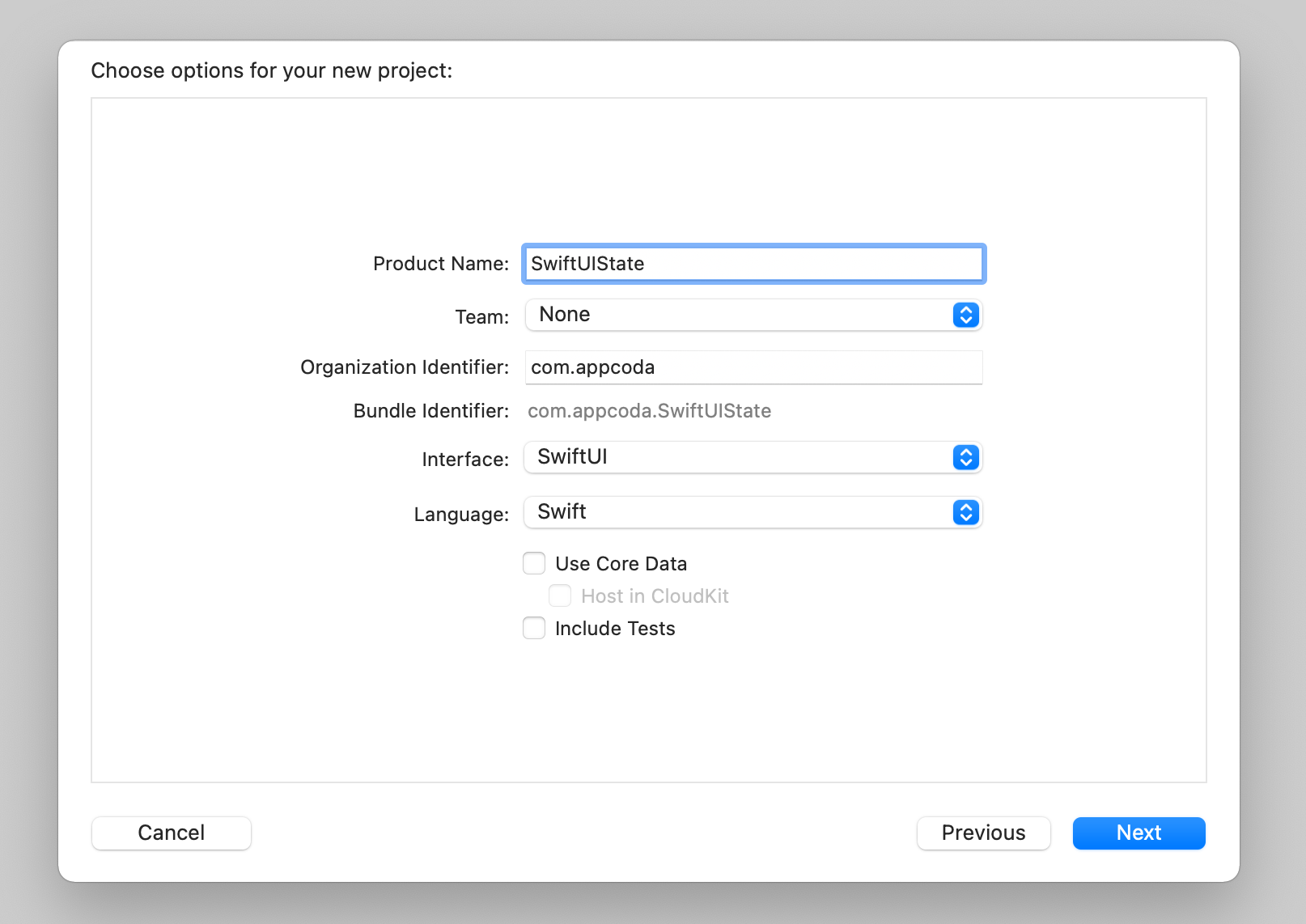
Once you save the project, Xcode loads the ContentView.swift file and display a preview in the preview canvas. Create the Play button like this:
Button {
    // Switch between the play and stop button
} label: {
    Image(systemName: "play.circle.fill")
        .font(.system(size: 150))
        .foregroundColor(.green)
}
We make use of the system image play.circle.fill and color the button green.
Controlling the Button's State
The button's action is empty. We want to change its appearance from Play to Stop when someone taps the button. The color of the button should also be changed to red when the stop button is displayed.
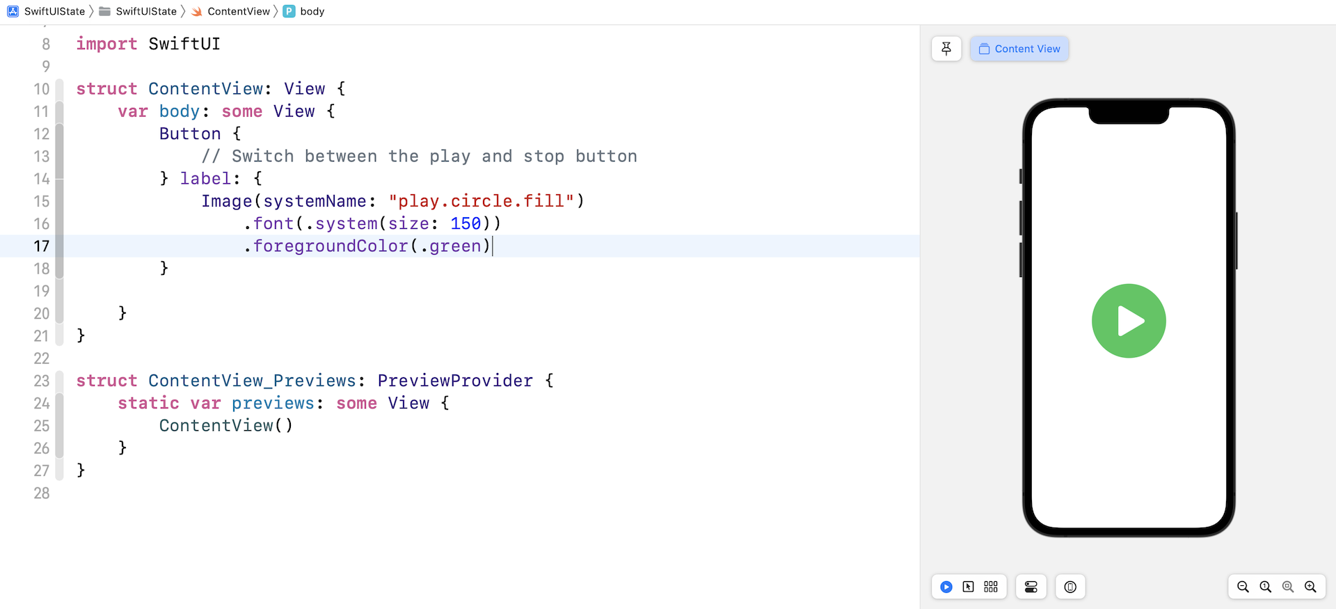
So, how can we implement that? Obviously, we need a variable to keep track of the button's state. Let's name it isPlaying. It's a boolean variable indicating whether the app is in the Playing state or not. If isPlaying is set to true, the app should show a Stop button. If isPlaying is set to false, the app shows a Play button. The code is written like this:
struct ContentView: View {
    private var isPlaying = false

    var body: some View {
        Button {
            // Switch between the play and stop button
        } label: {
            Image(systemName: isPlaying ? "stop.circle.fill" : "play.circle.fill")
                .font(.system(size: 150))
                .foregroundColor(isPlaying ? .red : .green)
        }
    }
}
We change the image's name and color by referring the value of the isPlaying variable. If you update the code in your project, you should see a Play button in the preview canvas. However, if you set the default value of isPlaying to true, you would see a Stop button.
Now the question is how can the app monitor the change of the state (i.e. isPlaying) and update the button automatically? With SwiftUI, all you need to do is prefix the isPlaying property with @State:
@State private var isPlaying = false
Once we declare the property as a state variable, SwiftUI manages the storage of isPlaying and monitors its value change. When the value of isPlaying changes, SwiftUI automatically recomputes the views that are referencing the isPlaying state.
Only access a state property from inside the view’s body (or from functions called by it). For this reason, you should declare your state properties as
private, to prevent clients of your view from accessing it- Apple's official documentation (https://developer.apple.com/documentation/swiftui/state)
We still haven't implemented the button's action. So, let's do that now:
Button {
    // Switch between the play and stop button
    isPlaying.toggle()
} label: {
    Image(systemName: isPlaying ? "stop.circle.fill" : "play.circle.fill")
        .font(.system(size: 150))
        .foregroundColor(isPlaying ? .red : .green)
}
In the action closure, we call the toggle() method to toggle the Boolean value from false to true or from true to false. In the preview canvas, click the play icon to toggle between the Play and Stop button.
Did you notice that SwiftUI renders a fade animation when you toggle between the buttons? This animation is built-in and automatically generated for you. We will talk more about animations in later chapters of the book, but as you can see, SwiftUI makes UI animation more approachable for all developers.
Exercise #1
Your exercise is to create a counter button which shows the number of taps. When a user taps the button, the counter will increase by one and display the total number of taps.

Working with Binding
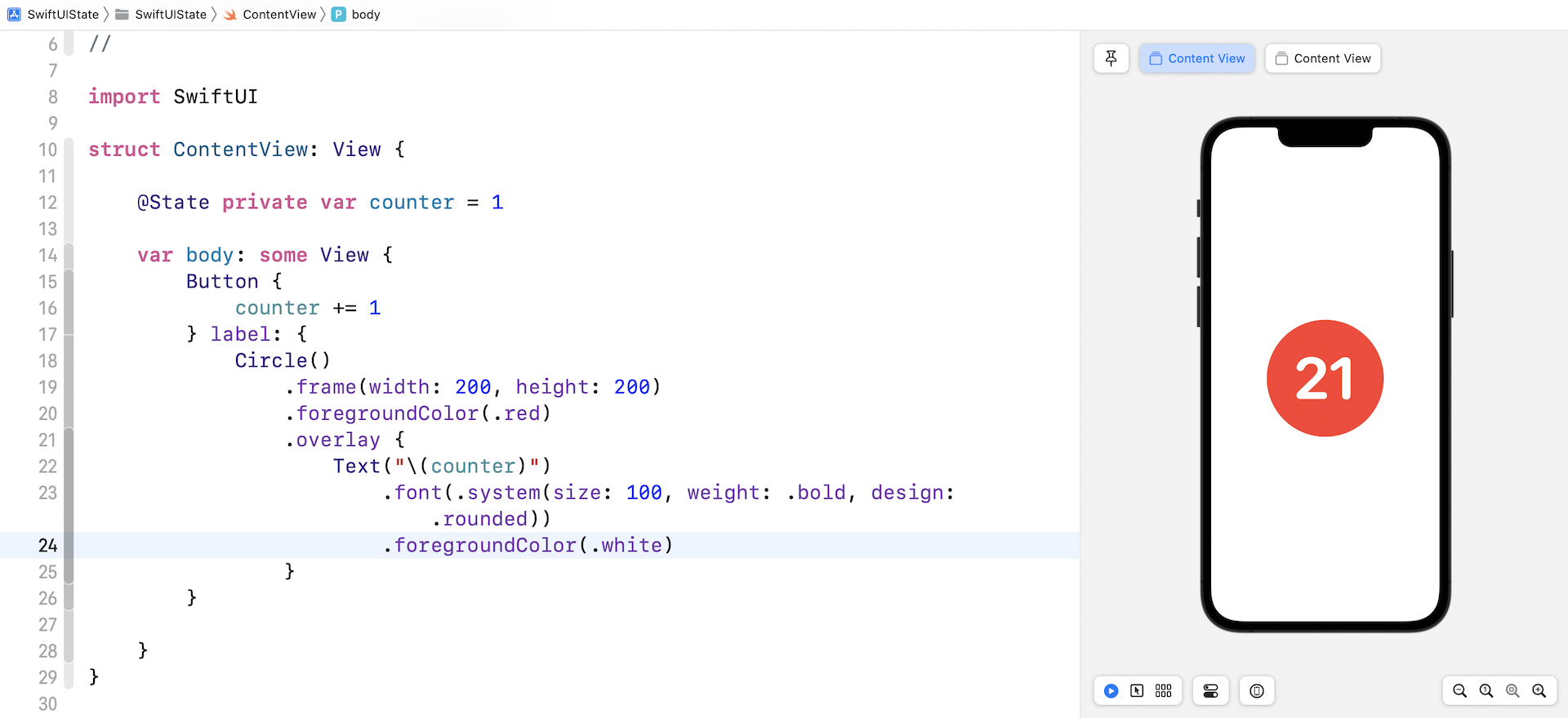
Were you successful in creating the counter button? Instead of declaring a boolean variable as a state, we use an integer state variable to keep track of the count. When the button is tapped, the counter will increase by 1. Figure 6 shows the code snippet to achieve this.
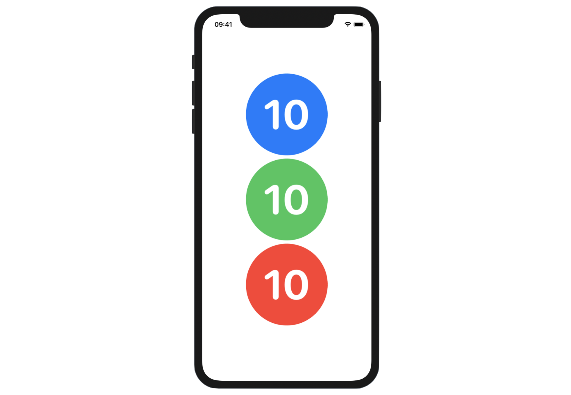
Now we will further modify the code to display three counter buttons (see figure 7). All three buttons share the same counter. No matter which button is tapped, the counter will increase by 1 and all the buttons will be invalidated to display the updated count.
As you can see, all the buttons share the same look & feel. As I've explained in earlier chapters, rather than duplicating the code, it's always a good practice to extract a common view into a reusable subview. We can extract the Button view to create an independent subview like this:
struct CounterButton: View {
    @Binding var counter: Int

    var color: Color

    var body: some View {
        Button {
            counter += 1
        } label: {
            Circle()
                .frame(width: 200, height: 200)
                .foregroundColor(color)
                .overlay {
                    Text("\(counter)")
                        .font(.system(size: 100, weight: .bold, design: .rounded))
                        .foregroundColor(.white)
                }
        }
    }
}
The CounterButton view accepts two parameters: counter and color. You can create a button in red like this:
CounterButton(counter: $counter, color: .red)
You should notice that the counter variable is annotated with @Binding. When you create a CounterButton instance, the value of the counter parameter is prefixed by a $ sign.
What do they mean?
After we extract the button into a separate view, CounterButton becomes a subview of ContentView. The counter increment is now performed in the CounterButton view instead of the ContentView. The CounterButton must have a way to manage the state variable in the ContentView.
The @Binding keyword indicates that the caller must provide the binding of the state variable. It's just like creating the two-way connection between the counter in the ContentView and the counter in the CounterButton. Updating counter in the CounterButton view propagates its value back to the counter state in the ContentView.
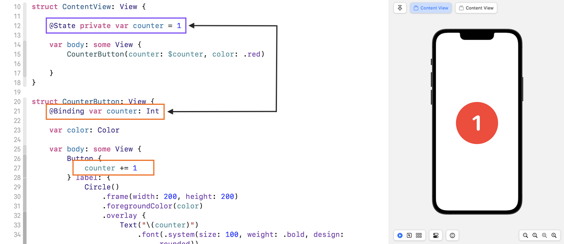
So, what's the $ sign? In SwiftUI, you use the $ prefix operator to get the binding from a state variable.
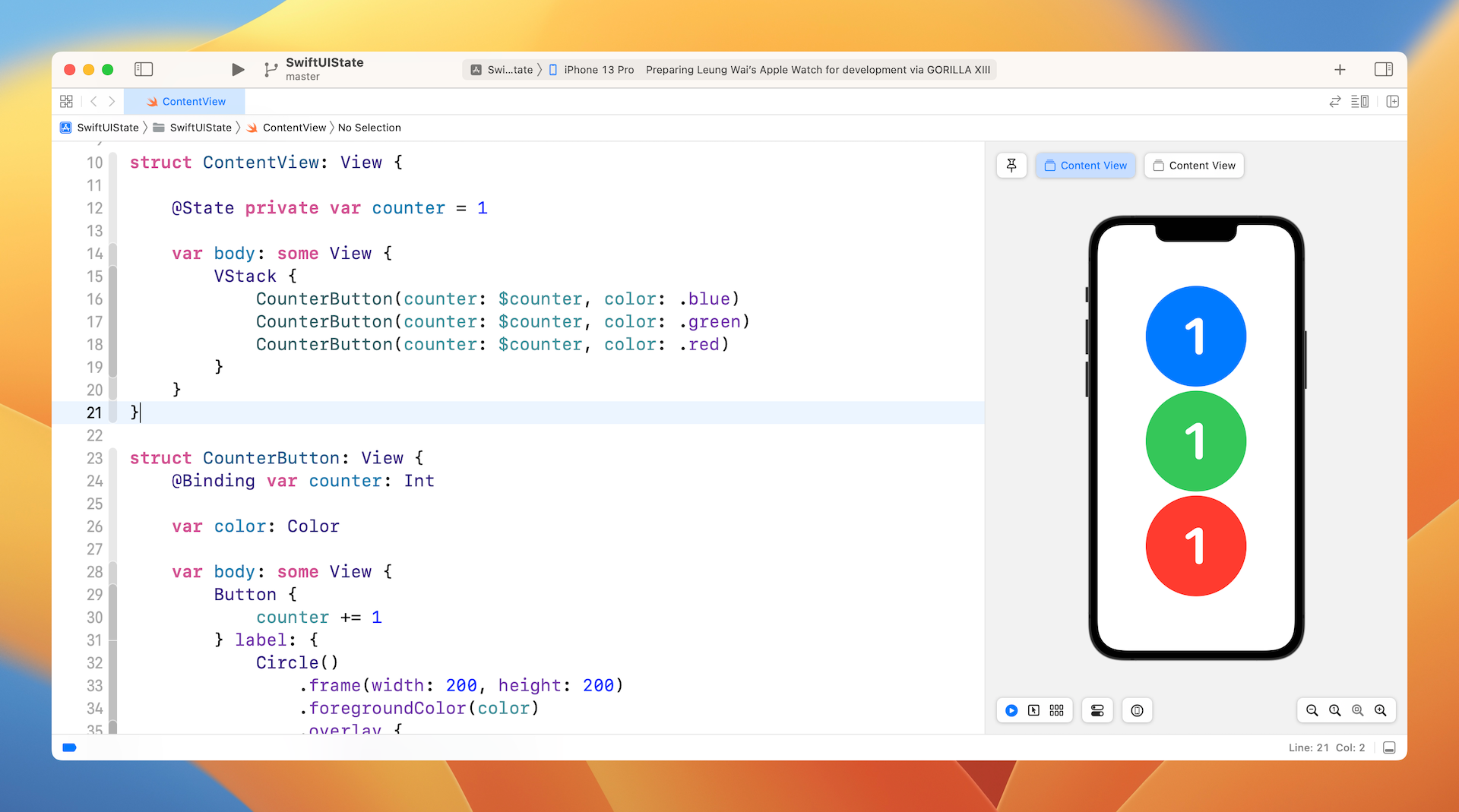
Now that you understand how binding works, you can continue to create the other two buttons and align them vertically using VStack like this:
struct ContentView: View {

    @State private var counter = 1

    var body: some View {
        VStack {
            CounterButton(counter: $counter, color: .blue)
            CounterButton(counter: $counter, color: .green)
            CounterButton(counter: $counter, color: .red)
        }
    }
}
After the changes, run the app to test it. Tapping any of the buttons will increase the count by one.
Exercise #2
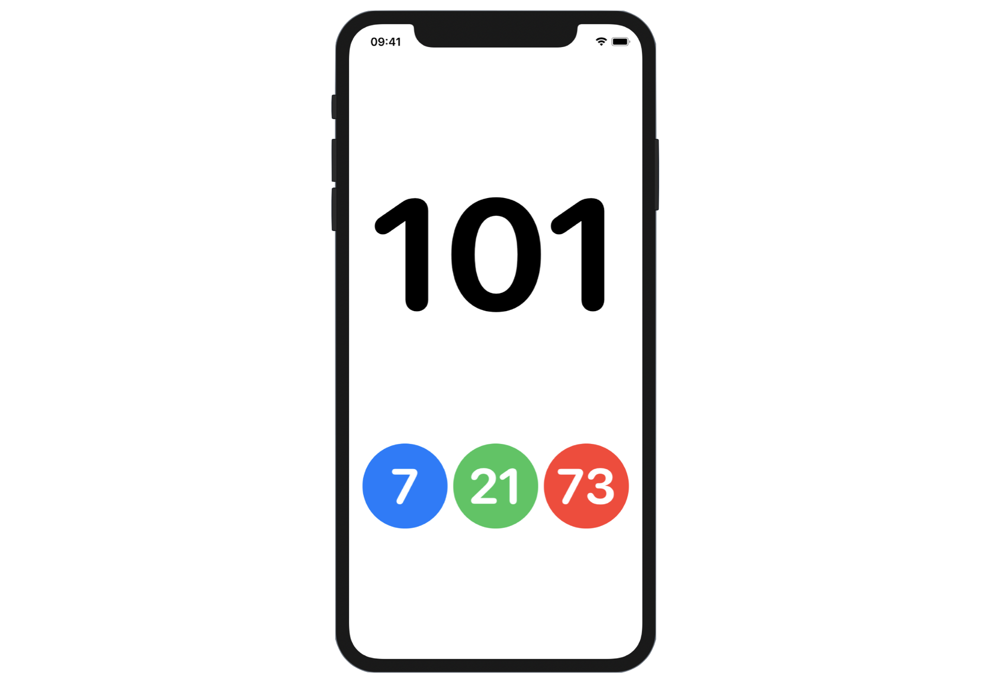
Presently, all the buttons share the same count. For this exercise, you are required to modify the code such that each of the buttons has its own counter. When the user taps the blue button, the app only increases the counter of the blue button by 1. In addition, you will need to provide a master counter that sums up the counter of all buttons. Figure 10 shows the sample layout for the exercise..
Summary
The support of State in SwiftUI simplifies state management in application development. It's important you understand what @State and @Binding mean because they play a big part in SwiftUI for managing states and UI updates. This chapter kicks off the basics of state management in SwiftUI. Later, you will learn more about how we can utilize @State in view animation and how to manage shared states among multiple views.
For reference, you can download the sample state project below: