- Made by AppCoda
- Contact us / Support
- Tweet this book
- Preface
- 1. Introduction to SwiftUI
- 2. Getting Started with SwiftUI and Working with Text
- 3. Working with Images
- 4. Layout User Interfaces with Stacks
- 5. Understanding ScrollView and Building a Carousel UI
- 6. Working with SwiftUI Buttons and Gradient
- 7. Understanding State and Binding
- 8. Implementing Path and Shape for Line Drawing and Pie Charts
- 9. Basic Animations and Transitions
- 10. Understanding Dynamic List, ForEach and Identifiable
- 11. Working with Navigation UI and Navigation Bar Customization
- 12. Playing with Modal Views, Floating Buttons and Alerts
- 13. Building a Form with Picker, Toggle and Stepper
- 14. Data Sharing with Combine and Environment Objects
- 15. Building a Registration Form with Combine and View Model
- 16. Working with Swipe-to-Delete, Context Menu and Action Sheets
- 17. Using Gestures
- 18. Displaying an Expandable Bottom Sheet Using Presentation Detents
- 19. Creating a Tinder-like UI with Gestures and Animations
- 20. Creating an Apple Wallet like Animation and View Transition
- 21. Working with JSON, Slider and Data Filtering
- 22. Building a ToDo app with Core Data
- 23. Integrating UIKit with SwiftUI Using UIViewRepresentable
- 24. Creating a Search Bar View and Working with Custom Binding
- 25. Putting Everything Together to Build a Real World App
- 26. Creating an App Store like Animated View Transition
- 27. Building an Image Carousel
- 28. Building an Expandable List View Using OutlineGroup
- 29. Building Grid Layout Using LazyVGrid and LazyHGrid
- 30. Creating an Animated Activity Ring with Shape and Animatable
- 31. Working with AnimatableModifier and LibraryContentProvider
- 32. Working with TextEditor to Create Multiline Text Fields
- 33. Using matchedGeometryEffect to Create View Animations
- 34. ScrollViewReader and Grid Animation
- 35. Working with Tab View and Tab Bar Customization
- 36. Using AsyncImage in SwiftUI for Loading Images Asynchronously
- 37. Implementing Search Bar Using Searchable
- 38. Creating Bar Charts and Line Charts with the Charts Framework
- 39. Capturing Text within Image Using Live Text APIs
- 40. How to Use ShareLink for Sharing Data Like Text and Photos
- 41. Using ImageRenderer to Convert SwiftUI Views into Images
- 42. Creating PDF Documents Using ImageRenderer
- 43. Using Gauge to Display Progress and Create a Speedometer
- 44. Creating Grid Layout Using Grid APIs
- 45. Switching Layout with AnyLayout
- Published with GitBook
Chapter 11
Working with Navigation UI and Navigation Bar Customization
In most apps, you will have experienced a navigational interface. This kind of UI tyically has a navigation bar and a list of data. It allows users navigate to a detail view when tapping the content.
In UIKit, we implement this type of interface using UINavigationController. For SwiftUI, Apple calls it NavigationView and now in iOS 16, it's known as NavigationStack. In this chapter, I will walk you through the implementation of navigation views and show you how to perform some customizations. As usual, we will work on a couple of demo projects so you'll get some hands on experience with NavigationStack.
Preparing the Starter Project
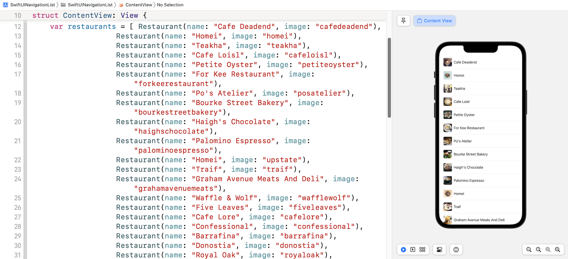
Let's get started and implement a demo project that we have built earlier with a navigation UI. So, first download the starter project from https://www.appcoda.com/resources/swiftui4/SwiftUINavigationListStarter.zip. Once downloaded, open the project and check out the preview. You should be very familiar with this demo app. It just displays a list of restaurants.
What we're going to do is embed this list view in a navigation stack.
Implementing a Navigation Stack
Prior to iOS 16, the SwiftUI framework provides a view called NavigationView for you to create a navigation UI. To embed the list view in a NavigationView, all you need to do is wrap the List with a NavigationView like this:
NavigationView {
    List {
        ForEach(restaurants) { restaurant in
            BasicImageRow(restaurant: restaurant)
        }
    }
    .listStyle(.plain)
}
In iOS 16, Apple replaced the NavigationView with NavigationStack. You can still use NavigationView to create a navigation view. But it's recommended to use NavigationStack because NavigationView will eventually be removed from the SDK.
To create a navigation view using NavigationStack, you can write the same piece of code like this:
NavigationStack {
    List {
        ForEach(restaurants) { restaurant in
            BasicImageRow(restaurant: restaurant)
        }
    }
    .listStyle(.plain)
}
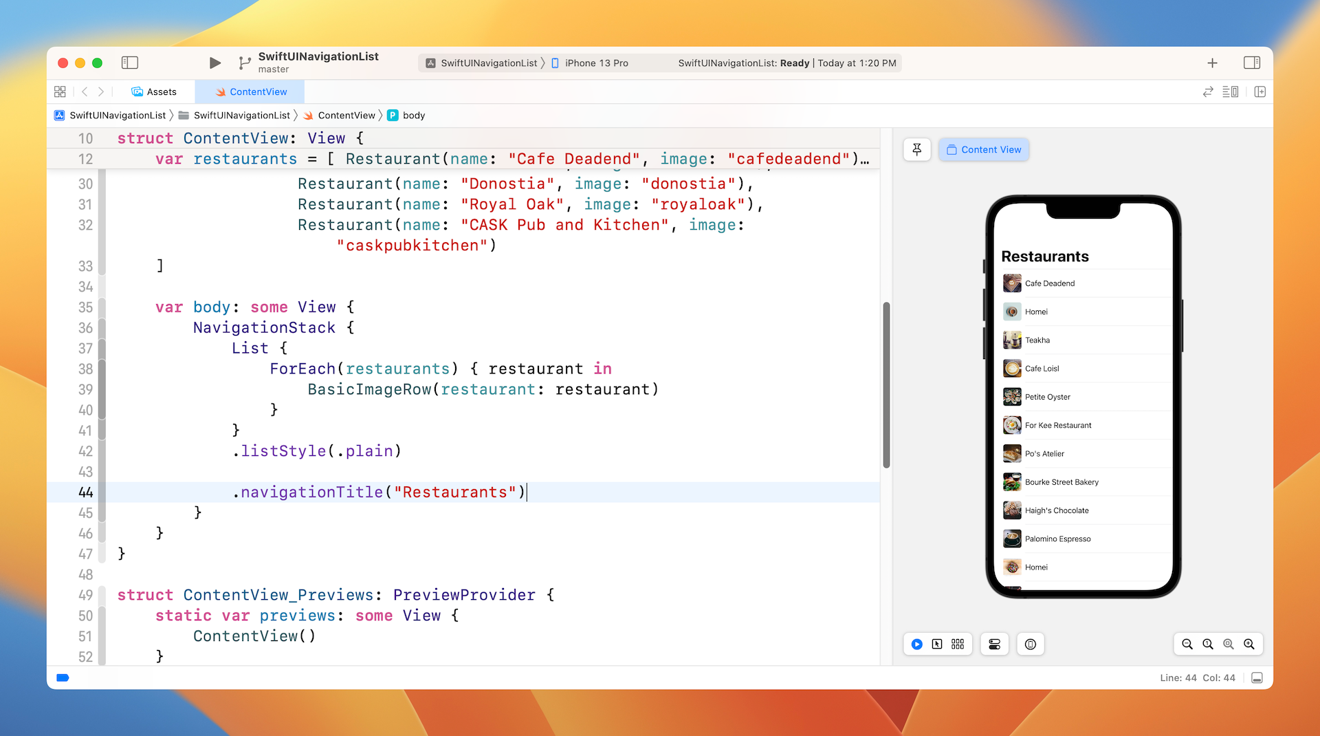
Once you have made the change, you should see an empty navigation bar. To assign a title to the bar, insert the navigationBarTitle modifier like below:
NavigationStack {
    List {
        ForEach(restaurants) { restaurant in
            BasicImageRow(restaurant: restaurant)
        }
    }
    .listStyle(.plain)

    .navigationTitle("Restaurants")
}
Now the app has a navigation bar with a large title.
Passing Data to a Detail View Using NavigationLink
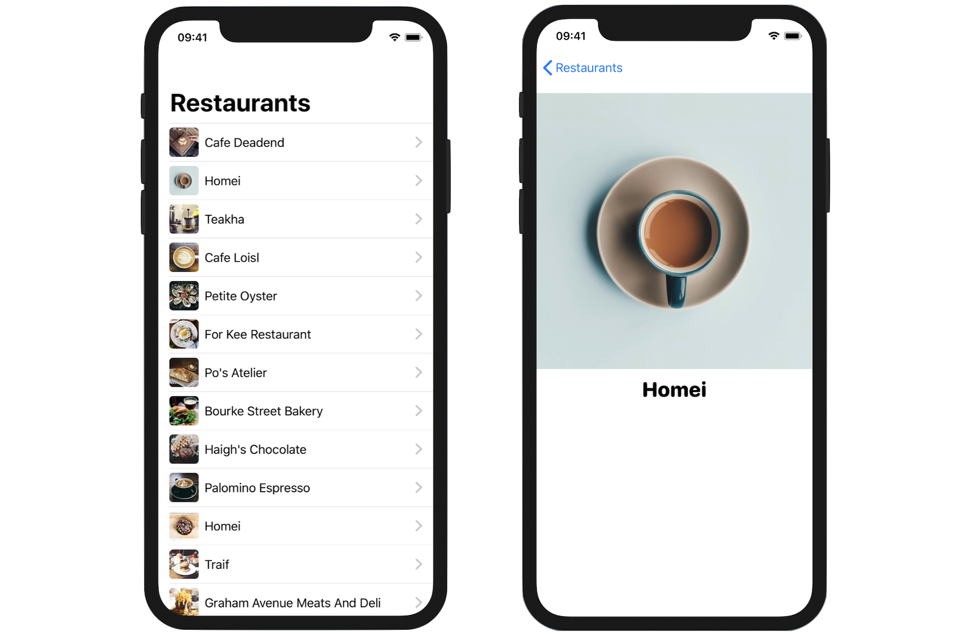
So far, we have added a navigation bar to the list view. We usually use a navigation interface for the user to navigate to a detail view, showing the details of the selected item. For this demo, we will build a simple detail view showing a bigger image of the restaurant.
Let's start with the detail view. Insert the following code at the end of the ContentView.swift file to create the detail view:
struct RestaurantDetailView: View {
    var restaurant: Restaurant

    var body: some View {
        VStack {
            Image(restaurant.image)
                .resizable()
                .aspectRatio(contentMode: .fit)

            Text(restaurant.name)
                .font(.system(.title, design: .rounded))
                .fontWeight(.black)

            Spacer()
        }
    }
}
The detail view is just like other SwiftUI views of the type View. Its layout is very simple that it only displays the restaurant image and name. The RestaurantDetailView struct also takes in a Restaurant object in order to retrieve the image and name of the restaurant.
With the detail view now ready, the question is how you can pass the selected restaurant in the content view to this detail view?
SwiftUI provides a special button called NavigationLink, which is able to detect users' touches and triggers the navigation presentation. The basic usage of NavigationLink is like this:
NavigationLink(destination: DetailView()) {
    Text("Press me for details")
}
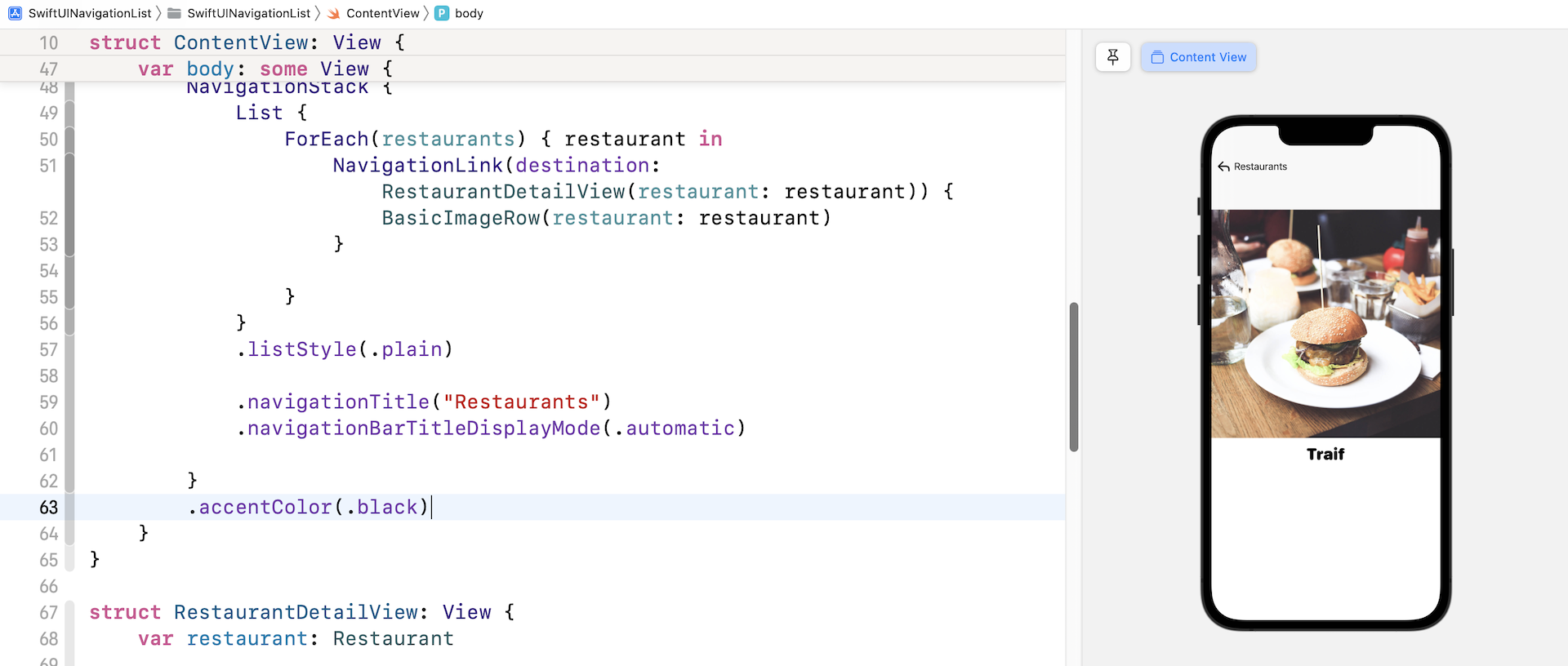
You specify the destination view in the destination parameter and implement its appearance in the closure. For the demo app, it should navigate to the RestaurantDetailView when any of the restaurants is tapped. In this case, we can apply NavigationLink to each of the rows. Update the List view like this:
List {
    ForEach(restaurants) { restaurant in
        NavigationLink(destination: RestaurantDetailView(restaurant: restaurant)) {
            BasicImageRow(restaurant: restaurant)
        }
    }
}
.listStyle(.plain)
In the code above, we tell NavigationLink to navigate to the RestaurantDetailView when users select a restaurant. We also pass the selected restaurant to the detail view for display. That's all you need to build a navigation interface and perform data passing.
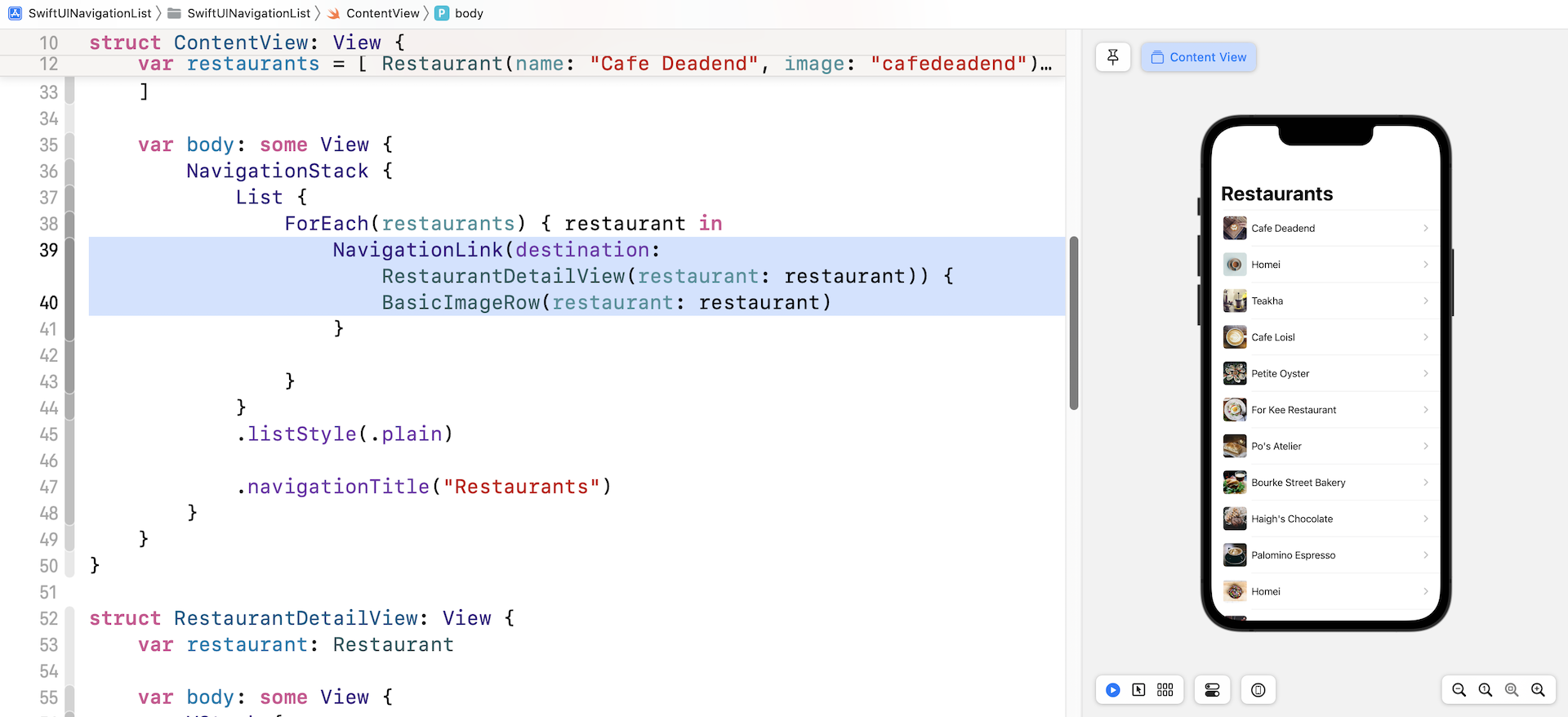
In the canvas, you should notice that each row of data has been added with a disclosure icon. In the preview canvas, you should be able to navigate to the detail view after selecting one of the restaurants. Furthermore, you can navigate back to content view by clicking the back button. The whole navigation is automatically rendered by NavigationStack.
Customizing the Navigation Bar
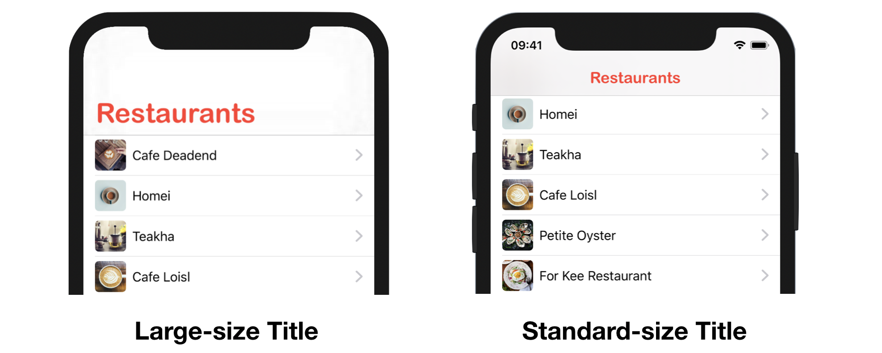
First, let's talk about the display mode of the navigation bar. By default, the navigation bar is set to appear as a large title. But when you scroll up the list, the navigation bar will become smaller. This became the default behaviour when Apple introduced the "Large Title" navigation bar.
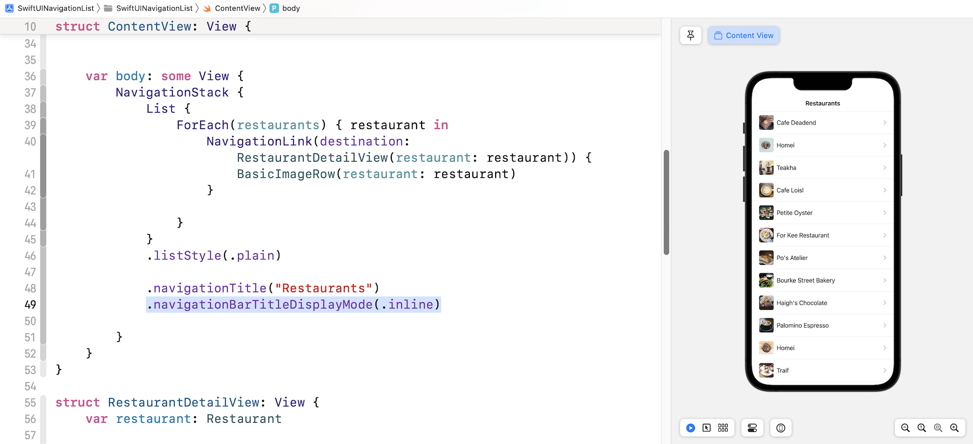
If you want to keep the navigation bar compact and disable the use of the large title, you can add the navigationBarTitleDisplayMode modifier right below navigationTitle:
.navigationBarTitleDisplayMode(.inline)
The parameter specifies the appearance of the navigation bar, whether it should appear as a large title bar or compact title. By default, it's set to .automatic, which means large title is used. In the code above, we set it to .inline. This instructs iOS to use a compact bar.
Change the display mode to .automatic and the navigation bar will become a large title bar again.
.navigationBarTitleDisplayMode(.automatic)
Configuring Font and Color
Next, let's change the title's font and color. At the time of this writing, there is no modifier in SwiftUI for developers to configure the navigation bar's font and color. Instead, we need to use the API named UINavigationBarAppearance provided by UIKit.
Say, we want to change the title color to red and the font to Arial Rounded MT Bold. We create a UINavigationBarAppearance object in the init() function and configure the attributes accordingly. Insert the following function in ContentView:
init() {
    let navBarAppearance = UINavigationBarAppearance()
    navBarAppearance.largeTitleTextAttributes = [.foregroundColor: UIColor.red, .font: UIFont(name: "ArialRoundedMTBold", size: 35)!]
    navBarAppearance.titleTextAttributes = [.foregroundColor: UIColor.red, .font: UIFont(name: "ArialRoundedMTBold", size: 20)!]

    UINavigationBar.appearance().standardAppearance = navBarAppearance
    UINavigationBar.appearance().scrollEdgeAppearance = navBarAppearance
    UINavigationBar.appearance().compactAppearance = navBarAppearance
}
The largeTitleTextAttributes property is used to configuring the text attributes of the large-size title, while the titleTextAttributes property is used for setting the text attributes of the standard-size title. Once we configure the navBarAppearance, we assign it to the three appearance properties including standardAppearance, scrollEdgeAppearance, and compactAppearance. If you want, you can create and assign a separate appearance object for scrollEdgeAppearance, and compactAppearance.
Back Button Image and Color
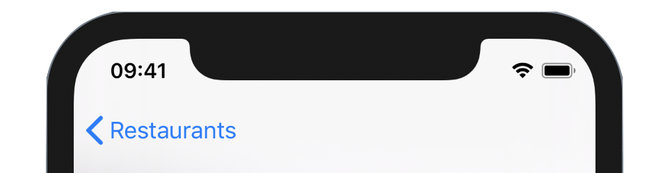
The back button of the navigation view is set to blue by default and it uses a chevron icon to indicate "Go back." By using the UINavigationBarAppearance API, you can also customize the color and even the indicator image of the back button.
Let's see how this customization works. To change the indicator image, you can call the setBackIndicatorImage method and provide your own UIImage. Here I set it to the system image arrow.turn.up.left.
navBarAppearance.setBackIndicatorImage(UIImage(systemName: "arrow.turn.up.left"), transitionMaskImage: UIImage(systemName: "arrow.turn.up.left"))
For the back button color, you can change it by setting the accentColor property like this:
NavigationStack {
  .
  .
  .
}
.accentColor(.black)
Test the app again. The back button should be like that shown in figure 9.
Custom Back Button
Instead of using the APIs of UIKit to customize the back button, an alternative approach is to hide the default back button and create our own back button in SwiftUI. To hide the back button, you can use the modifier .navigationBarBackButtonHidden and set its value to true like this in the detail view:
.navigationBarBackButtonHidden(true)
SwiftUI also provides a modifier called toolbar for creating your own navigation bar items. For example, you can create a back button with the name of the selected restaurant like this:
.toolbar {
    ToolbarItem(placement: .navigationBarLeading) {
        Button {
            dismiss()
        } label: {
            Text("\(Image(systemName: "chevron.left")) \(restaurant.name)")
                .foregroundColor(.black)
        }
    }
}
In the closure of toolbar, we create an ToolbarItem object with the placement set to .navigationBarLeading. This tells iOS to place the button in the leading edge of the navigation bar.
To put the following code into action and update RestaurantDetailView like below:
struct RestaurantDetailView: View {
    @Environment(\.dismiss) var dismiss

    var restaurant: Restaurant

    var body: some View {
        VStack {
            Image(restaurant.image)
                .resizable()
                .aspectRatio(contentMode: .fit)

            Text(restaurant.name)
                .font(.system(.title, design: .rounded))
                .fontWeight(.black)

            Spacer()
        }

        .navigationBarBackButtonHidden(true)
        .toolbar {
            ToolbarItem(placement: .navigationBarLeading) {
                Button {
                    dismiss()
                } label: {
                    Text("\(Image(systemName: "chevron.left")) \(restaurant.name)")
                        .foregroundColor(.black)
                }

            }
        }
    }
}
SwiftUI offers a wide range of built-in environment values. To dismiss the current view and go back to the previous view, we retrieve the environment value using the .dismiss key. Then you can call the dismiss() function to dismiss the current view. Please note that the .dismiss environment key is only available on iOS 15 (or up). If you need to support an older version of iOS, you can use the environment key .presentationMode:
@Environment(\.presentationMode) var presentationMode
Then you can call the dismiss function of the presentation mode like this:
presentationMode.wrappedValue.dismiss()
Now test the app in the preview canvas and select any of the restaurants. You will see a back button with the restaurant name. Tapping the back button will navigate back to the main screen.
Exercise
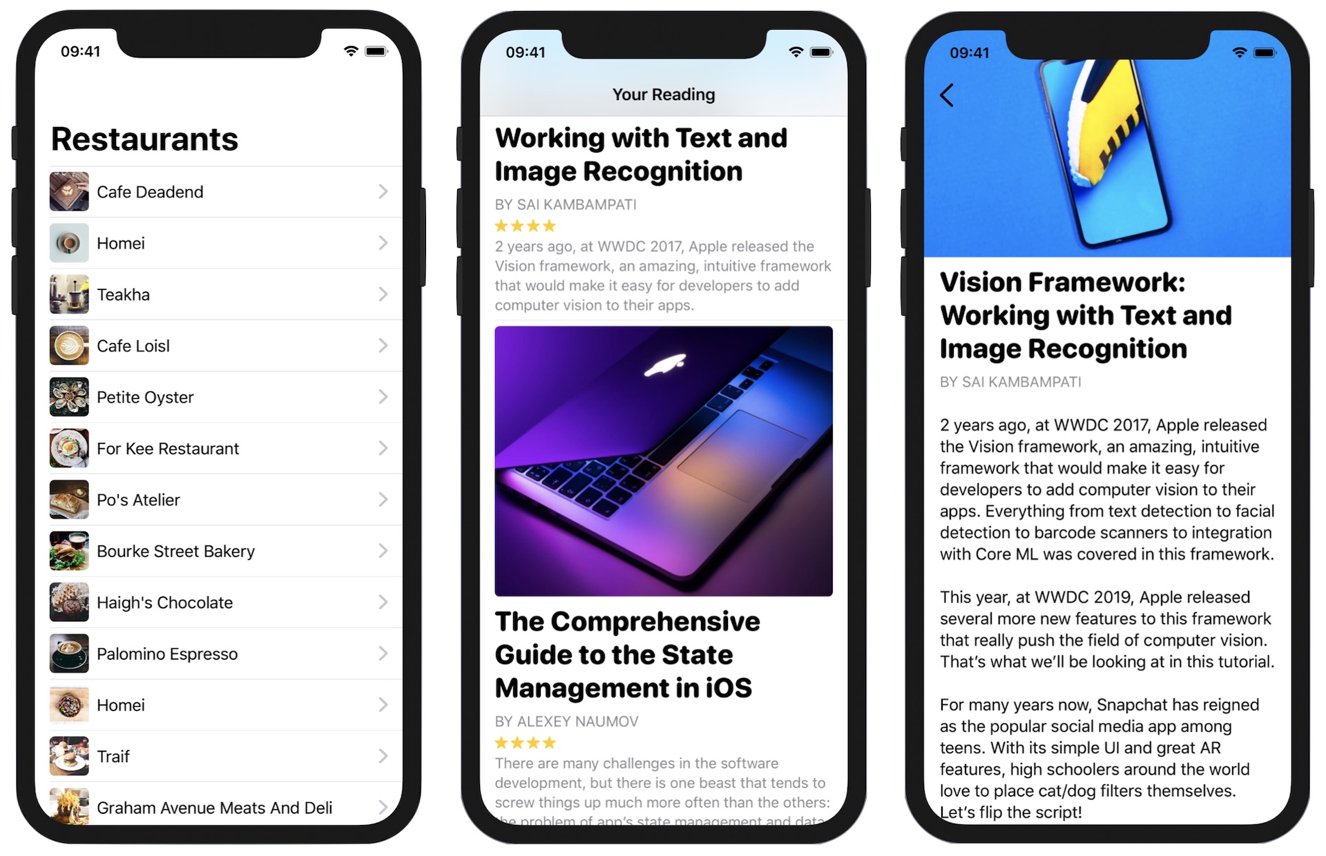
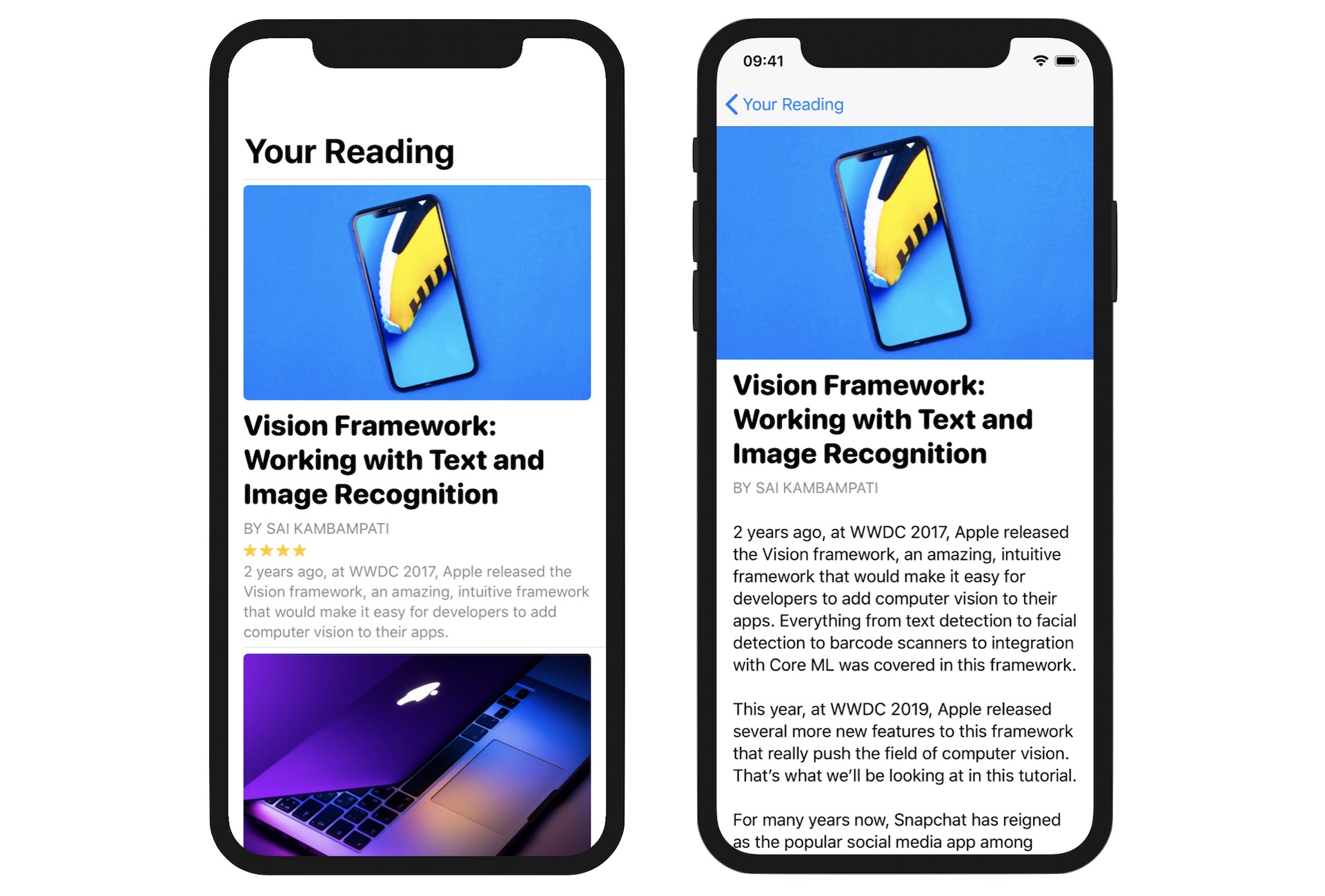
To make sure understand how to build a navigation UI, here is an exercise for you. First, download this starter project from https://www.appcoda.com/resources/swiftui4/SwiftUINavigationStarter.zip. Open the project and you will see a demo app showing a list of articles.
This project is very similar to the one you've built before. The main difference is the introduction of Article.swift. This file stores the articles array, which contains sample data. If you look at the Article struct closely, it now has the content property for storing a full article.
Your task is to embed the list in a navigation view and create the detail view. When a user taps one of the articles in the content view, it'll navigate to the detail view showing the full article. I'll present the solution to you in the next section, but please try your best to figure out your own solution.
Building the Detail View
Have you completed the exercise? The detail view is more complicated than the one we built earlier. Let's see how to create it.
To better organize the code, instead of creating the detail view in the ContentView.swift file, we will create a separate file for it. In the project navigator, right-click the SwiftUINavigation folder and select New File... Choose the SwiftUI View template and name the file ArticleDetailView.swift.
Since the detail view is going to display the full article , we need to have this property for the caller to pass the article. So, declare an article property in ArticleDetailView:
var article: Article
Next, update the body like this to lay out the detail view:
var body: some View {
    ScrollView {
        VStack(alignment: .leading) {
            Image(article.image)
                .resizable()
                .aspectRatio(contentMode: .fit)

            Group {
                Text(article.title)
                    .font(.system(.title, design: .rounded))
                    .fontWeight(.black)
                    .lineLimit(3)

                Text("By \(article.author)".uppercased())
                    .font(.subheadline)
                    .foregroundColor(.secondary)
            }
            .padding(.bottom, 0)
            .padding(.horizontal)

            Text(article.content)
                .font(.body)
                .padding()
                .lineLimit(1000)
                .multilineTextAlignment(.leading)
        }
    }
}
We use a ScrollView to wrap all the views to enable scrollable content. I'll not go over the code line by line as you understand how Text, Image, and VStack work. But one modifier that I want to highlight is Group. This modifier allows you to group multiple views together and apply a configuration to the group. In the code above, we need to apply padding to both Text views. To avoid code duplication, we group both views together and apply the padding.
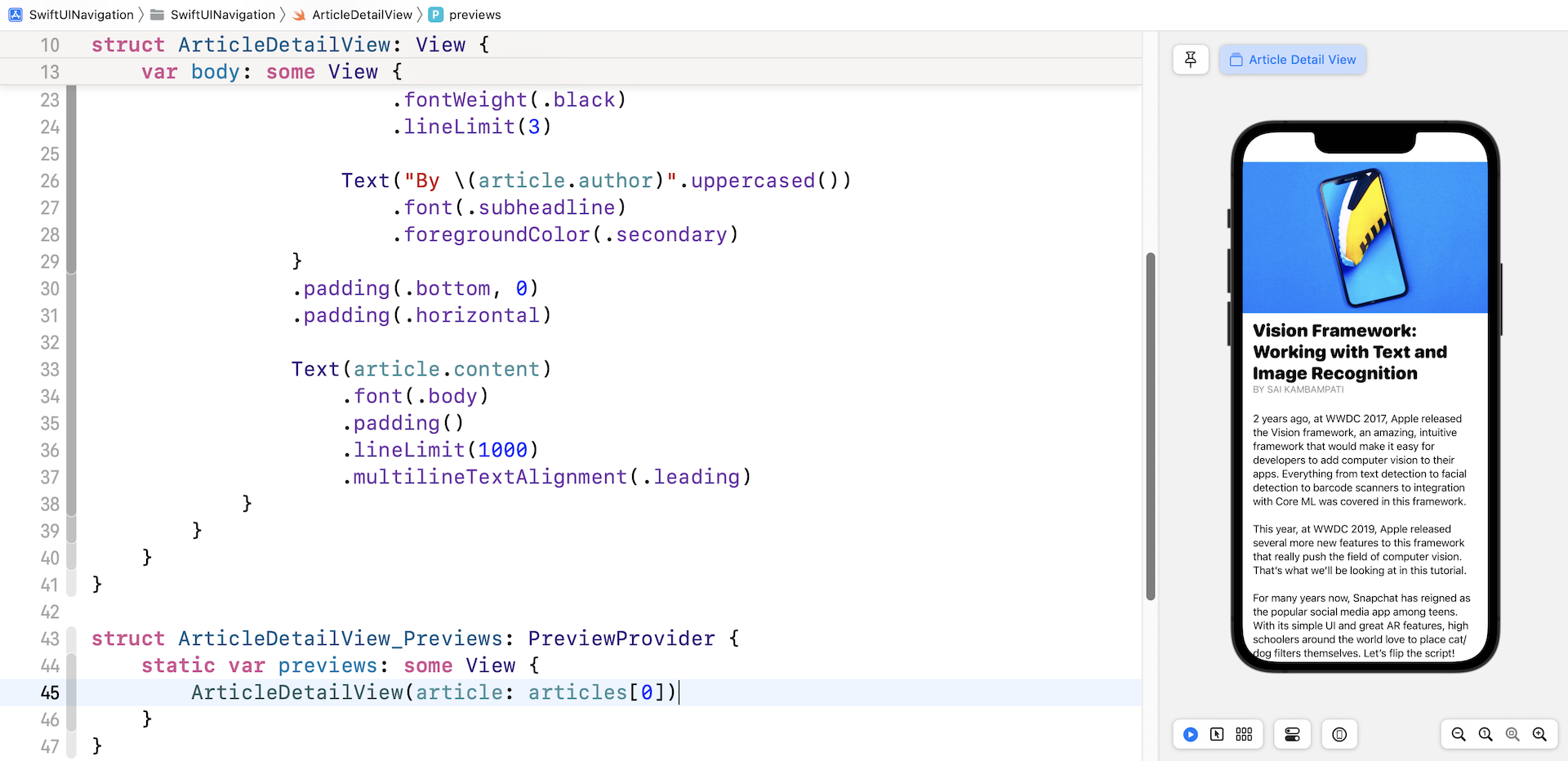
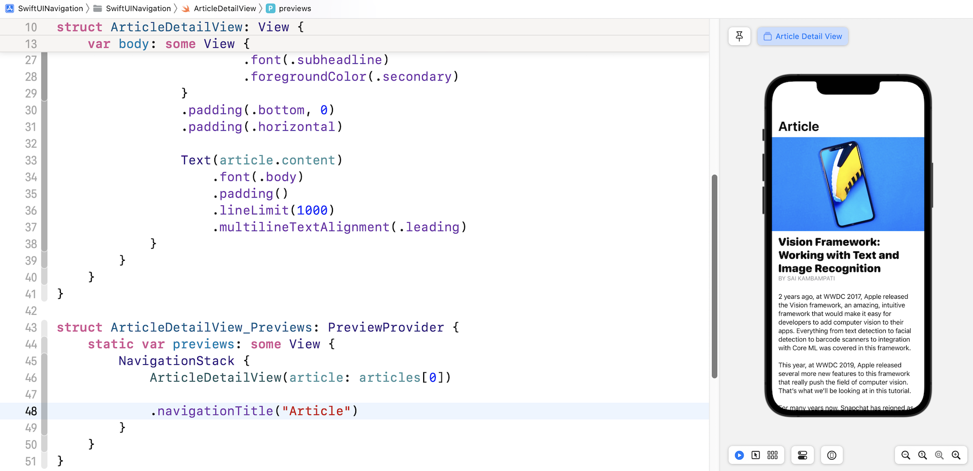
Now that we have completed the layout of the detail view, you will see an error in Xcode complaining about the ArticleDetailView_Previews. The preview doesn't work because we've added the property article in ArticleDetailView. Therefore, you need to pass a sample article in the preview. Update ArticleDetailView_Previews like this to fix the error:
struct ArticleDetailView_Previews: PreviewProvider {
    static var previews: some View {
        ArticleDetailView(article: articles[0])
    }
}
Here we simply pick the first article of the articles array for preview. You can change it to a different value if you want to preview other articles. Once you have made this change, the preview canvas should render the detail view properly.
Let's try one more thing. Since this view is going to be embed in a NavigationView, you can modify the preview code to preview how it looks in a navigation view:
struct ArticleDetailView_Previews: PreviewProvider {
    static var previews: some View {
        NavigationStack {
            ArticleDetailView(article: articles[0])

            .navigationTitle("Article")
        }
    }
}
By updating the code, you will see a blank navigation bar in the preview canvas.
Now that we've completed the layout of the detail view, it's time to go back to ContentView.swift to implement the navigation. Update the ContentView struct like this:
struct ContentView: View {

    var body: some View {

        NavigationStack {
            List(articles) { article in
                NavigationLink(destination: ArticleDetailView(article: article)) {
                    ArticleRow(article: article)
                }

                .listRowSeparator(.hidden)
            }
            .listStyle(.plain)

            .navigationTitle("Your Reading")
        }

    }
}
In the code above, we embed the List view in a NavigationStack and apply a NavigationLink to each of the rows. The destination of the navigation link is set to the detail view we just created. In your preview, you should be able to test the app and navigate to the detail view when selecting an article.
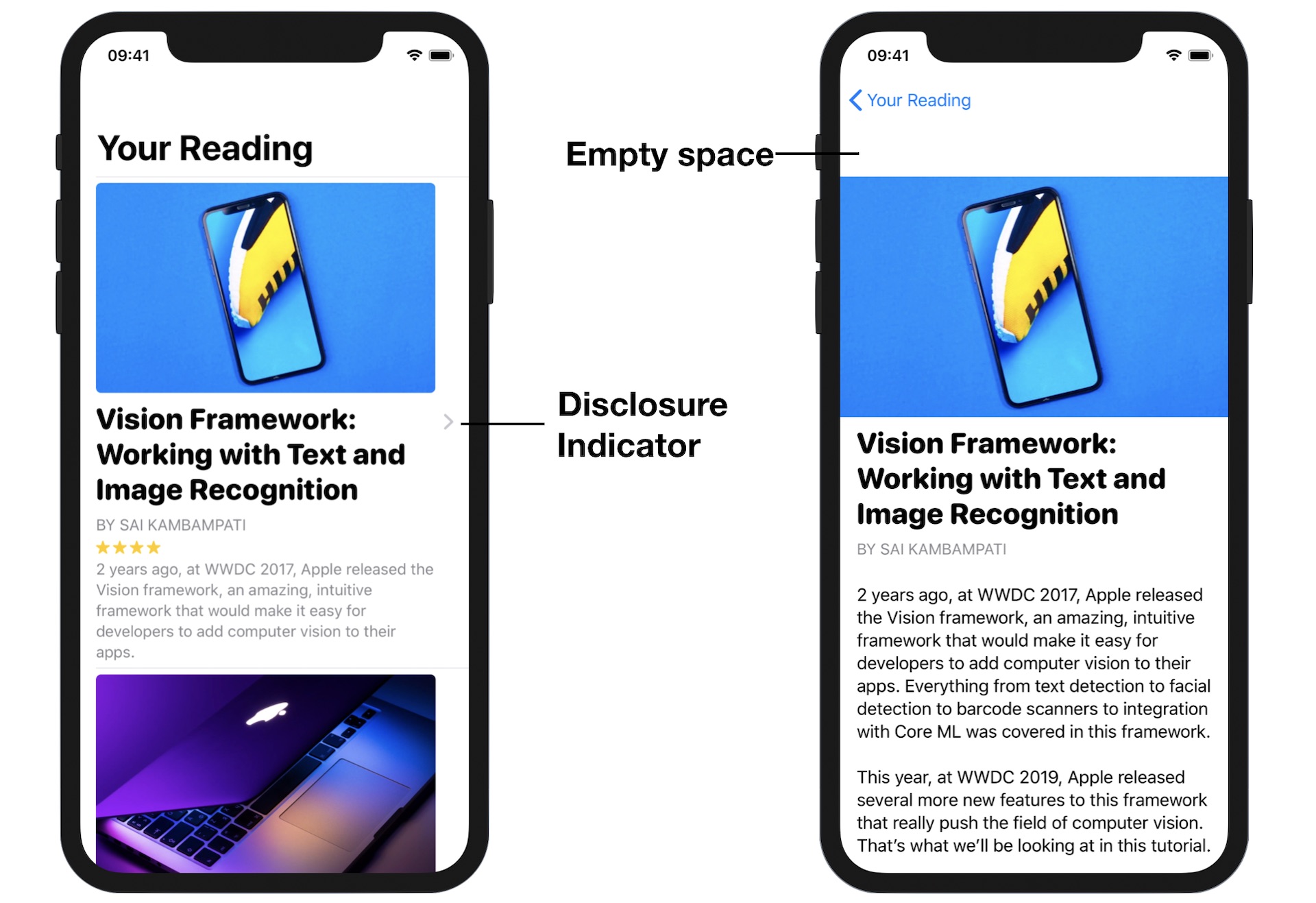
Removing the Disclosure Indicator
The app works perfectly but there are two issues that you may want to fine tune. First, it's the disclosure indicator in the content view. It looks a bit weird to display the disclosure indicator. We will disable it. The second issue is the empty space appearing right above the featured image in the detail view. Let's discuss the issues one at a time.
SwiftUI doesn't provide an option for developers to disable or hide the disclosure indicator. To work around the issue, we are not going to apply NavigationLink to the article row directly. Instead, we create a ZStack with two layers. Update the NavigationStack of the ContentView like this:
NavigationStack {
    List(articles) { article in
        ZStack {
            ArticleRow(article: article)

            NavigationLink(destination: ArticleDetailView(article: article)) {
                EmptyView()
            }
            .opacity(0)

            .listRowSeparator(.hidden)
        }
    }
    .listStyle(.plain)

    .navigationTitle("Your Reading")
}
The lower layer is the article row, while the upper layer is an empty view. The NavigationLink now applies to the empty view, preventing iOS from rendering the disclosure button. Once you have made the change, the disclosure indicator vanishes but you can still navigate to the detail view.
Now let's see the root cause of the second issue.
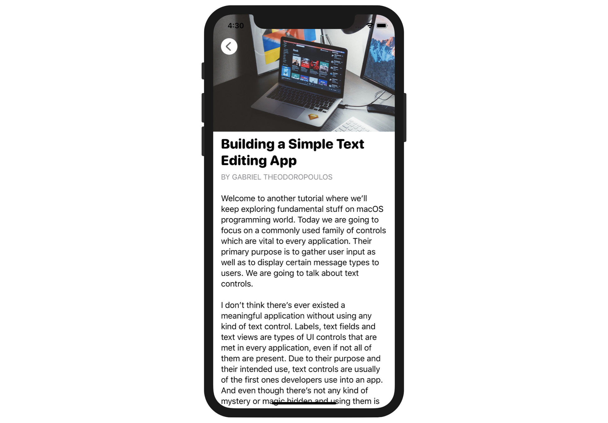
Switch over to ArticleDetailView.swift. I didn't mention the issue when we were designing the detail view. But actually from the preview, you should spot the issue (see figure 13).
The reason why we have that empty space right above the image is due to the navigation bar. This empty space is actually a large-size navigation bar with a blank title. When the app navigates from the content view to the detail view, the navigation bar becomes a standard-size bar. So, to fix the issue, all we need to do is explicitly specify to use the standard-size navigation bar.
Insert this line of code after the closing bracket of ScrollView:
.navigationBarTitleDisplayMode(.inline)
By setting the navigation bar to the inline mode, the navigation bar will be minimized. You can now go back to ContentView.swift and test the app again. The detail view now looks much better.
An even more Elegant UI with a Custom Back Button
Though you can customize the back button indicator image using a built-in property, sometimes you may want to build a custom back button that navigates back to the content view. The question is how can it be done programmatically?
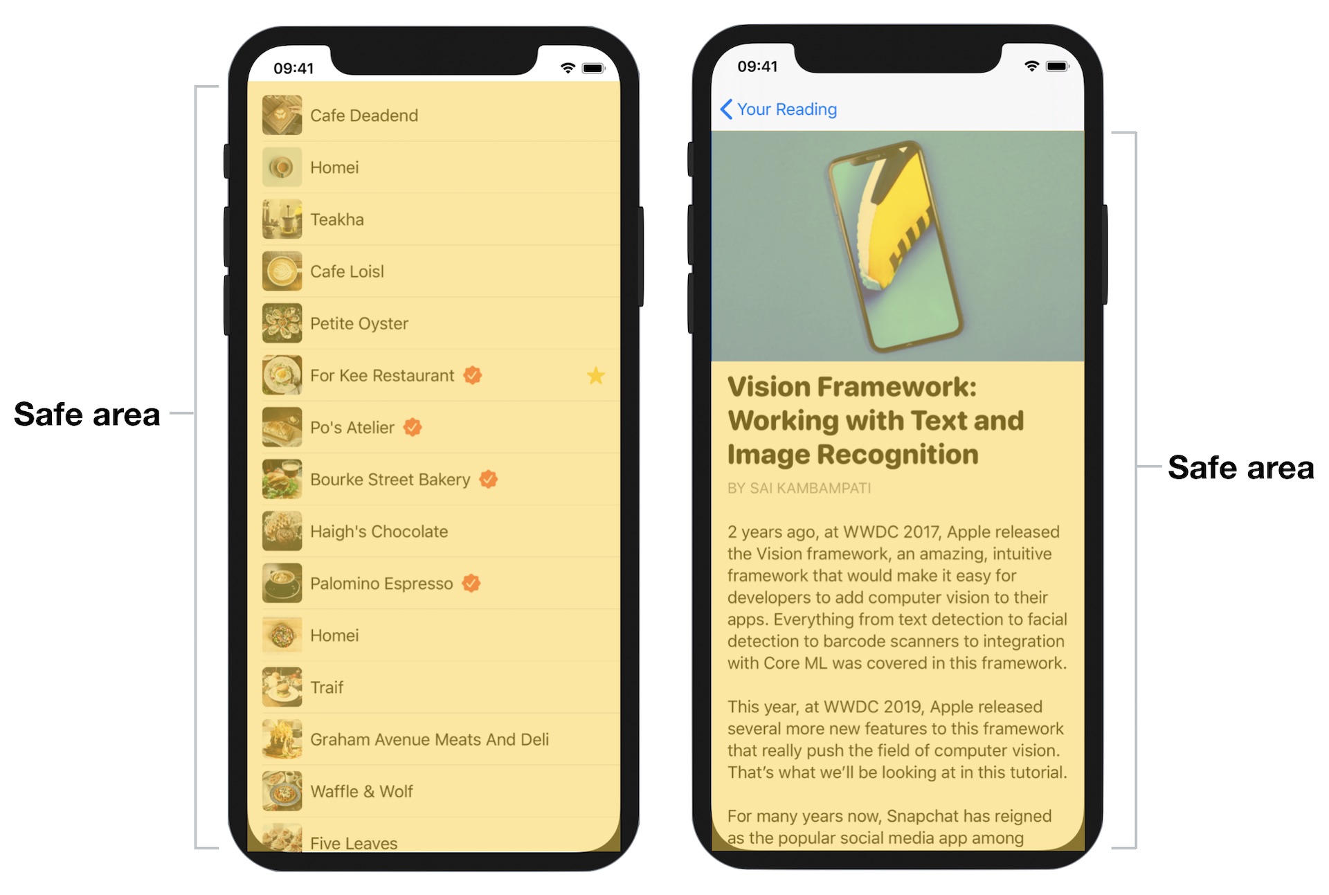
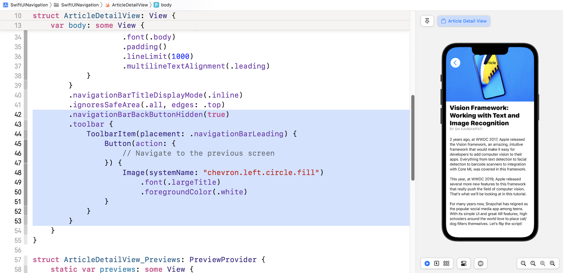
In this last section, I want to show you how to build an even more elegant detailed view by hiding the navigation bar and building your own back button. First, let's check out the final design displayed in figure 14. Doesn't it look great?
To lay out this screen, we have to tackle two issues:
- Extend the scroll view to the very top of the screen
- Create a custom back button and trigger the navigation programmatically
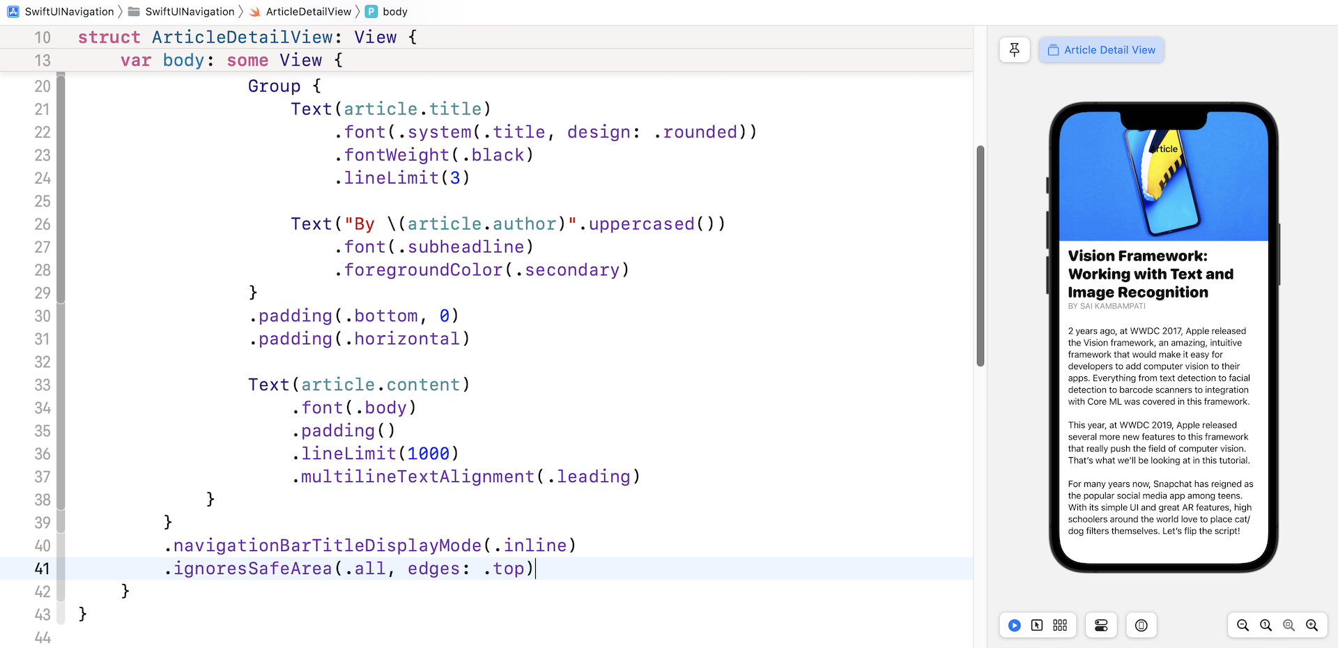
iOS has a concept known as safe areas for aiding the layout of views. Safe areas help you place the views within the visible portion of the interface. For example, safe areas prevent the views from hiding the status bar. If your UI has a navigation bar, the safe area will automatically be adjusted to prevent you from positioning views that hide the navigation bar.
](images/navigation/swiftui-navigation-15.jpg)
To place content that extends outside the safe areas, you use a modifier named ignoresSafeArea. For our project, we want the scroll view to go beyond the top edge of the safe area, To accomplish this, we write the modifier like this:
.ignoresSafeArea(.all, edges: .top)
This modifiers accepts other values such as .bottom and .leading for the edges parameter. If you want to ignore the whole safe area, you can just call .ignoresSafeArea(). By attaching this modifier to the ScrollView, we can hide the navigation bar and achieve a visually pleasing detail view.
Now it comes to the second issue of creating our own back button. This issue is trickier than the first one. Here is what we're going to implement:
- Hide the original back button
- Create a normal button and then assign it as the left button of the navigation bar
To hide the back button, SwiftUI provides a modifier called navigationBarBackButtonHidden. You just need to set its value to true to hide the back button:
.navigationBarBackButtonHidden(true)
Once the back button is hidden, you can replace it with your own button. The toolbar modifier allows you to configure the navigation bar items. In the closure, we create the custom back button using ToolbarItem and assign the button as the left button of the navigation bar. Here is the code:
.toolbar {
    ToolbarItem(placement: .navigationBarLeading) {
        Button(action: {
            // Navigate to the previous screen
        }) {
            Image(systemName: "chevron.left.circle.fill")
                .font(.largeTitle)
                .foregroundColor(.white)
        }
    }
}
You can attach the above modifiers to the ScrollView. Once the change is applied, you should see our custom back button in the preview canvas.
You may have noticed that the action closure of the button was left empty. The back button has been laid out nicely but the problem is that it doesn't function!
The original back button rendered by NavigationView can automatically navigate back to the previous screen. We need to programmatically navigate back. Thanks to the environment values built into the SwiftUI framework. You can refer to an environment binding named dismiss for dismissing the current view.
Now declare a dismiss variable in ArticleDetailView to capture the environment value:
@Environment(\.dismiss) var dismiss
Next, in the action of our custom back button, insert this line of code:
dismiss()
Here we call the dismiss method to dismiss the detail view when the back button is tapped. Run the app and test it again. You should be able to navigate between the content view and the detail view.
Summary
Navigation UI is very common in mobile apps. It's crucial you understand this key concept. With this understanding, you are capable of building a simple content-based app, although the data is static. x
For reference, you can download the complete project here:
- Demo project for the first project (https://www.appcoda.com/resources/swiftui4/SwiftUINavigationList.zip)
- Demo project for the second project (https://www.appcoda.com/resources/swiftui4/SwiftUINavigation.zip)
To further study navigation view, you can also refer to the documentation provided by Apple: