- Made by AppCoda
- Contact us / Support
- Tweet this book
- Preface
- 1. Introduction to SwiftUI
- 2. Getting Started with SwiftUI and Working with Text
- 3. Working with Images
- 4. Layout User Interfaces with Stacks
- 5. Understanding ScrollView and Building a Carousel UI
- 6. Working with SwiftUI Buttons and Gradient
- 7. Understanding State and Binding
- 8. Implementing Path and Shape for Line Drawing and Pie Charts
- 9. Basic Animations and Transitions
- 10. Understanding Dynamic List, ForEach and Identifiable
- 11. Working with Navigation UI and Navigation Bar Customization
- 12. Playing with Modal Views, Floating Buttons and Alerts
- 13. Building a Form with Picker, Toggle and Stepper
- 14. Data Sharing with Combine and Environment Objects
- 15. Building a Registration Form with Combine and View Model
- 16. Working with Swipe-to-Delete, Context Menu and Action Sheets
- 17. Using Gestures
- 18. Displaying an Expandable Bottom Sheet Using Presentation Detents
- 19. Creating a Tinder-like UI with Gestures and Animations
- 20. Creating an Apple Wallet like Animation and View Transition
- 21. Working with JSON, Slider and Data Filtering
- 22. Building a ToDo app with Core Data
- 23. Integrating UIKit with SwiftUI Using UIViewRepresentable
- 24. Creating a Search Bar View and Working with Custom Binding
- 25. Putting Everything Together to Build a Real World App
- 26. Creating an App Store like Animated View Transition
- 27. Building an Image Carousel
- 28. Building an Expandable List View Using OutlineGroup
- 29. Building Grid Layout Using LazyVGrid and LazyHGrid
- 30. Creating an Animated Activity Ring with Shape and Animatable
- 31. Working with AnimatableModifier and LibraryContentProvider
- 32. Working with TextEditor to Create Multiline Text Fields
- 33. Using matchedGeometryEffect to Create View Animations
- 34. ScrollViewReader and Grid Animation
- 35. Working with Tab View and Tab Bar Customization
- 36. Using AsyncImage in SwiftUI for Loading Images Asynchronously
- 37. Implementing Search Bar Using Searchable
- 38. Creating Bar Charts and Line Charts with the Charts Framework
- 39. Capturing Text within Image Using Live Text APIs
- 40. How to Use ShareLink for Sharing Data Like Text and Photos
- 41. Using ImageRenderer to Convert SwiftUI Views into Images
- 42. Creating PDF Documents Using ImageRenderer
- 43. Using Gauge to Display Progress and Create a Speedometer
- 44. Creating Grid Layout Using Grid APIs
- 45. Switching Layout with AnyLayout
- Published with GitBook
Chapter 12
Playing with Modal Views, Floating Buttons and Alerts
Earlier, we built a navigation interface that lets users navigate from the content view to the detail view. The view transition is nicely animated and completely taken care by iOS. When a user triggers the transition, the detail view slides from right to left fluidly. Navigation UI is just one of the commonly-used UI patterns. In this chapter, I'll introduce to you another design technique to present content modally.
For iPhone users, you should be very familiar with modal views. One common use of modal views is for presenting a form for input. For example, the Calendar app presents a modal view for users to create a new event. The built-in Reminders and Contact apps also use modal views to ask for user input.
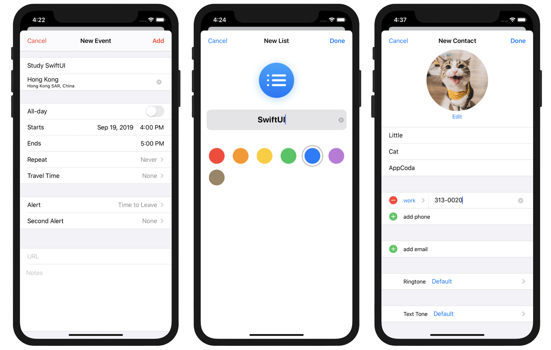
From the user experience point of view, a modal view is usually triggered by tapping a button. Again, the transition animation of the modal view is handled by iOS. When presenting a full-screen modal view, it slides up fluidly from the bottom of the screen.
If you're a long-time iOS user, you may find the look & feel of the modal views displayed in figure 1 are not the same as the traditional ones. Prior to iOS 13, the presentation of modal views covered the entire screen. Starting with iOS 13, modal views are displayed in card-like format by default. The modal view doesn't cover the whole screen but partially covers the underlying content view. You can still see the top edge of the content/parent view. On top of the visual change, the modal view can now be dismissed by swiping down from anywhere on the screen. You do not need to write a line of code to enable this gesture. It's completely built-in and generated by iOS. Of course, if you want to dismiss a modal view via a button, you can still do that.
Okay, so what are we going to work on in this chapter?
I will show you how to present the same detail view that we implemented in the previous chapter using a modal view. While modal views are commonly used for presenting a form, it doesn't mean you can't use them for presenting other information. In addition to modal views, you will also learn how to create a floating button in the detail view. While the modal views can be dismissed through the swipe gesture, I want to provide a Close button for users to dismiss the detail view. Furthermore, we will also look into Alerts, which is another kind of modal view.
We got a lot to discuss in this chapter. Let's get started.
Understanding Sheet in SwiftUI
The sheet presentation style appears as a card that partially covers the underlying content and dims all uncovered areas to prevent interaction with them. The top edge of the parent view or a previous card is visible behind the current card to help people remember the task they suspended when they opened the card.
- Apple's official documentation (https://developer.apple.com/design/human-interface-guidelines/ios/app-architecture/modality/)
Before we dive into the implementation, let me give you a quick introduction to the card-like presentation of modal views. The card presentation is achieved in SwiftUI using the sheet presentation style. It's the default presentation style for modal views.
Basically, to present a modal view, you apply the sheet modifier like this:
.sheet(isPresented: $showModal) {
    DetailView()
}
It takes in a boolean value to indicate whether the modal view is presented. If isPresented is set to true, the modal view will be automatically presented in the form of card.
Another way to present the modal view is like this:
.sheet(item: $itemToDisplay) {
    DetailView()
}
The sheet modifier also allows you to trigger the display of modal views by passing an optional binding. If the optional has a value, iOS will bring up the modal view. If you remember our discussion on actionSheet in an earlier chapter, you will find that the usage of sheet is very similar to actionSheet.
Preparing the Starter Project
That's enough background information. Let's move onto the actual implementation of our demo project. To begin, please download the starter project from https://www.appcoda.com/resources/swiftui4/SwiftUIModalStarter.zip. Once downloaded, open the project and check out the preview. You should be very familiar with this demo app. The app still has a navigation bar but the navigation link has been removed.
Implementing the Modal View Using isPresented
As discussed earlier, the sheet modifier provides us two ways to present a modal view. I'll show you how both approaches work. Let's start with the isPresented approach. For this approach, we need a state variable of the type Bool to keep track of the status of the modal view. Declare this variable in ContentView:
@State var showDetailView = false
By default, it's set to false. The value of this variable will be set to true when one of the rows is clicked. Later, we will make this change in the code.
When presenting the detail view, the view requires us to pass the selected article. So, we also need to declare a state variable to store the user's selection. In ContentView, declare another state variable for this purpose:
@State var selectedArticle: Article?
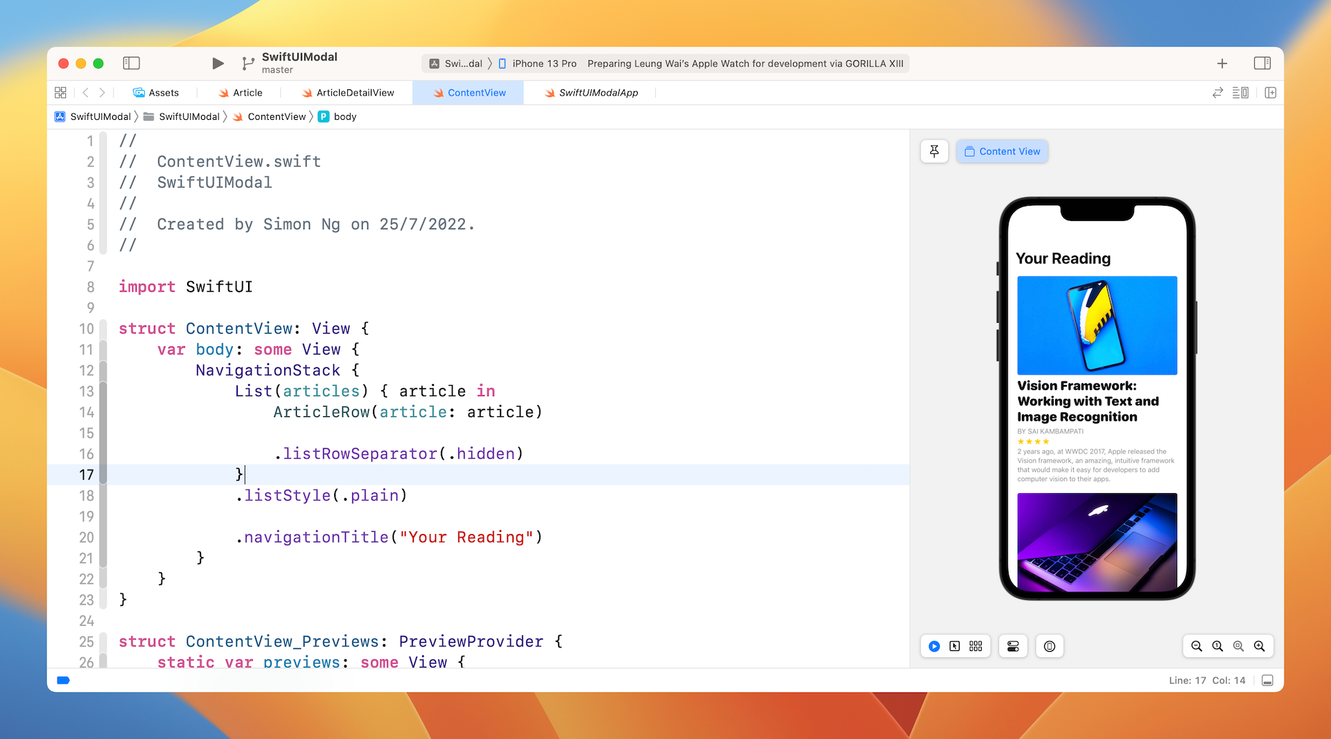
To implement the modal view, we attach the sheet modifier to the List like this:
NavigationStack {
    List(articles) { article in
        ArticleRow(article: article)

        .listRowSeparator(.hidden)
    }
    .listStyle(.plain)
    .sheet(isPresented: $showDetailView) {

        if let selectedArticle = self.selectedArticle {
            ArticleDetailView(article: selectedArticle)
        }
    }

    .navigationTitle("Your Reading")
}
The presentation of the modal view depends on the value of the showDetailView property. This is why we specify it in the isPresented parameter. The closure of the sheet modifier describes the layout of the view to be presented. Here we present the ArticleDetailView.
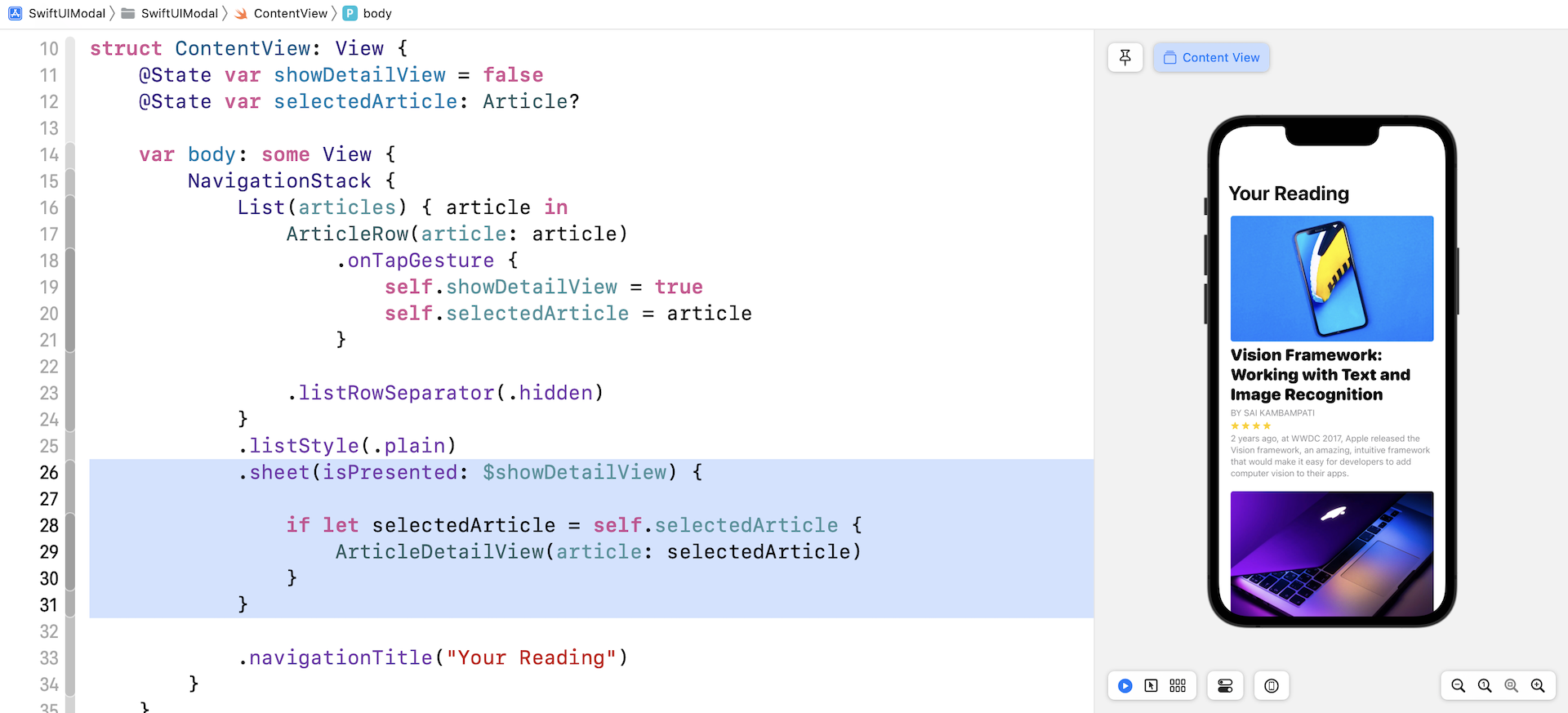
The remaining item is to detect the user's touch. When building the navigation UI, we utilize NavigationLink to handle touch. However, this special button is designed for the navigation interface. In SwiftUI, there is a handler called onTapGesture which can be used to recognize a tap gesture. You can attach this handler to each of the ArticleRow to ArticleRow to detect the users' touch. Modify the NavigationStack in the body variable like this:
NavigationStack {
    List(articles) { article in
        ArticleRow(article: article)
            .onTapGesture {
                self.showDetailView = true
                self.selectedArticle = article
            }

        .listRowSeparator(.hidden)
    }
    .listStyle(.plain)
    .sheet(isPresented: $showDetailView) {

        if let selectedArticle = self.selectedArticle {
            ArticleDetailView(article: selectedArticle)
        }
    }

    .navigationTitle("Your Reading")
}
In the closure of onTapGesture, we set the showDetailView to true. This is used to trigger the presentation of the modal view. We also store the selected article in the selectedArticle variable.
Test the app in the preview canvas by clicking the play button. You should be able to bring up the detail view modally.
Note: For the very first time the app brings up the modal view, it shows a blank view. Wipe down the dialog to dismiss it, select another article (not the same article) and you should get the correct rendering. This is a known issue and we will discuss the fix in the later section.
Implementing the Modal View with Optional Binding
The sheet modifier also provides another way for you to present the modal view. Instead of having a boolean value to control the appearance of the modal view, the modifier lets you use an optional binding to achieve the same goal.
You can replace the sheet modifier like this:
.sheet(item: $selectedArticle) { article in
    ArticleDetailView(article: article)
}
In this case, the sheet modifier requires you to pass an optional binding. Here we specify the binding of the selectedArticle. What this means is that iOS will bring up the modal view only if the selected article has a value. The code in the closure specifies how the modal view looks, but it's slightly different than the code we wrote earlier.
For this approach, the sheet modifier will pass the selected article in the closure. The article parameter contains the selected article which is guaranteed to have a value. This is why we can use it to initiate an ArticleDetailView directly.
Since we no longer use the showDetailView variable, you can remove this line of code:
@State var showDetailView = false
And remove the self.showDetailView = true from the .onTapGesture closure.
.onTapGesture {
    self.showDetailView = true
    ...
}
After changing the code, you can test the app again. Everything should work like the first version but the underlying code is cleaner than the original code.
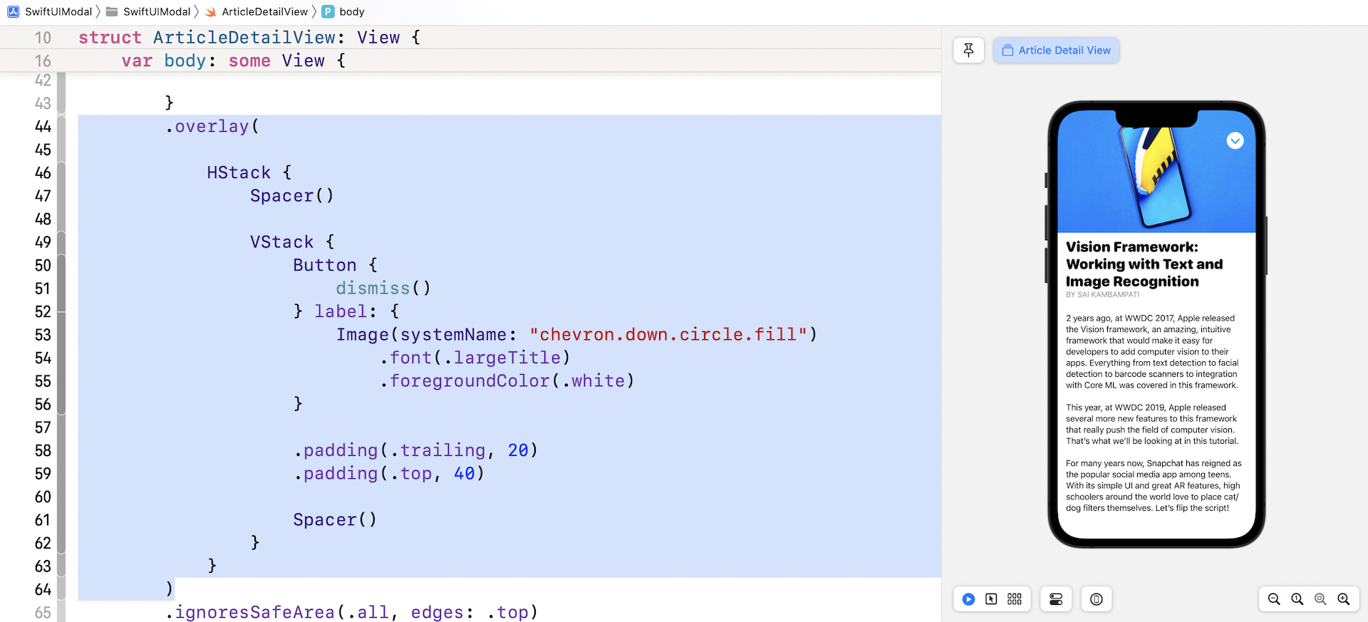
Creating a Floating Button for Dismissing the Modal View
The modal view has built-in support for the swipe-down gesture. Currently, you can swipe down the modal view to close it. I guess this works pretty naturally for long-time iPhone users because apps like Facebook have used this type of gesture for dismissing a view. However, new comers may not know about this. It's better for us to develop a Close button as an alternative way of dismissing the modal view.
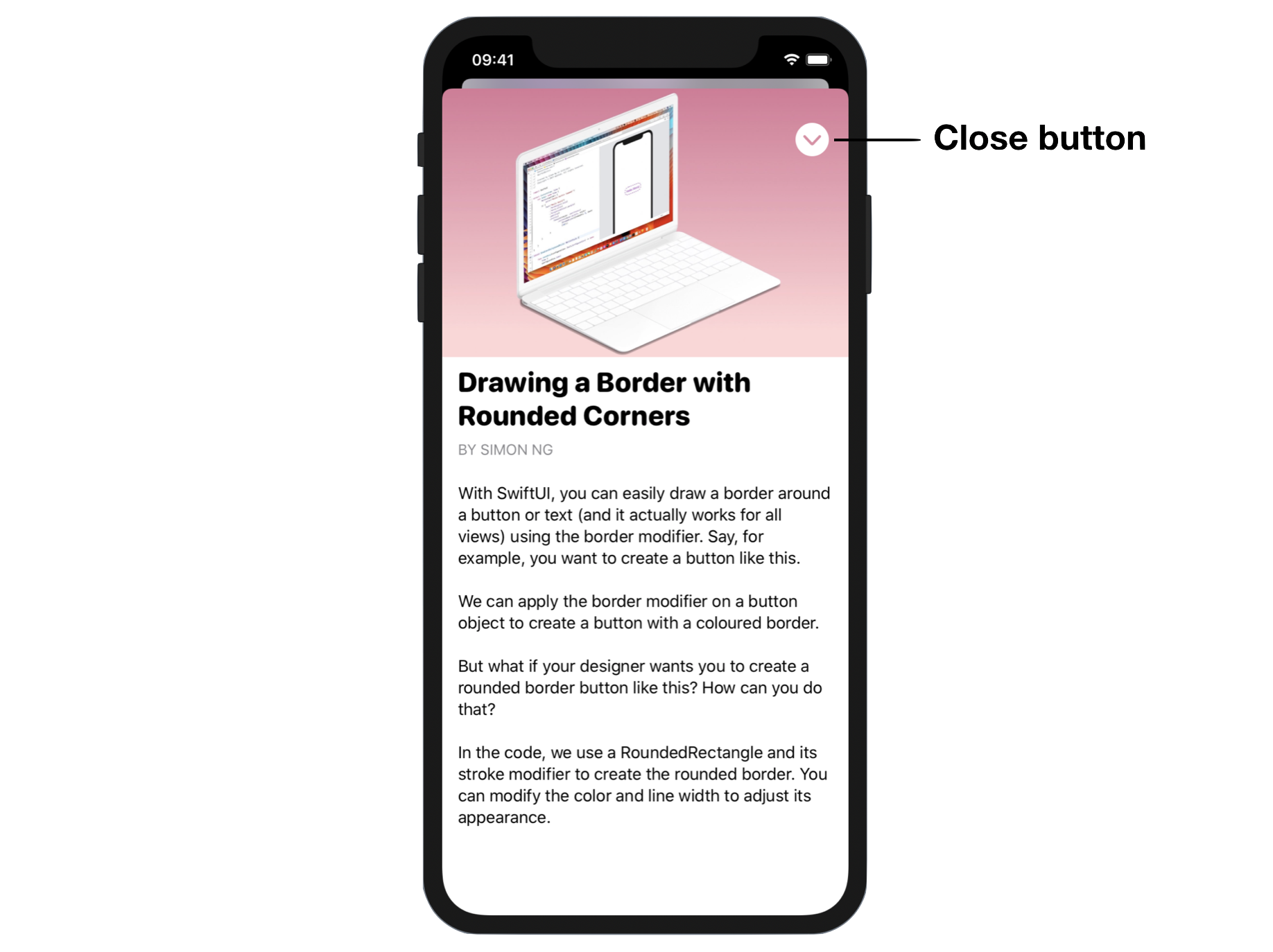
Switch over to ArticleDetailView.swift. We'll add the close button to the view as shown in figure 7.
Do you know how to position the button at the top-right corner? Try not to peek at my code and come up with your own implementation.
Similar to NavigationStack, we can dismiss the modal view by using the dismiss environment value. So, first declare the following variable in ArticleDetailView:
@Environment(\.dismiss) var dismiss
For the close button, we can attach the overlay modifier to the scroll view like this (place the code snippet before ignoresSafeArea):
.overlay(

    HStack {
        Spacer()

        VStack {
            Button {
                dismiss()
            } label: {
                Image(systemName: "chevron.down.circle.fill")
                    .font(.largeTitle)
                    .foregroundColor(.white)
            }

            .padding(.trailing, 20)
            .padding(.top, 40)

            Spacer()
        }
    }
)
The button will be overlayed on top of the scroll view so that it appears as a floating button. Even if you scroll down the view, the button will be stuck at the same position. To place the button at the top-right corner, here we use a HStack and a VStack, together with the help of Spacer. To dismiss the view, you simply call the dismiss() function.
Run the app in a simulator or switch over to ContentView and run it in the canvas. You should be able to dismiss the modal view by clicking the close button.
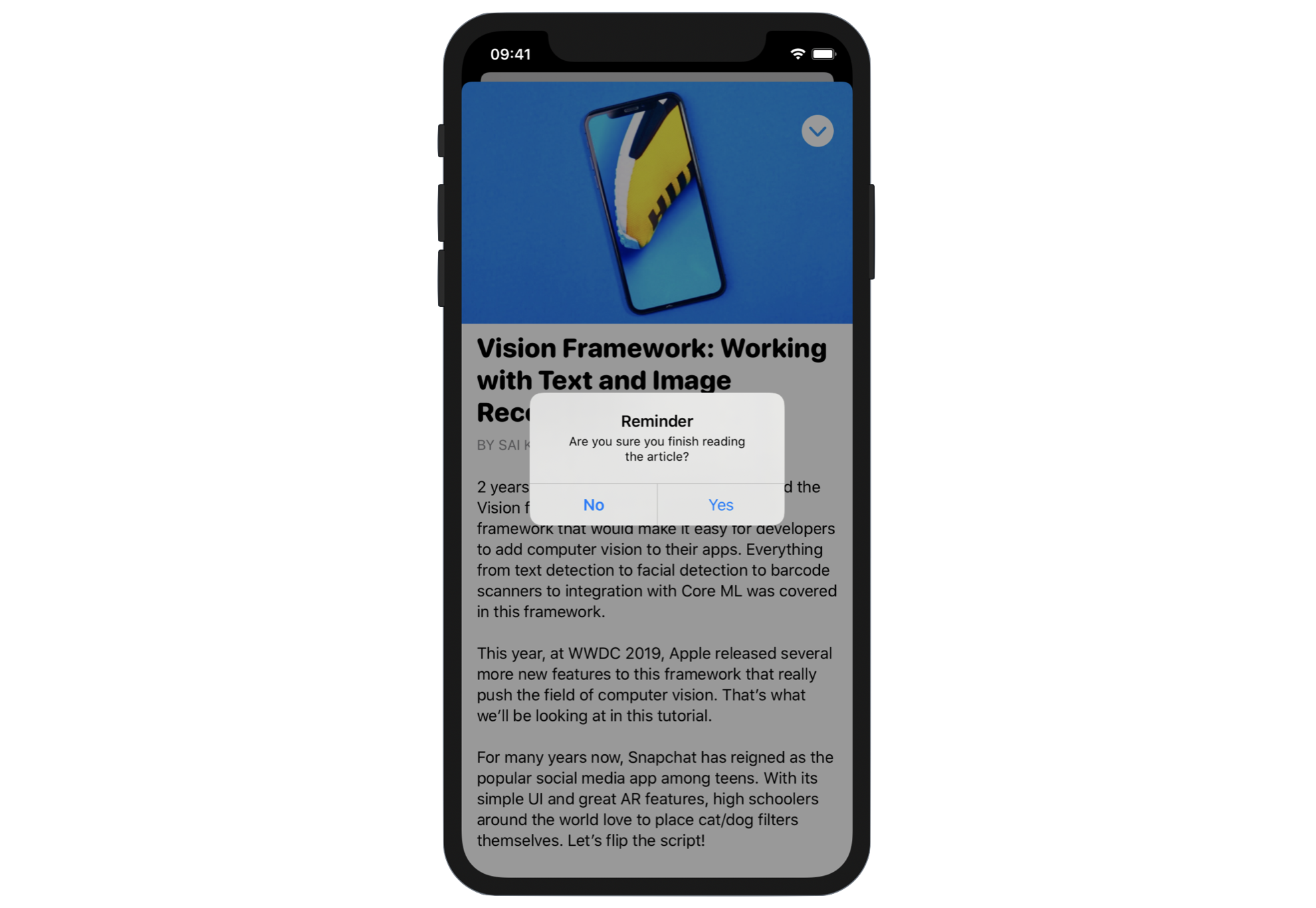
Using Alerts
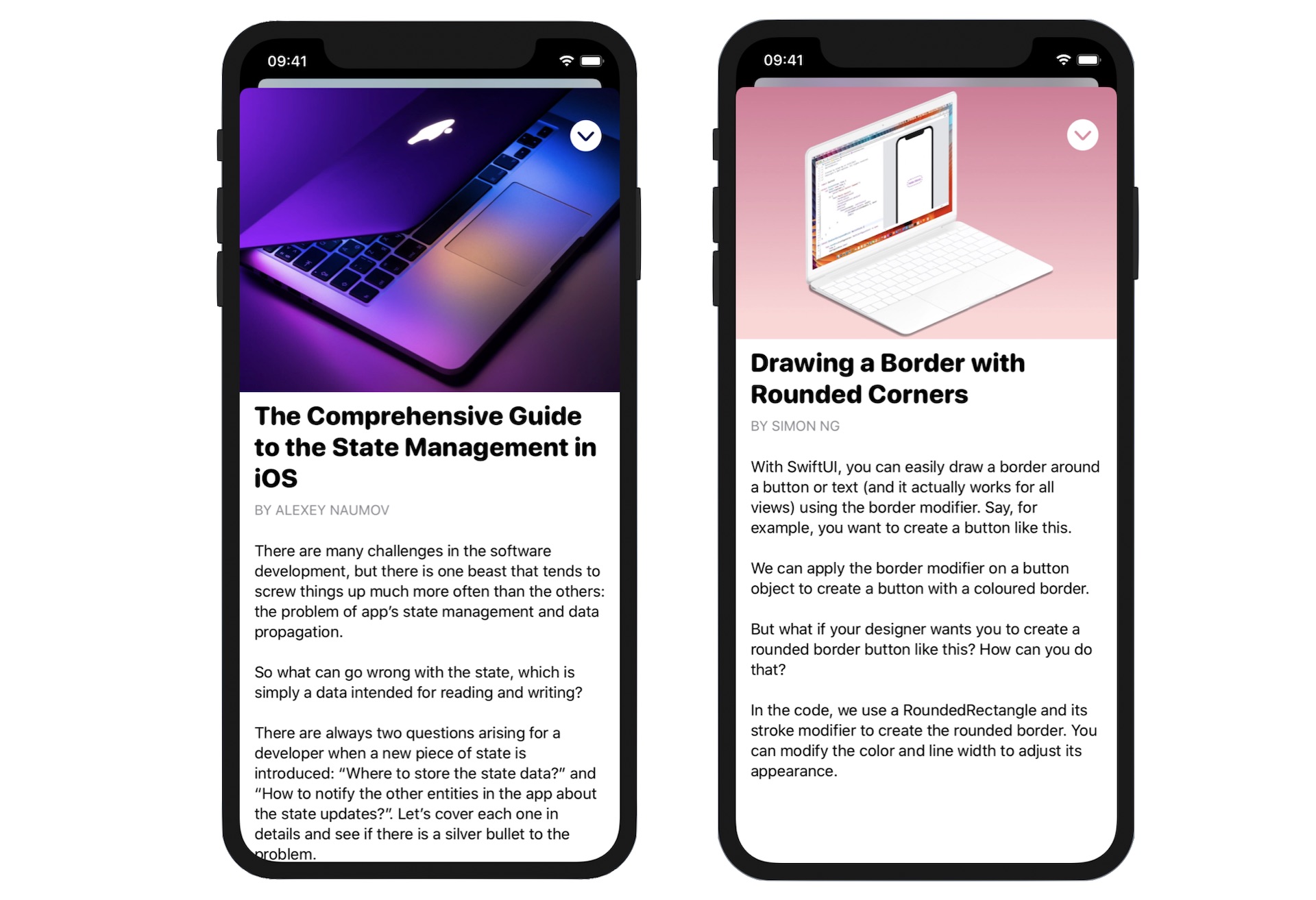
In addition to the card-like modal views, Alerts are another kind of modal view. When it's presented, the entire screen is blocked. You can't dismiss the dialog without choosing one of the options. Figure 7 shows a sample alert that we're going to implement in our demo project. What we're going to display an alert after a user taps the close button.
In SwiftUI, you create an alert using the .alert modifier. Here is an example of .alert:
.alert("Warning", isPresented: $showAlert, actions: {
    Button {
        dismiss()
    } label: {
        Text("Confirm")
    }

    Button(role: .cancel, action: {}) {
        Text("Cancel")
    }
}, message: {
    Text("Are you sure you want to leave?")
})
The sample code initiates an alert view with the title "Warning". The alert prompt also displays the message, "Are you sure you want to leave" to the user. There are two buttons in the alert view: Confirm and Cancel.
Here is the code to create the alert as shown in figure 8:
.alert("Reminder", isPresented: $showAlert, actions: {
    Button {
        dismiss()
    } label: {
        Text("Yes")
    }

    Button(role: .cancel, action: {}) {
        Text("No")
    }

}, message: {
    Text("Are you sure you are finished reading the article?")
})
It's similar to the previous code snippet except that the labels of the buttons are different. This alert asks the user whether he/she has finished reading the article. If the user chooses Yes, the modal view will be closed. Otherwise, the modal view will stay open.
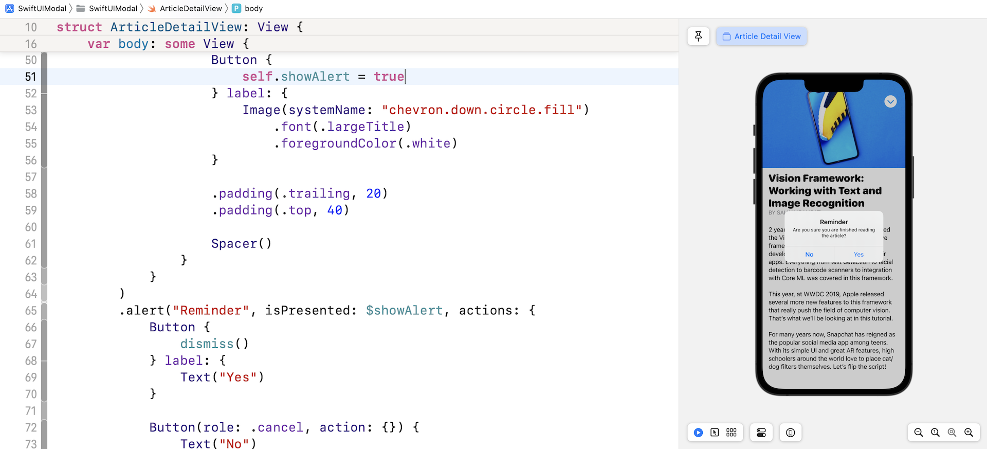
Now that we have the code for creating the alert, the question is how can we trigger the display of the alert? SwiftUI provides the alert modifier that you can attach it to any views. Again, you use a boolean variable to control the display of the alert. So, declare a state variable in ArticleDetailView:
@State private var showAlert = false
Next, attach the alert modifier as displayed earlier to the ScrollView.
There is still one thing left. When should we trigger this alert? In other words, when should we set showAlert to true?
Obviously, the app should display the alert when someone taps the close button. So, replace the close button's action like this:
Button {
    self.showAlert = true
} label: {
    Image(systemName: "chevron.down.circle.fill")
        .font(.largeTitle)
        .foregroundColor(.white)
}
Instead of dismissing the modal view directly, we instruct iOS to show the alert by setting showAlert to true. You're now ready to test the app. When you tap the close button, you'll see the alert. The modal view will be dismissed if you choose "Yes."
Displaying a Full Screen Modal View
Starting with iOS 13, the modal view doesn't cover the whole screen by default. If you want to present a full screen modal view, you can use the .fullScreenCover modifier introduced in iOS 14. Instead of using .sheet to bring up a modal view, you can apply the .fullScreenCover modifier like this:
.fullScreenCover(item: $selectedArticle) { article in
    ArticleDetailView(article: article)
}
Summary
You've learned how to present a modal view, implement a floating button, and show an alert. The latest release of iOS continues to encourage people interact with the device using gestures and provides built-in support for common gestures. Without writing a line of code, you can let users swipe down the screen to dismiss a modal view.
The API design of both modal view and alert is very similar. It monitors a state variable to determine whether the modal view (or alert) should be triggered. Once you understand this technique, the implementation shouldn't be difficult for you.
For reference, you can download the complete modal project here:
- Demo project (https://www.appcoda.com/resources/swiftui4/SwiftUIModal.zip)