- Made by AppCoda
- Contact us / Support
- Tweet this book
- Preface
- 1. Introduction to SwiftUI
- 2. Getting Started with SwiftUI and Working with Text
- 3. Working with Images
- 4. Layout User Interfaces with Stacks
- 5. Understanding ScrollView and Building a Carousel UI
- 6. Working with SwiftUI Buttons and Gradient
- 7. Understanding State and Binding
- 8. Implementing Path and Shape for Line Drawing and Pie Charts
- 9. Basic Animations and Transitions
- 10. Understanding Dynamic List, ForEach and Identifiable
- 11. Working with Navigation UI and Navigation Bar Customization
- 12. Playing with Modal Views, Floating Buttons and Alerts
- 13. Building a Form with Picker, Toggle and Stepper
- 14. Data Sharing with Combine and Environment Objects
- 15. Building a Registration Form with Combine and View Model
- 16. Working with Swipe-to-Delete, Context Menu and Action Sheets
- 17. Using Gestures
- 18. Displaying an Expandable Bottom Sheet Using Presentation Detents
- 19. Creating a Tinder-like UI with Gestures and Animations
- 20. Creating an Apple Wallet like Animation and View Transition
- 21. Working with JSON, Slider and Data Filtering
- 22. Building a ToDo app with Core Data
- 23. Integrating UIKit with SwiftUI Using UIViewRepresentable
- 24. Creating a Search Bar View and Working with Custom Binding
- 25. Putting Everything Together to Build a Real World App
- 26. Creating an App Store like Animated View Transition
- 27. Building an Image Carousel
- 28. Building an Expandable List View Using OutlineGroup
- 29. Building Grid Layout Using LazyVGrid and LazyHGrid
- 30. Creating an Animated Activity Ring with Shape and Animatable
- 31. Working with AnimatableModifier and LibraryContentProvider
- 32. Working with TextEditor to Create Multiline Text Fields
- 33. Using matchedGeometryEffect to Create View Animations
- 34. ScrollViewReader and Grid Animation
- 35. Working with Tab View and Tab Bar Customization
- 36. Using AsyncImage in SwiftUI for Loading Images Asynchronously
- 37. Implementing Search Bar Using Searchable
- 38. Creating Bar Charts and Line Charts with the Charts Framework
- 39. Capturing Text within Image Using Live Text APIs
- 40. How to Use ShareLink for Sharing Data Like Text and Photos
- 41. Using ImageRenderer to Convert SwiftUI Views into Images
- 42. Creating PDF Documents Using ImageRenderer
- 43. Using Gauge to Display Progress and Create a Speedometer
- 44. Creating Grid Layout Using Grid APIs
- 45. Switching Layout with AnyLayout
- Published with GitBook
Chapter 5
Understanding ScrollView and Building a Carousel UI
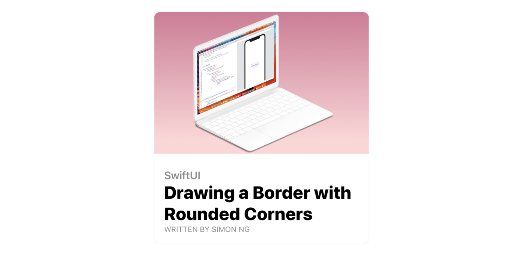
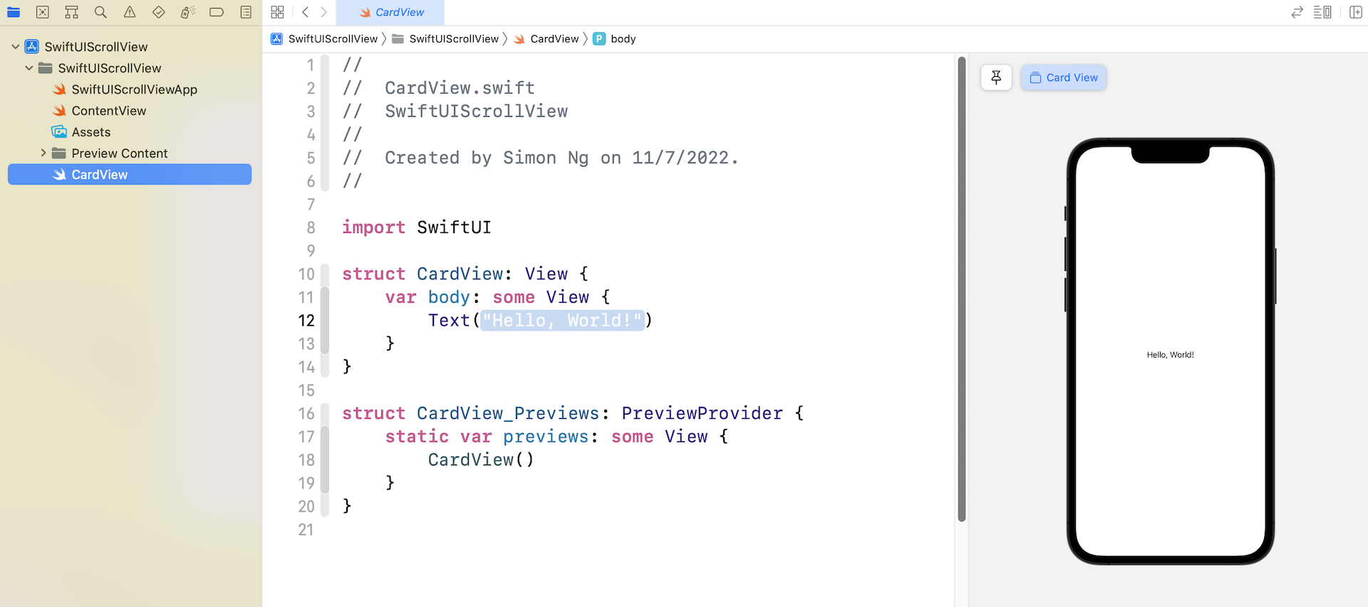
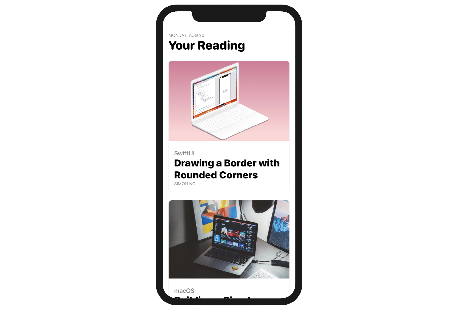
After going through the previous chapter, I believe you should now understand how to build a complex UI using stacks. Of course, it will take you a lot of practice before you can master SwiftUI. Therefore, before we dive deep into ScrollView to make the views scrollable, let's begin this chapter with a challenge. Your task is to create a card view like that shown in figure 1.
By using stacks, image, and text views, you should be able to create the UI. While I will go through the implementation step by step with you later, please take some time to work on the exercise and figure out your own solution.
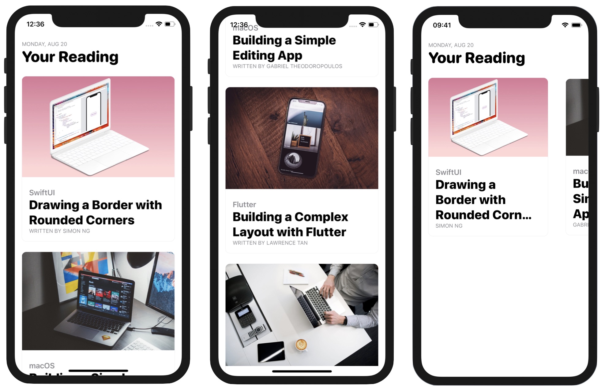
Once you create the card view, I will discuss ScrollView with you and build a scrollable interface using the card view. Figure 2 shows you the complete UIs.
Creating a Card-like UI
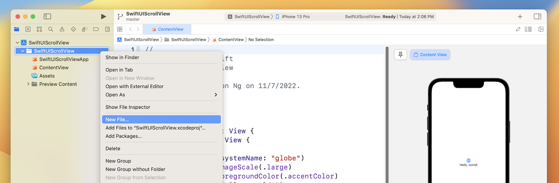
If you haven't opened Xcode, fire it up and create a new project using the App template (under iOS). In the next screen, set the product name to SwiftUIScrollView (or whatever name you like) and fill in all the required values. Make sure you select SwiftUI for the Interface option.
So far, we have coded the user interface in the ContentView.swift file. It's very likely you wrote your solution code there. That's completely fine, but I want to show you a better way to organize your code. For the implementation of the card view, let's create a separate file. In the project navigator, right click SwiftUIScrollView and choose New File...
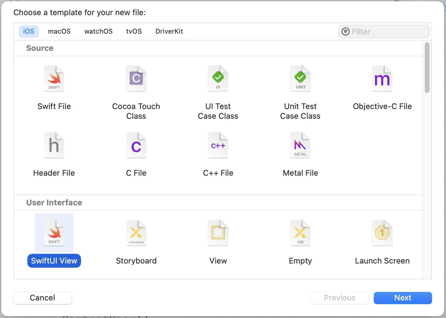
In the User Interface section, choose the SwiftUI View template and click Next to create the file. Name the file CardView and save it in the project folder.
The code in CardView.swift looks very similar to that of ContentView.swift. Similarly, you can preview the UI in the canvas.
Preparing the Image Files
Now we're ready to code the card view. But first, you need to prepare the image files and import them in the asset catalog. If you don't want to prepare your own images, you can download the sample images from https://www.appcoda.com/resources/swiftui/SwiftUIScrollViewImages.zip. Once you unzip the image archive, select Assets and drag all the images to the asset catalog.
Implementing the Card View
Now switch back to the CardView.swift file. If you look at figure 1 again, the card view is composed of two parts: the upper part is the image and the lower part is the text description.
Let's start with the image. I'll make the image resizable and scale it to fit the screen while retaining the aspect ratio. You write the code like this:
struct CardView: View {
    var body: some View {
        Image("swiftui-button")
            .resizable()
            .aspectRatio(contentMode: .fit)
    }
}
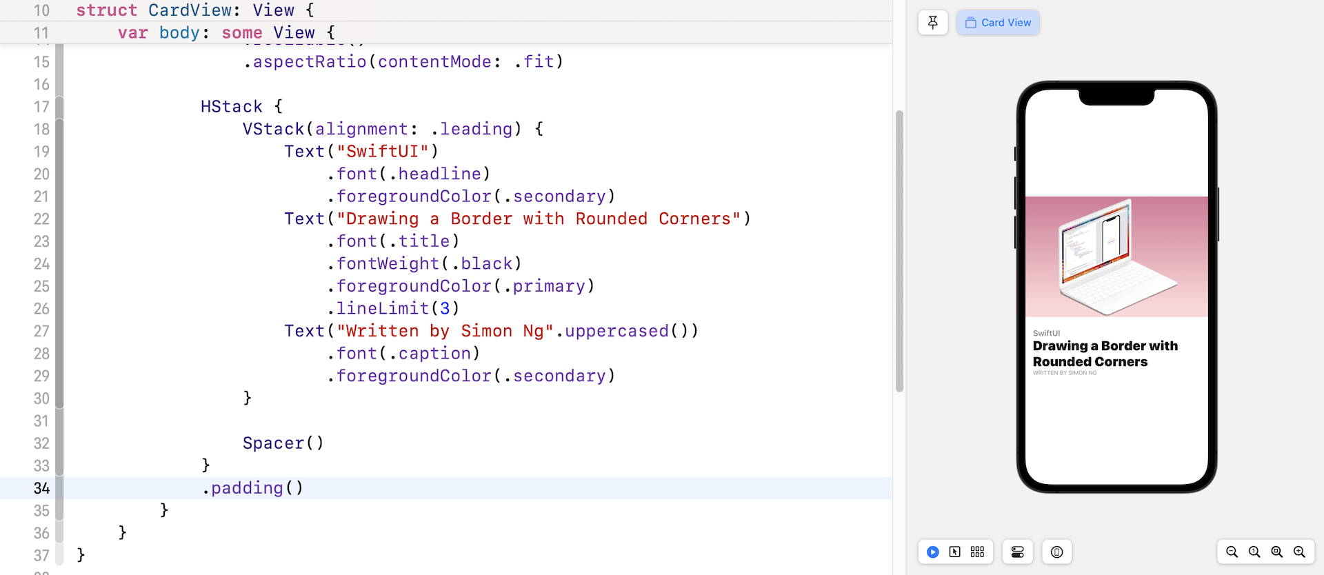
If you forgot what these two modifiers do, go back and read the chapter about the Image view. Next, let's implement the text description. You may write the code like this:
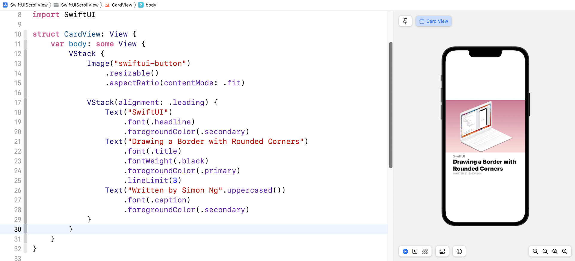
VStack(alignment: .leading) {
    Text("SwiftUI")
        .font(.headline)
        .foregroundColor(.secondary)
    Text("Drawing a Border with Rounded Corners")
        .font(.title)
        .fontWeight(.black)
        .foregroundColor(.primary)
        .lineLimit(3)
    Text("Written by Simon Ng".uppercased())
        .font(.caption)
        .foregroundColor(.secondary)
}
You need to use Text to create the text view. Since we actually have three text views in the description, that are vertically aligned, we use a VStack to embed them. For the VStack, we specify the alignment as .leading. This will align the text view to the left of the stack view.
The modifiers of Text are all discussed in the chapter about the Text object. You can refer to it if you find any of the modifiers are confusing. But one topic about the .primary and .secondary colors should be highlighted.
While you can specify a standard color like .black and .purple in the foregroundColor modifier, iOS provides a set of system colors that contain primary, secondary, and tertiary variants. By using these color variants, your app can easily support both light and dark modes. For example, the primary color of the text view is set to black in light mode by default. When the app is switched over to dark mode, the primary color will be adjusted to white. This is automatically arranged by iOS, so you don't have to write extra code to support the dark mode. We will discuss dark mode in depth in a later chapter.
To arrange the image and these text views vertically, we use a VStack to embed them. The current layout is shown in the figure below.
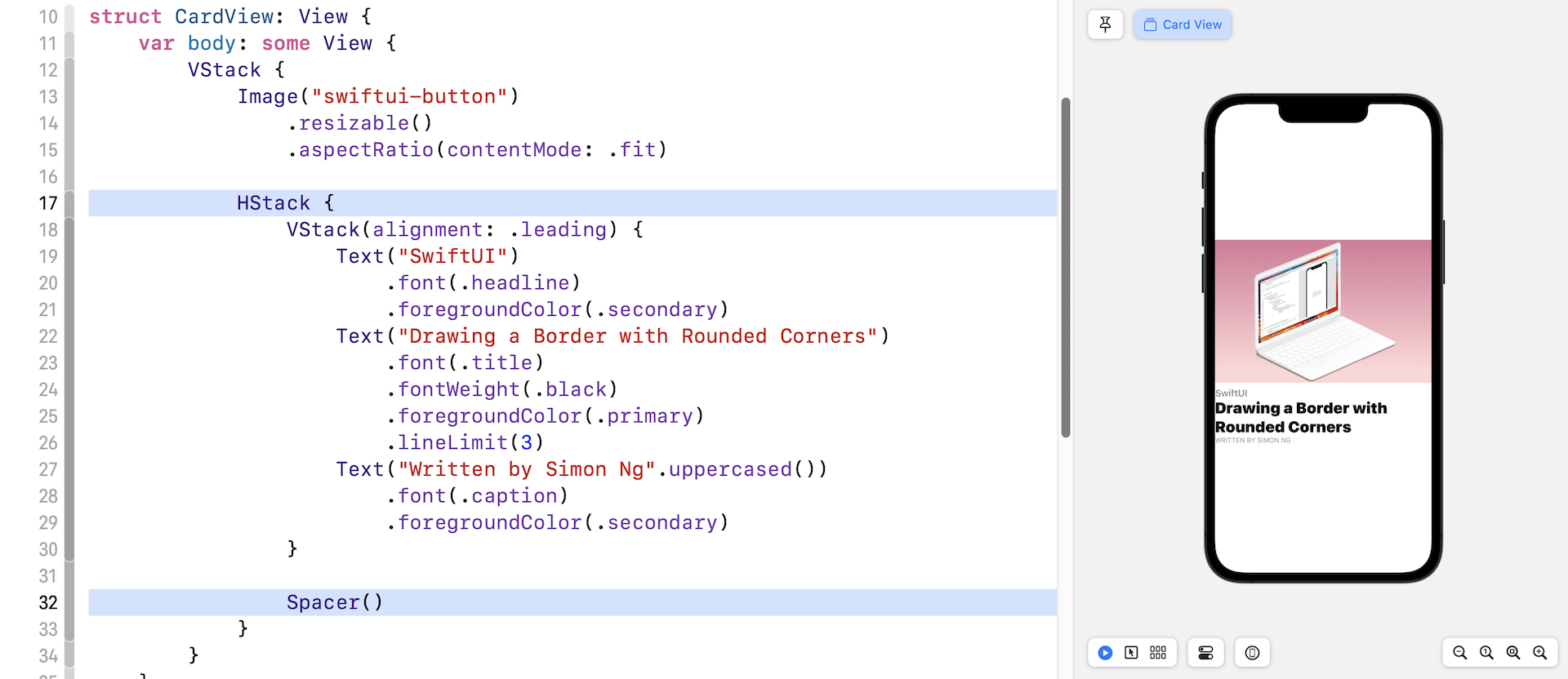
We are not done yet! There are still a couple of things we need to implement. First, the text description block should be left aligned to the edge of the image.
How do you do that?
Based on what we've learned, we can embed the VStack of the text views in a HStack. And then, we will use a Spacer to push the VStack to the left. Let's see if this works.
If you've changed the code to match the one shown in figure 8, the VStack of the text views are aligned to the left of the screen.
It would be better to add some padding around the HStack. Insert the padding modifier like this (line 34 in figure 9) :
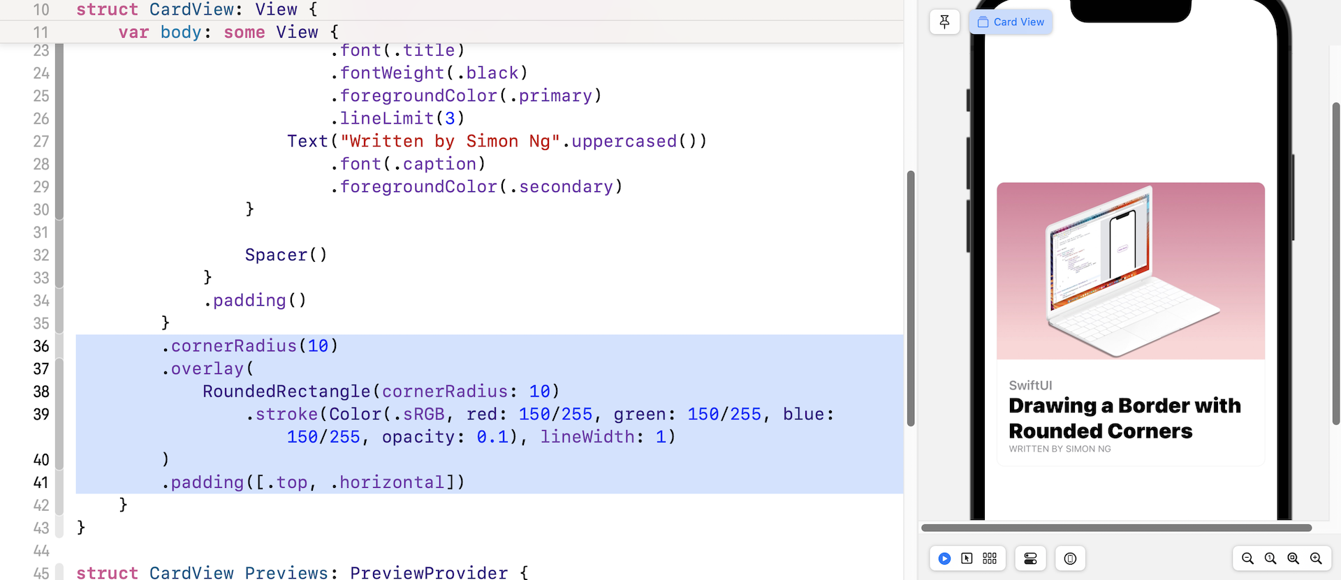
Lastly, it's the border. We have discussed how to draw a border with rounded corners in an earlier chapter. We use the overlay modifier and draw the border using RoundedRectangle. Here is the complete code:
struct CardView: View {
    var body: some View {
        VStack {
            Image("swiftui-button")
                .resizable()
                .aspectRatio(contentMode: .fit)

            HStack {
                VStack(alignment: .leading) {
                    Text("SwiftUI")
                        .font(.headline)
                        .foregroundColor(.secondary)
                    Text("Drawing a Border with Rounded Corners")
                        .font(.title)
                        .fontWeight(.black)
                        .foregroundColor(.primary)
                        .lineLimit(3)
                    Text("Written by Simon Ng".uppercased())
                        .font(.caption)
                        .foregroundColor(.secondary)
                }

                Spacer()

            }
            .padding()
        }
        .cornerRadius(10)
        .overlay(
            RoundedRectangle(cornerRadius: 10)
                .stroke(Color(.sRGB, red: 150/255, green: 150/255, blue: 150/255, opacity: 0.1), lineWidth: 1)
        )
        .padding([.top, .horizontal])
    }
}
In addition to the border, we also add some padding for the top, left, and right sides. Now you have completed the card view layout.
Make the Card View more Flexible
While the card view works, we've hard-coded the image and text. To make it more flexible, let's refactor the code. First, declare these variables for the image, category, heading, and author in CardView:
var image: String
var category: String
var heading: String
var author: String
Next, replace the values of the Image and Text views with the variables like this:
VStack {
    Image(image)
        .resizable()
        .aspectRatio(contentMode: .fit)

    HStack {
        VStack(alignment: .leading) {
            Text(category)
                .font(.headline)
                .foregroundColor(.secondary)
            Text(heading)
                .font(.title)
                .fontWeight(.black)
                .foregroundColor(.primary)
                .lineLimit(3)
            Text("Written by \(author)".uppercased())
                .font(.caption)
                .foregroundColor(.secondary)
        }

        Spacer()
    }
    .padding()
}
Once you made the changes, you will see an error in the CardView_Previews struct. This is because we've introduced some variables in CardView. We have to specify the parameters when using it.
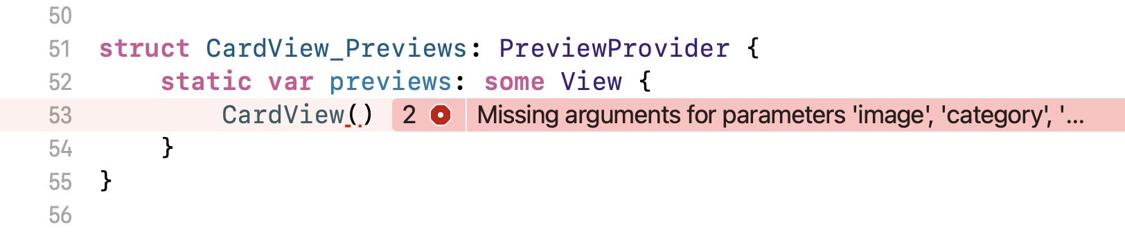
Modify the code like this:
struct CardView_Previews: PreviewProvider {
    static var previews: some View {
        CardView(image: "swiftui-button", category: "SwiftUI", heading: "Drawing a Border with Rounded Corners", author: "Simon Ng")
    }
}
This should fix the error. Great! You have built a flexible CardView that accepts different images and text.
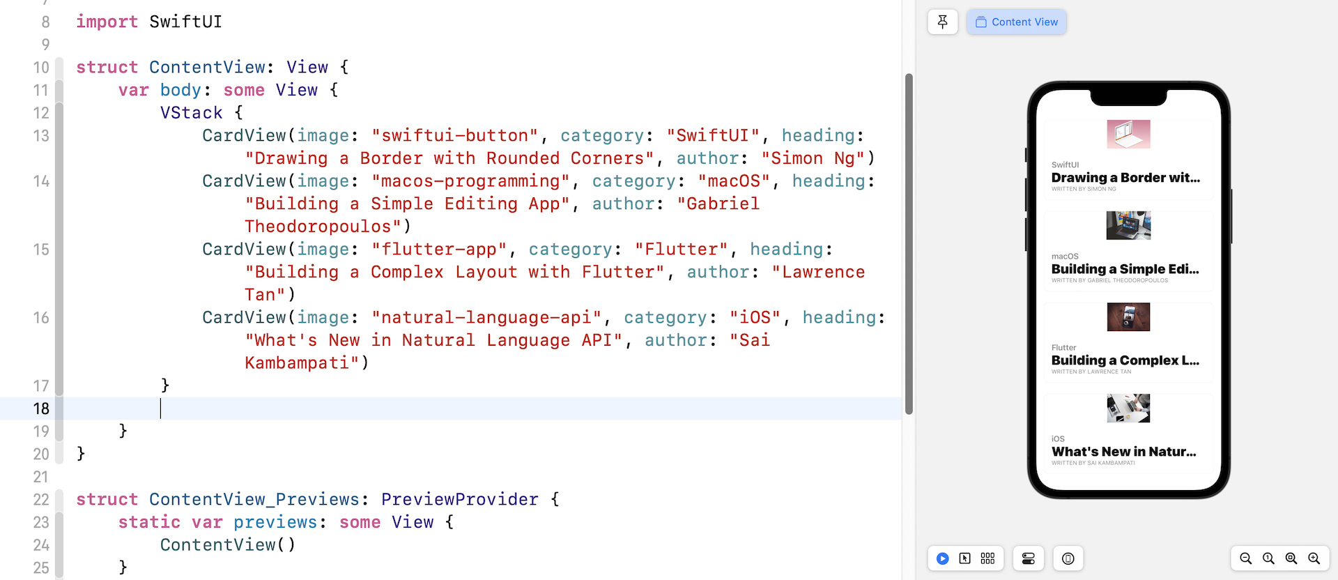
Introducing ScrollView
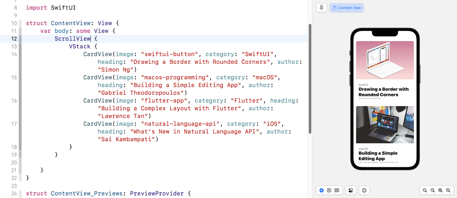
Take a look at figure 2 again. That's the user interface we're going to implement. At first, you may think we can embed four card views using a VStack. You can switch over to ContentView.swift and insert the following code:
VStack {
    CardView(image: "swiftui-button", category: "SwiftUI", heading: "Drawing a Border with Rounded Corners", author: "Simon Ng")
    CardView(image: "macos-programming", category: "macOS", heading: "Building a Simple Editing App", author: "Gabriel Theodoropoulos")
    CardView(image: "flutter-app", category: "Flutter", heading: "Building a Complex Layout with Flutter", author: "Lawrence Tan")
    CardView(image: "natural-language-api", category: "iOS", heading: "What's New in Natural Language API", author: "Sai Kambampati")
}
If you did that, the card views will be squeezed to fit the screen because VStack is non-scrollable, just like that shown in figure 12.
To support scrollable content, SwiftUI provides a view called ScrollView. When the content is embedded in a ScrollView, it becomes scrollable. What you need to do is to enclose the VStack within a ScrollView to make the views scrollable. In the preview canvas, you can drag the views to scroll the content.
Exercise #1
Your task is to add a header to the existing scroll view. The result is displayed in figure 14. If you understand VStack and HStack thoroughly, you should be able to create the layout.
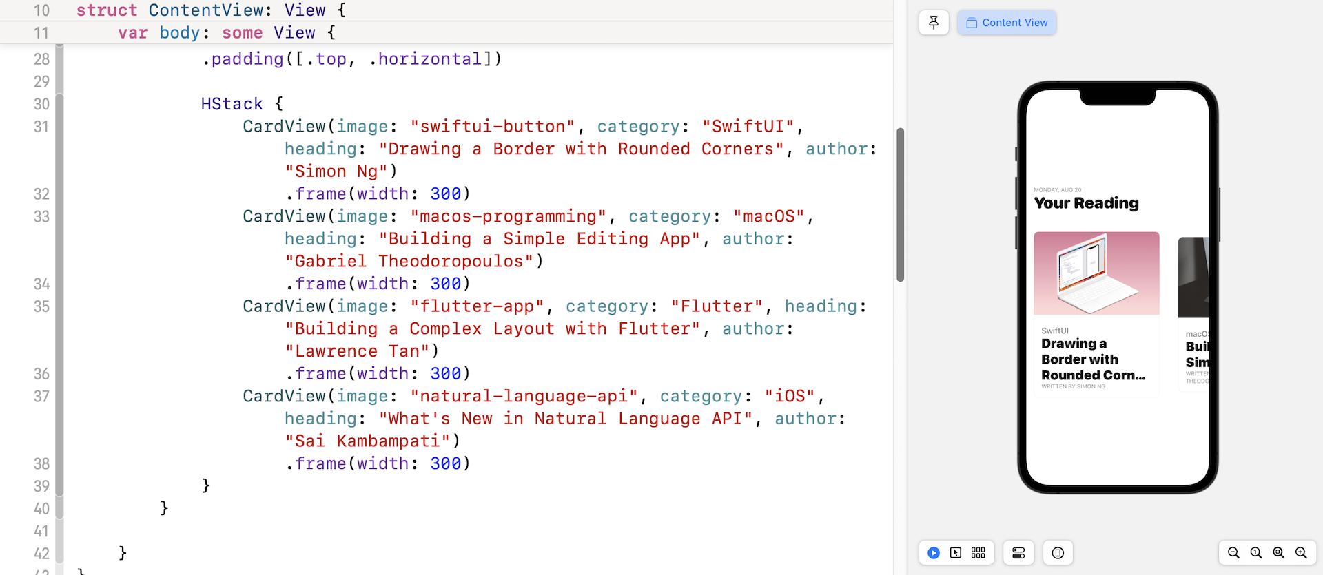
Creating a Carousel UI with Horizontal ScrollView
By default, the ScrollView allows you to scroll the content in vertical orientation. Alternatively, it also supports scrollable content in horizontal orientation. Let's see how to convert the current layout into a carousel UI with a few changes.
Update the ContentView like this:
struct ContentView: View {
    var body: some View {

        ScrollView(.horizontal) {

            // Your code for exercise #1

            HStack {
                CardView(image: "swiftui-button", category: "SwiftUI", heading: "Drawing a Border with Rounded Corners", author: "Simon Ng")
                    .frame(width: 300)
                CardView(image: "macos-programming", category: "macOS", heading: "Building a Simple Editing App", author: "Gabriel Theodoropoulos")
                    .frame(width: 300)
                CardView(image: "flutter-app", category: "Flutter", heading: "Building a Complex Layout with Flutter", author: "Lawrence Tan")
                    .frame(width: 300)
                CardView(image: "natural-language-api", category: "iOS", heading: "What's New in Natural Language API", author: "Sai Kambampati")
                    .frame(width: 300)
            }
        }

    }
}
We've made three changes in the code above:
- We specify in
ScrollViewto use a horizontal scroll view by passing it a.horizontalvalue. - Since we use a horizontal scroll view, we also need to change the stack view from
VStacktoHStack. - For each card view, we set the frame's width to 300 points. This is required because the image is too wide to display.
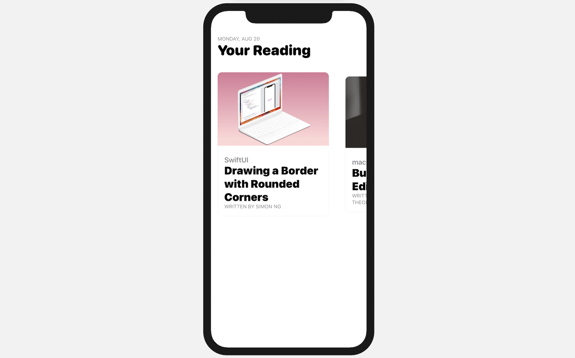
After changing the code, you'll see the card views are arranged horizontally and they are scrollable.
Hiding the Scroll Indicator
While you're scrolling the views, did you notice there is a scroll indicator near the bottom of the screen? This indicator is displayed by default. If you want to hide it, you can change the ScrollView by adding showsIndicators: false to it:
ScrollView(.horizontal, showsIndicators: false)
By setting showIndicators to false, iOS will no longer show the indicator.
Grouping View Content
If you look at the code again, you will see that all the CardViews have a .frame modifier to limit their width to 300 points. Is there any way we can simplify that and remove the duplicated code? The SwiftUI framework provides a Group view for developers to group related content. More importantly, you can attach modifiers to the group to apply the changes to each of the views embedded in the group.
For example, you can rewrite the code in HStack like this to achieve the same result:
HStack {
    Group {
        CardView(image: "swiftui-button", category: "SwiftUI", heading: "Drawing a Border with Rounded Corners", author: "Simon Ng")
        CardView(image: "macos-programming", category: "macOS", heading: "Building a Simple Editing App", author: "Gabriel Theodoropoulos")
        CardView(image: "flutter-app", category: "Flutter", heading: "Building a Complex Layout with Flutter", author: "Lawrence Tan")
        CardView(image: "natural-language-api", category: "iOS", heading: "What's New in Natural Language API", author: "Sai Kambampati")
    }
    .frame(width: 300)
}
Resize the Text Automatically
As you can see in figure 15, the title of the first card is truncated. How do you fix this? In SwiftUI, you can use the .minimumScaleFactor modifier to automatically downscale text. Switch over to CardView.swift and attach the following modifier to Text(heading):
.minimumScaleFactor(0.5)
SwiftUI will automatically scale down the text to fit the available space. The value sets the minimum amount of scaling that the view permits. In this case, SwiftUI can draw the text in a font size as small as 50% of the original font size.
Exercise #2
Here comes to the final exercise. Modify the current code and re-arrange it like that shown in figure 16. Please note that the title and the date should be visible to users when he/she scrolls through the card views.
For reference, you can download the complete scrollview project here: