- Made by AppCoda
- Contact us / Support
- Tweet this book
- Preface
- 1. Introduction to SwiftUI
- 2. Getting Started with SwiftUI and Working with Text
- 3. Working with Images
- 4. Layout User Interfaces with Stacks
- 5. Understanding ScrollView and Building a Carousel UI
- 6. Working with SwiftUI Buttons and Gradient
- 7. Understanding State and Binding
- 8. Implementing Path and Shape for Line Drawing and Pie Charts
- 9. Basic Animations and Transitions
- 10. Understanding Dynamic List, ForEach and Identifiable
- 11. Working with Navigation UI and Navigation Bar Customization
- 12. Playing with Modal Views, Floating Buttons and Alerts
- 13. Building a Form with Picker, Toggle and Stepper
- 14. Data Sharing with Combine and Environment Objects
- 15. Building a Registration Form with Combine and View Model
- 16. Working with Swipe-to-Delete, Context Menu and Action Sheets
- 17. Using Gestures
- 18. Displaying an Expandable Bottom Sheet Using Presentation Detents
- 19. Creating a Tinder-like UI with Gestures and Animations
- 20. Creating an Apple Wallet like Animation and View Transition
- 21. Working with JSON, Slider and Data Filtering
- 22. Building a ToDo app with Core Data
- 23. Integrating UIKit with SwiftUI Using UIViewRepresentable
- 24. Creating a Search Bar View and Working with Custom Binding
- 25. Putting Everything Together to Build a Real World App
- 26. Creating an App Store like Animated View Transition
- 27. Building an Image Carousel
- 28. Building an Expandable List View Using OutlineGroup
- 29. Building Grid Layout Using LazyVGrid and LazyHGrid
- 30. Creating an Animated Activity Ring with Shape and Animatable
- 31. Working with AnimatableModifier and LibraryContentProvider
- 32. Working with TextEditor to Create Multiline Text Fields
- 33. Using matchedGeometryEffect to Create View Animations
- 34. ScrollViewReader and Grid Animation
- 35. Working with Tab View and Tab Bar Customization
- 36. Using AsyncImage in SwiftUI for Loading Images Asynchronously
- 37. Implementing Search Bar Using Searchable
- 38. Creating Bar Charts and Line Charts with the Charts Framework
- 39. Capturing Text within Image Using Live Text APIs
- 40. How to Use ShareLink for Sharing Data Like Text and Photos
- 41. Using ImageRenderer to Convert SwiftUI Views into Images
- 42. Creating PDF Documents Using ImageRenderer
- 43. Using Gauge to Display Progress and Create a Speedometer
- 44. Creating Grid Layout Using Grid APIs
- 45. Switching Layout with AnyLayout
- Published with GitBook
Chapter 15
Building a Registration Form with Combine and View Model
Now that you have some basic idea about Combine, let's explore how Combine can make SwiftUI really shine. When developing a real-world app, it's very common to have a user registration page for people to sign up and create an account. In this chapter, we will build a simple registration screen with three text fields. Our focus is on form validation, so we will not perform an actual sign up. You'll learn how we can leverage the power of Combine to validate each of the input fields and organize our code in a view model.
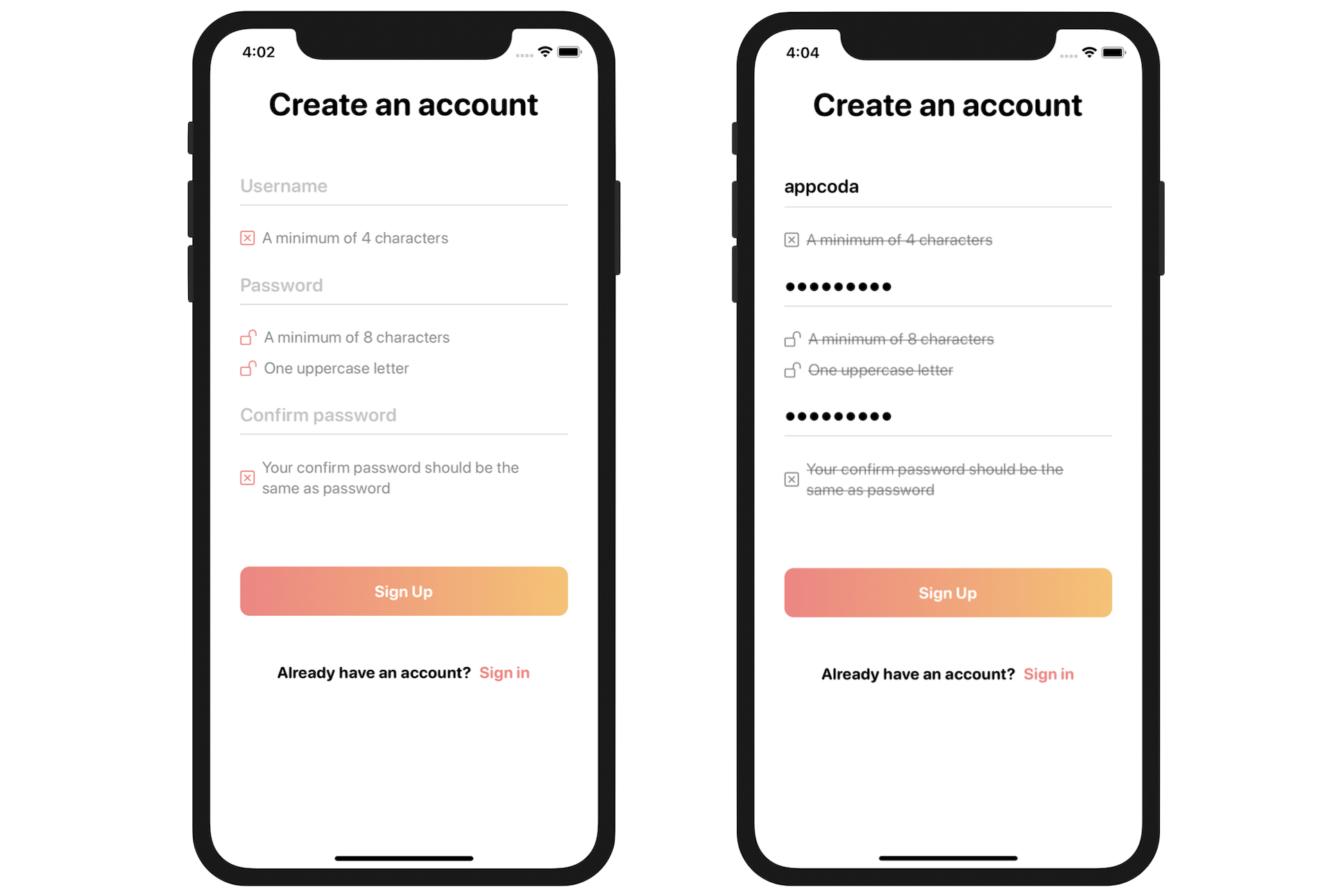
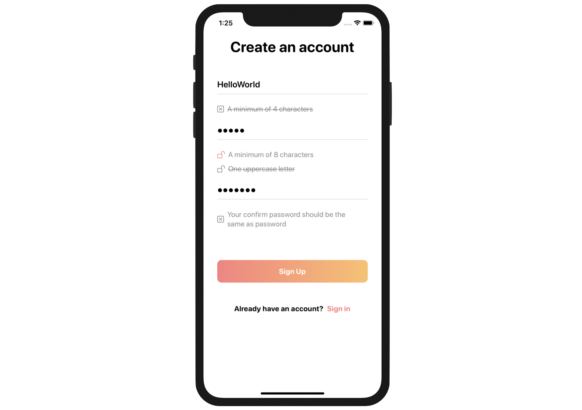
Before we dive into the code, take a look at figure 1. That is the user registration screen we're going to build. Under each of the input fields, it lists out the requirements. As soon as the user fills in the information, the app validates the input in real-time and crosses out the requirement if it's been fulfilled. The sign up button is disabled until all the requirements are matched.
If you have experience in Swift and UIKit, you know there are various types of implementation to handle the form validation. In this chapter, however, we're going to explore how you can utilize the Combine framework to perform form validation.
Layout the Form using SwiftUI
Let's begin this chapter with an exercise, use what you've learned so far and layout the form UI shown in figure 1. To create a text field in SwiftUI, you can use the TextField component. For the password fields, SwiftUI provides a secure text field called SecureField.
To create a text field, you initiate a TextField with a field name and a binding. This renders an editable text field with the user's input stored in your given binding. Similar to other form fields, you can modify its look & feel by applying the associated modifiers. Here is a sample code snippet:
TextField("Username", text: $username)
    .font(.system(size: 20, weight: .semibold, design: .rounded))
    .padding(.horizontal)
The usage of these two components are very similar except that the secure field automatically masks the user's input:
SecureField("Password", text: $password)
    .font(.system(size: 20, weight: .semibold, design: .rounded))
    .padding(.horizontal)
I know these two components are new to you, but try your best to build the form before looking at the solution.
Are you able to create the form? Even if you can't finish the exercise, that's completely fine. Download this project from https://www.appcoda.com/resources/swiftui4/SwiftUIFormRegistrationUI.zip. I will go through my solution with you.
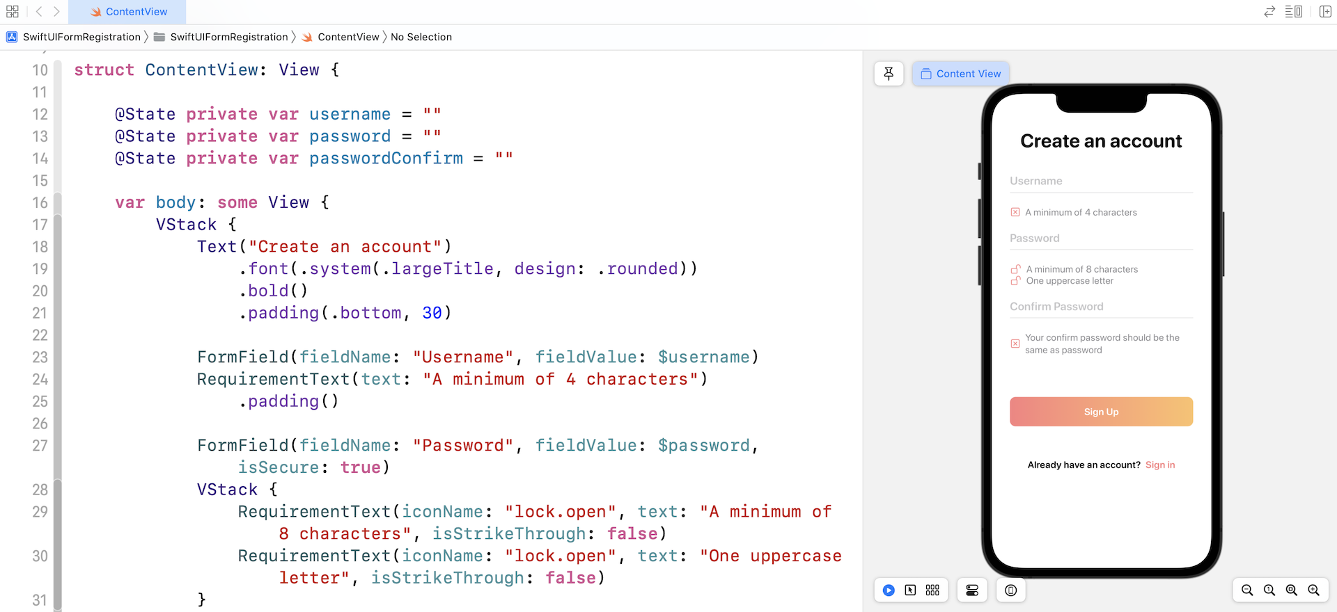
Open the ContentView.swift file and preview the layout in the canvas. Your rendered view should look like that shown in figure 2. Now, let's briefly go over the code. Let's start with the RequirementText view.
struct RequirementText: View {

    var iconName = "xmark.square"
    var iconColor = Color(red: 251/255, green: 128/255, blue: 128/255)

    var text = ""
    var isStrikeThrough = false

    var body: some View {
        HStack {
            Image(systemName: iconName)
                .foregroundColor(iconColor)
            Text(text)
                .font(.system(.body, design: .rounded))
                .foregroundColor(.secondary)
                .strikethrough(isStrikeThrough)
            Spacer()
        }
    }
}
First, why do I create a separate view for the requirements text (see figure 3)? If you look at all of the requirements text, each requirement has an icon and a description. Instead of creating each of the requirements text from scratch, we can generalize the code and build a generic view for it.

The RequirementText view has four properties including iconName, iconColor, text, and isStrikeThrough. It's flexible enough to support different styles of requirements text. If you accept the default icon and color, you can simply create a requirement text like this:
RequirementText(text: "A minimum of 4 characters")
This will render the square with an x in it (xmark.square) and the text as shown in figure 3. In some cases, the requirement text should be crossed out and display a different icon/color. The code can be written like this:
RequirementText(iconName: "lock.open", iconColor: Color.secondary, text: "A minimum of 8 characters", isStrikeThrough: true)
You specify a different system icon name, color, and set the isStrikeThrough option to true. This will allow you to create a requirement text like that displayed in figure 4.

Now that you understand how the RequirementText view works and why I created that, let's take a look at the FormField view. Again, if you look at all the text fields, they all have a common style - a text field with rounded font style. This is the reason why I extracted the common code and created a FormField view.
struct FormField: View {
    var fieldName = ""
    @Binding var fieldValue: String

    var isSecure = false

    var body: some View {

        VStack {
            if isSecure {
                SecureField(fieldName, text: $fieldValue)
                    .font(.system(size: 20, weight: .semibold, design: .rounded))
                    .padding(.horizontal)

            } else {
                TextField(fieldName, text: $fieldValue)
                    .font(.system(size: 20, weight: .semibold, design: .rounded))
                    .padding(.horizontal)
            }

            Divider()
                .frame(height: 1)
                .background(Color(red: 240/255, green: 240/255, blue: 240/255))
                .padding(.horizontal)

        }
    }
}
Since this generic FormField needs to take care of both text fields and secure fields, it has a property named isSecure. If it's set to true, the form field will be created as a secure field. In SwiftUI, you can make use of the Divider component to create a line. In the code, we use the frame modifier to change its height to 1 point.
To create the username field, you write the code like this:
FormField(fieldName: "Username", fieldValue: $username)
For the password field, the code is very similar except that the isSecure parameter is set to true:
FormField(fieldName: "Password", fieldValue: $password, isSecure: true)
Okay, let's head back to the ContentView struct and see how the form is laid out.
struct ContentView: View {

    @State private var username = ""
    @State private var password = ""
    @State private var passwordConfirm = ""

    var body: some View {
        VStack {
            Text("Create an account")
                .font(.system(.largeTitle, design: .rounded))
                .bold()
                .padding(.bottom, 30)

            FormField(fieldName: "Username", fieldValue: $username)
            RequirementText(text: "A minimum of 4 characters")
                .padding()

            FormField(fieldName: "Password", fieldValue: $password, isSecure: true)
            VStack {
                RequirementText(iconName: "lock.open", iconColor: Color.secondary, text: "A minimum of 8 characters", isStrikeThrough: true)
                RequirementText(iconName: "lock.open", text: "One uppercase letter", isStrikeThrough: false)
            }
            .padding()

            FormField(fieldName: "Confirm Password", fieldValue: $passwordConfirm, isSecure: true)
            RequirementText(text: "Your confirm password should be the same as the password", isStrikeThrough: false)
                .padding()
                .padding(.bottom, 50)

            Button(action: {
                // Proceed to the next screen
            }) {
                Text("Sign Up")
                    .font(.system(.body, design: .rounded))
                    .foregroundColor(.white)
                    .bold()
                    .padding()
                    .frame(minWidth: 0, maxWidth: .infinity)
                    .background(LinearGradient(gradient: Gradient(colors: [Color(red: 251/255, green: 128/255, blue: 128/255), Color(red: 253/255, green: 193/255, blue: 104/255)]), startPoint: .leading, endPoint: .trailing))
                    .cornerRadius(10)
                    .padding(.horizontal)

            }

            HStack {
                Text("Already have an account?")
                    .font(.system(.body, design: .rounded))
                    .bold()

                Button(action: {
                    // Proceed to Sign in screen
                }) {
                    Text("Sign in")
                        .font(.system(.body, design: .rounded))
                        .bold()
                        .foregroundColor(Color(red: 251/255, green: 128/255, blue: 128/255))
                }
            }.padding(.top, 50)

            Spacer()
        }
        .padding()
    }

}
First, we have a VStack to hold all the form elements. It begins with the heading, followed by all the form fields and requirement text. I have already explained how the form fields and requirement text are created, so I will not go through them again. What I added to the fields is the padding modifier. This is used to add some space between the text fields.
The Sign up button is created using the Button component and has an empty action. I intend to leave the action closure blank because our focus is on form validation. Again, I believe you should know how a button can be customized, so I will not go into it in detail. You can always refer to the Button chapter.
Lastly, it is the description text Already have an account. This text and the Sign in button are completely optional. I'm mimicing the layout of a common sign up form.
That's how I laid out the user registration screen. If you've tried out the exercise, you might have come up with a different solution. That's completely fine. Here I just want to show you one of the approaches to building the form. You can use it as a reference and come up with an even better implementation.
Understanding Combine
Before we dive into the code for form validation, it's better for me to give you some more background information of the Combine framework. As mentioned in the previous chapter, this new framework provides a declarative API for processing values over time.
What does it mean by "processing values over time"? What are these values?
Let's use the registration form as an example. The app continues to generate UI events when it interacts with users. Each keystroke a user enters in the text field triggers an event. This becomes a stream of values as illustrated in figure 5.
These UI events are one type of "values" the framework refers to. Another example of these values is network events (e.g. downloading a file from a remote server).
The Combine framework provides a declarative approach for how your app processes events. Rather than potentially implementing multiple delegate callbacks or completion handler closures, you can create a single processing chain for a given event source. Each part of the chain is a Combine operator that performs a distinct action on the elements received from the previous step.
- Apple's official documentation (https://developer.apple.com/documentation/combine/receiving_and_handling_events_with_combine)
Publisher and Subscriber are the two core elements of the framework. With Combine, Publisher sends events and Subscriber subscribes to receive values from that Publisher. Again, let's use the text field as an example. By using Combine, each keystroke the user inputs in the text field triggers a value change event. The subscriber, which is interested in monitoring these values, can subscribe to receive these events and perform further operations (e.g. validation).
For example, you are writing a form validator which has a property to indicate if the form is ready to submit. In this case, you can mark that property with the @Published annotation like this:
class FormValidator: ObservableObject {
    @Published var isReadySubmit: Bool = false
}
Every time you change the value of isReadySubmit, it publishes an event to the subscriber. The subscriber receives the updated value and continues the processing. Let's say, the subscriber uses that value to determine if the submit button should be enabled or not.
You may think @Published works pretty much like @State in SwiftUI. While it works pretty much the same for this example, @State only applies to properties that belong to a specific SwiftUI view. If you want to create a custom type that doesn't belong to a specific view or that can be used among multiple views, you need to create a class that conforms to ObservableObject and mark those properties with the @Published annotation.
Combine and MVVM
Now that you have a basic concept of Combine, let's begin to implement the form validation using the framework. Here is what we are going to do:
- Create a view model to represent the user registration form
- Implement form validation in the view model
I know you may have a few questions in mind. First, why do we need to create a view model? Can we add the properties of the form and perform the form validation in the ContentView?
Absolutely, you can do that. But as your project grows or the view becomes more complex, it's a good practice to break a complex component into multiple layers.
"Separation of concerns" is a fundamental principle of writing good software. Instead of putting everything in a single view, we can separate a view into two components: the view and its view model. The view itself is responsible for the UI layout, while the view model holds the states and data to be displayed in the view. The view model also handles the data validation and conversion. For experienced developers, we are applying a well known design pattern called MVVM (short for Model-View-ViewModel).
So, what data will this view model hold?
Take a look at the registration form again. We have three text fields including:
- Username
- Password
- Password confirm
On top of that, this view model will hold the states of the requirements text, indicating whether they should be crossed out or not:
- A minimum of 4 characters (username)
- A minimum of 8 characters (password)
- One uppercase letter (password)
- Your confirm password should the same as the password (password confirm)
Therefore, the view model will have seven properties and each of these properties publishes its value change to those which are interested in receiving the value. The basic skeleton of the view model can be defined like this:
class UserRegistrationViewModel: ObservableObject {
    // Input
    @Published var username = ""
    @Published var password = ""
    @Published var passwordConfirm = ""

    // Output
    @Published var isUsernameLengthValid = false
    @Published var isPasswordLengthValid = false
    @Published var isPasswordCapitalLetter = false
    @Published var isPasswordConfirmValid = false
}
That's the data model for the form view. The username, password, and passwordConfirm properties hold the value of the username, password, and password confirm text fields respectively. This class should conform to ObservableObject. All these properties are annotated with @Published because we want to notify the subscribers whenever there is a value change and perform the validation accordingly.
Validating the Username with Combine
Okay, that's the data model. But we still haven't dealt with the form validation. How do we validate the username, password, and passwordConfirm in accordance to the requirements?
With Combine, you have to develop a publisher/subscriber mindset to answer the question. Consider the username, we actually have two publishers here: username and isUsernameLengthValid. The username publisher emits value changes whenever the user enters in a keystroke in the username field. The isUsernameLengthValid publisher informs the subscriber about the validation status of the user input. Nearly all controls in SwiftUI are subscribers, so the requirements text view will listen to the change of validation result and update its style (i.e. strikethrough or not) accordingly. Figure 6 illustrates how we use Combine to validate the username input.
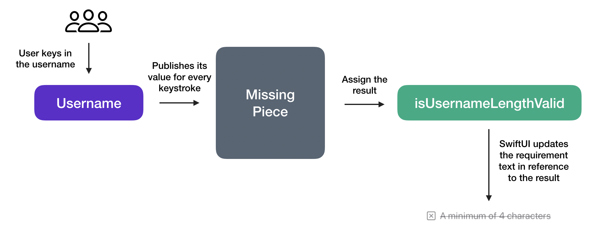
What's missing here is something that connects between these two publishers. And, this "something" should handle the following tasks:
- Listen to the
usernamechange - Validate the username and return the validation result (true/false)
- Assign the result to
isUsernameLengthValid
If you transform the requirements above into code, here is what the code snippet looks like:
$username
    .receive(on: RunLoop.main)
    .map { username in
        return username.count >= 4
    }
    .assign(to: \.isUsernameLengthValid, on: self)
The Combine framework provides two built-in subscribers: sink and assign. For sink, it creates a general purpose subscriber to receive values. assign allows you to create another type of subscriber that can update a specific property of an object. For example, it assigns the validation result (true/false) to isUsernameLengthValid directly.
Let me dive deeper into the code above line by line. $username is the source of value change that we want to listen to. Since we're subscribing to the change of UI events, we call the receive(on:) function to ensure the subscriber receives values on the main thread (i.e. RunLoop.main).
The value sent by the publisher is the username input by the user. But what the subscriber is interested in is whether the length of the username meets the minimum requirement. Here, the map function is an operator in Combine that takes an input, processes it, and transforms the input into something that the subscriber expects. So, what we did in the code above is:
- We take the username as input.
- Then we validate the username and verify if it has at least 4 characters.
- Lastly, we return the validation result as a boolean (true/false) to the subscriber.
With the validation result, the subscriber simply sets the result to the isUsernameLengthValid property. Recall that isUsernameLengthValid is also a publisher, we can then update the RequirementText control like this to subscribe to the change and update the UI accordingly:
RequirementText(iconColor: userRegistrationViewModel.isUsernameLengthValid ? Color.secondary : Color(red: 251/255, green: 128/255, blue: 128/255), text: "A minimum of 4 characters", isStrikeThrough: userRegistrationViewModel.isUsernameLengthValid)
Both the icon color and the status of strike through depend on the validation result (i.e. isUsernameLengthValid).
This is how we use Combine to validate a form field. We still haven't put the code change into our project, but I want you to understand the concept of publisher/subscriber and how we perform validation using this approach. In later section, we will apply what we learned and make the code change.
Validate the Passwords with Combine
Now that you understand how the validation of the username field is done, we will apply a similar implementation for the password and password confirm validation.
The password field has two requirements:
- The length of password should have at least 8 characters.
- It should contain at least one uppercase letter.
To meet these requirements, we set up two subscribers like this:
$password
    .receive(on: RunLoop.main)
    .map { password in
        return password.count >= 8
    }
    .assign(to: \.isPasswordLengthValid, on: self)

$password
    .receive(on: RunLoop.main)
    .map { password in
        let pattern = "[A-Z]"
        if let _ = password.range(of: pattern, options: .regularExpression) {
            return true
        } else {
            return false
        }
    }
    .assign(to: \.isPasswordCapitalLetter, on: self)
The first subscriber subscribes the verification result of password length and assigns it to the isPasswordLengthValid property. The second subscriber hands the validation of the uppercase letter. We use the range method to test if the password has at least one uppercase letter. Again, the subscriber assigns the validation result the isPasswordCapitalLetter property directly.
Okay, what's left is the validation of the password confirm field. For this field, the input requirement is that the password confirm should be equal to that of the password field. Both password and passwordConfirm are publishers. To verify if both publishers have the same value, we use Publisher.combineLatest to receive and combine the latest values from the publishers. We can then verify if the two values are the same. Here is the code snippet:
Publishers.CombineLatest($password, $passwordConfirm)
    .receive(on: RunLoop.main)
    .map { (password, passwordConfirm) in
        return !passwordConfirm.isEmpty && (passwordConfirm == password)
    }
    .assign(to: \.isPasswordConfirmValid, on: self)
Similarly, we assign the validation result to the isPasswordConfirmValid property.
Implementing the UserRegistrationViewModel
Now that I've explained the implementation, let's put everything together into the project. First, create a new Swift file named UserRegistrationViewModel.swift using the Swift File template. Replace the whole file's content with the following code:
import Foundation
import Combine

class UserRegistrationViewModel: ObservableObject {
    // Input
    @Published var username = ""
    @Published var password = ""
    @Published var passwordConfirm = ""

    // Output
    @Published var isUsernameLengthValid = false
    @Published var isPasswordLengthValid = false
    @Published var isPasswordCapitalLetter = false
    @Published var isPasswordConfirmValid = false

    private var cancellableSet: Set<AnyCancellable> = []

    init() {
        $username
            .receive(on: RunLoop.main)
            .map { username in
                return username.count >= 4
            }
            .assign(to: \.isUsernameLengthValid, on: self)
            .store(in: &cancellableSet)

        $password
            .receive(on: RunLoop.main)
            .map { password in
                return password.count >= 8
            }
            .assign(to: \.isPasswordLengthValid, on: self)
            .store(in: &cancellableSet)

        $password
            .receive(on: RunLoop.main)
            .map { password in
                let pattern = "[A-Z]"
                if let _ = password.range(of: pattern, options: .regularExpression) {
                    return true
                } else {
                    return false
                }
            }
            .assign(to: \.isPasswordCapitalLetter, on: self)
            .store(in: &cancellableSet)

        Publishers.CombineLatest($password, $passwordConfirm)
            .receive(on: RunLoop.main)
            .map { (password, passwordConfirm) in
                return !passwordConfirm.isEmpty && (passwordConfirm == password)
            }
            .assign(to: \.isPasswordConfirmValid, on: self)
            .store(in: &cancellableSet)
    }
}
The code is nearly the same as what we went through in the earlier sections. To use Combine, you first need to import the Combine framework. In the init() method, we initialize all the subscribers to listen to the value change of the text fields and perform the corresponding validations.
The code is nearly the same as the code snippets we discussed earlier. One thing you may notice is the cancellableSet variable. Additionally, for each of the subscribers, we call the store function at the very end.
What does the store function and cancellableSet variable do?
The assign function, which creates the subscriber, returns you with a cancellable instance. You can use this instance to cancel the subscription at the appropriate time. The store function lets us save the cancellable reference into a set for later cleanup. If you do not store the reference, the app may end up with memory leak issues.
So, when will the clean up happen for this demo? Because cancellableSet is defined as a property of the class, the cleanup and cancellation of the subscription will happen when the class is deinitialized.
Now switch back to ContentView.swift and update the UI controls. First, replace the following state variables:
@State private var username = ""
@State private var password = ""
@State private var passwordConfirm = ""
with a view model and name it userRegistrationViewModel:
@ObservedObject private var userRegistrationViewModel = UserRegistrationViewModel()
Next, update the text field and the requirement text of username like this:
FormField(fieldName: "Username", fieldValue: $userRegistrationViewModel.username)

RequirementText(iconColor: userRegistrationViewModel.isUsernameLengthValid ? Color.secondary : Color(red: 251/255, green: 128/255, blue: 128/255), text: "A minimum of 4 characters", isStrikeThrough: userRegistrationViewModel.isUsernameLengthValid)
    .padding()
The fieldValue parameter is now changed to $userRegistrationViewModel.username. For the requirement text, SwiftUI monitors the userRegistrationViewModel.isUsernameLengthValid property and updates the requirement text accordingly.
Similarly, update the UI code for the password and password confirm fields like this:
FormField(fieldName: "Password", fieldValue: $userRegistrationViewModel.password, isSecure: true)

VStack {
    RequirementText(iconName: "lock.open", iconColor: userRegistrationViewModel.isPasswordLengthValid ? Color.secondary : Color(red: 251/255, green: 128/255, blue: 128/255), text: "A minimum of 8 characters", isStrikeThrough: userRegistrationViewModel.isPasswordLengthValid)

    RequirementText(iconName: "lock.open", iconColor: userRegistrationViewModel.isPasswordCapitalLetter ? Color.secondary : Color(red: 251/255, green: 128/255, blue: 128/255), text: "One uppercase letter", isStrikeThrough: userRegistrationViewModel.isPasswordCapitalLetter)
}
.padding()

FormField(fieldName: "Confirm Password", fieldValue: $userRegistrationViewModel.passwordConfirm, isSecure: true)

RequirementText(iconColor: userRegistrationViewModel.isPasswordConfirmValid ? Color.secondary : Color(red: 251/255, green: 128/255, blue: 128/255), text: "Your confirm password should be the same as password", isStrikeThrough: userRegistrationViewModel.isPasswordConfirmValid)
    .padding()
    .padding(.bottom, 50)
That's it! You're now ready to test the app. If you've made all the changes correctly, the app should now validate the user input.
Summary
I hope you now have gained some basic knowledge of the Combine framework. The introduction of SwiftUI and Combine completely change the way you build apps. Functional Reactive Programming (FRP) has become more and more popular in recent years. This is the first time Apple has released their own functional reactive framework. To me, it's a major paradigm shift. The company finally took position on FRP and recommends Apple developers embrace this new programming methodology.
Like the introduction of any new technology, there will be a learning curve. Even if you've been programming in iOS, it will take time to move from the programming methodology of delegates to publishers and subscribers.
However, once you get comfortable with the Combine framework, you will be very glad as it will help you achieve more maintainable and modular code. As you can now see, together with SwiftUI, communication between a view and a view model is a breeze.
For reference, you can download the complete form validation project here: